


 Интернет
 Информатика
Похожие презентации:
")


Usability Heuristics and Design Guidelines. Human Computer Interaction and Communication. (Part 2)
1. Usability Heuristics and Design Guidelines, Part II
Usability HeuristicsPresentedand byDesign
Guidelines, Part II
Human Computer Interaction and Communication
2.
Topics and AgendaJakob Nielsen’s Ten Usability Heuristics
Reflection
3.
Course ProgressProject 01: World Food Initiative Website
Project 02: Auto Rental Corporation Website
• Class 16: Research Plan Evaluation
• Class 24: Updating Your Research Plan and
Competitive Analysis
• Class 17: Competitive Analysis Evaluation
• Class 25: Usability Heuristics and Design
Guidelines, Part I
• Assessment 06
• Class 18: Storyboards
Class 26: Usability Heuristics and Design
Guidelines, Part II
• Class 19: Storyboard Evaluation
• Assessment 04
• Class 27: Heuristic Evaluations
• Class 20: Generalized Transition Networks
(GTNs) and Sitemaps
• Class 28: High-Level Design Review
• Assessment 07
• Class 21: GTN Evaluation
• Class 29: Low-Level Design Review
• Class 22: Wireframes and Mockups
• Assessment 05
• Class 30: Mid-Semester Assessment 02
• Class 23: Wireframe and Mockup Evaluation
4.
Jakob Nielsen’s Ten Usability Heuristics21.
2.
3.
4.
5.
6.
7.
8.
9.
10.
Visibility of system status
Match between system and the real world
User control and freedom
Consistency and standards
Error prevention
Recognition rather than recall
Flexibility and efficiency of use
Aesthetic and minimalist design
Help users recognize, diagnose, and recover from errors
Help and documentation
2. http://www.useit.com/papers/heuristic/heuristic_list.html
5.
Consistency and StandardsDesign should follow the guidelines and conventions of similar systems,
applications, or websites
Users should be able to make inferences about labels and terms by drawing
from their experiences with similar interfaces and systems
6.
Error PreventionDesign to prevent errors
7.
Recognition Rather than RecallKeep the amount users have to remember to a minimum
Don’t expect users to remember specific, detailed information
about system
Interface should be designed to allow users to easily recognize
or intuit functionality
8.
Flexibility and Efficiency of UseDesign should accommodate both experienced and
inexperienced users
9.
Aesthetic and Minimalist DesignDesign should include only relevant, minimally needed information
Unnecessary information:
Makes it harder to see important information
Decreases design’s overall usability
10.
Help Users Recognize, Diagnose, and Recover from ErrorsUse plain language to indicate problem and suggest solution
Error messages should:
Be clear, specific, easy to understand
Be meaningful to the user
Provide immediate feedback and specific guidance on how to recover
from the error
11.
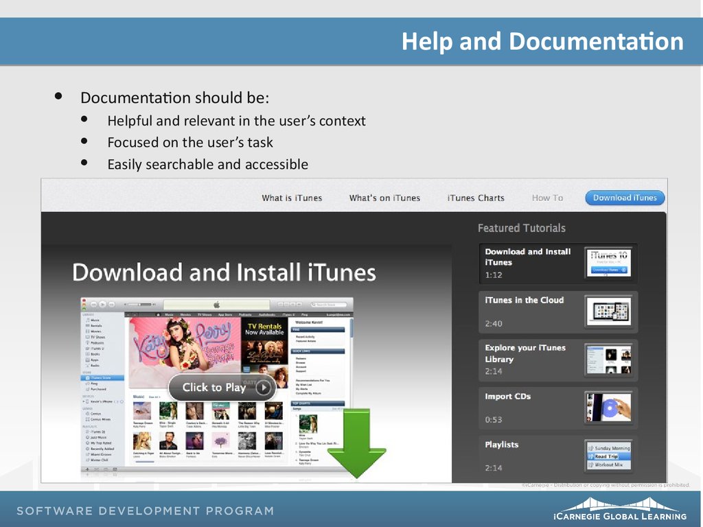
Help and DocumentationDocumentation should be:
Helpful and relevant in the user’s context
Focused on the user’s task
Easily searchable and accessible
12.
Exercise ReflectionWhat have you learned from checking your design against all
ten principles combined and how will you improve your design
as a result?
13.
Remember…Project 02: Due on Class 30
Due by 8 p.m. via the LMS
Assessment 07: Class 28
Mid-Semester Assessment 02: Class 30