


 Информатика
Похожие презентации:


")

")
 — Chapter 1 — Farid Feyzi")
ICT. Description of the process and its visualization
1.
Practical work 9Description of the process
and its visualization
2.
Vocabulary1.Visualization
2.Plots
3.Charts and matrices
4.Cards
3.
Visualization is the first step tounderstand data. Analytical data uses a
wide range of methods: charts, diagrams,
maps, etc. Also, visualization makes the
data understandable. Meanwhile, wrong
tactics cannot fully disclose our data.
4.
Definition of the visualization:1. to make visual or visible;
2. to form a mental image;
3. to make perceptible to he mind or
imagination.
5.
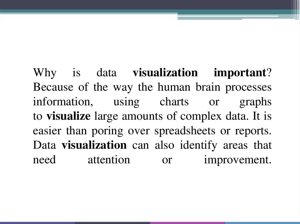
Why is data visualization important?Because of the way the human brain processes
information,
using
charts
or
graphs
to visualize large amounts of complex data. It is
easier than poring over spreadsheets or reports.
Data visualization can also identify areas that
need
attention
or
improvement.
6.
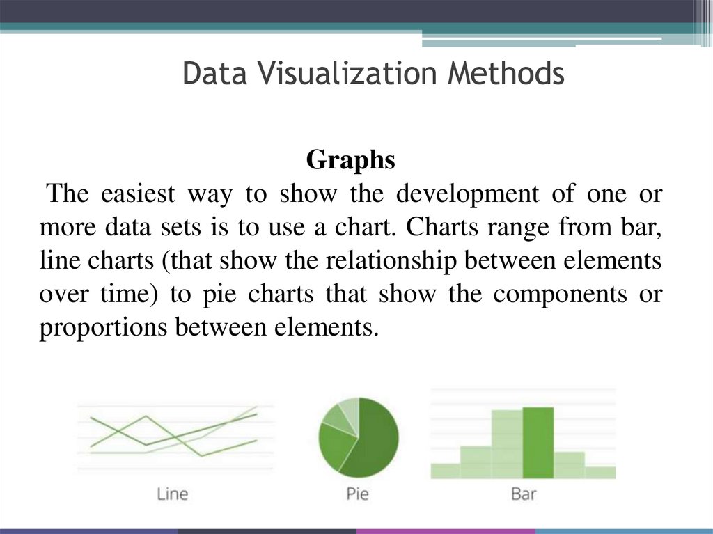
Data Visualization MethodsGraphs
The easiest way to show the development of one or
more data sets is to use a chart. Charts range from bar,
line charts (that show the relationship between elements
over time) to pie charts that show the components or
proportions between elements.
7.
PlotsGraphs allow you to distribute two or more data sets
in two-dimensional or even three-dimensional space to
show the relationship between these sets and
parameters on the graph. Graphs also differ: dot and
bubble, those two graphs are the most traditional.
Although, when it comes to big data, analysts use
block charts that allow you to visualize the
relationship between large volumes of different data.
8.
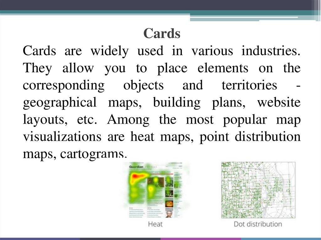
CardsCards are widely used in various industries.
They allow you to place elements on the
corresponding objects and territories geographical maps, building plans, website
layouts, etc. Among the most popular map
visualizations are heat maps, point distribution
maps, cartograms.
9.
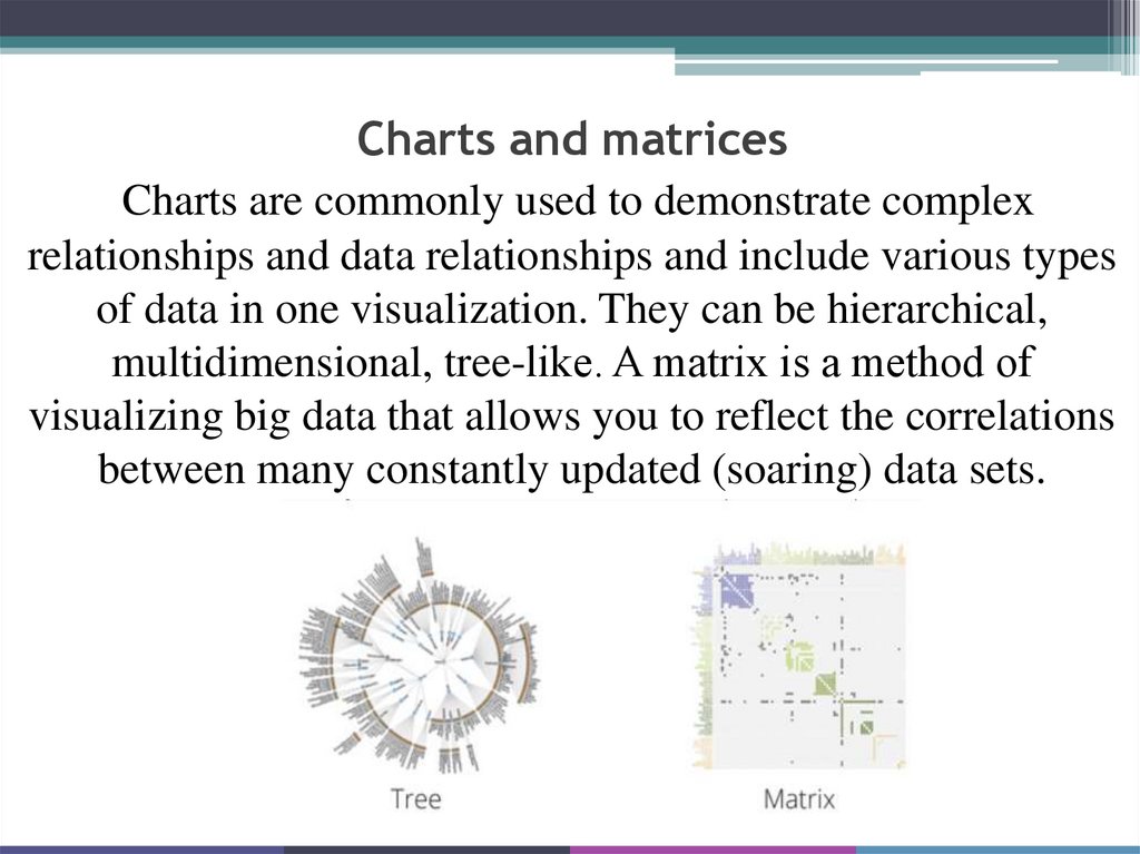
Charts and matricesCharts are commonly used to demonstrate complex
relationships and data relationships and include various types
of data in one visualization. They can be hierarchical,
multidimensional, tree-like. A matrix is a method of
visualizing big data that allows you to reflect the correlations
between many constantly updated (soaring) data sets.
10.
Intelligence cardThis is a way to visualize the
process of thinking by creating
non-linear schemes.
For what we use:
(For example)
Pupils and students: navigate the
flow of educational information
and better remember the
material for the exam, write a
diploma that you will be proud
of.
11.
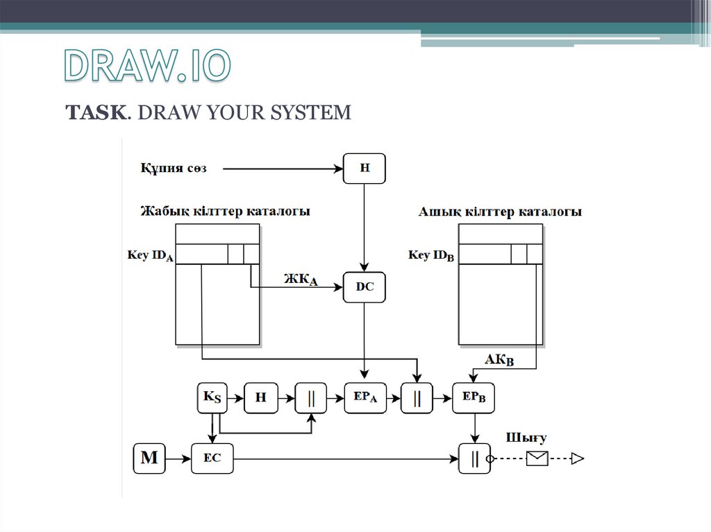
TASK. DRAW YOUR SYSTEM12.
HOMEWORKVine or social project video