Похожие презентации:
A presentation about presentations
1.
“Meta-Presentation”A Presentation about Presentations
2. Prelude
Delivering a presentation or a publicspeech not necessarily an inborn talent
Much of it can be learnt!
But, there is no universal recipe to be a
perfect presenter!
W. Runge 08/2008
2
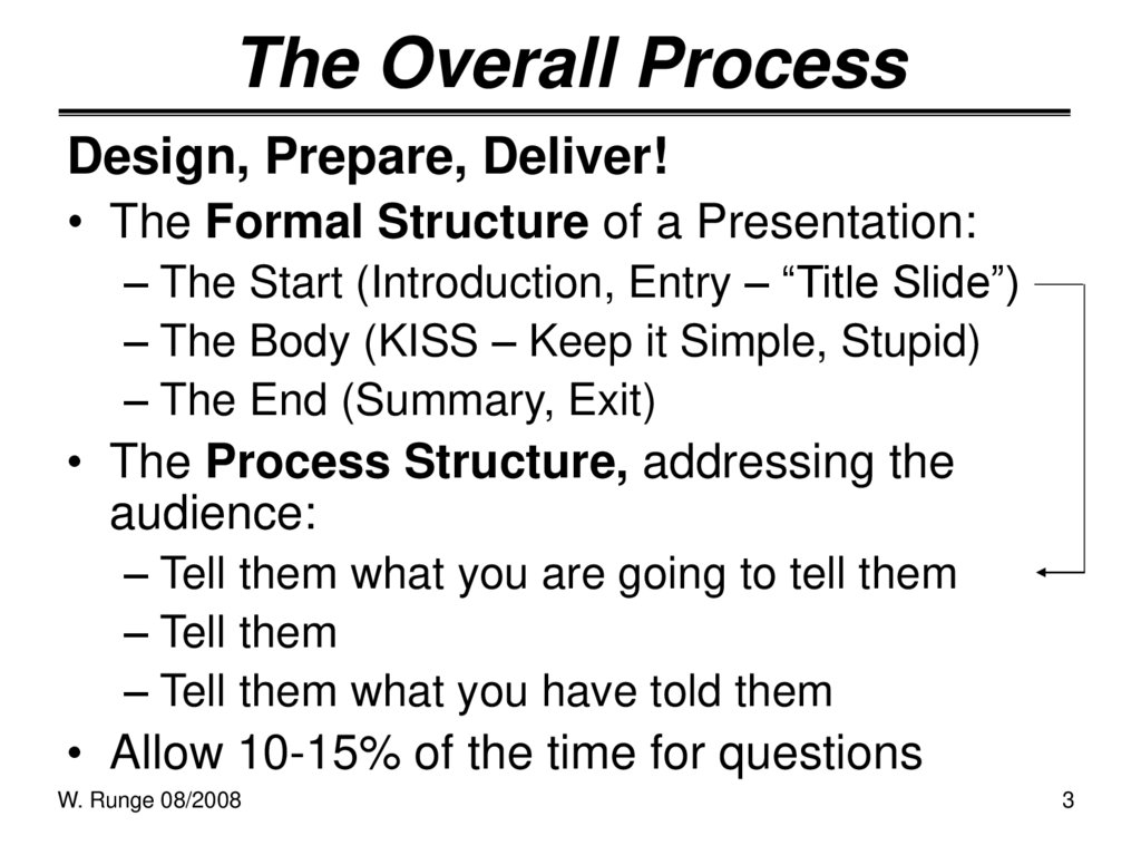
3. The Overall Process
Design, Prepare, Deliver!• The Formal Structure of a Presentation:
– The Start (Introduction, Entry – “Title Slide”)
– The Body (KISS – Keep it Simple, Stupid)
– The End (Summary, Exit)
• The Process Structure, addressing the
audience:
– Tell them what you are going to tell them
– Tell them
– Tell them what you have told them
• Allow 10-15% of the time for questions
W. Runge 08/2008
3
4.
Presentation IntentionsBased on face-to-face communication
1. inform somebody or an audience
2. convince somebody or an audience to
do/accept something
In case of entrepreneurship it is NOT
–
–
an academic exercise, seminar or dispute,
a report at a technical meeting, conference, …
It is about “selling” (yourself, your firm,
your project, etc. vis-à-vis somebody)
W. Runge 08/2008
4
5. Know What You Want to Achieve
For entrepreneurship (to found a firm)• Attract one specific or several investors or
backers
• Attract a specific type of investor (venture
capitalist, investment firm, angel investor,
corporate venturing investor; a banker)
• Testing your attractiveness for financing
options (to assess your business plan)
Otherwise (e.g. in a firm, R&D project)
• Gain support for further actions, find “sponsor”,
gain allies (or - identify opponents, “enemies”)
W. Runge 08/2008
5
6. Know the Audience
• It is your responsibility to tailor your talk tothe audience (what can you offer?)
• What is the fundamental driver (intention) of
the participants you want to convince?
(investors - profit in short time;
in firm - kill your proposal, project?)
• Overview or detail? Anyway, no “tech talk”!
• Use language the audience can understand!
• The Challenge:
complex (technical) concepts in few words
W. Runge 08/2008
6
7. Nervousness
• Everybody is nervous!• Practice, practice and practice again!
– In front of a mirror, a friend, or an empty
conference room or a “dry run” for yourself
(rehearsal – practice talking out loud)
• Be totally sure with your first two sentences
(questions) – the first impression you deliver
• Rationale:
Grab attention right out of the gate.
Audiences remember the first thing you say
and the last.
W. Runge 08/2008
7
8. Formal Preparations
• A presentation starts long before you get up tospeak
Homework, homework, homework!
• Know your presentation’s weak points
• Have a sense of what the audience may/will
ask you
• Know the presentation location and technology.
If possible “test” the actual location/technology
• What if technology fails?
• Know whether (when) you will distribute slides
W. Runge 08/2008
8
9. You and the Audience
• Be happy to be speaking andenthusiastic about the subject!
• Be yourself! Believe in yourself!
• Be confident that you have done
everything you could have done to
“succeed”
• Convey experience and credibility
• Remember: Perception is reality!
W. Runge 08/2008
9
10. The Start
• Your introduction will get your speech off to agood start
Grab attention – build tension
– A question is often a good start;
analogies (what do these have in common?)
– Tell the audience - why they are special and
what you will share with them; why they can
“win”
why it is now the right time to talk about …
• Tell the audience why they are there
• Bring the audience in line with you,
the audience should be on the same wavelength
W. Runge 08/2008
10
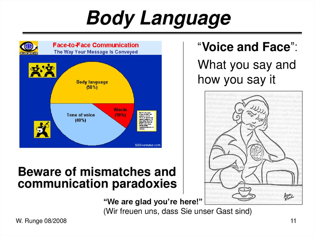
11. Body Language
“Voice and Face”:What you say and
how you say it
Beware of mismatches and
communication paradoxies
“We are glad you’re here!”
(Wir freuen uns, dass Sie unser Gast sind)
W. Runge 08/2008
11
12. Interest Keepers: The Laws of Attraction
• Your main communications assets:Substance, Sizzle and Soul
• Substance:
the content of your message
• Sizzle:
the memorable, interesting ways you deliver your
message
• Soul:
the deeper reasons your message is important to you
• Some special approaches:
use humor/jokes, questions, analogies, metaphors,
some unusual facts …
W. Runge 08/2008
12
13. Eye Contact
• Presentation is not face-to-faces, but face-to-face• Eye contact in Western culture: associated
with trustworthiness, sincerity and confidence
• Ca. 80% of
the time
• Everyone
should
feel included
• Talk to the
audience,
W. Runge 08/2008
not to the screen
13
14. Observable Behavior of Audience
• Reading (newspapers orother material)
• Talking to their partner,
clearly not about your talk
(Distance – Rejection)
(Does that mean anything for me?
So what?)
W. Runge 08/2008
• Staring at the wall,
through the window
• Writing letters, drawing
pictures
14
15. Fingers?
As a Pointer …Watch out!
to hint to displayed
information having
spoken verbally about,
W. Runge 08/2008
Waving – Fury
to directly address
someone (of the
audience)
15
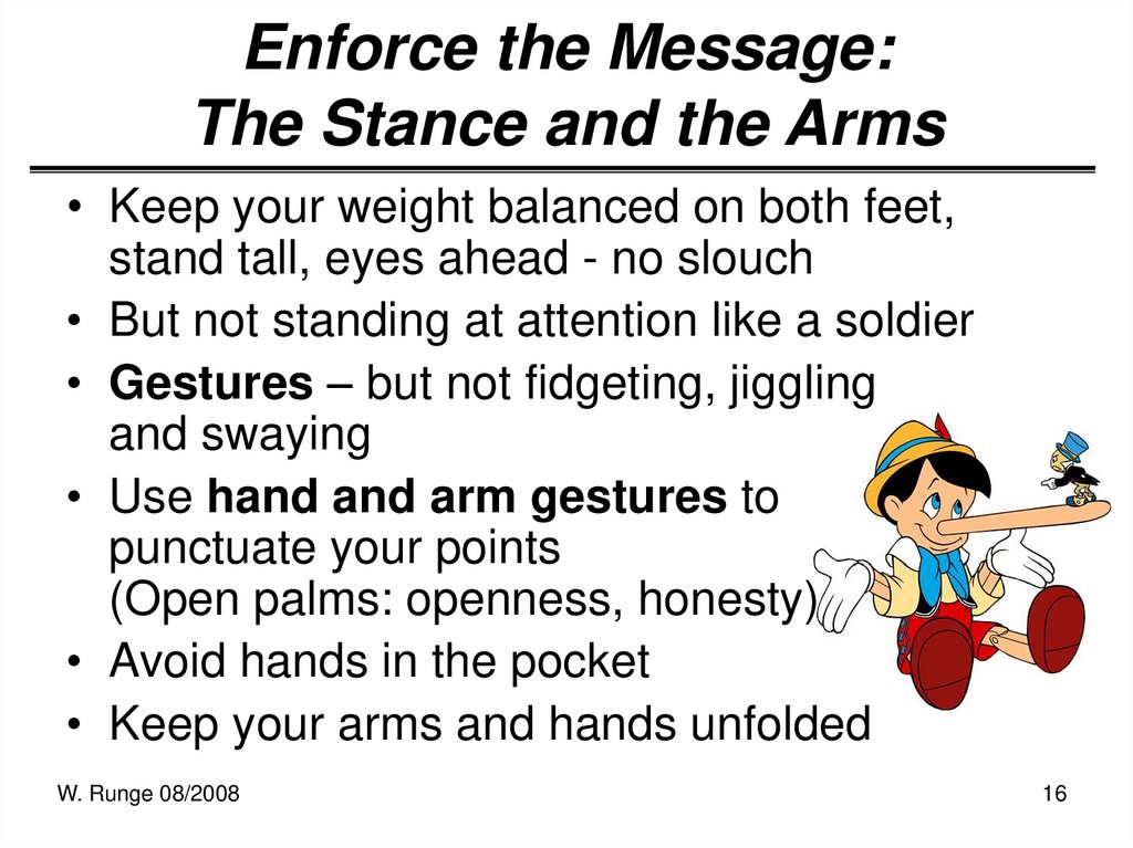
16. Enforce the Message: The Stance and the Arms
• Keep your weight balanced on both feet,stand tall, eyes ahead - no slouch
• But not standing at attention like a soldier
• Gestures – but not fidgeting, jiggling
and swaying
• Use hand and arm gestures to
punctuate your points
(Open palms: openness, honesty)
• Avoid hands in the pocket
• Keep your arms and hands unfolded
W. Runge 08/2008
16
17. The Power of the Pause
Make your audience wait.
It’s your show, so take your time.
"The right word may be effective, but no
word was ever as effective as a rightly
timed pause." (Mark Twain)
Silence builds tension
1. People start to listen if you stop talking
2. Let the audience ingest what you said (and
put on the screen)
W. Runge 08/2008
17
18.
PowerPoint: Very Basic Rules• PowerPoint (and your laptop) is not a
crutch to get through the material!
• Contrasts for readability (light on dark) and
one of the most effective ways to add
visual interest to a page
• Grab the eye with Arial (or Verdana) –
fonts can be read quickly
• Keep the font throughout the slide body
• Script fonts:
Only save it for accents:
W. Runge
W.08/2008
Runge 08/2008
18
19.
PowerPoint: Visuals• One concept per slide
• 20-Minutes Presentation: “10/20/30 Rule”
• Consistent design (“Slide Master Template”)
• Know when and how to emphasize (italics
and/or bold or using color)
• Be restrictive with colors
… colours
• Pictures? Use them! Differentiate informative,
emphasizing and decorative pictures
• Use action, assessment or conclusion
slides
W. Runge
W.08/2008
Runge 08/2008
19
20. Visualizations
BEFORE:Sales (in mio. €) and Numbers of Employees
2000
2001
2002
2003
2004
2005
2006
2007
Sales (mio. €)
3
4
4.7
5.2
5.5
6.4
7.1
8
# Employees
11
14
20
22
24
26
28
31
We outperform in sales,
on average 15% growth over the last 7 years!
Let’s talk about sales,
and, boy ….
AFTER:
9
8
7
6
5
4
3
2
1
0
35
30
25
20
15
10
5
0
2000
2001
2002
2003
Sales (mio. €)
W. Runge 08/2008
2004
2005
2006
2007
# Employees
20
21. The End
• Summarize your MAIN POINTS:what the audience shall remember when
they leave!
• WHAT shall the audience remember?
Prioritize messages!
• End with a bang
• Call to action
• Thank the audience
• Initiate Q&A
W. Runge 08/2008
21
22.
Summarizing(Business Presentations)
• WHERE (external orientations – customers,
conferences, fairs – vs. internal orientation in firm)
• WHOM (the audience)
• WHY (achieving goals – inform, analyze, convince)
• HOW (clear, concise, verbally specific, well
prepared, restricted time)
• COMMUNICATION
– Verbal communication (the “special” and the “normal
language of the presentation)
– Non-verbal communication (eye contact, “face”, gestures
etc.)
– Visualizations, visual (technical) aids (graphics, diagrams,
slide shows etc.)
W. Runge 08/2008
22
23.
Eliminate Bad Presentation Habits!• Failure to rehearse
• Missed attention and interest on entry
• Ending with an inspiration deficit
• Failing to excite
• Avoiding eye contact
• Small, annoying gestures or mannerisms
• Standing at attention
• Reading from scripts, notes, or PowerPoint
slides
• Reciting bullet points
W. Runge 08/2008
23
24. One Moment, Please!
W. Runge 08/200824











 Образование


