


 Информатика
Похожие презентации:


Bitzee. Animation guideline
1.
ANIMATION GUIDELINES2.
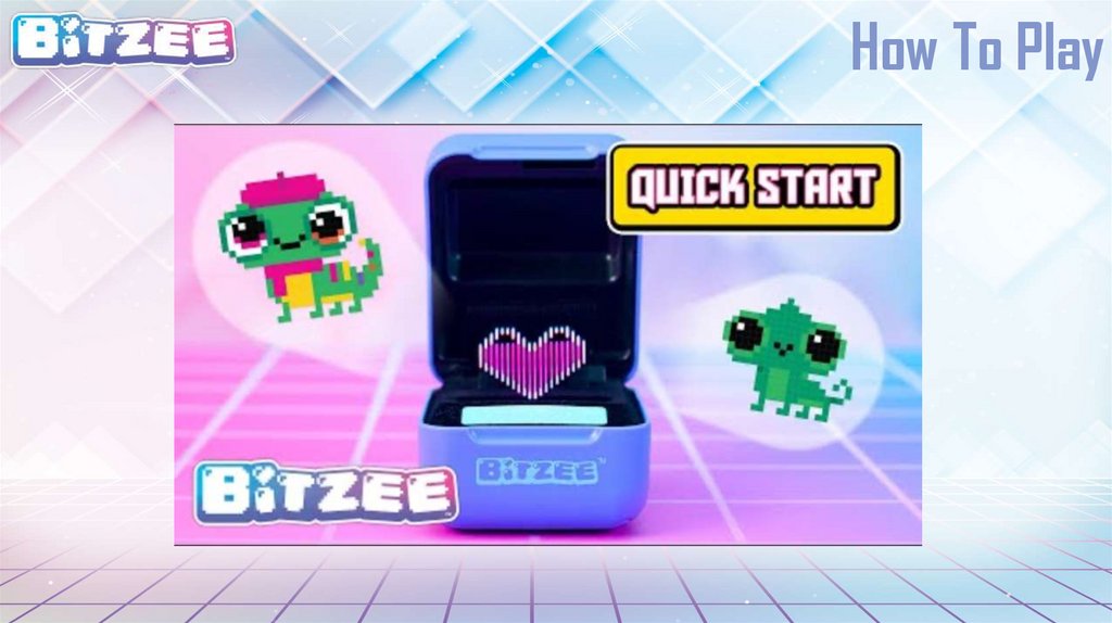
How To Play3.
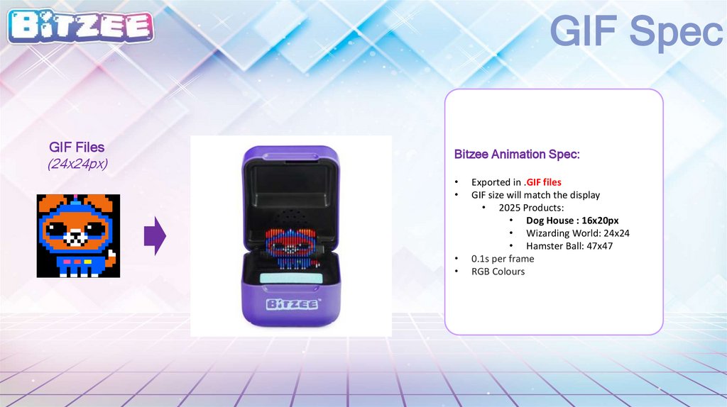
GIF SpecGIF Files
(24x24px)
Bitzee Animation Spec:
Exported in .GIF files
GIF size will match the display
• 2025 Products:
• Dog House : 16x20px
• Wizarding World: 24x24
• Hamster Ball: 47x47
0.1s per frame
RGB Colours
4.
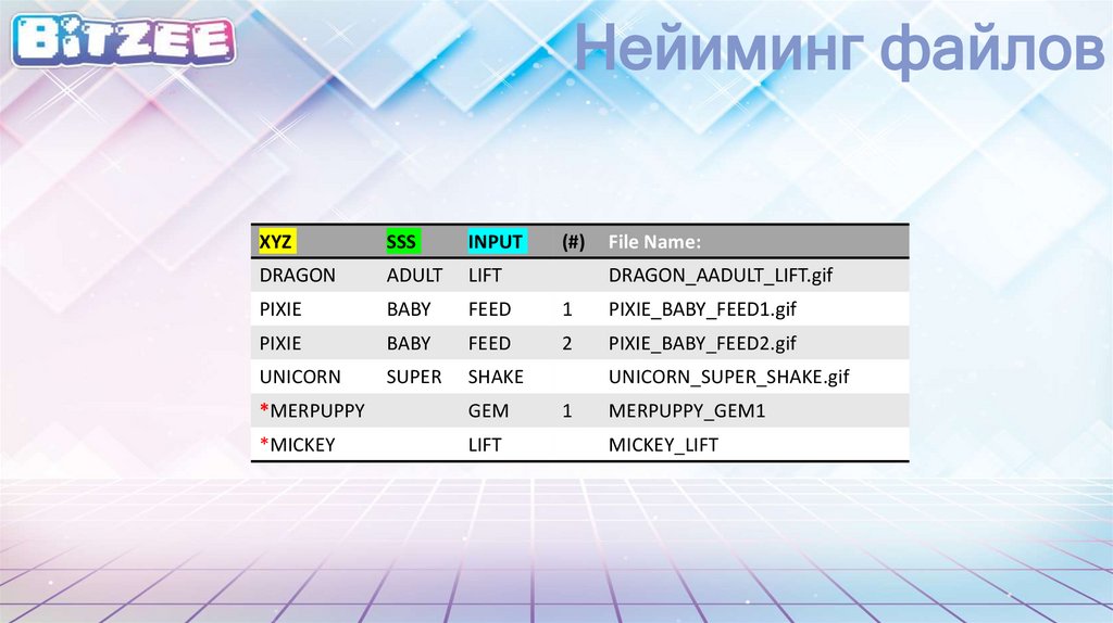
Нейиминг файловXYZ
SSS
INPUT
DRAGON
ADULT
LIFT
PIXIE
BABY
FEED
1
PIXIE_BABY_FEED1.gif
PIXIE
BABY
FEED
2
PIXIE_BABY_FEED2.gif
UNICORN
SUPER
SHAKE
*MERPUPPY
GEM
*MICKEY
LIFT
(#)
File Name:
DRAGON_AADULT_LIFT.gif
UNICORN_SUPER_SHAKE.gif
1
MERPUPPY_GEM1
MICKEY_LIFT
5.
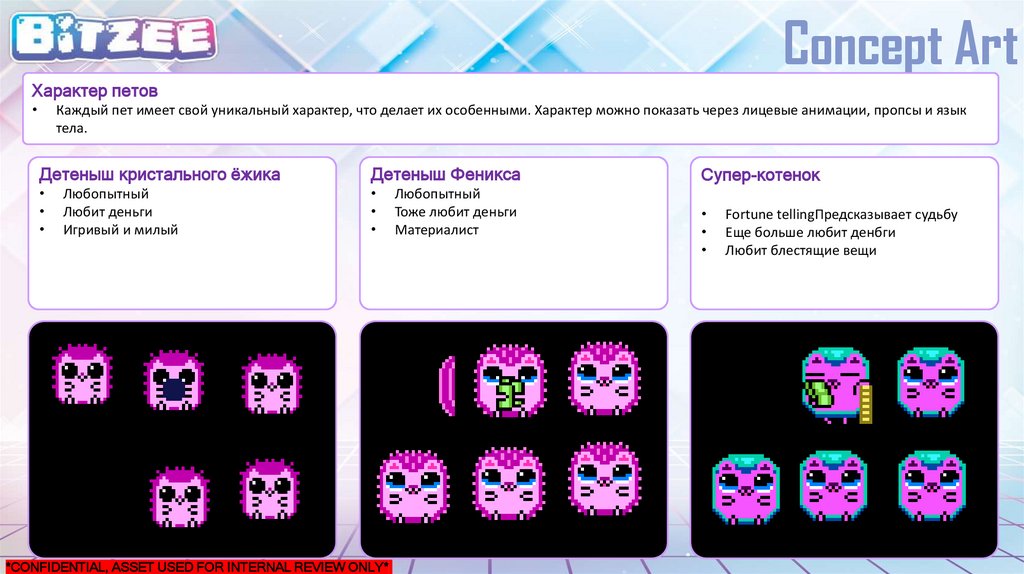
Concept ArtХарактер петов
Каждый пет имеет свой уникальный характер, что делает их особенными. Характер можно показать через лицевые анимации, пропсы и язык
тела.
Детеныш кристального ёжика
Детеныш Феникса
Любопытный
Любит деньги
Игривый и милый
*CONFIDENTIAL, ASSET USED FOR INTERNAL REVIEW ONLY*
Любопытный
Тоже любит деньги
Материалист
Супер-котенок
Fortune tellingПредсказывает судьбу
Еще больше любит денбги
Любит блестящие вещи
6.
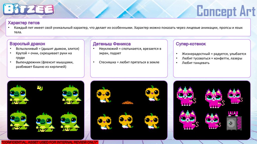
Concept ArtХарактер петов
Каждый пет имеет свой уникальный характер, что делает их особенными. Характер можно показать через лицевые анимации, пропсы и язык
тела.
Взрослый дракон
Детеныш Феникса
Вспыльчивый = (дышит дымом, злится)
Крутой = очки, скрещивает руки на
груди
Выпендрежник (флексит мышцами,
разбивает башню из кирпичей)
*CONFIDENTIAL, ASSET USED FOR INTERNAL REVIEW ONLY*
Неуклюжий = спотыкается, врезается в
экран, падает
Стесняшка = любит прятаться в земле
Супер-котенок
Жизнерадостный = радуется, улыбается
Любит тусоваться = конфетти, лазеры
Любит танцевать
7.
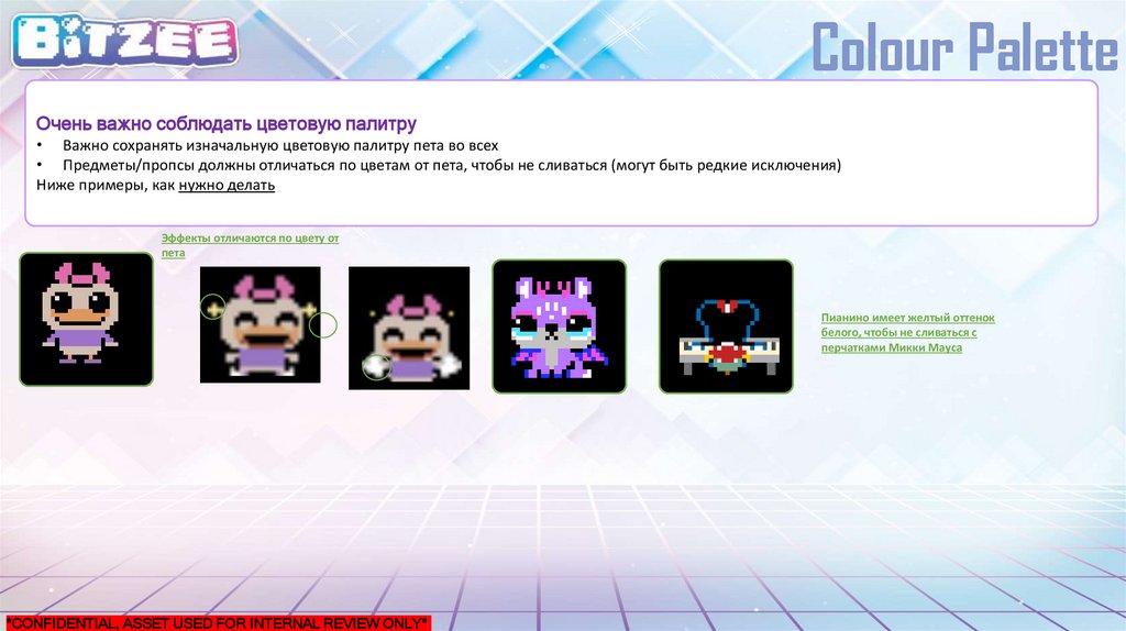
Colour PaletteОчень важно соблюдать цветовую палитру
• Важно сохранять изначальную цветовую палитру пета во всех
• Предметы/пропсы должны отличаться по цветам от пета, чтобы не сливаться (могут быть редкие исключения)
Ниже примеры, как нужно делать
Эффекты отличаются по цвету от
пета
Пианино имеет желтый оттенок
белого, чтобы не сливаться с
перчатками Микки Мауса
*CONFIDENTIAL, ASSET USED FOR INTERNAL REVIEW ONLY*
8.
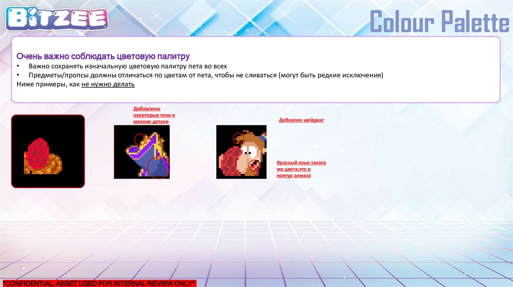
Colour PaletteОчень важно соблюдать цветовую палитру
• Важно сохранять изначальную цветовую палитру пета во всех
• Предметы/пропсы должны отличаться по цветам от пета, чтобы не сливаться (могут быть редкие исключения)
Ниже примеры, как не нужно делать
Добавлены
некоторые тени и
мелкие детали
Добавлен шейдинг
Красный язык такого
же цвета,что и
контур алмаза
*CONFIDENTIAL, ASSET USED FOR INTERNAL REVIEW ONLY*
9.
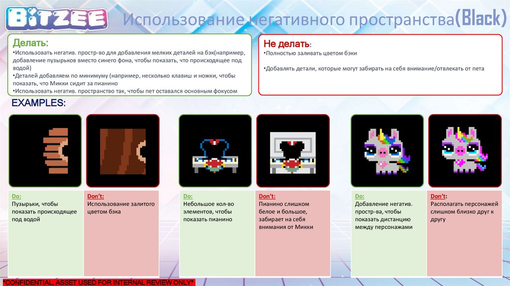
Использование негативного пространства(Black)Делать:
•Использовать негатив. простр-во для добавления мелких деталей на бэк(например,
добавление пузырьков вместо синего фона, чтобы показать, что происходящее под
водой)
•Деталей добавляем по минимуму (например, несколько клавиш и ножки, чтобы
показать, что Микки сидит за пианино
•Использовать негатив. пространство так, чтобы пет оставался основным фокусом
Не делать:
•Полностью заливать цветом бэки
•Добавлять детали, которые могут забирать на себя внимание/отвлекать от пета
EXAMPLES:
Do:
Пузырьки, чтобы
показать происходящее
под водой
Don’t:
Использование залитого
цветом бэка
Do:
Небольшое кол-во
элементов, чтобы
показать пианино
*CONFIDENTIAL, ASSET USED FOR INTERNAL REVIEW ONLY*
Don’t:
Пианино слишком
белое и большое,
забирает на себя
внимания от Микки
Do:
Добавление негатив.
простр-ва, чтобы
показать дистанцию
между персонажами
Don’t:
Располагать персонажей
слишком близко друг к
другу
10.
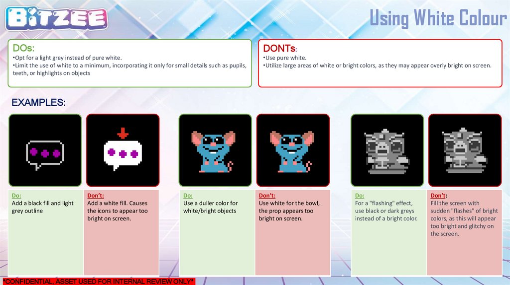
Using White ColourDOs:
DONTs:
•Opt for a light grey instead of pure white.
•Limit the use of white to a minimum, incorporating it only for small details such as pupils,
teeth, or highlights on objects
•Use pure white.
•Utilize large areas of white or bright colors, as they may appear overly bright on screen.
EXAMPLES:
Do:
Add a black fill and light
grey outline
Don’t:
Add a white fill. Causes
the icons to appear too
bright on screen.
Do:
Use a duller color for
white/bright objects
*CONFIDENTIAL, ASSET USED FOR INTERNAL REVIEW ONLY*
Don’t:
Use white for the bowl,
the prop appears too
bright on screen.
Do:
For a "flashing" effect,
use black or dark greys
instead of a bright color.
Don’t:
Fill the screen with
sudden "flashes" of bright
colors, as this will appear
too bright and glitchy on
the screen.
11.
Objects & PropsDOs:
DONTs:
Use contrasting colors to create separation between props, visual effects (VFX), and
characters.
Avoid using monochromatic colors or similar colours to the character
EXAMPLES:
Do:
Use contrasting colours
(yellow) to highlight
prop and create
clear differentiation
between characters
Don’t:
Use monochromatic
colours (purple) to similar
to the pet.
Do:
Use a red to create
seperation between the
bow, bassinet, and
character.
*CONFIDENTIAL, ASSET USED FOR INTERNAL REVIEW ONLY*
Don’t:
Use a green bow that
blends with the character.
Do:
Use white and a black
outline to help create
seperation between the
ice cream and character.
Don’t:
Use blue that blends in
the the charcater holdng
the ice cream cone.
12.
Objects & PropsDOs:
DONTs:
Adding black outlines around their limbs to clearly define their arms from their
bodies
Use a different colour to highlight their arms
EXAMPLES:
Do:
Add black outline around
their bird’s wings to help
define it clearly on
screen.
Don’t:
Use a monochromatic
colour to outline the
bird’s wings
Do:
Black outline added to
the arms to help
differentiate between the
arms and gift box
*CONFIDENTIAL, ASSET USED FOR INTERNAL REVIEW ONLY*
Don’t:
Overlay the arms over
props without adding a
black outline. The arms
and gift box looks like it is
one component
Do:
Black outline around their
Mike’s arms
Don’t:
Use a monochromatic
colour to outline Mike’s
arms.
13.
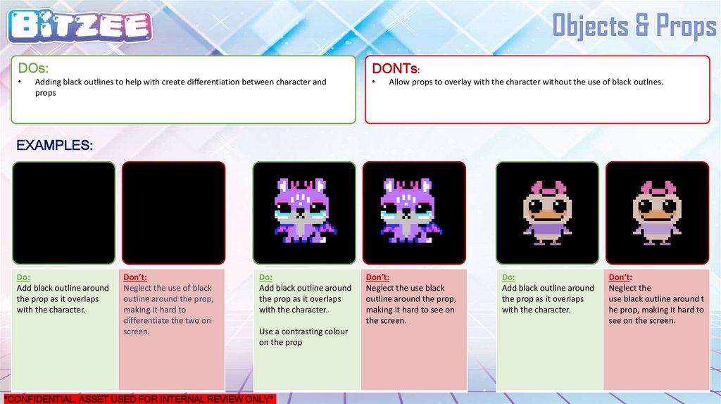
Objects & PropsDOs:
DONTs:
Adding black outlines to help with create differentiation between character and
props
Allow props to overlay with the character without the use of black outlnes.
EXAMPLES:
Do:
Add black outline around
the prop as it overlaps
with the character.
Don’t:
Neglect the use of black
outline around the prop,
making it hard to
differentiate the two on
screen.
Do:
Add black outline around
the prop as it overlaps
with the character.
Use a contrasting colour
on the prop
*CONFIDENTIAL, ASSET USED FOR INTERNAL REVIEW ONLY*
Don’t:
Neglect the use black
outline around the prop,
making it hard to see on
the screen.
Do:
Add black outline around
the prop as it overlaps
with the character.
Don’t:
Neglect the
use black outline around t
he prop, making it hard to
see on the screen.
14.
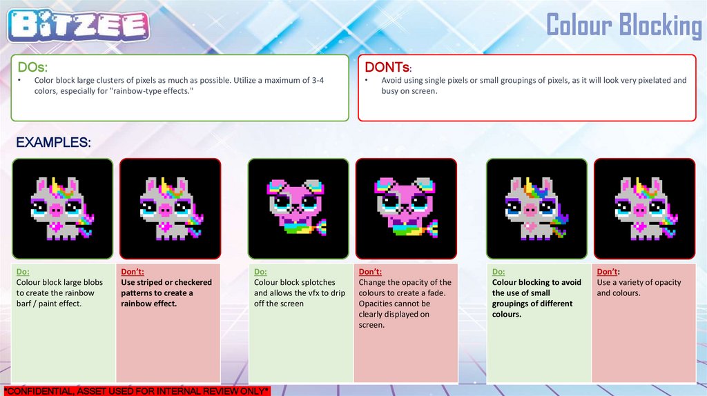
Colour BlockingDOs:
DONTs:
Color block large clusters of pixels as much as possible. Utilize a maximum of 3-4
colors, especially for "rainbow-type effects."
Avoid using single pixels or small groupings of pixels, as it will look very pixelated and
busy on screen.
EXAMPLES:
Do:
Colour block large blobs
to create the rainbow
barf / paint effect.
Don’t:
Use striped or checkered
patterns to create a
rainbow effect.
Do:
Colour block splotches
and allows the vfx to drip
off the screen
*CONFIDENTIAL, ASSET USED FOR INTERNAL REVIEW ONLY*
Don’t:
Change the opacity of the
colours to create a fade.
Opacities cannot be
clearly displayed on
screen.
Do:
Colour blocking to avoid
the use of small
groupings of different
colours.
Don’t:
Use a variety of opacity
and colours.
15.
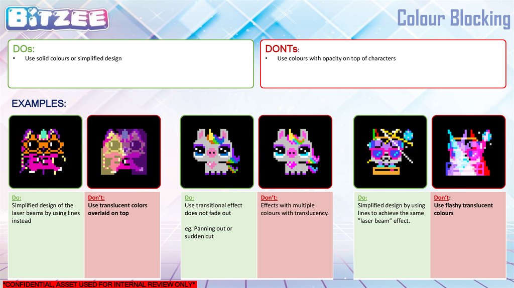
Colour BlockingDOs:
DONTs:
Use solid colours or simplified design
Use colours with opacity on top of characters
EXAMPLES:
Do:
Simplified design of the
laser beams by using lines
instead
Don’t:
Use translucent colors
overlaid on top
Do:
Use transitional effect
does not fade out
eg. Panning out or
sudden cut
*CONFIDENTIAL, ASSET USED FOR INTERNAL REVIEW ONLY*
Don’t:
Effects with multiple
colours with translucency.
Do:
Simplified design by using
lines to achieve the same
”laser beam” effect.
Don’t:
Use flashy translucent
colours
16.
SimplicityDOs:
DONTs:
Simplified design works best on the screen. Only added details if needed.
Overcomplicate the design by adding shading, lighting details, patterns, etc. The
small details draw attention away from the character and causes the display to be
very cluttered.
EXAMPLES:
Do:
A simplified bassinet
design allows the pet to
be the main focal point
Don’t:
Overcomplicate the
design by adding
textures or pattern.
Do:
Color block, simplify the
design, and following
existing character design
Don’t:
Add extra shading and
details.
Do:
Simplified design by using
lines to achieve the same
”laser beam” effect.
Add minimal details to
communicate the dj deck
*CONFIDENTIAL, ASSET USED FOR INTERNAL REVIEW ONLY*
Don’t:
Use flashy translucent
colours
Overcomplicate the
design by adding extra
details
17.
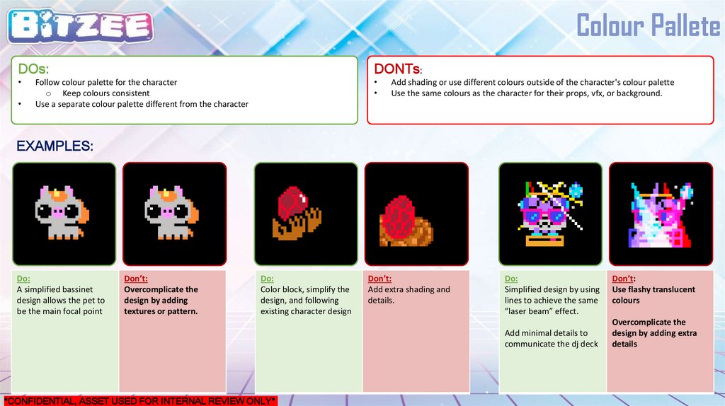
Colour PalleteDOs:
DONTs:
Follow colour palette for the character
o Keep colours consistent
Use a separate colour palette different from the character
Add shading or use different colours outside of the character's colour palette
Use the same colours as the character for their props, vfx, or background.
EXAMPLES:
Do:
A simplified bassinet
design allows the pet to
be the main focal point
Don’t:
Overcomplicate the
design by adding
textures or pattern.
Do:
Color block, simplify the
design, and following
existing character design
Don’t:
Add extra shading and
details.
Do:
Simplified design by using
lines to achieve the same
”laser beam” effect.
Add minimal details to
communicate the dj deck
*CONFIDENTIAL, ASSET USED FOR INTERNAL REVIEW ONLY*
Don’t:
Use flashy translucent
colours
Overcomplicate the
design by adding extra
details
18.
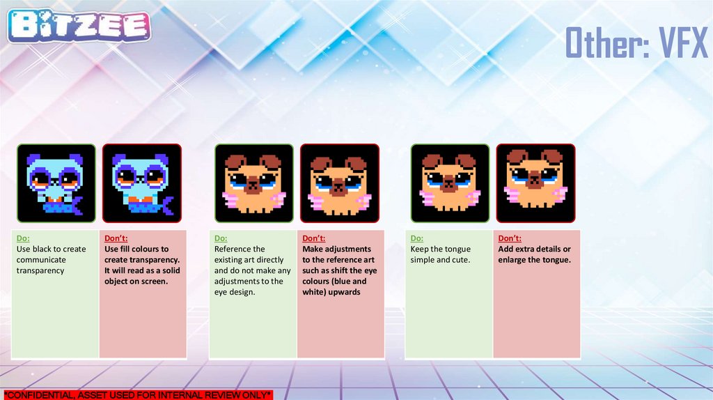
Other: VFXDo:
Use black to create
communicate
transparency
Don’t:
Use fill colours to
create transparency.
It will read as a solid
object on screen.
Do:
Reference the
existing art directly
and do not make any
adjustments to the
eye design.
*CONFIDENTIAL, ASSET USED FOR INTERNAL REVIEW ONLY*
Don’t:
Make adjustments
to the reference art
such as shift the eye
colours (blue and
white) upwards
Do:
Keep the tongue
simple and cute.
Don’t:
Add extra details or
enlarge the tongue.
19.
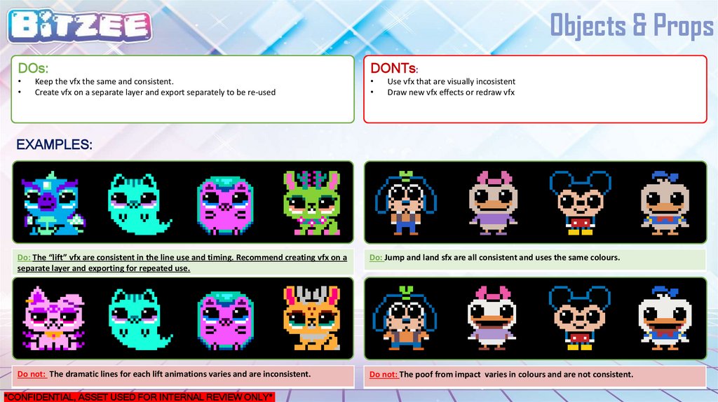
Objects & PropsDOs:
DONTs:
Keep the vfx the same and consistent.
Create vfx on a separate layer and export separately to be re-used
Use vfx that are visually incosistent
Draw new vfx effects or redraw vfx
EXAMPLES:
Do: The “lift” vfx are consistent in the line use and timing. Recommend creating vfx on a
separate layer and exporting for repeated use.
Do: Jump and land sfx are all consistent and uses the same colours.
Do not: The dramatic lines for each lift animations varies and are inconsistent.
Do not: The poof from impact varies in colours and are not consistent.
*CONFIDENTIAL, ASSET USED FOR INTERNAL REVIEW ONLY*