Похожие презентации:
Definition of Quality Indicators of Quality. Quality Engineering 1
1.
2. Overview (Lecture the 1st)
Definition of QualityIndicators of Quality
Historical perspective / performance - VOC
Deming’s quality principles
Plotting graphs (scatter method) and Spreadsheet
calculations
3. Definition
Of the many meanings of the word “quality,” two are of criticalimportance to managing for quality:
1. “Quality” means those features of products which meet customer
needs and thereby provide customer satisfaction. In this sense, the
meaning of quality is oriented to income. The purpose of such higher
quality is to provide greater customer satisfaction and, one hopes, to
increase income. However, providing more and/or better quality
features usually requires an investment and hence usually involves
increases in costs. Higher quality in this sense usually “costs more.”
4. Definition
2. “Quality” means freedom from deficiencies—freedom from errors thatrequire doing work over again (rework) or that result in field failures,
customer dissatisfaction, customer claims, and so on. In this sense, the
meaning of quality is oriented to costs, and higher quality usually “costs
less.”
“Quality engineering” is Discipline that deals with the analysis of a
manufacturing system at all stages, to improve the quality of the production
process and of its output
Quality engineering focuses on making sure that goods and services are
designed, developed, and made to meet or exceed consumers’ expectations
and requirements
Quality engineers design and monitor the quality of processes. They work in
a variety of industries and play a vital role in correcting or fixing defects
5. Indicators of Quality
1. Performance – primary operating characteristics2. Time – time waiting for service, time waiting on queue, time to
complete the service and etc
3. Reliability – extend of failure free operation
4. Durability – amount of use until replacement
5. Consistency - match with documentation
6. Serviceability – resolution of problems and complaints
7. Personal interface – punctuality, courtesy and professionalism
8. Harmlessness – health, safety, environment
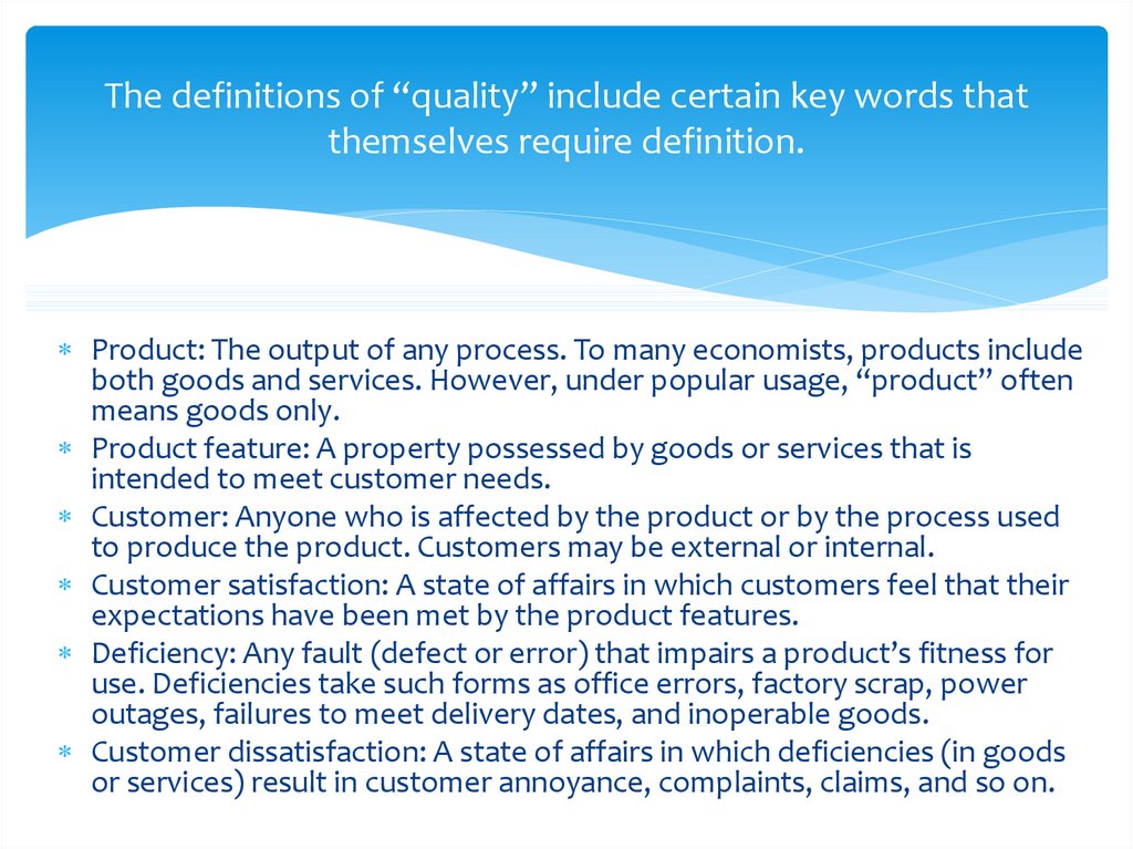
6. The definitions of “quality” include certain key words that themselves require definition.
Product: The output of any process. To many economists, products includeboth goods and services. However, under popular usage, “product” often
means goods only.
Product feature: A property possessed by goods or services that is
intended to meet customer needs.
Customer: Anyone who is affected by the product or by the process used
to produce the product. Customers may be external or internal.
Customer satisfaction: A state of affairs in which customers feel that their
expectations have been met by the product features.
Deficiency: Any fault (defect or error) that impairs a product’s fitness for
use. Deficiencies take such forms as office errors, factory scrap, power
outages, failures to meet delivery dates, and inoperable goods.
Customer dissatisfaction: A state of affairs in which deficiencies (in goods
or services) result in customer annoyance, complaints, claims, and so on.
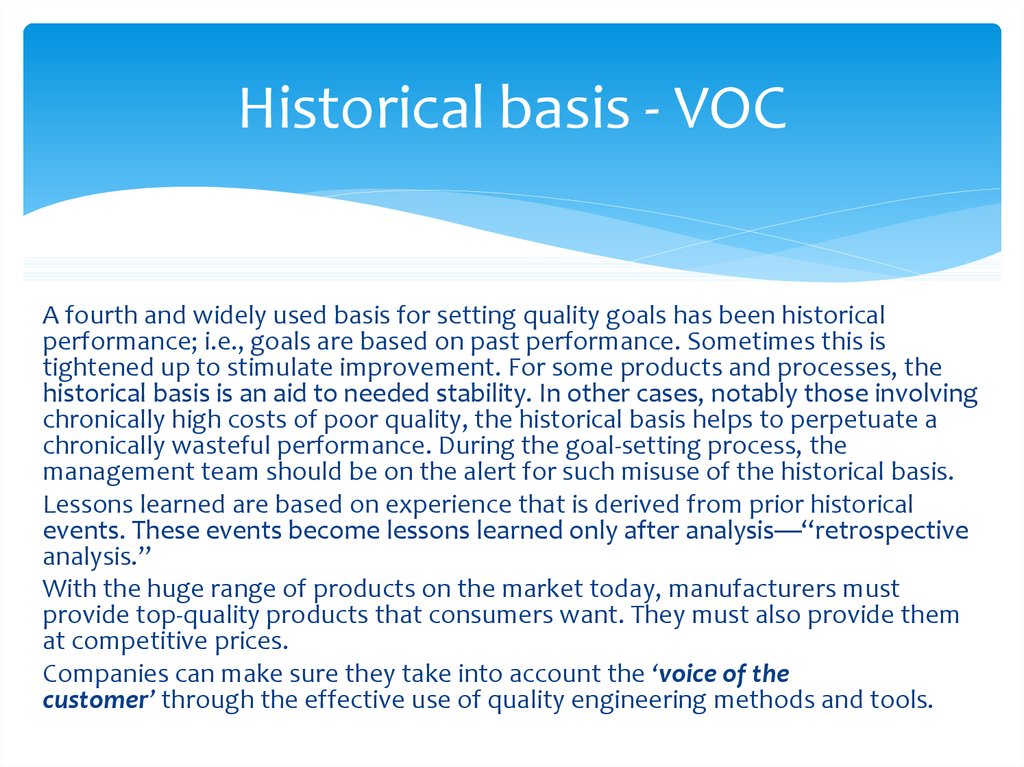
7. Historical basis - VOC
A fourth and widely used basis for setting quality goals has been historicalperformance; i.e., goals are based on past performance. Sometimes this is
tightened up to stimulate improvement. For some products and processes, the
historical basis is an aid to needed stability. In other cases, notably those involving
chronically high costs of poor quality, the historical basis helps to perpetuate a
chronically wasteful performance. During the goal-setting process, the
management team should be on the alert for such misuse of the historical basis.
Lessons learned are based on experience that is derived from prior historical
events. These events become lessons learned only after analysis—“retrospective
analysis.”
With the huge range of products on the market today, manufacturers must
provide top-quality products that consumers want. They must also provide them
at competitive prices.
Companies can make sure they take into account the ‘voice of the
customer’ through the effective use of quality engineering methods and tools.
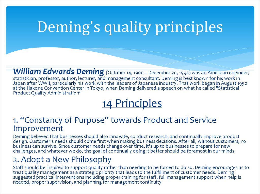
8. Deming’s quality principles
William Edwards Deming (October 14, 1900 – December 20, 1993) was an American engineer,statistician, professor, author, lecturer, and management consultant. Deming is best known for his work in
Japan after WWII, particularly his work with the leaders of Japanese industry. That work began in August 1950
at the Hakone Convention Center in Tokyo, when Deming delivered a speech on what he called "Statistical
Product Quality Administration“
14 Principles
1. “Constancy of Purpose” towards Product and Service
Improvement
Deming believed that businesses should also innovate, conduct research, and continually improve product
design. Customer’s needs should come first when making business decisions. After all, without customers, no
business can survive. Since customer needs change over time, it’s up to businesses to prepare for new
challenges, and whatever we do, the goal of continually doing it better should be foremost in our minds
2. Adopt a New Philosophy
Staff should be inspired to support quality rather than needing to be forced to do so. Deming encourages us to
treat quality management as a strategic priority that leads to the fulfillment of customer needs. Deming
suggested practical interventions including proper training for staff, full management support when help is
needed, proper supervision, and planning for management continuity
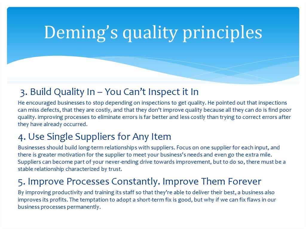
9. Deming’s quality principles
3. Build Quality In – You Can’t Inspect it InHe encouraged businesses to stop depending on inspections to get quality. He pointed out that inspections
can miss defects, that they are costly, and that they don’t improve quality because all they can do is find poor
quality. improving processes to eliminate errors is far better and less costly than trying to correct errors after
they have already occurred.
4. Use Single Suppliers for Any Item
Businesses should build long-term relationships with suppliers. Focus on one supplier for each input, and
there is greater motivation for the supplier to meet your business’s needs and even go the extra mile.
Suppliers can become part of your never-ending drive towards improvement, but to do so, there must be a
stable relationship characterized by trust.
5. Improve Processes Constantly. Improve Them Forever
By improving productivity and training its staff so that they’re able to deliver their best, a business also
improves its profits. The temptation to adopt a short-term fix is good, but why if we can fix flaws in our
business processes permanently.
10. Deming’s quality principles
6. Use On-The-Job TrainingExpenses + time loss. You don’t need to know all the details of how to do every job, you do need to
understand what people do, and what obstacles to quality your team members face. If people know where
they fit into a team, and how the team’s results depend on their work, they are far more likely to care about
the results they achieve.
7. Use Leadership Skill
You don’t just talk and expect others to “do,” you listen, you understand, and you act. You create an
environment in which people can realize their potential. You motivate them to want to do their best, and
they deliver their best.
8. Drive out Fear
Were you ever a junior employee who was scared of the boss? Perhaps you had a teacher at school who
terrified you. Could you deliver your best under these conditions? some of your best quality and process
improvement suggestions come from the coalface – but if you don’t have open lines of communication,
you’re never going to hear those suggestions. Never hide problems or mistakes in your job.
11. Deming’s quality principles
9. Break Down the Barriers Between DepartmentsWhen people work as a team, they can achieve more than they would on their own. Although your company will have
departments, they can’t work in isolation. If product designers never work with production, and if production doesn’t
work with sales, your organization is never going to reach its potential.
10. Ditch Slogans and Communicate With Individuals
Slogans sound so nifty, but do they have any real effect? “We put the customer first” is a typical example. It sounds
great, but what is its practical meaning? How does it apply to every worker in your internal value chain? Use tools like
Fishbone Diagrams to help you get down to root causes before you suggest solutions.
11. Quotas are Incompatible With Quality in Production
High production targets make quality suffer. For instance, if you are production line worker and you get paid
per piece, you will finish as many pieces as possible. You are working as fast as you can, but are you working
as well as you can? When you set a numerical target, are you encouraging people to take shortcuts that will
affect quality? if you want to set a numerical goal, be very sure you know how your business can reach it.
Without a plan and a method, numbers are meaningless.
12. Deming’s quality principles
12. Remove Barriers that Prevent Teams From Feeling Proud ofTheir Work
Taking pride in one’s work is essential to quality and process improvement. It’s natural that some workers will acquire
skills faster than others, and it’s natural that they will get better results than their counterparts. While it’s great to
recognize achievements, the rest of the team should never feel judged or be made to feel that they are valued less
than others are.
13. Encourage Education and Self-Improvement
Your business isn’t always going to stay the same, and the new skills your employees gain could prove helpful
in the longer-term. As a part of self-improvement motivation can play the major role, and what is more
important which type of motivation will you use Intrinsic / extrinsic, positive / negative motivation.
14. Make Transformation Everybody’s Job
We can ask people to help us think about how we can change processes to improve the quality of their
outputs. And since each step in a process impacts on subsequent ones, preparing for transformation
becomes everybody’s job
13. Plotting graphs (scatter method)
Scatter plots are used when you want to show the relationship between twovariables. Scatter plots are sometimes called correlation plots because they show
how two variables are correlated. There are three types of correlation:
Positive
Negative
No correlation
14. Plotting graphs (scatter method)
Microsoft Excel is a tool which has many uses, the most common ofwhich are performing calculations and plotting graphs.
When you open Microsoft Excel you will see a grid. Each box in the
grid is called a cell. Each cell has an "address" made up of a letter
indicating the column the cell is in and a number indicating the row
the cell is in. For example, the upper left cell is A1.
The first step in doing a spreadsheet calculation or making a graph is
entering the data.
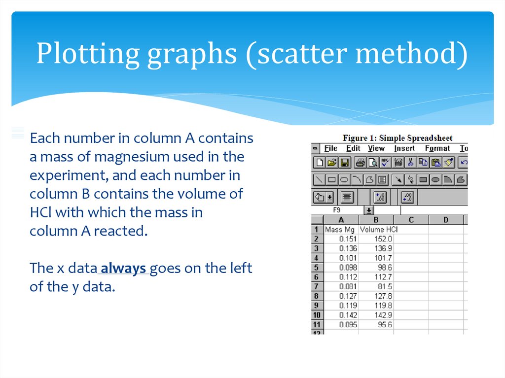
For example, if we did an experiment reacting several different
samples of magnesium metal with hydrochloric acid, we might want
to set up a spreadsheet containing the moles of magnesium and
volume of hydrochloric acid used. We would create a spreadsheet
that looks like figure 1.
15. Plotting graphs (scatter method)
Each number in column A containsa mass of magnesium used in the
experiment, and each number in
column B contains the volume of
HCl with which the mass in
column A reacted.
The x data always goes on the left
of the y data.
16. Some Symbols used in Excel “operations”
It is very important to use the "=" sign. The "=" sign tells thespreadsheet program that the information that follows is a formula
and the values for the selected cells using that formula should be
computed.
The "^" symbol means "raised to the power of...", the "*" means
"multiplied by...", and the "a2:a11" means the range of cells A2
through A11.
Range (:)
Negation of operand (-7)
Exponentiation (^)
Multiplication and division (* and /)
Addition and subtraction (+ and -)
17. Simple Spreadsheet Calculations
In order to convert from grams ofmagnesium to moles of magnesium,
equation 1 would be used:
Moles Mg = Mass Mg (grams) / Molecular Weight Mg
Equation 1
where the molecular weight of magnesium
is 24.305 g/mol.
This calculation can easily be done with a
calculator, however, for large data sets, a
spreadsheet is much faster.
A step wise procedure for using Microsoft
Excel to do such calculations is given on
next slides: below.
18. Simple Spreadsheet Calculations
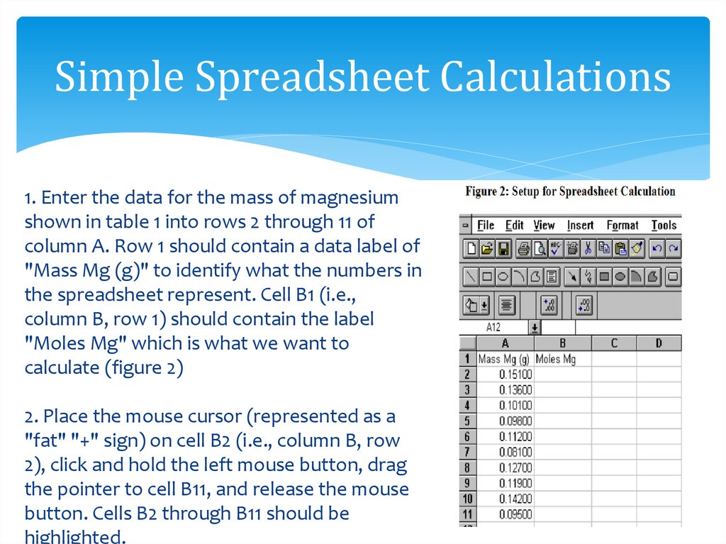
1. Enter the data for the mass of magnesiumshown in table 1 into rows 2 through 11 of
column A. Row 1 should contain a data label of
"Mass Mg (g)" to identify what the numbers in
the spreadsheet represent. Cell B1 (i.e.,
column B, row 1) should contain the label
"Moles Mg" which is what we want to
calculate (figure 2)
2. Place the mouse cursor (represented as a
"fat" "+" sign) on cell B2 (i.e., column B, row
2), click and hold the left mouse button, drag
the pointer to cell B11, and release the mouse
button. Cells B2 through B11 should be
highlighted.
19. Simple Spreadsheet Calculations
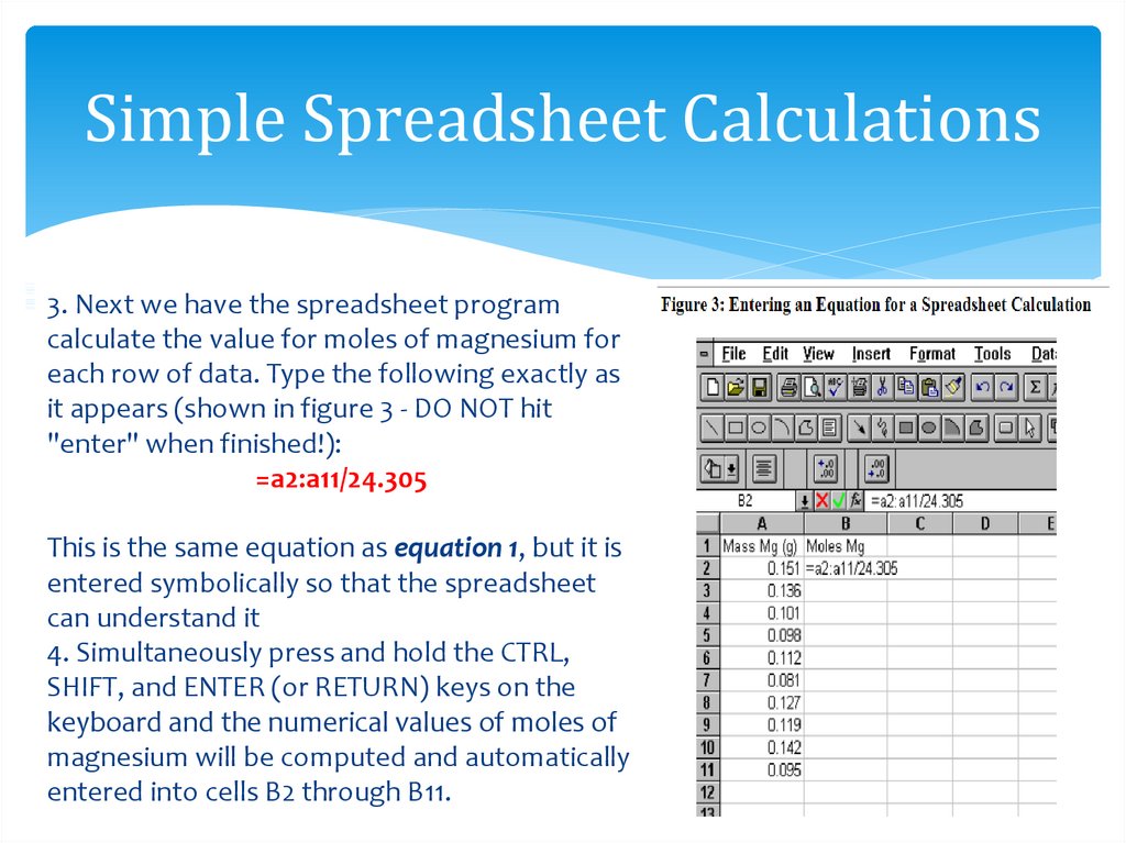
3. Next we have the spreadsheet programcalculate the value for moles of magnesium for
each row of data. Type the following exactly as
it appears (shown in figure 3 - DO NOT hit
"enter" when finished!):
=a2:a11/24.305
This is the same equation as equation 1, but it is
entered symbolically so that the spreadsheet
can understand it
4. Simultaneously press and hold the CTRL,
SHIFT, and ENTER (or RETURN) keys on the
keyboard and the numerical values of moles of
magnesium will be computed and automatically
entered into cells B2 through B11.
20. Plotting an X-Y Data Set and SCATTER Graph
1. The first step in creating a graph using MicrosoftExcel is entering the data. The data should be in
two adjacent columns with the x data in the left
column. The columns should be labeled in row one
in order to identify what the numbers in the
spreadsheet represent.(figure 4).
2. Position the cursor on the first X value (i.e., at the
top of the column containing the x values, or
"Moles of Mg" values), hold down the left mouse
button and drag the mouse cursor to the bottom Y
value (i.e., at the bottom of the column containing
the y values, or "Volume of HCl" values). All of the
X-Y values should now be highlighted (figure 4).
21. Plotting an X-Y Data Set and SCATTER Graph
3. Click on Insert at the top left of the toolbar.4. Click on Chart
5. Click on the box labeled XY (Scatter).
6. Click on Next >.
7. Click on the X-Y pattern without lines (Format Option
1).
8. Click on Next >; a reduced version of your graph will
appear.
9. Click on Next >.
10. Click in the rectangular box labeled "Chart Title" and
type in a title for the graph (e.g., "Volume of HCl vs.
Moles Mg).
11. Click separately on the boxes labeled "Category (X)"
and "Value (Y)" and type a label for the X axis (e.g.,
Moles Mg) and the Y axis (e.g., Volume HCl (mL)).
22. Plotting an X-Y Data Set and SCATTER Graph
12. Click on As New Sheet. This will instruct theprogram to plot the data on a separate sheet
labeled "Chart1".
13. Click on Next >.
14. Click on Finish. At this point you will have
created an X-Y plot of the data which should look
like figure 5.
23. Plotting an X-Y Data Set and SCATTER Graph
1. Be sure you are on the worksheet which contains the chart you wish to work with.2. Move the mouse cursor to any data point and press the left mouse button. All of
the data points should now be highlighted. Now, while the mouse cursor is still on
any one of the highlighted data points, press the right mouse button, and click
on Add Trendline from the menu that appears.
3. From within the "Trendline" window, click on the box with the type of fit you want
(e.g., Linear).
4. Click on Options at the top of the "Trendline" window.
5. Click in the checkbox next to "Display Equation on Chart" and the checkbox next
to "Display R-squared Value on Chart". Do not click on the checkbox next to "Set
Intercept = 0".
6. Click OK. A line, an equation, and an R-squared value should appear on the graph
as shown in figure 6 below.
24. Plotting an X-Y Data Set and SCATTER Graph
6. Click OK. A line, an equation, and an R-squared value should appear on the graphas shown in figure 6 below.
25. Printing Data from Excel
To print your data sheet:1. Click on File in the left-hand corner of the toolbar, and then click
on Page Setup....
2. Click on "Header/Footer" at the top of the "Page Setup" window.
3. Click on Custom Header....
4. Click on the box labeled "Left Section" and type in (on two
separate lines) your name and your section number.
5. Click on OK.
6. Click on Print....
7. Click on OK.
8. Retrieve your printout from the printer.








 Менеджмент


