Похожие презентации:
Usability Heuristics and Design Guidelines. Human Computer Interaction and Communication. (Part 1)
1. Usability Heuristics and Design Guidelines, Part I
Usability HeuristicsPresentedand byDesign
Guidelines, Part I
Human Computer Interaction and Communication
2.
Topics and AgendaAssessment 06
High-Level Design Guidelines
Jakob Nielsen’s Ten Usability Heuristics
Reflection
3.
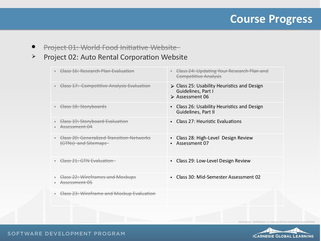
Course ProgressProject 01: World Food Initiative Website
Project 02: Auto Rental Corporation Website
• Class 16: Research Plan Evaluation
• Class 24: Updating Your Research Plan and
Competitive Analysis
• Class 17: Competitive Analysis Evaluation
Class 25: Usability Heuristics and Design
Guidelines, Part I
Assessment 06
• Class 18: Storyboards
• Class 26: Usability Heuristics and Design
Guidelines, Part II
• Class 19: Storyboard Evaluation
• Assessment 04
• Class 27: Heuristic Evaluations
• Class 20: Generalized Transition Networks
(GTNs) and Sitemaps
• Class 28: High-Level Design Review
• Assessment 07
• Class 21: GTN Evaluation
• Class 29: Low-Level Design Review
• Class 22: Wireframes and Mockups
• Assessment 05
• Class 30: Mid-Semester Assessment 02
• Class 23: Wireframe and Mockup Evaluation
4.
High-Level Design Guidelines1Ensure early focus on users and tasks
Perform empirical measurement
Create iterative designs:
Create the interface design
Test the user interface
Analyze the test results
Repeat
1. Rubin, Jeffery, Dana Chisnell, and Jared Spool. The Handbook of Usability Testing: How to Plan, Design, and Conduct Effective Tests. Indianapolis: Wiley
Publishing, Inc, 2008.
5.
Jakob Nielsen’s Ten Usability Heuristics21.
2.
3.
4.
5.
6.
7.
8.
9.
10.
Visibility of system status
Match between system and the real world
User control and freedom
Consistency and standards
Error prevention
Recognition rather than recall
Flexibility and efficiency of use
Aesthetic and minimalist design
Help users recognize, diagnose, and recover from errors
Help and documentation
2. http://www.useit.com/papers/heuristic/heuristic_list.html
6.
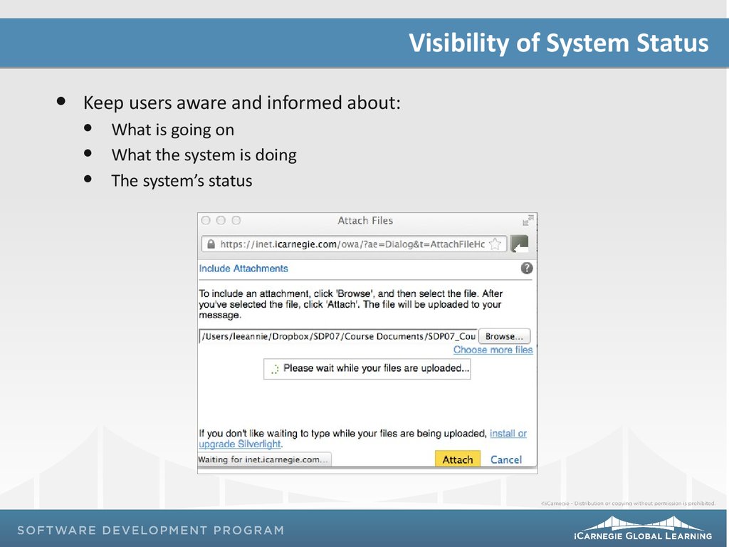
Visibility of System StatusKeep users aware and informed about:
What is going on
What the system is doing
The system’s status
7.
Match Between System and the Real WorldUsers should interact with the system in their own language
Use words, phrases, and concepts familiar to the users
Avoid terminology that is specific to the system
8.
User Control and FreedomUsers should feel:
Free to make choices
That they are in control of their choices
Like they have the ability to quickly and smoothly recover or undo a
wrong choice
9.
User Control and Freedom10.
Exercise ReflectionHow might you change your designs based on Rubin’s three
high-level design principles?
How might you change your designs, based on Nielsen’s first
three usability heuristics?
11.
Remember…Project 02: Due on Class 30
Due by 8 p.m. via the LMS
Assessment 07: Class 28
Mid-Semester Assessment 02: Class 30


 Интернет
 Информатика


