

 Программирование
Программирование (бағдарламалау) лекция 3
1.
ПРОГРАММИРОВАНИЕ(БАҒДАРЛАМАЛАУ)
3-лекция
Лектор:
PhD, МКМ кафедрасының
аға оқытушысы: Қулбай Мағира Назымхикматқызы
2.
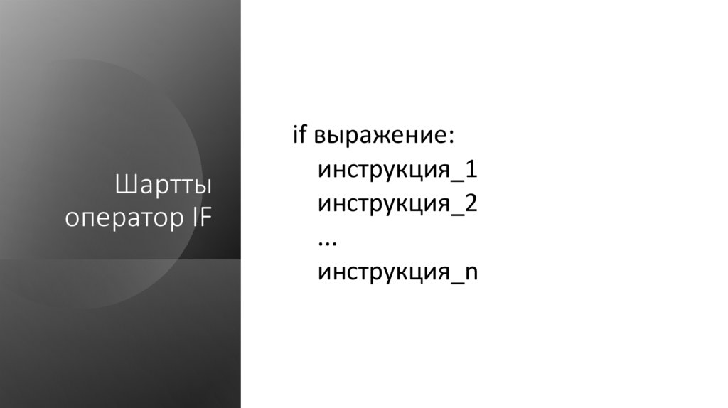
Шарттыоператор IF
if выражение:
инструкция_1
инструкция_2
...
инструкция_n
3.
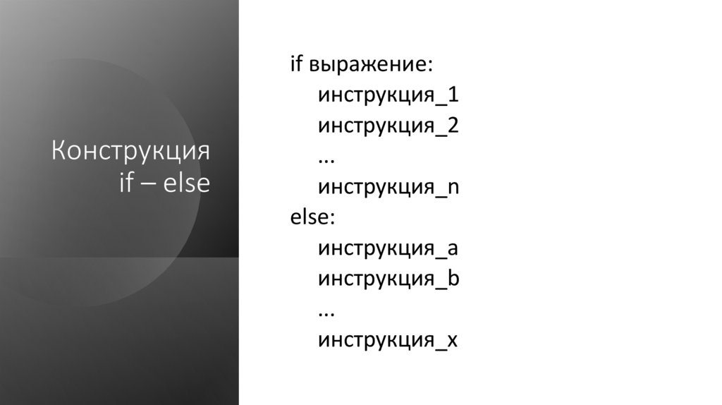
Конструкцияif – else
if выражение:
инструкция_1
инструкция_2
...
инструкция_n
else:
инструкция_a
инструкция_b
...
инструкция_x
4.
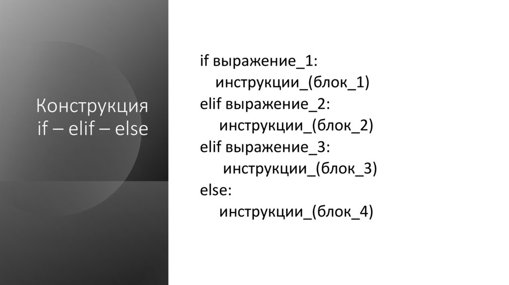
Конструкцияif – elif – else
if выражение_1:
инструкции_(блок_1)
elif выражение_2:
инструкции_(блок_2)
elif выражение_3:
инструкции_(блок_3)
else:
инструкции_(блок_4)
5.
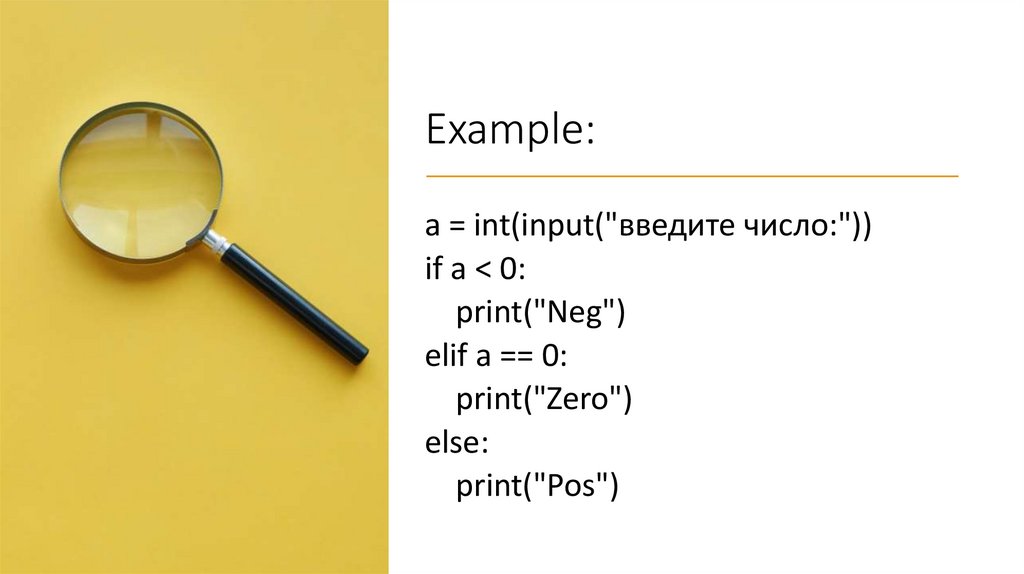
Example:a = int(input("введите число:"))
if a < 0:
print("Neg")
elif a == 0:
print("Zero")
else:
print("Pos")
6.
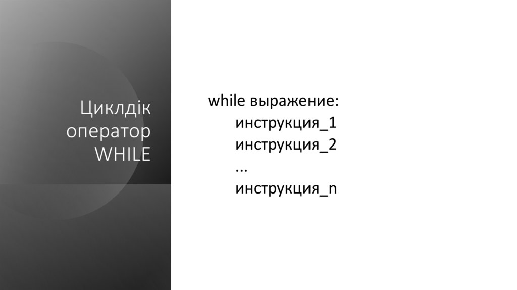
Циклдікоператор
WHILE
while выражение:
инструкция_1
инструкция_2
...
инструкция_n
7.
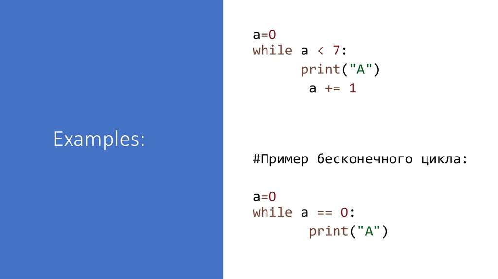
a=0while a < 7:
print("A")
a += 1
Examples:
#Пример бесконечного цикла:
a=0
while a == 0:
print("A")
8.
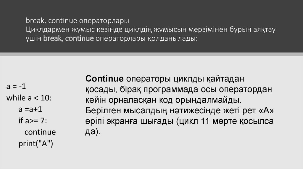
break, continue операторларыЦиклдармен жұмыс кезінде циклдің жұмысын мерзімінен бұрын аяқтау
үшін break, continue операторлары қолданылады:
a = -1
while a < 10:
a =a+1
if a>= 7:
continue
print("A")
Continue операторы циклды қайтадан
қосады, бірақ программада осы оператордан
кейін орналасқан код орындалмайды.
Берілген мысалдың нәтижесінде жеті рет «А»
әріпі экранға шығады (цикл 11 мәрте қосылса
да).
9.
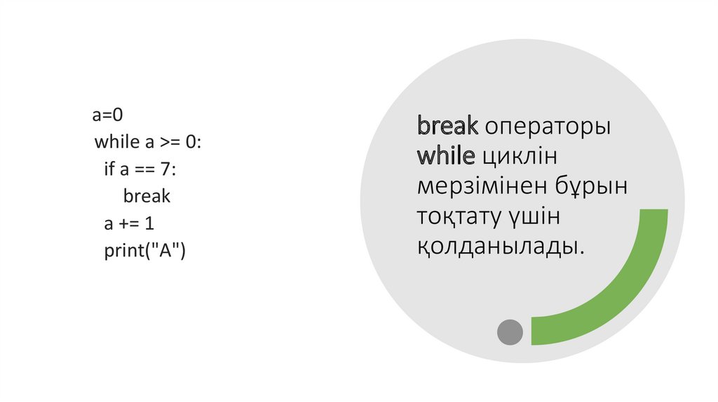
a=0while a >= 0:
if a == 7:
break
a += 1
print("A")
break операторы
while циклін
мерзімінен бұрын
тоқтату үшін
қолданылады.
10.
Python-да график салу Matplotlibкітапханасын енгізу арқылы жүзеге асады:
import matplotlib . pyplot as plt
График тұрғызу үшін келесі функциялар жиі қолданылады:
• plot()
• title()
xlabel()
• ylabel()
• axis()
• grid()
• subplot()
• legend()
• show()
11.
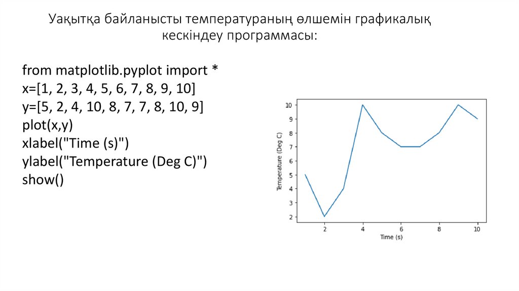
Уақытқа байланысты температураның өлшемін графикалықкескіндеу программасы:
from matplotlib.pyplot import *
x=[1, 2, 3, 4, 5, 6, 7, 8, 9, 10]
y=[5, 2, 4, 10, 8, 7, 7, 8, 10, 9]
plot(x,y)
xlabel("Time (s)")
ylabel("Temperature (Deg C)")
show()
12.
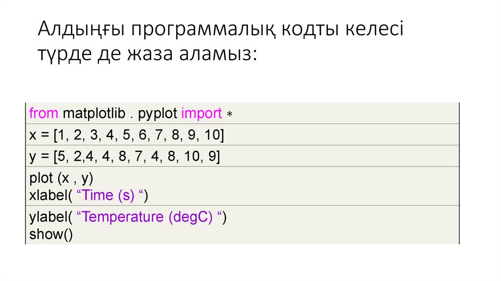
Алдыңғы программалық кодты келесітүрде де жаза аламыз:
from matplotlib . pyplot import ∗
x = [1, 2, 3, 4, 5, 6, 7, 8, 9, 10]
y = [5, 2,4, 4, 8, 7, 4, 8, 10, 9]
plot (x , y)
xlabel( “Time (s) “)
ylabel( “Temperature (degC) “)
show()
13.
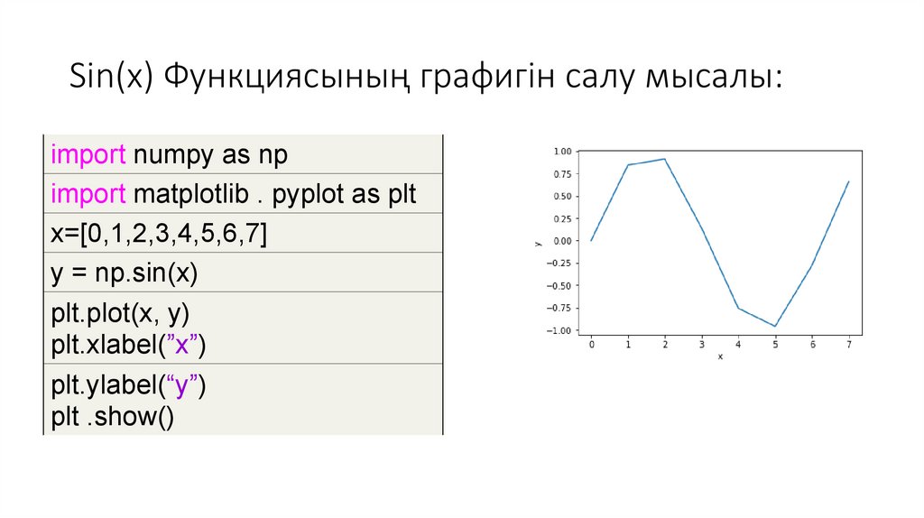
Sin(x) Функциясының графигін салу мысалы:import numpy as np
import matplotlib . pyplot as plt
x=[0,1,2,3,4,5,6,7]
y = np.sin(x)
plt.plot(x, y)
plt.xlabel(”x”)
plt.ylabel(“y”)
plt .show()
14.
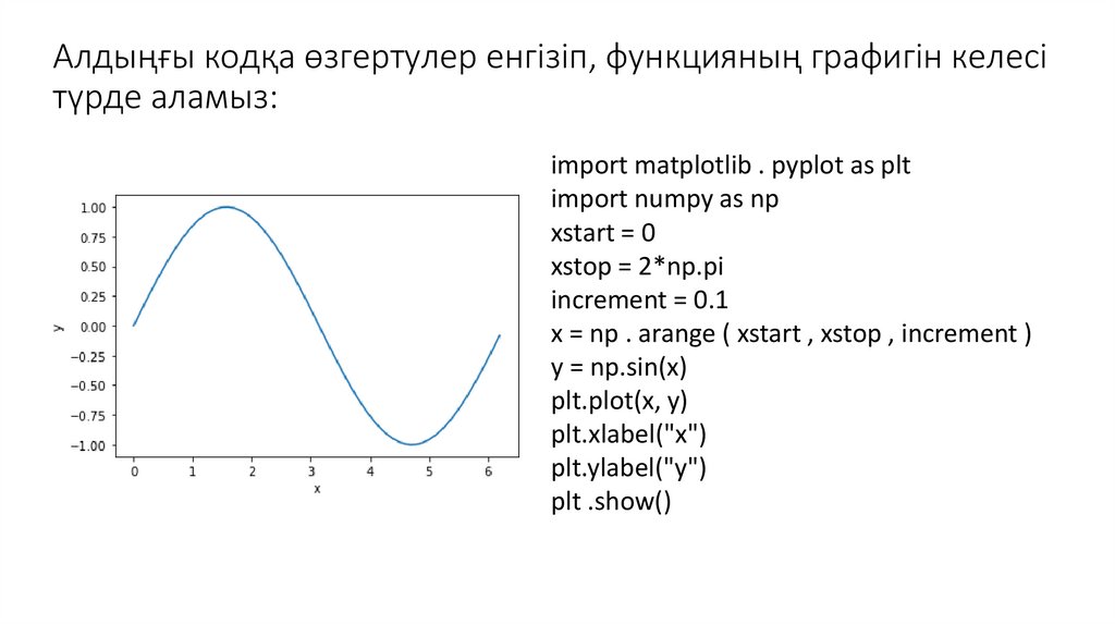
Алдыңғы кодқа өзгертулер енгізіп, функцияның графигін келесітүрде аламыз:
import matplotlib . pyplot as plt
import numpy as np
xstart = 0
xstop = 2*np.pi
increment = 0.1
x = np . arange ( xstart , xstop , increment )
y = np.sin(x)
plt.plot(x, y)
plt.xlabel("x")
plt.ylabel("y")
plt .show()
15.
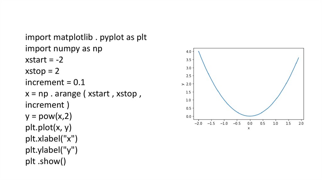
import matplotlib . pyplot as pltimport numpy as np
xstart = -2
xstop = 2
increment = 0.1
x = np . arange ( xstart , xstop ,
increment )
y = pow(x,2)
plt.plot(x, y)
plt.xlabel("x")
plt.ylabel("y")
plt .show()
16.
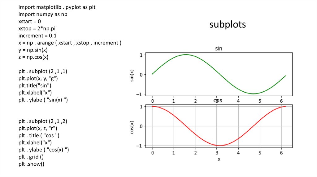
import matplotlib . pyplot as pltimport numpy as np
xstart = 0
xstop = 2*np.pi
increment = 0.1
x = np . arange ( xstart , xstop , increment )
y = np.sin(x)
z = np.cos(x)
plt . subplot (2 ,1 ,1)
plt.plot(x, y, "g")
plt.title("sin")
plt.xlabel("x")
plt . ylabel( "sin(x) ")
plt . subplot (2 ,1 ,2)
plt.plot(x, z, "r")
plt . title ( "cos ")
plt.xlabel("x")
plt . ylabel( "cos(x) ")
plt . grid ()
plt .show()
subplots
17.
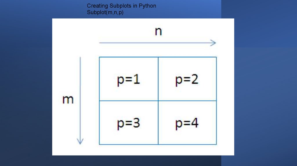
Creating Subplots in PythonSubplot(m,n,p)
18.
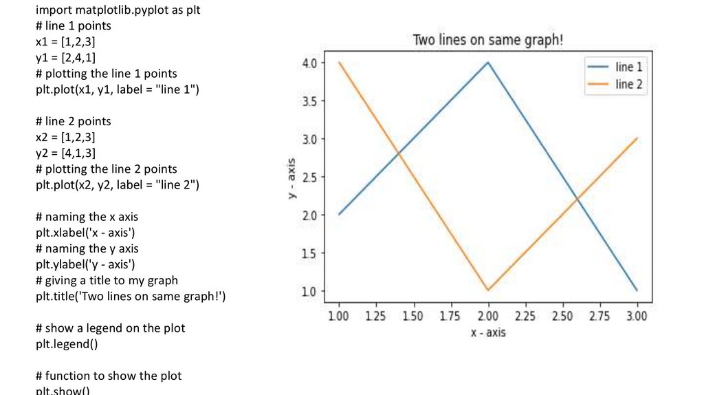
import matplotlib.pyplot as plt# line 1 points
x1 = [1,2,3]
y1 = [2,4,1]
# plotting the line 1 points
plt.plot(x1, y1, label = "line 1")
# line 2 points
x2 = [1,2,3]
y2 = [4,1,3]
# plotting the line 2 points
plt.plot(x2, y2, label = "line 2")
# naming the x axis
plt.xlabel('x - axis')
# naming the y axis
plt.ylabel('y - axis')
# giving a title to my graph
plt.title('Two lines on same graph!')
# show a legend on the plot
plt.legend()
# function to show the plot
plt.show()
19.
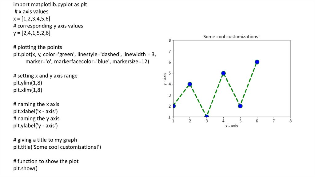
import matplotlib.pyplot as plt# x axis values
x = [1,2,3,4,5,6]
# corresponding y axis values
y = [2,4,1,5,2,6]
# plotting the points
plt.plot(x, y, color='green', linestyle='dashed', linewidth = 3,
marker='o', markerfacecolor='blue', markersize=12)
# setting x and y axis range
plt.ylim(1,8)
plt.xlim(1,8)
# naming the x axis
plt.xlabel('x - axis')
# naming the y axis
plt.ylabel('y - axis')
# giving a title to my graph
plt.title('Some cool customizations!')
# function to show the plot
plt.show()
20.
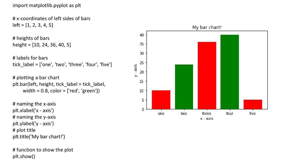
import matplotlib.pyplot as plt# x-coordinates of left sides of bars
left = [1, 2, 3, 4, 5]
# heights of bars
height = [10, 24, 36, 40, 5]
# labels for bars
tick_label = ['one', 'two', 'three', 'four', 'five']
# plotting a bar chart
plt.bar(left, height, tick_label = tick_label,
width = 0.8, color = ['red', 'green'])
# naming the x-axis
plt.xlabel('x - axis')
# naming the y-axis
plt.ylabel('y - axis')
# plot title
plt.title('My bar chart!')
# function to show the plot
plt.show()
21.
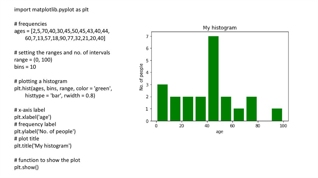
import matplotlib.pyplot as plt# frequencies
ages = [2,5,70,40,30,45,50,45,43,40,44,
60,7,13,57,18,90,77,32,21,20,40]
# setting the ranges and no. of intervals
range = (0, 100)
bins = 10
# plotting a histogram
plt.hist(ages, bins, range, color = 'green',
histtype = 'bar', rwidth = 0.8)
# x-axis label
plt.xlabel('age')
# frequency label
plt.ylabel('No. of people')
# plot title
plt.title('My histogram')
# function to show the plot
plt.show()
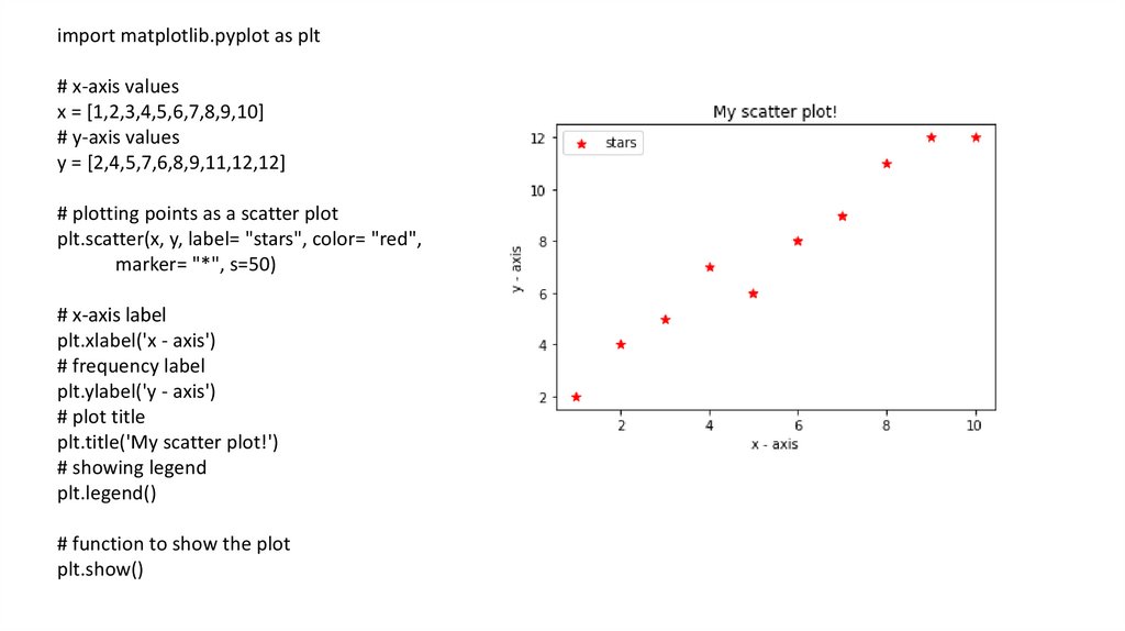
22.
import matplotlib.pyplot as plt# x-axis values
x = [1,2,3,4,5,6,7,8,9,10]
# y-axis values
y = [2,4,5,7,6,8,9,11,12,12]
# plotting points as a scatter plot
plt.scatter(x, y, label= "stars", color= "red",
marker= "*", s=50)
# x-axis label
plt.xlabel('x - axis')
# frequency label
plt.ylabel('y - axis')
# plot title
plt.title('My scatter plot!')
# showing legend
plt.legend()
# function to show the plot
plt.show()
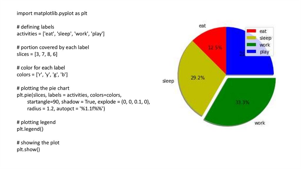
23.
import matplotlib.pyplot as plt# defining labels
activities = ['eat', 'sleep', 'work', 'play']
# portion covered by each label
slices = [3, 7, 8, 6]
# color for each label
colors = ['r', 'y', 'g', 'b']
# plotting the pie chart
plt.pie(slices, labels = activities, colors=colors,
startangle=90, shadow = True, explode = (0, 0, 0.1, 0),
radius = 1.2, autopct = '%1.1f%%')
# plotting legend
plt.legend()
# showing the plot
plt.show()
24.
Назарларыңызғарахмет!