


 Маркетинг
Похожие презентации:


")


Mojo Gym Juice – Logo Modernisation
1.
1Mojo Gym Juice – Logo Modernisation
CONFIDENTIAL – NOT FOR DISTRIBUTION
`
2.
3WHO WE
ARE:
`
3.
8`
4.
9WHO ARE OUR CUSTOMERS?
`
5.
9WHAT IS THE MOJO BRAND DNA?
Self
Improvement
Rule Breaker
Cocky/Cheeky
Best
Version of
YOU
Confidence
Sexy
Charismatic
`
6.
9TO HAVE MOJO: (Urban Dictionary)
`
7.
WHERE WE’RE CURRENTLY POSITIONED:`
6
8.
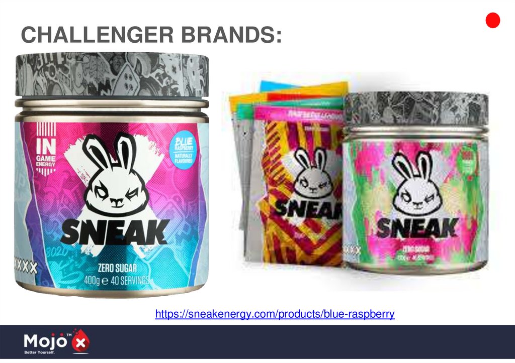
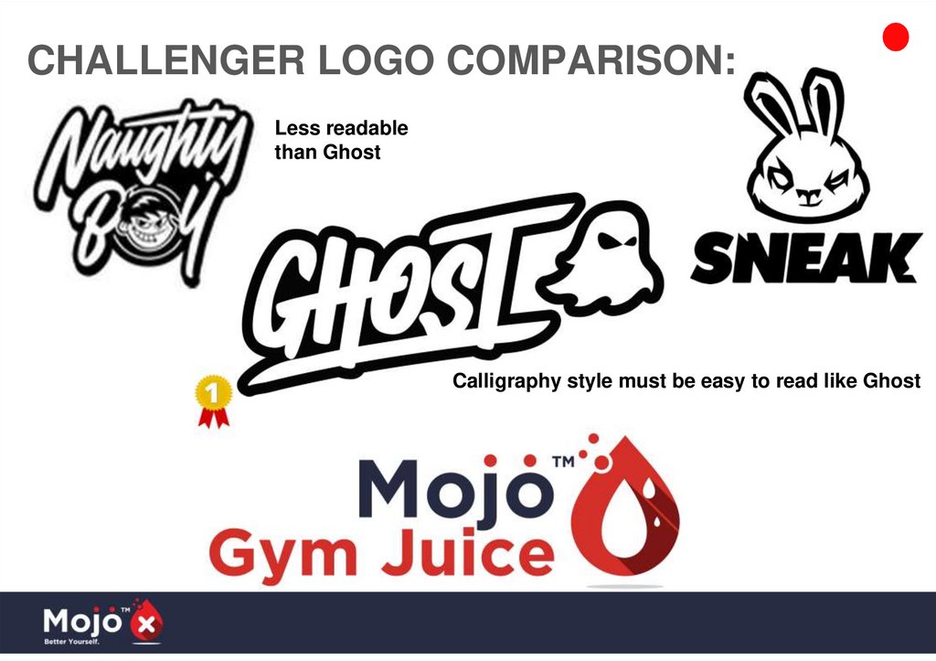
CHALLENGER BRANDS:9.
NaughtyBoy Pre-Workout:https://naughtyboylifestyle.com/collections/stim-pre-workout/products/naughty-boy-the-drip
10.
CHALLENGER BRANDS:https://sneakenergy.com/products/blue-raspberry
11.
LEADING CHALLENGER BRAND:https://au.ghostlifestyle.com/collections/supplements/products/ghost-legend-x-warheads-sour-watermelon
12.
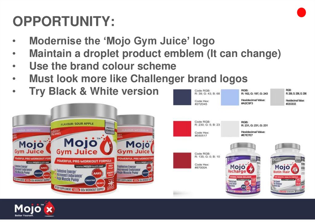
OPPORTUNITY:Modernise the ‘Mojo Gym Juice’ logo
Maintain a droplet product emblem (It can change)
Use the brand colour scheme
Must look more like Challenger brand logos
Try Black & White version
13.
VARIATION, BUT STILL ‘ON-BRAND’…‘Mojo Gym Juice’ logo will be Old Mojo’s cooler younger
cousin
Still fits in with Mojo brand, but with more ‘Attitude’
Would fit in well on the shelf against Challenger brands
14.
PRODUCT LOGO BREAKDOWN:Brand Logo Text + TM (Must have 2 Dots):
Brand Teardrop Emblem
Product Name:
(Different Colour to
Brand Logo)
Need to be able to replace ‘Gym Juice’ with
Other product names example:
- ‘Game Juice’
- ‘Whey Protein’
- ‘Fat Burner’
Product Specific
Shape Inside Emblem
(Changeable)
+ Grey Shadow
15.
CHALLENGER LOGO COMPARISON:Less readable
than Ghost
Calligraphy style must be easy to read like Ghost
16.
IDEAS:All our products have the red droplet, with something inside
to indicate the product
Ideally we would keep this, but modernise
Fonts probably need to change
Keeping the 3 dots above the emblem would be
welcomed but not mandatory
Mojo logo must have 2x dots above J + O and TM
NOTE:
Nice style but
Poor Readability -->>
17.
FAVOURITE 99DESIGN’s CONTEST:POSITIVES:
- Thick black stroke outline
matches ingredients table
- Grey drop shadow makes it
stand off the page
- White works with everything
https://99designs.com.au/profiles/dete
ctype/designs/1570107
NEGATIVES:
- First two letters could be
more readable
- Missing Product Name
(Different Colour)
18.
SIMILAR 99 DESIGN’s CONTEST STYLES:https://99designs.com.au/
profiles/2733818/designs/
761524
https://99designs.com.au/profil
es/1899397/designs/1827034
https://99designs.com.au/profile
s/mercidsgn/designs/1785135
https://99designs.com.au/profiles/
harvysevillano/designs/1207400
https://99designs.com.au/prof
iles/akirax3/designs/975989
19.
ON-BRAND TEST: Does It ‘FIT’ withExisting Product Mix / Labels/Branding?
URBAN CALLIGRAPHY ART /
GRAFFITI STYLE LOGO
ALL EXISTING LOGO ELEMENTS
20.
EXAMPLE TEST: Works! ✅21.
ON-BRAND TEST: Does It ‘FIT’ withExisting Product Mix / Labels/Branding?
URBAN CALLIGRAPHY ART /
GRAFFITI STYLE LOGO
ALL EXISTING LOGO ELEMENTS
22.
EXAMPLE TEST: Works! ✅23.
Final Deliverables/Versions:6. Brand + Slogan + Emblem
1. Full Colour - Solo
2. Black - Solo
3. Black & White - Solo
7. Brand + Product Name
4. Product Emblem
5. Brand Emblem (X)
8. Brand + Product Name + Emblem
24.
1Good Luck in the Contest!
Make us ‘Cool’ again