
 Маркетинг
Похожие презентации:


Oral - B. Brand book to share
1.
Business UseDialing up our
experiences,
personality,
and tone
2.
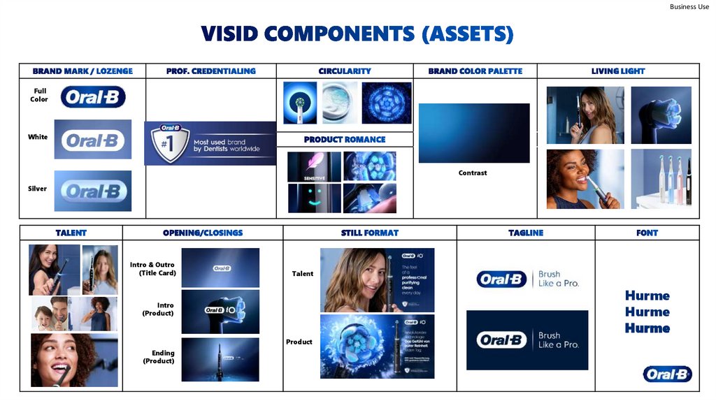
Business UseFull
Color
White
Contrast
Silver
Intro & Outro
(Title Card)
Talent
Hurme
Hurme
Hurme
Intro
(Product)
Product
Ending
(Product)
3.
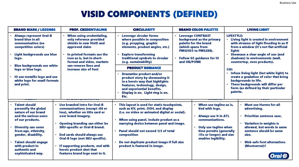
Business UseAlways represent Oral-B
brand blue in all
communication (no
competitive colors)
When using credentialing,
only reference provided
shields in new VisID and
approved claim
Leverage circular forms
where possible in composition
(e.g. propping, graphic
elements, product angles, etc.)
Light backgrounds use blue
logo.
In printed formats use the
icon as is, but in shortformat and video, markets
can remove lines and
increase size of font
Explore transforming
traditional symbols to circular
(e.g. sustainability)
Blue backgrounds use white
logo or blue logo.
iO use metallic logo and use
white logo for small formats
and print.
Talent should
personify the global
nature of our brand
and the various users
of our products.
Diversity can come
from age, ethnicity,
gender, disability.
Talent should engage
with product in
authentic and
sophisticated way.
Use branded intro for Oral-B
communications (except :06 or
less), whether on title card or
over brand imagery.
Opening branding can either be
SKU-specific or Oral-B brand.
End cards should always use
Oral-B logo (not SKU specific).
If supporting products, end with
heroic product shot that
features brand logo next to it.
Leverage CONTRAST
background as the primary
palette for the brand
(which spans from
PMS2935 to PMS288).
Follow G5 guidance for iO
and OR/POME
CGI:
• Infuse living light (hot white light) to
create a gradation of color that bring
backgrounds to life.
• These backgrounds will differ per
form (as defined by their particular
palette.
Dramatize product and/or
product story by showcasing it
in a heroic way that highlights
features, technology, design,
and experiential benefits.
Display is on. Light ring is on.
Etc.
This layout is used for static touchpoints,
such as KV, print, OOH, and display
(i.e. no video or animated digital or social).
When using panel, include product as a
marrying device between panel and image.
Panel should not exceed 1/3 of total
composition
Do not duplicate product image if full size
product is featured in image.
LIFESTYLE:
• Living light is created in environment
with streams of light flooding in as if
from a window (it's not flat artificial
light)
• Showcase a clear angle of sun (and
shadows) in environments (wall,
countertop, even products).
When use tagline as is,
tied with logo.
Must use Hurme for all
advertising.
Always use it in ATL
communications.
Prioritize sentence case.
Only use tagline when
time permits (generally
:15s or longer) and size
enables legibility.
Variation in weights is
allowed, but words in same
sentence should be same
size.
Web safe font alternatives
(Montserrat)?
4.
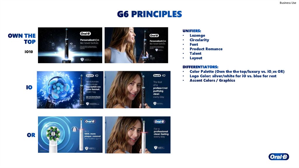
Business UseiO10
Lozenge
Circularity
Font
Product Romance
Talent
Layout
Color Palette (Own the the top/luxury vs. iO,vs OR)
Logo Color: silver/white for iO vs. blue for rest
Accent Colors / Graphics
5.
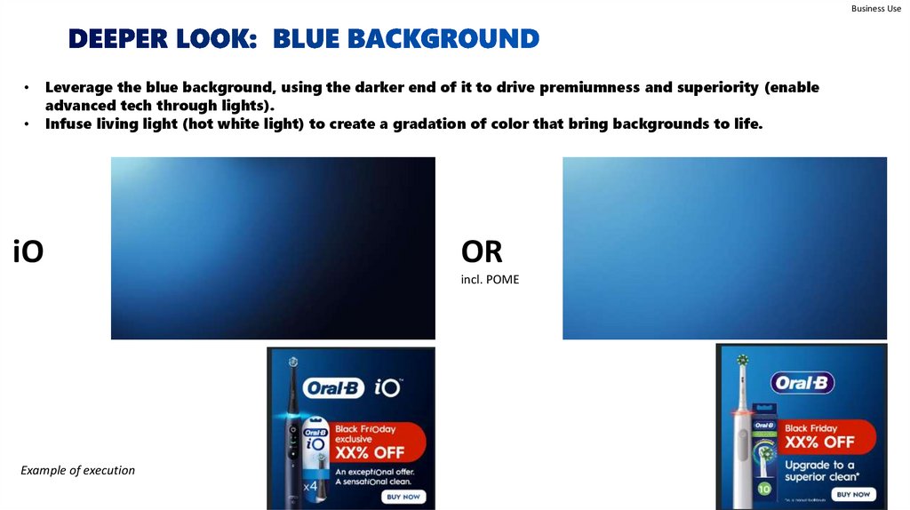
Business UseLeverage the blue background, using the darker end of it to drive premiumness and superiority (enable
advanced tech through lights).
Infuse living light (hot white light) to create a gradation of color that bring backgrounds to life.
iO
OR
incl. POME
Example of execution
6.
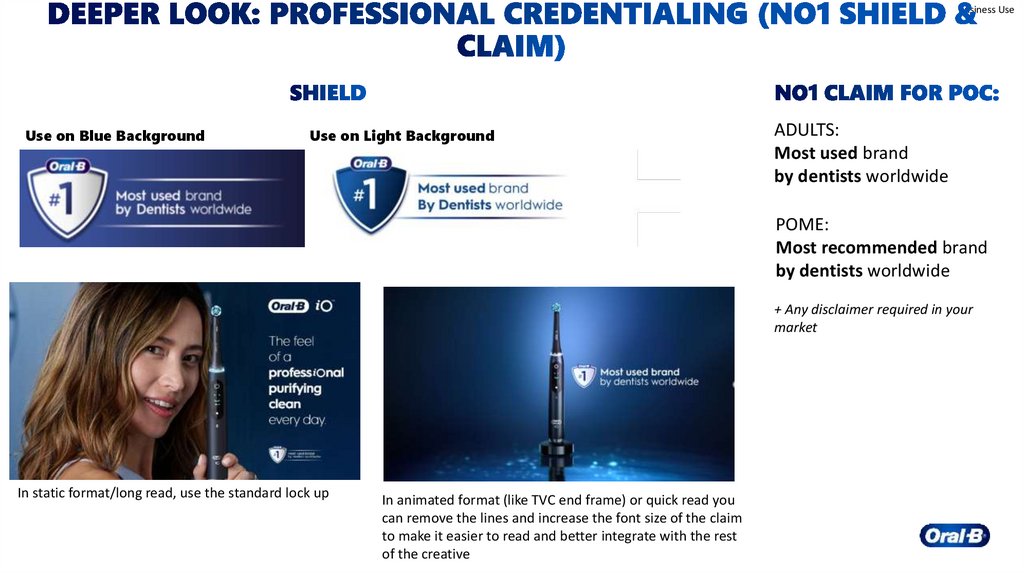
Business UseUse on Blue Background
Use on Light Background
ADULTS:
Most used brand
by dentists worldwide
POME:
Most recommended brand
by dentists worldwide
+ Any disclaimer required in your
market
In static format/long read, use the standard lock up
In animated format (like TVC end frame) or quick read you
can remove the lines and increase the font size of the claim
to make it easier to read and better integrate with the rest
of the creative