


 Математика
 Социология
Похожие презентации:


")

. Week 2 (2)")

")

")
Descriptive statistics (chapter 2)
1.
CHAPTER 2STATISTICS FOR BUSINESS AND ECONOMICS 13e Anderson,
David R 2017
2.
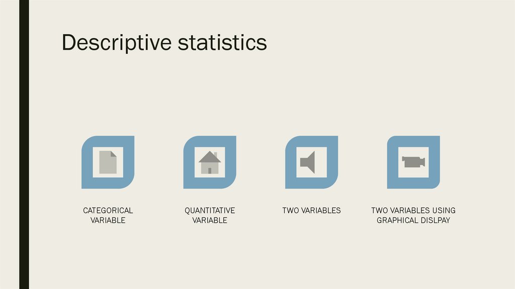
Descriptive statisticsCATEGORICAL
VARIABLE
QUANTITATIVE
VARIABLE
TWO VARIABLES
TWO VARIABLES USING
GRAPHICAL DISLPAY
3.
Statistics in Practice■ 38,000 employees
■ Represented in more than 200 countries
■ Uses statistics in its quality assurance program
■ For example: customer satisfaction with the quantity of detergent in a carton
4.
Statistics in Practice■ Every carton in each size category is filled with the same amount of detergent by
weight, but the volume of detergent is affected by the density of the detergent
powder
– For example, if powder density is on the heavy side, smaller volume of
detergent may be needed, therefore carton may appear under filled
■ Limits are placed on the acceptable range of powder density
■ Statistical samples are taken periodically, and the density of each powder sample is
measured
■ Following data has been uncovered:
5.
Statistics in Practice■ A frequency distribution for the densities of 150
samples taken over a one week period
■ Histogram based on frequency distribution
■ Level above 0.4 are unacceptably high
■ Less than 1% of samples near the undesirable
.4 level
6.
Statistics in Practice■ In this chapter we will learn tabular and graphical methods of descriptive statistics
■ Such as
–
–
–
–
–
Frequency distribution
Bar charts
Histograms
Stem-and-leaf displays
Crosstabulations
7.
Introduction■ Before discussing descriptive statistics, lets learn statistical terms used
8.
■ Data Set – all the data collected in a particular study. In out example 60 nations thatparticipate in the World Trade Organization
9.
■ Element are the entities on which data are collected10.
■ Variable is a characteristic of interest for the elements11.
■ Observation the set of measurements obtained for a particular element12.
Introduction■ Variable scales of measurement
– Nominal – consists of labels or names used to identify an attribute of the
element
– Ordinal – exhibits the properties of nominal data and in addition, the order or
rank of the data is meaningful
– Interval – has all the properties of ordinal data and the interval between values
is expressed in terms of a fixed unit of measure (always numerical)
– Ratio – has all properties of interval data and the ratio of two values is
meaningful
■ Let’s observe our data
13.
14.
Introduction■ Data classification:
■ Categorical Data
– Can be grouped by specific categories
– Can be either nominal or ordinal scale of measurement
■ Quantitative Data
– Variable with quantitative data (answers question how many)
– Can be either interval or rational scale
15.
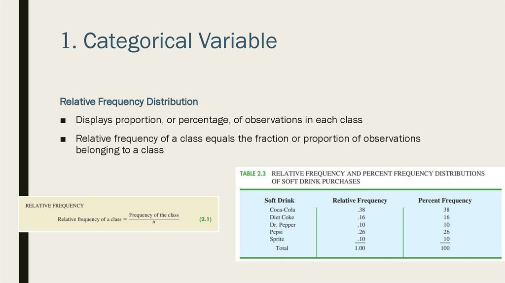
1. Categorical VariableFrequency Distribution
■ Tabular summary of data showing the number (frequency) of observations in each of
several nonoverlapping categories or classes
■ Example:
16.
1. Categorical VariableFrequency Distribution
■ To develop a frequency distribution for these data, we count the number of times
each soft drink appears in each class
17.
1. Categorical VariableRelative Frequency Distribution
■ Displays proportion, or percentage, of observations in each class
■ Relative frequency of a class equals the fraction or proportion of observations
belonging to a class
18.
1. Categorical VariableBar Charts
■ Graphical display for depicting categorical data summarized in a frequency, relative
frequency, or percent frequency distribution
■ Let’s display Bar Chart for our example:
19.
1. Categorical VariableBar Charts
20.
1. Categorical VariablePie Charts
■ Another graphical display for
presenting relative frequency and
percent frequency distributions for
categorical data
■ In our example:
21.
1. Categorical VariablePie Charts
■ We can modify the display
22.
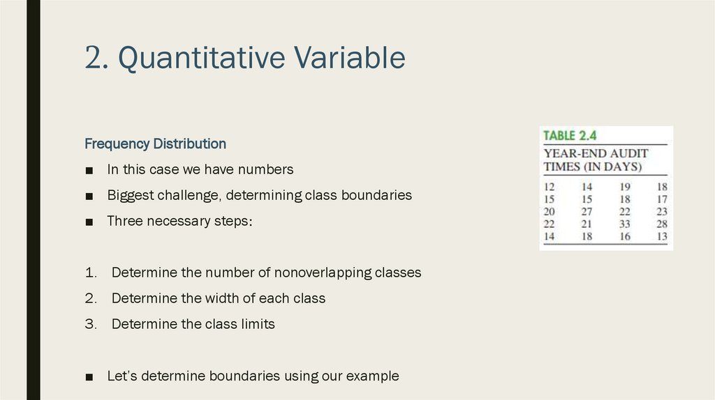
2. Quantitative VariableFrequency Distribution
■ In this case we have numbers
■ Biggest challenge, determining class boundaries
■ Three necessary steps:
1. Determine the number of nonoverlapping classes
2. Determine the width of each class
3. Determine the class limits
■ Let’s determine boundaries using our example
23.
2. Quantitative VariableFrequency Distribution
(1) Determine the number of nonverlapping classes
■ General guideline, use between 5 and 20 classes
■ The goal is to use enough classes to show the variation in the data, but not so many
classes that some contain only a few data items
24.
2. Quantitative VariableFrequency Distribution
(2) Determine the width of each class
■ As a general guideline, the width be the same for each class
■ Generally we use formula:
25.
2. Quantitative VariableFrequency Distribution
■ In our example
■ Let’s use 5 classes
■ Therefore:
– Largest data value is 33
– Lowest data value is 2
■ Category width is (33-12)/5=4.2
■ Let’s round up and say 5
26.
2. Quantitative VariableFrequency Distribution
(3) Determine the class limits
■ Must be chosen so that each data item belongs to one and
only one class
■ For example:
27.
2. Quantitative VariableFrequency Distribution
(3) Determine the class limits
■ We can display it using relative frequency distribution
28.
2. Quantitative VariableFrequency Distribution
Class midpoint
■ In some cases, we may want to know the midpoints of each lasses in a frequency
distribution
■ In our case: 12, 17, 22, 27 and 32
29.
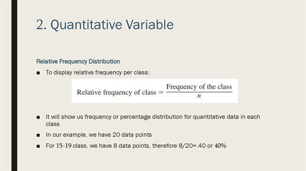
2. Quantitative VariableRelative Frequency Distribution
■ To display relative frequency per class:
■ It will show us frequency or percentage distribution for quantitative data in each
class
■ In our example, we have 20 data points
■ For 15-19 class, we have 8 data points, therefore 8/20=.40 or 40%
30.
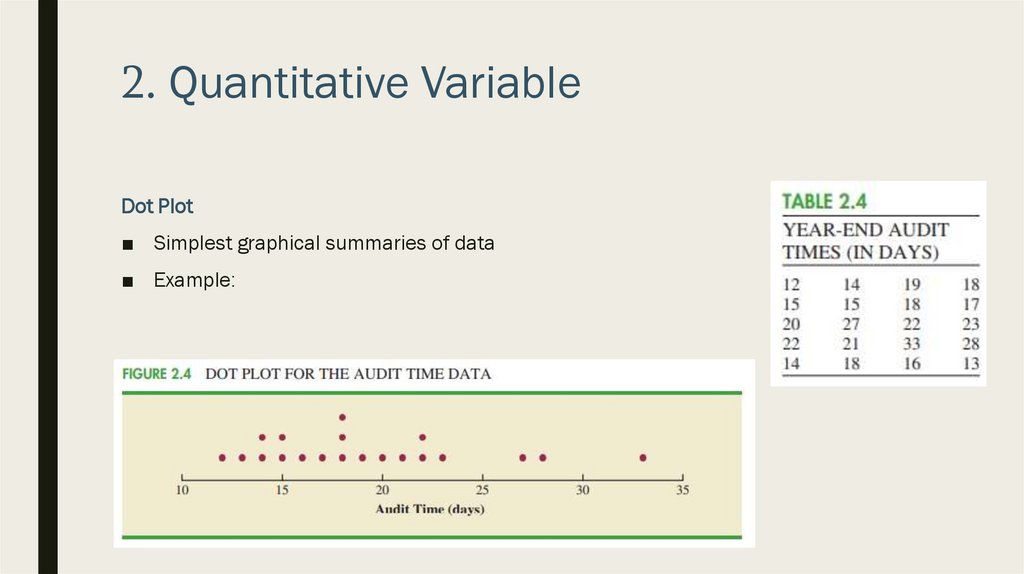
2. Quantitative VariableDot Plot
■ Simplest graphical summaries of data
■ Example:
31.
2. Quantitative VariableHistogram
■ Most commonly used graphical display of quantitative data
■ Can be prepared using data in either a frequency, relative frequency or percent
frequency distribution
■ A histogram is constructed by placing the variable of interest on the horizontal axis
and the frequency, relative frequency, or percent frequency on the vertical axis
■ Frequency, relative frequency, or percent frequency is shown by drawing a rectangle
whose base is determine by the class limits on the horizontal axis and whose height
is the corresponding frequency, relative frequency, or percent frequency
■ Example:
32.
2. Quantitative VariableHistogram
33.
2. Quantitative VariableHistogram
■ One of the most important uses of histogram is to provide information about the
shape or form of a distribution
■ Example:
34.
2. Quantitative VariableHistogram
35.
2. Quantitative VariableCumulative Distribution
■ Variation of the frequency distribution
■ Uses same number of classes, class widths, and class limits developed for the
frequency distribution
■ However, rather than showing the frequency of each class, the cumulative frequency
distribution shows the number of data items with values les than or equal to the
upper class limit of each class
■ Example
36.
2. Quantitative VariableCumulative Distribution
37.
2. Quantitative VariableStem-and-Leaf Display
■ Graphical display used to show simultaneously the rank order and shape of a
distribution of data
■ Let’s use following example for demonstration
38.
2. Quantitative VariableStem-and-Leaf Display
39.
2. Quantitative VariableStem-and-Leaf Display
40.
2. Quantitative VariableStem-and-Leaf Display
41.
2. Quantitative VariableStem-and-Leaf Display
■ In the end we have the rank order and form of the distribution
42.
3. Descriptive Statistics for Two Variable■ Thus far we have focused on using tabular and graphical displays to summarize the
data for a single categorical or quantitative variable
■ In most cases, we have data for two or more variables
■ In this section we will concentrate on summarizing data for two variables using
tables
43.
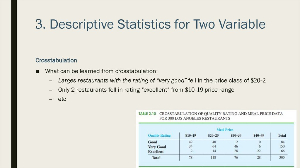
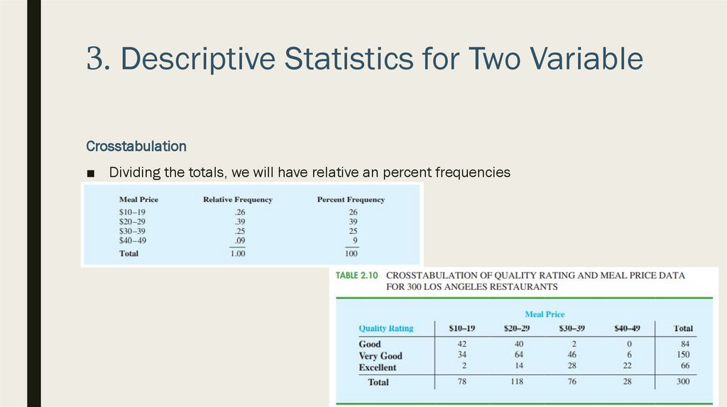
3. Descriptive Statistics for Two VariableCrosstabulation
■ Is a tabular summary of data for
two variables
■ Let’s use following data for
demonstration
44.
3. Descriptive Statistics for Two VariableCrosstabulation
■ First we will define the classes
■ Rating categories: good, very good or excellent
■ For meal price, following ranges: $10-19, $20-29, $30-39 and $40-49
■ Then
45.
3. Descriptive Statistics for Two VariableCrosstabulation
■ What can be learned from crosstabulation:
– Larges restaurants with the rating of “very good” fell in the price class of $20-2
– Only 2 restaurants fell in rating “excellent” from $10-19 price range
– etc
46.
3. Descriptive Statistics for Two VariableCrosstabulation
■ Right and bottom margins provide frequency distribution for each variable
■ What can be learned
– There are 84 restaurants in “good” class
– Or 78 restaurants in $10-19 class
– etc
47.
3. Descriptive Statistics for Two VariableCrosstabulation
■ Dividing the totals, we will have relative an percent frequencies
48.
3. Descriptive Statistics for Two VariableCrosstabulation
■ Dividing the totals, we will have relative an percent frequencies
49.
3. Descriptive Statistics for Two VariableCrosstabulation
■ Dividing the totals, we will have relative an percent frequencies
■ What can be learned from data?
50.
3. Descriptive Statistics for Two VariableCrosstabulation
■ For example:
– Lowes quality rating are from $10-19 and $20-29 price ranges (50% and 47,6%)
– Highest quality ratings are from $30-39 and $40-49 price ranges (42,2% and
33,4%)
– Etc
51.
4. Graphical Displays for Two VariableScatter Diagram and Trendline
■ Scatter diagram is a graphical display of the relationship between two quantitative
variables
■ Trendline is a line that provides an approximation of the relationship
52.
4. Graphical Displays for Two VariableScatter Diagram and Trendline
■ Let’s consider following example
■ Is there a relationship between variables? What if we have 1000 data points?
53.
4. Graphical Displays for Two VariableScatter Diagram and Trendline
54.
4. Graphical Displays for Two VariableScatter Diagram and Trendline
■ It can take several form:
55.
4. Graphical Displays for Two VariableSide-by-Side and Stacked Bar Charts
■ Graphical display for depicting multiple bar charts on the same display
■ Example:
56.
4. Graphical Displays for Two VariableSide-by-Side and Stacked Bar
Charts
■ We can also use a stacked bar
chart, a bar chart in which
each bar is broken into
rectangular segments of a
different color showing the
relative frequency of each
class
■ We use cumulative frequency
distribution