


 Программирование
Похожие презентации:


Computational Programming. Part 5
1.
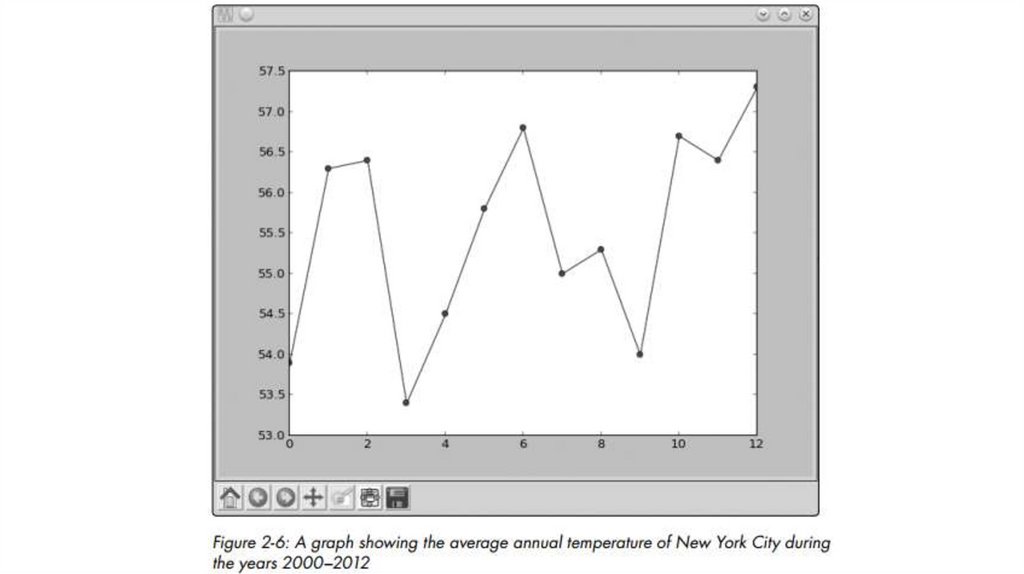
Graphing the Average Annual Temperature in New York CityLet’s take a look at a slightly larger set of data so we can explore more features of
matplotlib. The average annual temperatures for New York City—
measured at Central Park, specifically—during the years 2000 to 2012
are as follows: 53.9, 56.3, 56.4, 53.4, 54.5, 55.8, 56.8, 55.0, 55.3, 54.0, 56.7,
56.4, and 57.3 degrees Fahrenheit. Right now, that just looks like a random
jumble of numbers, but we can plot this set of temperatures on a graph to
make the rise and fall in the average temperature from year to year much
clearer:
>>> nyc_temp = [53.9, 56.3, 56.4, 53.4, 54.5, 55.8, 56.8, 55.0, 55.3, 54.0, 56.7,
56.4, 57.3]
>>> plot(nyc_temp, marker='o')
[<matplotlib.lines.Line2D object at 0x7f2549d52f90>]
2.
3.
>>> nyc_temp = [53.9, 56.3, 56.4, 53.4, 54.5, 55.8, 56.8, 55.0, 55.3, 54.0, 56.7, 56.4, 57.3]>>> years = range(2000, 2013)
>>> plot(years, nyc_temp, marker='o')
[<matplotlib.lines.Line2D object at 0x7f2549a616d0>]
>>> show()
We use the range() function we learned about in Chapter 1 to specify
the years 2000 to 2012. Now you’ll see the years displayed on the
axis
(see Figure 2-7).
x-
4.
5.
Comparing the Monthly Temperature Trends of New York CityWhile still looking at New York City, let’s see how the average monthly temperature has varied
over the years. This will give us a chance to understand
how to plot multiple lines on a single graph. We’ll choose three years: 2000,
2006, and 2012. For each of these years, we’ll plot the average temperature
for all 12 months.
>>> nyc_temp_2000 = [31.3, 37.3, 47.2, 51.0, 63.5, 71.3, 72.3, 72.7, 66.0, 57.0,
45.3, 31.1]
>>> nyc_temp_2006 = [40.9, 35.7, 43.1, 55.7, 63.1, 71.0, 77.9, 75.8, 66.6, 56.2,
51.9, 43.6]
>>> nyc_temp_2012 = [37.3, 40.9, 50.9, 54.8, 65.1, 71.0, 78.8, 76.7, 68.8, 58.0,
43.9, 41.5]
6.
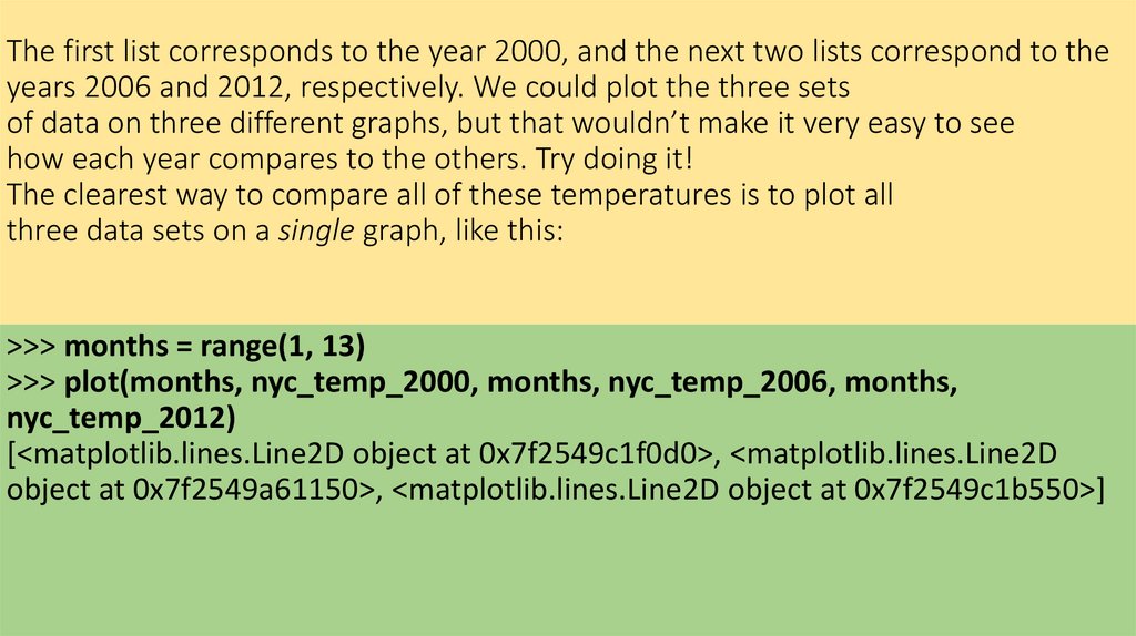
The first list corresponds to the year 2000, and the next two lists correspond to theyears 2006 and 2012, respectively. We could plot the three sets
of data on three different graphs, but that wouldn’t make it very easy to see
how each year compares to the others. Try doing it!
The clearest way to compare all of these temperatures is to plot all
three data sets on a single graph, like this:
>>> months = range(1, 13)
>>> plot(months, nyc_temp_2000, months, nyc_temp_2006, months,
nyc_temp_2012)
[<matplotlib.lines.Line2D object at 0x7f2549c1f0d0>, <matplotlib.lines.Line2D
object at 0x7f2549a61150>, <matplotlib.lines.Line2D object at 0x7f2549c1b550>]
7.
8.
Now we have three plots all on one graph. Python automatically choosesa different color for each line to indicate that the lines have been plotted
from different data sets.
Instead of calling the plot function with all three pairs at once, we
could also call the plot function three separate times, once for each pair:
>>> plot(months, nyc_temp_2000)
[<matplotlib.lines.Line2D object at 0x7f1e51351810>]
>>> plot(months, nyc_temp_2006)
[<matplotlib.lines.Line2D object at 0x7f1e5ae8e390>]
>>> plot(months, nyc_temp_2012)
[<matplotlib.lines.Line2D object at 0x7f1e5136ccd0>]
>>> show()
9.
We have a problem, however, because we don’t have any clue as to whichcolor corresponds to which year. To fix this, we can use the function legend(),
which lets us add a legend to the graph. A legend is a small display box that
identifies what different parts of the graph mean. Here, we’ll use a legend
to indicate which year each colored line stands for. To add the legend, first
call the plot() function as earlier:
>>> plot(months, nyc_temp_2000, months, nyc_temp_2006, months,
nyc_temp_2012)
[<matplotlib.lines.Line2D object at 0x7f2549d6c410>, <matplotlib.lines.Line2D
object at 0x7f2549d6c9d0>, <matplotlib.lines.Line2D object at 0x7f2549a86850>]
10.
Then, import the legend() function from the pylab module and call it asfollows:
>>> from pylab import legend
>>> legend([2000, 2006, 2012])
<matplotlib.legend.Legend object at 0x7f2549d79410>
11.
We call the legend() function with a list of the labels we want to use toidentify each plot on the graph. These labels are entered in this order to
match the order of the pairs of lists that were entered in the plot() function. That is,
2000 will be the label for the plot of the first pair we entered
in the plot() function; 2006, for the second pair; and 2012, for the third.
You can also specify a second argument to the function that will specify
the position of the legend. By default, it’s always positioned at the top
right of the graph. However, you can specify a particular position, such
as 'lower center', 'center left', and 'upper left'. Or you can set the position to 'best',
and the legend will be positioned so as not to interfere
with the graph.
Finally, we call show() to display the graph:
>>> show()
12.
13.
Customizing GraphsWe already learned about one way to customize a graph—by adding a legend. Now, we’ll learn
about other ways to customize a graph and to make it
clearer by adding labels to the x- and y-axes, adding a title to the graph, and
controlling the range and steps of the axes.
Adding a Title and Labels
We can add a title to our graph using the title() function and add labels
for the x- and y-axes using the xlabel() and ylabel() functions. Let’s re-create
the last plot and add all this additional information:
• >>> from pylab import plot, show, title, xlabel, ylabel, legend
>>> plot(months, nyc_temp_2000, months, nyc_temp_2006, months, nyc_temp_2012)
[<matplotlib.lines.Line2D object at 0x7f2549a9e210>, <matplotlib.lines.Line2D
object at 0x7f2549a4be90>, <matplotlib.lines.Line2D object at 0x7f2549a82090>]
>>> title('Average monthly temperature in NYC')
<matplotlib.text.Text object at 0x7f25499f7150>
>>> xlabel('Month')
<matplotlib.text.Text object at 0x7f2549d79210>
>>> ylabel('Temperature')
<matplotlib.text.Text object at 0x7f2549b8b2d0>
>>> legend([2000, 2006, 2012])
<matplotlib.legend.Legend object at 0x7f2549a82910>
14.
15.
Customizing the AxesSo far, we’ve allowed the numbers on both axes to be automatically determined by Python based
on the data supplied to the plot() function. This
may be fine for most cases, but sometimes this automatic range isn’t the
clearest way to present the data, as we saw in the graph where we plotted
the average annual temperature of New York City (see Figure 2-7). There,
even small changes in the temperature seemed large because the automatically chosen y-axis
range was very narrow. We can adjust the range of the
axes using the axis() function. This function can be used both to retrieve
the current range and to set a new range for the axes.
Consider, once again, the average annual temperature of New York City
during the years 2000 to 2012 and create a plot as we did earlier.
>>> nyc_temp = [53.9, 56.3, 56.4, 53.4, 54.5, 55.8, 56.8, 55.0, 55.3, 54.0, 56.7, 56.4,
57.3]
>>> plot(nyc_temp, marker='o')
[<matplotlib.lines.Line2D object at 0x7f3ae5b767d0>]
16.
Now, import the axis() function and call it:>>> from pylab import axis
>>> axis()
(0.0, 12.0, 53.0, 57.5)
17.
The function returned a tuple with four numbers corresponding to therange for the x-axis (0.0, 12.0) and the y-axis (53.0, 57.5). These are the
same range values from the graph that we made earlier. Now, let’s
change the y-axis to start from 0 instead of 53.0:
>>> axis(ymin=0)
(0.0, 12.0, 0, 57.5)
18.
19.
Saving the PlotsIf you need to save your graphs, you can do so using the savefig() function.
This function saves the graph as an image file, which you can use in reports
or presentations. You can choose among several image formats, including
PNG, PDF, and SVG.
Here’s an example:
>>> from pylab import plot, savefig
>>> x = [1, 2, 3]
>>> y = [2, 4, 6]
>>> plot(x, y)
>>> savefig('mygraph.png')
20.
This program will save the graph to an image file, mygraph.png, in yourcurrent directory. On Microsoft Windows, this is usually C:\Python33 (where
you installed Python). On Linux, the current directory is usually your home
directory (/home/<username>), where <username> is the user you’re logged in
as. On a Mac, IDLE saves files to ~/Documents by default. If you wanted to save
it in a different directory, specify the complete pathname. For example, to
save the image under C:\ on Windows as mygraph.png, you’d call the savefig()
function as follows:
>>> savefig('C:\mygraph.png')