


 Программирование
Похожие презентации:


")


Computational Programming. Part 6
1.
creating graphs with MatplotlibNow we’re ready to create our first graph. We’ll start with a
simple graph with just three points: (1, 2), (2, 4), and (3, 6). To
create this graph, we’ll first make two lists of numbers—one
storing the values of the x-coordinates of these points and
another storing the y-coordinates. The following two
statements do exactly that, creating the two lists x_numbers
and y_numbers:
• >>> x_numbers = [1, 2, 3]
>>> y_numbers = [2, 4, 6]
2.
From here, we can create the plot:• >>> from pylab import plot, show
>>> plot(x_numbers, y_numbers)
[<matplotlib.lines.Line2D object at 0x7f83ac60df10>]
3.
The plot() function only creates the graph. Toactually display it, we have to call the show()
function:
• >>> show()
4.
15.
Notice that instead of starting from the origin (0, 0), the x-axisstarts from the number 1 and the y-axis starts from the
number 2. These are the lowest numbers from each of the
two lists. Also, you can see increments marked on each of the
axes (such as 2.5, 3.0, 3.5, etc., on the y-axis).
In “Customizing Graphs” on page 41, we’ll learn how to control
those aspects of the graph, along with how to add axes labels
and a graph title. You’ll notice in the interactive shell that you
can’t enter any further statements until you close the
matplotlib window. Close the graph window so that you can
continue programming
6.
Marking Points on Your GraphIf you want the graph to mark the points that you
supplied for plotting, you
can use an additional keyword argument while calling
the plot() function:
• >>> plot(x_numbers, y_numbers, marker='o')
7.
.8.
The marker at (2, 4) is easily visible, while the others are hidden inthe very corners of the graph. You can choose from several marker
options, including 'o', '*', 'x', and '+'. Using marker= includes a line
connecting the points (this is the default). You can also make a graph
that marks only the points that you specified, without any line
connecting them, by omitting marker=:
• >>> plot(x_numbers, y_numbers, 'o')
[<matplotlib.lines.Line2D object at 0x7f2549bc0bd0>]
9.
.10.
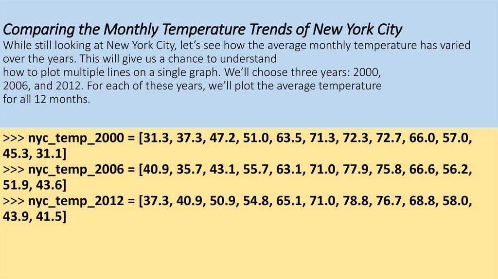
Comparing the Monthly Temperature Trends of New York CityWhile still looking at New York City, let’s see how the average monthly temperature has varied
over the years. This will give us a chance to understand
how to plot multiple lines on a single graph. We’ll choose three years: 2000,
2006, and 2012. For each of these years, we’ll plot the average temperature
for all 12 months.
>>> nyc_temp_2000 = [31.3, 37.3, 47.2, 51.0, 63.5, 71.3, 72.3, 72.7, 66.0, 57.0,
45.3, 31.1]
>>> nyc_temp_2006 = [40.9, 35.7, 43.1, 55.7, 63.1, 71.0, 77.9, 75.8, 66.6, 56.2,
51.9, 43.6]
>>> nyc_temp_2012 = [37.3, 40.9, 50.9, 54.8, 65.1, 71.0, 78.8, 76.7, 68.8, 58.0,
43.9, 41.5]
11.
The first list corresponds to the year 2000, and the next two lists correspond to theyears 2006 and 2012, respectively. We could plot the three sets
of data on three different graphs, but that wouldn’t make it very easy to see
how each year compares to the others. Try doing it!
The clearest way to compare all of these temperatures is to plot all
three data sets on a single graph, like this:
>>> months = range(1, 13)
>>> plot(months, nyc_temp_2000, months, nyc_temp_2006, months,
nyc_temp_2012)
[<matplotlib.lines.Line2D object at 0x7f2549c1f0d0>, <matplotlib.lines.Line2D
object at 0x7f2549a61150>, <matplotlib.lines.Line2D object at 0x7f2549c1b550>]
12.
13.
Now we have three plots all on one graph. Python automatically choosesa different color for each line to indicate that the lines have been plotted
from different data sets.
Instead of calling the plot function with all three pairs at once, we
could also call the plot function three separate times, once for each pair:
>>> plot(months, nyc_temp_2000)
[<matplotlib.lines.Line2D object at 0x7f1e51351810>]
>>> plot(months, nyc_temp_2006)
[<matplotlib.lines.Line2D object at 0x7f1e5ae8e390>]
>>> plot(months, nyc_temp_2012)
[<matplotlib.lines.Line2D object at 0x7f1e5136ccd0>]
>>> show()
14.
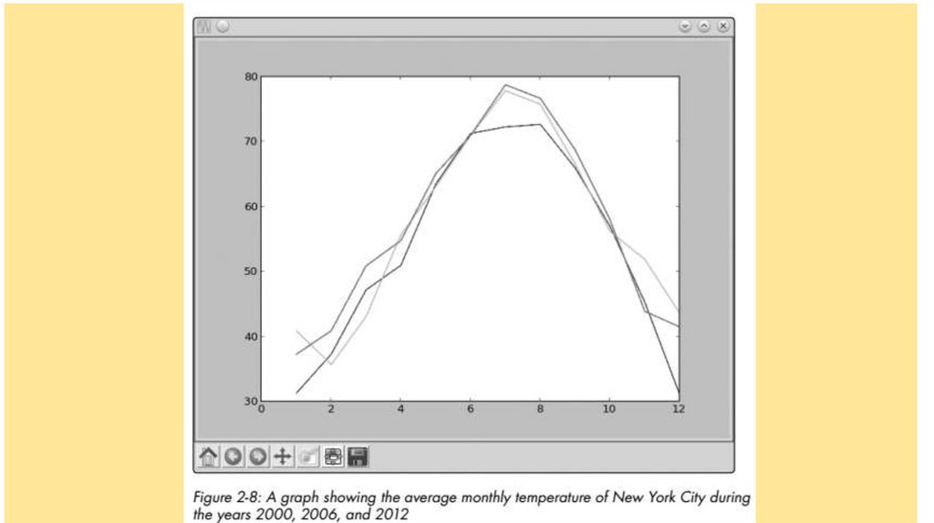
We have a problem, however, because we don’t have any clue as to whichcolor corresponds to which year. To fix this, we can use the function legend(),
which lets us add a legend to the graph. A legend is a small display box that
identifies what different parts of the graph mean. Here, we’ll use a legend
to indicate which year each colored line stands for. To add the legend, first
call the plot() function as earlier:
>>> plot(months, nyc_temp_2000, months, nyc_temp_2006, months,
nyc_temp_2012)
[<matplotlib.lines.Line2D object at 0x7f2549d6c410>, <matplotlib.lines.Line2D
object at 0x7f2549d6c9d0>, <matplotlib.lines.Line2D object at 0x7f2549a86850>]
15.
Then, import the legend() function from the pylab module and call it asfollows:
>>> from pylab import legend
>>> legend([2000, 2006, 2012])
<matplotlib.legend.Legend object at 0x7f2549d79410>
16.
We call the legend() function with a list of the labels we want to use toidentify each plot on the graph. These labels are entered in this order to
match the order of the pairs of lists that were entered in the plot() function. That is,
2000 will be the label for the plot of the first pair we entered
in the plot() function; 2006, for the second pair; and 2012, for the third.
You can also specify a second argument to the function that will specify
the position of the legend. By default, it’s always positioned at the top
right of the graph. However, you can specify a particular position, such
as 'lower center', 'center left', and 'upper left'. Or you can set the position to 'best',
and the legend will be positioned so as not to interfere
with the graph.
Finally, we call show() to display the graph:
>>> show()
17.
18.
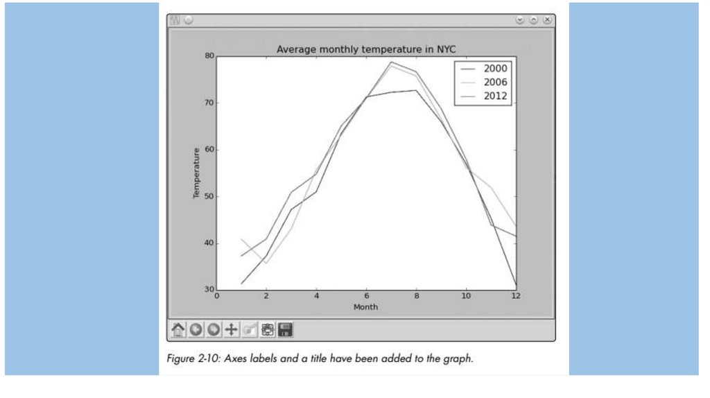
Customizing GraphsWe already learned about one way to customize a graph—by adding a legend. Now, we’ll learn
about other ways to customize a graph and to make it
clearer by adding labels to the x- and y-axes, adding a title to the graph, and
controlling the range and steps of the axes.
Adding a Title and Labels
We can add a title to our graph using the title() function and add labels
for the x- and y-axes using the xlabel() and ylabel() functions. Let’s re-create
the last plot and add all this additional information:
• >>> from pylab import plot, show, title, xlabel, ylabel, legend
>>> plot(months, nyc_temp_2000, months, nyc_temp_2006, months, nyc_temp_2012)
[<matplotlib.lines.Line2D object at 0x7f2549a9e210>, <matplotlib.lines.Line2D
object at 0x7f2549a4be90>, <matplotlib.lines.Line2D object at 0x7f2549a82090>]
>>> title('Average monthly temperature in NYC')
<matplotlib.text.Text object at 0x7f25499f7150>
>>> xlabel('Month')
<matplotlib.text.Text object at 0x7f2549d79210>
>>> ylabel('Temperature')
<matplotlib.text.Text object at 0x7f2549b8b2d0>
>>> legend([2000, 2006, 2012])
<matplotlib.legend.Legend object at 0x7f2549a82910>
19.
20.
Customizing the AxesSo far, we’ve allowed the numbers on both axes to be automatically determined by Python based
on the data supplied to the plot() function. This
may be fine for most cases, but sometimes this automatic range isn’t the
clearest way to present the data, as we saw in the graph where we plotted
the average annual temperature of New York City (see Figure 2-7). There,
even small changes in the temperature seemed large because the automatically chosen y-axis
range was very narrow. We can adjust the range of the
axes using the axis() function. This function can be used both to retrieve
the current range and to set a new range for the axes.
Consider, once again, the average annual temperature of New York City
during the years 2000 to 2012 and create a plot as we did earlier.
>>> nyc_temp = [53.9, 56.3, 56.4, 53.4, 54.5, 55.8, 56.8, 55.0, 55.3, 54.0, 56.7, 56.4,
57.3]
>>> plot(nyc_temp, marker='o')
[<matplotlib.lines.Line2D object at 0x7f3ae5b767d0>]
21.
Now, import the axis() function and call it:>>> from pylab import axis
>>> axis()
(0.0, 12.0, 53.0, 57.5)
22.
The function returned a tuple with four numbers corresponding to therange for the x-axis (0.0, 12.0) and the y-axis (53.0, 57.5). These are the
same range values from the graph that we made earlier. Now, let’s
change the y-axis to start from 0 instead of 53.0:
>>> axis(ymin=0)
(0.0, 12.0, 0, 57.5)
23.
24.
Saving the PlotsIf you need to save your graphs, you can do so using the savefig() function.
This function saves the graph as an image file, which you can use in reports
or presentations. You can choose among several image formats, including
PNG, PDF, and SVG.
Here’s an example:
>>> from pylab import plot, savefig
>>> x = [1, 2, 3]
>>> y = [2, 4, 6]
>>> plot(x, y)
>>> savefig('mygraph.png')
25.
This program will save the graph to an image file, mygraph.png, in yourcurrent directory. On Microsoft Windows, this is usually C:\Python33 (where
you installed Python). On Linux, the current directory is usually your home
directory (/home/<username>), where <username> is the user you’re logged in
as. On a Mac, IDLE saves files to ~/Documents by default. If you wanted to save
it in a different directory, specify the complete pathname. For example, to
save the image under C:\ on Windows as mygraph.png, you’d call the savefig()
function as follows:
>>> savefig('C:\mygraph.png')
26.
Plotting with FormulasUntil now, we’ve been plotting points on our graphs based
on observed scientific measurements. In those graphs, we
already had all our values for x and y laid out. For example,
recorded temperatures and dates were already available
to us at the time we wanted to create the New York City
graph, showing how the temperature varied over months
or years. In this section, we’re going to create graphs from
mathematical formulas.
27.
Newton’s Law of Universal GravitationAccording to Newton’s law of universal gravitation, a body of mass m1
attracts another body of mass m2 with an amount of force F according
to the formula
,
where r is the distance between the two bodies and G is the gravitational
constant. We want to see what happens to the force as the distance between
the two bodies increases.
Let’s take the masses of two bodies: the mass of the first body (m1) is
0.5 kg, and the mass of the second body (m2) is 1.5 kg. The value of the
gravitational constant is 6.674 × 10⁻¹¹ N m2 kg-2. Now we’re ready to calculate the
gravitational force between these two bodies at 19 different distances: 100 m,
150 m, 200 m, 250 m, 300 m, and so on up through 1000 m. The following
program performs these calculations and also draws the graph:
28.
'''The relationship between gravitational force and
distance between two bodies
'''
import matplotlib.pyplot as plt
# Draw the graph
def draw_graph(x, y):
plt.plot(x, y, marker='o')
plt.xlabel('Distance in meters')
29.
plt.ylabel('Gravitational force in newtons’)plt.title('Gravitational force and distance’)
plt.show()
def generate_F_r():
# Generate values for r
r = range(100, 1001, 50)
# Empty list to store the calculated values of F
F = []
# Constant, G
G = 6.674*(10**-11)
30.
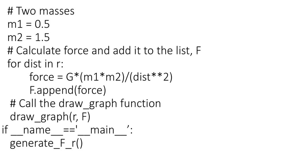
# Two massesm1 = 0.5
m2 = 1.5
# Calculate force and add it to the list, F
for dist in r:
force = G*(m1*m2)/(dist**2)
F.append(force)
# Call the draw_graph function
draw_graph(r, F)
if __name__=='__main__’:
generate_F_r()
31.
32.
33.
Projectile MotionNow, let’s graph something you’ll be familiar with
from everyday life. If
you throw a ball across a field, it follows a trajectory
like the one shown in
Figure 2-13.
34.
Generating Equally Spaced Floating Point NumbersWe’ve used the range() function to generate equally
spaced integers—that is, if we wanted a list of integers
between 1 and 10 with each integer separated by 1, we
would use range(1, 10). If we wanted a different step
value, we could specify that to the range function as the
third argument.
35.
'''Generate equally spaced floating point
numbers between two given values
'''
def frange(start, final, increment):
numbers = []
while start < final:
numbers.append(start)
start = start + increment
return numbers
36.
Drawing the TrajectoryThe following program draws the trajectory of a
ball thrown with a certain velocity and angle—
both of which are supplied as input to the
program:
37.
'''Draw the trajectory of a body in projectile motion
'''
from matplotlib import pyplot as plt
import math
def draw_graph(x, y):
plt.plot(x, y)
plt.xlabel('x-coordinate’)
plt.ylabel('y-coordinate’)
plt.title('Projectile motion of a ball')
38.
def frange(start, final, interval):numbers = []
while start < final:
numbers.append(start)
start = start + interval
return numbers
39.
def draw_trajectory(u, theta):theta = math.radians(theta)
g = 9.8
# Time of flight
t_flight = 2*u*math.sin(theta)/g
# Find time intervals
intervals = frange(0, t_flight, 0.001)
40.
# List of x and y coordinatesx = []
y = []
for t in intervals:
x.append(u*math.cos(theta)*t)
y.append(u*math.sin(theta)*t - 0.5*g*t*t)
draw_graph(x, y)
41.
if __name__ == '__main__’:try:
u = float(input('Enter the initial velocity (m/s): ‘))
theta = float(input('Enter the angle of projection
(degrees): ‘))
except ValueError:
print('You entered an invalid input’)
else:
draw_trajectory(u, theta)
plt.show()
42.
Enter the initial velocity (m/s): 25Enter the angle of projection (degrees): 60
43.
44.
Comparing the Trajectory at Different Initial VelocitiesThe previous program allows you to perform
interesting experiments. For example, what will the
trajectory look like for three balls thrown at different
velocities but with the same initial angle?
To graph three trajectories at once, we can replace
the main code block from our previous program with
the following:
45.
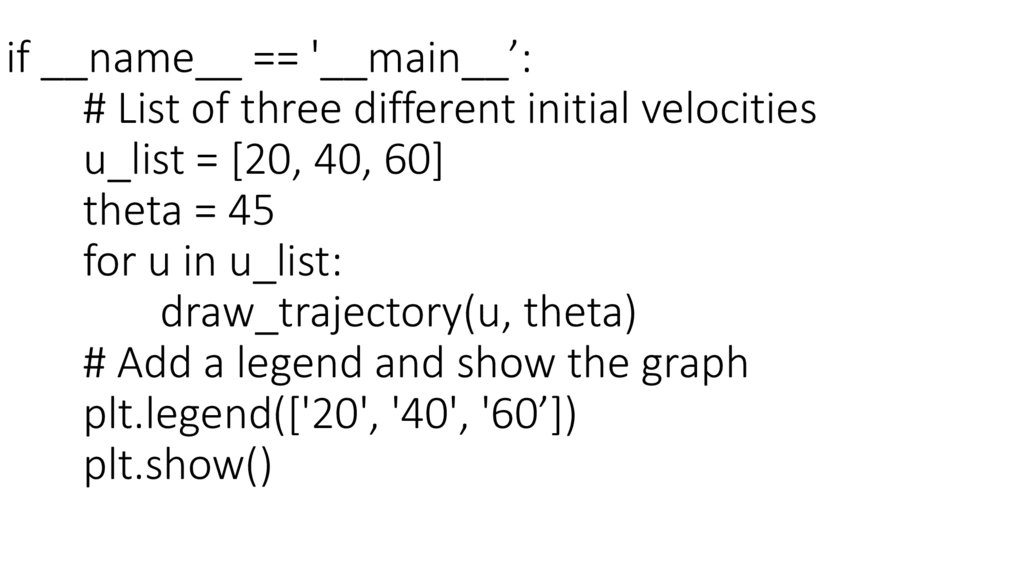
if __name__ == '__main__’:# List of three different initial velocities
u_list = [20, 40, 60]
theta = 45
for u in u_list:
draw_trajectory(u, theta)
# Add a legend and show the graph
plt.legend(['20', '40', '60’])
plt.show()
46.
47.
Programming challengesHere are a few challenges that build on what you’ve
learned in this
chapter. You can find sample solutions at
http://www.nostarch.com/doingmathwithpython/
48.
#1: How Does the Temperature Vary During the Day?If you enter a search term like “New York weather” in Google’s search
engine, you’ll see, among other things, a graph showing the temperature
at different times of the present day. Your task here is to re-create such a
graph.
Using a city of your choice, find the temperature at different points
ofthe day. Use the data to create two lists in your program and to create
a graph with the time of day on the x-axis and the corresponding
temperature on the y-axis. The graph should tell you how the
temperature varies with the time of day. Try a different city and see how
the two cities compare by plotting both lines on the same graph.
The time of day may be indicated by strings such as '10:11 AM' or
'09:21 PM'.
49.
#2: Exploring a Quadratic Function VisuallyIn Chapter 1, you learned how to find the roots of a
quadratic equation, such as x2 + 2x + 1 = 0. We can
turn this equation into a function by writing
it as y = x2 + 2x + 1. For any value of x, the quadratic
function produces some value for y. For example,
when x = 1, y = 4. Here’s a program that calculates
the value of y for six different values of x:
50.
'''Quadratic function calculator
'''
# Assume values of x
x_values = [-1, 1, 2, 3, 4, 5]
for x in x_values:
# Calculate the value of the quadratic function
y = x**2 + 2*x + 1
print('x={0} y={1}'.format(x, y))
51.
When you run the program, you should see thefollowing output:
x=-1 y=0
x=1 y=4
x=2 y=9
x=3 y=16
x=4 y=25
x=5 y=36
52.
Exploring the Relationship Between the Fibonacci Sequenceand the Golden Ratio
The Fibonacci sequence (1, 1, 2, 3, 5, . . .) is the series of numbers where
the ith number in the series is the sum of the two previous numbers—
that is, the numbers in the positions (i - 2) and (i - 1). The successive
numbers in this series display an interesting relationship. As you increase
the number of terms in the series, the ratios of consecutive pairs of
numbers are nearly equal to each other. This value approaches a special
number referred to as the golden ratio. Numerically, the golden ratio is
the number 1.618033988 . . . ,
53.
def fibo(n):if n == 1:
return [1]
if n == 2:
return [1, 1]
#n>2
a=1
b=1
# First two members of the series
series = [a, b]
for i in range(n):
c=a+b
series.append(c)
a=b
b=c
return series