

 Маркетинг
Похожие презентации:

")


It should be
1.
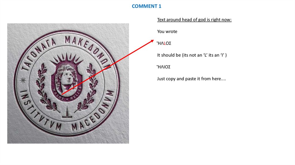
COMMENT 1Text around head of god is right now:
You wrote
ἭΛLΟΣ
It should be (its not an ‘L’ its an ‘I’ )
ἭΛΙΟΣ
Just copy and paste it from here....
2.
COMMENT 2Missing the sun on the right side of the logo…..
It should be there like on the left side
3.
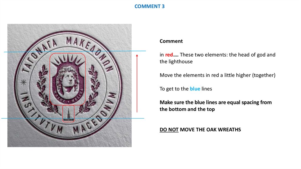
COMMENT 3Comment
in red…. These two elements: the head of god and
the lighthouse
Move the elements in red a little higher (together)
To get to the blue lines
Make sure the blue lines are equal spacing from
the bottom and the top
DO NOT MOVE THE OAK WREATHS
4.
FINAL COMMENTTHANK YOU FOR TAKING THIS JOURNEY WITH US
WE ARE VERY PLEASED WITH THE END RESULT
I DIDN’T TAKE 3 DAYS – BUT 5 BUT THE RESULT IS EVIDENT
PLEASE MAKE THE FINAL CHANGES AND SEND US THE FULL PACKAGE OF LOGO’S:
• IN ALL FORMATS (FILE EXTENSIONS)
• IN ALL COLORS
• IN ALL VARIATIONS
• ALSO THE VERSION ON PAPER – WATERMARK
• IF YOU HAVE SOME VERSIONS LIKE STAMP OR A WAX STAMP WOULD ALSO BE GREAT
ONE REQUEST…I SEE THE GOLDEN WATERMARKED LOGO IS ALWAYS SIDEWAYS…NEXT TIME
YOU SEND IT PLEASE MAKE IT STRAIGHT (LIKE THE THYRE-PURPLE ONE) -----------------
PLEASE SEND ME THE FINAL REQUEST FOR PAYMENT AND I WILL MAKE SURE IT COMPLETED
THANKS AGAIN. JOHN