Похожие презентации:
Usability. Practice 1
1.
UsabilityPractice 1
2.
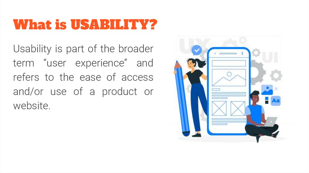
What is USABILITY?Usability is part of the broader
term “user experience” and
refers to the ease of access
and/or use of a product or
website.
3.
“Usability is about human behavior. It recognizes that humans are lazy,get emotional, are not interested in putting a lot of effort into, say,
getting a credit card and generally prefer things that are easy to do vs.
those that are hard to do.”
— David McQuillen, ex-Swiss banker and founder of Sufferfest cycling
workout resources
4.
5.
Usability Elements For Exceptional Experiences1. Effectiveness—It supports users in completing actions
accurately.
2. Efficiency—Users can perform tasks quickly through the
easiest process.
3. Engagement—Users find it pleasant to use and appropriate for
its industry/topic.
6.
Usability Elements For Exceptional Experiences4. Error Tolerance—It supports a range of user actions and only shows
an error in genuine erroneous situations. You achieve this by finding out
the number, type and severity of common errors users make, as well as
how easily users can recover from those errors.
5. Ease of Learning—New users can accomplish goals easily and even
more easily on future visits.
7.
8.
How to design for optimum usability?1. Work with a clear understanding of users’ goals and show it in your
design.
2. Mimic the real world regarding concepts, icons and language.
3. Present instantly understandable, jargon-free messages and actions users
can take—one chief action per screen.
4. Limit options to give a strong information scent on an uncluttered
display—show essential information for completing tasks.
5. Keep content consistent.
9.
How to design for optimum usability?6. Follow established norms regarding function and layout (e.g., logo positioning,
tappable buttons).
7. Use proper font size, color, contrast, whitespace, etc. to:
a. combine aesthetic appeal with scanning readability,
b. present a clear, logical information hierarchy,
c. design for accessibility.
8. Use chunking and emphasize key information at the beginning and end of
interactive sequences.
9. Offer informative feedback about system status.
10. Include helpful navigation systems and search functionality.
10.
A usable interfacehas three main
outcomes
11.
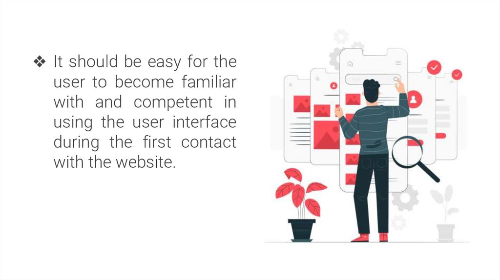
❖ It should be easy for theuser to become familiar
with and competent in
using the user interface
during the first contact
with the website.
12.
❖ It should be easy forusers to achieve their
objective
through
using the website.
13.
❖ It should be easy torecall
the
user
interface and how
to
use
it
on
subsequent visits.
14.
5 quality components of usability● Learnability: How easy is it for users to accomplish basic tasks the first time they
encounter the design?
● Efficiency: Once users have learned the design, how quickly can they perform tasks?
● Memorability: When users return to the design after a period of not using it, how
easily can they reestablish proficiency?
● Errors: How many errors do users make, how severe are these errors, and how easily
can they recover from the errors?
● Satisfaction: How pleasant is it to use the design?
15.
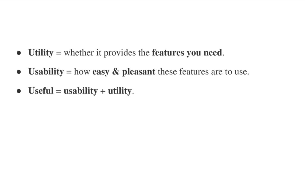
● Utility = whether it provides the features you need.● Usability = how easy & pleasant these features are to use.
● Useful = usability + utility.
16.
Learnability17.
Big theme topics1. Utility as a part of Usability
2. Memorability as a part of Usability
3. Satisfaction as a part of Usability




 Интернет


