Похожие презентации:
Christmas Card
1.
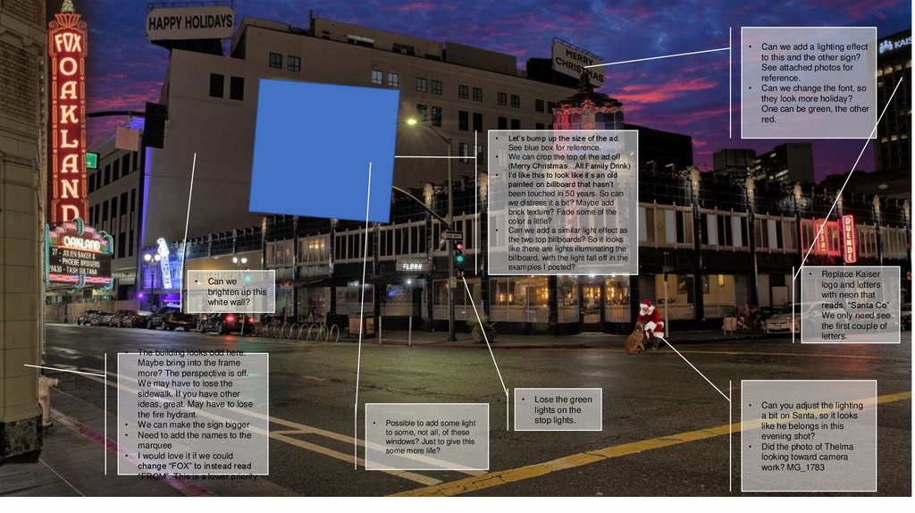
Let’s bump up the size of the ad.
See blue box for reference.
We can crop the top of the ad off
(Merry Christmas…All Family Drink)
I’d like this to look like it’s an old
painted on billboard that hasn’t
been touched in 50 years. So can
we distress it a bit? Maybe add
brick texture? Fade some of the
color a little?
Can we add a similar light effect as
the two top billboards? So it looks
like there are lights illuminating the
billboard, with the light fall off in the
examples I posted?
Can we
brighten up this
white wall?
The building looks odd here.
Maybe bring into the frame
more? The perspective is off.
We may have to lose the
sidewalk. If you have other
ideas, great. May have to lose
the fire hydrant.
We can make the sign bigger
Need to add the names to the
marquee
I would love it if we could
change “FOX” to instead read
“FROM”. This is a lower priority.
Possible to add some light
to some, not all, of these
windows? Just to give this
some more life?
Lose the green
lights on the
stop lights.
Can we add a lighting effect
to this and the other sign?
See attached photos for
reference.
Can we change the font, so
they look more holiday?
One can be green, the other
red.
Replace Kaiser
logo and letters
with neon that
reads, “Santa Co”
We only need see
the first couple of
letters.
Can you adjust the lighting
a bit on Santa, so it looks
like he belongs in this
evening shot?
Did the photo of Thelma
looking toward camera
work? MG_1783


