Похожие презентации:
People Experience Management
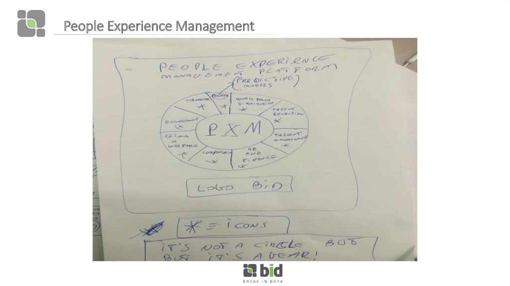
1. People Experience Management
2. People Experience Management
Double click on Turnover Segment3. Turnover
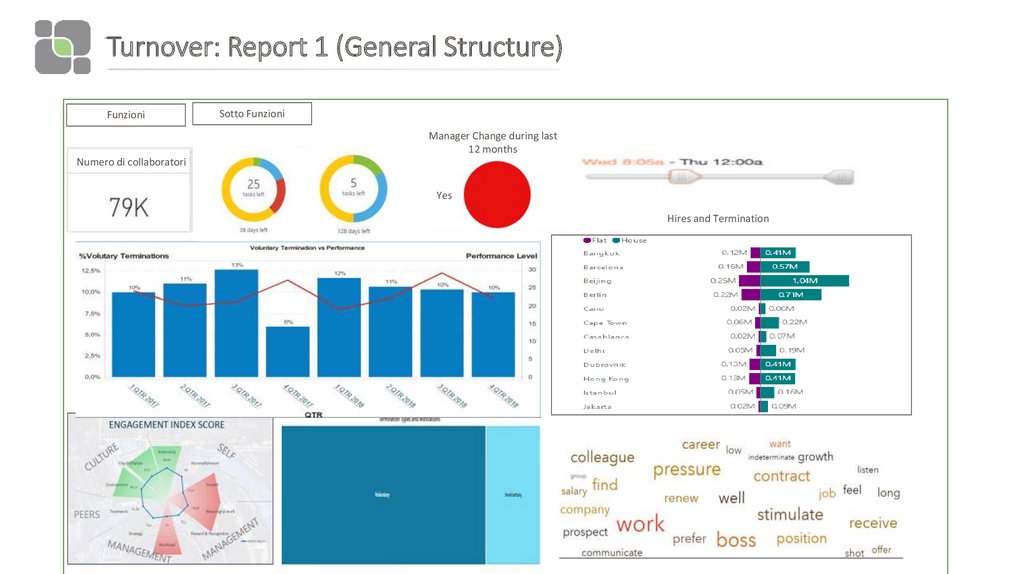
4. Turnover: Report 1 (General Structure)
FunzioniSotto Funzioni
Manager Change during last
12 months
Numero di collaboratori
Yes
Hires and Termination
5. Turnover: Report 1 (Deep dive on objects)
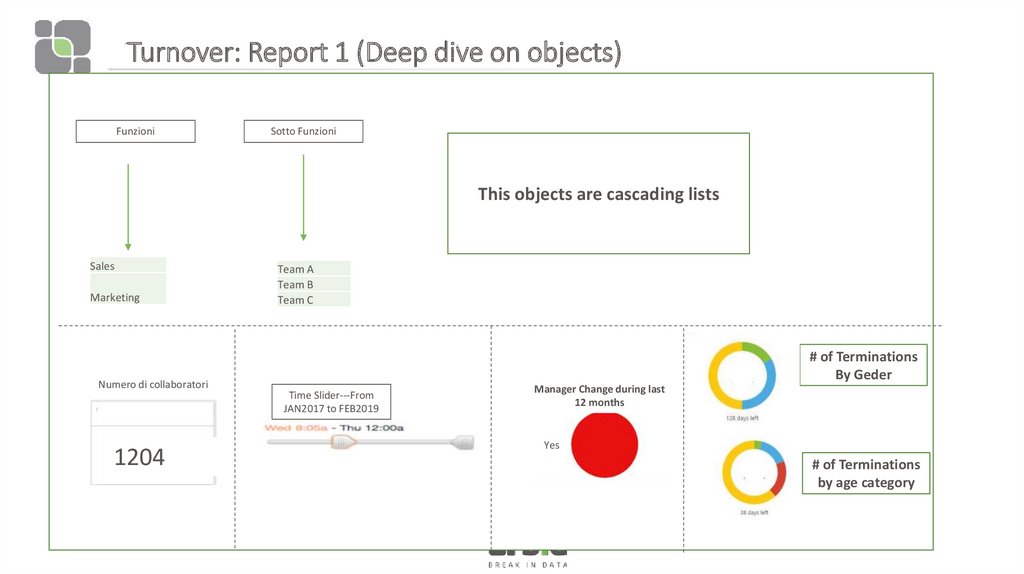
FunzioniSotto Funzioni
This objects are cascading lists
Sales
Marketing
Numero di collaboratori
1204
Team A
Team B
Team C
# of Terminations
By Geder
Time Slider---From
JAN2017 to FEB2019
Manager Change during last
12 months
Yes
# of Terminations
by age category
6. Turnover: Report 1 (Deep dive on objects)
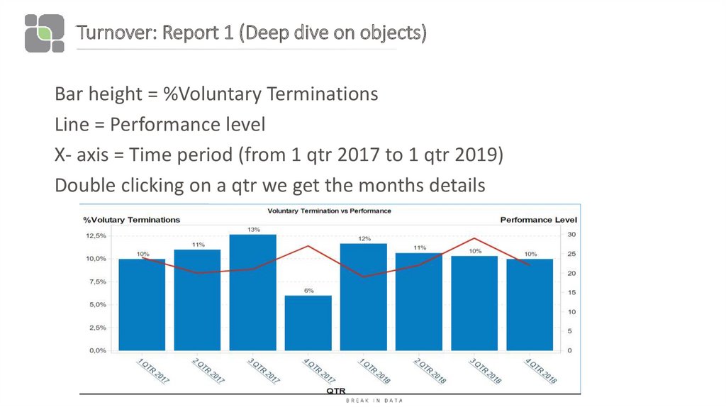
Bar height = %Voluntary TerminationsLine = Performance level
X- axis = Time period (from 1 qtr 2017 to 1 qtr 2019)
Double clicking on a qtr we get the months details
7. Turnover: Report 1 (Deep dive on objects)
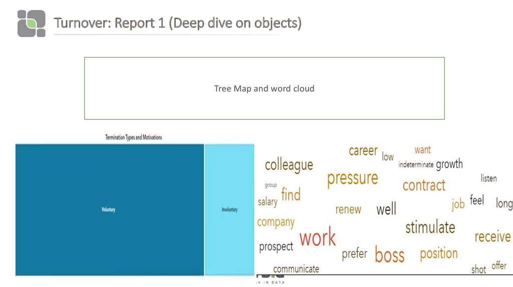
Tree Map and word cloud10/03/2019
8. Turnover: Report 1 (Deep dive on objects)
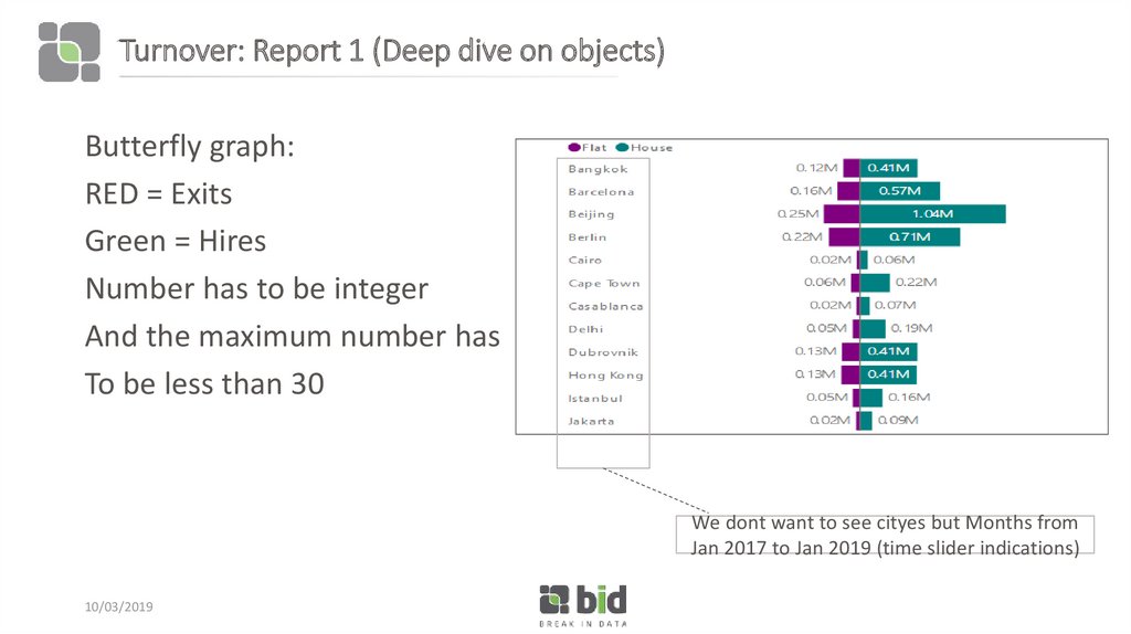
Butterfly graph:RED = Exits
Green = Hires
Number has to be integer
And the maximum number has
To be less than 30
We dont want to see cityes but Months from
Jan 2017 to Jan 2019 (time slider indications)
10/03/2019
9. Turnover: Report 1 (Deep dive on objects)
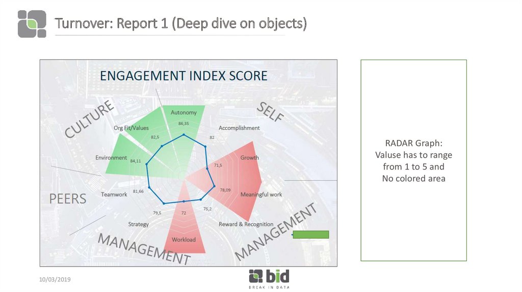
RADAR Graph:Valuse has to range
from 1 to 5 and
No colored area
10/03/2019
10. Story
• We want to analyze %Volutary termination correlated to perfromanceand engagement.
• Clicking on a specific function (eg marketing) all graphs change their
values.
• Then clicking on a specific team we want to show the reduction of
performance - the increment of voluntary termination - the reduction
of engagement.
11. Story
Clicking on cascading list «funzione» select Marketing.All graphs changes a little their values .
Then Clicking on «sottofunzione» team B:
When Team B is selected the graphs changes values:
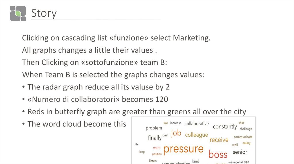
• The radar graph reduce all its valuse by 2
• «Numero di collaboratori» becomes 120
• Reds in butterfly graph are greater than greens all over the city
• The word cloud become this
12. Story
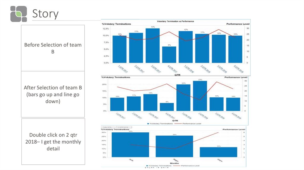
Before Selection of teamB
After Selection of team B
(bars go up and line go
down)
Double click on 2 qtr
2018– I get the monthly
detail
10/03/2019
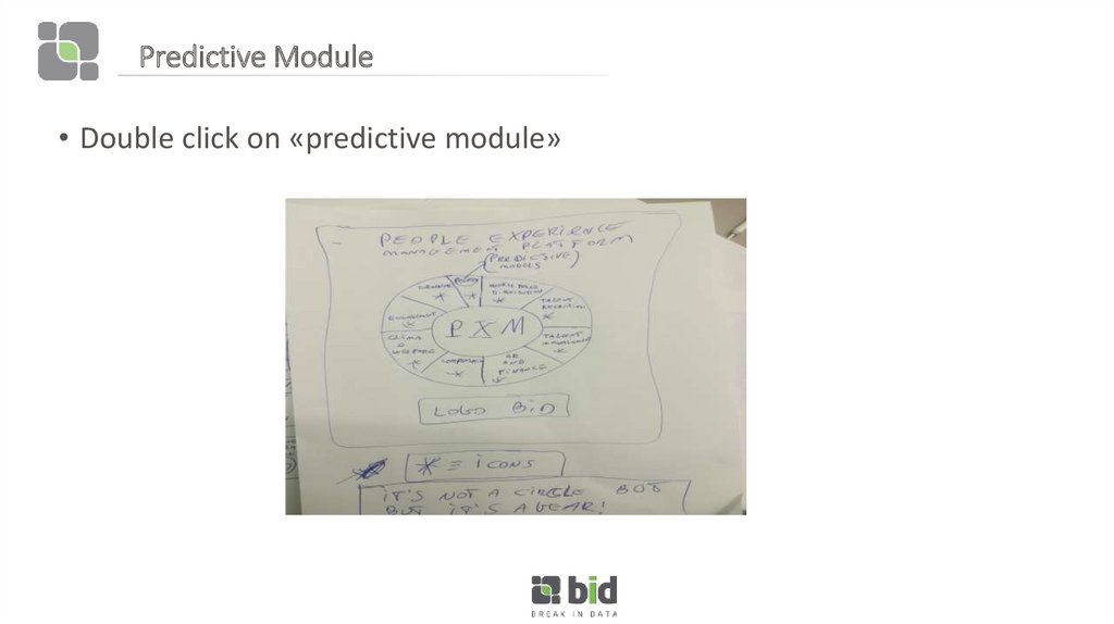
13. Predictive Module
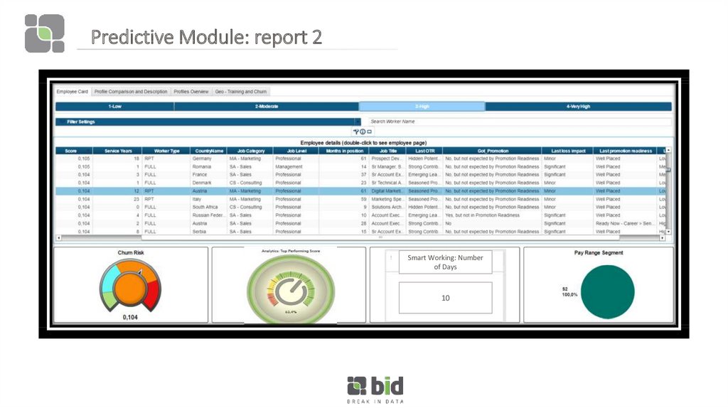
• Double click on «predictive module»14. Predictive Module: report 2
Smart Working: Numberof Days
10
15. Predictive Module: report 2 (story)
• Clicking on different rows of the table, the gauges change their values.• Clicking on the first row we get:
Churn risk = 15 % -- red zone
Top Perfofrming score = 60% green zone
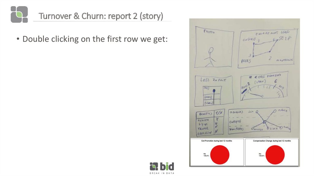
16. Turnover & Churn: report 2 (story)
Turnover & Churn: report 2 (story)• Double clicking on the first row we get:
 Английский язык


