


 -")
")
")


 Информатика
Похожие презентации:

 — Chapter 1 — Farid Feyzi")


")


Organizing data graphical and nabular descriptive techniques
1. Organizing Data Graphical and Tabular Descriptive Techniques
1.2.
3.
4.
5.
6.
7.
8.
9.
Numerical/Quantitative Data
Qualitative/Categorical Data
Graphical Presentation of Qualitative Data
Organizing and Graphing Quantitative Data
Frequency Distributions
Process of Constructing a Frequency Table
Graphing Grouped Data
Ogive
Stem-аnd-Leaf Displays
2.1
2. Learning Objectives
Overall: To give students a basic understandingof best way of presentation of data
Specific: Students will be able to
• Understand Types of data
• Draw Tables
• Draw Graphs
• Make Frequency distribution………….
2
3.
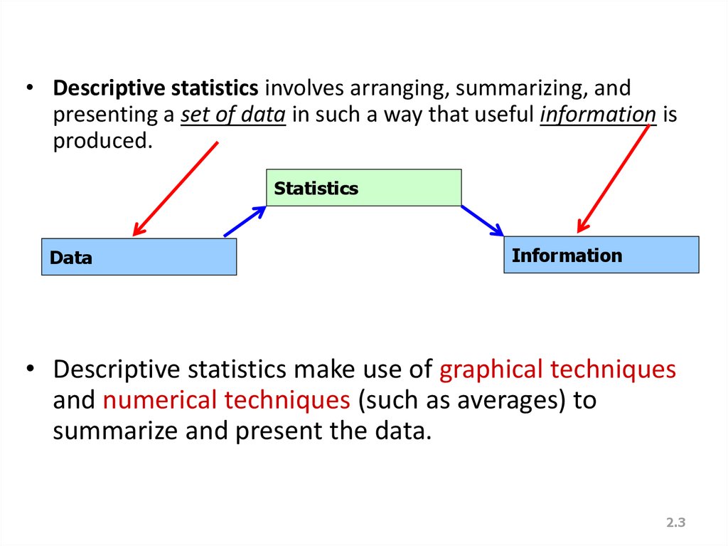
• Descriptive statistics involves arranging, summarizing, andpresenting a set of data in such a way that useful information is
produced.
Statistics
Data
Information
• Descriptive statistics make use of graphical techniques
and numerical techniques (such as averages) to
summarize and present the data.
2.3
4. DATA MINING
• Most companies routinely collect data – atthe cash register for each purchase, on the
factory floor from each step of production,
or on the Internet from each visit to its
website – resulting in huge databases
containing potentially useful information
about how to increase sales, how to
improve production, or how to turn mouse
clicks into purchases.
4
5.
• DATA MINING is a collection of methods forobtaining useful knowledge by analyzing large
amounts of data, often by searching for hidden
patterns. Once a business has collected
information for some purpose, it would be
wasteful to leave it unexplored when it might
be useful in many other ways. The goal of data
mining is to obtain value from these vast stores
of data, in order to improve the company with
higher sales, lower costs, and better products.
Here are just a few of the many areas of
business in which data mining can be helpful:
5
6.
1. Marketing and sales: companies have lots ofinformation about past contacts with
potential customers and their results. These
data can be mined for guidance on how (and
when) to better reach customers in the
future. One example is the difficult decision
of when a store should reduce prices: reduce
too soon and you lose money (on items that
might have been sold for more); reduce too
late and you may be stuck (with items no
longer in season).
6
7.
• Finance: Mining of financial data can beuseful in forming and evaluating investment
strategies and in hedging (or reducing) risk. In
the stock markets alone, there are many
companies: about 3,298 listed on the New
York Stock Exchange and about 2,942
companies listed on the NASDAQ Stock
Market. Historical information on price and
volume (number of shares traded) is easily
available to anyone interested in exploring
investment strategies.
7
8.
• Statistical methods, such as hypothesistesting, are helpful as part of data mining
distinguish random from systematic behavior
because stock that performed well last year
will not necessarily perform well next year.
Imagine that you toss 100 coins six times each
and then carefully choose the one that came
up “heads” all six times – this coin is not as
special as it might seem!
8
9.
3. Product design: What particularcombinations of features are
customers ordering in larger-thanexpected quantities? The answers
could help you create products to
appeal to a group of potential
customers who would not take
the trouble to place special
orders.
9
10.
• 4. ProductionImagine a factory running 24/7 with thousands
of partially completed units, each with its bar
code, being carefully tracked by the computer
system, with efficiency and quality being
recorder as well. This is a tremendous source of
information that can tell you about the kinds of
situations that cause trouble (such as finding a
machine that needs adjustment by noticing
clusters of units that don’t work) or the kinds of
situations that lead to extra-fast production of
the highest quality.
10
11.
5. Fraud detections:• Fraud can affect many areas of business,
including consumer finance, insurance, and
networks (including telephone and the
Internet). One of the best methods of
protection involves mining data to distinguish
between ordinary and fraudulent patterns of
usage, then using the results to classify new
transactions, and looking carefully at
suspicious new occurrences to decide where
or not fraud is actually involved.
11
12.
• YOU once received a telephone call from yourcredit card company asking you to verify
recent transactions – identified by its
statistical analysis – that departed from your
typical pattern of spending. One fraud risk
identification system that helps detect
fraudulent use of credit card is Falcon Fraud
Manager from Fair Isaac, which uses the
flexible “neural network” data-mining
technique
12
13.
• Data mining is a large task thatinvolves combining resources from
many fields. Here is how statistics,
computer science, and optimization
are used in data mining.
13
14.
• Statistics: All of the basic activities ofstatistics are involved: a design for
collecting the data, exploring for patterns,
a modeling framework, estimation of
features, and hypothesis testing to assess
significance of patterns as a “reality check”
on the results. Nearly every method in the
rest of this lectures has the potential to be
useful in data mining, depending on the
database and the needs of the company.
14
15.
• Some specialized statistical methods areparticularly useful, including
classification analysis (also called
discriminant analysis) to assign a new
case to a category (such as “likely
purchaser” or “fraudulent”), cluster
analysis to identify homogeneous group
of individuals, and prediction analysis
(also called regression analysis).
15
16.
• Computer science: Efficient algorithms(computer instructions) are needed for
collecting, maintaining, organizing, and
analyzing data. Creative methods involving
artificial intelligence are useful, including
machine learning techniques for prediction
analysis such as neural networks and boosting,
to learn from the data by identifying useful
patterns automatically. Some of these
methods from computer science are closely
related to statistical prediction analysis.
16
17.
• Optimization:• These methods help you achieve a goal,
which might be very specific such as
maximizing profits, lowering
production cost, finding new
customers, developing profitable new
product models, or increasing sales
volume.
17
18.
• Alternatively, the goal might be more vaguesuch as obtaining a better understanding of
the different types of customers you serve,
characterizing the differences in production
quality that occur under different
circumstances, or identifying relationships
that occur more or less consistently
throughout the data. Optimization is often
accomplished by adjusting the parameters
of a model until the objective is achieved.
18
19. WHAT IS PROBABILITY?
WHAT IS PROBABILITY?• Probability is a what if tool for understanding risk
and uncertainty. Probability shows you the
likelihood, or chances, for each of the various
potential future events, based on a set of
assumptions about how the world works. For
example, you might assume that you know
basically how the world works (i.e., all of the
details of process that will produce success or
failure or payoffs in between). Probabilities of
various outcomes would then be computed for
each of several strategies to indicate how
successful each strategy would be.
19
20.
• You might learn, for example, that aninternational project has only an 8% chance of
success (i.e. the probability of success is 0.08),
but if you assume that the government can
keep inflation low, then the chance of success
rises to 35% - still very risky, but a much better
situation than the 8% chance. Probability will
not tell you whether to invest in the project, but
it will help you keep your eyes open to the
realities of the situation.
20
21.
Here are additional examples of situationswhere finding the appropriate answer requires
computing or estimating a probability number:
1. Given the nature of an investment portfolio
and a set of assumptions that describe how
financial markets work, what are the chances
that you will profit over a one-year horizon?
2. What are the chances of rain tomorrow? What
are the chances that next winter will be cold
enough so that your heating-oil business will
make a profit?
21
22.
3. What are the chances that a foreign country(where you have a manufacturing plant) will
become involved in civil war over the next
two years?
4. What are the chances that the college
student you just interviewed for a job will
become a valued employee over the coming
months?
22
23.
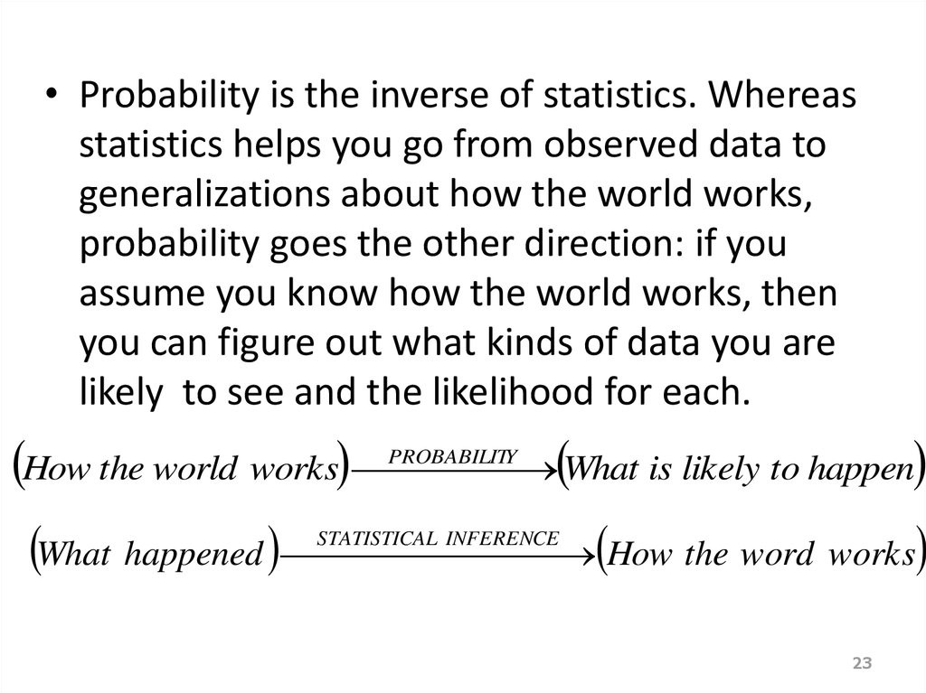
• Probability is the inverse of statistics. Whereasstatistics helps you go from observed data to
generalizations about how the world works,
probability goes the other direction: if you
assume you know how the world works, then
you can figure out what kinds of data you are
likely to see and the likelihood for each.
How the world works What is likely to happen
PROBABILITY
What happened How the word works
STATISTICAL INFERENCE
23
24.
• Probability also works together withstatistics by providing a solid foundation for
statistical inference. When there is
uncertainty, you cannot know exactly what
will happen, and there is some chance of
error. Using probability, you will learn ways
to control the error rate so that it is, say, less
than 5% or less than 1% of the time.
24
25.
2526. Definitions…
• A variable [Typically called a “random” variablesince we do not know it’s value until we observe it]
is some characteristic of a population or sample.
E.g. student grades, weight of a potato, # heads in 10 flips
of a coin, etc.
Typically denoted with a capital letter: X, Y, Z…
• The values of the variable are the range of possible
values for a variable.
E.g. student marks (0..100)
• Data are the observed values of a random variable.
E.g. student marks: {67, 74, 71, 83, 93, 55, 48}
2.26
27. We Deal with “2” Types of Data
• Numerical/Quantitative Data [Real Numbers]:* height
* weight
* temperature
• Qualitative/Categorical Data [Labels rather
than numbers]:
* favorite color
* Gender
* SES
2.27
28. Quantitative/Numerical Data…
• Quantitative Data is further broken downinto
Continuous Data – Data can be any real
number within a given range. Normally
measurement data [weights, Age, Prices, etc]
Discrete Data – Data can only be very specific
values which we can list. Normally count
data [# of firecrackers in a package of 100 that fail to pop, # of
accidents on the UTA campus each week, etc]
2.28
29. Qualitative/Categorical Data
• Nominal Data [has no natural order to the values].E.g. responses to questions about marital
status: Single = 1, Married = 2, Divorced = 3,
Widowed = 4
• Arithmetic operations don’t make any sense (e.g.
does Widowed ÷ 2 = Married?!)
• Ordinal Data [values have a natural order]:
E.g. College course rating system: poor = 1,
fair = 2, good = 3, very good = 4, excellent = 5
2.29
30. Graphical & Tabular Techniques for Nominal Data…
Graphical & Tabular Techniques for Nominal Data…• The only allowable calculation on nominal data is
to count the frequency of each value of the
variable.
• We can summarize the data in a table that
presents the categories and their counts called a
frequency distribution.
• A relative frequency distribution lists the
categories and the proportion with which each
occurs.
• Since Nominal data has no order, if we arrange
the outcomes from the most frequently occurring
to the least frequently occurring, we call this a
“pareto chart”
2.30
31. Nominal Data (Tabular Summary) -
2.3132. Nominal Data (Frequency)
Bar Charts are often used to display frequencies…Is there a better way to order these? Would Bar Chart
look different if we plotted “relative frequency” rather than “frequency”?
2.32
33. Nominal Data (Relative Frequency)
Pie Charts show relative frequencies…2.33
34. Frequency Distributions
DefinitionA frequency distribution for
qualitative data lists all categories and
the number of elements that belong to
each of the categories.
34
35. Example 2.2
A sample of 30 employees from largecompanies was selected, and these employees
were asked how stressful their jobs were. The
responses of these employees are recorded
next where very represents very stressful,
somewhat means somewhat stressful, and none
stands for not stressful at all.
35
36. Example 2.2
Some whatNone
Very
Somewhat Very
Very
None
Somewhat Somewhat Very
Somewhat
Somewhat
Very
Somewhat None
None
Somewhat
Somewhat
Very
Somewhat Somewhat Very
None
Somewhat
Very
very
Somewhat
Very
somewhat None
Construct a frequency distribution table for these
data.
36
37. Solution 2.2
Table 2.2 Frequency Distribution of Stress on JobStress on Job
Very
Somewhat
None
Tally
|||| ||||
|||| |||| ||||
|||| |
Frequency (f)
10
14
6
Sum = 30
37
38. Relative Frequency and Percentage Distributions
Calculating Relative Frequency of aCategory
Re lative frequency of a category
Frequency of that category
Sum of all frequencie s
38
39. Relative Frequency and Percentage Distributions cont.
Calculating PercentagePercentage =
= (Relative frequency) · 100
39
40. Example 2.3
Determine the relative frequencyand percentage for the data in
Table 2.4.
40
41. Solution 2-2
Table 2.3 Relative Frequency and PercentageDistributions of Stress on Job
Stress on
Job
Very
Somewhat
None
Relative Frequency
Percentage
10/30 = .333
14/30 = .467
6/30 = .200
.333(100) = 33.3
.467(100) = 46.7
.200(100) = 20.0
Sum = 1.00
Sum = 100
41
42.
Graphical Presentation of QualitativeData
Definition
A graph made of bars whose
heights represent the frequencies
of respective categories is called a
bar graph.
42
43. Figure 2.2 Bar graph for the frequency distribution of Table 2.3
FrequencyFrequency
16
16
14
14
12
12
10
10
88
66
44
22
00
Very
Very
Somewhat
Somewhat
Strees
Strees on
on Job
Job
None
None
43
44.
Graphical Presentation of QualitativeData cont.
Definition
A circle divided into portions that represent
the relative frequencies or percentages of a
population or a sample belonging to different
categories is called a pie chart.
44
45. Table 2.4 Calculating Angle Sizes for the Pie Chart
Stress onJob
Very
Somewhat
None
Relative
Frequency
.333
.467
.200
Sum = 1.00
Angle Size
360(.333) = 119.88
360(.467) = 168.12
360(.200) = 72.00
Sum = 360
45
46. Figure 2.4 Pie chart for the percentage distribution of Table 2.5.
47. ORGANIZING AND GRAPHING QUANTITATIVE DATA
Frequency Distributions
Constructing Frequency Distribution Tables
Relative and Percentage Distributions
Graphing Grouped Data
– Histograms
– Polygons
47
48. Frequency Distributions
Table 2.7 Weekly Earnings of 100 Employeesof a Company
Variable
Third class
Weekly Earnings
(dollars)
Number of Employees Frequency
f
column
401 to 600
601 to 800
801 to 1000
1001 to 1200
1201 to 1400
1401 to 1600
Lower limit of the sixth
class
9
22
39
15
9
6
Frequency of
the third class
Upper limit of the
sixth class
48
49. Frequency Distributions cont.
DefinitionA frequency distribution for quantitative data
lists all the classes and the number of values
that belong to each class. Data presented in the
form of a frequency distribution are called
grouped data.
49
50. Essential Question :
How do we construct a frequencydistribution table?
51. Process of Constructing a Frequency Table
STEP 1: Determine the range.R = Highest Value – Lowest
Value
52.
STEP 2. Determine the tentativenumber of classes (k)
k = 1 + 3.322 log N
Always round – off
Note: The number of classes should be between
5 and 20. The actual number of classes may be
affected by convenience or other subjective
factors
53.
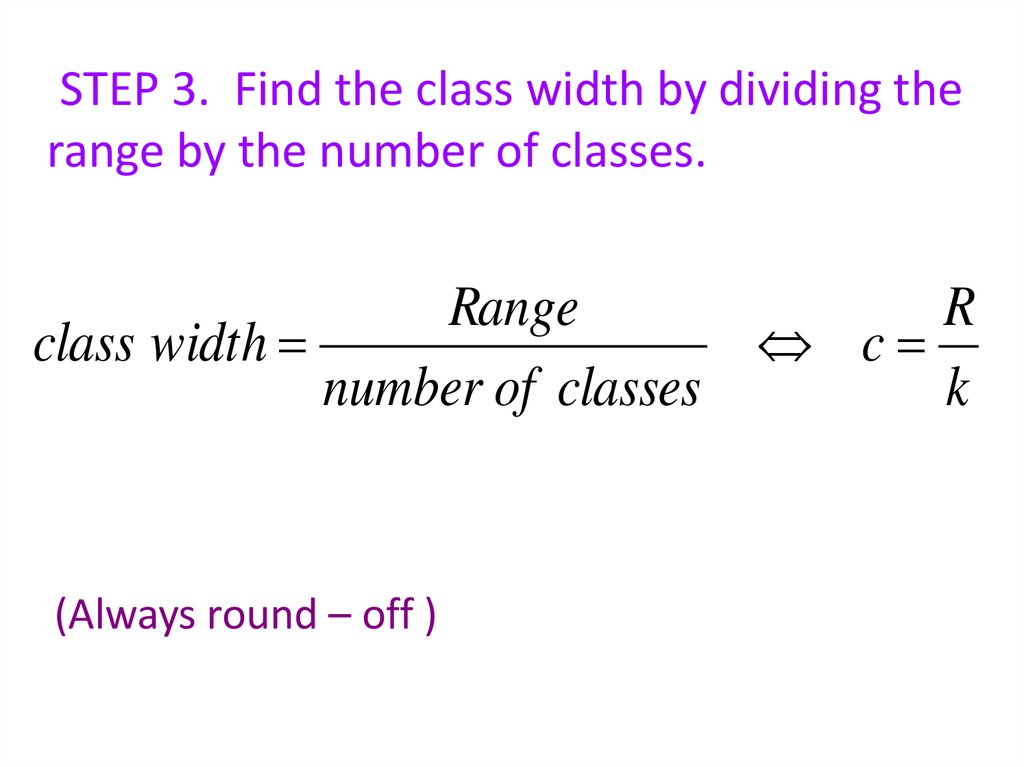
STEP 3. Find the class width by dividing therange by the number of classes.
Range
class width
number of classes
(Always round – off )
R
c
k
54.
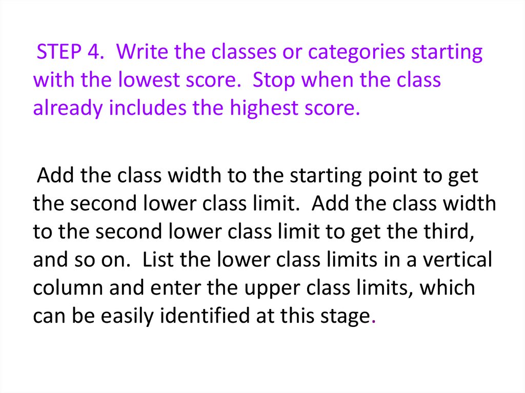
STEP 4. Write the classes or categories startingwith the lowest score. Stop when the class
already includes the highest score.
Add the class width to the starting point to get
the second lower class limit. Add the class width
to the second lower class limit to get the third,
and so on. List the lower class limits in a vertical
column and enter the upper class limits, which
can be easily identified at this stage.
55.
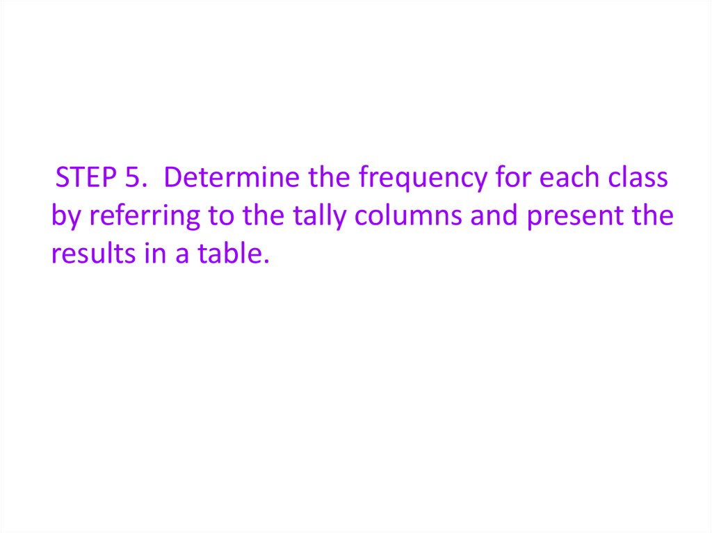
STEP 5. Determine the frequency for each classby referring to the tally columns and present the
results in a table.
56. When constructing frequency tables, the following guidelines should be followed.
1. The classes must be mutuallyexclusive. That is, each score must
belong to exactly one class.
2. Include all classes, even if the
frequency might be zero.
57.
3. All classes should have the samewidth, although it is sometimes
impossible to avoid open – ended
intervals such as “65 years or older”.
4. The number of classes should be
between 5 and 20.
58. Let’s Try!!!
• Time magazine collected informationon all 464 people who died from
gunfire in the Philippines during one
week. Here are the ages of 50 men
randomly
selected
from
that
population. Construct a frequency
distribution table.
59.
1923
47
17
24
21
27
18
25
69
36
29
27
23
30
21
20
65
42
23
40
33
31
70
37
25
41 33
65 17
18 24
22 25
26 46
71 37
73
20
35
65
27
75
25
76
24
16
63
25
60.
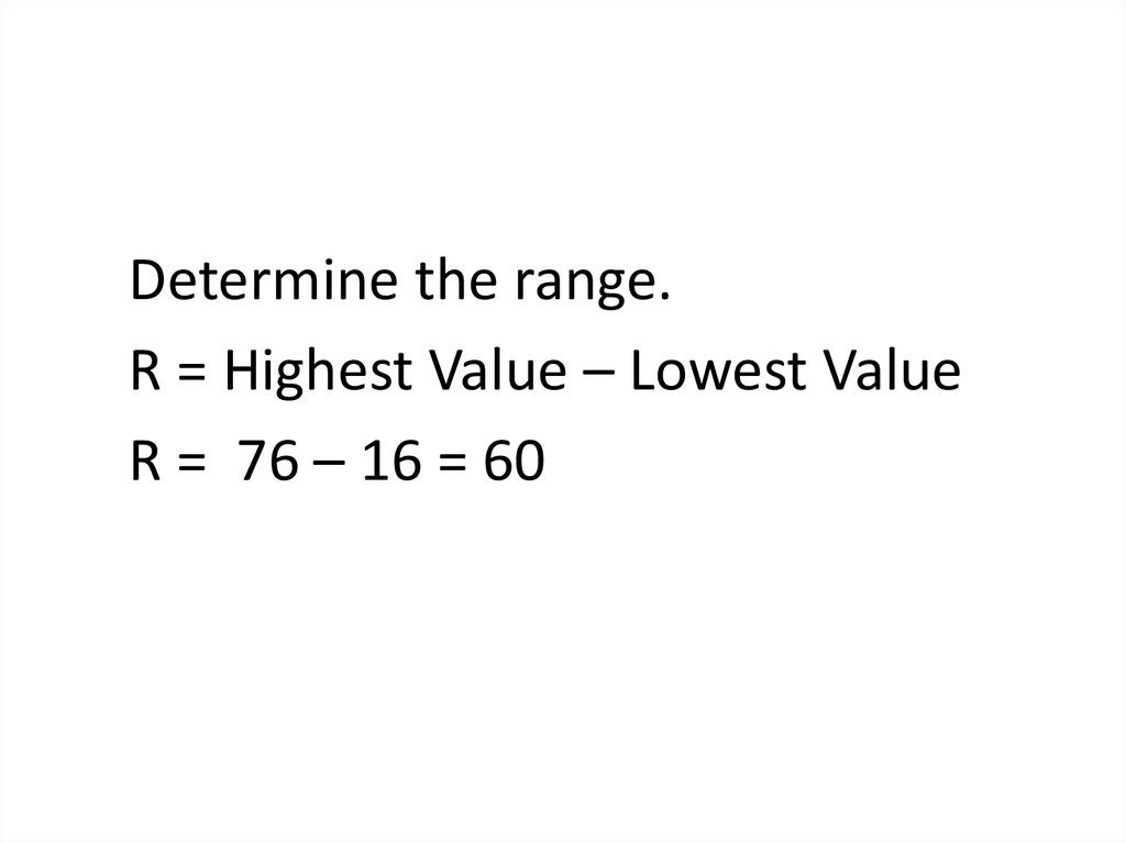
Determine the range.R = Highest Value – Lowest Value
R = 76 – 16 = 60
61.
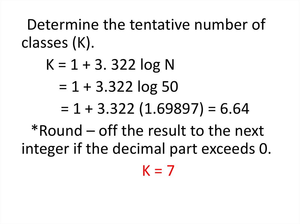
Determine the tentative number ofclasses (K).
K = 1 + 3. 322 log N
= 1 + 3.322 log 50
= 1 + 3.322 (1.69897) = 6.64
*Round – off the result to the next
integer if the decimal part exceeds 0.
K=7
62.
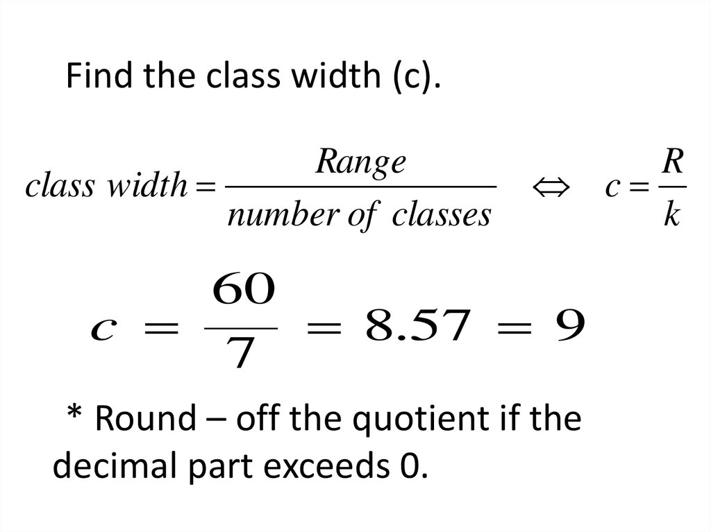
Find the class width (c).Range
class width
number of classes
R
c
k
60
c
8.57 9
7
* Round – off the quotient if the
decimal part exceeds 0.
63. Write the classes starting with lowest score.
Classes70
61
52
43
34
25
16
–
–
–
–
–
–
–
78
69
60
51
42
33
24
Tally Marks
/////
/////
//
/////-//
/////-/////-////
/////-/////-/////-//
Freq.
5
5
0
2
7
14
17
64.
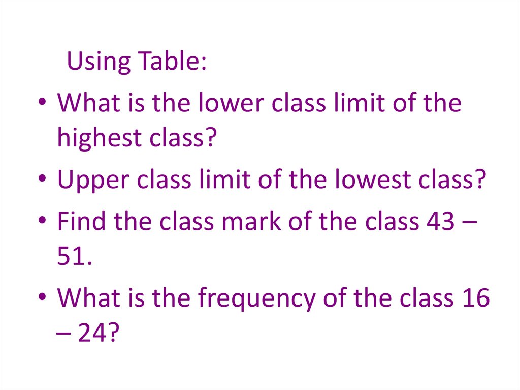
Using Table:
What is the lower class limit of the
highest class?
Upper class limit of the lowest class?
Find the class mark of the class 43 –
51.
What is the frequency of the class 16
– 24?
65.
Classes70
61
52
43
34
25
16
–
–
–
–
–
–
–
78
69
60
51
42
33
24
Class
boundaries
69.5
60.5
51.5
42.5
33.5
24.5
15.5
–
–
–
–
–
–
–
78.5
69.5
60.5
51.5
42.5
33.5
24.5
Tally Marks
/////
/////
//
/////-//
/////-/////-////
/////-/////-///////
Freq
.
x
5
5
0
2
7
14
17
74
65
56
47
38
29
20
66. Example
Table 2.9 gives the total home runs hit by allplayers of each of the 30 Major League Baseball
teams during the 2012 season. Construct a
frequency distribution table.
66
67. Table 2.9 Home Runs Hit by Major League Baseball Teams During the 2012 Season
TeamAnaheim
Arizona
Atlanta
Baltimore
Boston
Chicago Cubs
Chicago White Sox
Cincinnati
Cleveland
Colorado
Detroit
Florida
Houston
Kansas City
Los Angeles
Home Runs
152
165
164
165
177
200
217
169
192
152
124
146
167
140
155
Team
Milwaukee
Minnesota
Montreal
New York Mets
New York Yankees
Oakland
Philadelphia
Pittsburgh
St. Louis
San Diego
San Francisco
Seattle
Tampa Bay
Texas
Toronto
Home Runs
139
167
162
160
223
205
165
142
175
136
198
152
133
230
187
67
68. Solution 2-3
Approximat e width of each class230 124
21.2
5
Now we round this approximate width to a
convenient number – say, 22.
68
69. Solution 2-3
The lower limit of the first class canbe taken as 124 or any number less
than 124. Suppose we take 124 as the
lower limit of the first class. Then our
classes will be
124 – 145, 146 – 167, 168 – 189,
190 – 211, and 212 - 233
69
70. Table 2.10 Frequency Distribution for the Data of Table 2.9
Total HomeRuns
124 – 145
146 – 167
168 – 189
190 – 211
212 - 233
Tally
|||| |
|||| |||| |||
||||
||||
|||
f
6
13
4
4
3
∑f = 30
70
71. Relative Frequency and Percentage Distributions
Relative Frequency and Percentage DistributionsFrequency of that class
f
Relative frequency of a class
Sum of all frequencie s f
Percentage (Relative frequency) 100
71
72. Example 2-4
Calculate the relative frequencies andpercentages for Table 2.10
72
73. Solution 2-4
Table 2.11 Relative Frequency and PercentageDistributions for Table 2.10
Total
Home
Runs
Class Boundaries
Relative
Frequency
Percentage
124 – 145
146 – 167
168 – 189
190 – 211
212 - 233
123.5 to less than 145.5
145.5 to less than 167.5
167.5 to less than 189.5
189.5 to less than 211.5
211.5 to less than 233.5
.200
.433
.133
.133
.100
20.0
43.3
13.3
13.3
10.0
Sum =
.999
Sum =
99.9%
73
74. Graphing Grouped Data
DefinitionA histogram is a graph in which classes are
marked on the horizontal axis and the
frequencies, relative frequencies, or percentages
are marked on the vertical axis. The frequencies,
relative frequencies, or percentages are
represented by the heights of the bars. In a
histogram, the bars are drawn adjacent to each
other.
74
75. Figure 2.3 Frequency histogram for Table 2.10.
15Frequency
12
9
6
3
0
124 - 146 145
167
168 -
190 -
212 -
189
211
233
Total home runs
75
76. Figure 2.4 Relative frequency histogram for Table 2.10.
Relative Frequency.50
.40
.30
.20
.10
0
124 145
146 167
168 -
190 -
212 -
189
211
233
Total home runs
76
77. Graphing Grouped Data cont.
DefinitionA graph formed by joining the
midpoints of the tops of successive
bars in a histogram with straight lines
is called a polygon.
77
78. Figure 2.5 Frequency polygon for Table 2.10.
15Frequency
12
9
6
3
0
124 145
146 167
168 -
190 -
212 -
189
211
233
78
79. Figure 2.6 Frequency Distribution curve
FrequencyFigure 2.6 Frequency Distribution curve
x
79
80. Example 2-5
The following data give the average travel timefrom home to work (in minutes) for 50 states.
The data are based on a sample survey of
700,000 households conducted by the Census
Bureau (USA TODAY, August 6, 2013).
80
81. Example 2-5
22.419.7
21.6
15.4
21.1
18.2
27.0
21.9
22.1
25.4
23.7
21.7
23.2
19.6
24.9
19.8
17.6
16.0
21.4
25.5
26.7
17.7
16.1
23.8
20.1
23.4
22.5
22.3
21.9
17.1
23.5
23.7
24.4
21.9
22.5
21.2
28.7
15.6
24.3
29.2
19.9
22.7
26.7
26.1
31.2
23.6
24.2
22.7
22.6
20.8
Construct a frequency distribution table. Calculate
the relative frequencies and percentages for all
classes.
81
82. Solution 2-5
Approximat e width of each class31.2 15.4
2.63
6
82
83. Solution 2-5
Table 2.12Frequency, Relative Frequency, and Percentage
Distributions of Average Travel Time to Work
Class Boundaries
15
18
21
24
27
30
to
to
to
to
to
to
less
less
less
less
less
less
than
than
than
than
than
than
18
21
24
27
30
33
f
Relative
Frequency
Percentage
7
7
23
9
3
1
.14
.14
.46
.18
.06
.02
14
14
46
18
6
2
Σf =50
Sum = 1.00
Sum = 100%
83
84. Example 2-6
The administration in a large city wanted to know thedistribution of vehicles owned by households in that
city. A sample of 40 randomly selected households
from this city produced the following data on the
number of vehicles owned:
5 1 1 2 0 1 1 2 1 1
1 3 3 0 2 5 1 2 3 4
2 1 2 2 1 2 2 1 1 1
4 2 1 1 2 1 1 4 1 3
Construct a frequency distribution table for these data,
and draw a bar graph.
84
85. Solution 2-6
Table 2.13 Frequency Distribution of Vehicles OwnedVehicles Owned
Number of Households (f)
0
1
2
3
4
5
2
18
11
4
3
2
Σf = 40
85
86. Figure 2.7 Bar graph for Table 2.13.
2018
16
Frequency
14
12
10
8
6
4
2
0
No Car
1 Car
2 Cars
3 Cars
4 Cars
5 Cars
Vehicles ow ned
86
87. Ogive
• The ogive is a graph that represents thecumulative frequencies for the classes in a
frequency distribution
• Step 1. Find the cumulative frequency for each
class.
• Step 2. Draw the x and y axes. Label the x-axis
with the class boundaries.
• Step 3. Plot the cumulative frequency at each
upper class boundary.
88. Ogive
Cumulative FreqeuncyCumulative Frequency Distribution of Ages of
Students
80
70
60
50
40
30
20
10
0
14.5
19.5
24.5
29.5
Age
34.5
39.5
44.5
49.5
89. Patterns of Scatter Diagrams…
• Linearity and Direction are two concepts weare interested in
Positive Linear Relationship
Negative Linear Relationship
Weak or Non-Linear Relationship
2.89