


 Информатика
Похожие презентации:


Visual storytelling &data visualization best practices
1.
VISUAL STORYTELLING&DATA VISUALIZATION
BEST PRACTICES
2017
CONFIDENTIAL
1
2.
AGENDA1. Introduction
2. How do we visualize data?
3. Chart Types
4. Best Practices – What to avoid,
what to do
5. UI & UX
6. The Importance of Storytelling
7. Appendix – EPAM visualization
standards
CONFIDENTIAL
2
3.
VISUAL STORYTELLING &DATA VISUALIZATION BEST PRACTICES1. INTRODUCTION
CONFIDENTIAL
3
4.
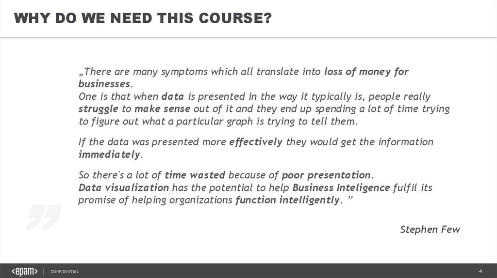
WHY DO WE NEED THIS COURSE?„There are many symptoms which all translate into loss of money for
businesses.
One is that when data is presented in the way it typically is, people really
struggle to make sense out of it and they end up spending a lot of time trying
to figure out what a particular graph is trying to tell them.
„
If the data was presented more effectively they would get the information
immediately.
So there's a lot of time wasted because of poor presentation.
Data visualization has the potential to help Business Inteligence fulfil its
promise of helping organizations function intelligently. ’’
CONFIDENTIAL
Stephen Few
4
5.
WHAT WILL YOU LEARN?CONFIDENTIAL
Get tips how to improve
visuals to
support decision making
Learn how can the same
information be represented
differently
See Best-In-Class examples
from the business
cases for story telling
Understand how to
implement the What-WhyHow concept into analysis
Collect inputs on how to
apply data visualization best
practices
See the importance of good
UI and UX design
5
6.
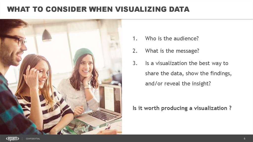
WHAT TO CONSIDER WHEN VISUALIZING DATA1.
Who is the audience?
2.
What is the message?
3.
Is a visualization the best way to
share the data, show the findings,
and/or reveal the insight?
Is it worth producing a visualization ?
CONFIDENTIAL
6
7.
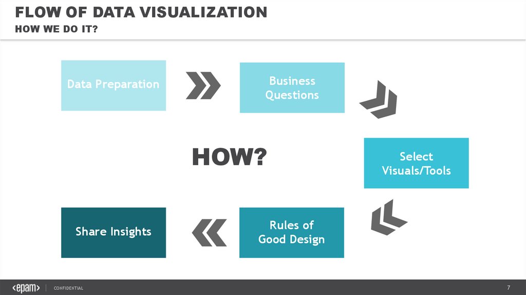
FLOW OF DATA VISUALIZATIONHOW WE DO IT?
Data Preparation
Business
Questions
HOW?
Share Insights
CONFIDENTIAL
Select
Visuals/Tools
Rules of
Good Design
7
8.
VISUAL STORYTELLING &DATA VISUALIZATION BEST PRACTICES2. HOW DO WE VISUALIZE DATA?
CONFIDENTIAL
8
9.
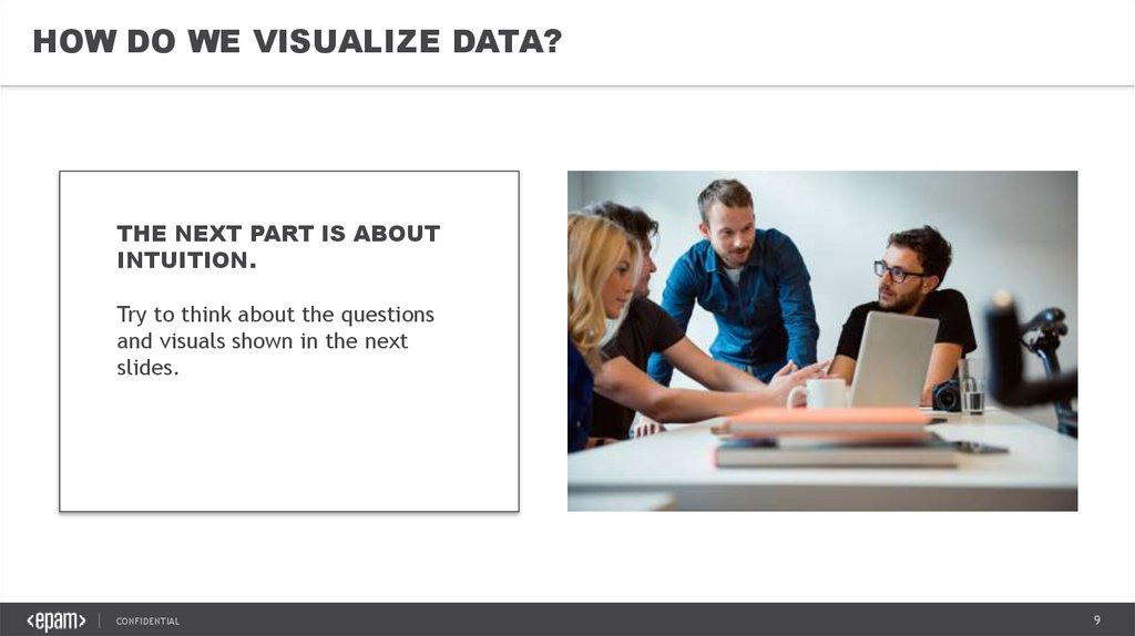
HOW DO WE VISUALIZE DATA?THE NEXT PART IS ABOUT
INTUITION.
Try to think about the questions
and visuals shown in the next
slides.
CONFIDENTIAL
9
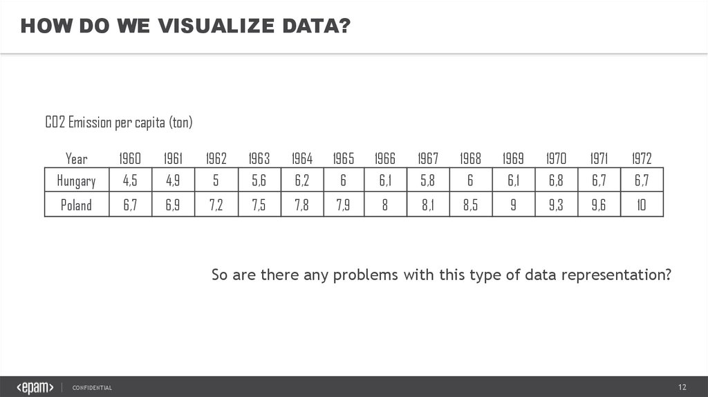
10.
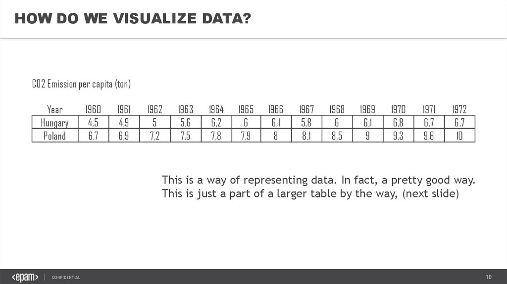
HOW DO WE VISUALIZE DATA?CO2 Emission per capita (ton)
Year
Hungary
Poland
1960
4,5
6,7
1961
4,9
6,9
1962
5
7,2
1963
5,6
7,5
1964
6,2
7,8
1965
6
7,9
1966
6,1
8
1967
5,8
8,1
1968
6
8,5
1969
6,1
9
1970
6,8
9,3
1971
6,7
9,6
1972
6,7
10
This is a way of representing data. In fact, a pretty good way.
This is just a part of a larger table by the way, (next slide)
CONFIDENTIAL
10
11.
HOW DO WE VISUALIZE DATA?CO2 Emission per capita (ton)
Year
1960
1961
1962
1963
1964
1965
1966
1967
1968
1969
1970
1971
1972
1973
1974
1975
1976
1977
1978
1979
1980
1981
1982
1983
1984
1985
1986
1987
1988
1989
1990
Hungary
4,54447 4,88333 5,02504 5,57905 6,16624 6,04004 6,06504 5,75824 5,96292 6,06091 6,77149 6,68246 6,67703 7,00424 7,07174 7,15238 7,54943 7,81405 8,25355 8,05571 8,10935 8,08621 8,11461 8,33881 8,51638 8,08594 7,85828 7,95613 7,38592 7,25933 6,06855
Poland
6,74036
6,9228 7,15361 7,52862 7,80729 7,86205
7,9757 8,10583 8,54859 9,02208 9,32032 9,55499 9,98174 10,0766 10,2995 11,0409 11,6146 12,0794 12,3566 12,5539 13,0594 11,4228 11,6535 11,5482 11,7573 11,9859
1991
6,1152
1992
1993
1994
1995
1996
1997
1998
5,6614 5,80417 5,61465 5,81453 6,08059 6,00626 5,91988
12,104 12,3541 11,7907 11,1636 9,62387 9,45432 9,31306 9,16554
1999
2000
5,8962 5,60556
8,7218 8,98598 9,29007 9,08285 8,45591 8,20308 7,84556
2001
2002
2003
2004
2005
2006
2007
2008
2009
2010
5,5972 5,52183 5,83162 5,67439 5,74167 5,68289 5,55496 5,44487 4,85658 5,05825
7,9169 7,76691 7,97957
7,9877 7,95479 8,38998 8,27997 8,29163 7,83158 8,30863
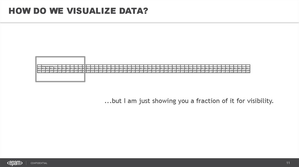
...but I am just showing you a fraction of it for visibility.
CONFIDENTIAL
11
12.
HOW DO WE VISUALIZE DATA?CO2 Emission per capita (ton)
Year
Hungary
1960
4,5
1961
4,9
1962
5
1963
5,6
1964
6,2
1965
6
1966
6,1
1967
5,8
1968
6
1969
6,1
1970
6,8
1971
6,7
1972
6,7
Poland
6,7
6,9
7,2
7,5
7,8
7,9
8
8,1
8,5
9
9,3
9,6
10
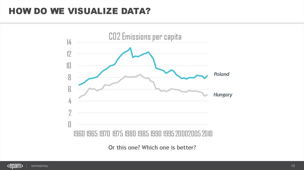
So are there any problems with this type of data representation?
CONFIDENTIAL
12
13.
HOW DO WE VISUALIZE DATA?14
CO2 Emissions per capita
12
10
Poland
8
6
Hungary
4
2
0
1960 1965 1970 1975 1980 1985 1990 1995 20002005 2010
Or this one? Which one is better?
CONFIDENTIAL
13
14.
WHICH ONE IS BETTER?TABLE
Perfect for representing precise
values.
Perfect for accurate data
comparison
Few values vs. set of data?
CHART VISUALIZATIONS
Visual processing part of the brain
Large set of data simultaneously
Patterns
Trends
Irregularities
CONFIDENTIAL
As said, tables are pretty good...
...for their limited role.
These types of data is processed by the analytical part of
our brain – which is used for math.
However, if you want to show a SET of data as a whole,
there is a part of the brain which is much better at the
task.
The brains visual processing performs much better when
coming to
Pattern recognition
Recognizing trends and irregularities.
So at the end of the day, it turns out that choosing the
right type of data representation largely depends on
what you want to show.
14
15.
CONCLUSIONAs we see, the same data can be visualized
in many different ways.
The decision of choosing a different
representation method is not based on the
data itself, rather than what we want to
show (the story we want to tell).
Therefore, when it comes to the
visualization part we need to remember
that it is not the data itself which defines
visualization, but what we want to achieve
with the same data.
Or to put it this way, the STORY you want to
tell about the data.
We start with available data and its
granularity, but then we move on to
business questions.
CONFIDENTIAL
15
16.
VISUAL STORYTELLING &DATA VISUALIZATION BEST PRACTICES3. CHART TYPES
CONFIDENTIAL
16
17.
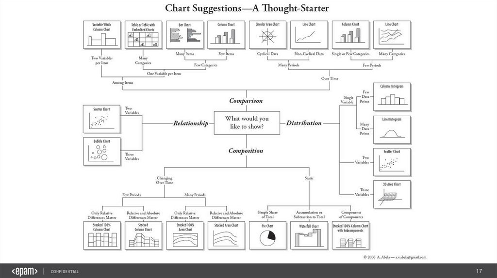
CONFIDENTIAL17
18.
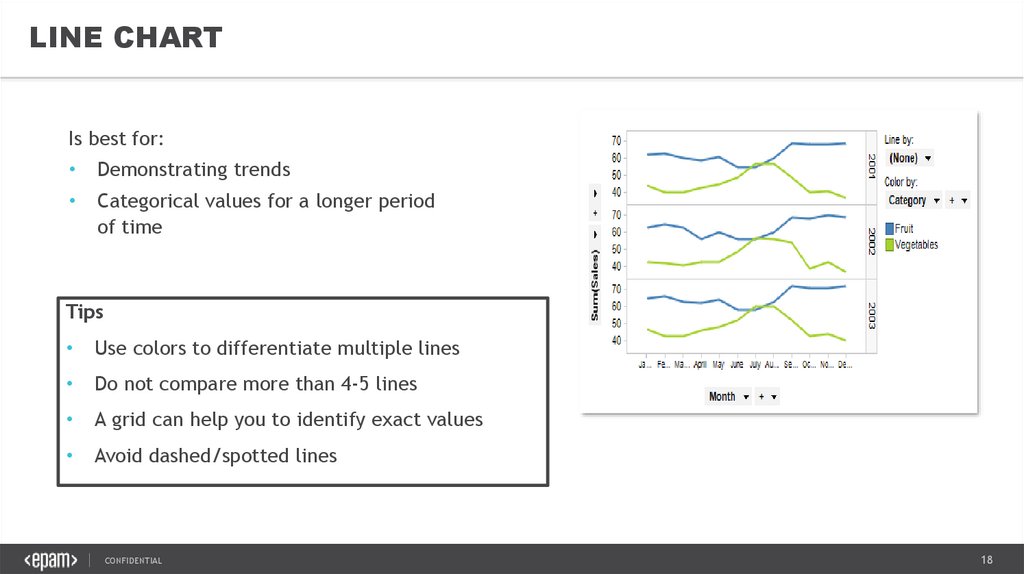
LINE CHARTIs best for:
Demonstrating trends
Categorical values for a longer period
of time
Representing continuous data
Tips
Use colors to differentiate multiple lines
Do not compare more than 4-5 lines
A grid can help you to identify exact values
Avoid dashed/spotted lines
CONFIDENTIAL
18
19.
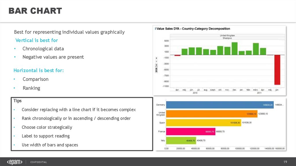
BAR CHARTBest for representing individual values graphically
Vertical is best for
Chronological data
Negative values are present
Horizontal is best for:
Comparison
Ranking
Tips
Consider replacing with a line chart if it becomes complex
Rank chronologically or in ascending / descending order
Choose color strategically
Label to support reading
Use width of bars and spaces (1/2 bar) consistently
CONFIDENTIAL
19
20.
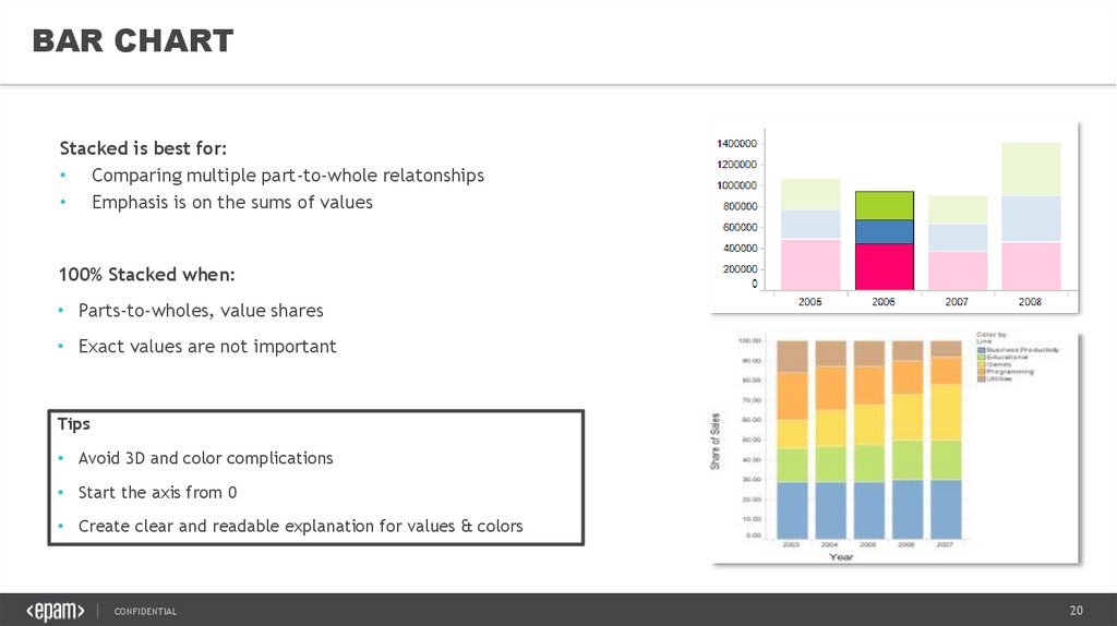
BAR CHARTStacked is best for:
• Comparing multiple part-to-whole relatonships
• Emphasis is on the sums of values
100% Stacked when:
• Parts-to-wholes, value shares
• Exact values are not important
Tips
• Avoid 3D and color complications
• Start the axis from 0
• Create clear and readable explanation for values & colors
CONFIDENTIAL
20
21.
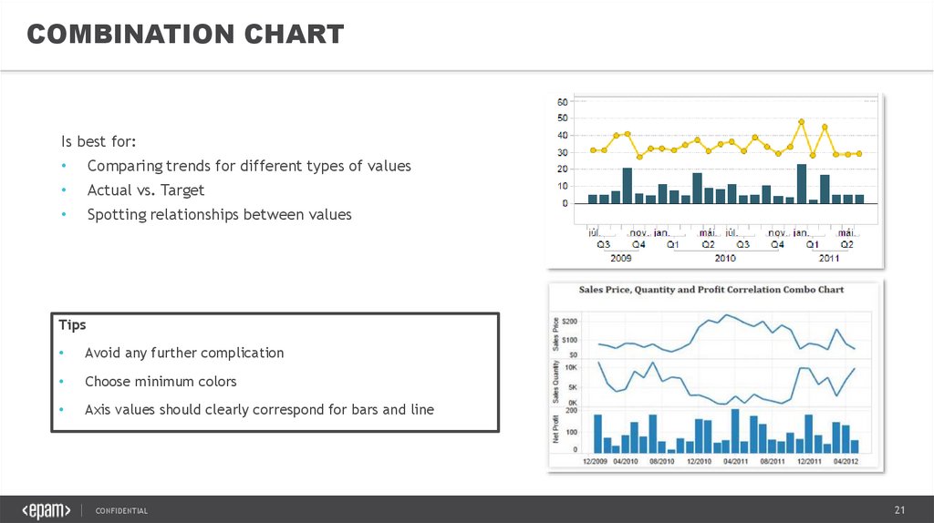
COMBINATION CHARTIs best for:
Comparing trends for different types of values
Actual vs. Target
Spotting relationships between values
Tips
Avoid any further complication
Choose minimum colors
Axis values should clearly correspond for bars and line
CONFIDENTIAL
21
22.
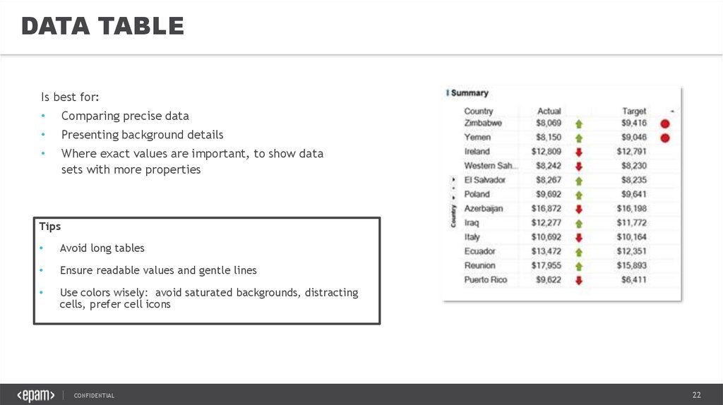
DATA TABLEIs best for:
Comparing precise data
Presenting background details
Where exact values are important, to show data
sets with more properties
Tips
Avoid long tables
Ensure readable values and gentle lines
Use colors wisely: avoid saturated backgrounds, distracting
cells, prefer cell icons
CONFIDENTIAL
22
23.
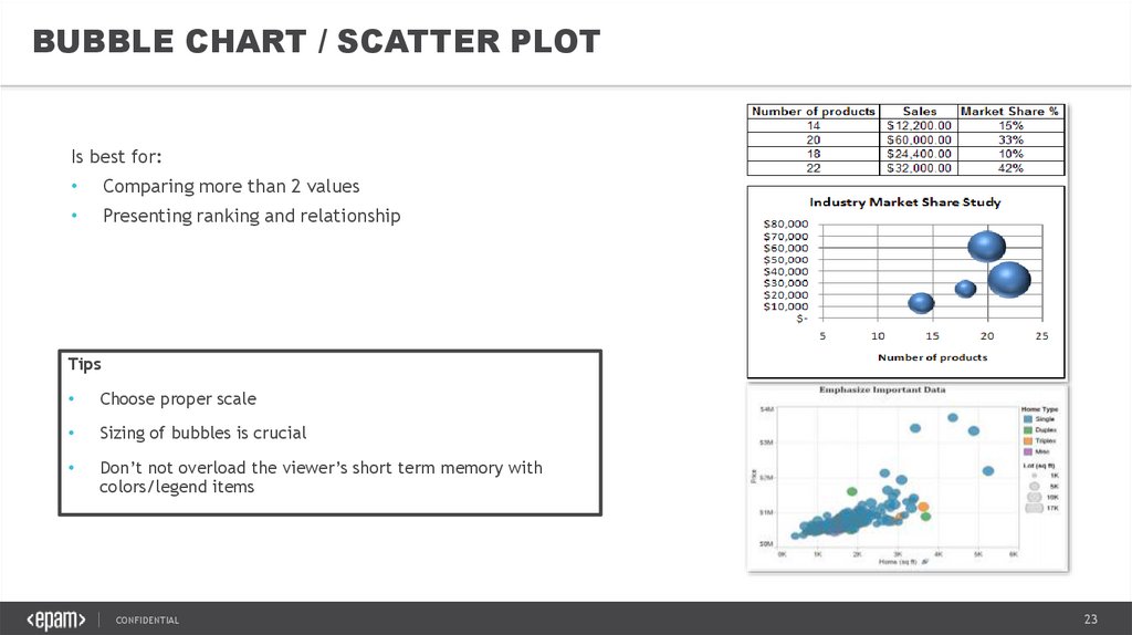
BUBBLE CHART / SCATTER PLOTIs best for:
Comparing more than 2 values
Presenting ranking and relationship
Tips
Choose proper scale
Sizing of bubbles is crucial
Don’t not overload the viewer’s short term memory with
colors/legend items
CONFIDENTIAL
23
24.
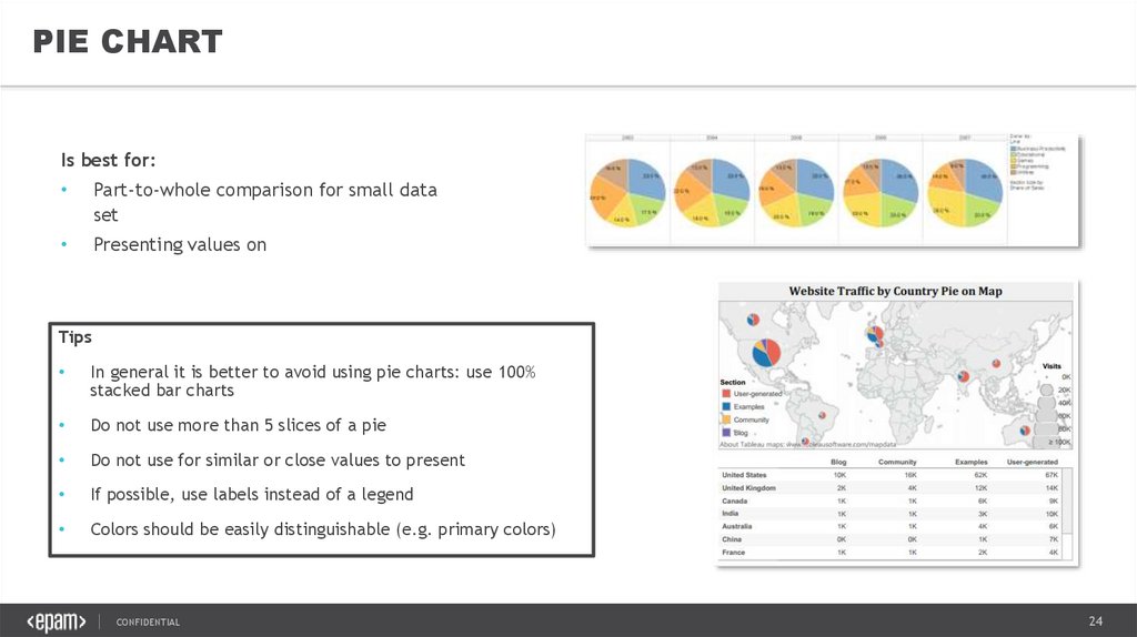
PIE CHARTIs best for:
Part-to-whole comparison for small data
set
Presenting values on maps
Tips
In general it is better to avoid using pie charts: use 100%
stacked bar charts
Do not use more than 5 slices of a pie
Do not use for similar or close values to present
If possible, use labels instead of a legend
Colors should be easily distinguishable (e.g. primary colors)
CONFIDENTIAL
24
25.
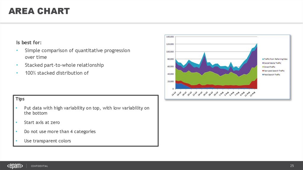
AREA CHARTIs best for:
Simple comparison of quantitative progression
over time
Stacked part-to-whole relationship
100% stacked distribution of categories as part of
a whole over time (total is unimportant)
Tips
Put data with high variability on top, with low variability on
the bottom
Start axis at zero
Do not use more than 4 categories
Use transparent colors
CONFIDENTIAL
25
26.
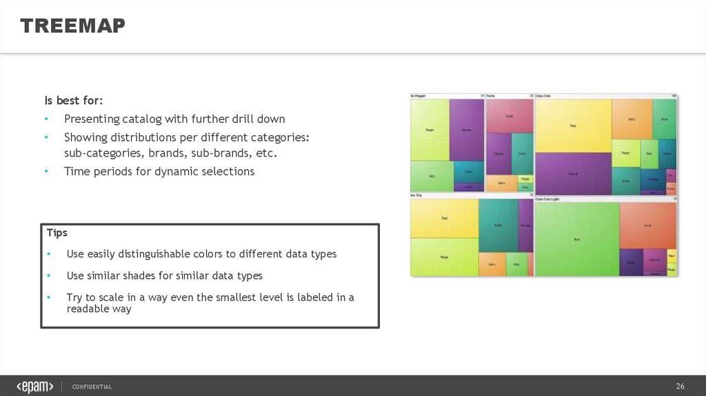
TREEMAPIs best for:
Presenting catalog with further drill down
Showing distributions per different categories:
sub-categories, brands, sub-brands, etc.
Time periods for dynamic selections
Tips
Use easily distinguishable colors to different data types
Use similar shades for similar data types
Try to scale in a way even the smallest level is labeled in a
readable way
CONFIDENTIAL
26
27.
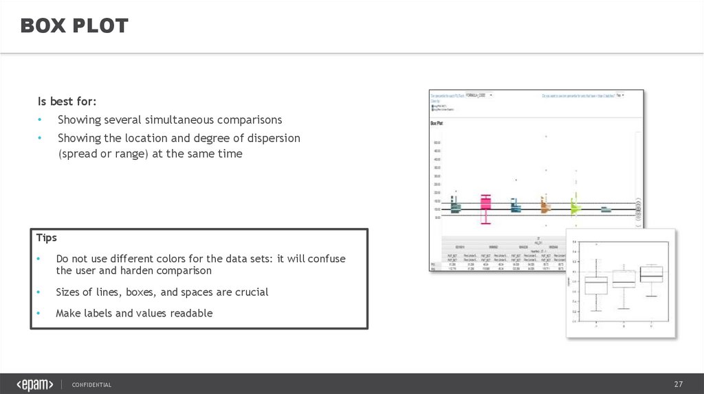
BOX PLOTIs best for:
Showing several simultaneous comparisons
Showing the location and degree of dispersion
(spread or range) at the same time
Tips
Do not use different colors for the data sets: it will confuse
the user and harden comparison
Sizes of lines, boxes, and spaces are crucial
Make labels and values readable
CONFIDENTIAL
27
28.
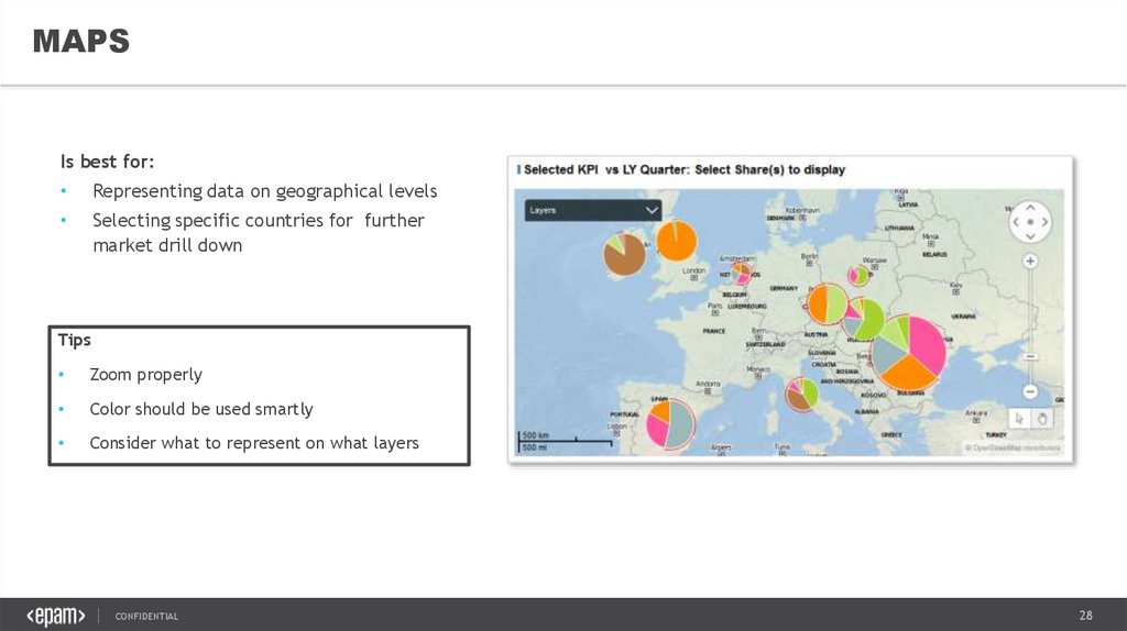
MAPSIs best for:
Representing data on geographical levels
Selecting specific countries for further
market drill down
Tips
Zoom properly
Color should be used smartly
Consider what to represent on what layers
CONFIDENTIAL
28
29.
VISUAL STORYTELLING &DATA VISUALIZATION BEST PRACTICES4. CHECKLIST FOR
GOOD VISUALIZATION
CONFIDENTIAL
29
30.
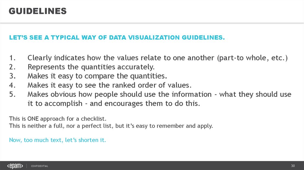
GUIDELINESLET’S SEE A TYPICAL WAY OF DATA VISUALIZATION GUIDELINES.
1.
2.
3.
4.
5.
Clearly indicates how the values relate to one another (part-to whole, etc.)
Represents the quantities accurately.
Makes it easy to compare the quantities.
Makes it easy to see the ranked order of values.
Makes obvious how people should use the information - what they should use
it to accomplish - and encourages them to do this.
This is ONE approach for a checklist.
This is neither a full, nor a perfect list, but it’s easy to remember and apply.
Now, too much text, let’s shorten it.
CONFIDENTIAL
30
31.
GUIDELINES---SPEND A FEW SECONDS DESCRIBING
THE LIST---
1.
2.
3.
4.
5.
How the values relate
Quantities accurately
Compare the quantities
Ranked order
Importance of chart
Notice that the list can be divided to two
main parts.
CONFIDENTIAL
31
32.
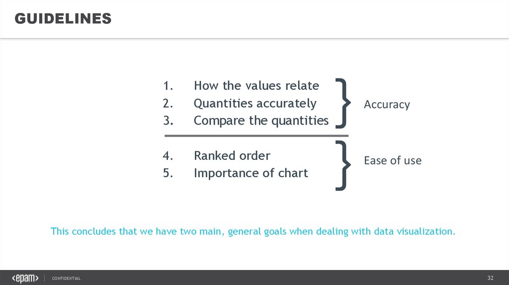
GUIDELINES1.
2.
3.
How the values relate
Quantities accurately
Compare the quantities
4.
5.
Ranked order
Importance of chart
}
}
Accuracy
Ease of use
This concludes that we have two main, general goals when dealing with data visualization.
CONFIDENTIAL
32
33.
GUIDELINES• Avoid misleading visualizations
• Improve ease of understanding
CONFIDENTIAL
33
34.
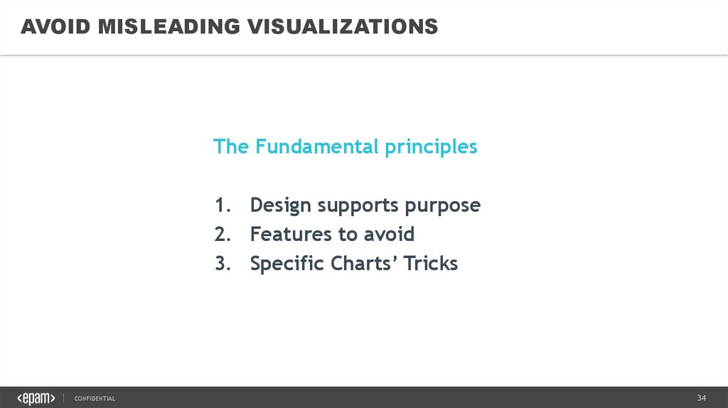
AVOID MISLEADING VISUALIZATIONSThe Fundamental principles
1. Design supports purpose
2. Features to avoid
3. Specific Charts’ Tricks
CONFIDENTIAL
34
35.
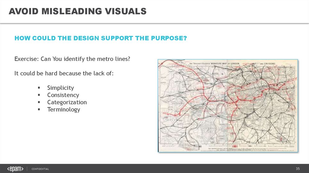
AVOID MISLEADING VISUALSHOW COULD THE DESIGN SUPPORT THE PURPOSE?
Exercise: Can You identify the metro lines?
It could be hard because the lack of:
Simplicity
Consistency
Categorization
Terminology
CONFIDENTIAL
35
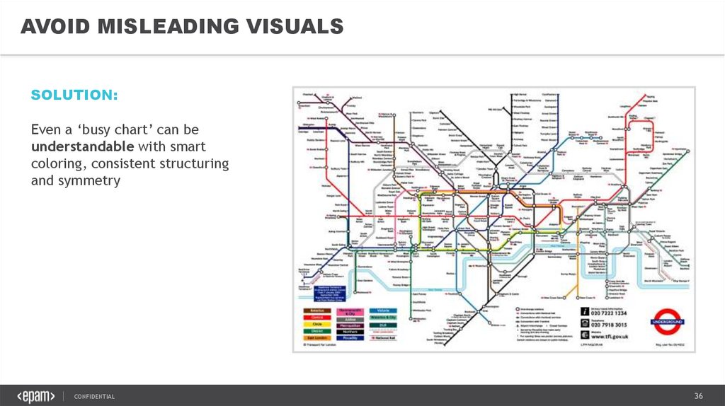
36.
AVOID MISLEADING VISUALSSOLUTION:
Even a ‘busy chart’ can be
understandable with smart
coloring, consistent structuring
and symmetry
CONFIDENTIAL
36
37.
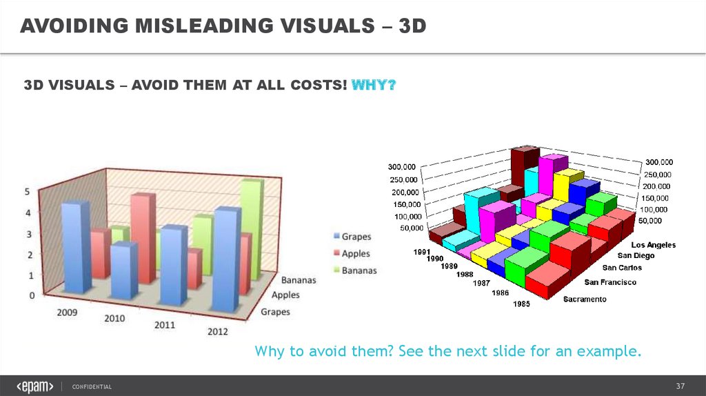
AVOIDING MISLEADING VISUALS – 3D3D VISUALS – AVOID THEM AT ALL COSTS! WHY?
Why to avoid them? See the next slide for an example.
CONFIDENTIAL
37
38.
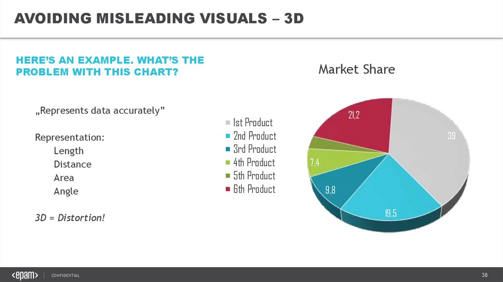
AVOIDING MISLEADING VISUALS – 3DHERE’S AN EXAMPLE. WHAT’S THE
PROBLEM WITH THIS CHART?
„Represents data accurately”
Representation:
Length
Distance
Area
Angle
3D = Distortion!
CONFIDENTIAL
Market Share
1st Product
2nd Product
3rd Product
4th Product
5th Product
6th Product
21,2
39
3,4
7,4
9,8
19,5
38
39.
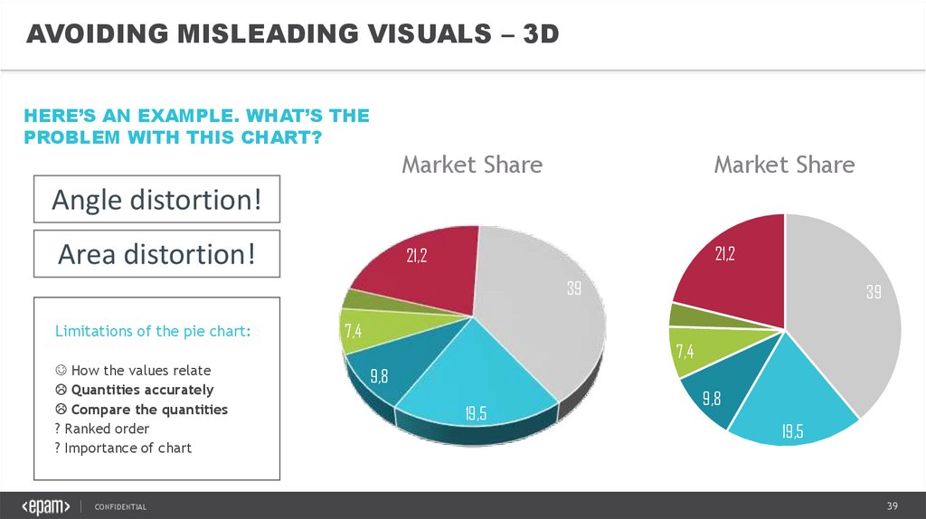
AVOIDING MISLEADING VISUALS – 3DHERE’S AN EXAMPLE. WHAT’S THE
PROBLEM WITH THIS CHART?
Market Share
Market Share
21,2
21,2
Angle distortion!
Area distortion!
39
3,4
Limitations of the pie chart:
How the values relate
Quantities accurately
Compare the quantities
? Ranked order
? Importance of chart
CONFIDENTIAL
39
3,4
7,4
7,4
9,8
19,5
9,8
19,5
39
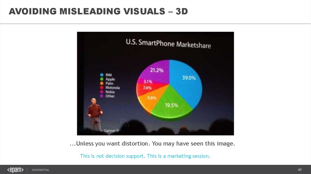
40.
AVOIDING MISLEADING VISUALS – 3D...Unless you want distortion. You may have seen this image.
This is not decision support. This is a marketing session.
CONFIDENTIAL
40
41.
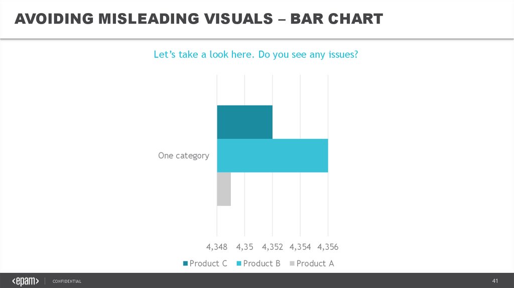
AVOIDING MISLEADING VISUALS – BAR CHARTLet’s take a look here. Do you see any issues?
One category
4,348
Product C
CONFIDENTIAL
4,35
4,352 4,354 4,356
Product B
Product A
41
42.
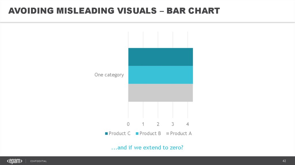
AVOIDING MISLEADING VISUALS – BAR CHARTOne category
0
Product C
1
2
Product B
3
4
Product A
...and if we extend to zero?
CONFIDENTIAL
42
43.
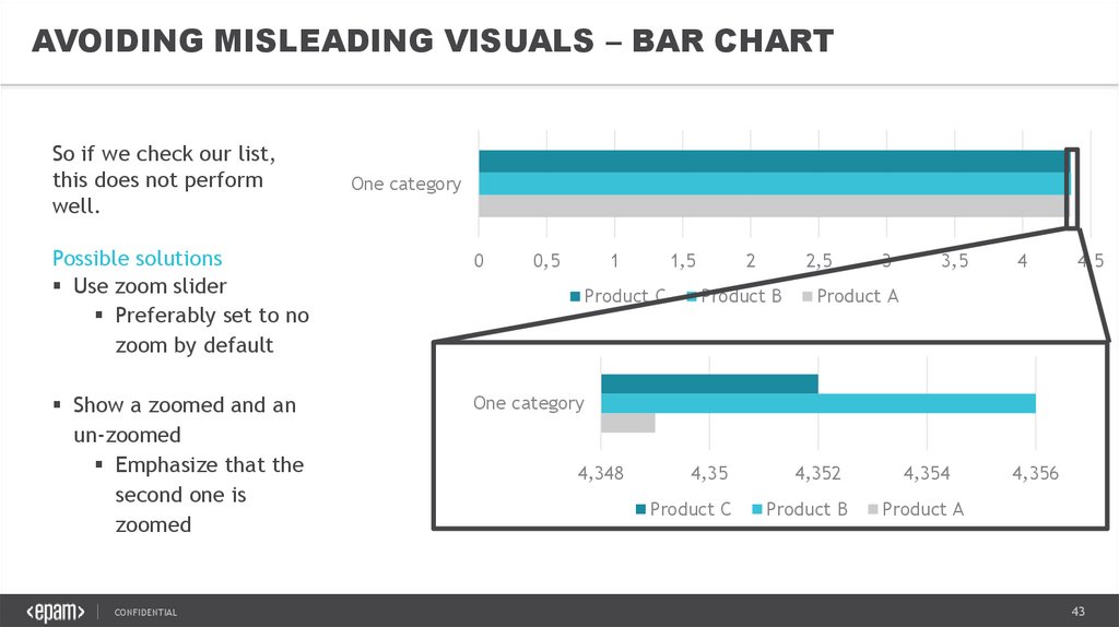
AVOIDING MISLEADING VISUALS – BAR CHARTSo if we check our list,
this does not perform
well.
One category
Possible solutions
Use zoom slider
Preferably set to no
zoom by default
0
Show a zoomed and an
un-zoomed
Emphasize that the
second one is
zoomed
One category
CONFIDENTIAL
0,5
1
1,5
Product C
4,348
2
2,5
Product B
4,35
Product C
3
3,5
4
4,5
Product A
4,352
Product B
4,354
4,356
Product A
43
44.
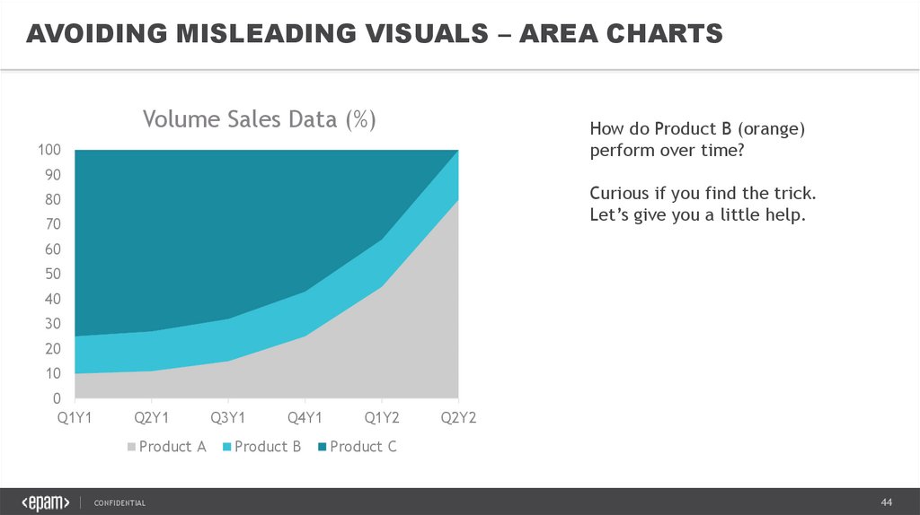
AVOIDING MISLEADING VISUALS – AREA CHARTSVolume Sales Data (%)
How do Product B (orange)
perform over time?
100
90
Curious if you find the trick.
Let’s give you a little help.
80
70
60
50
40
30
20
10
0
Q1Y1
Q2Y1
Product A
CONFIDENTIAL
Q3Y1
Q4Y1
Product B
Q1Y2
Q2Y2
Product C
44
45.
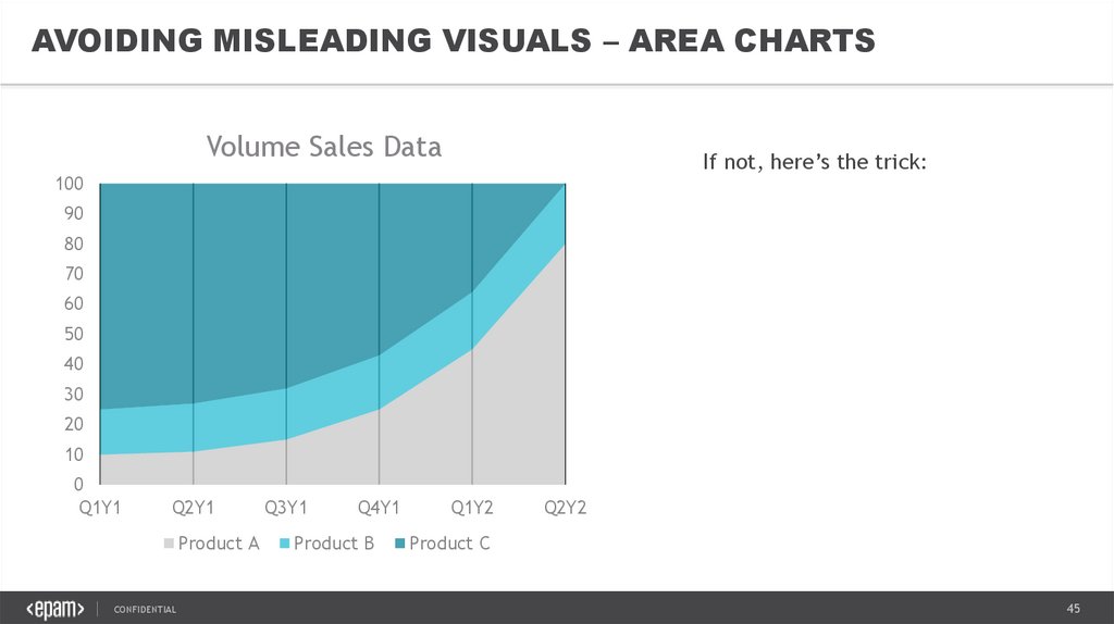
AVOIDING MISLEADING VISUALS – AREA CHARTSVolume Sales Data
If not, here’s the trick:
100
90
80
70
60
50
40
30
20
10
0
Q1Y1
Q2Y1
Product A
CONFIDENTIAL
Q3Y1
Q4Y1
Product B
Q1Y2
Q2Y2
Product C
45
46.
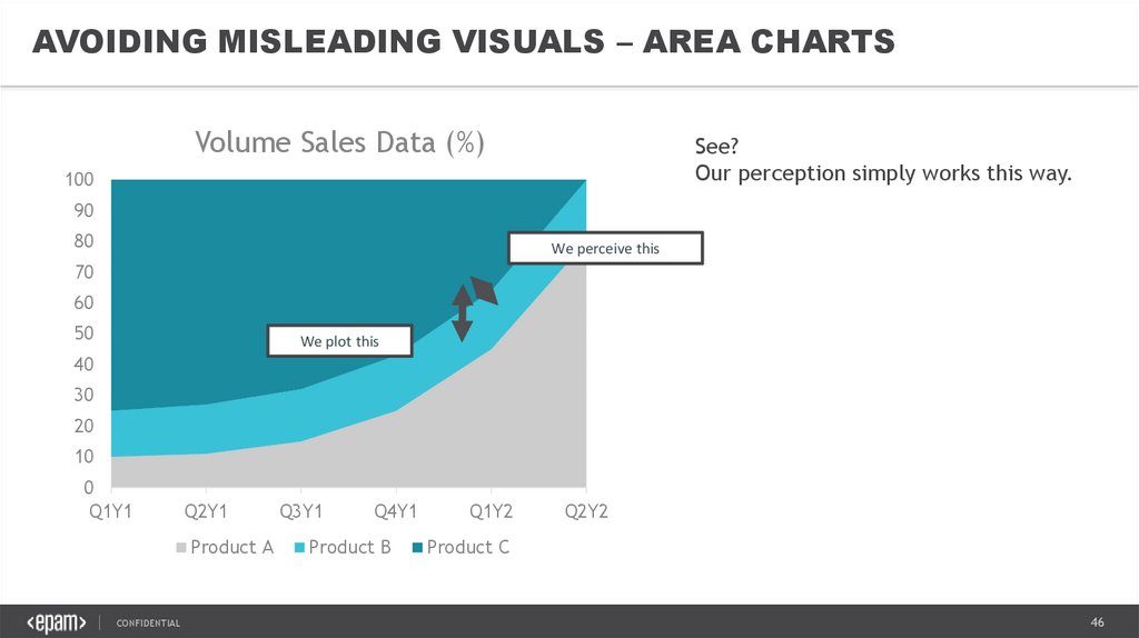
AVOIDING MISLEADING VISUALS – AREA CHARTSVolume Sales Data (%)
See?
Our perception simply works this way.
100
90
80
We perceive this
70
60
50
We plot this
40
30
20
10
0
Q1Y1
Q2Y1
Product A
CONFIDENTIAL
Q3Y1
Q4Y1
Product B
Q1Y2
Q2Y2
Product C
46
47.
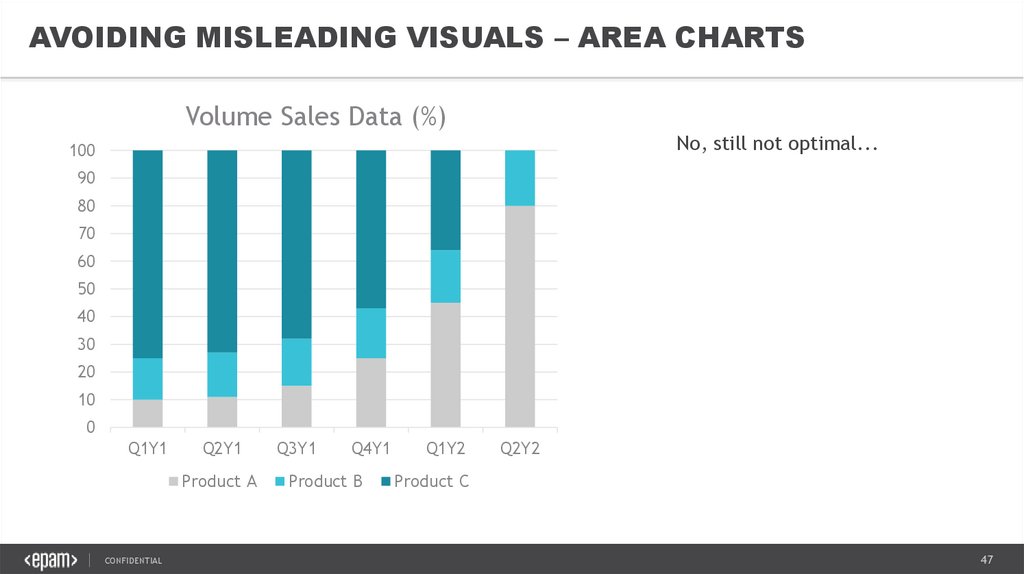
AVOIDING MISLEADING VISUALS – AREA CHARTSVolume Sales Data (%)
No, still not optimal...
100
90
80
70
60
50
40
30
20
10
0
Q1Y1
Q2Y1
Product A
CONFIDENTIAL
Q3Y1
Q4Y1
Product B
Q1Y2
Q2Y2
Product C
47
48.
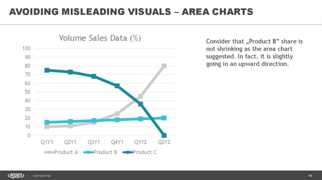
AVOIDING MISLEADING VISUALS – AREA CHARTSVolume Sales Data (%)
Consider that „Product B” share is
not shrinking as the area chart
suggested. In fact, it is slightly
going in an upward direction.
100
90
80
70
60
50
40
30
20
10
0
Q1Y1
Q2Y1
Product A
CONFIDENTIAL
Q3Y1
Q4Y1
Product B
Q1Y2
Q2Y2
Product C
48
49.
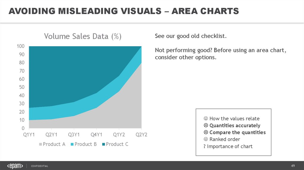
AVOIDING MISLEADING VISUALS – AREA CHARTSVolume Sales Data (%)
See our good old checklist.
100
Not performing good? Before using an area chart,
consider other options.
90
80
70
60
50
40
30
20
10
0
Q1Y1
Q2Y1
Product A
CONFIDENTIAL
Q3Y1
Q4Y1
Product B
Q1Y2
Product C
Q2Y2
How the values relate
Quantities accurately
Compare the quantities
Ranked order
? Importance of chart
49
50.
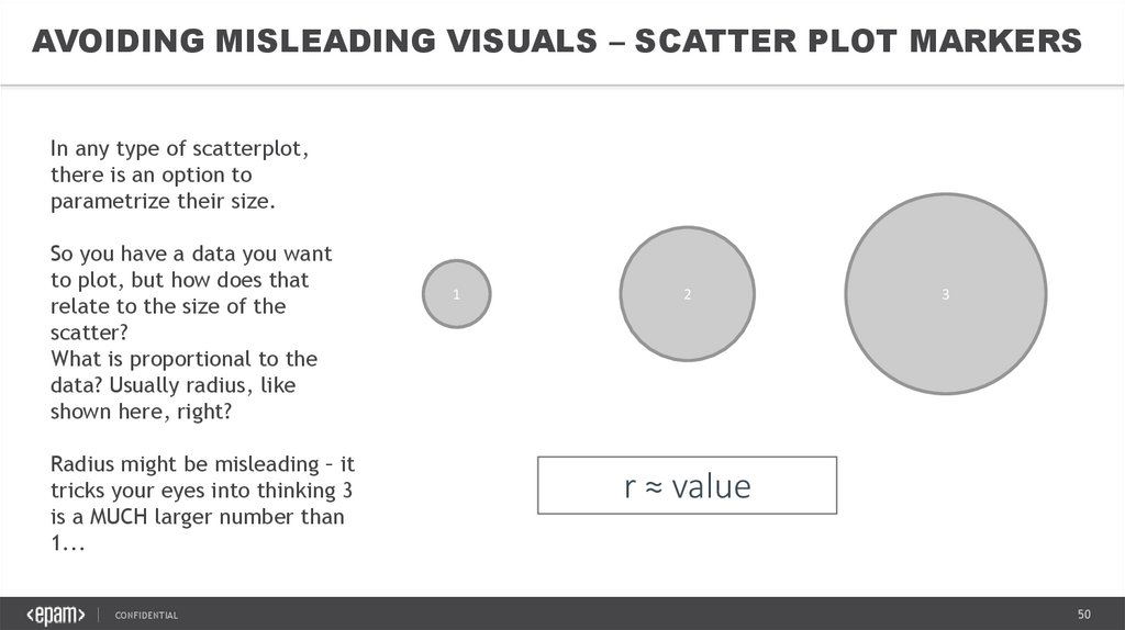
AVOIDING MISLEADING VISUALS – SCATTER PLOT MARKERSIn any type of scatterplot,
there is an option to
parametrize their size.
So you have a data you want
to plot, but how does that
relate to the size of the
scatter?
What is proportional to the
data? Usually radius, like
shown here, right?
Radius might be misleading – it
tricks your eyes into thinking 3
is a MUCH larger number than
1...
CONFIDENTIAL
1
2
3
r ≈ value
50
51.
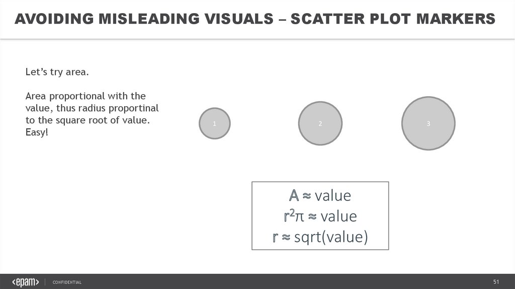
AVOIDING MISLEADING VISUALS – SCATTER PLOT MARKERSLet’s try area.
Area proportional with the
value, thus radius proportinal
to the square root of value.
Easy!
1
2
3
A ≈ value
r2π ≈ value
r ≈ sqrt(value)
CONFIDENTIAL
51
52.
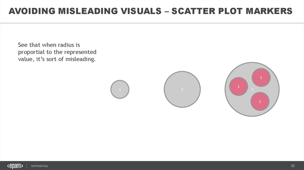
AVOIDING MISLEADING VISUALS – SCATTER PLOT MARKERSSee that when radius is
proportial to the represented
value, it’s sort of misleading.
1
1
2
1
3
1
CONFIDENTIAL
52
53.
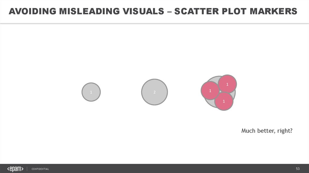
AVOIDING MISLEADING VISUALS – SCATTER PLOT MARKERS1
1
2
1
3
1
Much better, right?
CONFIDENTIAL
53
54.
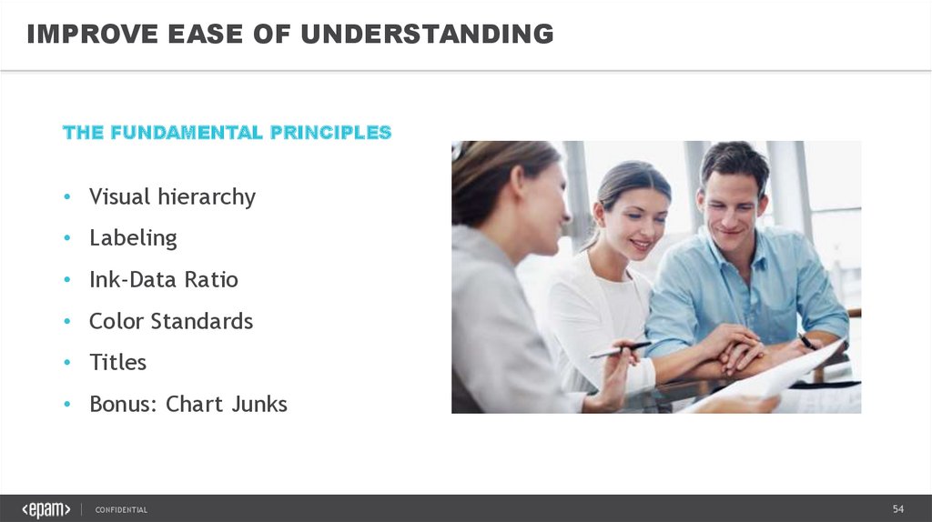
IMPROVE EASE OF UNDERSTANDINGTHE FUNDAMENTAL PRINCIPLES
• Visual hierarchy
• Labeling
• Ink-Data Ratio
• Color Standards
• Titles
• Bonus: Chart Junks
CONFIDENTIAL
54
55.
IMPROVE EASE OF UNDERSTANDING – VISUAL HIERARCHYThe system should always keep users informed about what is going on, through appropriate feedback
within reasonable time.
CONFIDENTIAL
55
56.
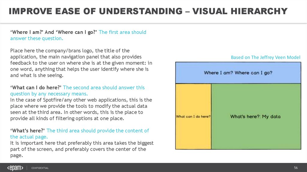
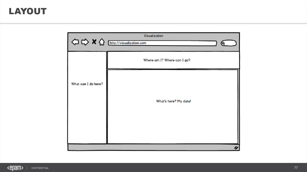
IMPROVE EASE OF UNDERSTANDING – VISUAL HIERARCHY‘Where I am?’ And ‘Where can I go?’ The first area should
answer these question.
Place here the company/brans logo, the title of the
application, the main navigation panel that also provides
feedback to the user on where she is at the given moment: in
one word, anything that helps the user identify where she is
and what is she seeing.
Based on The Jeffrey Veen Model
‘What can I do here?’ The second area should answer this
question by any necessary means.
In the case of Spotfire/any other web applications, this is the
place where we provide the tools to modify the actual data
seen at the third area. In other words, this is the place to
provide all kinds of filtering options at one place.
‘What’s here?’ The third area should provide the content of
the actual page.
It is important here that preferably this area takes the biggest
part of the screen, and preferably covers the center of the
page.
CONFIDENTIAL
56
57.
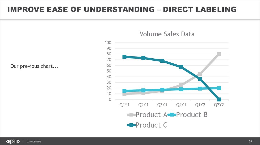
IMPROVE EASE OF UNDERSTANDING – DIRECT LABELINGVolume Sales Data
Our previous chart...
100
90
80
70
60
50
40
30
20
10
0
Q1Y1
Q2Y1
Q3Y1
Product A
Product C
CONFIDENTIAL
Q4Y1
Q1Y2
Q2Y2
Product B
57
58.
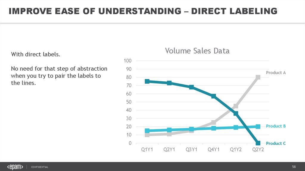
IMPROVE EASE OF UNDERSTANDING – DIRECT LABELINGVolume Sales Data
With direct labels.
100
No need for that step of abstraction
when you try to pair the labels to
the lines.
90
Product A
80
70
60
50
40
30
Product B
20
10
0
Product C
Q1Y1
CONFIDENTIAL
Q2Y1
Q3Y1
Q4Y1
Q1Y2
Q2Y2
58
59.
ease of understandingIMPROVE EASE OF UNDERSTANDING –Improve
DATA-INK
RATIO
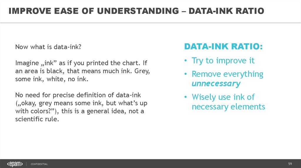
Now what is data-ink?
Imagine „ink” as if you printed the chart. If
an area is black, that means much ink. Grey,
some ink, white, no ink.
No need for precise definition of data-ink
(„okay, grey means some ink, but what’s up
with colors?”), this is a general idea, not a
scientific rule.
CONFIDENTIAL
DATA-INK RATIO:
• Try to improve it
• Remove everything
unnecessary
• Wisely use ink of
necessary elements
59
60.
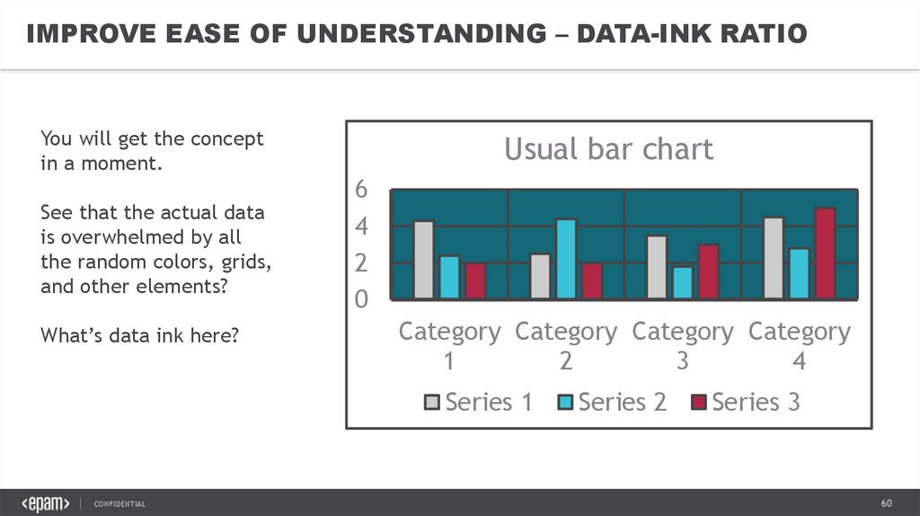
IMPROVE EASE OF UNDERSTANDING – DATA-INK RATIOYou will get the concept
in a moment.
See that the actual data
is overwhelmed by all
the random colors, grids,
and other elements?
What’s data ink here?
Usual bar chart
6
4
2
0
Category Category Category Category
1
2
3
4
Series 1
CONFIDENTIAL
Series 2
Series 3
60
61.
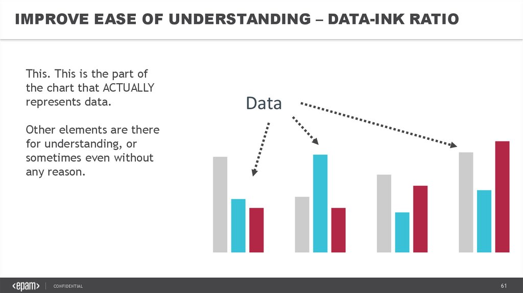
IMPROVE EASE OF UNDERSTANDING – DATA-INK RATIOThis. This is the part of
the chart that ACTUALLY
represents data.
Data
Other elements are there
for understanding, or
sometimes even without
any reason.
CONFIDENTIAL
61
62.
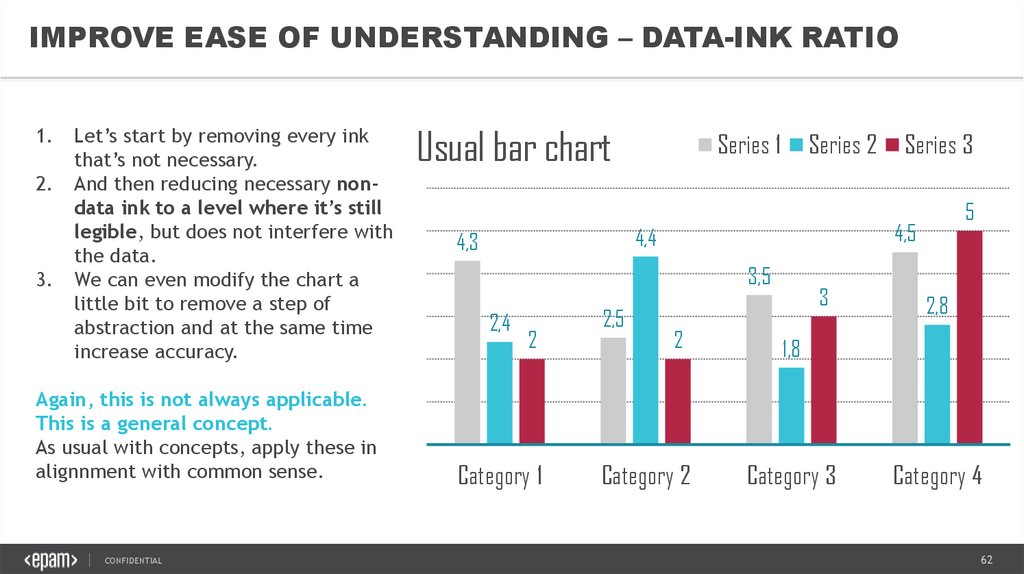
IMPROVE EASE OF UNDERSTANDING – DATA-INK RATIO1.
2.
3.
Let’s start by removing every ink
that’s not necessary.
And then reducing necessary nondata ink to a level where it’s still
legible, but does not interfere with
the data.
We can even modify the chart a
little bit to remove a step of
abstraction and at the same time
increase accuracy.
Again, this is not always applicable.
This is a general concept.
As usual with concepts, apply these in
alignnment with common sense.
CONFIDENTIAL
Usual bar chart
Series 1
Series 2
3,5
2,4
2
Category 1
2,5
5
4,5
4,4
4,3
Series 3
2
Category 2
3
2,8
1,8
Category 3
Category 4
62
63.
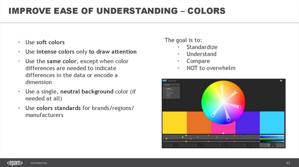
IMPROVE EASE OF UNDERSTANDING – COLORS• Use soft colors
• Use intense colors only to draw attention
• Use the same color, except when color
differences are needed to indicate
differences in the data or encode a
dimension
The goal is to:
• Standardize
• Understand
• Compare
• NOT to overwhelm
• Use a single, neutral background color (if
needed at all)
• Use colors standards for brands/regions/
manufacturers
CONFIDENTIAL
63
64.
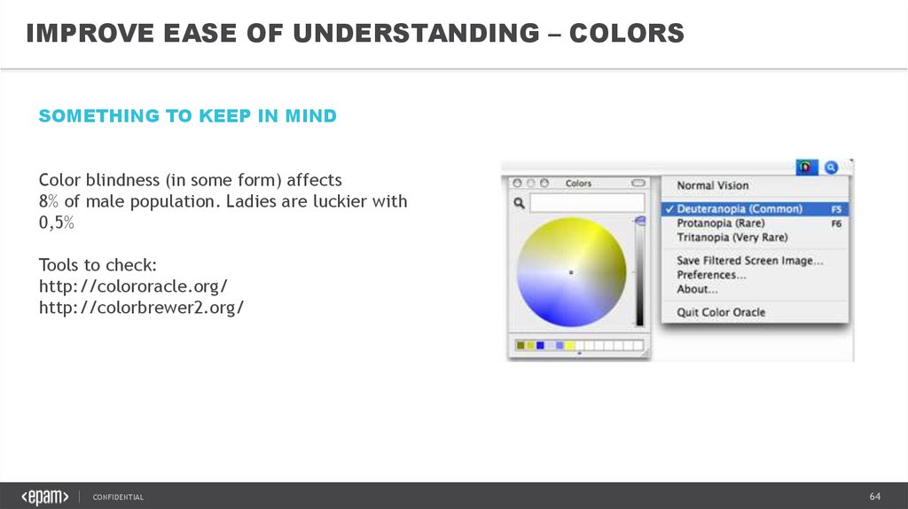
IMPROVE EASE OF UNDERSTANDING – COLORSSOMETHING TO KEEP IN MIND
Color blindness (in some form) affects
8% of male population. Ladies are luckier with
0,5%
Tools to check:
http://colororacle.org/
http://colorbrewer2.org/
CONFIDENTIAL
64
65.
IMPROVE EASE OF UNDERSTANDING – TITLESSee this.
Tell your users
why they should
be interested.
Youth unemployment rate, for population aged 15-24,
in EU
Member States, 2001 - 2012
(% of active population 15-24)
25
20
15
10
5
0
2001 2002 2003 2004 2005 2006 2007 2008 2009 2010
2011
2012
Youth Unemp. Rate (%)
CONFIDENTIAL
65
66.
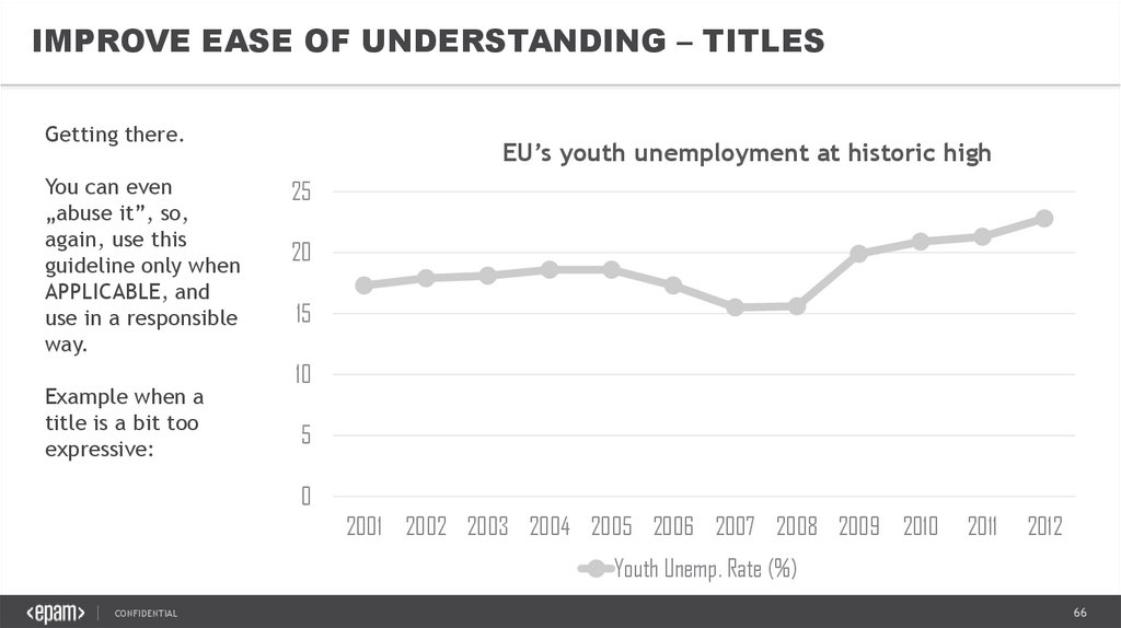
IMPROVE EASE OF UNDERSTANDING – TITLESGetting there.
You can even
„abuse it”, so,
again, use this
guideline only when
APPLICABLE, and
use in a responsible
way.
Example when a
title is a bit too
expressive:
EU’s youth unemployment at historic high
25
20
15
10
5
0
2001 2002 2003 2004 2005 2006 2007 2008 2009 2010
2011
2012
Youth Unemp. Rate (%)
CONFIDENTIAL
66
67.
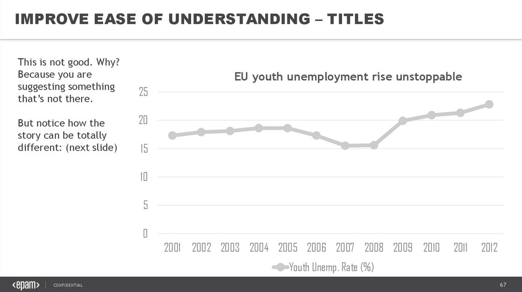
IMPROVE EASE OF UNDERSTANDING – TITLESThis is not good. Why?
Because you are
suggesting something
that’s not there.
But notice how the
story can be totally
different: (next slide)
EU youth unemployment rise unstoppable
25
20
15
10
5
0
2001 2002 2003 2004 2005 2006 2007 2008 2009 2010
2011
2012
Youth Unemp. Rate (%)
CONFIDENTIAL
67
68.
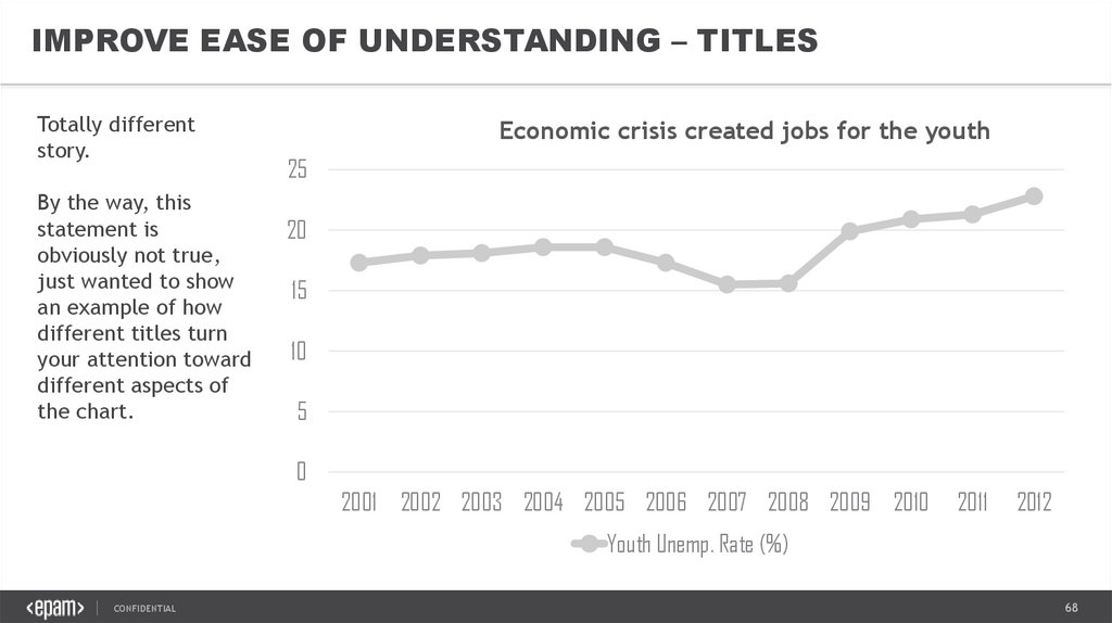
IMPROVE EASE OF UNDERSTANDING – TITLESTotally different
story.
By the way, this
statement is
obviously not true,
just wanted to show
an example of how
different titles turn
your attention toward
different aspects of
the chart.
Economic crisis created jobs for the youth
25
20
15
10
5
0
2001 2002 2003 2004 2005 2006 2007 2008 2009 2010
2011
2012
Youth Unemp. Rate (%)
CONFIDENTIAL
68
69.
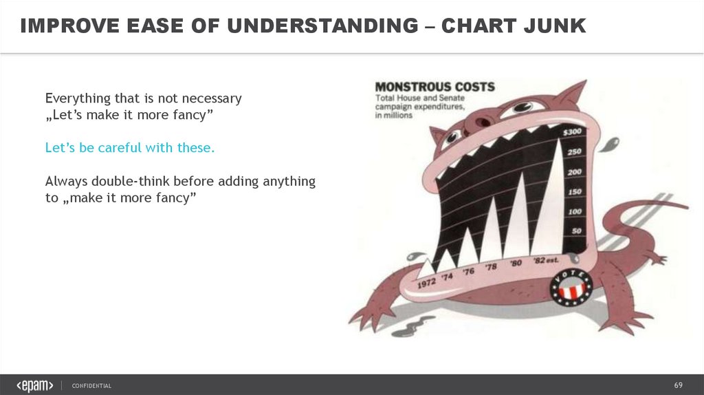
IMPROVE EASE OF UNDERSTANDING – CHART JUNKEverything that is not necessary
„Let’s make it more fancy”
Let’s be careful with these.
Always double-think before adding anything
to „make it more fancy”
CONFIDENTIAL
69
70.
VISUAL STORYTELLING &DATA VISUALIZATION BEST PRACTICES5. UX & UI
CONFIDENTIAL
70
71.
UNDERSTANDING UI ELEMENTS & PRINCIPLESKnow your audience
The essence of interface
The MAYA principle
Input controls
Navigation
Animations
Guided Actions
CONFIDENTIAL
71
72.
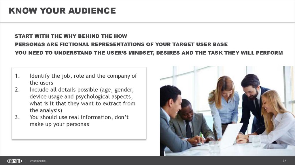
KNOW YOUR AUDIENCESTART WITH THE WHY BEHIND THE HOW
PERSONAS ARE FICTIONAL REPRESENTATIONS OF YOUR TARGET USER BASE
YOU NEED TO UNDERSTAND THE USER’S MINDSET, DESIRES AND THE TASK THEY WILL PERFORM
1.
2.
3.
Identify the job, role and the company of
the users
Include all details possible (age, gender,
device usage and psychological aspects,
what is it that they want to extract from
the analysis)
You should use real information, don’t
make up your personas
CONFIDENTIAL
72
73.
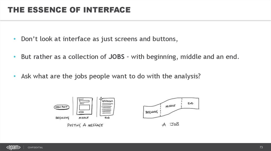
THE ESSENCE OF INTERFACE• Don’t look at interface as just screens and buttons,
• But rather as a collection of JOBS – with beginning, middle and an end.
• Ask what are the jobs people want to do with the analysis?
CONFIDENTIAL
73
74.
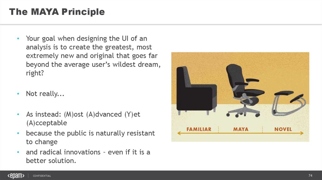
The MAYA Principle• Your goal when designing the UI of an
analysis is to create the greatest, most
extremely new and original that goes far
beyond the average user’s wildest dream,
right?
• Not really...
• As instead: (M)ost (A)dvanced (Y)et
(A)cceptable
• because the public is naturally resistant
to change
• and radical innovations – even if it is a
better solution.
CONFIDENTIAL
74
75.
UNDERSTANDING VISUAL ELEMENTS OF UIContrast
Color Theory
Color Schemes
Typography
CONFIDENTIAL
75
76.
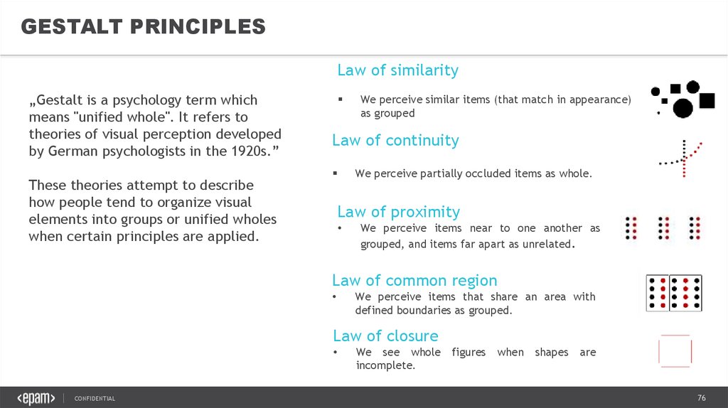
GESTALT PRINCIPLESLaw of similarity
„Gestalt is a psychology term which
means "unified whole". It refers to
theories of visual perception developed
by German psychologists in the 1920s.”
These theories attempt to describe
how people tend to organize visual
elements into groups or unified wholes
when certain principles are applied.
We perceive similar items (that match in appearance)
as grouped
Law of continuity
We perceive partially occluded items as whole.
Law of proximity
We perceive items near to one another as
grouped, and items far apart as unrelated.
Law of common region
We perceive items that share an area with
defined boundaries as grouped.
Law of closure
CONFIDENTIAL
We see whole
incomplete.
figures
when
shapes
are
76
77.
LAYOUTCONFIDENTIAL
77
78.
LAYOUT – KEY PRINCIPLESLOGICAL
INFORMATIVE
EFFICIENT
USER CENTERED
DESIGN
CONFIDENTIAL
78
79.
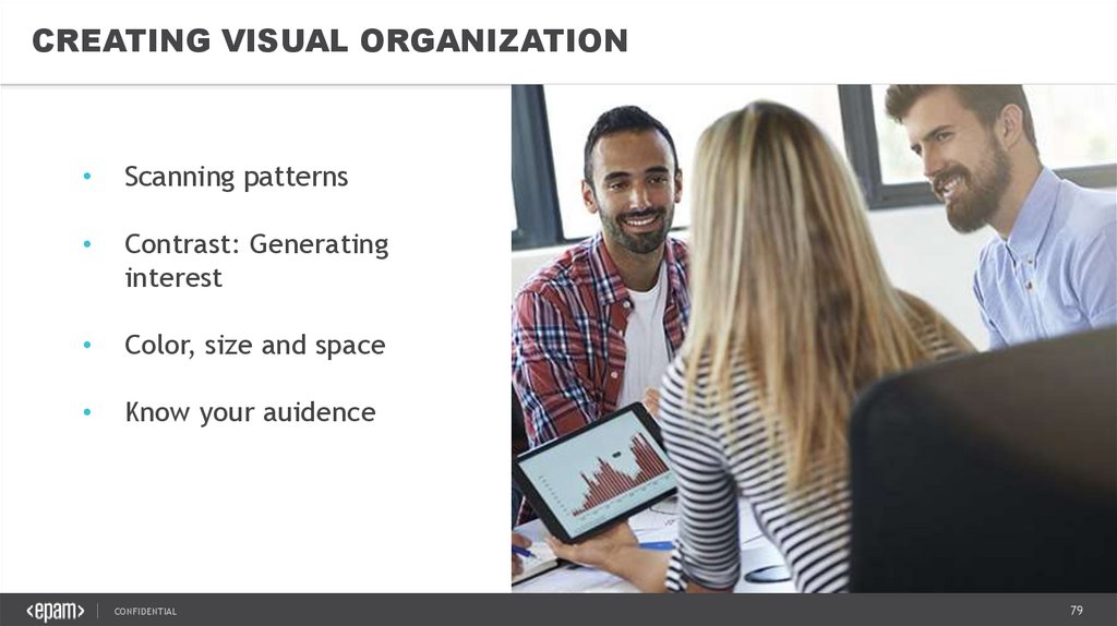
CREATING VISUAL ORGANIZATIONScanning patterns
Contrast: Generating
interest
Color, size and space
Know your auidence
CONFIDENTIAL
79
80.
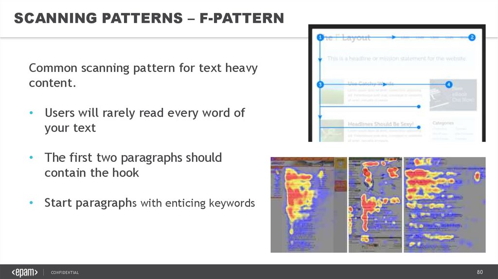
SCANNING PATTERNS – F-PATTERNCommon scanning pattern for text heavy
content.
• Users will rarely read every word of
your text
• The first two paragraphs should
contain the hook
• Start paragraphs with enticing keywords
CONFIDENTIAL
80
81.
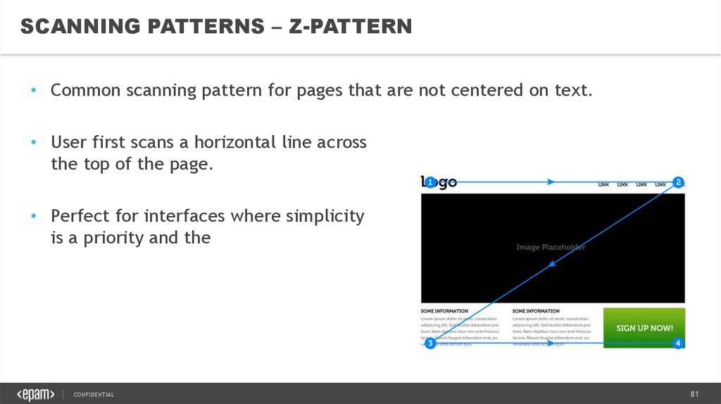
SCANNING PATTERNS – Z-PATTERN• Common scanning pattern for pages that are not centered on text.
• User first scans a horizontal line across
the top of the page.
• Perfect for interfaces where simplicity
is a priority and the call to action is
the main takeaway.
CONFIDENTIAL
81
82.
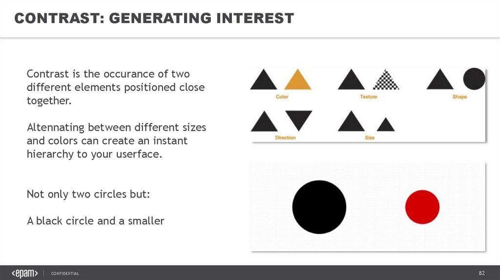
CONTRAST: GENERATING INTERESTContrast is the occurance of two
different elements positioned close
together.
Altennating between different sizes
and colors can create an instant
hierarchy to your userface.
Not only two circles but:
A black circle and a smaller red circle.
CONFIDENTIAL
82
83.
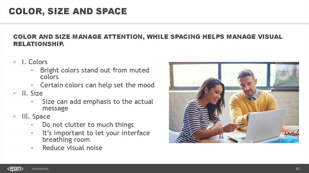
COLOR, SIZE AND SPACECOLOR AND SIZE MANAGE ATTENTION, WHILE SPACING HELPS MANAGE VISUAL
RELATIONSHIP.
• I. Colors
• Bright colors stand out from muted
colors
• Certain colors can help set the mood
• II. Size
• Size can add emphasis to the actual
message
• III. Space
• Do not clutter to much things
• It’s important to let your interface
breathing room
• Reduce visual noise
CONFIDENTIAL
83
84.
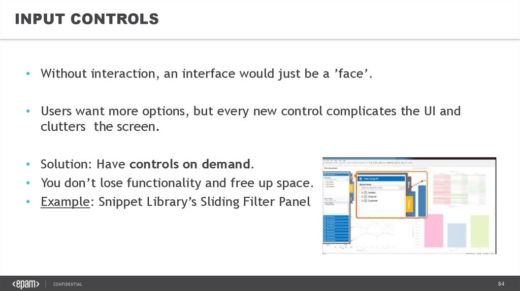
INPUT CONTROLS• Without interaction, an interface would just be a ’face’.
• Users want more options, but every new control complicates the UI and
clutters the screen.
• Solution: Have controls on demand.
• You don’t lose functionality and free up space.
• Example: Snippet Library’s Sliding Filter Panel
CONFIDENTIAL
84
85.
NAVIGATION• It’s hard to appreciate an analysis if you are lost, which
is why having navigation is mandatory.
Users should always know their current place in the
analysis
The navigation system should remain consistent for all
pages
• Either use horizontal navigation on the top of the pages
• Or vertical navigation on the left side or hidden into
Snippet Library
CONFIDENTIAL
85
86.
ANIMATIONSWHY?
1. The eye is drawn to movement
An animated icon will signal a change to your users more effectively than a
static icon.
2. Establishes connections
Animations make excellent transitions, and small transitions can enhance
emotional connection
3. Cues and Clues
Well-thought animations can
CONFIDENTIAL
suggest actions to users
86
87.
GUIDED ACTIONS• Guided actions can be used
by emphasizing key
functions, controls and
buttons.
• At EPAM you can also add
Guided Tours/ iCoach to the
analysis.
• People, as a whole, are open
to suggestion.
CONFIDENTIAL
87
88.
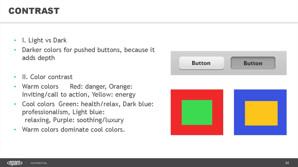
CONTRAST• I. Light vs Dark
• Darker colors for pushed buttons, because it
adds depth
• II. Color contrast
• Warm colors
Red: danger, Orange:
inviting/call to action, Yellow: energy
• Cool colors Green: health/relax, Dark blue:
professionalism, Light blue:
relaxing, Purple: soothing/luxury
• Warm colors dominate cool colors.
CONFIDENTIAL
88
89.
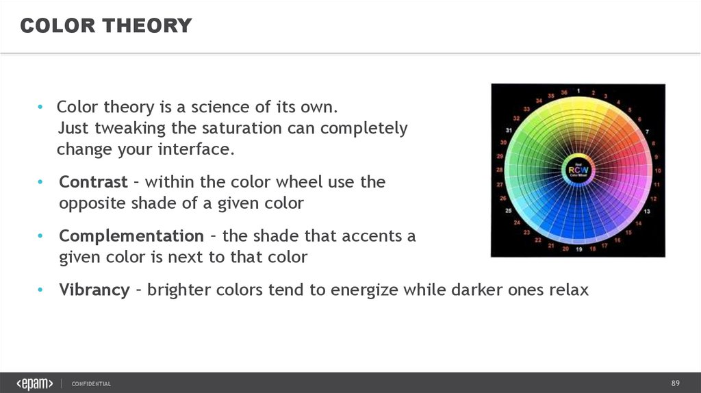
COLOR THEORY• Color theory is a science of its own.
Just tweaking the saturation can completely
change your interface.
• Contrast – within the color wheel use the
opposite shade of a given color
• Complementation – the shade that accents a
given color is next to that color
• Vibrancy – brighter colors tend to energize while darker ones relax
CONFIDENTIAL
89
90.
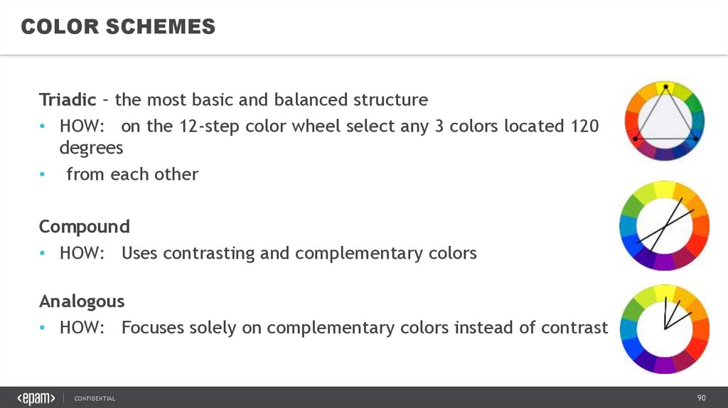
COLOR SCHEMESTriadic – the most basic and balanced structure
• HOW: on the 12-step color wheel select any 3 colors located 120
degrees
• from each other
Compound
• HOW: Uses contrasting and complementary colors
Analogous
• HOW: Focuses solely on complementary colors instead of contrast
CONFIDENTIAL
90
91.
TYPOGRAPHYMeasure the Measure - /measure=width of a body type/
• The ideal amound of characters per line is 52-78
Appropriate size:
Body and leading – 11px/16.5px
Main heading – 24px
Subheadings – 18px
Navigation – 16px
All other headed elements – 13px
CONFIDENTIAL
91
92.
VISUAL STORYTELLING &DATA VISUALIZATION BEST PRACTICES6. STORYTELLING
CONFIDENTIAL
92
93.
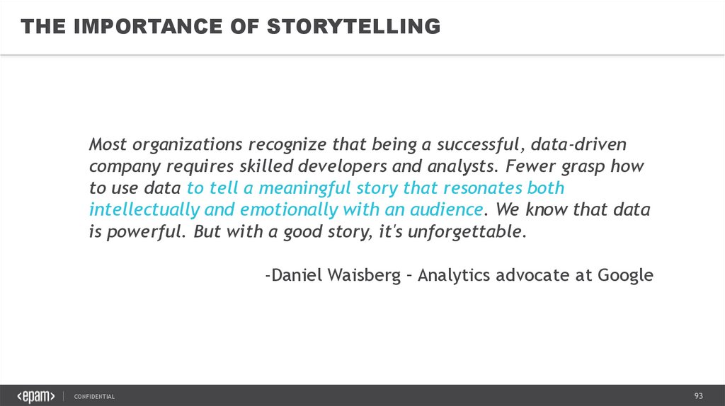
THE IMPORTANCE OF STORYTELLINGMost organizations recognize that being a successful, data-driven
company requires skilled developers and analysts. Fewer grasp how
to use data to tell a meaningful story that resonates both
intellectually and emotionally with an audience. We know that data
is powerful. But with a good story, it's unforgettable.
-Daniel Waisberg – Analytics advocate at Google
CONFIDENTIAL
93
94.
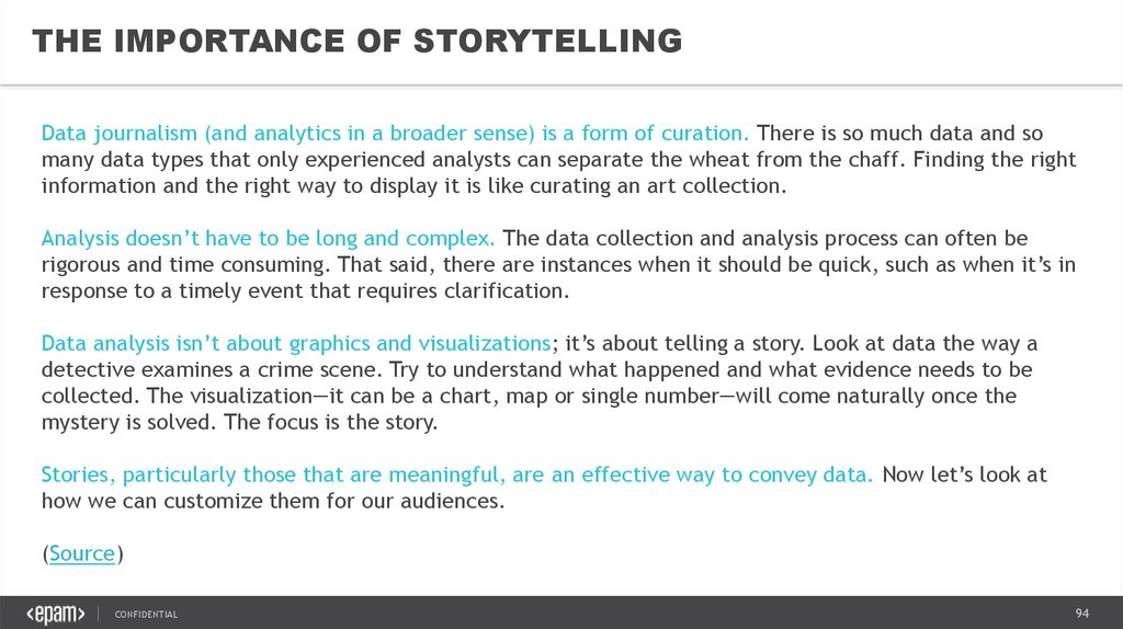
THE IMPORTANCE OF STORYTELLINGData journalism (and analytics in a broader sense) is a form of curation. There is so much data and so
many data types that only experienced analysts can separate the wheat from the chaff. Finding the right
information and the right way to display it is like curating an art collection.
Analysis doesn’t have to be long and complex. The data collection and analysis process can often be
rigorous and time consuming. That said, there are instances when it should be quick, such as when it’s in
response to a timely event that requires clarification.
Data analysis isn’t about graphics and visualizations; it’s about telling a story. Look at data the way a
detective examines a crime scene. Try to understand what happened and what evidence needs to be
collected. The visualization—it can be a chart, map or single number—will come naturally once the
mystery is solved. The focus is the story.
Stories, particularly those that are meaningful, are an effective way to convey data. Now let’s look at
how we can customize them for our audiences.
(Source)
CONFIDENTIAL
94
95.
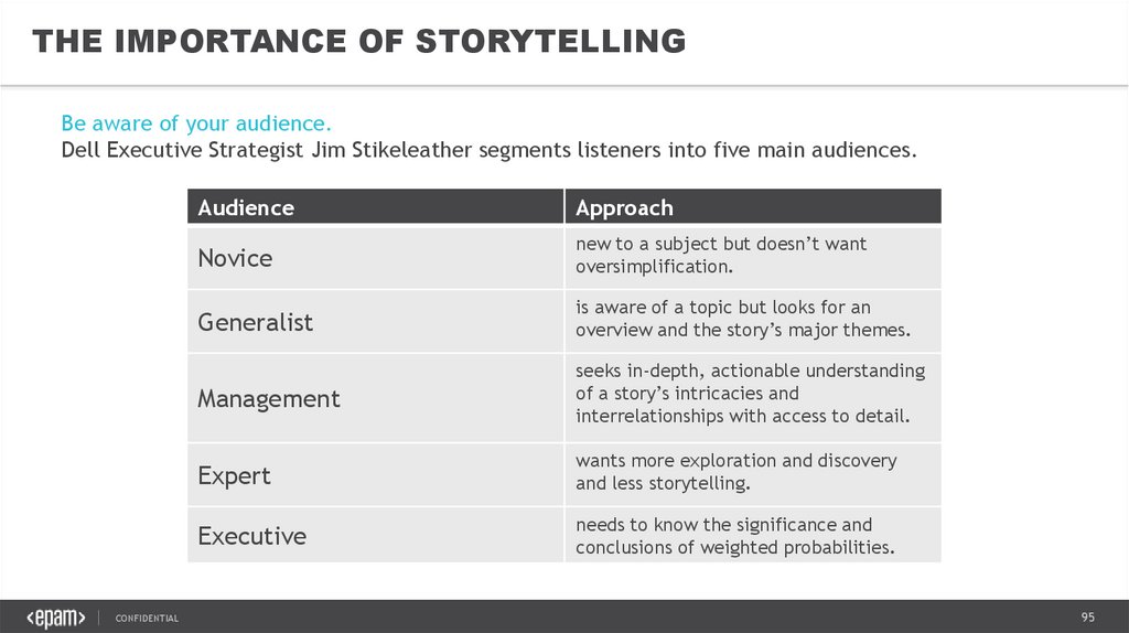
THE IMPORTANCE OF STORYTELLINGBe aware of your audience.
Dell Executive Strategist Jim Stikeleather segments listeners into five main audiences.
CONFIDENTIAL
Audience
Approach
Novice
new to a subject but doesn’t want
oversimplification.
Generalist
is aware of a topic but looks for an
overview and the story’s major themes.
Management
seeks in-depth, actionable understanding
of a story’s intricacies and
interrelationships with access to detail.
Expert
wants more exploration and discovery
and less storytelling.
Executive
needs to know the significance and
conclusions of weighted probabilities.
95
96.
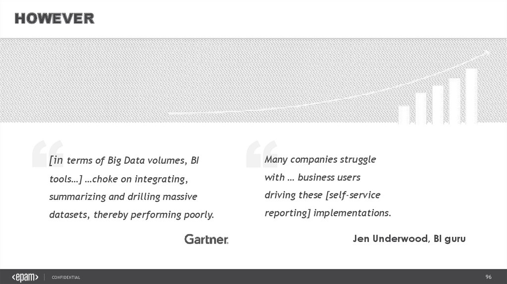
HOWEVER”
tools…] …choke on integrating,
summarizing and drilling massive
datasets, thereby performing poorly.
”
[in terms of Big Data volumes, BI
Many companies struggle
with … business users
driving these [self-service
reporting] implementations.
Jen Underwood, BI guru
CONFIDENTIAL
96
97.
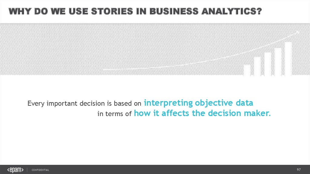
WHY DO WE USE STORIES IN BUSINESS ANALYTICS?interpreting objective data
in terms of how it affects the decision maker.
Every important decision is based on
CONFIDENTIAL
97
98.
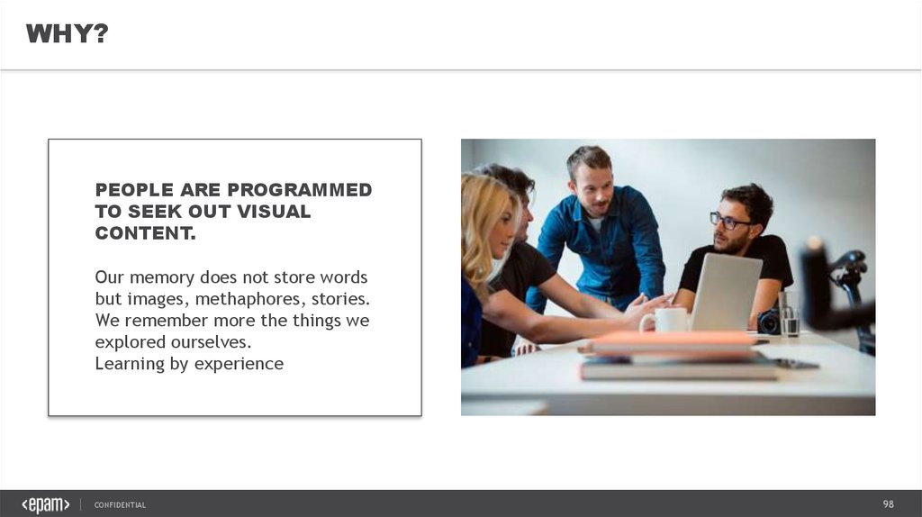
WHY?PEOPLE ARE PROGRAMMED
TO SEEK OUT VISUAL
CONTENT.
Our memory does not store words
but images, methaphores, stories.
We remember more the things we
explored ourselves.
Learning by experience
CONFIDENTIAL
98
99.
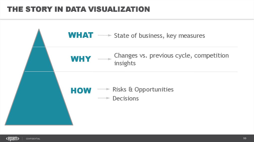
THE STORY IN DATA VISUALIZATIONWHAT
CONFIDENTIAL
State of business, key measures
WHY
Changes vs. previous cycle, competition
insights
HOW
Risks & Opportunities
Decisions
99
100.
UNDERSTAND AND GUIDEWHAT is happening in my business?
Market trends
Company performance
(shares)
WHY is it happening?
Drivers (and drainers)
Insights
On competition
On business
On customers
HOW do we deliver the goal/fill the gap?
Actionables
Business Decisions
CONFIDENTIAL
100
101.
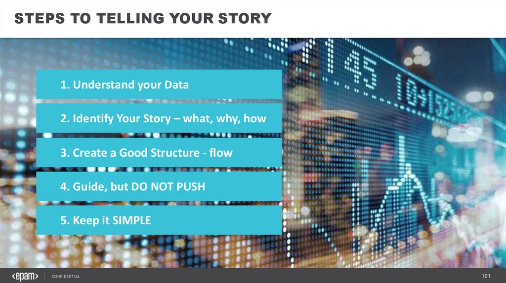
STEPS TO TELLING YOUR STORY1. Understand your Data
2. Identify Your Story – what, why, how
3. Create a Good Structure - flow
4. Guide, but DO NOT PUSH
5. Keep it SIMPLE
CONFIDENTIAL
101
102.
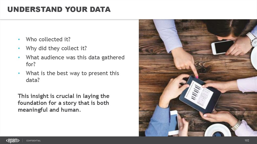
UNDERSTAND YOUR DATAWho collected it?
Why did they collect it?
What audience was this data gathered
for?
What is the best way to present this
data?
This insight is crucial in laying the
foundation for a story that is both
meaningful and human.
CONFIDENTIAL
102
103.
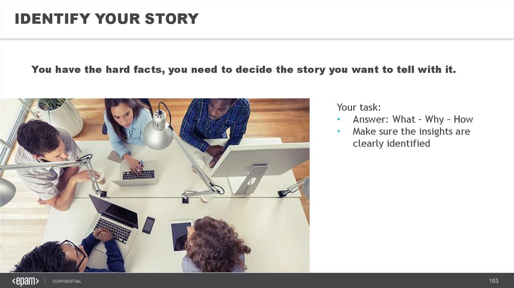
IDENTIFY YOUR STORYYou have the hard facts, you need to decide the story you want to tell with it.
Your task:
• Answer: What – Why – How
• Make sure the insights are
clearly identified
CONFIDENTIAL
103
104.
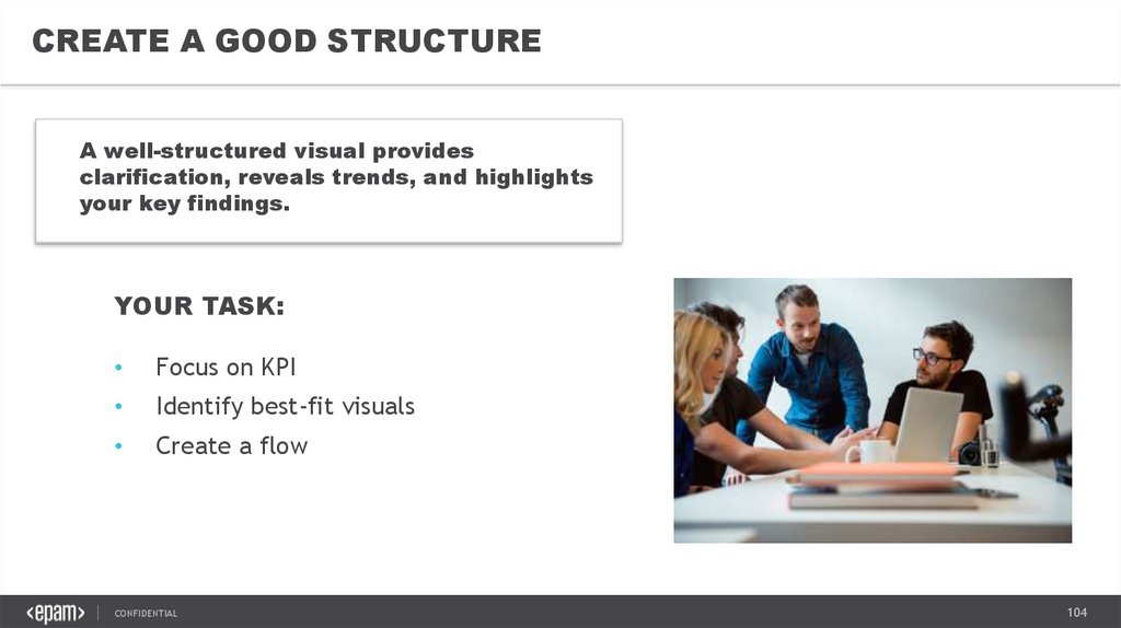
CREATE A GOOD STRUCTUREA well-structured visual provides
clarification, reveals trends, and highlights
your key findings.
YOUR TASK:
Focus on KPI
Identify best-fit visuals
Create a flow
CONFIDENTIAL
104
105.
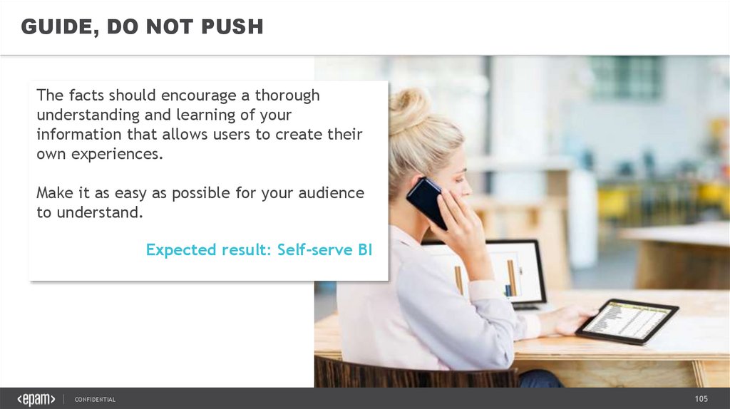
GUIDE, DO NOT PUSHThe facts should encourage a thorough
understanding and learning of your
information that allows users to create their
own experiences.
Make it as easy as possible for your audience
to understand.
Expected result: Self-serve BI
CONFIDENTIAL
105
106.
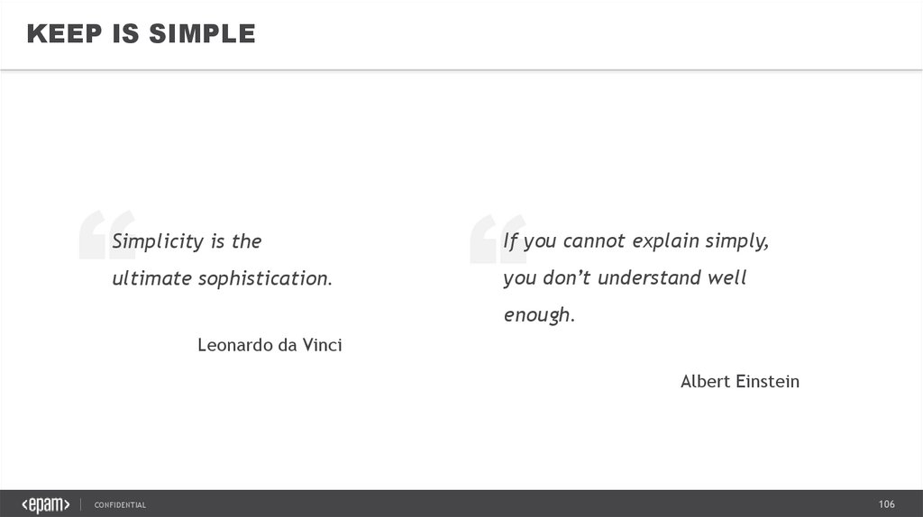
KEEP IS SIMPLE”
ultimate sophistication.
”
Simplicity is the
If you cannot explain simply,
you don’t understand well
enough.
Leonardo da Vinci
Albert Einstein
CONFIDENTIAL
106
107.
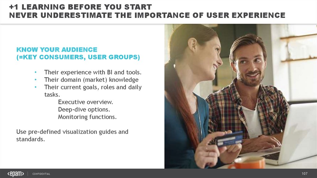
+1 LEARNING BEFORE YOU STARTNEVER UNDERESTIMATE THE IMPORTANCE OF USER EXPERIENCE
KNOW YOUR AUDIENCE
(=KEY CONSUMERS, USER GROUPS)
Their experience with BI and tools.
Their domain (market) knowledge
Their current goals, roles and daily
tasks.
Executive overview.
Deep-dive options.
Monitoring functions.
Use pre-defined visualization guides and
standards.
CONFIDENTIAL
107
108.
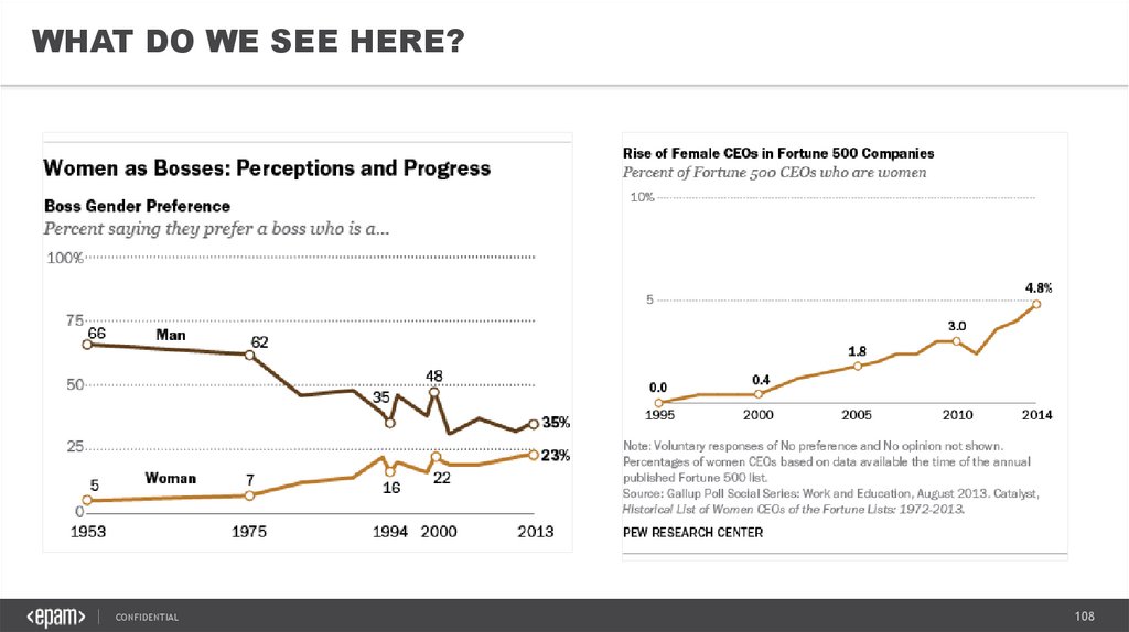
WHAT DO WE SEE HERE?CONFIDENTIAL
108
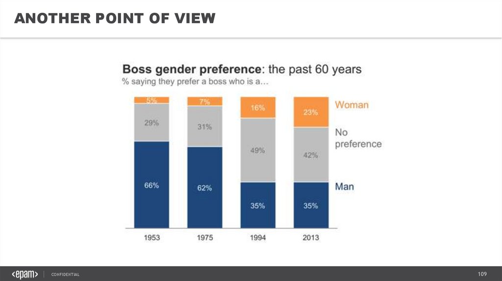
109.
ANOTHER POINT OF VIEWCONFIDENTIAL
109
110.
TAKEAWAYS1. Understand your Data
2. Identify Your Story – what, why, how
3. Create a Good Structure - flow
4. Guide, but DO NOT PUSH
5. Keep it SIMPLE
CONFIDENTIAL
+ 1 TAKEAWAY
ALWAYS DESIGN FOR
YOUR AUDIENCE.
110
111.
VISUAL STORYTELLING &DATA VISUALIZATION BEST PRACTICES7. EPAM VISUALIZATION STANDARDS
CONFIDENTIAL
111
112.
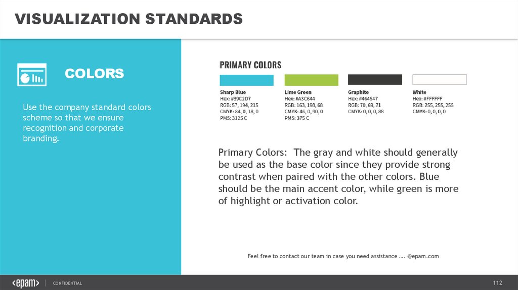
VISUALIZATION STANDARDSCOLORS
Use the company standard colors
scheme so that we ensure
recognition and corporate
branding.
Primary Colors: The gray and white should generally
be used as the base color since they provide strong
contrast when paired with the other colors. Blue
should be the main accent color, while green is more
of highlight or activation color.
Feel free to contact our team in case you need assistance …. @epam.com
CONFIDENTIAL
112
113.
VISUALIZATION STANDARDSCOLORS
Use the company standard colors
scheme so that we ensure
recognition and corporate
branding.
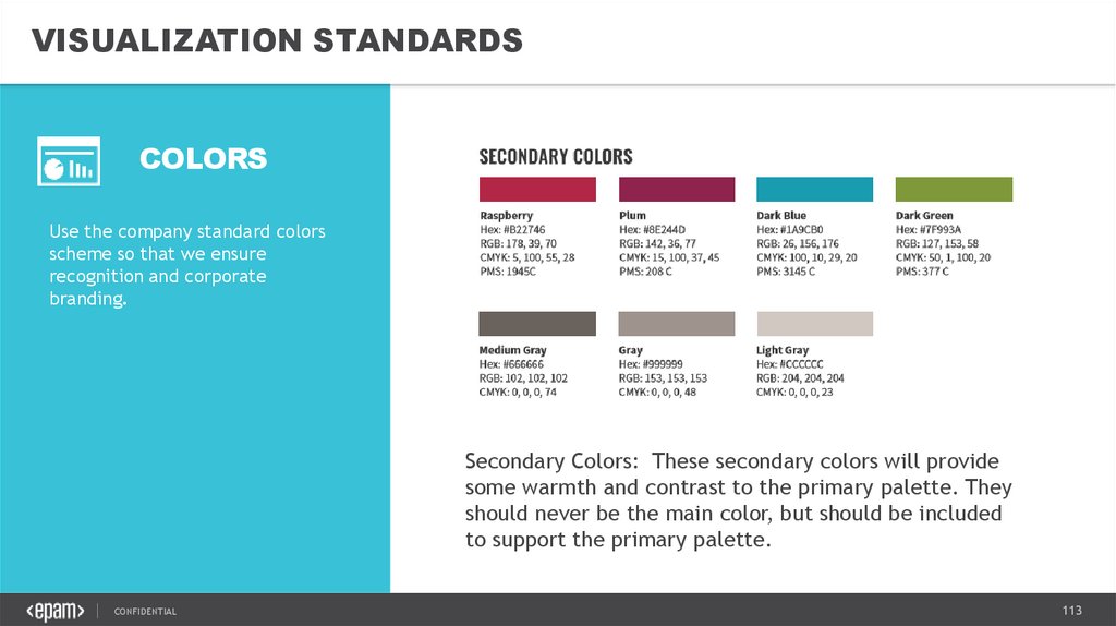
Secondary Colors: These secondary colors will provide
some warmth and contrast to the primary palette. They
should never be the main color, but should be included
to support the primary palette.
CONFIDENTIAL
113
114.
VISUALIZATION STANDARDSTYPOGRAPHY
Use the company standard colors
scheme so that we ensure
recognition and corporate
branding.
HEADING: ARIAL BLACK CAPITAL
All templates use Arial Black fonts for headings and page
titles.
Visualization font:
Use Arial or the default font of analytics tool
Filter panel
Text area
Legend
Chart labels
BUTTON FONT: ARIAL BLACK CAPITAL
BUTTONS
CONFIDENTIAL
BUTTONS
114
115.
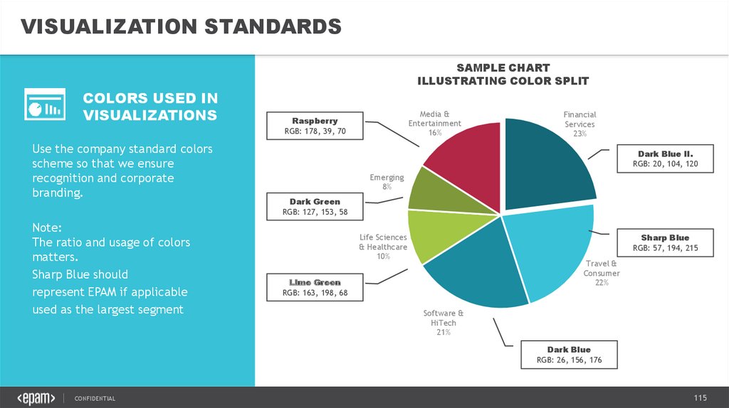
VISUALIZATION STANDARDSSAMPLE CHART
ILLUSTRATING COLOR SPLIT
COLORS USED IN
VISUALIZATIONS
Use the company standard colors
scheme so that we ensure
recognition and corporate
branding.
Note:
The ratio and usage of colors
matters.
Sharp Blue should
represent EPAM if applicable
used as the largest segment
Media &
Entertainment
16%
Raspberry
RGB: 178, 39, 70
Financial
Services
23%
Dark Blue II.
RGB: 20, 104, 120
Emerging
8%
Dark Green
RGB: 127, 153, 58
Sharp Blue
RGB: 57, 194, 215
Life Sciences
& Healthcare
10%
Travel &
Consumer
22%
Lime Green
RGB: 163, 198, 68
Software &
HiTech
21%
Dark Blue
RGB: 26, 156, 176
CONFIDENTIAL
115
116.
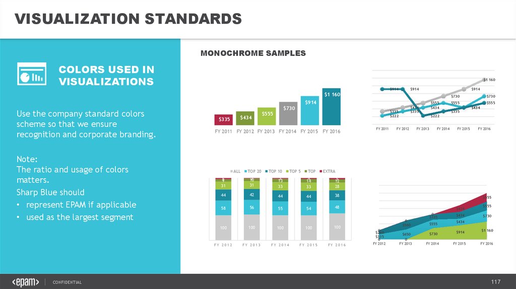
VISUALIZATION STANDARDSMONOCHROME SAMPLES
$1 160
COLORS USED IN
VISUALIZATIONS
Use the company standard colors
scheme so that we ensure
recognition and corporate
branding.
Note:
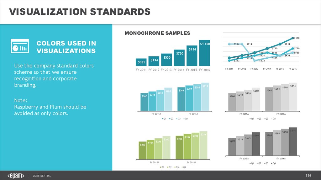
Raspberry and Plum should be
avoided as only colors.
$1 160
$914
$914
$914
$730
$914
$730
$335
$555
$434
$200
$218
$284
$264
$260
$236
FY 2015A
$200
$218
$298
FY 2011
FY 2016A
$236
Q2
$260
Q3
$264
$284
FY 2012
FY 2013
FY 2014
FY 2015
$218
$236
$260
$264
$284
FY 2015A
$314
$218
$236
Q2
$260
Q3
FY 2016A
Q1
CONFIDENTIAL
Q2
Q3
$314
$264
Q4
$284
FY 2015A
FY 2015A
$298
FY 2016
FY 2016A
Q1
$200
$555
$434
$335
$222
Q4
$298
$730
$555
$314
$200
Q1
$434
$335
$335
$222
FY 2011 FY 2012 FY 2013 FY 2014 FY 2015 FY 2016
$555
$434
$298
$314
FY 2016A
Q1
Q2
Q3
Q4
Q4
116
117.
VISUALIZATION STANDARDSMONOCHROME SAMPLES
COLORS USED IN
VISUALIZATIONS
$1 160
$914
$914
$914
$1 160
$730
$914
Use the company standard colors
scheme so that we ensure
recognition and corporate branding.
Note:
The ratio and usage of colors
matters.
Sharp Blue should
• represent EPAM if applicable
• used as the largest segment
$335
$555
ALL
TOP 20
TOP 10
TOP 5
TOP
2
10
31
3
13
33
4
14
33
5
12
28
44
42
44
44
38
58
56
54
48
FY 2012
100
FY 2013
100
FY 2014
100
FY 2015
FY 2011
$730
$555
$335
$555
$434
$222
FY 2012
FY 2013
FY 2014
FY 2015
FY 2016
EXTRA
5
9
31
55
$434
$335
$335
$222
FY 2011 FY 2012 FY 2013 FY 2014 FY 2015 FY 2016
100
CONFIDENTIAL
$434
$730
$555
$434
100
FY 2016
$555
$434
0
$560
0
$240
$335
0
FY 2012
$650
0
FY 2013
0
$335
$555
$434
$555
$730
$434
$730
$914
FY 2014
FY 2015
$1 160
FY 2016
117
118.
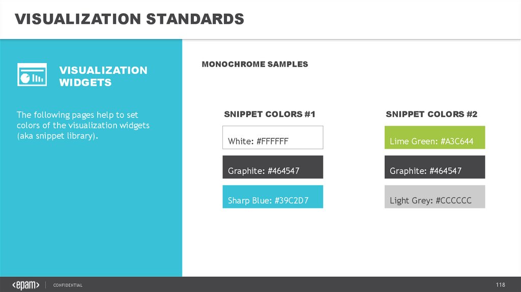
VISUALIZATION STANDARDSVISUALIZATION
WIDGETS
The following pages help to set
colors of the visualization widgets
(aka snippet library).
CONFIDENTIAL
MONOCHROME SAMPLES
SNIPPET COLORS #1
SNIPPET COLORS #2
White: #FFFFFF
Lime Green: #A3C644
Graphite: #464547
Graphite: #464547
Sharp Blue: #39C2D7
Light Grey: #CCCCCC
118
119.
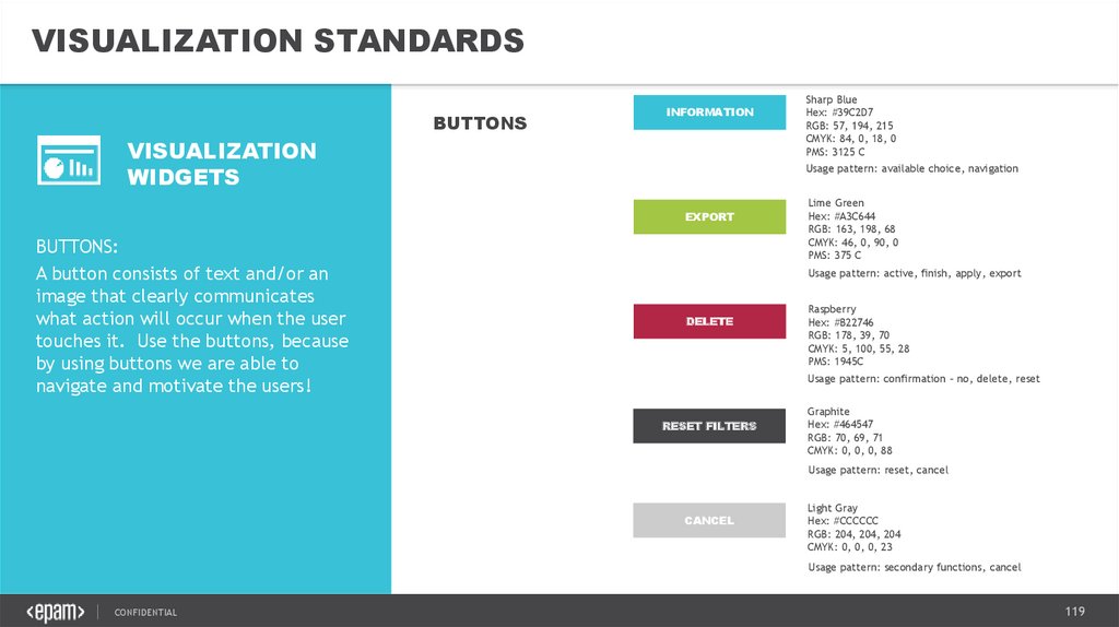
VISUALIZATION STANDARDSBUTTONS
INFORMATION
VISUALIZATION
WIDGETS
Usage pattern: available choice, navigation
EXPORT
BUTTONS:
A button consists of text and/or an
image that clearly communicates
what action will occur when the user
touches it. Use the buttons, because
by using buttons we are able to
navigate and motivate the users!
Sharp Blue
Hex: #39C2D7
RGB: 57, 194, 215
CMYK: 84, 0, 18, 0
PMS: 3125 C
Lime Green
Hex: #A3C644
RGB: 163, 198, 68
CMYK: 46, 0, 90, 0
PMS: 375 C
Usage pattern: active, finish, apply, export
DELETE
Raspberry
Hex: #B22746
RGB: 178, 39, 70
CMYK: 5, 100, 55, 28
PMS: 1945C
Usage pattern: confirmation – no, delete, reset
RESET FILTERS
Graphite
Hex: #464547
RGB: 70, 69, 71
CMYK: 0, 0, 0, 88
Usage pattern: reset, cancel
CANCEL
Light Gray
Hex: #CCCCCC
RGB: 204, 204, 204
CMYK: 0, 0, 0, 23
Usage pattern: secondary functions, cancel
CONFIDENTIAL
119
120.
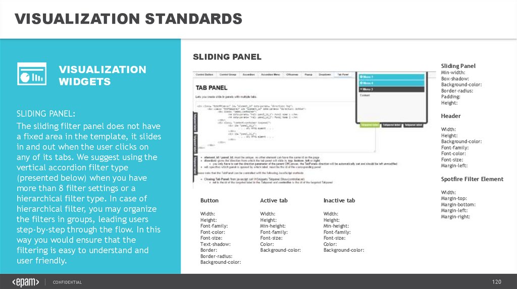
VISUALIZATION STANDARDSSLIDING PANEL
VISUALIZATION
WIDGETS
SLIDING PANEL:
The sliding filter panel does not have
a fixed area in the template, it slides
in and out when the user clicks on
any of its tabs. We suggest using the
vertical accordion filter type
(presented below) when you have
more than 8 filter settings or a
hierarchical filter type. In case of
hierarchical filter, you may organize
the filters in groups, leading users
step-by-step through the flow. In this
way you would ensure that the
filtering is easy to understand and
user friendly.
CONFIDENTIAL
Sliding Panel
Min-width:
Box-shadow:
Background-color:
Border-radius:
Padding:
Height:
Header
Width:
Height:
Background-color:
Font-family:
Font-color:
Font-size:
Margin-left:
Spotfire Filter Element
Button
Active tab
Inactive tab
Width:
Height:
Font-family:
Font-color:
Font-size:
Text-shadow:
Border:
Border-radius:
Background-color:
Width:
Height:
Min-height:
Font-family:
Font-size:
Color:
Background-color:
Width:
Height:
Min-height:
Font-family:
Font-size:
Color:
Background-color:
Width:
Margin-top:
Margin-bottom:
Margin-left:
Margin-right:
120
121.
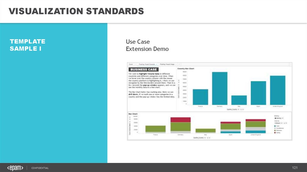
VISUALIZATION STANDARDSTEMPLATE
SAMPLE I
CONFIDENTIAL
Use Case
Extension Demo
121
122.
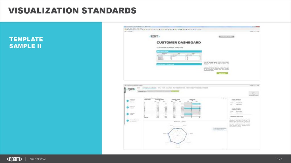
VISUALIZATION STANDARDSTEMPLATE
SAMPLE II
CONFIDENTIAL
122