Похожие презентации:
Principles and Elements of Design Applied to Architecture
1. Principles and Elements of Design Applied to Architecture
2. Visual Design Elements
Six integral components used in thecreation of a design:
Line
Space
Color
Texture
Form and Shape
Value
3. Line
TypesVertical – Represents dignity, formality, stability, and
strength
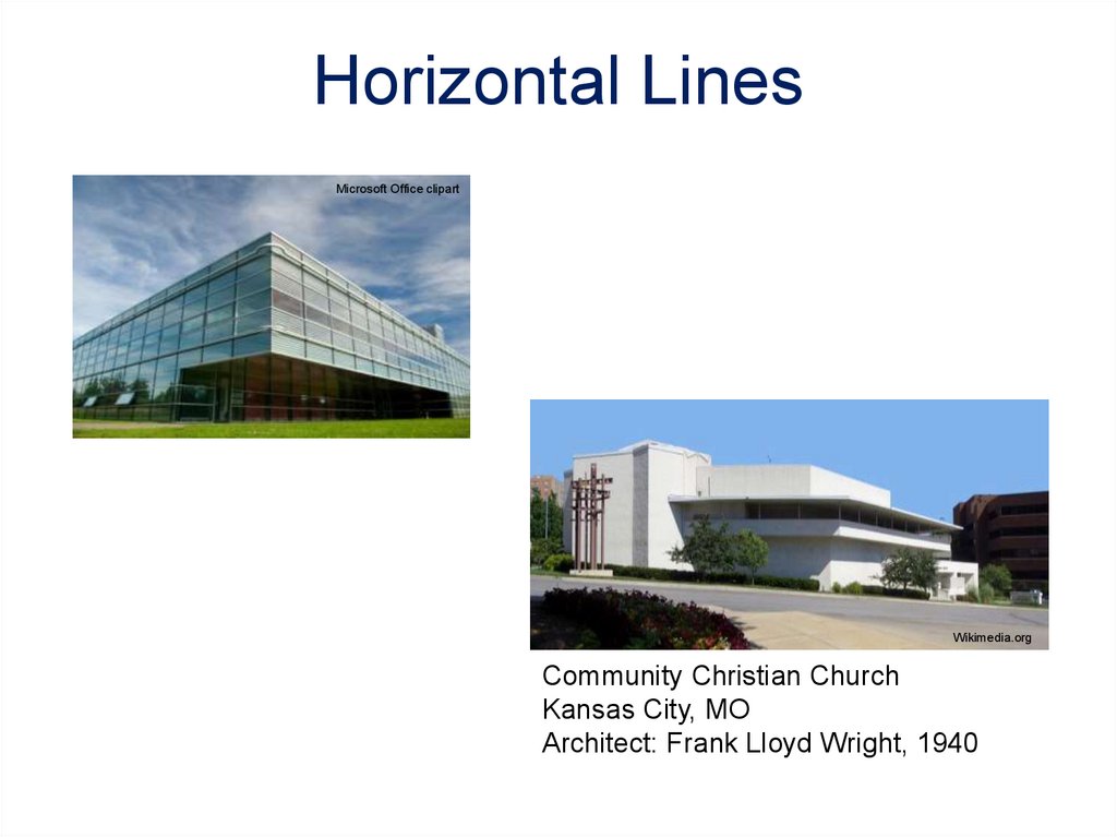
Horizontal – Represents calm, peace, and relaxation
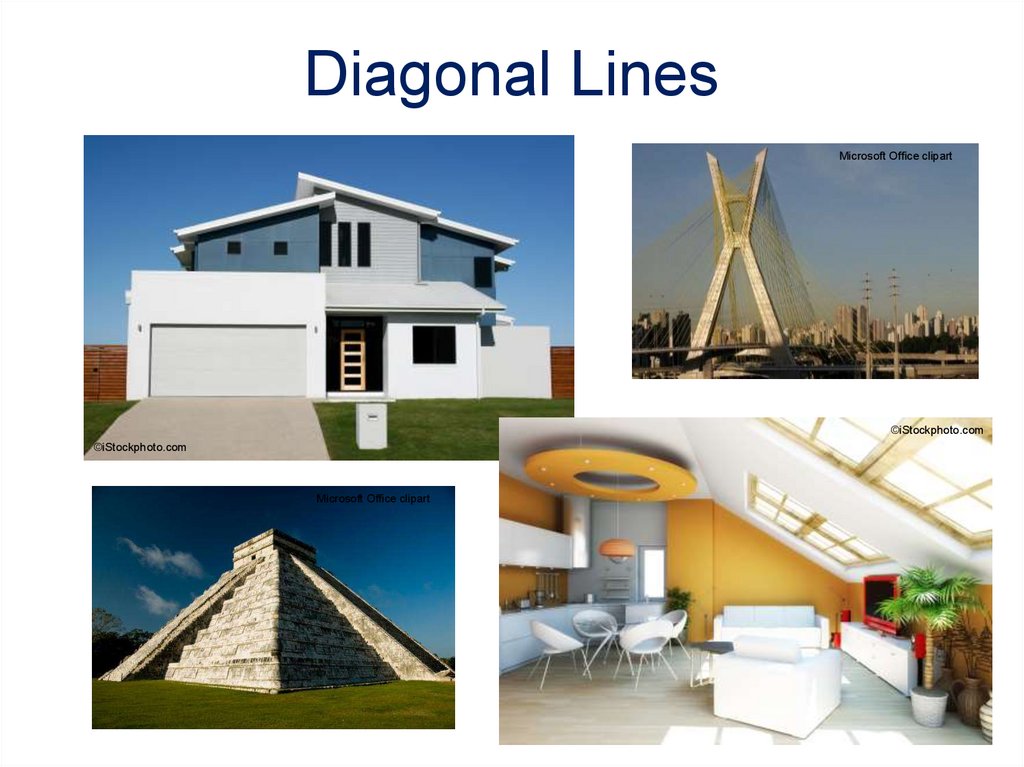
Diagonal – Represents action, activity, excitement, and
movement
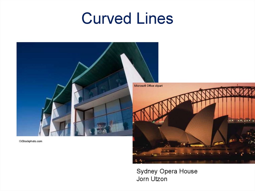
Curved – Represents freedom, the natural, having the
appearance of softness, and creates a soothing feeling
or mood
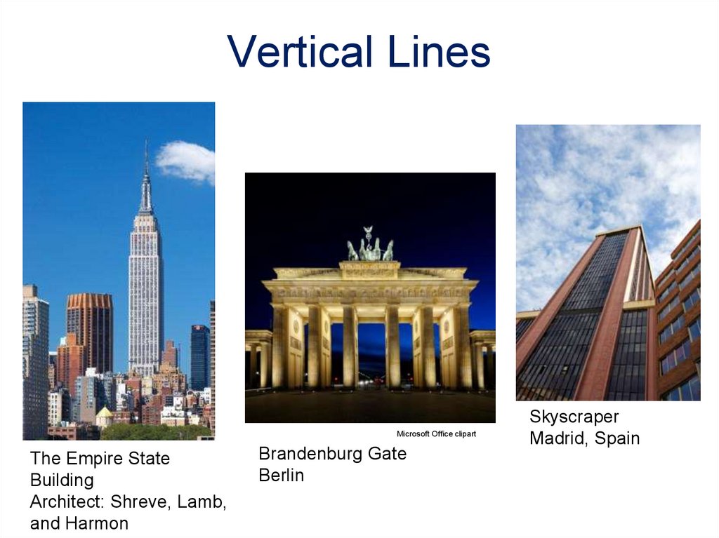
4. Vertical Lines
Microsoft Office clipartThe Empire State
Building
Architect: Shreve, Lamb,
and Harmon
Brandenburg Gate
Berlin
Skyscraper
Madrid, Spain
5. Horizontal Lines
Microsoft Office clipartWikimedia.org
Community Christian Church
Kansas City, MO
Architect: Frank Lloyd Wright, 1940
6. Diagonal Lines
Microsoft Office clipart©iStockphoto.com
©iStockphoto.com
Microsoft Office clipart
7. Curved Lines
Microsoft Office clipart©iStockphoto.com
Sydney Opera House
Jorn Utzon
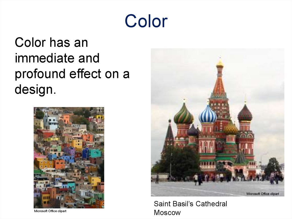
8. Color
Color has animmediate and
profound effect on a
design.
©iStockphoto.com
Microsoft Office clipart
Microsoft Office clipart
Saint Basil’s Cathedral
Moscow
9. Color
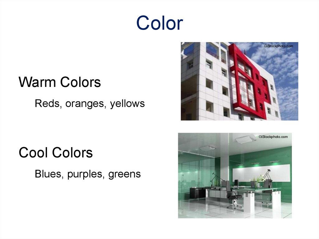
©iStockphoto.comWarm Colors
Reds, oranges, yellows
©iStockphoto.com
Cool Colors
Blues, purples, greens
10. Color
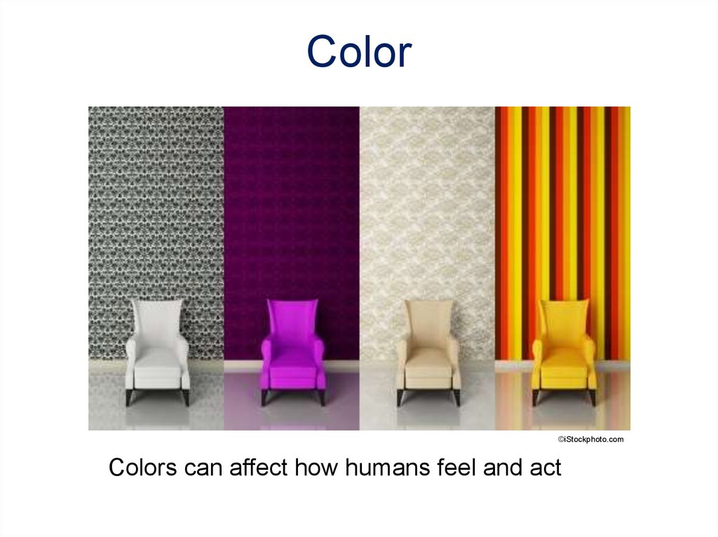
©iStockphoto.comColors can affect how humans feel and act
11. Form and Shape
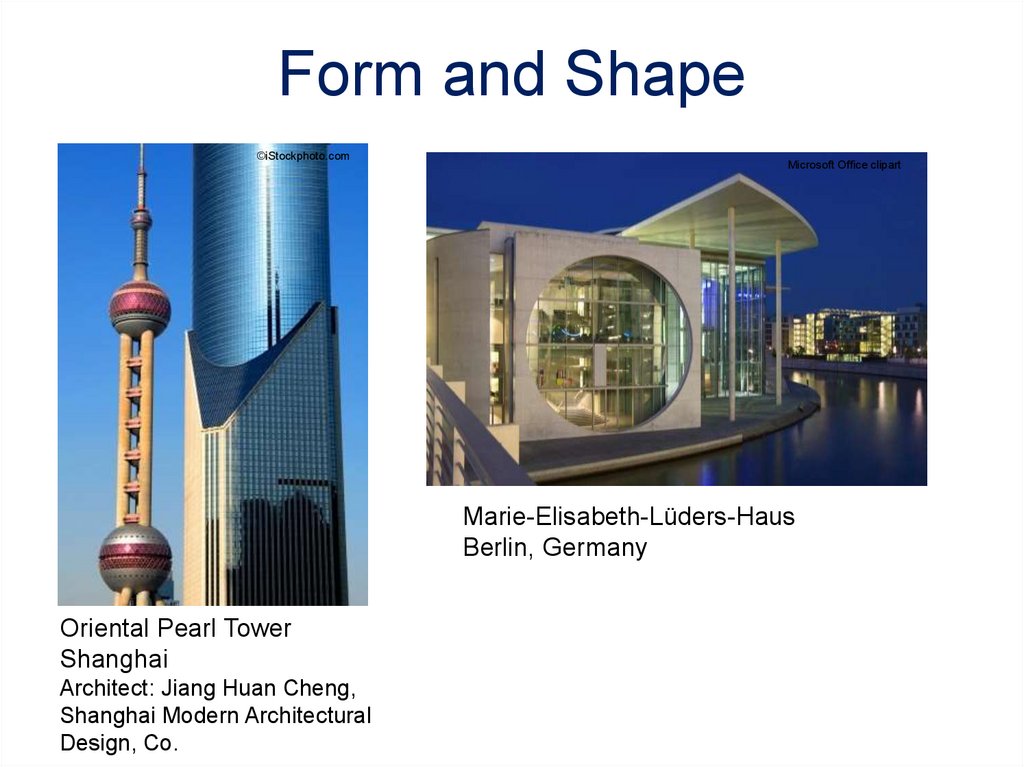
Form: (3D)The shape and structure of something asdistinguished from its substance or material.
Shape: (2D)The two-dimensional contour that
characterizes an object or area.
12. Form and Shape
©iStockphoto.comMicrosoft Office clipart
Marie-Elisabeth-Lüders-Haus
Berlin, Germany
Oriental Pearl Tower
Shanghai
Architect: Jiang Huan Cheng,
Shanghai Modern Architectural
Design, Co.
13. Space
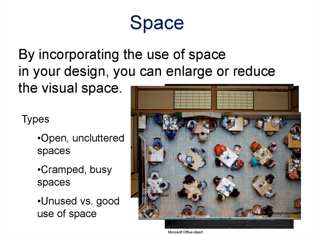
By incorporating the use of spacein your design, you can enlarge or reduce
the visual space.
Microsoft Office clipart
Types
•Open, uncluttered
spaces
•Cramped, busy
spaces
•Unused vs. good
use of space
Microsoft Office clipart
©iStockphoto.com
Microsoft Office clipart
14. Texture
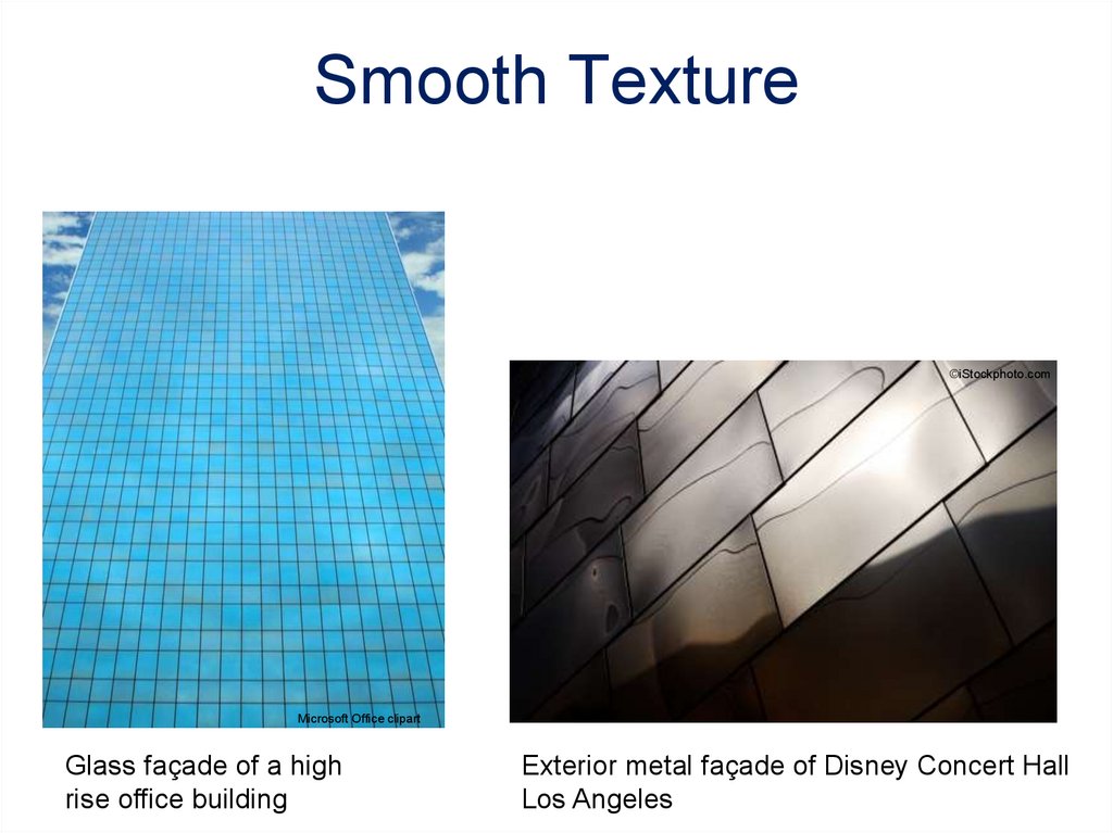
The surface look or feel of somethingSmooth Surface – Reflects more light and
therefore is a more intense color.
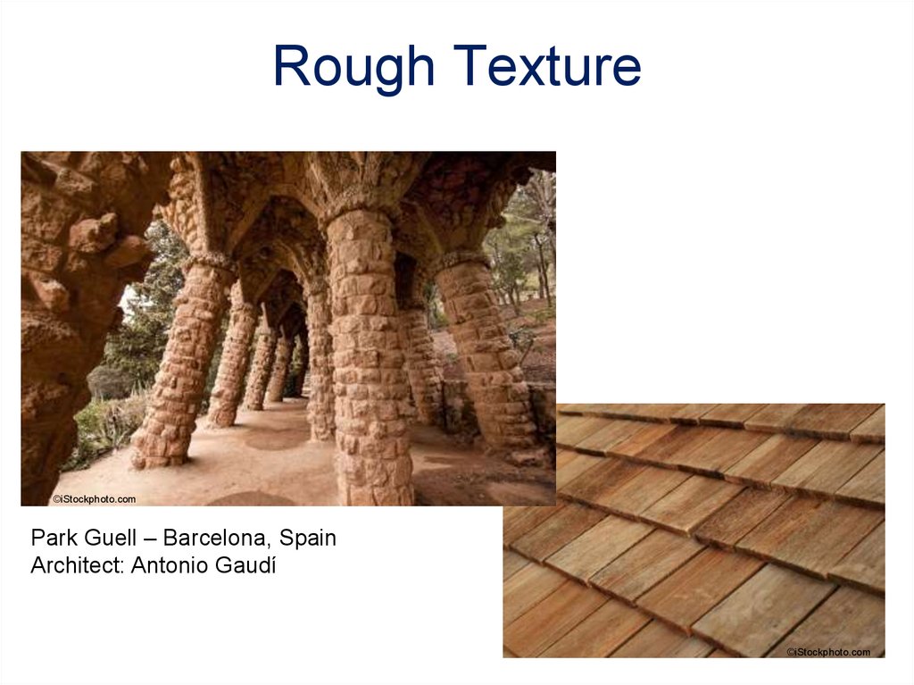
Rough Surface – Absorbs more light and
therefore appears darker.
15. Smooth Texture
©iStockphoto.comMicrosoft Office clipart
Glass façade of a high
rise office building
Exterior metal façade of Disney Concert Hall
Los Angeles
16. Rough Texture
©iStockphoto.comPark Guell – Barcelona, Spain
Architect: Antonio Gaudí
©iStockphoto.com
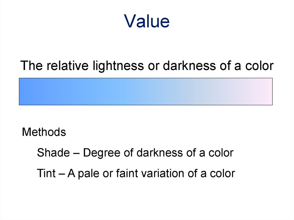
17. Value
The relative lightness or darkness of a colorMethods
Shade – Degree of darkness of a color
Tint – A pale or faint variation of a color
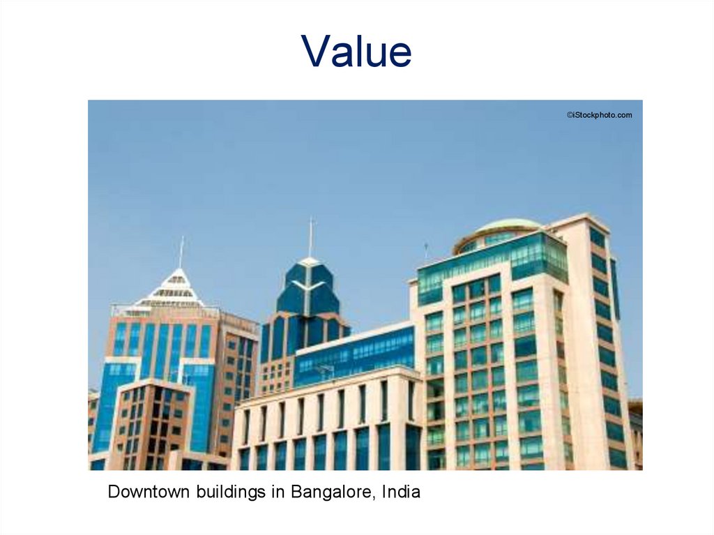
18. Value
©iStockphoto.comDowntown buildings in Bangalore, India
19. Visual Design Principles
Seven principles encompass an interestingdesign.
•Balance
•Rhythm
•Emphasis
•Proportion and scale
•Movement
•Contrast
•Unity
20. Balance
Parts of the design are equally distributed to createa sense of stability. Both physical and visual
balance exist.
Types
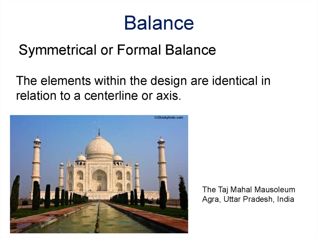
•Symmetrical or formal balance
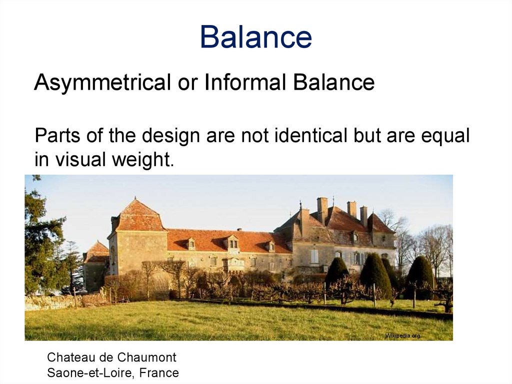
•Asymmetrical or informal balance
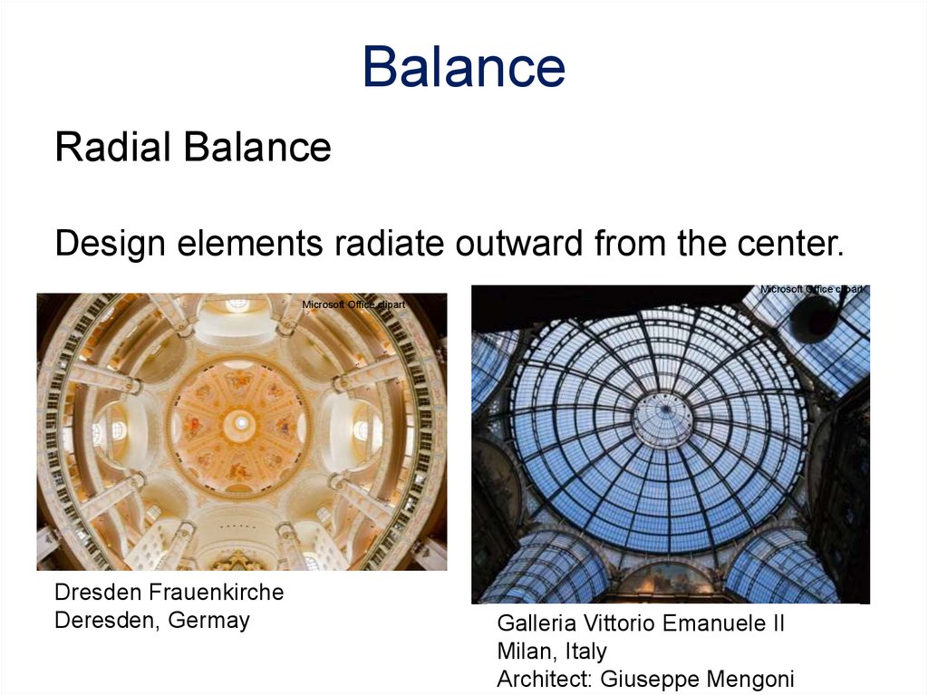
•Radial balance
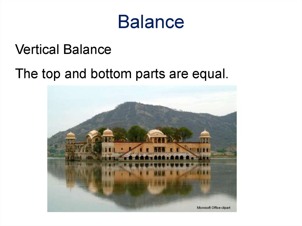
•Vertical balance
•Horizontal balance
21. The elements within the design are identical in relation to a centerline or axis.
BalanceSymmetrical or Formal Balance
The elements within the design are identical in
relation to a centerline or axis.
©iStockphoto.com
The Taj Mahal Mausoleum
Agra, Uttar Pradesh, India
22. Balance
Asymmetrical or Informal BalanceParts of the design are not identical but are equal
in visual weight.
Wikipedia.org
Chateau de Chaumont
Saone-et-Loire, France
23. Balance
Radial BalanceDesign elements radiate outward from the center.
Microsoft Office clipart
Microsoft Office clipart
Dresden Frauenkirche
Deresden, Germay
Galleria Vittorio Emanuele II
Milan, Italy
Architect: Giuseppe Mengoni
24. Balance
Vertical BalanceThe top and bottom parts are equal.
Microsoft Office clipart
25.
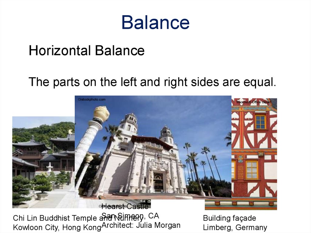
BalanceHorizontal Balance
The parts on the left and right sides are equal.
©istockphoto.com
Hearst Castle
SanNunnery
Simeon, CA
Chi Lin Buddhist Temple and
Kowloon City, Hong KongArchitect: Julia Morgan
Microsoft Office clipart
©iStockphoto.com
Building façade
Limberg, Germany
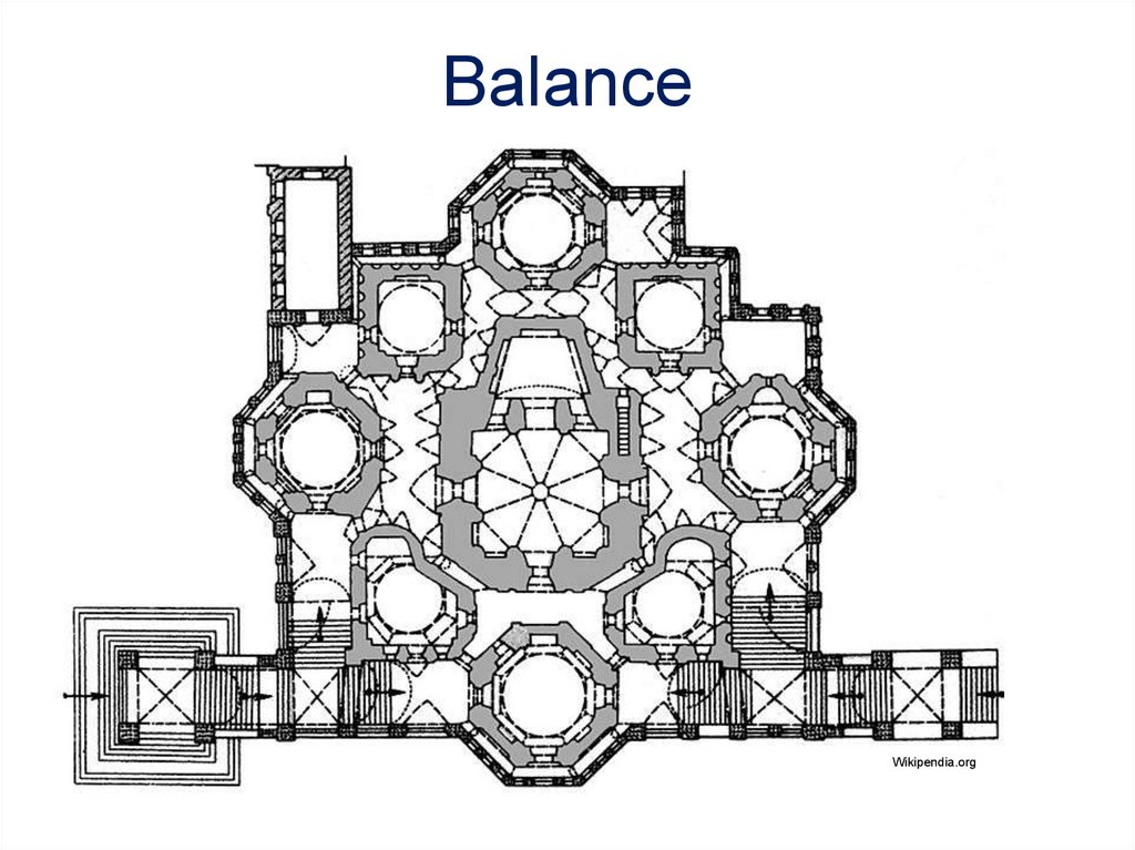
26. Balance
Wikipendia.org27.
RhythmRepeated use of line, shape, color, texture
or pattern
Types
•Regular rhythm
•Graduated rhythm
•Random rhythm
•Gradated rhythm
28. Rhythm
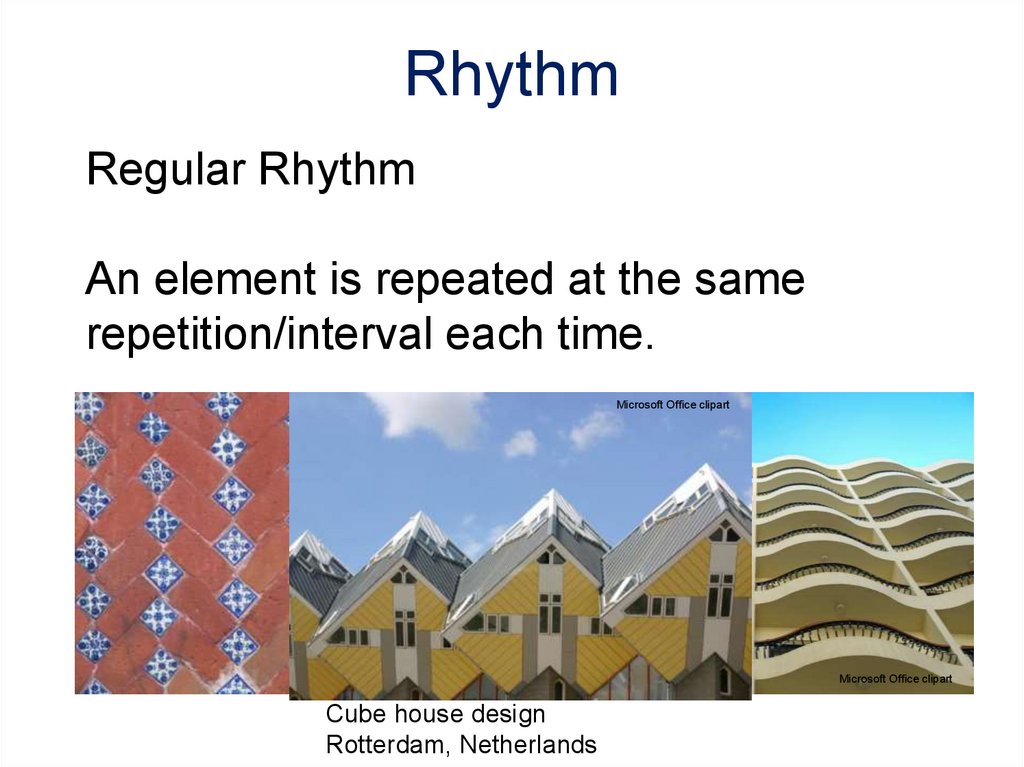
Regular RhythmAn element is repeated at the same
repetition/interval each time.
Microsoft Office clipart
Microsoft Office clipart
Cube house design
Rotterdam, Netherlands
Microsoft Office clipart
29. Rhythm
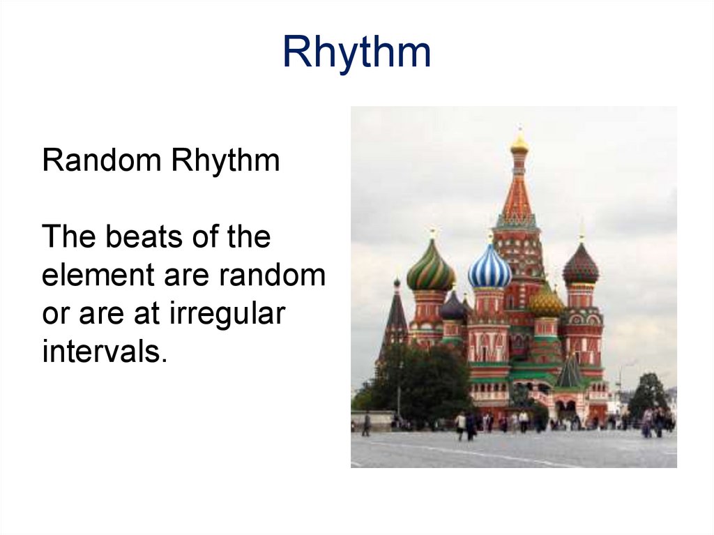
Random RhythmThe beats of the
element are random
or are at irregular
intervals.
30. Rhythm
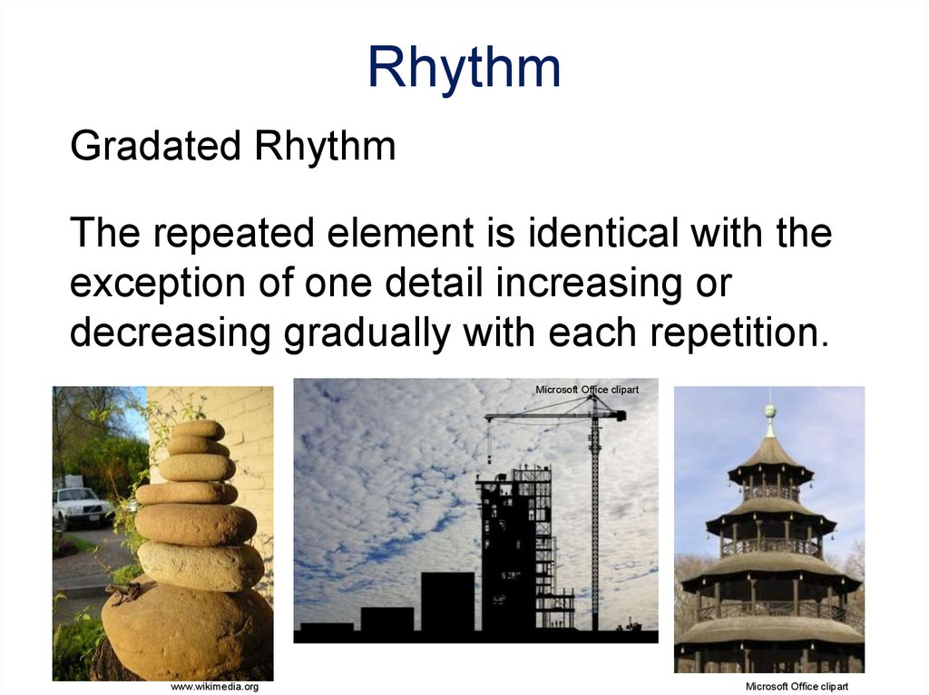
Gradated RhythmThe repeated element is identical with the
exception of one detail increasing or
decreasing gradually with each repetition.
Microsoft Office clipart
Left: Stack of rocks used
as focal point in
landscaping
Right: The Chinese Tower
English Gardens
Munich, Germany
www.wikimedia.org
Microsoft Office clipart
31. Emphasis
Wikipedia.orgEmphasis
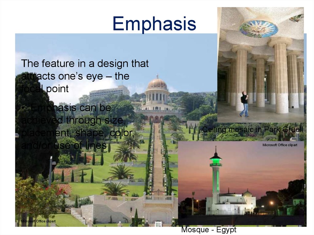
The feature in a design that
attracts one’s eye – the
focal point
• Emphasis can be
achieved through size,
placement, shape, color,
and/or use of lines
Ceiling mosaic in Park Gruell
Microsoft Office clipart
Microsoft Office clipart
Mosque - Egypt
32. Proportion and Scale
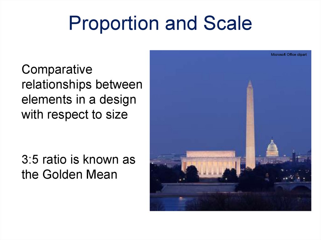
Microsoft Office clipartComparative
relationships between
elements in a design
with respect to size
3:5 ratio is known as
the Golden Mean
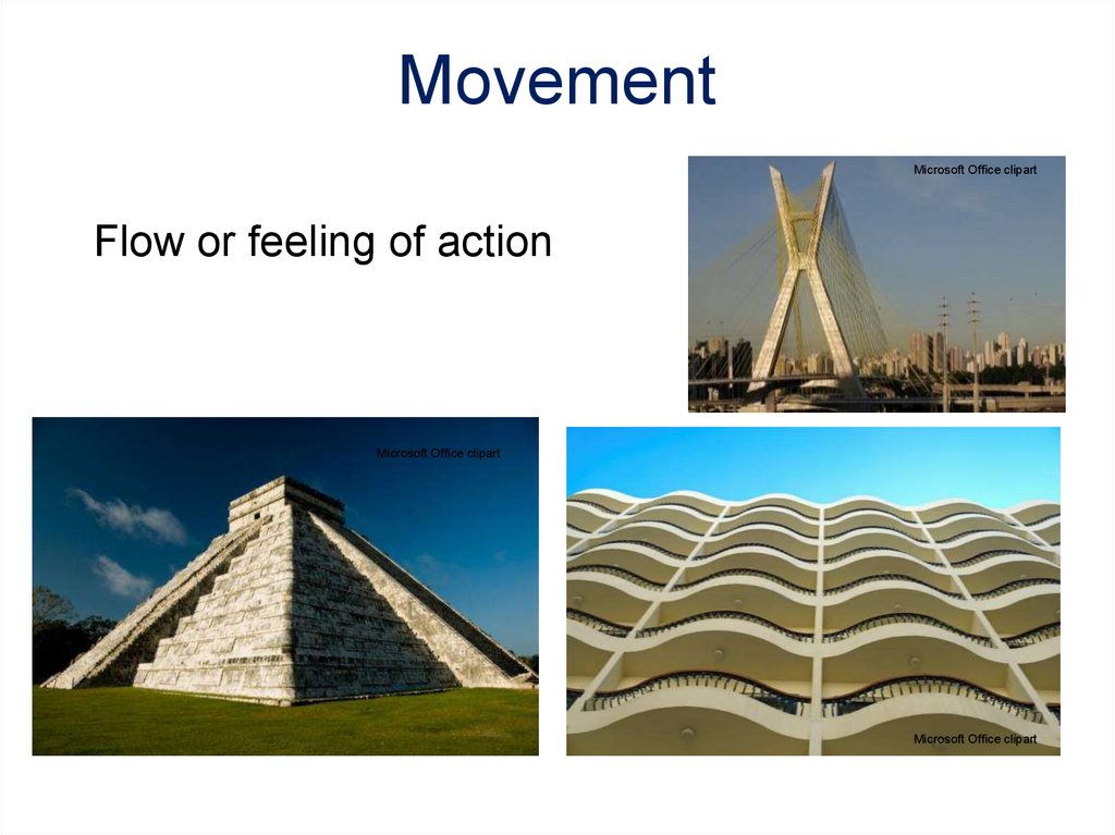
33. Movement
Microsoft Office clipartFlow or feeling of action
Microsoft Office clipart
Microsoft Office clipart
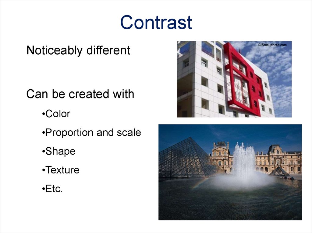
34. Contrast
Noticeably differentCan be created with
•Color
•Proportion and scale
•Shape
•Texture
•Etc.
©iStockphoto.com
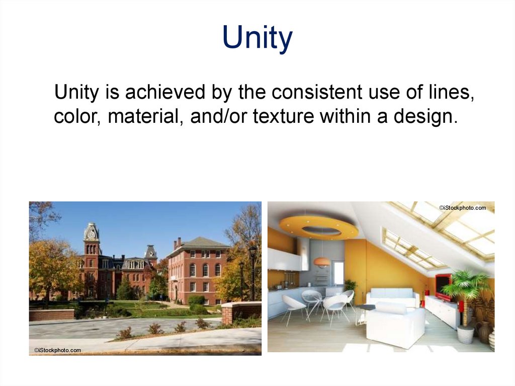
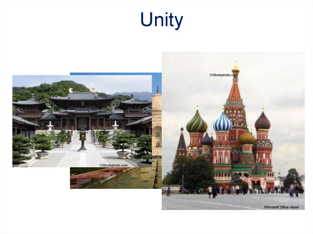
35. Unity
Unity is achieved by the consistent use of lines,color, material, and/or texture within a design.
©iStockphoto.com
©iStockphoto.com
36.
Unity©iStockphoto.com
©iStockphoto.com
Microsoft Office clipart
37. Image Resources
Microsoft, Inc. (2008). Clip art. Retrieved January 7, 2009, fromhttp://office. microsoft.com/en-us/clipart/default.aspx
Wikipedia. Retrieved January 7, 2009, from http://en.wikipedia.org
iStockphoto. Retrieved January 7, 2009 from
http://www.istockphoto.com/index.php
38. References
The Empire State Building Official Internet Site (n.d.). RetrievedJanuary 7, 2009, from http://www.esbnyc.com/
Great Buildings. (2009). Retrieved January 7, 2009, from
www.greatbuildings.com.
Heart Castle – Hearst San Simeon State Historical Monument. (2009).
Retrieved January 7, 2009, from www.hearstcastle.org
