Похожие презентации:
IELTS Journal. Task 1. IELTS Writing
1.
TargetBand
7
+
IELTS
JOURNAL
Task 1 IELTS Writing
Academic Training Module by Adam Smith
First Published in 2015
IELTSJOURNAL
2.
ContentsAbout the Writing Test
4
How to use your 20 minutes
4
Points to Apply in Task 1, Report Writing
5
What does a good report look like?
6
Using the right tense is important
6
Different types of visuals
7
Describing trends, Language of change
8
Connecting trends
10
Using the right prepositions
12
Describing numbers, percentages & fractions
16
Describing Quantities
17
Varying your language
18
Using Simple Comparisons
19
The language for comparing
20
Other Important Language for Comparisons
21
Adding an explanation
22
Writing an introduction
23
Writing the General Overview Paragraph
26
Selecting Main Points
27
Writing an 'overview' not a conclusion
29
Writing Body Paragraphs
30
Writing just six sentences to include the details
31
Selecting details and grouping them
33
Including approximation
35
IELTS JOURNAL
2
3.
Having a Task 1 checklist is important36
Avoid common mistakes
36
Describing more than one chart
37
Describing Processes
39
Describing a map
42
Effective ways to prepare for Task 1
46
Good Sample Answers Worth Reading
47
Keep in touch!
104
Use this book together with the instagram page @ieltsjournal
The instagram page contains lessons that show how to use the ideas from this
book. You can keep in touch with the author there and ask your questions.
IELTS JOURNAL
3
4.
Academic Training WritingAbout the Writing Test
The IELTS Academic Training Writing Test takes 60 minutes. You have to complete two
writing tasks.
Task 1
x You have about 20 minutes
x You must write a report of at least 150 words
x You are given a visual presentation which can be in form of a graph, diagram, bar
chart, table, map or a process. You must write a report explaining the main features
of the figure and make comparisons where relevant. You must not include any
personal opinion while you are explaining the figure. You just need to describe and
report what you are given.
How to use your 20 minutes
You have 20 minutes for task 1, so try spending 5 minutes on each paragraph. This might
help you to organise your time better.
First 5 minutes
Read the question, make sure you understand the chart, write your
introduction by paraphrasing the question.
Second 5 minutes
Look at the chart and try to find 2 general points. Don't look at specific details;
look for "the big picture". Write 2 sentences summarising the information.
Final 10 minutes
Describe specific details. Try to break this part into 2 paragraphs because it
looks better. You could spend 5 minutes on each paragraph.
IELTS JOURNAL
4
5.
Points to Apply in Task 1, Report WritingThe IELTS writing Task 1 academic is an information transfer task which requires you to
write a fairly precise account of some information presented in graphic form such as a
graph, table or some form of pictorial representation of data. In order to complete the task
successfully, follow these suggestions.
x Introduction should describe the purpose of the report and say what the overall trends are.
For example, if the graph is climbing up or dropping down, you should mention the change
or the changes accurately and meaningfully. You need to remember that you are describing
a graph to someone who does not see it, so your words must draw the picture. Write what
the graph is about, its dates and location as well as the right kind of measurements used.
You must write in complete sentences. Notes are not acceptable.
x Do not copy whole sentences or long phrases from the question. The examiner will
recognize them, and they will not count towards the minimum number of words you must
write.
x The overall trend or the general over view should sum up the global or the general trends
shown in the figure and compare them if possible. Your personal opinion should not appear
anywhere in the report. You should not include other information that does not appear in
the figure or the chart since this kind of writing can and will probably be penalized.
x The body paragraphs should describe the most important features and trends, while all the
information is summarized to avoid unnecessary details. When you are given too much
information, you need to group them and select the most noticeable ones. For example, if
there is a graph that has 2 peaks, you should mention them and tell when those peaks
appeared and what the peak values are; however, if there are 5 similar trends, you need to
group the information in order to avoid over length writing, which can lead to a waste of
time.
x Notice how many distinctive features the diagram or the graph has and divide them into
paragraphs, one paragraph one set of features that is a group of similar trends. You should
also link the paragraphs by sentences that logically connect them to one another.
x You need to write about all the periods of time and all the subjects of the graph or the
figure. If it shows several years for example 1992, 1993, 1994 and 1995, write about all of
them. If it is about men and women, write about both genders. Remember that
summarizing does not mean throwing away information. The key here is to select what is
important, organize it and make comparisons, which is describing both the similarities and
the differences where relevant.
x You may write your plans on the question sheet if, for example, you want to underline key
words or to write notes and make comparisons. The examiner who marks your writing will
not see the question sheet.
IELTS JOURNAL
5
6.
What does a good report look like?When your Task 1 academic writing is graded by IELTS examiners, they look for this
structure:
x Introduction (including 1 or 2 sentences)
x Overall view (including at least two important general points in 2 or 3 sentences)
x Body paragraphs (including the details and the factual information presented in the
figure as well as relevant comparisons in 6 or 7 sentences)
Using the right tense is important
The figures you need to write a report about always have a time stamp on them. The time
stamp tells you whether the graph or the figure describes something that happened in the
past or happens in the present or will happen in the future.
Examples
x The rate of unemployment increased significantly between 2010 and 2012. (It
happened in the past)
x The figures for the electricity consumption show a rapid growth during the day
time. (It happens in the present, generally)
x It is predicted that the amount of air pollution will decrease by 5% within the next
two years. (It will happen in the future)
Note: When there is no time stamp that is a date or a time period as in some graphs or
in processes, the present tense must be used.
IELTS JOURNAL
6
7.
Different types of visuals1
2
3
4
5
6
7
1.
2.
3.
4.
5.
6.
7.
IELTS JOURNAL
7
Table
Bar chart
Line graph
Pie chart
Process
Map
Line graph & pie chart
(more than one graph)
8.
Describing trends, Language of changeBelow you can see a list of the most popular vocabulary used to describe trends. We use combinations of
verb/adverbs and adjective/nouns to refer to changes in graphs.
Noun
a rise
an increase
a growth
a climb
a boom
a peak
N/A
fall
decrease
reduce
decline
dip
go down
a fall
a decrease
a reduction
a decline
a dip
N/A
level out
not change
remain stable
a leveling out
no change
(a period of)
stability
N/A
N/A
N/A
remain steady
stay constant
maintain the
same level
stand steady
fluctuate
oscillate
be volatile
Degree and speed
Adverb
Adjective
dramatically
dramatic
sharply
sharp
enormously
enormous
steeply
steep
substantially
substantial
considerably
considerable
significantly
significant
rapidly
rapid
moderately
moderate
gradually
gradual
slightly
slight
minimally
minimal
Strong
Weak
Figure 1:
GM car sales
105
85
'000 dollars
Trends
Verb
rise
increase
grow
climb
boom
peak
go up
N/A
a fluctuation
an oscillation
a period of
volatility
65
45
25
5
1960 1970 1980 1990 2000 2010
Figure 1 example sentences:
9 GM car sales increased significantly from $5,000 to $105,000 between 1960 and 2010.
9 There was a significant increase of $100,000 in GM car sales, from $5,000 to $105,000, between
1960 and 2010.
9 GM car sales saw a significant growth in GM car sales, from $5,000 to $105,000, between 1960 and
2010.
9 GM car sales registered a significant rise between 1960 and 2010.
9 GM car sales reached a peak at $105,000 in 2010.
9 GM car sales had an enormous climb of $100,000 between 1960 and 2010.
Note: Why is a ‘past tense’ used in the examples above?
IELTS JOURNAL
8
9.
Exercise 1: Look at the graphs below. Then describe the changes.A (Car sales in ‘000)
B (Car sales)
C (Car sales)
105
105
105
85
85
85
65
65
65
45
45
45
25
25
25
5
5
5
D (Net users in ‘000)
E (Net users)
F (Net users)
105
105
105
85
85
85
65
65
65
45
45
45
25
25
25
5
5
5
G (Cases of polio in ‘000)
H (Cases of polio)
I (Cases of polio)
105
105
105
85
85
85
65
65
65
45
45
45
25
25
25
5
5
5
J (Radio listeners in ‘000)
K (Radio listeners)
L (Radio listeners)
105
105
105
85
85
85
65
65
65
45
45
45
25
25
25
5
5
5
Note: Use a ‘future tense’ to describe changes in items J, K and L above.
Example: It is predicted that the number of radio listeners will fall to 45,000 people in 2030.
IELTS JOURNAL
9
10.
Connecting trendsSimilar or different trends
Figure 1 (Addition)
Figure 2 (Contrast)
GM car sales
105
105
85
85
'000 Dollars
'000 Dollars
GM car sales
65
45
25
5
65
45
25
5
1960 1970 1980 1990 2000 2010
1960 1970 1980 1990 2000 2010
Figure 1 example:
9 GM car sales increased gradually to $24,000 in 1980, and then it continued its upward trend in the
next four years to reach a peak at $105,000 in 2010.
Figure 2 example:
9 There was a sharp increase in GM car sales between 1960 and 1990 until it reached a high of almost
$95,000; however, sales began to decrease swiftly to under $65,000 in 2010.
Exercise 2: Look at the graphs below. Then describe the changes trying to connect trends.
A (Net users in ‘000)
B (Net users)
C (Net users)
105
105
105
85
85
85
65
65
65
45
45
45
25
25
25
5
5
5
D (Birds population in ‘000)
E (Birds population)
F (Birds population)
105
105
105
85
85
85
65
65
65
45
45
45
25
25
25
5
5
5
IELTS JOURNAL
10
11.
Exercise 3: First, label the graph using the words and phrases below. Then describe the changes and connect thetrends where relevant.
1.
2.
3.
4.
5.
6.
7.
mild fluctuations
a peak
a period of instability
a significant increase
a partial growth
a record high
figures climbing back
8. a marked rise
9. a dramatic decrease
10. a period of slight volatility
11. a leveling out
12. a sharp decline
13. a plateau
14. figures remaining constant
The number of XYZ radio station listeners since 1940 with projections until 2030
105
Thousand s
85
65
45
25
5
1940
1950
1960
1970
1980
1990
2000
2010
2020
2030
Example (Numbers 1 & 5 above):
9 There were mild fluctuations in the number of the XYZ radio station from 1980 to 2000, ranging
between 11 and 35 listeners; however, the figures saw a partial growth over the next two years,
reaching almost 25 thousand people.
IELTS JOURNAL
11
12.
Using the right prepositionsIt is important to use the right preposition when you are reporting the features and
describing the numbers, prepositions like to, by, with and at when describing numbers and
figures. Here are some examples to give you a basic idea of the differences:
1. Use to when describing what happened to the number:
In 2008, the rate of unemployment rose to 10%.
2. Use by when describing the amount of change between two numbers:
In 2009, the rate of unemployment fell by 2% (from 10% to 8%).
3. Use with to give the idea of 'having' the number:
He won the election with 52% of the vote.
4. Use at to add the number on the end of a sentence:
Unemployment reached its highest level in 2008, at 10%.
Exercise: Complete the sentences choosing the right preposition from the list below.
for
of
at on
to
up
down
in by
with
from
between
and
during
1. ……… 1990 ……… 2000, there was a drop ……… 15%.
2. GM car sales peaked ……… 2,000 in 1999.
3. The chart shows a decline ……… 35% ……… the bird population.
4. There has been a significant increase ……… the number of people aged over eighty.
5. There have been dramatic cuts ……… the level of spending on the elderly, reaching a
low …… 11%.
6. Profits rose ……… a low of 4.5 million to a high of 8 million in 2008.
7. Canada and Australia’s wheat exports fluctuated ……… 5 million and 6 million
respectively.
8. There were significant improvements ……… healthcare ……… 1980.
9. The statistics show a reduction ……… 20% ……… energy costs as a result ……… the
measures.
10.Profits fell ……… 10%, from 2,000 to 1,800 in 1970s.
11.The radio station experienced a fall ……… 36,000 listeners to a total audience ………
2.1 million.
IELTS JOURNAL
12
13.
12.The number of students fell ……… a low of 1,500 in the second half of the year.13.Cases of AIDS shot ……… from 2,400 in 1996 to 4,000 in 2004.
14.Demand reached a peak ……… 45,000 in early March.
15.The number of cars sold remained unchanged in 1999 ……… three million.
16.Students do between three ……… four hours homework a night.
17.The number of accidents ……… 1999 was slightly higher than that of 2000.
18.The figure rose steadily ……… the four years between 1997 ……… 2001.
19.Oil production rose dramatically at first but then leveled out ……… $70 a barrel.
20.There was an increase ……… 50,000 between 1990 and 1992.
21.……… 1994 ……… 1997, sales rose steadily ……… over 20,000.
22.DVD sales peaked ……… 60,000 ……… 1992 but then decreased ……… about 10,000
over the next two years.
23.In the year 2000, sales started ……… 10,000. In the first month, there was a rise ………
around 2,000.
24.After some fluctuations, sales in 2000 reached their peak ……… just over 15,000, a
rise ……… 5,000 since the beginning of the year. Sales increased ……… over 10,000
between 1994 and 1997, but then dropped ……… more than 10,000 …………… 1997
and 1999.
25.In 2008, the rate of unemployment rose …… 10%.
26.In 2008, the rate of unemployment rose …… 10%, from 2,000 to 2,200 cases.
27.There was a slight rise …… the number of men employed.
28.Experts expect there to be a fall …… approximately 30% over the next decade.
29.The introduction ……… DVDs led to a decline ……… 20% ……… video sales.
30.The figures show a drop ……… 5% ……… student numbers.
31.The health service program spent a total ……… $2.5 billion on staffing …… April 2002.
32.The survey hopes to track trends ……… consumer spending.
33.In 2009, the rate of unemployment fell ……… 2% (from 10% to 8%).
34.He won the election ……… 52% of the vote.
35.Unemployment reached its highest level ……… the year 2008 ……… 10%.
36.……… 2002, the cost of an average house in the UK was around £130,000. ……… 2007,
the average house price had risen ……… almost £190,000, but it fell back ……… just
under £150,000 ……… 2008.
37.Japan ……… two gold medals and a silver one stood ahead of the US ……… one gold
and one bronze medal ……… 1968.
IELTS JOURNAL
13
14.
Now you can check your work with this key:1. From 1990 to 2000, there was a drop of 15%.
2. GM car sales peaked at 2,000 in 1999.
3. The chart shows a decline of 35% in the bird population.
4. There has been a significant increase in the number of people aged over eighty.
5. There have been dramatic cuts in the level of spending on the elderly, reaching a low
of 11%.
6. Profits rose from a low of 4.5 million to a high of 8 million in 2008.
7. Canada and Australia’s wheat exports fluctuated between 5 million and 6 million
respectively.
8. There were significant improvements in healthcare in 1980.
9. The statistics show a reduction of 20% in energy costs as a result of the measures.
10.Profits fell by 10%, from 2,000 to 1,800 in 1970s.
11.The radio station experienced a fall of 36,000 listeners to a total audience of 2.1
million.
12.The number of students fell to a low of 1,500 in the second half of the year.
13.Cases of AIDS shot up from 2,400 in 1996 to 4,000 in 2004.
14.Demand reached a peak of 45,000 in early March.
15.The number of cars sold remained unchanged in 1999 at three million.
16.Students do between three and four hours homework a night.
17.The number of accidents in 1999 was slightly higher than that of 2000.
18.The figure rose steadily in the four years between 1997 and 2001.
19.Oil production rose dramatically at first but then leveled out at $70 a barrel.
20.There was an increase of 50,000 between 1990 and 1992.
21.Between 1994 and 1997, sales rose steadily to over 20,000.
22.DVD sales peaked at 60,000 in 1992 but then decreased to about 10,000 over the
next two years.
23.In the year 2000, sales started at 10,000. In the first month, there was a rise of
around 2,000.
24.After some fluctuations, sales in 2000 reached their peak of just over 15,000, a rise of
5,000 since the beginning of the year. Sales increased to over 10,000 between 1994
and 1997, but then dropped to more than 10,000 between 1997 and 1999.
25.In 2008, the rate of unemployment rose to 10%.
26.In 2008, the rate of unemployment rose by 10%, from 2,000 to 2,200 cases.
27.There was a slight rise in the number of men employed.
28.Experts expect there to be a fall of approximately 30% over the next decade.
IELTS JOURNAL
14
15.
29.The introduction of DVDs led to a decline of 20% in video sales.30.The figures show a drop of 5% in student numbers.
31.The health service program spent a total of $2.5 billion on staffing in April 2002.
32.The survey hopes to track trends in consumer spending.
33.In 2009, the rate of unemployment fell by 2% (from 10% to 8%).
34.He won the election with 52% of the vote.
35.Unemployment reached its highest level in the year 2008 at 10%.
36.In 2002, the cost of an average house in the UK was around £130,000. In 2007, the
average house price had risen to almost £190,000, but it fell back to just under
£150,000 in 2008.
37.Japan with two gold medals and a silver one stood ahead of the US with one gold and
one bronze medal in 1968.
IELTS JOURNAL
15
16.
Describing numbers, percentages & fractionsIn some graphs, esp. tables, there are some especial numbers, fractions e.g. 1/3 (one third) and percentages e.g.
50%. Look at the following table which shows a number in different years, 1990-1995:
A. You could describe the table using numbers, fractions or percentages:
1990
1,200
Note:
1995
1,800
1. The number went up by 600 from 1,200 to 1,800. (Number)
2. The number went up by one third from 1,200 to 1,800. (Fraction)
3. The number went up by 50% from 1,200 to 1,800. (Percentage)
Look how we write
fractions in task 1
½ = a half
¼ = a quarter
BUT:
1/3 = one third
2/5 = two fifth
B. You could describe the table using the words double, treble, quadruple, -fold
and times:
1992
500
1.
2.
3.
4.
5.
6.
7.
8.
1994
1,000
1996
3,000
Note:
1998
12,000
See how –fold & times are
used in examples below:
The number doubled between 1992 and 1994.
The number trebled between 1994 and 1996.
The number quadrupled from 1996 to 1998.
There was a two-fold increase between 1992 and 1994.
The number went up six times between 1992 and 1996.
The figure in 1996 was six fold the 1992 figure.
The figure for 1996 was six times higher than that of 1992.
The figure for 1998 was four times greater than that of 1996.
“In the last 50 years,
there has been a 35-fold
increase in the amount of
pesticide in farming.”
“She earns five times
more than I do.”
C. You could describe the table using fractions:
1992
1,000
1994
800
1996
400
1998
100
1. Between 1992 and 1994, the figure fell by one fifth.
2. Between 1994 and 1996, the figure dropped by half.
3. The figure in 1998 was one tenth the 1992 total.
D. You could put the percentage either at the beginning of the sentence or at the end of the sentence:
Family Type
Single aged person
Aged couple
Proportion of people living in poverty
6%
4%
1. 6% of single aged people were living in poverty.
2. The level of poverty among single aged people stood at 6% .
E. You could also add a comparison:
1. 6% of single aged people were living in poverty, compared to only 4% of aged couples.
IELTS JOURNAL
16
17.
Further explanation and examples1. 'double' (verb)
x The number of unemployed people doubled between 2005 and 2009.
2. 'twice as...as/compared to', 'three times as...as/compared to'
x There were twice as many unemployed people in 2009 as in 2005.
x Twice as many people were unemployed in 2009 compared to 2005.
3. 'twofold', 'threefold' (adjective or adverb)
x There was a twofold increase in the number of unemployed people between
2005 and 2009. (adjective with the noun 'increase')
x The number of unemployed people increased twofold between 2005 and
2009. (adverb with the verb 'increase')
Try using these forms in your own sentences. Make sure you follow the patterns.
Describing Quantities
Look at the patterns below and the examples carefully so that you can describe different numbers and
amounts in your report correctly.
The number of + Plural Countable Noun + Singular Verb Form
x The number of people out of work fell by 99,000 to 2.39 million in the three months to
October.
The amount of + Singular Uncountable Noun + Singular Verb Form
x The amount of rainfall doubles between May and June.
The proportion of + Countable or Uncountable Nouns + Singular Verb Form
x The proportion of spending on furniture and equipment reached its peak in 2001, at 23%.
The percentage of + Countable or Uncountable Nouns + Singular Verb Form
x The percentage of people using their phones to access the Internet jumped to 41% in 2008.
The figures for Countable or Uncountable Nouns + Plural Verb Form
x The figures for imprisonment fluctuated sharply over the period shown.
IELTS JOURNAL
17
18.
Varying your languageAs with any task 1, this is important. You should not keep repeating the same structures.
The key language when you write about pie charts is proportions and percentages.
Common phrases to see are "the proportion of…" or "the percentage of…". However, you
can also use other words and fractions. These are some:
x
x
x
x
x
x
x
x
x
x
x
x
x
x
x
x
x
x
x
x
x
x
x
A large number of people
over a quarter of people
a small minority
A significant number of people
less than a fifth
This table presents some examples
of how you can change percentages
to fractions or ratios:
Percentage Fraction
80% four-fifths
75% three-quarters
70% seven in ten
65% two-thirds
60%
55%
50%
45%
40%
35%
30%
25%
20%
15%
10%
5%
three-fifths
more than half
half
more than two fifths
two-fifths
more than a third
less than a third
a quarter
a fifth
less than a fifth
one in ten
one in twenty
If the percentages are not exact as above, then you can use qualifiers to make sure your
description remains accurate. Here are some examples:
x
x
x
x
x
77%
77%
49%
49%
32%
x Percentage proportion / number /
amount / majority / minority
x 75% - 85% a very large majority
x 65% - 75% a significant proportion
x 10% - 15% a minority
x 5% a very small number
just over three quarters
approximately three quarters
just under a half
nearly a half
almost a third
The words above are interchangeable, though number is for countable nouns and amount
is for uncountable nouns.
Here are 3 useful techniques for describing percentages:
1. English speakers usually put the percentage at the start of the sentence.
2. Use while, whereas or compared to (after a comma) to add a comparison.
3. Use "the figure for" to add another comparison in the next sentence.
IELTS JOURNAL
18
19.
Use these examples as models for your own sentences:x In 1999, 35% of British people went abroad for their holidays, while only 28% of
Australians spent their holidays in a different country. The figure for the USA stood
at 31%.
x Around 40% of women in the UK had an undergraduate qualification in 1999,
compared to 37% of men. The figures for the year 2000 rose slightly to 42% and
38% respectively.
Using Simple Comparisons
You can use "compared to", "compared with", "in comparison to" and "in comparison with"
in the same way. For example:
x Prices in the UK are high compared to / with / in comparison with (prices in)
Canada and Australia.
x Compared to / with / in comparison with (prices in) Canada and Australia,
prices in the UK are high.
When writing about numbers or changes, I find it easier to use "while" or "whereas":
x There are 5 million smokers in the UK, while / whereas only 2 million
Canadians and 1 million Australians smoke.
x Between 1990 and 2000, the number of smokers in the UK decreased
dramatically, while / whereas the figures for Canada and Australia remained
the same.
Note:
x We don't say "comparing to".
x We say "2 million" not "2 millions".
Correct: 10 million people
Wrong: 10 millions people, 10 millions of people, 10 million of people
When there is no number, we do write "millions of".
e.g. Millions of people travel abroad each year.
IELTS JOURNAL
19
20.
The language for comparingHere are some good phrases for comparing. See if you can adapt them to other task 1
questions.
x
x
x
x
x
x
x
x
The chart compares... in terms of the number of...
...is by far the most... OR ...has by far the highest number of...
the figures for... tend to be fairly similar
In second place on the chart is...*
The number of... is slightly higher than...
Only four other countries have...
...all with similar proportions of...
...is the only country with a noticeably higher proportion of...
Note: Only use phrases like "in second place" if the chart shows some kind of competition.
Don't write "in first / second place" if the chart shows unemployment or health problems.
Comparative and Superlative Adjectives
Being able to compare and contrast data is an essential skill for IELTS writing, especially in
Task 1. Comparatives and superlatives are one common way to do this.
Comparatives are used to compare two things:
x Leopards are faster than tigers.
Superlatives are used to compare one thing against a group of others:
x The leopard is the largest of the four big cats.
Here are the basics of how they are formed:
Words with one syllable
Words with three syllables
or more
Example Word
Comparative
high
higher
more productive
productive
Superlative
the highest
the most productive
less productive
wealthier
hotter
the least productive
the wealthiest
the hottest
better
the best
Words ending in –y
wealthy
Short words ending with a hot
consonant/vowel/consonant
Irregular
good
IELTS JOURNAL
20
21.
Other Important Language for ComparisonsComparatives and superlatives are useful to compare and contrast, but they won't be
enough.
Here are some other useful words and structures:
Transitions
1. The Middle East produces high levels of oil; however, Japan produces none.
2. The USA produces large amounts of natural gas. In contrast, South Korea
produces none.
3. European countries make great use of solar power. On the other hand, most
Asian countries us this method of power generation very little.
Subordinating Conjunctions
1. The Middle East produces high levels of oil, whereas / while Japan produces
none.
2. Whereas / While the Middle East produces high levels of oil, Japan produces
none.
3. Although the Middle East produced 100 tons oil, Japan produced none.
Other Structures
1. Developing countries are more reliant on alternative energy production than
developed countries.
2. Solar power accounts for far less of the total energy production than gas or
coal does.
3. Hydropower is not as efficient as wind power.
4. Like Japan, South Korea does not produce any natural gas.
5. The Middle East produces twice as much oil as Europe.
6. Western countries consume three times more oil than the Middle East.
7. Russia consumes slightly more oil than Germany.
8. The UAE produced the same amount of oil as Saudi Arabia.
IELTS JOURNAL
21
22.
Adding an explanationIn adding explanation, it is important to minimize the number of words which you intend to
use to make sure you stay within the word limit. Look at the examples below.
1. Both cities experienced a rise in the number of tourists coming in through their
airports, which reached a common level of 255,000 in July.
Reduced Form: Both cities experienced a rise in the number of tourists coming in
through their airports, reaching a common level of 255,000 in July.
2. Gold bar prices experienced a spectacular rise in November, which climbed to a new
peak of $625.
Reduced Form: Gold bar prices experienced a spectacular rise in November,
climbing to a new peak of $625.
3. In the first half of 2009, the attendance at the museum went into free fall, which
nose-dived to approximately 300,000 visitors.
Reduced Form: In the first half of 2009, the attendance at the museum went into
free fall, nose-diving to approximately 300,000 visitors.
4. Females also spend less time socializing and much less time than men on sport,
which allows them more time for studying.
Reduced Form: Females also spend less time socializing and much less time than
men on sport, allowing them more time for studying.
Exercise: Reduce the clauses in the sentences into phrases.
1. The figures then dropped sharply to well below 5000, which was the lowest in record for
more than 40 years.
2. The largest number of visitors in total came from the United States, which rose from 345
to 609 thousand.
3. Rents shot up from 11% in 1993 to 21% in 2003, which doubled over the ten-year period.
4. From the end of 2001, consumption remained unchanged with two minor peaks at the end
of 2001 and 2002, which corresponded with two dips in the use of nuclear and fossil
energies.
5. Email and instant messenger are close thirds and fourths in popularity, which scored 17%
and 16% respectively for men, 21% and 18% for their counterparts.
6. The amount of money saved also dropped dramatically, which stepped down from 6% in
2003 to just 2% ten years later.
7. In the first two months of the year, the number of internet users reached nearly 1.5
million, which was double the estimate for the period.
8. The number of internet users soared once more during March and April, which outstripped
forecasts by a wide margin.
IELTS JOURNAL
22
23.
Writing an introductionThe opening sentence for the first paragraph should define what the graph is about that is
the date, location and what is being described in the graph. The easiest way to start writing
is by paraphrasing the topic. Practice writing different introductions about one graph.
Example:
Writing Task 1
You should spend about 20 minutes on this task.
The table below shows the proportion of different categories of families living in
poverty in Australia in 1999.
Summerise the information by selecting and reporting the main features, and make
comparisons where relevant.
Write at least 150 words.
Family type
Single aged person
Aged couple
Single, no children
Couple, no children
Sole parent
Couple with children
All households
Proportion of people from each
household type living in poverty
6% (54,000)
4% (48,000)
19% (359,000)
7% (211,000)
21% (232,000)
12% (933,000)
11% (1,837,000)
Sample introductions:
Here are 3 introductions which paraphrase the question in different ways. Notice
that sometimes using the words from the table or the table can help you write
better.
1. The chart compares percentages of Australians from six different family
types who were classed as poor in 1999. (18 words)
2. The table gives information about poverty rates among six types of
households in Australia in the year 1999. (18 words)
3. The table compares different categories of Australian families in terms of the
proportion of people living below the poverty line in each one. (23 words)
IELTS JOURNAL
23
24.
Further practice with paraphrasing in Task 1 introductionsTask 1 introductions should be fast and easy. Just paraphrase the question statement, i.e.
rewrite it in your own words. If you practice this technique, you will be able to start the
writing test with more confidence. Here are some useful introductory phrases in addition to
some simple changes you can make:
Useful introductory phrases:
x
x
x
x
x
x
x
x
x
x
The table shows changes in …
The table gives information about …
The bar chart compares …
The graph illustrates …
The chart shows data about …
The pie charts compare …
The diagram shows the process of …
The figure shows how … is produced
The line graph shows changes in …
The line graph compares …
Simple changes you can make:
x Graph/line graph/chart/bar chart
x Diagram/figure
x Shows/illustrates/compares
x proportion = percentage
x information = data
x the number of/the figure for/the
proportion of
x people in the UK/ the British
x from 1999 to 2009/between 1999 and
2009/over a period of 10 years
x in three countries = in the UK, France
and Spain (i.e. name the countries)
Example:
in thousands
The graph below shows the figures for imprisonment in five countries
between 1930 and 1980.
We can change 3 elements of this sentence:
1. graph shows = bar chart compares
2. figures for imprisonment = number of people in prison/prisoners
3. between ... and ... = over a period of … years
Sample paraphrased introduction:
The bar chart compares the number of people in prison in five different countries over a
period of 50 years, from 1930 to 1980. (24 words)
IELTS JOURNAL
24
25.
Useful PhrasesYou can use the words and the phrases below to start writing your introductory paragraph
more quickly with more confidence.
x The … gives information about …
x The … compare(s) …
x The … makes a comparison between … and …
x The … shows changes in …
x The … illustrates ….
x The … shows data about …
IELTS JOURNAL
25
26.
Writing the General Overview ParagraphIn your task 1 essay, you need to write a general summary of the information. Examiners call this
the 'general overview' or ‘overall trend’. The summary paragraph can be written straight after the
introduction, but you can also put it at the end of the essay. One way to summarize graphs is to
look for the overall change for example from the first year to the last year shown. You can also
look for the main trends or the highest and lowest numbers.
As can be seen from the chart the biggest area of the total health spending, which is 31%, went
into hospital care, while a sum of 23% belong to 'other spending'. Surprisingly, nearly the same
amount, which is 22%, is spent on doctors and clinical services. (47 words)
Total health spending
Nursing home
7%
23%
31%
Prescription
drugs
10%
7%
Administartion
22%
Doctors and
clinical services
Hospital care
Other spending
It is clear that the total number of marriages per year fell between 1951 and 2009 in
the UK. While the number of first marriages fell dramatically from the end of the
1960s, the figure for remarriages remained stable. (36 words)
IELTS JOURNAL
26
27.
Selecting Main PointsWhen there is a lot of information (like in the bar chart below), it can be difficult to select the main
points. Look for a change from the beginning to the end of the period. However, there is no overall
trend because the figures fluctuate. So, we'll talk about the highest and lowest figures instead.
The table below shows the figures for imprisonment in thousands
in five countries between 1930 and 1980
Here is a summary of the main points:
While the figures for imprisonment fluctuated over the period shown, it is clear that the
United States had the highest number of prisoners overall. Great Britain, on the other
hand, had the lowest number of prisoners for the majority of the period.
Another example:
It is clear from the graph that the proportion of people who use the Internet increased in
each country over the period shown. Overall, Mexico had the lowest percentage of Internet
users, while Canada experienced the fastest growth in Internet usage.
IELTS JOURNAL
27
28.
Look at the graphs below and read the overall trends (general overview paragraphs)carefully.
Wheat exports 1985-1990 in millions of tones (MT)
It is clear that Canada exported more wheat than Australia and the European Community
for most of the period shown. However, while Canada's wheat exports fluctuated and
Australia's fell, wheat exports from the European Community rose steadily. (37 words)
The number of computer terminals available to students in different faculties of a university
Faculty
Agriculture
Arts
Education
Engineering
Law
Science
Total
Computer Number of
terminals students
17
35
25
41
43
74
235
240
730
890
317
473
241
2,891
Average number of
students using one
computer terminal
14
21
36
8
11
3
12
It can be concluded from the given information that there are not enough computer
terminals in comparison to the number of students in different faculties. It is clear that
some faculties with a higher number of students have fewer computer terminals compared
to some less populated faculties. (47 words)
IELTS JOURNAL
28
29.
Useful language to refer to graphs:x
x
x
x
x
x
x
x
x
x
x
As can be seen from the graph…
It can be seen from the graph that …
The graph shows…
It can be concluded from the graph that…
From the figures/statistics, it can be inferred that…
The graph illustrates…
It is noticeable that …
We can see that …
It is clear that …
Overall, …
It is clear from the … that …
Writing an 'overview' not a conclusion
You don't need to write a conclusion for IELTS writing task 1. You need to write an
"overview" of the information. But why don't you need to write a conclusion? What's the
difference between a conclusion and an overview?
First, a conclusion is really a final judgment, decision or opinion. This is perfect for the task
2 essay, but task 1 asks you to write a description without analysis or opinions. On the other
hand, an "overview" is a simple description of the main points. It is a summary of the
information shown in the graph or chart.
Second, a conclusion should be at the end of a piece of writing. An overview or general
summary could go either at the end or near the beginning. It is a good idea to describe the
main features of the graph or chart near the beginning of your essay.
So, the suggested report structure for task 1 looks like this:
1. Introduction: what does the chart show?
2. Overview / summary: what are the most noticeable features?
3. Specific details: try to write 2 paragraphs.
IELTS JOURNAL
29
30.
Writing Body ParagraphsNow we should plan writing two main body paragraphs so that your essay looks more
organized. We need to select something to say about each trend or piece of information.
Remember, there is no rule about what information you select; everyone will do this
differently. We should look for the highest figures in each category and make comparisons
or give explanations. While writing the body paragraphs, describe the graph in detail,
maybe in 3 or 4 sentences. In these two paragraphs you need to select key information,
include numbers and make comparisons or give explanations.
Example:
The table below gives information on consumer spending on different items in five different
countries in 2002. Write a report for a university lecturer describing the information shown below.
Make comparisons where relevant.
Percentage of national consumer expenditure by category – 2002
The table shows percentages of consumer expenditure for three categories of products and
services in five countries in 2002.
It is clear that the largest proportion of consumer spending in each country went on food,
drinks and tobacco. On the other hand, the leisure/education category has the lowest
percentages in the table.
Out of the five countries, consumer spending on food, drinks and tobacco was noticeably
higher in Turkey, at 32.14%, and Ireland, at nearly 29%. The proportion of spending on
leisure and education was also highest in Turkey, at 4.35%, while expenditure on clothing
and footwear was significantly higher in Italy, at 9%, than in any of the other countries.
It can be seen that Sweden had the lowest percentages of national consumer expenditure
for food/drinks/tobacco and for clothing/footwear, at nearly 16% and just over 5%
respectively. Spain had slightly higher figures for these categories, but the lowest figure for
leisure/education, at almost 2%.
155 Words
IELTS JOURNAL
30
31.
Writing just six sentences to include the detailsAfter writing an introduction and overview (summary), we need to describe some specific details
that are shown on the graph, chart or diagram.
Writing two 'details' paragraphs is suggested, with three sentences in each. That means we only
need six 'details' sentences in total. Try writing just six sentences. Look at the topic below.
The pie charts below show how dangerous waste products are dealt with in three countries
Here are six sentences that we can write about the pie charts. To encourage you to look carefully at the
sentences, I've put them in the wrong order. Can you find the correct order? You could also divide the
description into two paragraphs later on.
x The latter country recycles 69% of hazardous materials, which is far more than the other two
nations.
x These two methods are not employed in Korea or Sweden, which favour incineration for 9%
and 20% of dangerous waste respectively.
x Looking at the information in more detail, we can see that 82% of the UK’s dangerous waste is
put into landfill sites.
x While 25% of Sweden's dangerous waste is recycled, the UK does not recycle at all.
x This disposal technique is used for 55% of the harmful waste in Sweden and only 22% of
similar waste in Korea.
x Instead, it dumps waste at sea or treats it chemically.
IELTS JOURNAL
31
32.
Now read the full sample answer and pay more attention to the body paragraphs and howthe six sentences above are put together.
Sample Answer
The charts compare Korea, Sweden and the UK in terms of the methods used in each
country to dispose of harmful waste.
It is clear that in both the UK and Sweden, the majority of dangerous waste products
are buried underground. By contrast, most hazardous materials in the Republic of
Korea are recycled.
Looking at the information in more detail, we can see that 82% of the UK’s dangerous
waste is put into landfill sites. This disposal technique is used for 55% of the harmful
waste in Sweden and only 22% of similar waste in Korea. The latter country recycles
69% of hazardous materials, which is far more than the other two nations.
While 25% of Sweden's dangerous waste is recycled, the UK does not recycle at all.
Instead, it dumps waste at sea or treats it chemically. These two methods are not
employed in Korea or Sweden, which favour incineration for 9% and 20% of
dangerous waste respectively.
(159 words)
IELTS JOURNAL
32
33.
Selecting details and grouping themSome graphs or tables contain a lot of information, so you will not be able to include
everything. Look at the exam bar graph below.
The number of prisoner in thousands in five different countries from 1930 to 1980
In a case like this you should make sure that you write something about each
country. Select the most relevant point for each country, and don't forget to mention some
figures. Look at the example sentences about each country below.
United States
The United States had the highest number of prisoners in four out of the six years
shown on the chart, and in 1980 the figure for this country peaked at nearly
140,000 prisoners. (33 words)
Canada
Canada had the highest figures for imprisonment in 1930 and 1950, with about
120,000 prisoners in both years. (18 words)
New Zealand and Australia
The figures for New Zealand and Australia fluctuated between 40,000 and 100,000
prisoners, although New Zealand's prison population tended to be the higher of the
two. (26 words)
IELTS JOURNAL
33
34.
Great BritainIn contrast to the figures for the other countries, the number of prisoners in Great
Britain rose steadily between 1930 and 1980, reaching a peak of about 80,000 at
the end of the period. (34 words)
By putting the classified and grouped sentences together, now we can form our body
paragraphs. Read the sample answer below.
Sample Answer
The information given in the chart makes comparisons in the number of prisoners in
five different countries from 1930 to 1980.
While the figures for imprisonment fluctuated over the period shown, it is clear that
the United States had the highest number of prisoners overall. Great Britain, on the
other hand, had the lowest number of prisoners for the majority of the period.
As can be seen from the graph, the United States had the highest number of
prisoners in four out of the six years shown on the chart, and in 1980 the figure for
this country peaked at nearly 140,000 prisoners. Canada had the highest figures for
imprisonment in 1930 and 1950, with about 120,000 prisoners in both years.
The figures for New Zealand and Australia fluctuated between 40,000 and 100,000
prisoners, although New Zealand's prison population tended to be the higher of the
two.
In contrast to the figures for the other countries, the number of prisoners in Great
Britain rose steadily between 1930 and 1980, reaching a peak of about 80,000 at the
end of the period.
(181 words)
IELTS JOURNAL
34
35.
Including approximationThe following body paragraphs summarize the key information in the two graphs below.
Notice the expressions in bold that refer to time and amount. However, it is important not
to overuse these words.
Book sales 1990-1999
Just over 10,000 copies of the book were sold in 1990. Sales increased dramatically over the
next two years, to peak at almost 60,000 in 1992. However, sales then fell sharply to well
under 30,000 in the following year, and they went down by a further 12,000 or so between
1993 and 1994. There was a steady increase in sales over the next/following three years,
and by 1997 there had been a rise of slightly more than 10,000. However, after this sales
began to drop once more to approximately 10,000 in 1999.
Book sales Jan-Dec 2000
In the first six months/half of the year 2000, sales fluctuated remarkably, although
there was a moderate increase in July-August, reaching a peak at well over 15,000. A
sharp decrease followed, with sales falling to around 15,000 in September. They
remained steady at almost 15,000 until November, when there was a slight increase.
IELTS JOURNAL
35
36.
Having a Task 1 checklist is importantHere is a suggested checklist for writing task 1. Put a tick, a check mark, next to each point
on the list while writing a Task 1 report.
1. Know all the types of questions in Task 1 such as line graphs, bar charts, etc.
2. Try several real test examples of each type.
3. Know the 4-paragraph method suggested here.
4. Practice paraphrasing the question to write introductions.
5. Understand why we do not write a conclusion for task 1.
6. Know how to write an 'overview', and what to include in this paragraph.
7. Practice selecting key information, rather than describing everything.
8. Be able to write good 'comparing' sentences.
9. Be able to describe changes and trends (e.g. increase, decrease).
10.Be able to use the passive to describe steps in a process.
Avoid common mistakes
Here's some advice to help you avoid common mistakes in IELTS writing task 1:
1. Don't copy the question for your introduction. You should paraphrase the question
(i.e. rewrite it using some different words).
2. Don't forget to separate your paragraphs clearly.
3. Don't forget to write a good summary/overview of the information. Put the overview
straight after the introduction and try to write 2 sentences describing the information
in general. You will not get a high score if you do not write a good overview.
4. Don't describe items separately (e.g. 2 lines on a graph). You should always try to
compare things if it is possible to do so. Instead of describing 2 lines separately,
compare the 2 lines at key points.
5. Don't try to describe every number on a chart or graph (unless there are only a few
numbers). A key skill in task 1 is being able to choose the key information and
describe or compare it well. Try to mention around 6 or 7 numbers in the main body
paragraphs.
6. Don't spend longer than 20 minutes on task 1. Practice spending 5 minutes on each
of your 4 paragraphs. Stop yourself after 20 minutes; remember that task 2 is worth
more marks.
IELTS JOURNAL
36
37.
Describing more than one chartSometimes you are given two or three different charts e.g. a line graph and a bar, or a chart and a
pie chart. In this situation it is best to mention each chart in the introduction, and then, describe
the main feature of each chart. If there is a connection between the charts, describe it as well.
After that, describe the first chart, and then describe the second chart.
The charts below give information about USA marriage and divorce rates between
1970 and 2000, and the marital status of adult Americans in two of the years
IELTS JOURNAL
37
38.
Sample AnswerThe first bar chart shows changes in the number of marriages and divorces in the
USA, and the second chart shows figures for the marital status of American adults in
1970 and 2000.
It is clear that there was a fall in the number of marriages in the USA between 1970
and 2000. The majority of adult Americans were married in both years, but the
proportion of single adults was higher in 2000.
In 1970, there were 2.5 million marriages in the USA and 1 million divorces. The
marriage rate remained stable in 1980, but fell to 2 million by the year 2000. In
contrast, the divorce rate peaked in 1980, at nearly 1.5 million divorces, before
falling back to 1 million at the end of the period.
Around 70% of American adults were married in 1970, but this figure dropped to just
under 60% by 2000. At the same time, the proportion of unmarried people and
divorcees rose by about 10% in total. The proportion of widowed Americans was
slightly lower in 2000.
(174 Words)
IELTS JOURNAL
38
39.
Describing ProcessesOccasionally, you will have to describe a process in the test instead of a graph. Although
this type of diagram is less common to see in the test, it is still important to have an
understanding of how to tackle this should it arise.
While describing a process, explain the sequence of stages or actions and use words like
firstly, secondly, thirdly, then, next, after that, in addition, otherwise, at the same time,
concurrently, simultaneously and finally. These words help you show the sequence of
actions more accurately. Try to describe every stage of the process one by one.
Connect the stages by using linking words that mentioned earlier, words like firstly, then,
etc. Mention whether or not there are stages that are being performed at the same time.
You should also notice alternative stages. For example, either stage A or B is performed first
or at the same time. The main task here is to describe all the stages.
Wherever possible, try to make comparisons to make your writing flow more naturally. Use
the present simple tense and its passive form. For example, the ID card is inserted into the
machine. Remember that there is no need to write an overall view paragraph. You just
need to write an introduction and two body paragraphs. There is no rule in dividing the
paragraphs, and everyone can do it differently.
IELTS JOURNAL
39
40.
Sample ProcessYou will need to describe each step in order for process diagrams. Pay attention to the use
of passive verbs e.g. is dug, can be shaped, are placed. The stages have been divided into 2
paragraphs to make the essay easier to read.
The diagram below shows the process by which bricks are manufactured for the building industry.
Brick Manufacturing
The diagram illustrates different stages in the process of manufacturing bricks from
the digging step to delivery.
At the beginning of the process, clay is dug from the ground. Then, the clay is put
through a metal grid, and it passes onto a roller where it is mixed with sand and
water. After that, the clay can be shaped into bricks in two ways: either it is put in a
mould, or a wire cutter is used.
At the fourth stage in the process, the clay bricks are placed in a drying oven for one
to two days. Next, the bricks are heated in a kiln at a moderate temperature (200 900 degrees Celsius) and then at a high temperature (up to 1300 degrees Celsius),
before spending two to three days in a cooling chamber. Finally, the finished bricks
are packaged and delivered to be sold in the market.
(150 Words)
IELTS JOURNAL
40
41.
Sample ProcessThe diagram below shows the water cycle, which is the continuous movement of water on, above
and below the surface of the Earth.
Summarize the information by selecting and reporting the main features, and make comparisons
where relevant.
Cloud Formation
Condensing water vapour
Snow
Precipitation
Evaporation
Ocean contributes
about 80% of total
water vapour in air
Surface runoff
Lakes
Groundwater
Ocean
Salt water
intrusion
Impervious layer
The picture illustrates the way in which water passes from ocean to air to land during
the natural process known as the water cycle.
Three main stages are shown on the diagram. Ocean water evaporates, falls as rain,
and eventually runs back into the oceans again.
Beginning at the evaporation stage, we can see that 80% of water vapour in the air
comes from the oceans. Heat from the sun causes water to evaporate, and water
vapour condenses to form clouds. At the second stage, labelled ‘precipitation’ on the
diagram, water falls as rain or snow.
At the third stage in the cycle, rainwater may take various paths. Some of it may fall
into lakes or return to the oceans via ‘surface runoff’. Otherwise, rainwater may filter
through the ground, reaching the impervious layer of the earth. Salt water intrusion
is shown to take place just before groundwater passes into the oceans to complete
the cycle. (156 Words)
IELTS JOURNAL
41
42.
Describing a mapOccasionally, you will have to describe a process in the test instead of a graph. Although this type
of diagram is less common to see in the test, it is still important to have an understanding of how
to tackle this should it arise. Maps in IELTS writing task 1 show either the development of an area
or a comparison. When you write about a map, you need to focus on describing where things are
in location to each other. Language such as 'to the left', 'next to', 'north of', 'behind' etc. will be
important.
Chorleywood is a village near London whose population has increased steadily since the middle of
the nineteenth century. The map below shows the development of the village.
Write a report for a university lecturer describing the development of the village.
Village of Chorleywood showing development between 1868 and 1994
Sample Answer
The map shows the growth of a village called Chorleywood between 1868 and
1994.
It is clear that the village grew as the transport infrastructure was improved.
Four periods of development are shown on the map, and each of the
populated areas is near to the main roads, the railway or the motorway.
IELTS JOURNAL
42
43.
From 1868 to 1883, Chorleywood covered a small area next to one of the mainroads. Chorleywood Park and Golf Course is now located next to this original
village area. The village grew along the main road to the south between 1883
and 1922, and in 1909 a railway line was built crossing this area from west to
east. Chorleywood station is in this part of the village.
The expansion of Chorleywood continued to the east and west alongside the
railway line until 1970. At that time, a motorway was built to the east of the
village, and from 1970 to 1994, further development of the village took place
around motorway intersections with the railway and one of the main roads.
174 Words
IELTS JOURNAL
43
44.
Sample essayThe map below is of the town of Garlsdon. A new supermarket (S) is planned for the town. The map shows
two possible sites for the supermarket.
Summarize the information by selecting and reporting the main features, and make comparisons where
relevant.
The map shows two potential locations (S1 and S2) for a new supermarket in a town
called Garlsdon.
The main difference between the two sites is that S1 is outside the town, whereas S2
is in the town centre. The sites can also be compared in terms of access by road or
rail, and their positions relative to three smaller towns.
Looking at the information in more detail, S1 is in the countryside to the north west
of Garlsdon, but it is close to the residential area of the town. S2 is also close to the
housing area, which surrounds the town centre.
There are main roads from Hindon, Bransdon and Cransdon to Garlsdon town centre,
but this is a no traffic zone, so there would be no access to S2 by car. By contrast, S1
lies on the main road to Hindon, but it would be more difficult to reach from
Bransdon and Cransdon. Both supermarket sites are close to the railway that runs
through Garlsdon from Hindon to Cransdon. (171 Words)
IELTS JOURNAL
44
45.
Writing Task 1, MapBelow is a map of the city of Brandfield. City planners have decided to build a new
shopping mall for the area, and two sites, S1 and S2 have been proposed.
Summarize the information by selecting and reporting the main features and make
comparisons where relevant.
Map of Brandfield with two proposed sites for a shopping mall
Sample Answer
The map illustrates plans for two possible sites for a shopping mall in the city of
Brandfield. It can be seen that the two sites under consideration are in the north and
the south east of the town.
The first possible site for the shopping mall, S1, is just north of the city centre, above
the railway line, which runs from the south east of the city to the north west. If it is
built here, it will be next to a large housing estate, thus providing easy access for
those living on the estate and in the city centre. It will also be next to the river, which
runs through the town.
The site in the south east, S2, is again just by the railway line and fairly close to the
city centre, but it is near to an industrial estate rather than housing.
There is a main road that runs through the city and is close to both sites, thus
providing good road access to either location. A large golf course and park in the
west of the town prevents this area from being available as a site. (190 words)
IELTS JOURNAL
45
46.
Effective ways to prepare for Task 1There are some practical ways to prepare for writing Task 1, instead of just writing full
essays. Here are some study ideas:
1. Print a collection of questions
Before you start writing any task 1 essays, it's a good idea to have an overview of the
different types of questions that you might face. Try to get paper copies (printed) of
around 10 different questions – it is useful to be able to see them all in one place.
Your 'pack' of questions should include: a line graph, bar chart, pie chart, table, 2
different charts, 3 or more similar charts, process diagram, comparison diagram, life
cycle and a map.
2. Practice parts of essays
Instead of writing a full essay, try writing 10 introductions - one for each of the
questions in your 'pack' (see point 1 above). The next time you are studying, just
focus on writing overviews. On a different day, practice describing percentages, or
comparing numbers etc.
3. Use 'model' sentences
Read good samples, band score 7.0 and above. You can find them here and also at
the end of Cambridge IELTS books. Read one good sample several times. Every time,
read it from a different perspective, for example, once for the vocabulary used, once
for the grammar and the grammatical structures used and one more time to the
organization of the report or the essay. Underline some model sentences for
describing percentages, numbers and figures etc. You will find almost all the
sentence structures you need for writing Task 1. Use the sentences as models, and
simply change the content according to the topic.
IELTS JOURNAL
46
47.
Good Sample Answers Worth ReadingSample Answer 1
The table below gives information on average hours and minutes spent by UK males and females
on different daily activities.
Average hours and minutes spent by UK males and females on different daily activities
The table compares the average amount of time per day that men and women in the
UK spend doing different activities.
It is clear that people in the UK spend more time sleeping than doing any other daily
activity. Also, there are significant differences between the time spent by men and
women on employment/study and housework.
On average, men and women in the UK sleep for about 8 hours per day. Leisure takes
up the second largest proportion of their time. Men spend 5 hours and 25 minutes
doing various leisure activities, such as watching TV or doing sport, while women
have 4 hours and 53 minutes of leisure time.
It is noticeable that men work or study for an average of 79 minutes more than
women every day. By contrast, women spend 79 minutes more than men doing
housework, and they spend over twice as much time looking after children.
(151 words)
IELTS JOURNAL
47
48.
Sample Answer 2The table below gives information on UK acid rain emissions, measured in millions of tonnes,
from four different sectors between 1990 and 2007.
Write a report for a university lecturer describing the information shown below. Make
comparisons where relevant.
UK acid rain emissions, measured in millions of tonnes, from four different sectors
between 1990 and 2007
The line graph compares four sectors in terms of the amount of acid rain emissions that
they produced over a period of 17 years in the UK.
It is clear that the total amount of acid rain emissions in the UK fell considerably between
1990 and 2007. The most dramatic decrease was seen in the electricity, gas and water
supply sector.
In 1990, around 3.3 million tonnes of acid rain emissions came from the electricity, gas and
water sector. The transport and communication sector was responsible for about 0.7 million
tonnes of emissions, while the domestic sector produced around 0.6 million tonnes. Just
over 2 million tonnes of acid rain gases came from other industries.
Emissions from electricity, gas and water supply fell dramatically to only 0.5 million tonnes
in 2007, a drop of almost 3 million tonnes. While acid rain gases from the domestic sector
and other industries fell gradually, the transport sector saw a small increase in emissions,
reaching a peak of 1 million tonnes in 2005. (169 words)
IELTS JOURNAL
48
49.
Sample Answer 3The table below gives information on the proportion of carbohydrates, protein and fat in three different
diets.
Write a report for a university lecturer describing the information shown below. Make
comparisons where relevant.
You should write at least 150 words.
The proportion of carbohydrates, protein and fat in three different diets
The pie charts compare the proportion of carbohydrates, protein and fat in three different
diets, namely an average diet, a healthy diet, and a healthy diet for sport.
It is noticeable that sportspeople require a diet comprising a significantly higher proportion
of carbohydrates than an average diet or a healthy diet. The average diet contains the
lowest percentage of carbohydrates but the highest proportion of protein.
Carbohydrates make up 60% of the healthy diet for sport. This is 10% higher than the
proportion of carbohydrates in a normal healthy diet, and 20% more than the proportion in
an average diet. On the other hand, people who eat an average diet consume a greater
relative amount of protein (40%) than those who eat a healthy diet (30%) and sportspeople
(25%).
The third compound shown in the charts is fat. Fat constitutes exactly one fifth of both the
average diet and the healthy diet, but the figure drops to only 15% for the healthy sports
diet. (164 words)
IELTS JOURNAL
49
50.
Sample Answer 4The table below gives information on households with a regular use of a car in Great Britain from
1971 to 2007.
Write a report for a university lecturer describing the information shown below. Make
comparisons where relevant.
You should write at least 150 words.
Households with a regular use of a car, Great Britain
The graph shows changes in the number of cars per household in Great Britain over a period
of 36 years.
Overall, car ownership in Britain increased between 1971 and 2007. In particular, the
number of households with two cars rose, while the number of households without a car
fell.
In 1971, almost half of all British households did not have regular use of a car. Around 44%
of households had one car, but only about 7% had two cars. It was uncommon for families
to own three or more cars, with around 2% of households falling into this category.
The one-car household was the most common type from the late 1970’s onwards, although
there was little change in the figures for this category. The biggest change was seen in the
proportion of households without a car, which fell steadily over the 36-year period to
around 25% in 2007. In contrast, the proportion of two-car families rose steadily, reaching
about 26% in 2007, and the proportion of households with more than two cars rose by
around 5%. (176 Words)
IELTS JOURNAL
50
51.
Sample Answer 5The graph below gives information about internet users in three countries between 1999 and 2009.
Write a report for a university lecturer describing the information shown below. Make
comparisons where relevant.
You should write at least 150 words.
The line graph compares the percentage of people in three countries who used the Internet
between 1999 and 2009.
It is clear that the proportion of the population who used the Internet increased in each
country over the period shown. Overall, a much larger percentage of Canadians and
Americans had access to the Internet in comparison with Mexicans, and Canada
experienced the fastest growth in Internet usage.
In 1999, the proportion of people using the Internet in the USA was about 20%. The figures
for Canada and Mexico were lower, at about 10% and 5% respectively. In 2005, Internet
usage in both the USA and Canada rose to around 70% of the population, while the figure
for Mexico reached just over 25%.
By 2009, the percentage of Internet users was highest in Canada. Almost 100% of Canadians
used the Internet, compared to about 80% of Americans and only 40% of Mexicans.
(151 Words)
IELTS JOURNAL
51
52.
Sample Answer 6The graph below gives information about international migration to the UK, 1999-2008.
Write a report for a university lecturer describing the information shown below. Make
comparisons where relevant.
You should write at least 150 words.
International Migration, UK, 1999-2008
The chart gives information about UK immigration, emigration and net migration between 1999 and
2008.
Both immigration and emigration rates rose over the period shown, but the figures for immigration
were significantly higher. Net migration peaked in 2004 and 2007.
In 1999, over 450,000 people came to live in the UK, while the number of people who emigrated
stood at just under 300,000. The figure for net migration was around 160,000, and it remained at a
similar level until 2003. From 1999 to 2004, the immigration rate rose by nearly 150,000 people, but
there was a much smaller rise in emigration. Net migration peaked at almost 250,000 people in
2004.
After 2004, the rate of immigration remained high, but the number of people emigrating fluctuated.
Emigration fell suddenly in 2007, before peaking at about 420,000 people in 2008. As a result, the
net migration figure rose to around 240,000 in 2007, but fell back to around 160,000 in 2008.
(159 Words)
IELTS JOURNAL
52
53.
Sample Answer 7The table below gives information about the underground railway systems in six cities.
Write a report for a university lecturer describing the information shown below. Make
comparisons where relevant.
You should write at least 150 words.
The table shows data about the underground rail networks in six major cities.
The table compares the six networks in terms of their age, size and the number of people who use
them each year. It is clear that the three oldest underground systems are larger and serve
significantly more passengers than the newer systems.
The London underground is the oldest system, having opened in 1863. It is also the largest system,
with 394 kilometres of route. The second largest system, in Paris, is only about half the size of the
London underground, with 199 kilometres of route. However, it serves more people per year. While
only third in terms of size, the Tokyo system is easily the most used, with 1927 million passengers
per year.
Of the three newer networks, the Washington DC underground is the most extensive, with 126
kilometres of route, compared to only 11 kilometres and 28 kilometres for the Kyoto and Los
Angeles systems. The Los Angeles network is the newest, having opened in 2001, while the Kyoto
network is the smallest and serves only 45 million passengers per year.
185 Words
IELTS JOURNAL
53
54.
Sample Answer 8The table below shows the proportion of different categories of families living in poverty in
Australia in 1999.
Write a report for a university lecturer describing the information shown below. Make
comparisons where relevant.
You should write at least 150 words.
The table gives information about poverty rates among six types of household in Australia in the
year 1999.
It is noticeable that levels of poverty were higher for single people than for couples, and people with
children were more likely to be poor than those without. Poverty rates were considerably lower
among elderly people.
Overall, 11% of Australians, or 1,837,000 people, were living in poverty in 1999. Aged people were
the least likely to be poor, with poverty levels of 6% and 4% for single aged people and aged
couples respectively.
Just over one fifth of single parents were living in poverty, whereas only 12% of parents living with a
partner were classed as poor. The same pattern can be seen for people with no children: while 19%
of single people in this group were living below the poverty line, the figure for couples was much
lower, at only 7%.
150 Word
IELTS JOURNAL
54
55.
Sample Answer 9The chart below shows information about changes in average house prices in five different cities
between 1990 and 2002 compared with the average house prices in 1989.
Write a report for a university lecturer describing the information shown below. Make
comparisons where relevant.
You should write at least 150 words.
The bar chart compares the cost of an average house in five major cities over a period of 13 years
from 1989.
We can see that house prices fell overall between 1990 and 1995, but most of the cities saw rising
prices between 1996 and 2002. London experienced by far the greatest changes in house prices
over the 13-year period.
Over the 5 years after 1989, the cost of average homes in Tokyo and London dropped by around
7%, while New York house prices went down by 5%. By contrast, prices rose by approximately 2%
in both Madrid and Frankfurt.
Between 1996 and 2002, London house prices jumped to around 12% above the 1989 average.
Homebuyers in New York also had to pay significantly more, with prices rising to 5% above the
1989 average, but homes in Tokyo remained cheaper than they were in 1989. The cost of an
average home in Madrid rose by a further 2%, while prices in Frankfurt remained stable.
165 Words
IELTS JOURNAL
55
56.
Sample Answer 10The pie charts below show units of electricity production by fuel source in Australia and France
in 1980 and 2000.
Write a report for a university lecturer describing the information shown below, and make
comparisons where relevant.
You should write at least 150 words.
The pie charts compare the amount of electricity produced using five different sources of fuel in two
countries over two separate years.
Total electricity production increased dramatically from 1980 to 2000 in both Australia and France.
While the totals for both countries were similar, there were big differences in the fuel sources used.
Coal was used to produce 50 of the total 100 units of electricity in Australia in 1980, rising to 130 out
of 170 units in 2000. By contrast, nuclear power became the most important fuel source in France in
2000, producing almost 75% of the country’s electricity.
Australia depended on hydro power for just well under 25% of its electricity in both years, but the
amount of electricity produced using this type of power fell from 5 to only 2 units in France. Oil, on
the other hand, remained a relatively important fuel source in France, but its use declined in
Australia. Both countries relied on natural gas for electricity production significantly more in 1980
than in 2000.
170 Words
IELTS JOURNAL
56
57.
Sample Answer 11The graph and table below give information about water use worldwide and water consumption in two
different countries.
Write a report for a university lecturer describing the information shown below.
You should write at least 150 words.
The charts compare the amount of water used for agriculture, industry and homes around the world,
and water use in Brazil and the Democratic Republic of Congo.
It is clear that global water needs rose significantly between 1900 and 2000, and that agriculture
accounted for the largest proportion of water used. We can also see that water consumption was
considerably higher in Brazil than in the Congo.
In 1900, around 500km³ of water was used by the agriculture sector worldwide. The figures for
industrial and domestic water consumption stood at around one fifth of that amount. By 2000, global
water use for agriculture had increased to around 3000km³, industrial water use had risen to just
under half that amount, and domestic consumption had reached approximately 500km³.
In the year 2000, the populations of Brazil and the Congo were 176 million and 5.2 million
respectively. Water consumption per person in Brazil, at 359m³, was much higher than that in the
Congo, at only 8m³, and this could be explained by the fact that Brazil had 265 times more irrigated
land.
184 Words
IELTS JOURNAL
57
58.
Sample Answer 12The diagrams below show some principles of house design for cool and for warm climates
The diagrams show how house designs differ according to climate.
The most noticeable difference between houses designed for cool and warm climates
is in the shape of the roof. The designs also differ with regard to the windows and the
use of insulation.
We can see that the cool climate house has a high-angled roof, which allows sunlight
to enter through the window. By contrast, the roof of the warm climate house has a
peak in the middle and roof overhangs to shade the windows. Insulation and thermal
building materials are used in cool climates to reduce heat loss, whereas insulation
and reflective materials are used to keep the heat out in warm climates.
Finally, the cool climate house has one window which faces the direction of the sun,
while the warm climate house has windows on two sides which are shaded from the
sun. By opening the two windows at night, the house designed for warm climates can
be ventilated.
(162 words)
IELTS JOURNAL
58
59.
Sample Answer 13The graph below shows the proportion of the population aged 65 and over between 1940 and 2040 in
three different countries
The line graph compares the percentage of people aged 65 or more in three
countries over a period of 100 years.
It is clear that the proportion of elderly people increases in each country between
1940 and 2040. Japan is expected to see the most dramatic changes in its elderly
population.
In 1940, around 9% of Americans were aged 65 or over, compared to about 7% of
Swedish people and 5% of Japanese people. The proportions of elderly people in the
USA and Sweden rose gradually over the next 50 years, reaching just under 15% in
1990. By contrast, the figures for Japan remained below 5% until the early 2000s.
Looking into the future, a sudden increase in the percentage of elderly people is
predicted for Japan, with a jump of over 15% in just 10 years from 2030 to 2040. By
2040, it is thought that around 27% of the Japanese population will be 65 years old or
more, while the figures for Sweden and the USA will be slightly lower, at about 25%
and 23% respectively.
(178 words)
IELTS JOURNAL
59
60.
Sample Answer 14The climograph below shows average monthly temperatures and rainfall in the city of Kolkata
The chart compares average figures for temperature and precipitation over the
course of a calendar year in Kolkata.
It is noticeable that monthly figures for precipitation in Kolkata vary considerably,
whereas monthly temperatures remain relatively stable. Rainfall is highest from July
to August, while temperatures are highest in April and May.
Between the months of January and May, average temperatures in Kolkata rise from
their lowest point at around 20°C to a peak of just over 30°C. Average rainfall in the
city also rises over the same period, from approximately 20mm of rain in January to
100mm in May.
While temperatures stay roughly the same for the next four months, the amount of
rainfall more than doubles between May and June. Figures for precipitation remain
above 250mm from June to September, peaking at around 330mm in July. The final
three months of the year see a dramatic fall in precipitation, to a low of about 10mm
in December, and a steady drop in temperatures back to the January average.
(173 words)
IELTS JOURNAL
60
61.
Sample Answer 15The diagram shows the life cycle of the honey bee
nymph = immature form of an insect
moult = shed or lose old feathers, hair or skin to allow for new growth
The diagram illustrates the various stages in the life of a honey bee. We can see that
the complete life cycle lasts between 34 and 36 days. It is also noticeable that there
are five main stages in the development of the honey bee, from egg to mature adult
insect.
The life cycle of the honey bee begins when the female adult lays an egg; the female
typically lays one or two eggs every 3 days. Between 9 and 10 days later, each egg
hatches and the immature insect, or nymph, appears.
During the third stage of the life cycle, the nymph grows in size and sheds its skin
three times. This moulting first takes place 5 days after the egg hatches, then 7 days
later, and again another 9 days later. After a total of 30 to 31 days from the start of
the cycle, the young adult honey bee emerges from its final moulting stage, and in
the space of only 4 days it reaches full maturity.
(169 words)
IELTS JOURNAL
61
62.
Sample Answer 16The graph shows the average annual expenditure on cell phone and
residential phone services
The line graph compares average yearly spending by Americans on mobile and
landline phone services from 2001 to 2010.
It is clear that spending on landline phones fell steadily over the 10-year period, while
mobile phone expenditure rose quickly. The year 2006 marks the point at which
expenditure on mobile services overtook that for residential phone services.
In 2001, US consumers spent an average of nearly $700 on residential phone
services, compared to only around $200 on cell phone services. Over the following
five years, average yearly spending on landlines dropped by nearly $200. By contrast,
expenditure on mobiles rose by approximately $300.
In the year 2006, the average American paid out the same amount of money on both
types of phone service, spending just over $500 on each. By 2010, expenditure on
mobile phones had reached around $750, while the figure for spending on residential
services had fallen to just over half this amount.
(162 words)
IELTS JOURNAL
62
63.
Sample Answer 17The graph below shows the average number of UK commuters travelling each day
by car, bus or train between 1970 and 2030
The line graph compares figures for daily travel by workers in the UK using three
different forms of transport over a period of 60 years.
It is clear that the car is by far the most popular means of transport for UK
commuters throughout the period shown. Also, while the numbers of people who
use the car and train increase gradually, the number of bus users falls steadily.
In 1970, around 5 million UK commuters travelled by car on a daily basis, while the
bus and train were used by about 4 million and 2 million people respectively. In the
year 2000, the number of those driving to work rose to 7 million and the number of
commuting rail passengers reached 3 million. However, there was a small drop of
approximately 0.5 million in the number of bus users.
By 2030, the number of people who commute by car is expected to reach almost 9
million, and the number of train users is also predicted to rise, to nearly 5 million. By
contrast, buses are predicted to become a less popular choice, with only 3 million
daily users.
(188 words)
IELTS JOURNAL
63
64.
Sample Answer 18The two maps below show an island, before and after the construction of some tourist
facilities
Summarise the information by selecting and reporting the main features, and make
comparisons where relevant.
IELTS JOURNAL
64
65.
Sample AnswerThe diagrams illustrate some changes to a small island which has been developed for
tourism.
It is clear that the island has changed considerably with the introduction of tourism,
and six new features can be seen in the second diagram. The main developments are
that the island is accessible and visitors have somewhere to stay.
Looking at the maps in more detail, we can see that small huts have been built to
accommodate visitors to the island. The other physical structures that have been
added are a reception building, in the middle of the island, and a restaurant to the
north of the reception. Before these developments, the island was completely bare
apart from a few trees.
As well as the buildings mentioned above, the new facilities on the island include a
pier, where boats can dock. There is also a short road linking the pier with the
reception and restaurant, and footpaths connect the huts. Finally, there is a
designated swimming area for tourists off a beach on the western tip of the island.
(175 words)
IELTS JOURNAL
65
66.
Sample Answer 19The percentage of people using various mobile phone features
The table compares the percentages of people using different functions of their
mobile phones between 2006 and 2010.͒
Throughout the period shown, the main reason why people used their mobile phones
was to make calls. However, there was a marked increase in the popularity of other
mobile phone features, particularly the Internet search feature.
In 2006, 100% of mobile phone owners used their phones to make calls, while the
next most popular functions were text messaging (73%) and taking photos (66%). By
contrast, less than 20% of owners played games or music on their phones, and there
were no figures for users doing Internet searches or recording video.
Over the following 4 years, there was relatively little change in the figures for the top
three mobile phone features. However, the percentage of people using their phones
to access the Internet jumped to 41% in 2008 and then to 73% in 2010. There was
also a significant rise in the use of mobiles to play games and to record video, with
figures reaching 41% and 35% respectively in 2010.
(178 words)
IELTS JOURNAL
66
67.
Sample Answer 20The chart below shows the total number of Olympic medals won
by twelve different countries
The bar chart compares twelve countries in terms of the overall number of medals
that they have won at the Olympic Games.
It is clear that the USA is by far the most successful Olympic medal winning nation. It
is also noticeable that the figures for gold, silver and bronze medals won by any
particular country tend to be fairly similar.
The USA has won a total of around 2,300 Olympic medals, including approximately
900 gold medals, 750 silver and 650 bronze. In second place on the all-time medals
chart is the Soviet Union, with just over 1,000 medals. Again, the number of gold
medals won by this country is slightly higher than the number of silver or bronze
medals.
Only four other countries - the UK, France, Germany and Italy - have won more than
500 Olympic medals, all with similar proportions of each medal colour. Apart from
the USA and the Soviet Union, China is the only other country with a noticeably
higher proportion of gold medals (about 200) compared to silver and bronze (about
100 each).
(178 words)
IELTS JOURNAL
67
68.
Sample Answer 21The chart below shows the process of waste paper recycling
The flow chart shows how waste paper is recycled. It is clear that there are six
distinct stages in this process, from the initial collection of waste paper to the
eventual production of usable paper.
At the first stage in the paper recycling process, waste paper is collected either from
paper banks, where members of the public leave their used paper, or directly from
businesses. This paper is then sorted by hand and separated according to its grade,
with any paper that is not suitable for recycling being removed. Next, the graded
paper is transported to a paper mill.
Stages four and five of the process both involve cleaning. The paper is cleaned and
pulped, and foreign objects such as staples are taken out. Following this, all remnants
of ink and glue are removed from the paper at the de-inking stage. Finally, the pulp
can be processed in a paper making machine, which makes the end product: usable
paper.
(160 words)
IELTS JOURNAL
68
69.
Sample Answer 22The bar graph shows the global sales (in billions of dollars) of different
types of digital games between 2000 and 2006
The bar chart compares the turnover in dollars from sales of video games for four
different platforms, namely mobile phones, online, consoles and handheld devices,
from 2000 to 2006.
It is clear that sales of games for three out of the four platforms rose each year,
leading to a significant rise in total global turnover over the 7-year period. Sales
figures for handheld games were at least twice as high as those for any other
platform in almost every year.
In 2000, worldwide sales of handheld games stood at around $11 billion, while
console games earned just under $6 billion. No figures are given for mobile or online
games in that year. Over the next 3 years, sales of handheld video games rose by
about $4 billion, but the figure for consoles decreased by $2 billion. Mobile phone
and online games started to become popular, with sales reaching around $3 billion in
2003.
In 2006, sales of handheld, online and mobile games reached peaks of 17, 9 and 7
billion dollars respectively. By contrast, turnover from console games dropped to its
lowest point, at around $2.5 billion.
(187 words)
IELTS JOURNAL
69
70.
Sample Answer 23The diagram below shows how solar panels can be used to provide electricity for domestic use
The picture illustrates the process of producing electricity in a home using solar
panels.
It is clear that there are five distinct stages in this process, beginning with the capture
of energy from sunlight. The final two steps show how domestic electricity is
connected to the external power supply.
At the first stage in the process, solar panels on the roof of a normal house take
energy from the sun and convert it into DC current. Next, this current is passed to an
inverter, which changes it to AC current and regulates the supply of electricity. At
stage three, electricity is supplied to the home from an electrical panel.
At the fourth step shown on the diagram, a utility meter in the home is responsible
for sending any extra electric power outside the house into the grid. Finally, if the
solar panels do not provide enough energy for the household, electricity will flow
from the utility grid into the home through the meter.
(163 words)
IELTS JOURNAL
70
71.
Sample Answer 24The table below shows changes in the numbers of residents cycling to work in
different areas of the UK between 2001 and 2011
The table compares the numbers of people who cycled to work in twelve areas of the
UK in the years 2001 and 2011.
Overall, the number of UK commuters who travelled to work by bicycle rose
considerably over the 10-year period. Inner London had by far the highest number of
cycling commuters in both years.
In 2001, well over 43 thousand residents of inner London commuted by bicycle, and
this figure rose to more than 106 thousand in 2011, an increase of 144%. By contrast,
although outer London had the second highest number of cycling commuters in each
year, the percentage change, at only 45%, was the lowest of the twelve areas shown
in the table.
Brighton and Hove saw the second biggest increase (109%) in the number of
residents cycling to work, but Bristol was the UK’s second city in terms of total
numbers of cycling commuters, with 8,108 in 2001 and 15,768 in 2011. Figures for
the other eight areas were below the 10 thousand mark in both years.
(172 words)
IELTS JOURNAL
71
72.
Sample Answer 25The diagrams below show how houses can be protected in areas which are prone to flooding
Note:
Freeboard = the height of the underside of a structure above a given level or water
Berm = a bank of earth
The diagrams compare two different methods of defence for homes which are at risk
of being flooded.
The key difference between the diagrams is that they show flood protection with and
without a stopbank. In either case, the at-risk home is raised on stilts above ground
level.
The first diagram shows how a stopbank acts as a flood barrier to stop river water
from flooding homes. The stopbank is a small mound of land next to the river that is
higher than the 100-year flood level, and prevents the river from bursting its banks.
Nearby houses can be built on stilts to prevent flooding from rainwater, and a
floodgate beneath the stopbank can be opened to allow this ‘ponding’ to drain off
into the river.
When there is no stopbank, as shown in the second diagram, there will be nothing to
stop the river from flooding. In this case, the solution is to put buildings on stilts. The
height of the stilts is measured so that the floor of the house is 300mm above the
100-year flood level. This measurement is called the ‘freeboard’.
(184 words)
IELTS JOURNAL
72
73.
Sample Answer 26The line graph below shows changes in the amount and type of fast food consumed by Australian
teenagers from 1975 to 2000
The line graph illustrates the amount of fast food consumed by teenagers in Australia
between 1975 and 2000, a period of 25 years.
Overall, the consumption of fish and chips declined over the period, whereas the
amount of pizza and hamburgers that were eaten increased.
In 1975, the most popular fast food with Australian teenagers was fish and chips,
being eaten 100 times a year. This was far higher than Pizza and hamburgers, which
were consumed approximately 5 times a year. However, apart from a brief rise again
from 1980 to 1985, the consumption of fish and chips gradually declined over the 25
year timescale to finish at just under 40 times per year.
In sharp contrast to this, teenagers ate the other two fast foods at much higher
levels. Pizza consumption increased gradually until it overtook the consumption of
fish and chips in 1990. It then leveled off from 1995 to 2000. The biggest rise was
seen in hamburgers, increasing sharply throughout the 1970’s and 1980’s, exceeding
fish and chips consumption in 1985. It finished at the same level that fish and chips
began, with consumption at 100 times a year.
(191 words)
IELTS JOURNAL
73
74.
Sample Answer 27The pie chart shows the amount of money that a children's charity
located in the USA spent and received in one year
The pie charts show the amount of revenue and expenditures over a year of a
children’s charity in the USA. Overall, it can be seen that donated food accounted for
the majority of the income, while program services accounted for the most
expenditure. Total revenue sources just exceeded outgoings.
In detail, donated food provided most of the revenue for the charity, at 86%.
Similarly, with regard to expenditures, one category, program services, accounted for
nearly all of the outgoings, at 95.8%.
The other categories were much smaller. Community contributions, which were the
second largest revenue source, brought in 10.4% of overall income, and this was
followed by program revenue, at 2.2%. Investment income, government grants, and
other income were very small sources of revenue, accounting for only 0.8%
combined.
There were only two other expenditure items, fundraising and management and
general, accounting for 2.6% and 1.6% respectively. The total amount of income was
$53,561,580, which was just enough to cover the expenditures of $53,224,896.
Words 164
IELTS JOURNAL
74
75.
Sample Answer 28The table shows the Proportions of Pupils Attending Four Secondary School Types
Between 2000 and 2009
Secondary School Attendance
2000 2005 2009
Specialist Schools
12% 11% 10%
Grammar Schools
24% 19% 12%
Voluntary-controlled Schools 52% 38% 20%
Community Schools
12% 32% 58%
The table illustrates the percentage of school children attending four different types
of secondary school from 2000 to 2009. It is evident that the specialist, grammar and
voluntary-controlled schools experienced declines in numbers of pupils, whereas the
community schools became the most important providers of secondary school
education during the same period.
To begin, the proportion in voluntary-controlled schools fell from just over half to
only 20% or one fifth from 2000 to 2009. Similarly, the relative number of children in
grammar schools -- just under one quarter -- dropped by half in the same period. As
for the specialist schools, the relatively small percentage of pupils attending this type
of school (12%) also fell, although not significantly.
However, while the other three types of school declined in importance, the opposite
was true in the case of community schools. In fact, while only a small minority of 12%
were educated in these schools in 2000, this figure increased to well over half of all
pupils during the following nine years.
Words 170
IELTS JOURNAL
75
76.
Sample Answer 29The pie charts show the electricity generated in Germany and France from
all sources and renewables in the year 2009
The four pie charts compare the electricity generated between Germany and France during 2009,
and it is measured in billions kWh. Overall, it can be seen that conventional thermal was the main
source of electricity in Germany, whereas nuclear was the main source in France.
The bulk of electricity in Germany, whose total output was 560 billion kWh, came from
conventional thermal, at 59.6%. In France, the total output was lower, at 510 billion kWh, and in
contrast to Germany, conventional thermal accounted for just 10.3%, with most electricity coming
from nuclear power (76%). In Germany, the proportion of nuclear power generated electricity was
only one fifth of the total.
Moving on to renewables, this accounted for quite similar proportions for both countries, at
approximately 15% of the total electricity generated. In detail, in Germany, most of the renewables
consisted of wind and biomass, totaling around 75%, which was far higher than for hydroelectric
(17.7%) and solar (6.1%). The situation was very different in France, where hydroelectric made up
80.5% of renewable electricity, with biomass, wind and solar making up the remaining 20%.
(Words 183)
IELTS JOURNAL
76
77.
Sample Answer 30The chart shows British Emigration to selected destinations between 2004 and 2007
The bar chart shows the number of British people who emigrated to five destinations
over the period 2004 to 2007. It is evident from the chart that throughout the period,
the most popular place to move to was Australia.
Emigration to Australia stood at just over 40,000 people in 2004, which was
approximately 6,000 higher than for Spain, and twice as high as the other three
countries. Apart from a jump to around 52,000 in 2006, it remained around this level
throughout the period.
The next most popular country for Britons to move to was Spain, though its
popularity declined over the time frame to finish at below 30,000 in 2007. Despite
this, the figure was still higher than for the remaining three countries. Approximately
20,000 people emigrated to New Zealand each year, while the USA fluctuated
between 20-25,000 people over the period.
Although the number of visitors to France spiked to nearly 35,000 in 2005, it was the
country that was the least popular to emigrate to at the end of the period, at just
under 20,000 people.
(Words 179)
IELTS JOURNAL
77
78.
Sample Answer 31The line graph shows visits to and from the UK from 1979 to 1999, and the bar graph shows
the most popular countries visited by UK residents in 1999
The line graph illustrates the number of visitors in millions from the UK who went
abroad and those that came to the UK between 1979 and 1999, while the bar chart
shows which countries were the most popular for UK residents to visit in 1999.
Overall, it can be seen that visits to and from the UK increased, and that France was
the most popular country to go to.
To begin, the number of visits abroad by UK residents was higher than for those that
came to the UK, and this remained so throughout the period. The figures started at a
similar amount, around 10 million, but visits abroad increased significantly to over 50
million, whereas the number of overseas residents rose steadily to reach just under
30 million.
By far the most popular countries to visit in 1999 were France at approximately 11
million visitors, followed by Spain at 9 million. The USA, Greece, and Turkey were far
less popular at around 4, 3 and 2 million visitors respectively. (Words 171)
IELTS JOURNAL
78
79.
Sample Answer 32The illustrations show how chocolate is produced
The diagram explains the process for the making of chocolate. There are a total of ten
stages in the process, beginning with the growing of the pods on the cacao trees and
culminating in the production of the chocolate.
To begin, the cocoa comes from the cacao tree, which is grown in the South
American and African continents and the country of Indonesia. Once the pods are
ripe and red, they are harvested and the white cocoa beans are removed. Following a
period of fermentation, they are then laid out on a large tray so they can dry under
the sun. Next, they are placed into large sacks and delivered to the factory. They are
then roasted at a temperature of 350 degrees, after which the beans are crushed and
separated from their outer shell. In the final stage, this inner part that is left is
pressed and the chocolate is produced.
(152 Words)
IELTS JOURNAL
79
80.
Sample Answer 33The bar chart shows the monthly spending in dollars of a family in the USA on three items in 2010
The bar chart depicts the monthly expenditure on food, gas and clothing of a family
living in the USA in 2010. Overall, it can be seen that levels of expenditure fluctuated
over the period.
To begin, in January the most money was spent on food, at approximately $500 per
month. Although expenditure on food increased slightly the following month, it then
fell to account for the lowest expenditure of all the items at the end of the period at
just over $300.
Gas appeared to follow the opposite pattern to food spending. It started lower at
about $350 per month, falling in the following month, and then increasing
significantly to finish at just under $600 in April.
Clothing, which at just over $200 accounted for the lowest expenditure at the
beginning of the period, fluctuated dramatically over the time frame. After reaching
around the same levels as food in February (nearly $600), it dropped markedly in
March, then jumped to just under $700 in the final month.
With the exception of an increase in March, average spending decreased slightly over
the four months.
(183 words)
IELTS JOURNAL
80
81.
Sample Answer 34The bar chart shows the number of times per week (in 1000s), over five
weeks, that three computer packages were downloaded from the internet
The bar chart illustrates the download rate per week of ActiveX, Java and Net
computer packages over a period of five weeks. It can clearly be seen that ActiveX
was the most popular computer package to download, whilst Net was the least
popular of the three.
To begin, ActiveX and Java showed a similar pattern, with both gradually increasing
from week 1 to week 5. However, the purchases of Active X remained significantly
higher than for the other product over this time frame. In week 1, purchases of
ActiveX stood at around 75,000, while those for Java were about 30,000 lower. With
the exception of a slight fall in week 4, downloading of ActiveX kept increasing until it
reached a peak in the final week of just over 120,000. Java also increased at a steady
rate, finishing the period at 80,000.
The product that was downloaded the least was Net. This began at slightly under
40,000, and, in contrast to the other two products, fell over the next two weeks to
reach a low of approximately 25,000. It then increased sharply over the following two
weeks to finish at about 50,000, which was well below that of ActiveX.
(Words 197)
IELTS JOURNAL
81
82.
Sample Answer 35The pie charts show the main reasons for migration to and from the UK in 2007
The pie charts illustrate the primary reasons that people came to and left the UK in
2007. At first glance it is clear that the main factor influencing this decision was
employment.
Having a definite job accounted for 30 per cent of immigration to the UK, and this
figure was very similar for emigration, at 29%. A large number of people, 22%, also
emigrated because they were looking for a job, though the proportion of people
entering the UK for this purpose was noticeably lower at less than a fifth.
Another major factor influencing a move to the UK was for formal study, with over a
quarter of people immigrating for this reason. However, interestingly, only a small
minority, 4%, left for this.
The proportions of those moving to join a family member were quite similar for
immigration and emigration, at 15% and 13% respectively. Although a significant
number of people (32%) gave ‘other’ reasons or did not give a reason why they
emigrated, this accounted for only 17% with regards to immigration.
173 words
IELTS JOURNAL
82
83.
Sample Answer 36The line graph illustrates the amount of spreads consumed from 1981 to 2007, in grams
The graph shows the quantity of margarine, low fat spreads and butter consumed
between 1981 and 2007. The quantities are measured in grams. Over the period
1981 to 2007 as a whole, there was a significant decrease in the consumption of
butter and margarine and a marked increase in the consumption of low fat-fat
spreads.
Butter was the most popular fat at the beginning of the period, and consumption
reached a peak of about 160 grams per person per week in about 1986. After this,
there was a sharp decline.
The consumption of margarine began lower than that for butter at 90 grams.
Following this, in 1991, it exceeded that of butter for the first time, but after 1996
there was a steady downward trend in the amount consumed, which seemed set to
continue.
Low–fat spreads were introduced in 1996, and they saw a significant rise in their
consumption from that time, so that by about 2001 they were more popular than
either butter or margarine.
(167 words)
IELTS JOURNAL
83
84.
Sample Answer 37The charts show the distribution of money spent on music in three different
years in Northern Ireland
The pie charts illustrate the changes in spending patterns in Northern Ireland with
regards to music.
The first set of data is for 2003, where it can be seen that the majority of expenditure
was for CDs, accounting for well over half. Just under one third of the money was
spent attending concerts, standing at 31%. Downloaded music was only 6%, and the
smallest category was that labeled ‘other’.
Three years later, the order of the four categories was the same, but there was a
marked increase in the sale of digital music and an inverse correlation to the sale of
CDs, which fell by 20% to 41%.
By 2011, digital purchases had overtaken both concerts and CDs and accounted for
nearly half of all sales. The difference between CDs and concert sales narrowed to
only 2%, and the ‘other’ category rose slightly to 3%.
Overall, it is clear that while concert sales remained relatively stable at around one
third, digital music sales became more common than CD sales.
(170 words)
IELTS JOURNAL
84
85.
Sample Answer 38The table gives information about the average hours spent on the Internet
by European people of different age groups
The table shows the median number of weekly hours various age groups in Europe
spend on the internet.
The most striking point to note is that Internet usage is at its highest for those aged
between 16 and 20, with the figure for males being 19 hours and females just one
hour less. These figures represent an increase of treble the previous age category for
women and over two times more for males.
From 21 onwards, the hours spent reduced dramatically. By the ages of 26 to 30,
males and females spend the same amount of time online with 4 hours each, after
which females reportedly spend slightly longer online than males for the remaining
two categories, falling to only 3 hours for men and 4 hours for women for those aged
51 or older.
Overall, it can be seen that the highest period of internet usage for both male and
female was the age range of 16 to 20.
(160 words)
IELTS JOURNAL
85
86.
Sample Answer 39The bar chart shows the typical weekday for students in three different countries
The bar chart illustrates the breakdown of a typical 24 hour period on a school day
for students in 3 different countries, namely the UK, Japan and Germany.
Most notable is the amount of hours spent studying by Japanese children. At just
over 13 hours a day, this is over 5 hours longer than in the UK and 4 hours above the
average number for Germany.
With regards sleeping, UK schoolchildren spend the most time in bed, with
approximately 8.5 hours a day. Germany is not far behind at about 8 hours, but
students in Japan average at least one hour less sleep at 7 hours.
The UK and Germany share an equal 7 hours a day on relaxing or other pursuits,
whereas Japanese schoolchildren have only 4 hours.
In total, it is clear that despite a few minor differences, Germany and the UK have
similar statistics, whereas Japan focuses much more on studying.
(154 words)
IELTS JOURNAL
86
87.
Sample Answer 40The line graph shows the number of first time visitors and returning visitors
who visited Caryl Island from 2000 to 2008
The line graph depicts the number of people who visited Caryl Island over an 8 year
period from 2000, with data given in two yearly increments.
In 2000, the number of people who visited the destination for the first time was
approximately 8,000 per annum, compared with only about 3,000 returning visitors.
However, by 2002, this trend had reversed, with slightly more than 4,000 new visitors
compared to nearly 10,000 returning visitors.
From 2002 to 2006, both returning and first time visitor numbers increased
dramatically rising to a combined total of well over 24,000 visitors.
While the combined number of people visiting the island remained high in 2008, the
variation between first time and returning visitors narrowed as the number of people
on their first visit continued to increase while those coming back for additional visits
fell.
In total, it is evident that the number of people visiting Caryl island increased
significantly over the period given.
(156 words)
IELTS JOURNAL
87
88.
Sample Answer 41The process shows how plants create food
The illustration shows the process by which plants are able to produce food.
Plants require input from four different sources to produce the sugars that are
needed. First, the roots absorb water. Added to this, the plant is able to convert
sunlight into energy needed for the process to be able to take place. Additionally,
carbon dioxide is taken from the atmosphere through the leaves. Finally come the
minerals which are extracted from the soil through the roots.
When combined, these four factors allow the plant to produce sugar, which is then
converted into starch and stored in the leaves and the stem until required, when it is
used for growth and repair of damaged leaves, stems or roots. A byproduct of this
process is the conversion of carbon dioxide to oxygen, which is released into the air.
Overall, the process requires four elements to function, and in turn produces two
different effects.
(154 words)
IELTS JOURNAL
88
89.
Sample Answer 42The line graph shows the cost for watching films. The pie charts show the change
in the percentage of market share represented by the three forms
The line graph and pie charts illustrate the cost for watching movies in different
formats, as well as the percentage split between type.
The most notable trend with regard cost is that cinema tickets remained the most
expensive way to watch a movie from 2005 to 2011, rising to a peak of slightly over
£14 a ticket. Over the same period, DVD prices also increased by £2, from £6 to £8.
Downloaded movies were more expensive than DVDs in 2005; this changed in 2007
when they became the cheapest format, yet by 2011, the price had risen to £9.
In 2005, the majority of people opted to hire DVDs, with those going to the cinema
accounting for less than one third of the total, and movies from the internet
representing only 6%. By 2011, however, both going to the cinema and renting had
fallen as downloaded movies increased to just over one quarter of the market.
Overall, it is clear that although prices increased on average for all three forms, an
increasing percentage of people chose to download movies.
(179 words)
IELTS JOURNAL
89
90.
Sample Answer 43The chart shows ways that schoolchildren get to school in three different countries
The chart presents information about how pupils in three different countries travel to
school, separated into 6 different categories.
For the United States and the United Kingdom, the majority of students travel by car
to school, with figures of 40% and 39% respectively. In Australia only a quarter of
students use this mode of transport.
The school bus is the most common method of getting to school in Australia; in the
USA the number is only slightly behind those travelling by car. Less than a quarter use
the school bus in the UK. Almost four times as many Australian students walked to
school compared to the USA, with the UK being closer to Australia at 15%.
The remaining three categories showed only slight differences between the
countries, with public transport being followed by cycling, and finally a category
marked as 'other', which represents only about one twentieth of the total in each
country.
Overall, there are differences between the countries, but the school bus and cars
represent the most common ways for students to travel to school.
(178 words)
IELTS JOURNAL
90
91.
Sample Answer 44The table shows the percentage of people with mobile phones who use
various features on their phone
The table illustrates the various functions available on mobile phones, showing the
percent of users that take advantage of these capabilities over three different years.
The most striking point is that with the exception of a slight fall in 2010, all owners
use their mobile phone to telephone people. The second most common use is for
text messaging, which steadily increased from just under three quarter of all users in
2006 to nearly four fifths of users in 2010.
Using the phone as a camera increased by 5 percent each year, rising to a peak of
76% in 2010. Playing games on the phone increased dramatically between 2006 and
2008, but then fell slightly in 2010 to end at 41%.
The largest increase in the table is between 2008 and 2010 for those browsing the
internet, but no data is given for 2006. Video and music use also increased, with
video overtaking music in 2010.
In total, the functions used on mobiles all increased over the years with the exception
of games and making calls.
(175 words)
IELTS JOURNAL
91
92.
Sample Answer 45The diagram shows the parts of a coffee maker
The diagram is of a machine used to make coffee from coffee beans and can be
divided into three main sections – the top unit, the middle and the bottom.
Starting at the top, the machine has a light to indicate the power. On the other side
of this red light is an angled section used for pouring. On the right hand side below
the power light is a tube that is used to remove any overflow from the process. The
lower section of this part of the device has a filter made of paper that is used to
ensure smaller coffee grounds are separated.
The middle section has a metal filter which is used to remove larger coffee granules.
On the diagram, there is a large, horizontal blade used for grinding.
The lower part of the machine has an oval shaped section for the water which is
heated by an element at the bottom of the whole device. On the right hand side is a
handle which has been ergonomically designed. Finally, there is a power cable
protruding from the bottom right.
(182 words)
IELTS JOURNAL
92
93.
Sample Answer 46The line graph shows the average temperature during the hottest
part of the day in Australia in 2007
The line graph shows changes in median highest temperatures in 5 cities in Australia
in different seasons in 2007.
Throughout the graph, Darwin was always the hottest place, with an average
temperature of 34 degrees Celsius in summer. Darwin was also notable in that the
fall in temperature between summer and autumn was the smallest decrease
between seasons of any of the cities that year, sinking to only about 33 degrees.
Cairns and Perth were the next warmest cities shown, although Perth was markedly
cooler than Perth in autumn and winter, falling to approximately 19 degrees in the
coolest season.
Sydney and Adelaide had similar temperatures in summer and autumn, with only a
degree between them, but in winter, Adelaide fell below Sydney to become the
coldest place illustrated. Sydney, Adelaide and Perth all had comparable
temperatures in spring.
Overall, it can be seen that in 2007, temperatures in these cities in Australia ranged
from approximately 34 degrees to 15 degrees at their average hottest point.
(166 words)
IELTS JOURNAL
93
94.
Sample Answer 47The table shows the number of people in Canada in each earning level
The table details income levels in Canada and how many citizens were included in
each income bracket from 2005 to 2009.
In 2005, the number of people in each income level reduced the higher the income,
with nearly 10 million earning $20,000 or less, falling to only slightly above one third
of a million earning over $150,000.
By 2006, the pattern changed as the number of people with the lowest income fell by
nearly one quarter, whereas those earning between $20,000 and $50,000 increased
by almost one million and those in the next income level increased dramatically to
over 7 million. There was also an increase in the number of people in the highest
income bracket, which rose by over 50,000.
In 2007, the largest increase in numbers was observed in those earning between
$50,000 and $100,000, and in 2008 and 2009, figures remained relatively stable, with
those earning between $20,000 and $50,000 representing the majority.
Overall, there were variations in the number of people in each income level.
(170 words)
IELTS JOURNAL
94
95.
Sample Answer 48The chart shows the percentage of people who have moved house either in the last 3 years,
between 3 to 5 years or not within the last 5 years
The chart illustrates the breakdown between people who have changed address or
remained in the same house, with the numbers split between those who have moved
within 5 years, within 3 years or not moved for at least 5 years.
Those in their twenties and thirties have less than a quarter of people living in the
same home for more than 5 years and those who moved house three to 5 years back
being the highest.
Those aged between 40 and 49 had the highest figure for having moved 3 to 5 years
ago, with 55% of people compared to 31% that had moved more recently and only
14% who had not moved in the last 5 years. By the next age group, the percentage of
people who had moved over 3 years ago and those who had not moved for at least 5
years was almost the same, with only 17% of people having moved more recently.
Overall, it can be seen that there are wide variations in the percentage of people who
move during certain ages.
(178 words)
IELTS JOURNAL
95
96.
Sample Answer 49The charts show information about the number of kilometres travelled in an average
month and the distribution of vehicle types in Britain
Data is given for the distance travelled for three different reasons, as well as charts
indicating the percentage of vehicle types in the UK in 1990 and 2010.
The most significant trend is that the most kilometres were travelled for transporting
and delivery reasons. In 1990, this figure was approximately 6500 kilometres, rising
to almost 8000 kilometres by 1995 and 2000 but falling to 6,000 by 2010.
Personal travel accounted for about 1,200 kilometres a month more than commuting
for 1990 to 2000, but commuting distances increased from 2000 to be within
approximately 700 kilometres of personal driving, with the former being on 3,000
and the latter being around 2,300.
The pie charts indicate that in the twenty year difference, the percentage of cars fell
by 4% while the number of trucks increased by 5%. Over the same period, buses and
motorcycles both fell by 1% while the category labelled 'other' increased by 1%.
Overall, it is clear that there was a number of changes in the distance travelled and
type of vehicles from 1990 to 2010.
(177 words)
IELTS JOURNAL
96
97.
Sample Answer 50The process shows diamonds moving from the mine to the retailer
The flowchart illustrates the steps in the process of getting diamonds from a mine to
the those who are selling them.
The process begins with the stones being mined in their rough form, following which
they are sorted into two different grades, namely high grade and low grade.
The low grade diamonds are set aside for industrial purposes, after which they are
cut and shaped, then assessed for their level of hardness. The final step before being
sent to the retailers is the pricing.
High grade diamonds have a number of additional processes. Earmarked for cosmetic
applications, they are priced then submitted to a digital analysis to ensure the most
effective cut. They are then sent to be cut using a machine, or cut by hand, before
they are then polished. At this point they are rated, and dependent on that rating are
either returned for further polishing or, as with the industrial use diamonds, sent to
the retailers.
This ends the description of the process.
(166 words)
IELTS JOURNAL
97
98.
Sample Answer 51The graph shows the hours spent in different study methods during a two year course
The graph shows the number of weekly hours spent studying in the library, with a
tutor or lecturer or using the internet during a 2 year course.
The most striking trend is that there is a dramatic increase in the use of the internet
throughout the period, especially between the first and second semesters of each
year, with hours increasing from about 3 at the beginning of the course to over 10 by
the end.
Hours spent in a classroom or lecture situation was initially the highest at
approximately 7 hours a week, increasing to 8 hours in the second semester of the
first year. However, the figure fell during the second year to finish at only 5 hours a
week.
Time in the library was the most fluctuating, initially falling from 4 hours down to
about 3 hours, then rapidly increasingly to 8 hours before once again declining to end
at about 6 hours.
Overall, use of the internet increased while time in class and lectures declined and
time in the library varied.
(174 words)
IELTS JOURNAL
98
99.
Sample Answer 52The charts illustrate how recycling is carried out in Eutopia, and the pie charts show the
percentage of recycled and unrecycled waste
The charts provide information about recycling in Eutopia in three different years,
namely 1980, 1990 and 2000.
The column chart shows that the percentage of recycled waste collected from
people's homes decreased from over three quarters to just over 70%. The percentage
of recycled material taken to allocated areas increased between 1980 and 1990 but
remained steady at 18% in 2000.
The amount of recycling done from items that were returned to their original starting
point decreased in 1990 by 2%, but then increased to 8% in 2000. The category
labelled 'other' decreased by 1% then remained stable at 2% for the final two given
years.
The pie charts indicate a threefold increase in the amount of waste recycled between
1990 and 1990 from 7% up to 22%. In 2000, this figure had continued to increase,
although at a less dramatic rate, finishing at one third of waste being recycled.
Overall, it can be seen that recycling increased over the time displayed, while the
percentage collected from each house gradually decreased.
(171 words)
IELTS JOURNAL
99
100.
Sample Answer 53The charts show the percentage of power generated from 6 different types in Gareline
The charts illustrate the sources of power in three different periods in Gareline, with
the data divided into 6 different areas.
In 1970, nearly half of all electricity was derived from hydro power, which accounted
for 45% of the total. Geothermal production was slightly less than half this value,
followed by wind power which created 5% of all power, with gas and the category
labelled as 'other' making just over one percent each.
In 1980, the figure for hydro power had increased dramatically, making over three
quarters of the total. Geothermal, wind and nuclear power created 8%, 7% and 6%
respectively, with the other two categories increasing by only 0.2%.
By 1990, the trend for hydro power had reversed, with the most productive category
now being geothermal power. Wind power had remained constant but there was a
significant increase in electricity produced by nuclear power, accounting for 15.5%.
There was a minor increase once again for wind power and the 'other' category.
In total, geothermal power and hydro power were always the most productive,
although nuclear power was increasing.
(154 words)
IELTS JOURNAL
100
101.
Sample Answer 54The chart details the length of different quality water in rivers in England
The bar chart shows the length of water that was in good, fair or poor condition each
year from 1993 to 2003.
The largest increase given in the graph is from 1993 to 1994, where the amount of
good quality water increased by over one third to 18,500 kilometres. A slight increase
the following year was followed by a brief decline until 1998, when the length of
good water increased from 19,500 kilometres to 24,000 in 2001 and 2002, although
this was then followed by a drop of 3,000 km in 2003.
The length of water that was deemed to be fair quality varied between 13,000
kilometres and 8,000, with the first five years being higher each year than the second
half five years.
The amount of poor water declined dramatically between 1993 and 1994, with
figures falling by 6,000 kilometres, then to 2,000 kilometres for the next two years.
There was a slight increase in 1997 and 1998, followed by a gradual decrease until
2002.
Overall, the length of good quality water increased while fair and poor quality both
decreased.
(181 words)
IELTS JOURNAL
101
102.
Sample Answer 55The chart shows the average life expectancy for males and females in 1990, 1950 and 1990
The table provides data on the median number of years people from 5 different
countries lived in three different time periods.
The most notable point is that in all countries, women generally lived longer than
men, and in most cases the gap between the genders increases from 1900 to 1990.
The countries that had the longest average life span in 1900 and 1950 were Denmark
and Sweden, although by 1990, Danish life expectancy fell to the lowest age of all
countries for both male and female, with figures of 72.6 and 78.8 respectively.
The variations between Austria, Belgium and Germany closed from nearly ten years
difference at their peak in 1900 to only one third of a year difference for women and
one tenth of a year for men.
Overall, it can be seen that statistically, Swedish people have had the highest life
expectancy for both male and female for all three time periods.
(154 words)
IELTS JOURNAL
102
103.
Sample Answer 56The maps below illustrate how Frenton changed from 1990 to 2012
The maps show the developments that have taken place in Frenton over a period of
22 years between 1990 and 2012.
It is clear that Frenton underwent a dramatic transformation over the period,
becoming noticeably less green and more built up.
The only places that remained the same in Frenton over the period were the school
and the library. The playing fields in the south of the town , for example, were
IELTS JOURNAL
103
104.
replaced with flats. Secondly, the houses in the west of Frenton were also madelarger and factories were constructed on the site. Furthermore, the café and the park
east of High Street made way for a hotel and golf course , while the theatre and
shops became a cinema and supermarket, respectively.
The bank, located west of High Street and north of the school , was converted into a
restaurant and the trees in the southwest of the town were cut down to make way
for a technopark. One further development was the expansion of the hospital,
located west of the High Street.
(175 words)
Use this book together with the instagram page @ieltsjournal
The instagram page contains lessons that show how to use the ideas from this book. You
can keep in touch with the author there and ask your questions.
Task 1 IELTS Writing
Academic Training Module by Adam Smith
First Published in 2015
IELTSJOURNAL
IELTS JOURNAL
104


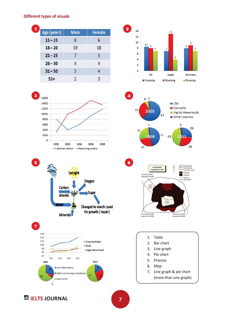
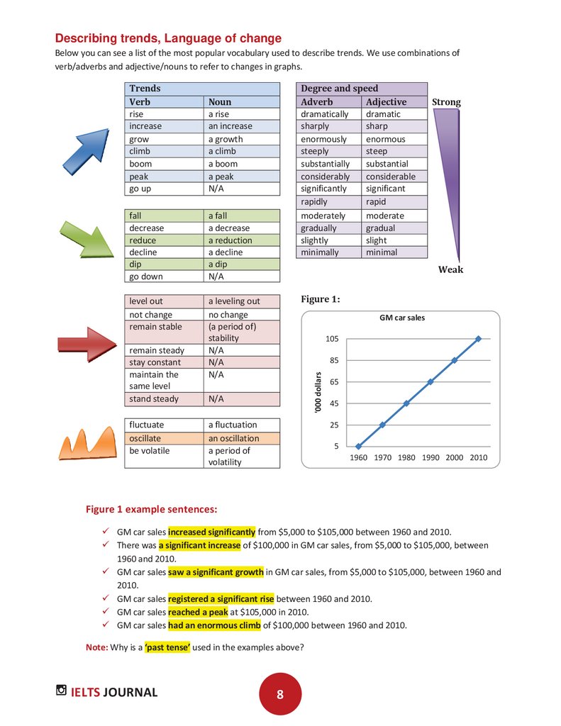

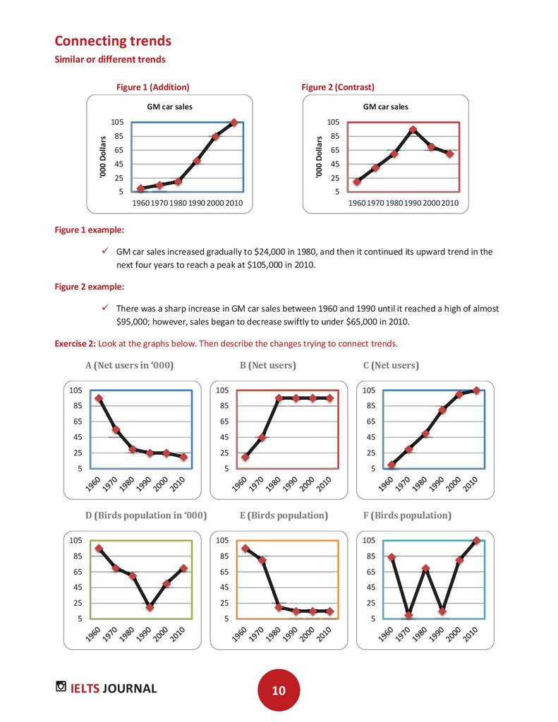

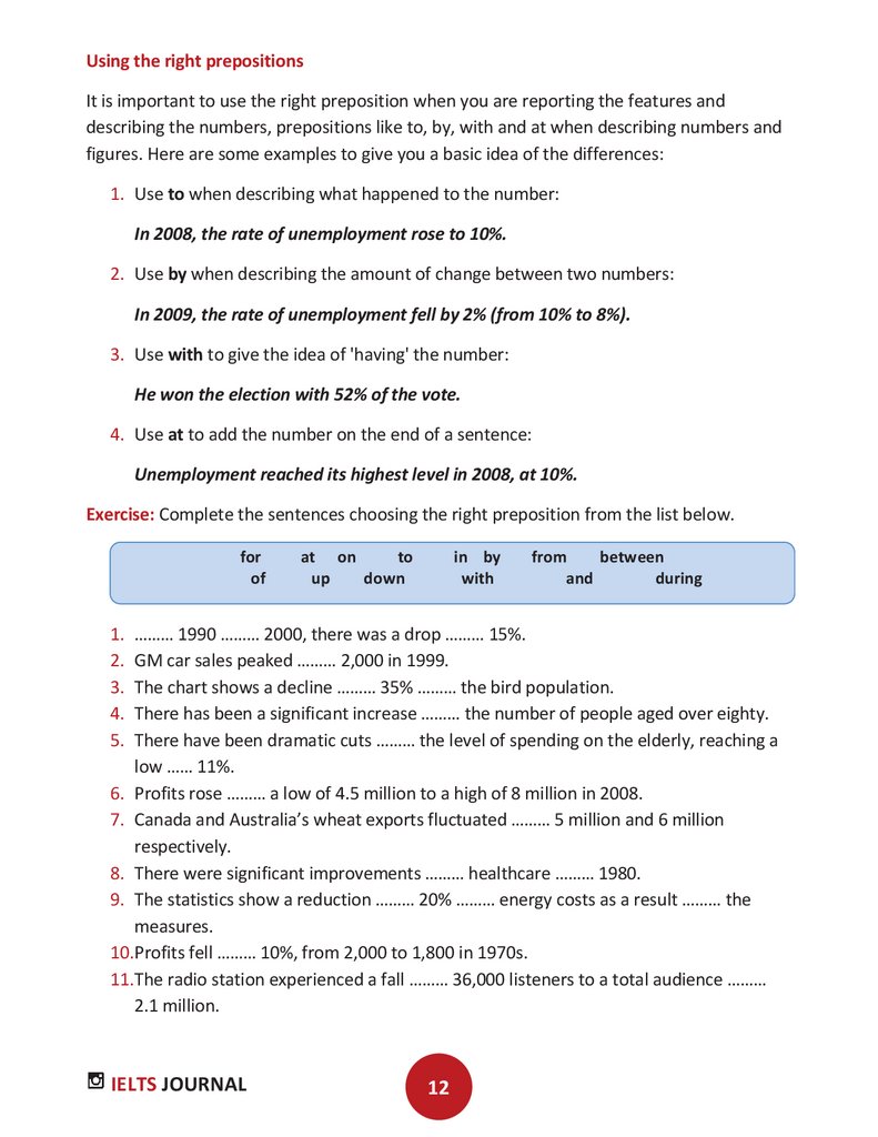
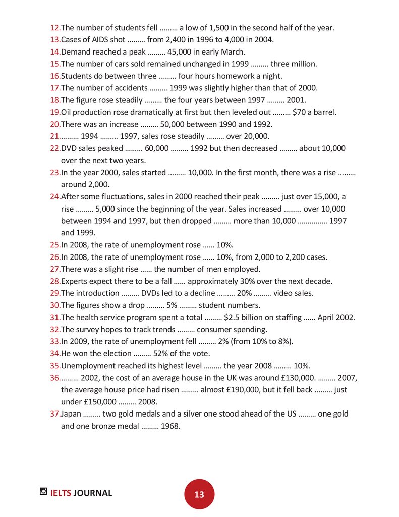
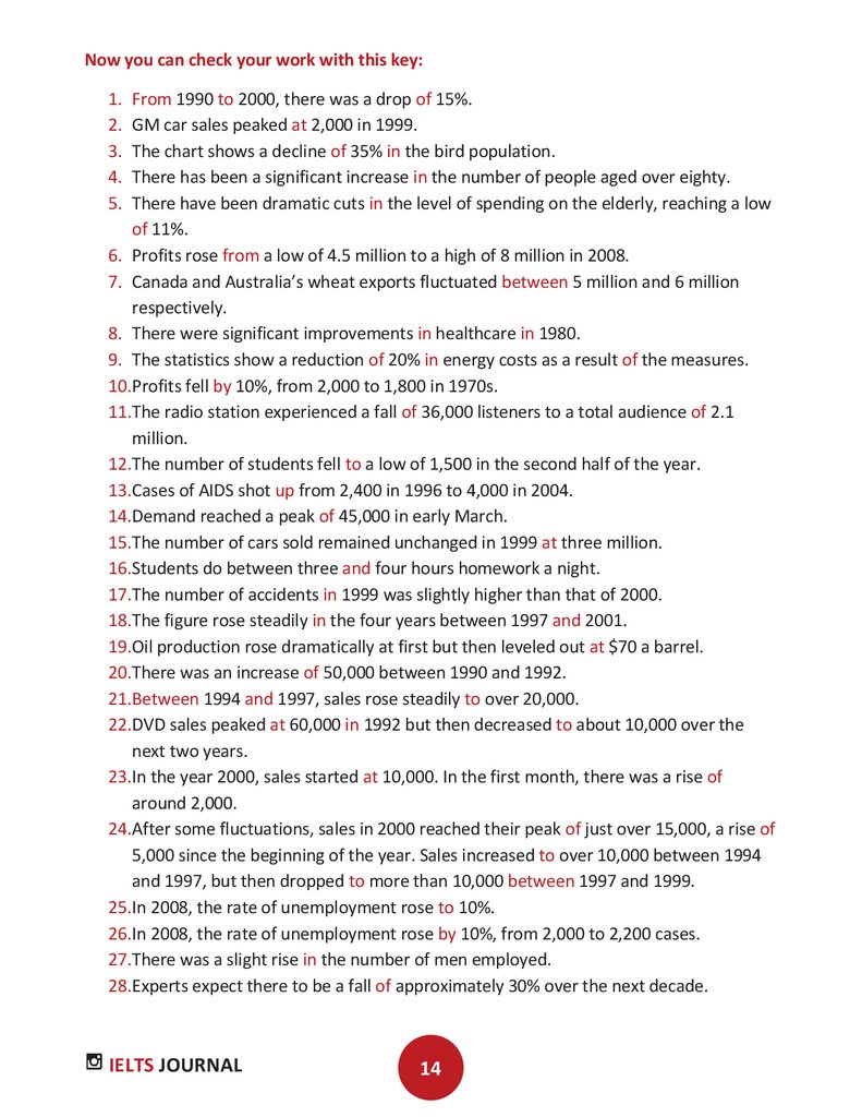
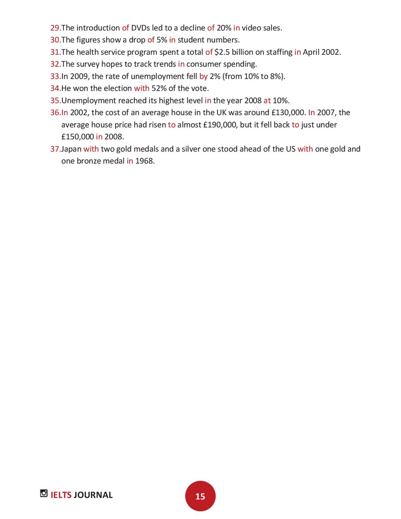
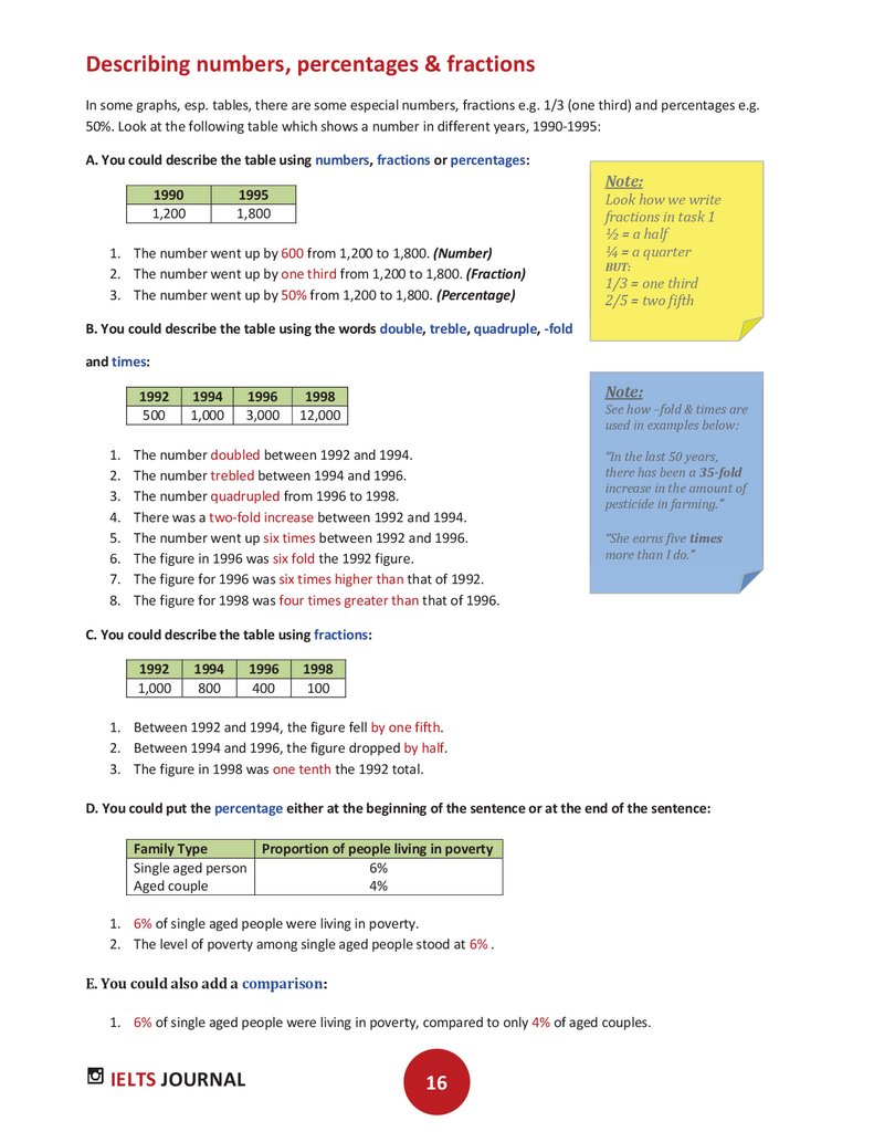






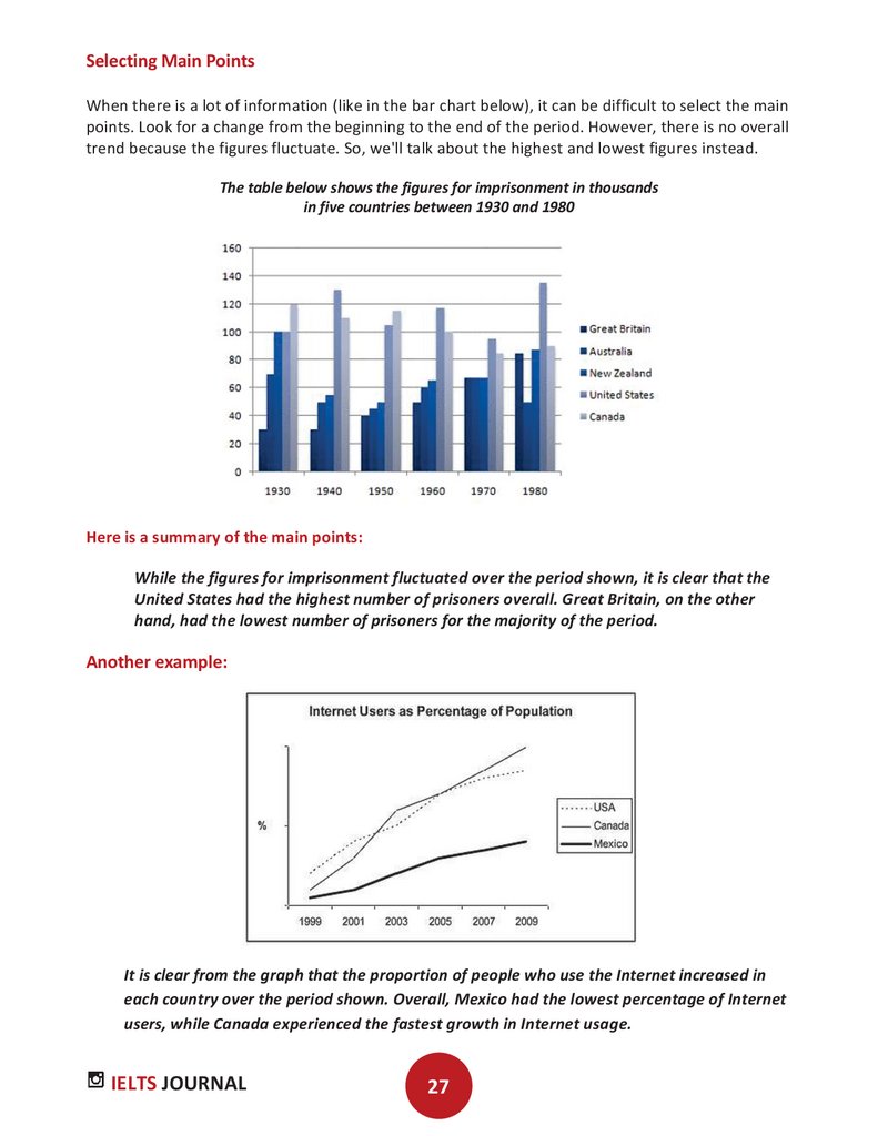

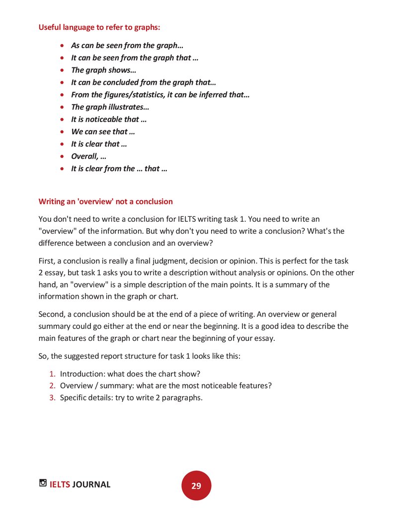


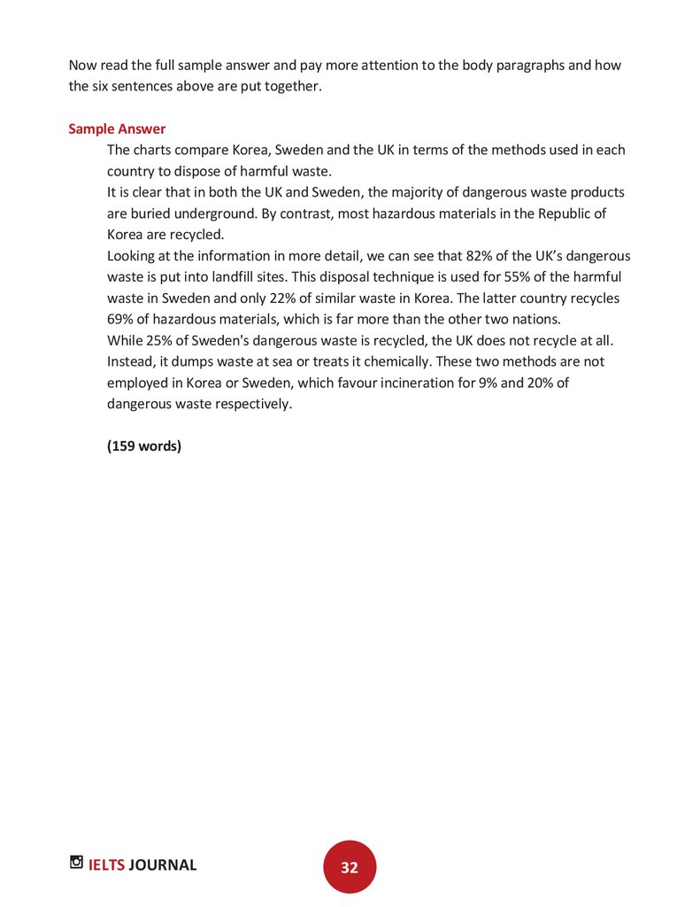

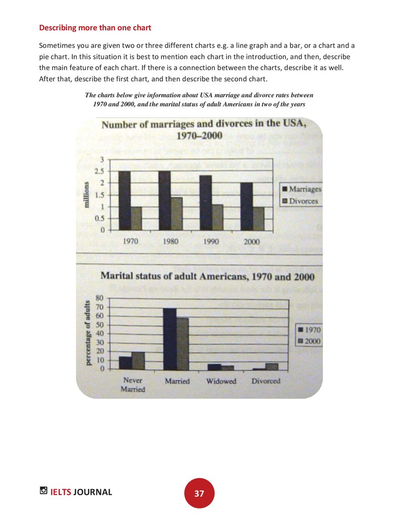

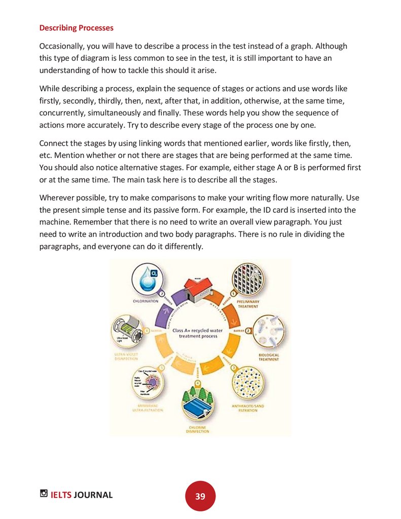

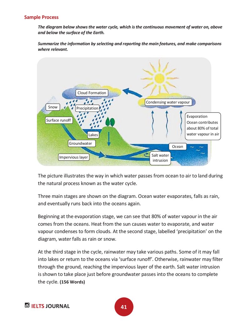
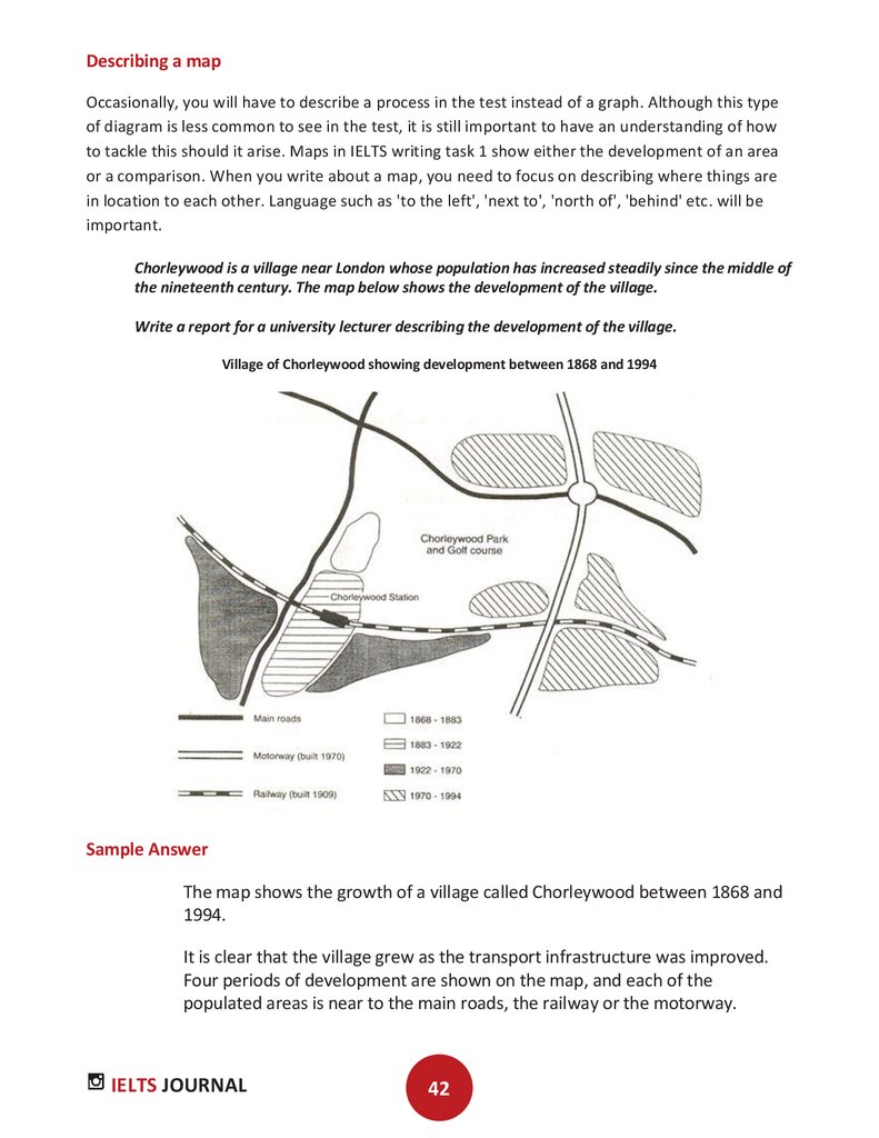


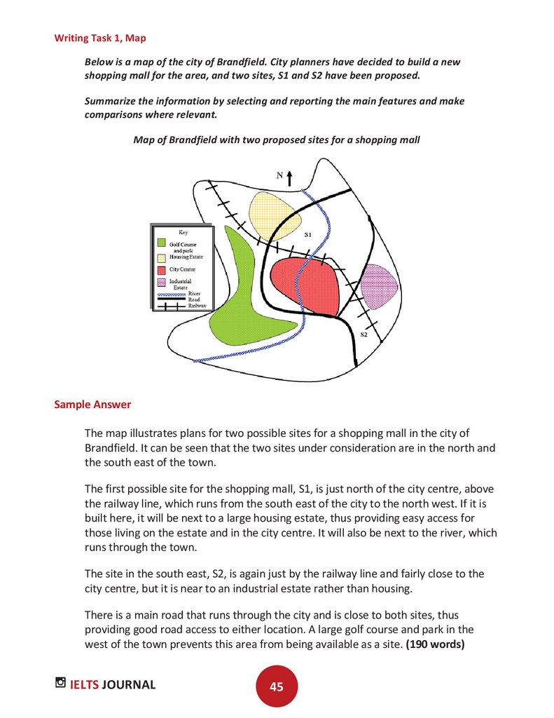
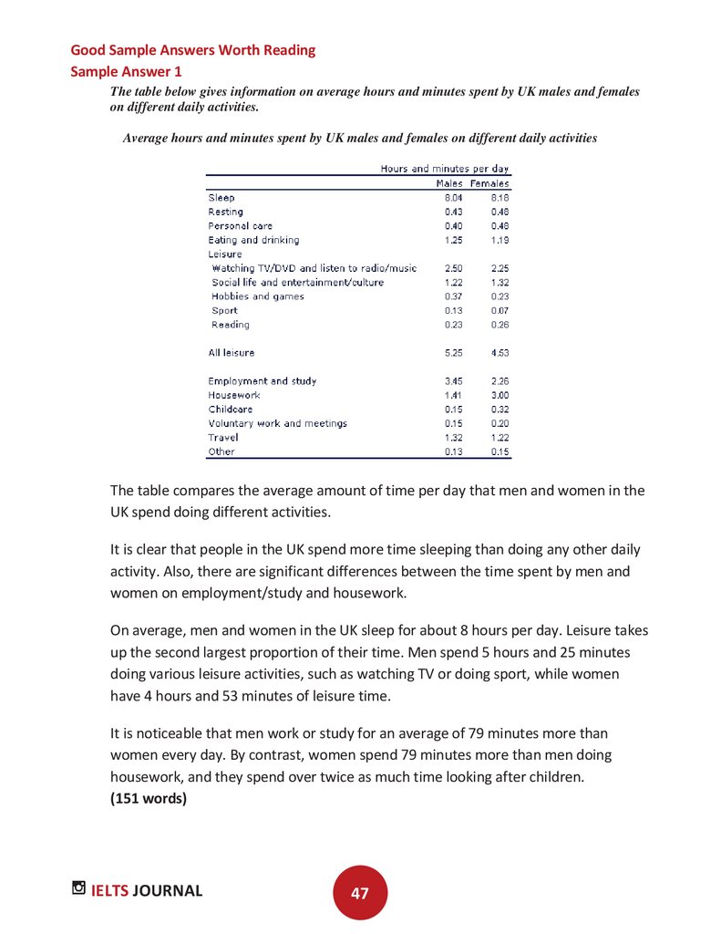

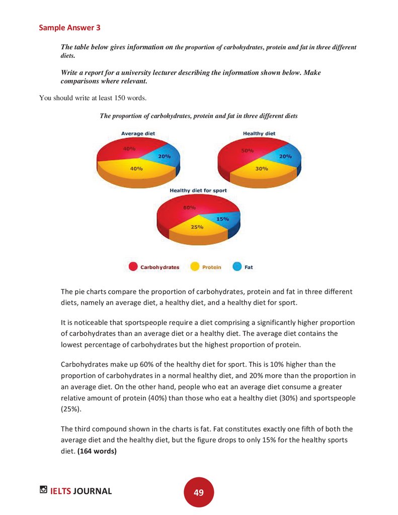

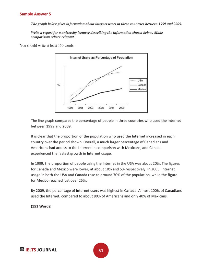
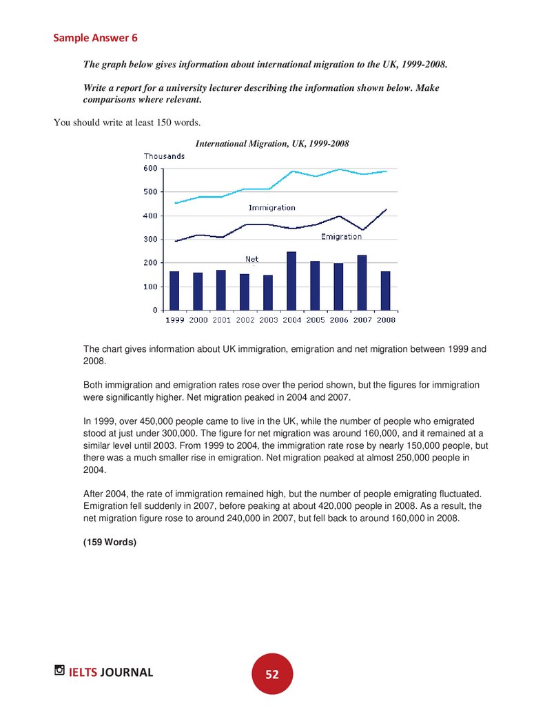
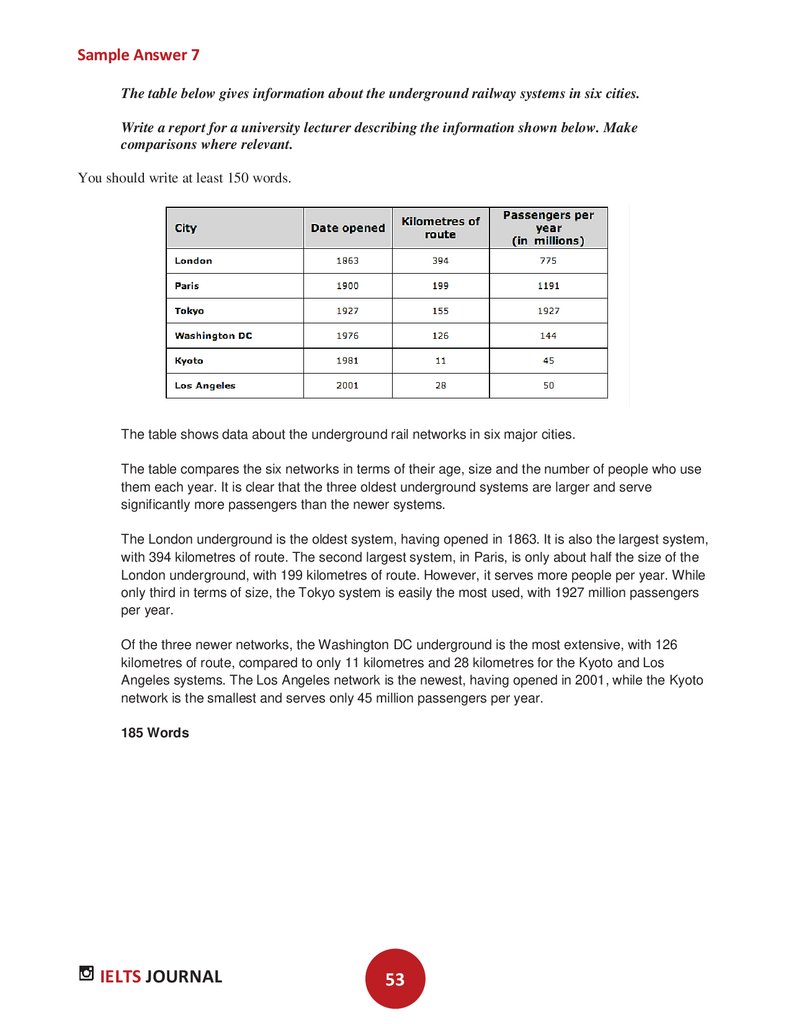
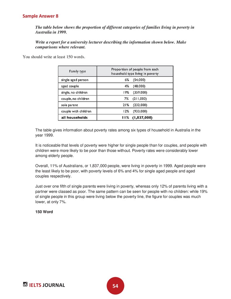


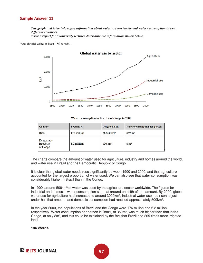

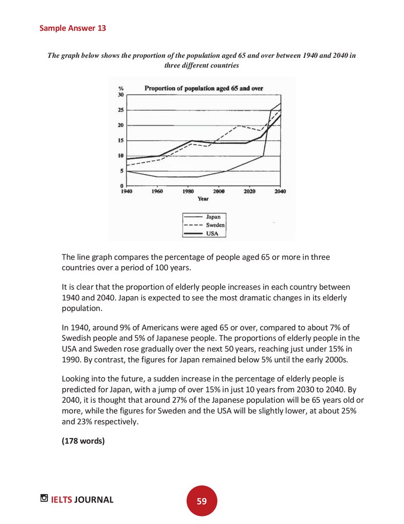
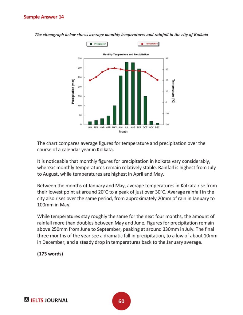
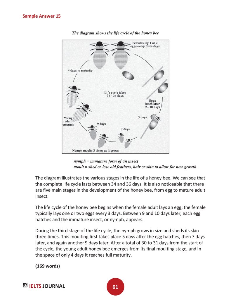
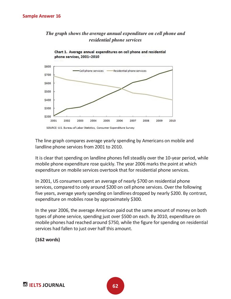
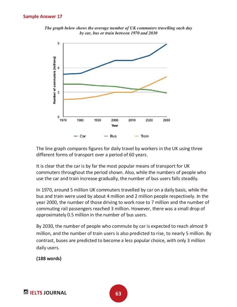
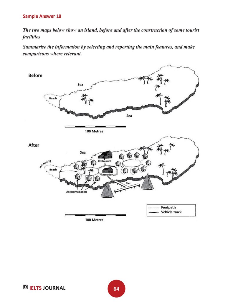
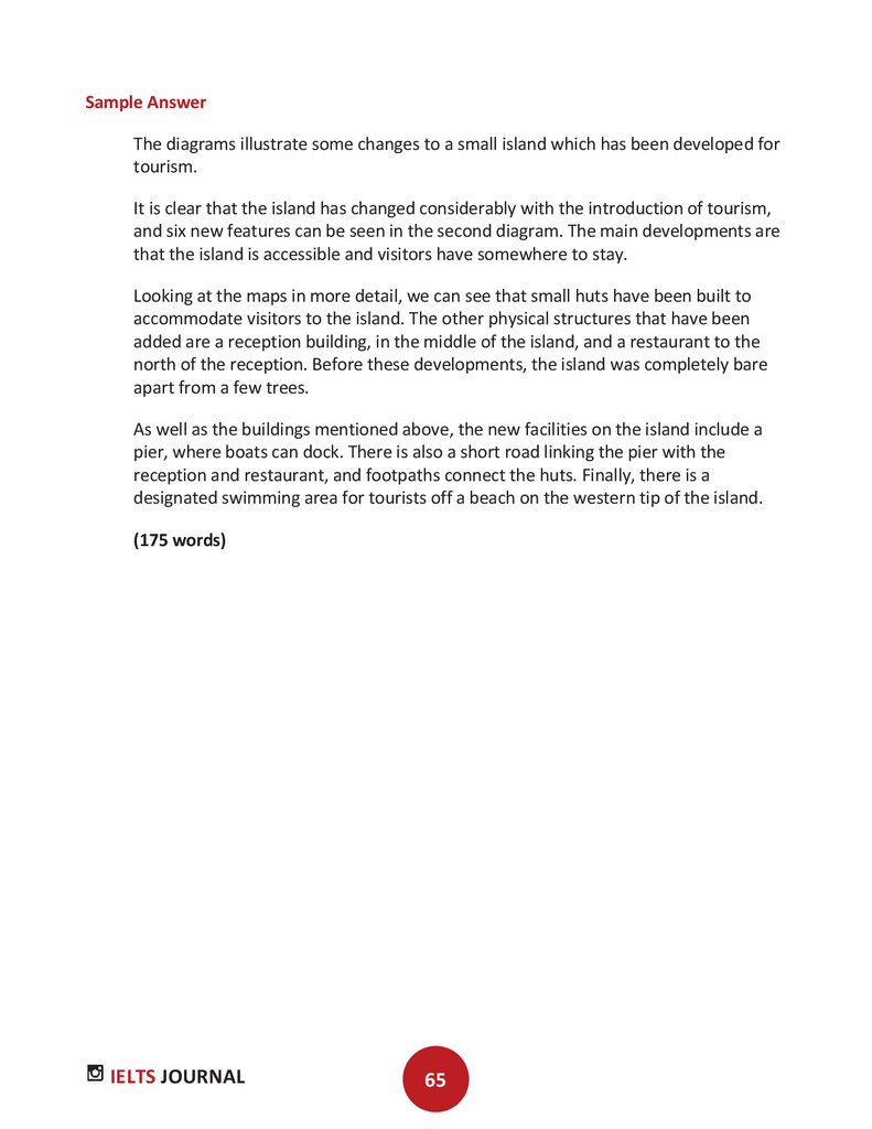
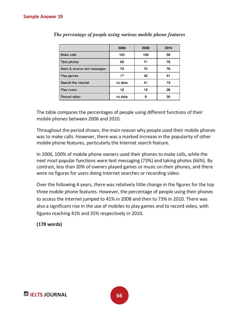

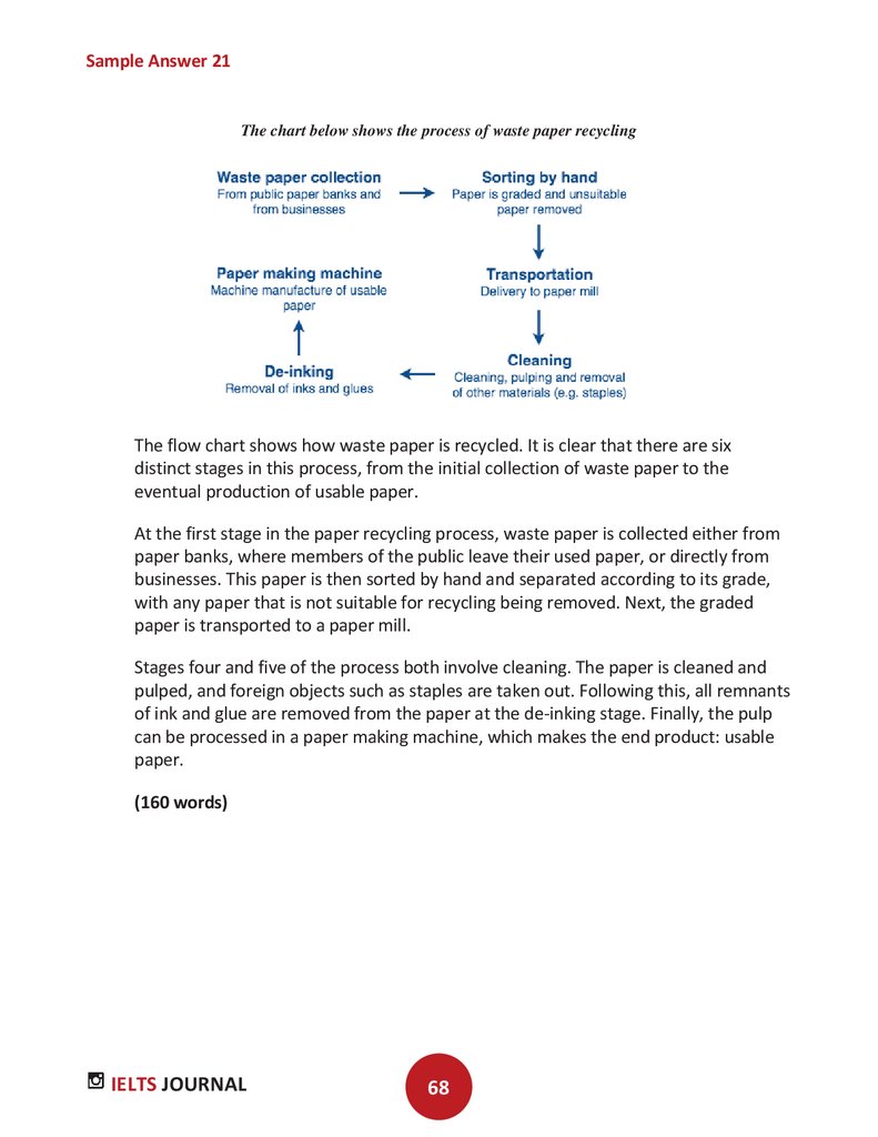


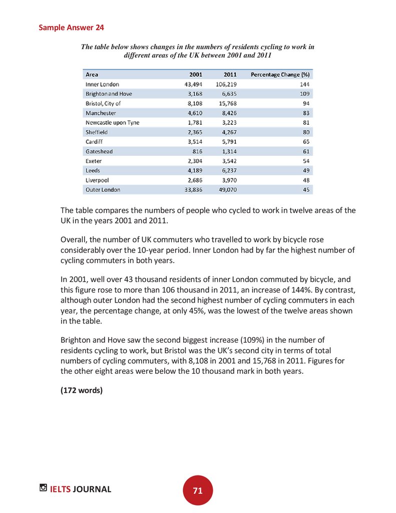
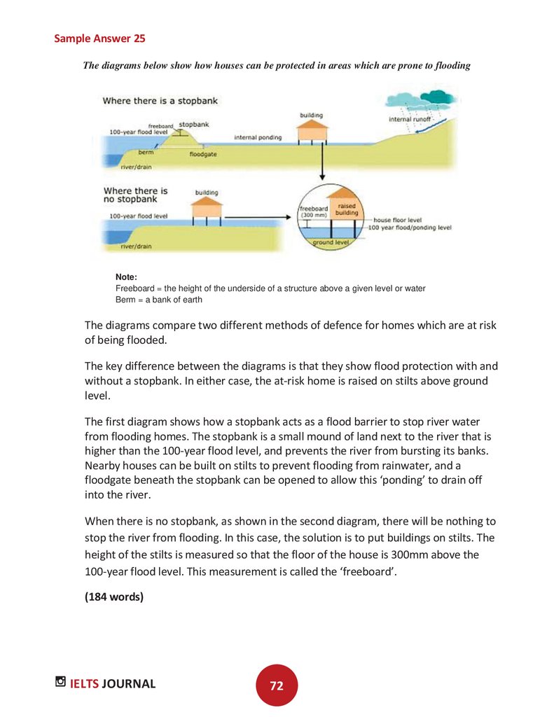
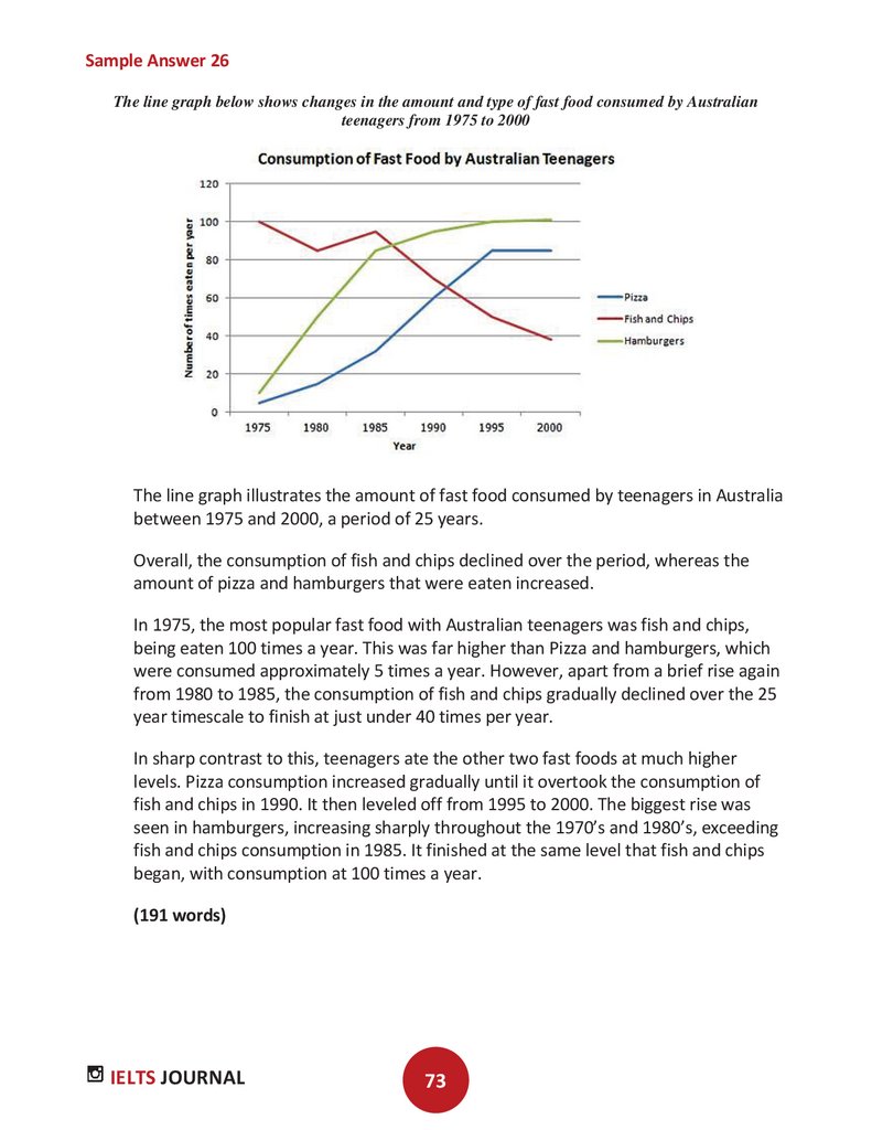
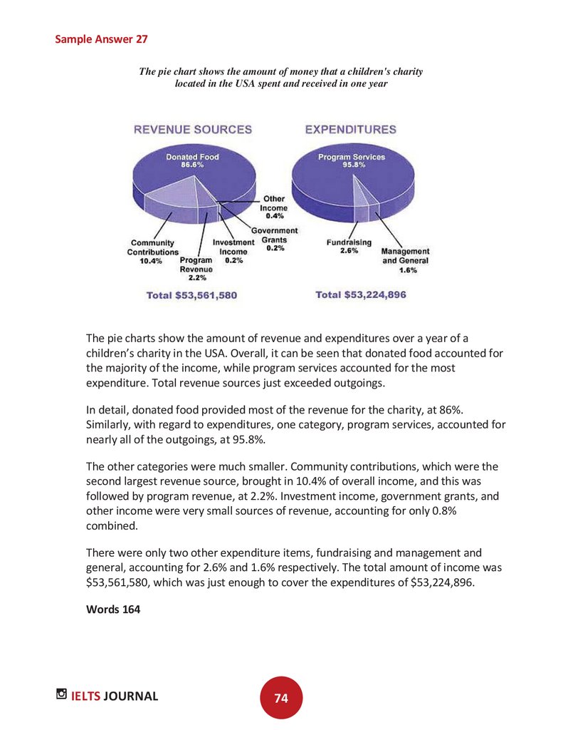

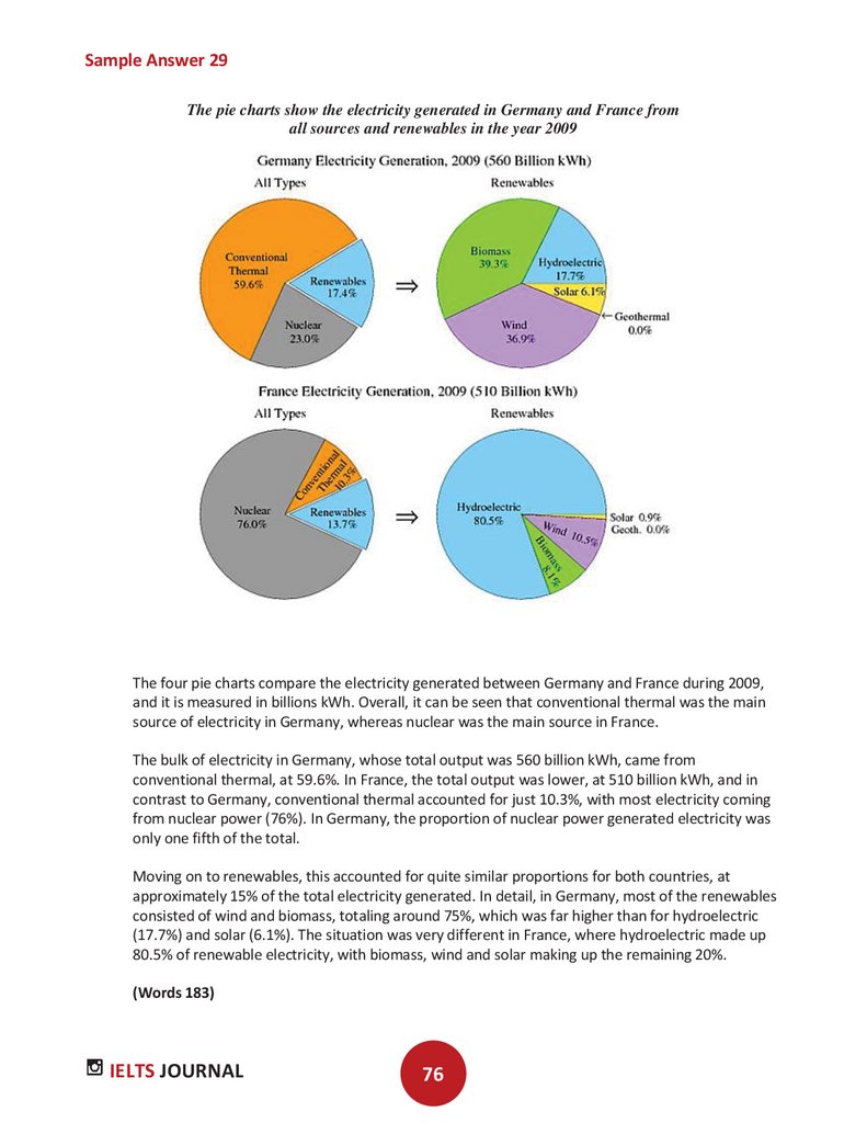

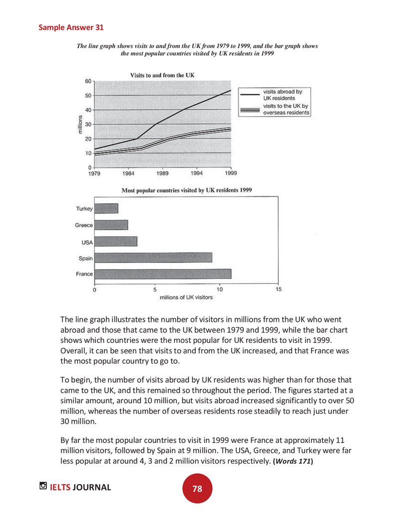
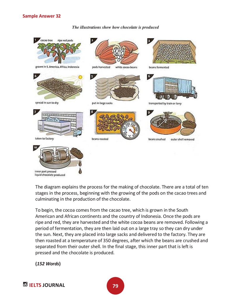

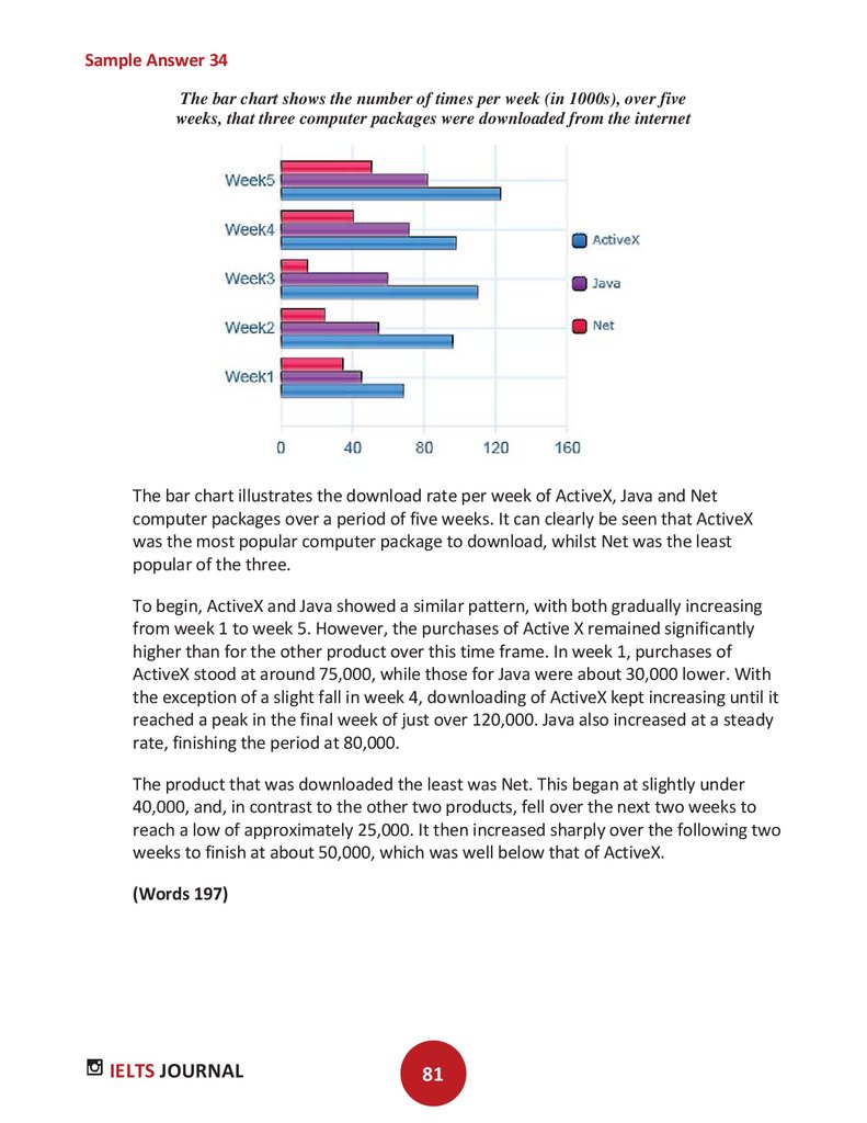
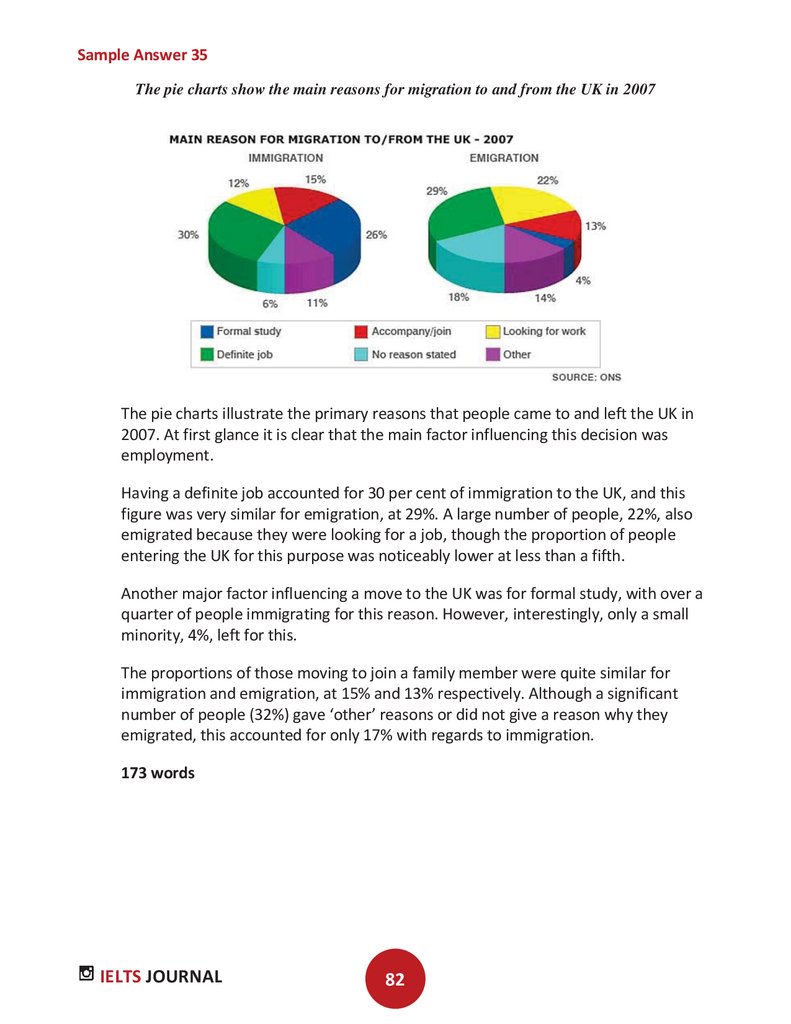
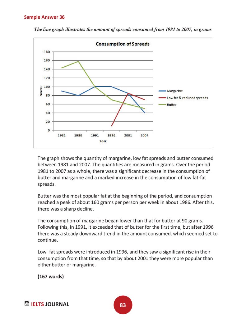

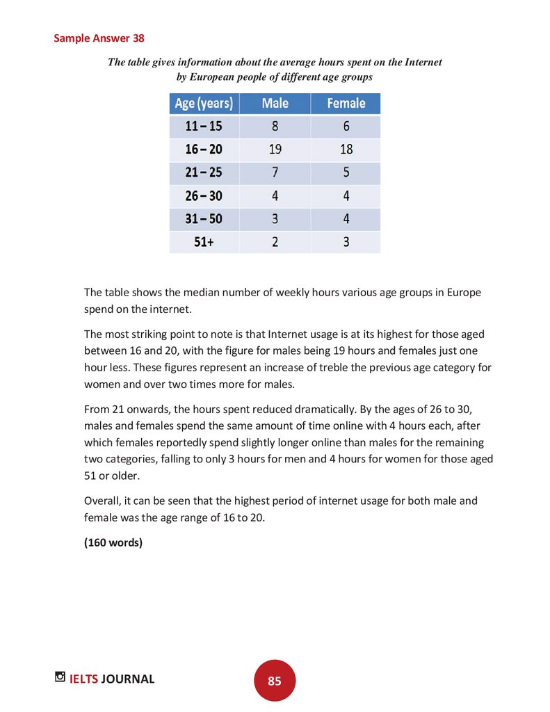
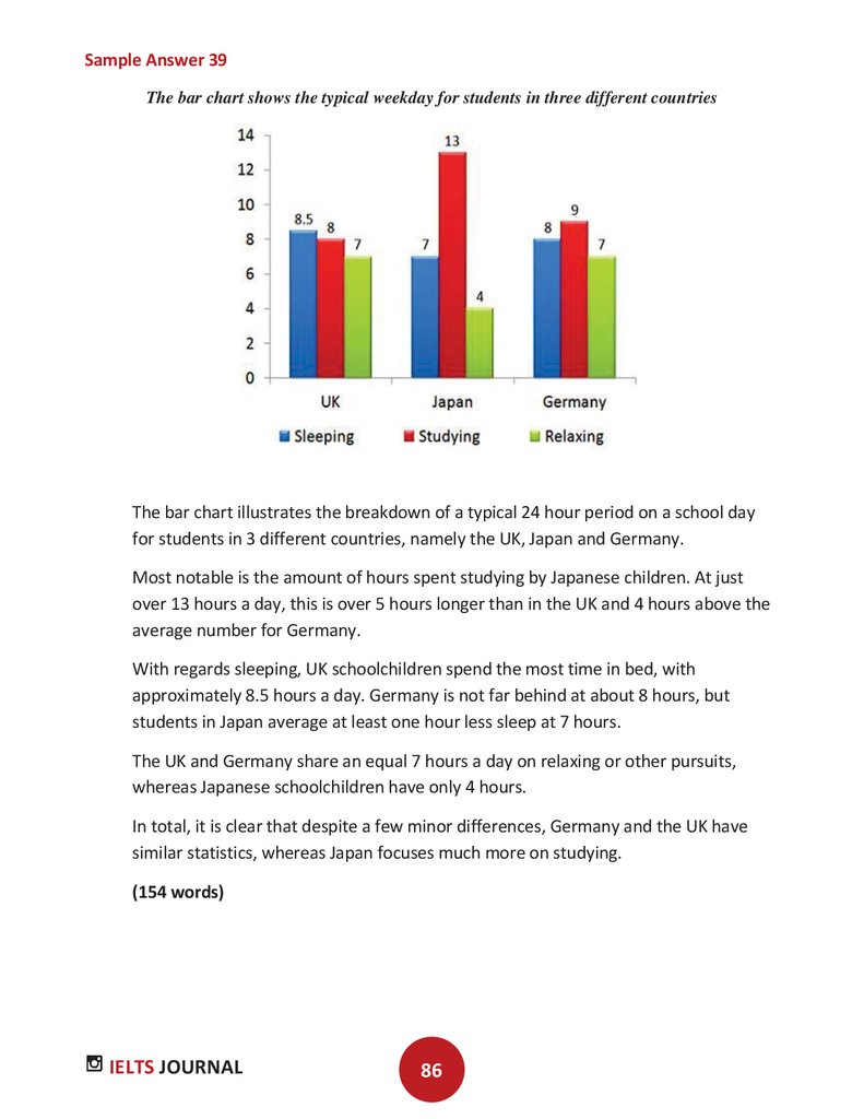
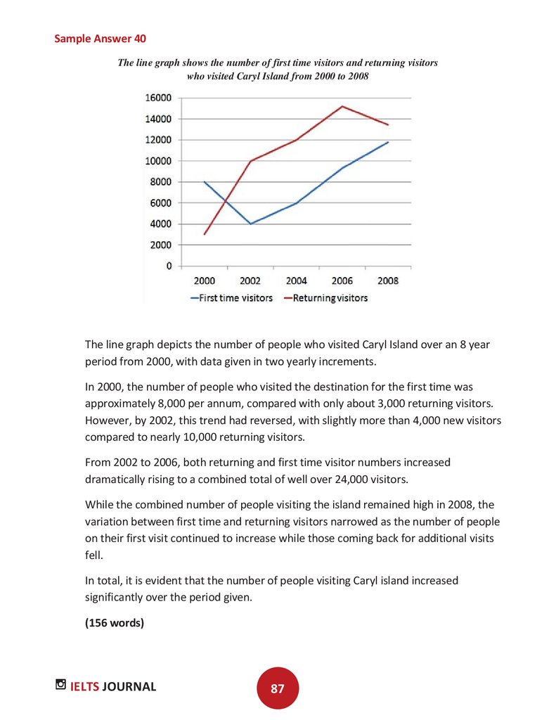
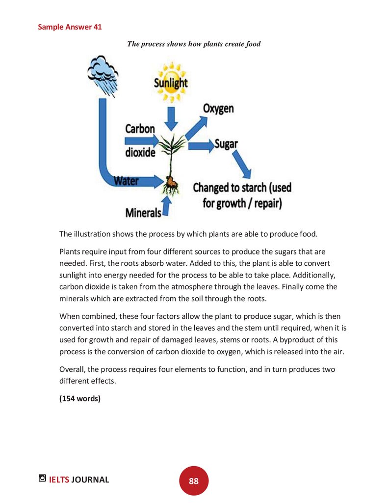
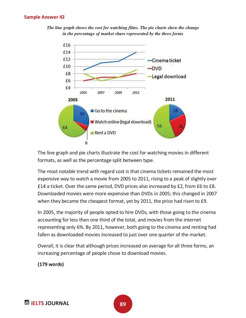
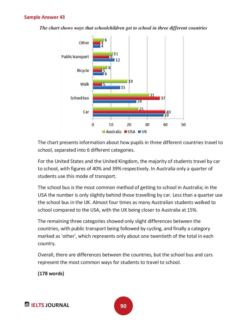
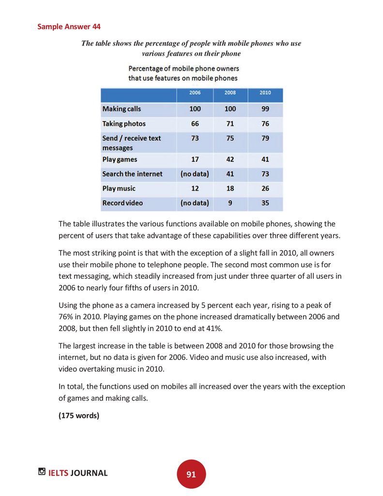
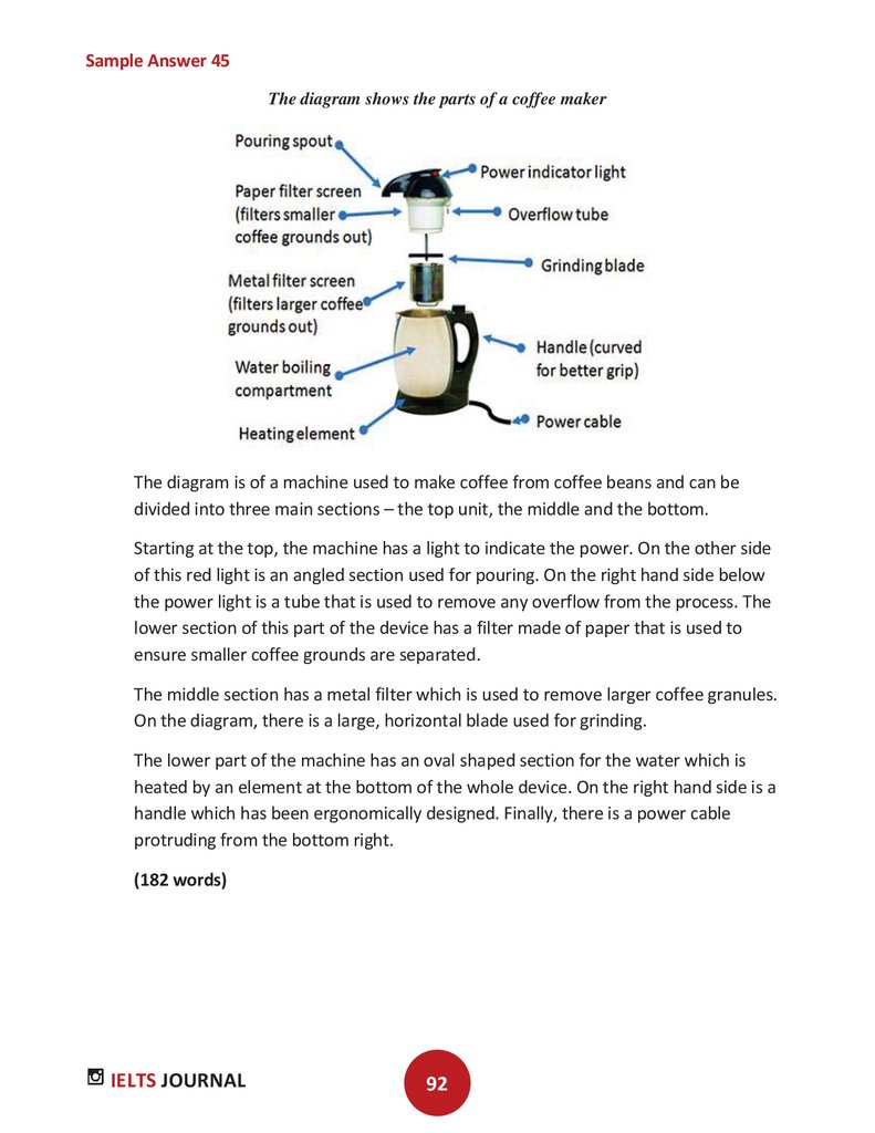
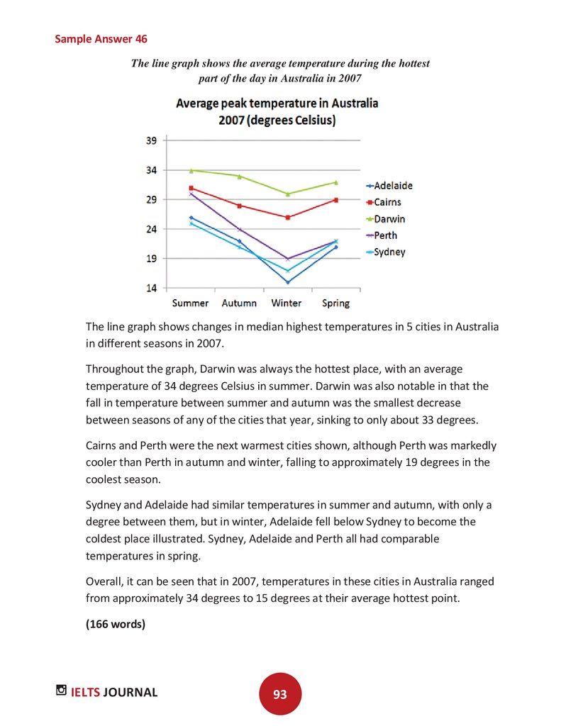
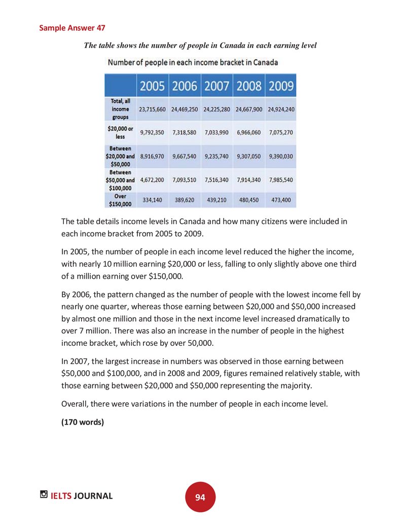
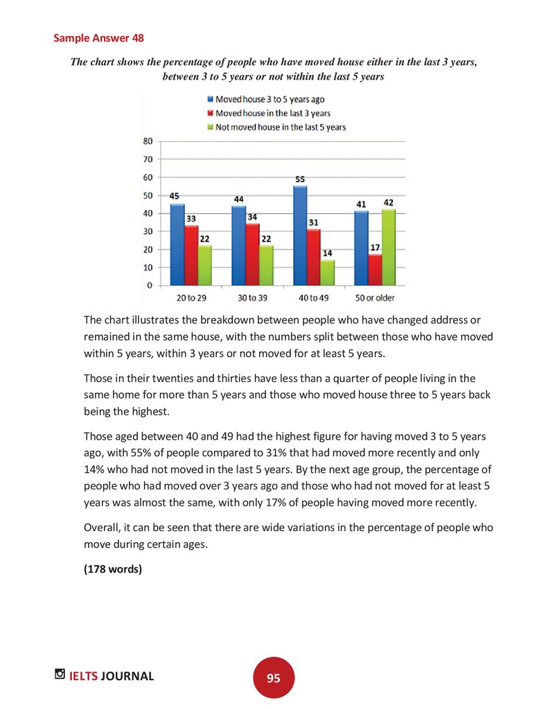
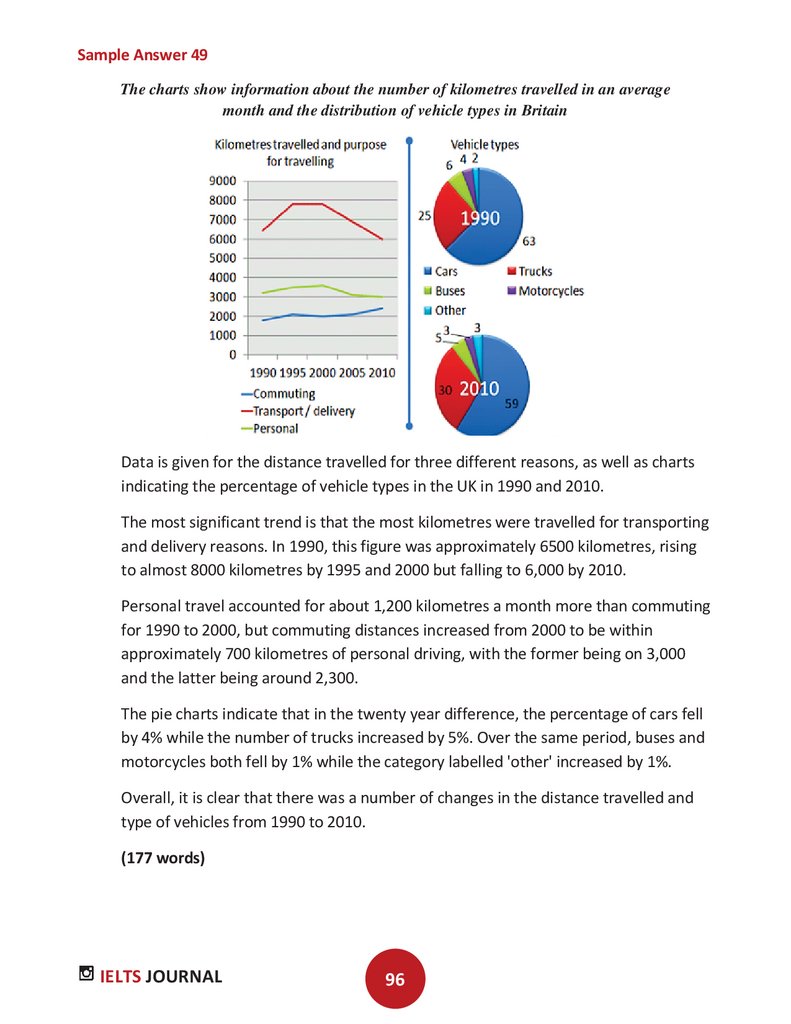
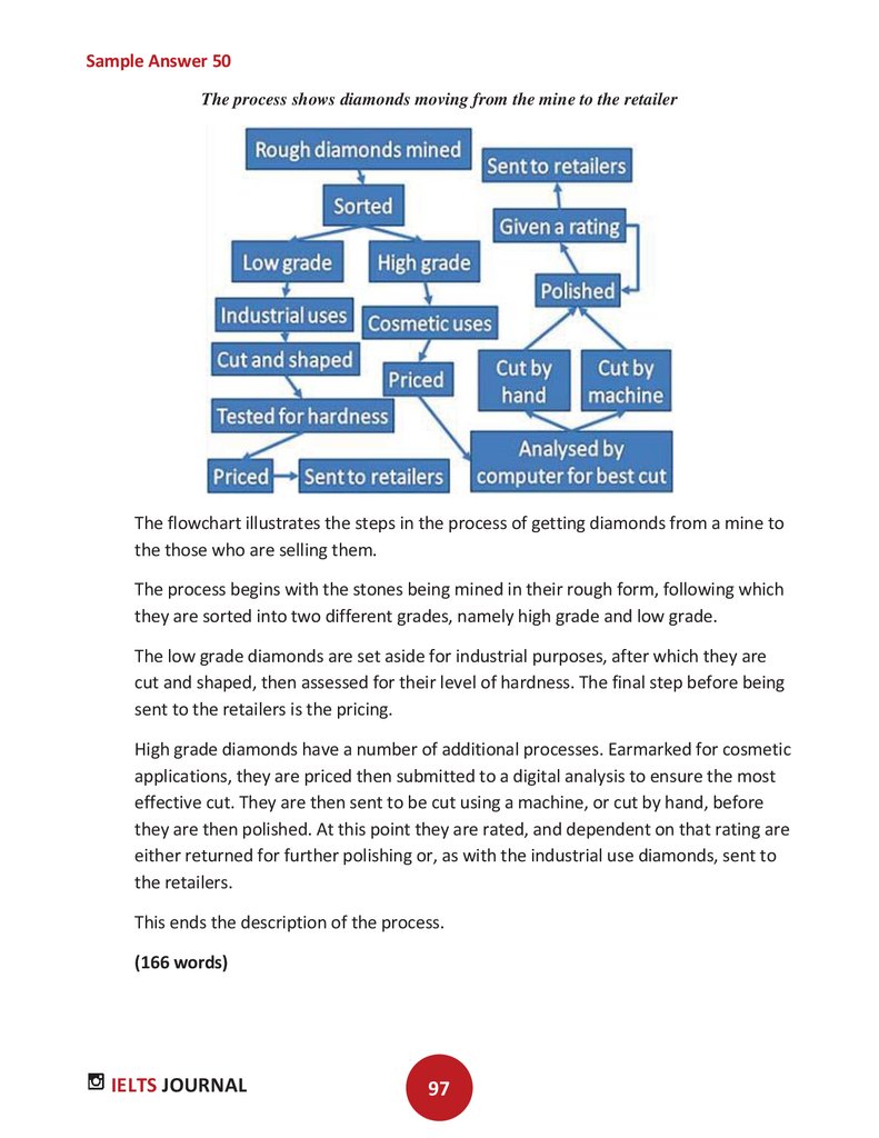

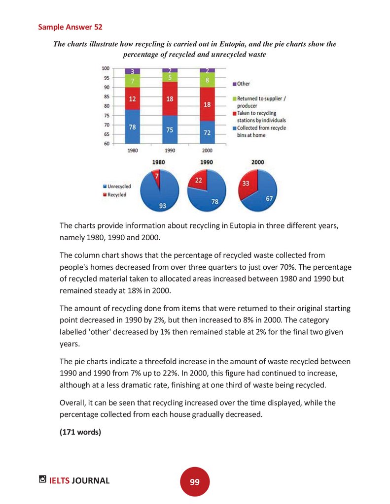
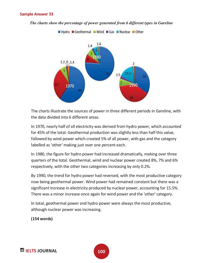

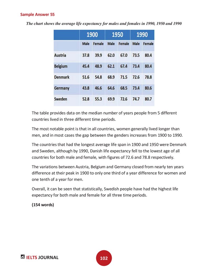
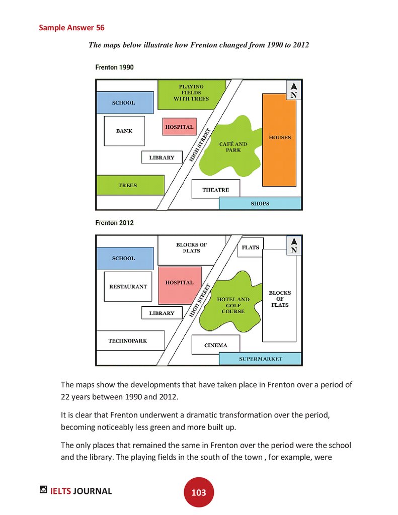
 Английский язык


