Похожие презентации:
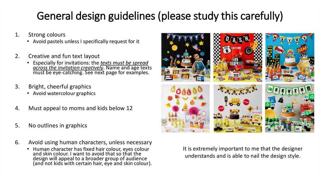
General design guidelines
1.
General design guidelines (please study this carefully)1.
2.
3.
Strong colours
• Avoid pastels unless I specifically request for it
Creative and fun text layout
• Especially for invitations: the texts must be spread
across the invitation creatively. Name and age texts
must be eye-catching. See next page for examples.
Bright, cheerful graphics
• Avoid watercolour graphics
4.
Must appeal to moms and kids below 12
5.
No outlines in graphics
6.
Avoid using human characters, unless necessary
• Human character has fixed hair colour, eyes colour
and skin colour. I want to avoid that so that the
design will appeal to a broader group of audience
(and not kids with certain hair, eye and skin colour).
It is extremely important to me that the designer
understands and is able to nail the design style.
2.
Examples of creative and fun text layoutCreative text layout:
• Age text is on the fire hydrant
• Address is on the fire truck
• Use of different fonts
• Use of curves
Fun text layout:
• For this car wash party theme,
the name text is on the car
wash shop which is fun
• Use of different fonts so that
the design looks fun & playful
Fun text layout:
• Big key visual (shark) – it’s
bright, happy and joyful
• Name and age texts are big
and eye-catching
Bad example:
• Texts are all concentrated at
the bottom. I prefer for the
texts to be spread creatively
across the invitation, not just
concentrated in one place.
Try to use your creative vision to see how you can make the text layout fun and interesting for the given party theme
3.
Deliverables1. Invitation ticket
2. Thank you card
3. Bottle wrappers (2 designs)
4. Banner (2 designs: with and w/o letter)
5. Cupcake toppers (6 designs)
6. Cupcake wrapper
7. Food labels (3 designs)
8. Welcome sign
9. Gift tags (3-4 designs)
10. Treats sign
11. Favor boxes (2-3 designs)
12. Cake topper
13. Backdrop
14. Birthday shirt graphic


 Маркетинг
 Искусство


