


 Информатика
 Искусство
Похожие презентации:


Common Design Mistakes
1.
CommonDesign
Mistakes
Common Design Mistakes
Made by: Yanchenko Artem
2.
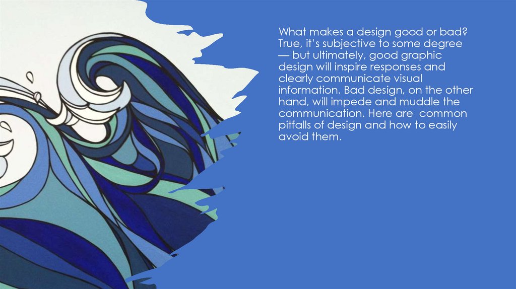
What makes a design good or bad?True, it’s subjective to some degree
— but ultimately, good graphic
design will inspire responses and
clearly communicate visual
information. Bad design, on the other
hand, will impede and muddle the
communication. Here are common
pitfalls of design and how to easily
avoid them.
3.
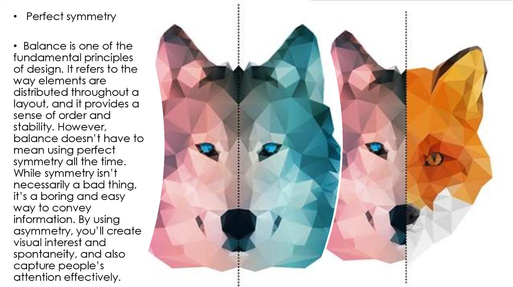
• Perfect symmetry• Balance is one of the
fundamental principles
of design. It refers to the
way elements are
distributed throughout a
layout, and it provides a
sense of order and
stability. However,
balance doesn’t have to
mean using perfect
symmetry all the time.
While symmetry isn’t
necessarily a bad thing,
it’s a boring and easy
way to convey
information. By using
asymmetry, you’ll create
visual interest and
spontaneity, and also
capture people’s
attention effectively.
4.
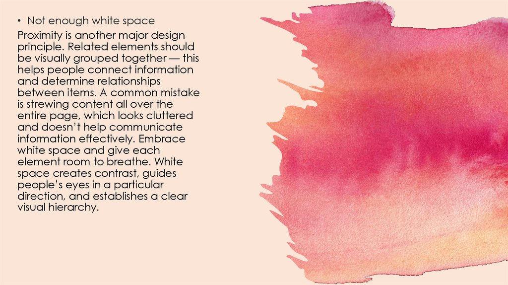
• Not enough white spaceProximity is another major design
principle. Related elements should
be visually grouped together — this
helps people connect information
and determine relationships
between items. A common mistake
is strewing content all over the
entire page, which looks cluttered
and doesn’t help communicate
information effectively. Embrace
white space and give each
element room to breathe. White
space creates contrast, guides
people’s eyes in a particular
direction, and establishes a clear
visual hierarchy.
5.
• Repetition lends a sense of unity andconsistency, and it also improves
readability. If you don’t repeat a few
visual elements throughout your
projects — for instance, certain colors,
layouts, or spatial relationships — your
design could lack continuity and your
reader can’t “tie it all together.” But
don’t overdo the repetition either.
Otherwise, it will become overwhelming
or bothersome.
6.
• Center-aligning textA common newbie design mistake is
to center-align chunks of text. Too
much centered text looks clumsy
and sloppy, and it’s actually harder
to read because it gives the text
ragged left and right edges. This
forces your readers to work harder to
find where each line starts, since
there’s no consistent starting place.
It’s best to use left- or rightalignment. Save the centered text
for headlines and short lines of text
only.
7.
• Too much text in one lineReading multiple long lines of
text can cause eye fatigue.
Content is much easier to
read if you keep the
measure, or the length of a
line of type, short. Research
shows that optimal
readability is between 45-75
characters per measure,
including spaces.
8.
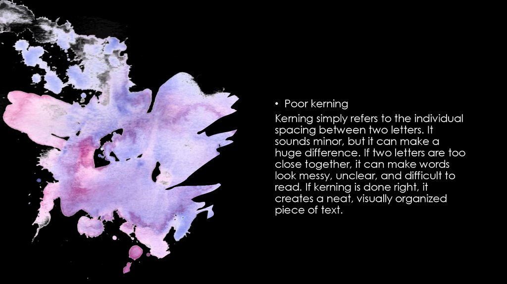
• Poor kerningKerning simply refers to the individual
spacing between two letters. It
sounds minor, but it can make a
huge difference. If two letters are too
close together, it can make words
look messy, unclear, and difficult to
read. If kerning is done right, it
creates a neat, visually organized
piece of text.
9.
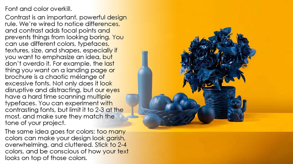
Font and color overkill.Contrast is an important, powerful design
rule. We’re wired to notice differences,
and contrast adds focal points and
prevents things from looking boring. You
can use different colors, typefaces,
textures, size, and shapes, especially if
you want to emphasize an idea, but
don’t overdo it. For example, the last
thing you want on a landing page or
brochure is a chaotic mélange of
excessive fonts. Not only does it look
disruptive and distracting, but our eyes
have a hard time scanning multiple
typefaces. You can experiment with
contrasting fonts, but limit it to 2-3 at the
most, and make sure they match the
tone of your project.
The same idea goes for colors: too many
colors can make your design look garish,
overwhelming, and cluttered. Stick to 2-4
colors, and be conscious of how your text
looks on top of those colors.
10.
• Using rastersRaster images are made up of pixels, and
these are your typical jpg/jpegs, tiffs, gifs,
bmps, and pngs. They’re resolution
dependent, so when you enlarge them, they
become pixelated and blurry because you’re
stretching the pixels. Vectors, on the other
hand, can be scaled up or down without
losing any quality, because they’re made up
of geometric shapes like points, lines, and
curves. Shutterstock has the largest vector
collection in the industry, so if you’re looking
for inspiration, check out some of the vectors
in our
popular Geometric and Linear collection
lightboxes.
Without good design, even the best, most
powerful idea gets lost in the mix. By learning
how to avoid common design mistakes, you’ll
be able to create content that looks clean
and professional, while also conveying your
message effectively.