Похожие презентации:
Store design Avocado
1.
STORE DESIGNAVOCADO
07-01-2019
powered by
2.
CONTENTСТРАНИЦА 3
СТРАНИЦА 11
LOGO DEVELOPMENT
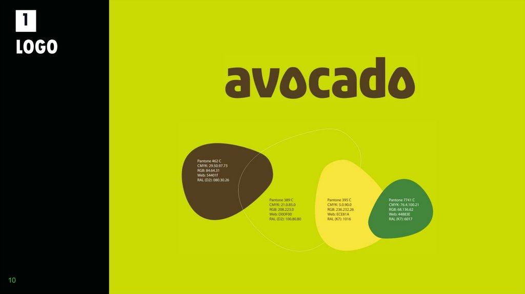
1. LOGO
2. DESIGN IDEA
3. STORE DESIGN ELEMENTS
СТРАНИЦА 22
4. POS MATERIALS
СТРАНИЦА 30
5. PHOTO CONCEPT
СТРАНИЦА 50
6. LAY OUT EXAMPLES
СТРАНИЦА 56
7. FACADE
СТРАНИЦА 73
2
3.
1LOGO
3
4.
1LOGO
4
5.
1LOGO
5
6.
1LOGO
6
7.
1LOGO
7
8.
1LOGO
8
9.
1LOGO
9
10.
1LOGO
10
11.
2DESIGN
IDEA
11
12.
2DESIGN
IDEA
12
The main branding idea is based on
freshness, warmth, joy and happiness.
We want to spend the customers a good
feeling in their everyday shopping
environment. The store design should
raise trust in the product quality and his
freshness.
The store design should be carried by
POS materials mainly and supported by
coloured walls and elements. It should
be easy to implement with a minimum
13.
2DESIGN
IDEA
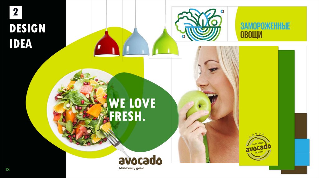
WE LOVE
FRESH.
13
14.
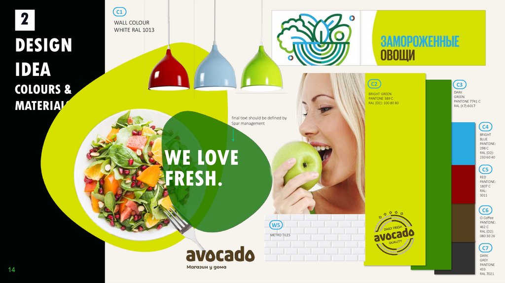
2C1
WALL COLOUR
WHITE RAL 1013
DESIGN
IDEA
C2
COLOURS &
MATERIALS
BRIGHT GREEN
PANTONE 389 C
RAL (D2): 100 80 80
final text should be defined by
Spar management
C3
DARK
GREEN
PANTONE 7741 C
RAL (K7):6017
C4
BRIGHT
BLUE
PANTONE:
298 C
RAL (D2):
230 60 40
WE LOVE
FRESH.
C5
RED
PANTONE:
1807 C
RAL:
3011
C6
W5
METRO TILES
CI Coffee
PANTONE:
462 C
RAL (D2):
080 30 26
C7
14
DARK
GREY
PANTONE
433
RAL 7021
15.
2DESIGN
IDEA
COLOURS &
MATERIALS
15
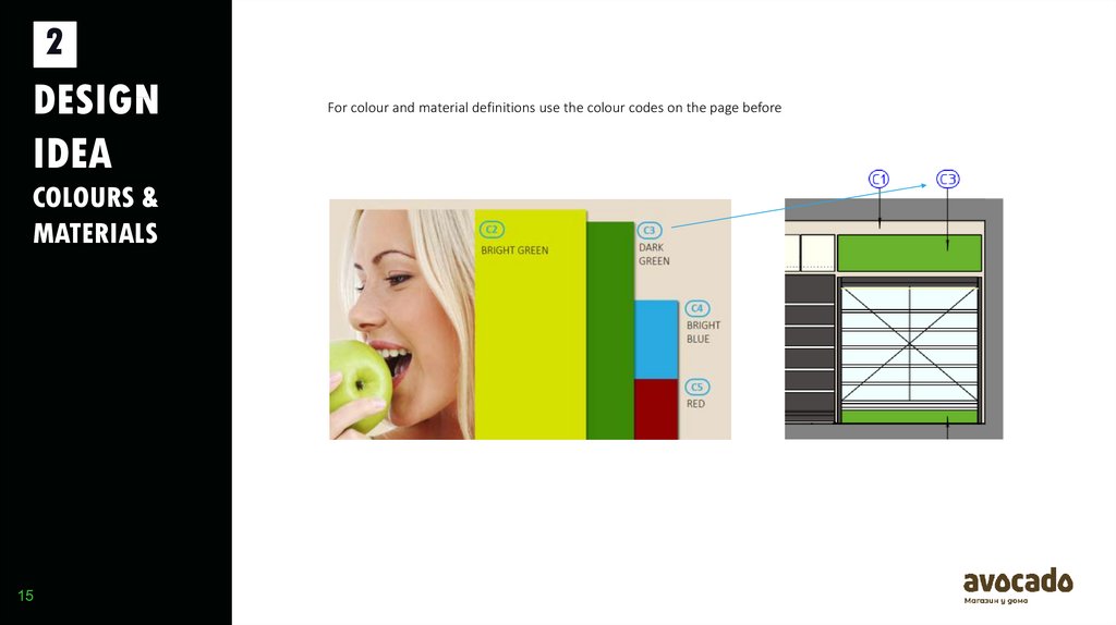
For colour and material definitions use the colour codes on the page before
16.
2DESIGN
IDEA
COLOURS &
MATERIALS
16
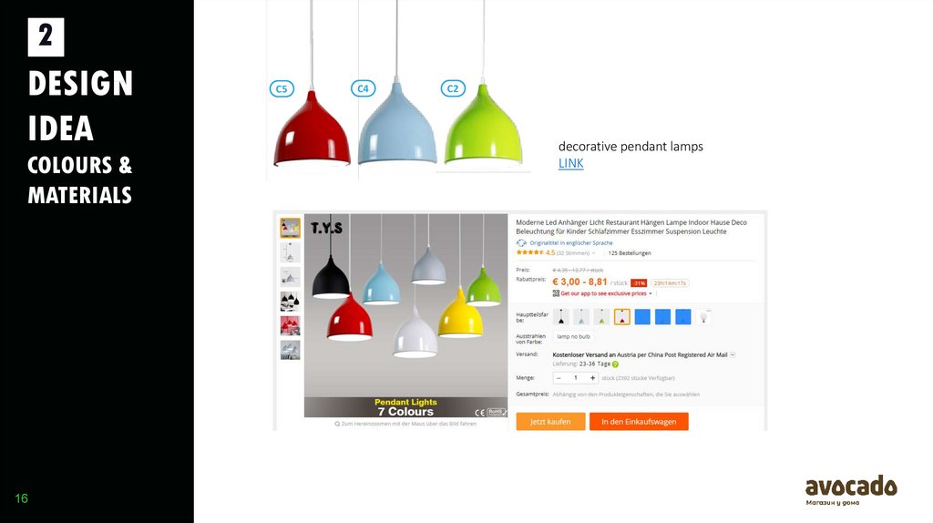
C5
C4
C2
decorative pendant lamps
LINK
17.
2DESIGN
IDEA
3D EXAMPLE
17
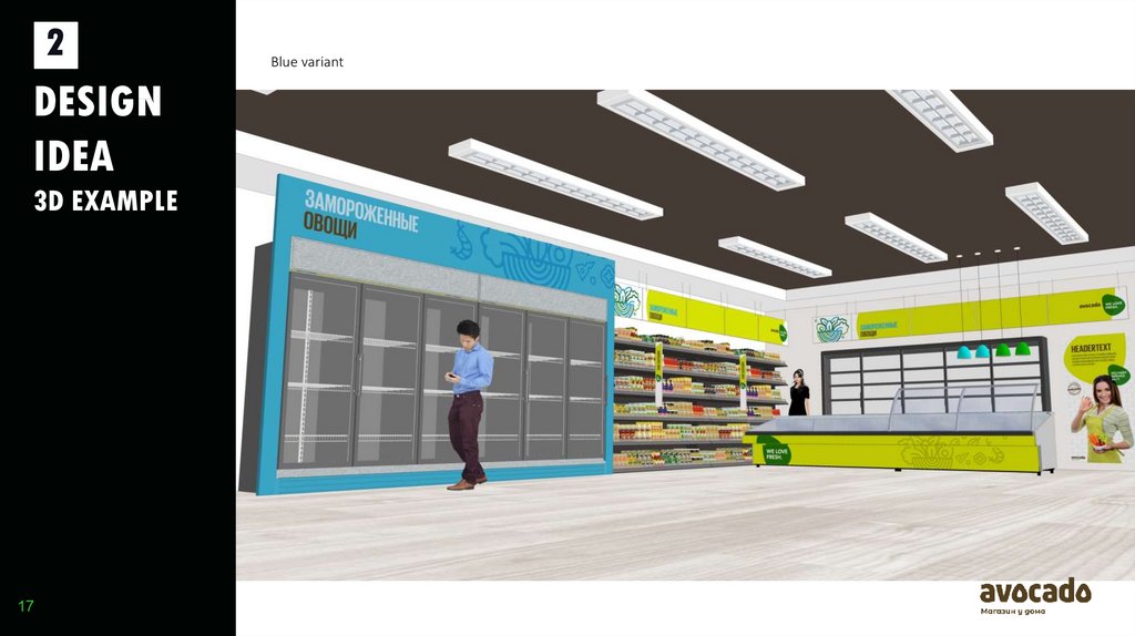
Blue variant
18.
2DESIGN
IDEA
3D EXAMPLE
18
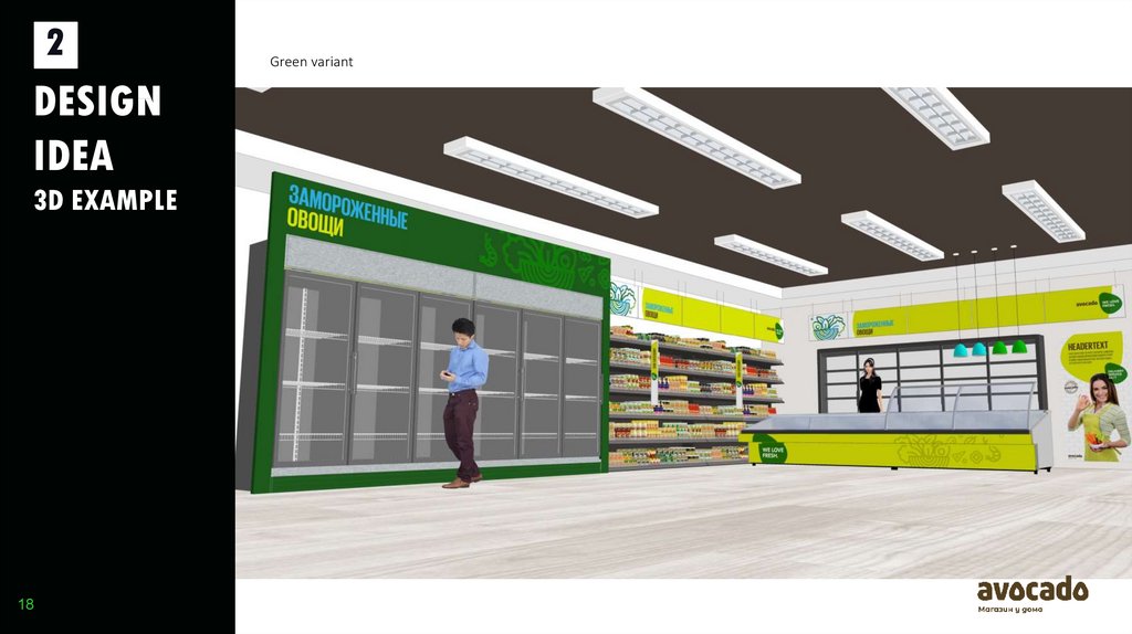
Green variant
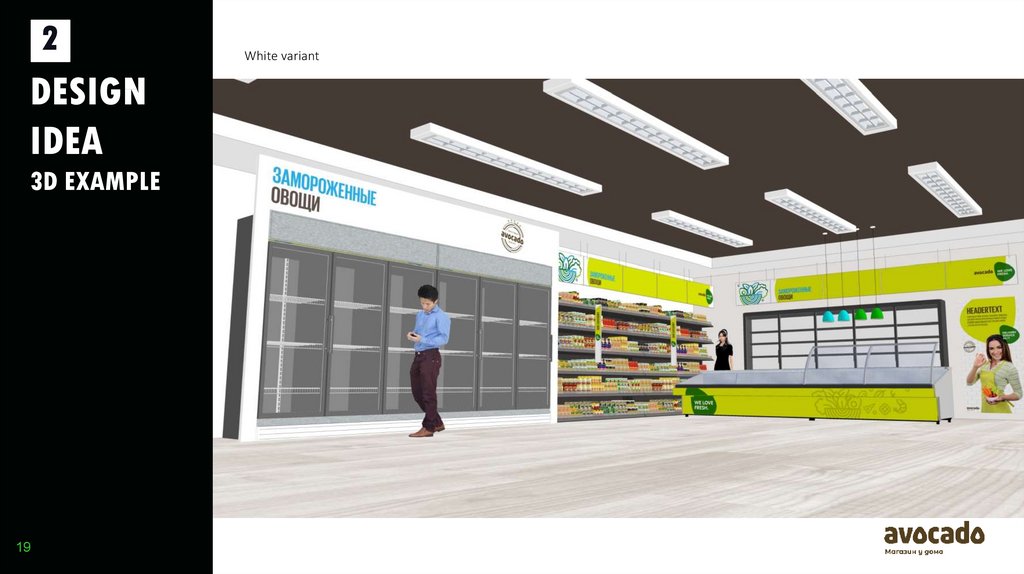
19.
2DESIGN
IDEA
3D EXAMPLE
19
White variant
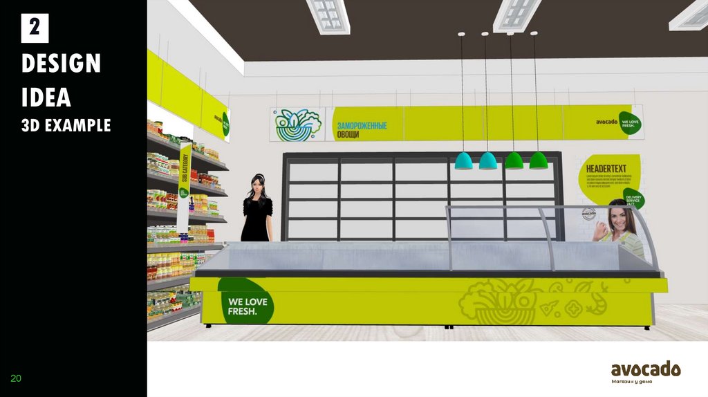
20.
2DESIGN
IDEA
3D EXAMPLE
20
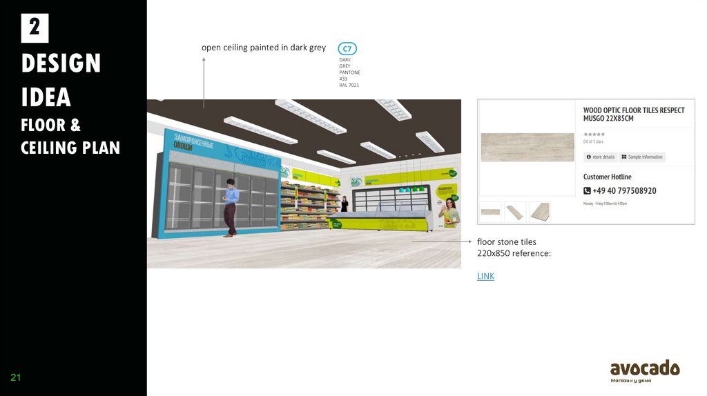
21.
2DESIGN
IDEA
open ceiling painted in dark grey
C7
DARK
GREY
PANTONE
433
RAL 7021
FLOOR &
CEILING PLAN
floor stone tiles
220x850 reference:
LINK
21
22.
3STORE
DESIGN
ELEMENTS
22
23.
3STORE
DESIGN
ELEMENTS
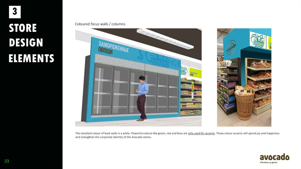
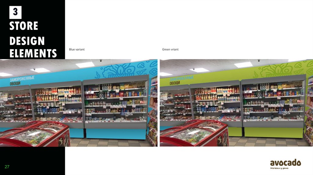
Coloured focus walls / columns
The standard colour of back walls is a white. Powerful colours like green, red and blue are only used for accents. These colour accents will spend joy and happiness
and strengthen the corporate identity of the Avocado stores.
23
24.
3STORE
DESIGN
ELEMENTS
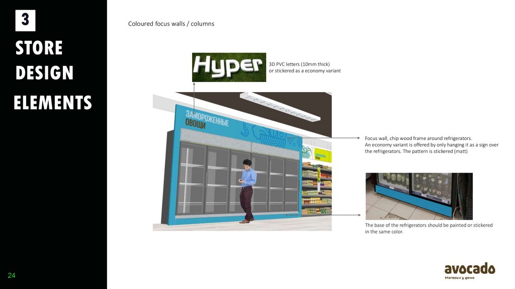
Coloured focus walls / columns
3D PVC letters (10mm thick)
or stickered as a economy variant
Focus wall, chip wood frame around refrigerators.
An economy variant is offered by only hanging it as a sign over
the refrigerators. The pattern is stickered (matt)
The base of the refrigerators should be painted or stickered
in the same color.
24
25.
3STORE
DESIGN
ELEMENTS
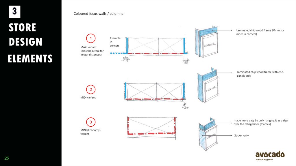
Coloured focus walls / columns
1
MAXI variant
(most beautiful for
longer distances)
Laminated chip wood frame 80mm (or
more in corners)
Example
in
corners
Laminated chip wood frame with endpanels only
2
MIDI variant
3
MINI (Economy)
variant
25
made more easy by only hanging it as a sign
over the refrigerator (foamex)
Sticker only
26.
3STORE
DESIGN
ELEMENTS
26
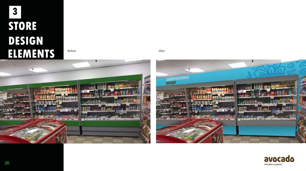
Before
After
27.
3STORE
DESIGN
ELEMENTS
27
Blue variant
Green vriant
28.
3STORE
DESIGN
ELEMENTS
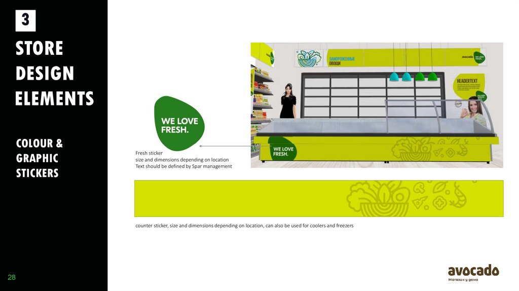
COLOUR &
GRAPHIC
STICKERS
Fresh sticker
size and dimensions depending on location
Text should be defined by Spar management
counter sticker, size and dimensions depending on location, can also be used for coolers and freezers
28
29.
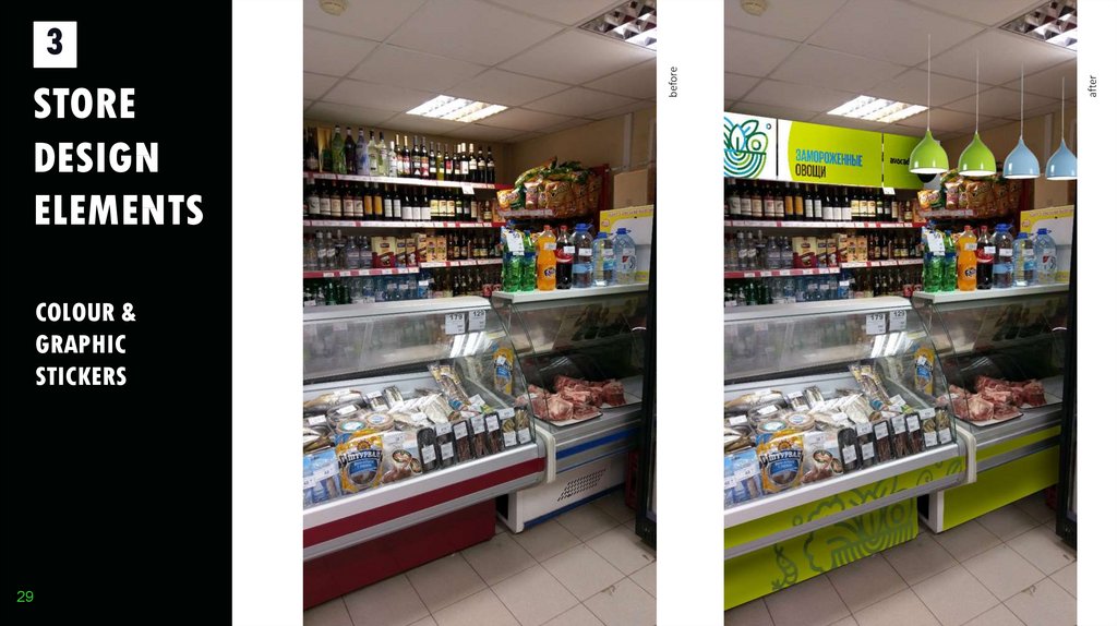
COLOUR &GRAPHIC
STICKERS
29
after
STORE
DESIGN
ELEMENTS
before
3
30.
4POS
MATERIAL
S
30
31.
4POS
MATERIAL
S
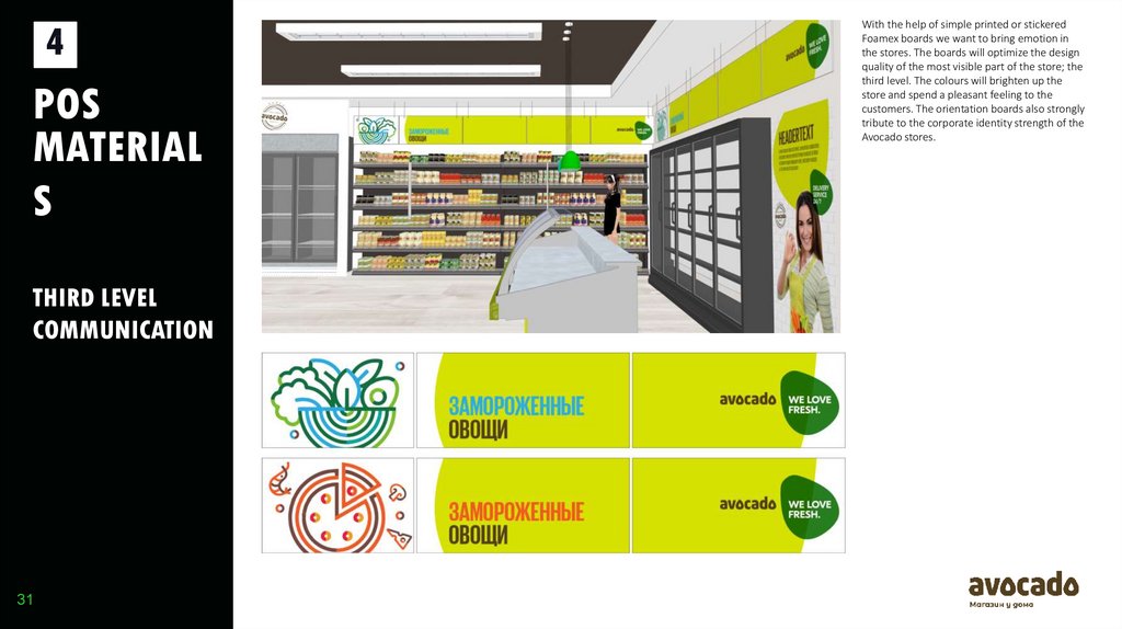
THIRD LEVEL
COMMUNICATION
31
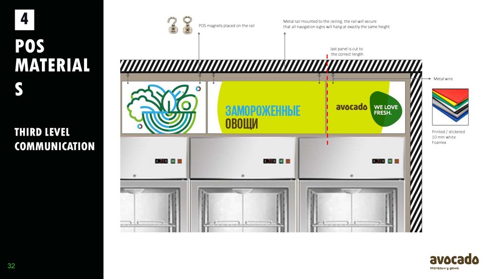
With the help of simple printed or stickered
Foamex boards we want to bring emotion in
the stores. The boards will optimize the design
quality of the most visible part of the store; the
third level. The colours will brighten up the
store and spend a pleasant feeling to the
customers. The orientation boards also strongly
tribute to the corporate identity strength of the
Avocado stores.
32.
4POS
MATERIAL
S
THIRD LEVEL
COMMUNICATION
32
POS magnets placed on the rail
Metal rail mounted to the ceiling, the rail will secure
that all navigation signs will hang at exactly the same height
last panel is cut to
the correct length
Metal wire
Printed / stickered
10 mm white
Foamex
33.
4POS
MATERIAL
S
THIRD LEVEL
COMMUNICATION
33
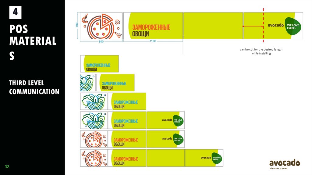
can be cut for the desired length
while installing
15
34.
4POS
MATERIAL
S
THIRD LEVEL
COMMUNICATION
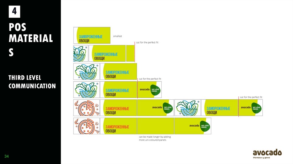
smallest
cut for the perfect fit
cut for the perfect fit
cut for the perfect fit
can be made longer by adding
more uni-coloured panels
34
35.
4POS
MATERIAL
S
THIRD LEVEL
COMMUNICATION
35
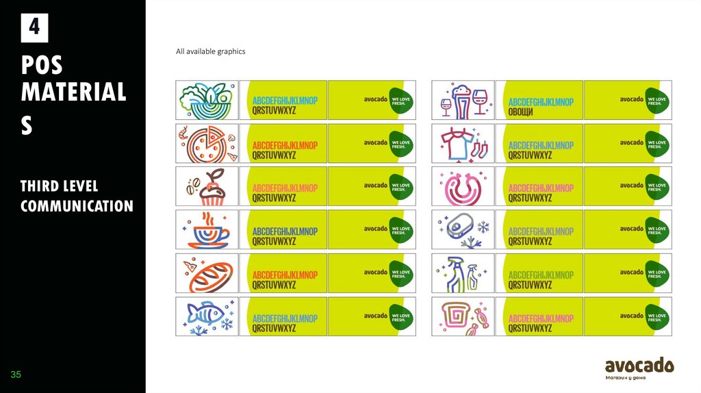
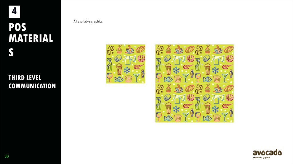
All available graphics
36.
4POS
MATERIAL
S
THIRD LEVEL
COMMUNICATION
36
All available graphics
37.
4THIRD LEVEL
COMMUNICATION
37
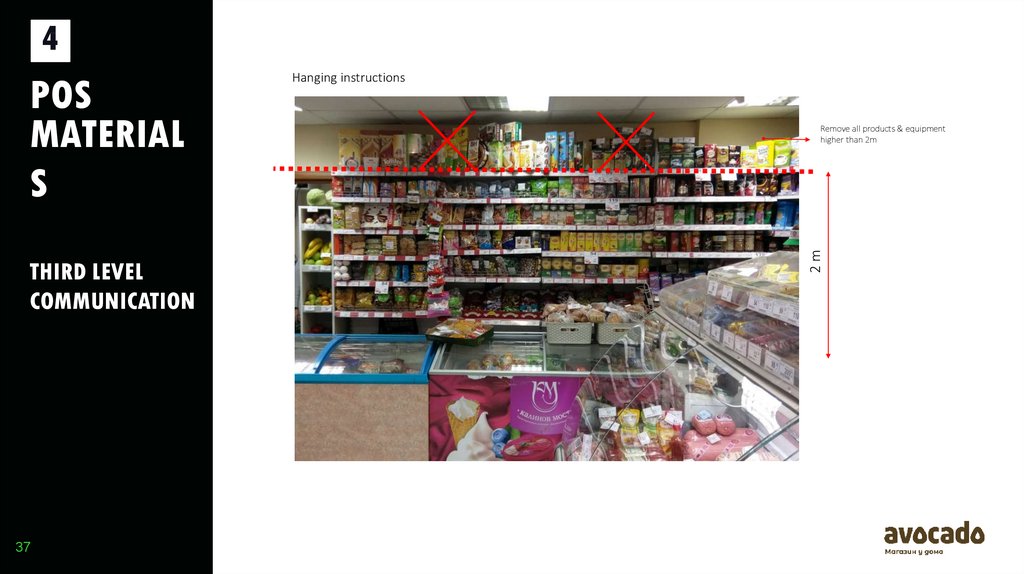
Remove all products & equipment
higher than 2m
2m
POS
MATERIAL
S
Hanging instructions
38.
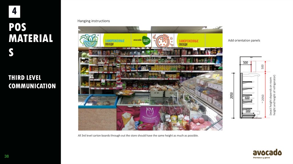
4Add orientation panels
~ 2050
THIRD LEVEL
COMMUNICATION
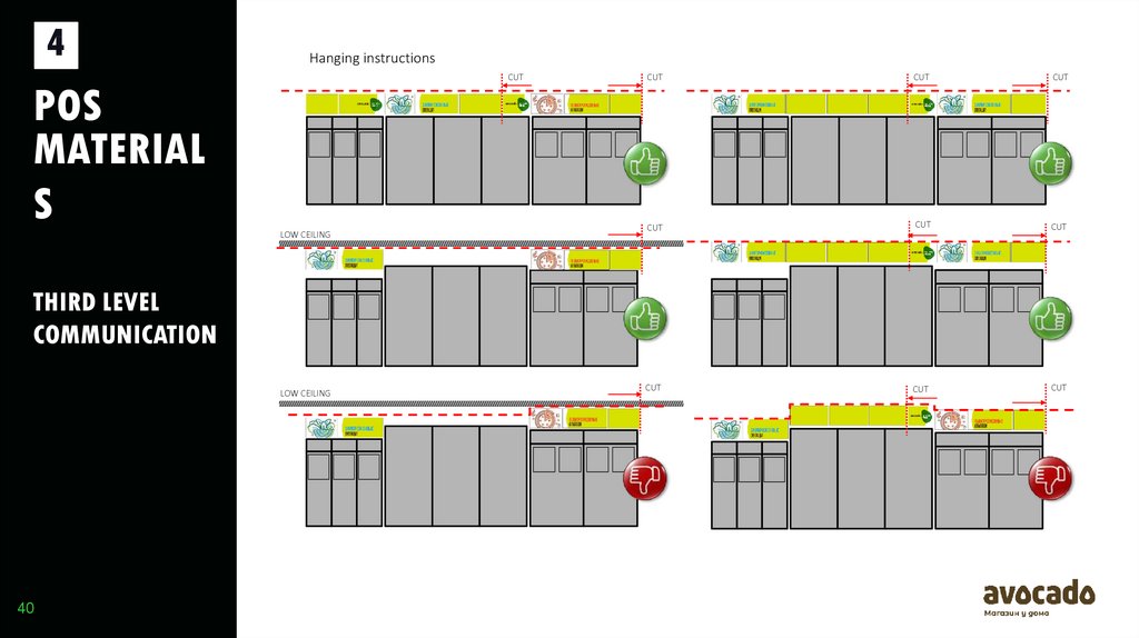
All 3rd level carton boards through out the store should have the same height as much as possible.
38
(exact height depends on room
height and height of refrigerator)
500
POS
MATERIAL
S
Hanging instructions
39.
4POS
MATERIAL
S
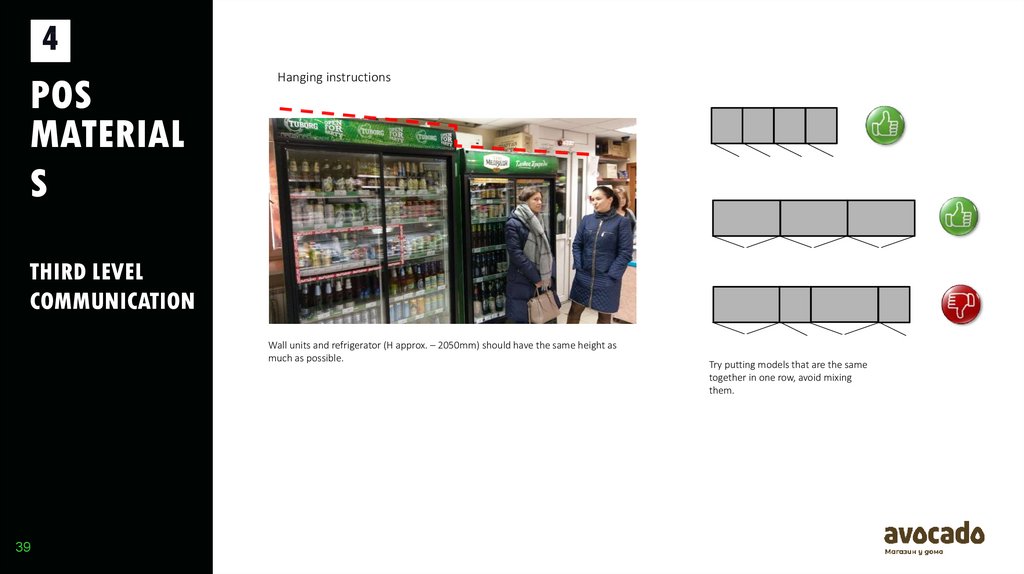
Hanging instructions
THIRD LEVEL
COMMUNICATION
Wall units and refrigerator (H approx. – 2050mm) should have the same height as
much as possible.
39
Try putting models that are the same
together in one row, avoid mixing
them.
40.
4Hanging instructions
CUT
POS
MATERIAL
S
LOW CEILING
CUT
CUT
CUT
CUT
CUT
CUT
CUT
CUT
CUT
THIRD LEVEL
COMMUNICATION
LOW CEILING
40
41.
4POS
MATERIAL
S
PRICING &
SIGNING
41
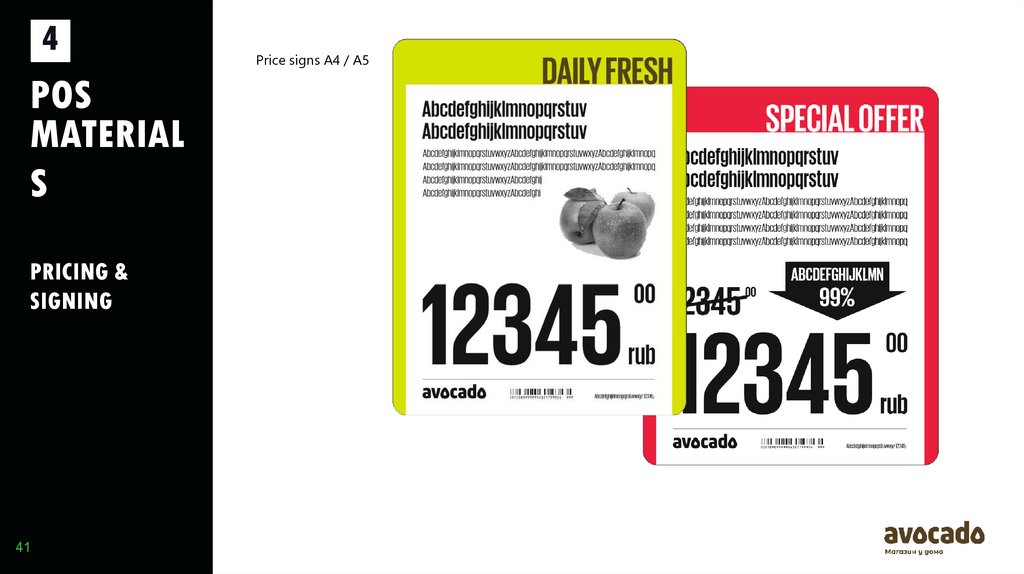
Price signs A4 / A5
42.
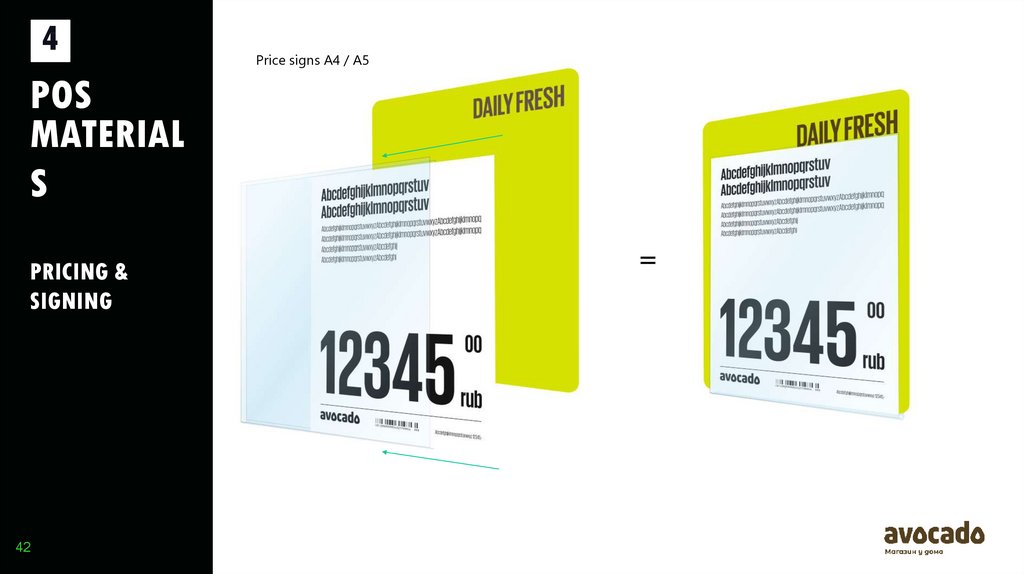
4Price signs A4 / A5
POS
MATERIAL
S
PRICING &
SIGNING
42
=
43.
4POS
MATERIAL
S
PRICING &
SIGNING
43
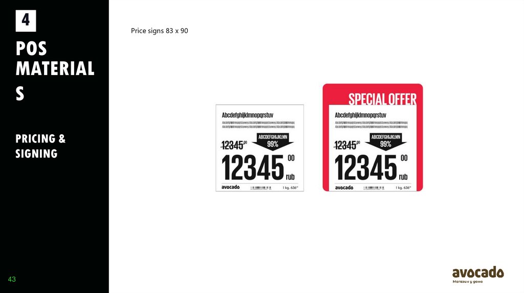
Price signs 83 x 90
44.
4POS
MATERIAL
S
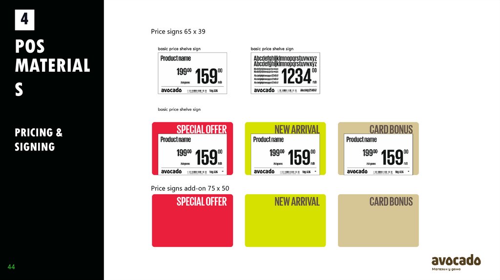
Price signs 65 x 39
PRICING &
SIGNING
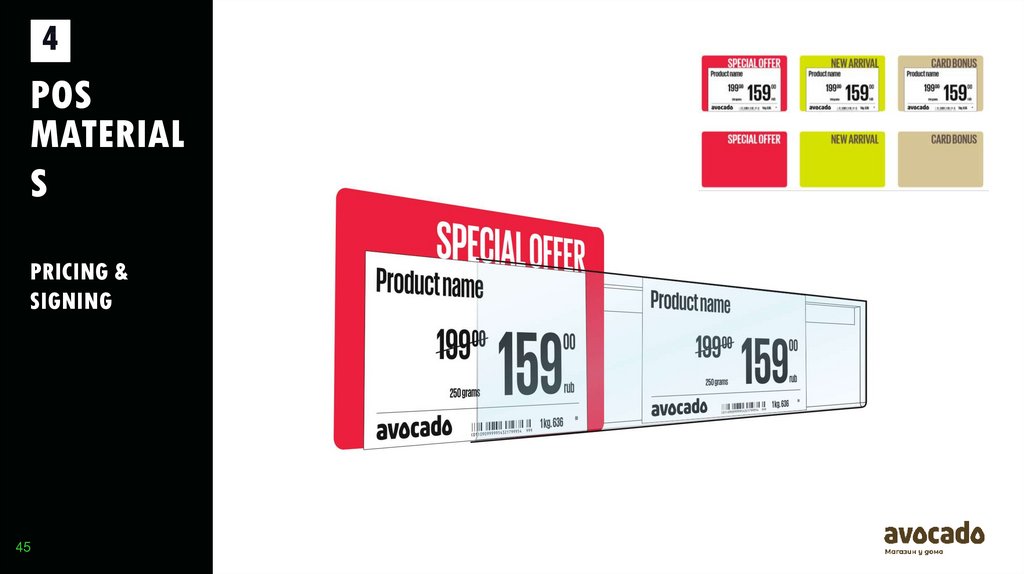
Price signs add-on 75 x 50
44
45.
4POS
MATERIAL
S
PRICING &
SIGNING
45
46.
4POS
MATERIAL
S
PRICING &
SIGNING
46
47.
4POS
MATERIAL
S
PRICING &
SIGNING
47
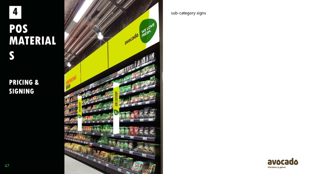
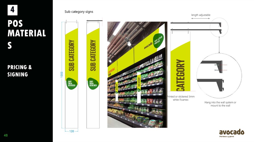
sub-category signs
48.
4Sub category signs
length adjustable
POS
MATERIAL
S
PRICING &
SIGNING
Printed or stickered 3mm
white Foamex
48
Hang into the wall system or
mount to the wall
49.
4POS
MATERIAL
S
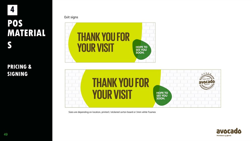
Exit signs
PRICING &
SIGNING
Sizes are depending on location, printed / stickered carton board or 3mm white Foamex
49
50.
5PHOTO
CONCEPT
50
51.
5PHOTO
CONCEPT
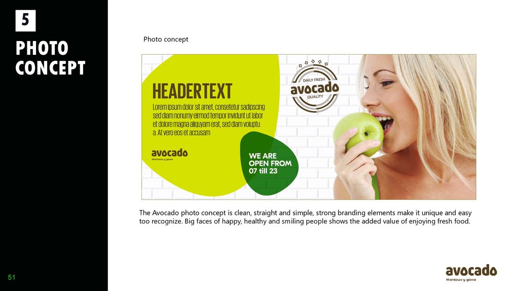
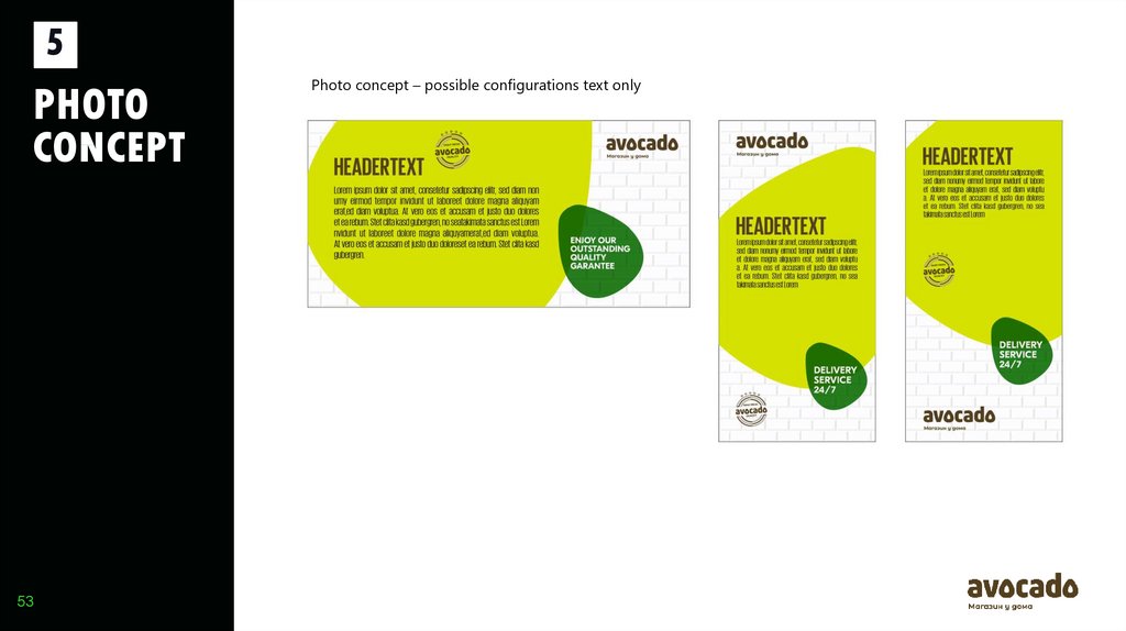
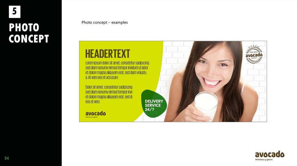
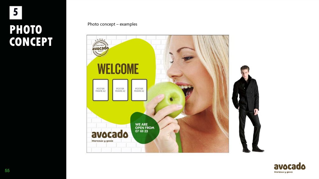
Photo concept
The Avocado photo concept is clean, straight and simple, strong branding elements make it unique and easy
too recognize. Big faces of happy, healthy and smiling people shows the added value of enjoying fresh food.
51
52.
5PHOTO
CONCEPT
52
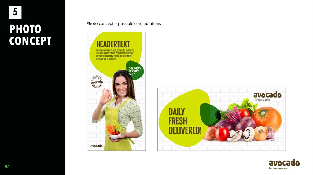
Photo concept – possible configurations
53.
5PHOTO
CONCEPT
53
Photo concept – possible configurations text only
54.
5PHOTO
CONCEPT
54
Photo concept – examples
55.
5PHOTO
CONCEPT
55
Photo concept – examples
56.
6LAY OUT
EXAMPLES
56
57.
6LAY OUT
EXAMPLES
57
57
58.
6LAY OUT
EXAMPLES
WALL ELEVATIONS
58
58
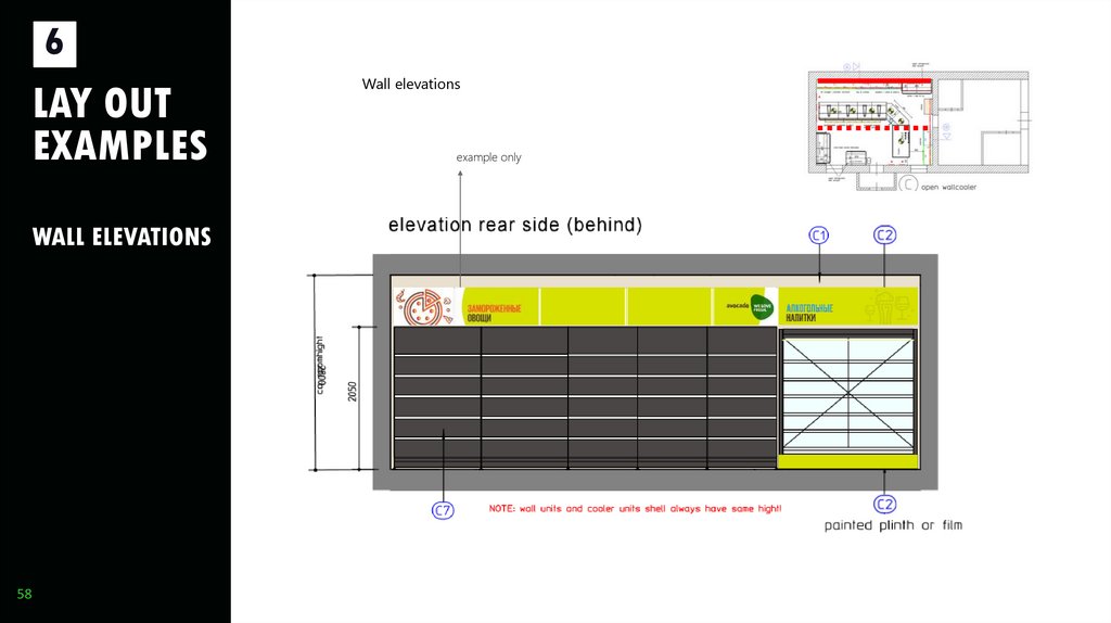
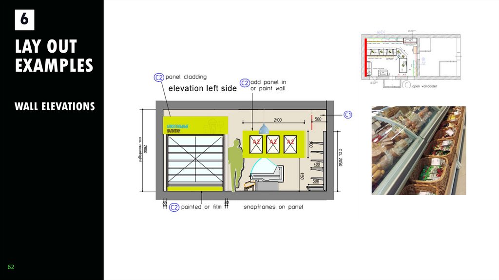
Wall elevations
example only
59.
6LAY OUT
EXAMPLES
WALL ELEVATIONS
59
59
60.
6LAY OUT
EXAMPLES
WALL ELEVATIONS
60
60
61.
6LAY OUT
EXAMPLES
WALL ELEVATIONS
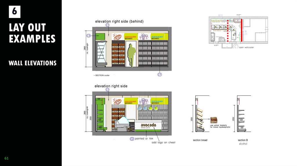
alcohol
61
61
62.
6LAY OUT
EXAMPLES
WALL ELEVATIONS
62
62
63.
6363
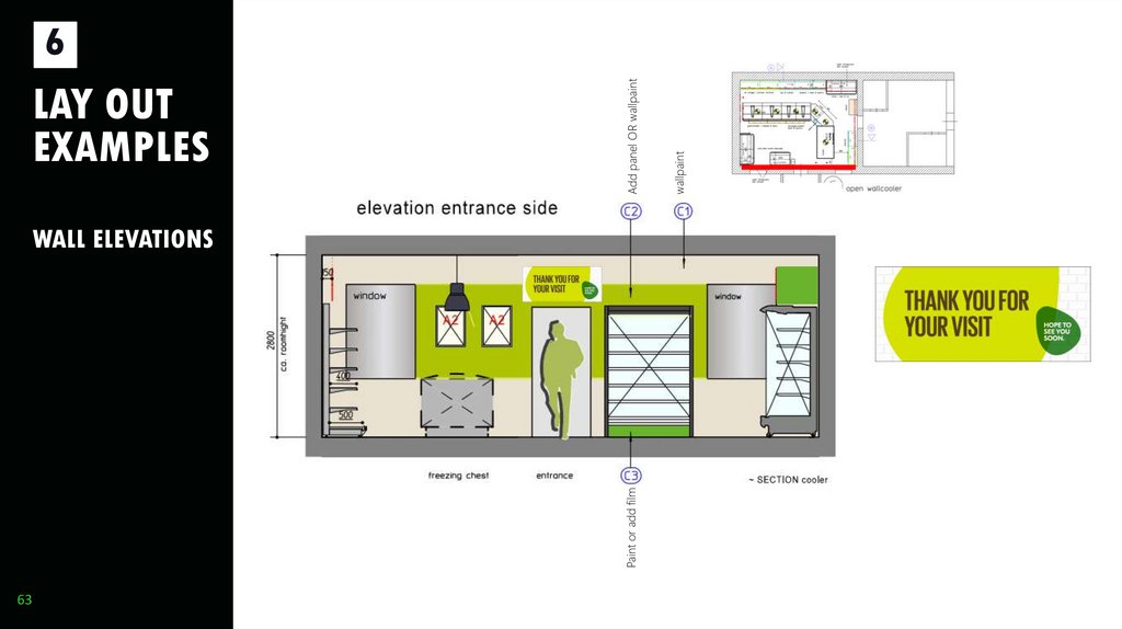
WALL ELEVATIONS
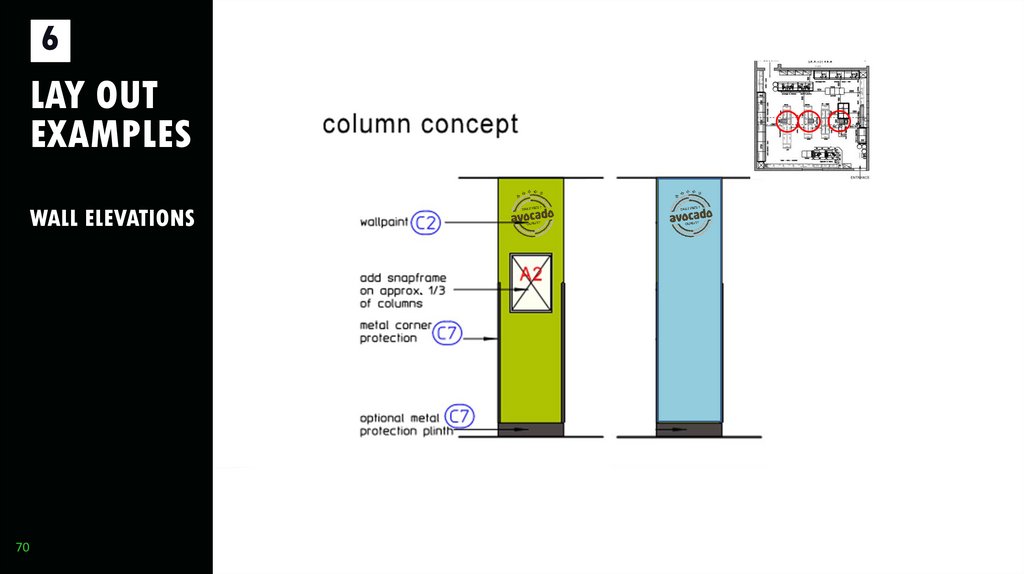
wallpaint
Add panel OR wallpaint
LAY OUT
EXAMPLES
Paint or add film
6
64.
6LAY OUT
EXAMPLES
64
64
65.
6LAY OUT
EXAMPLES
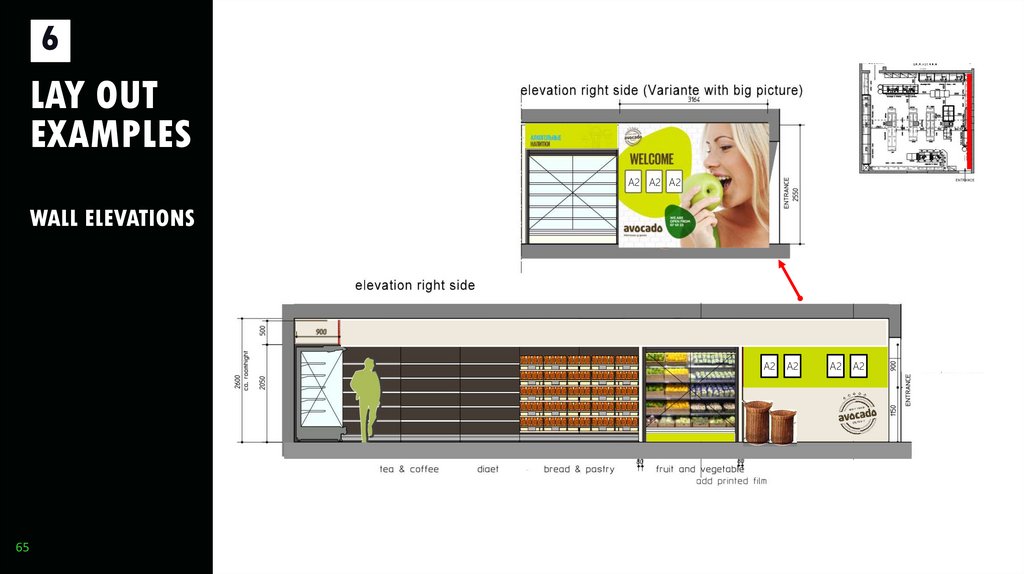
A3 A2
A3 A2
A3
A2
WALL ELEVATIONS
A2
65
65
A2
A2
A2
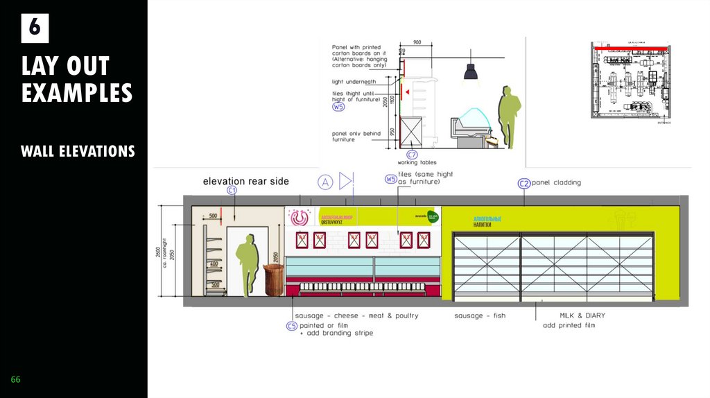
66.
6LAY OUT
EXAMPLES
WALL ELEVATIONS
66
66
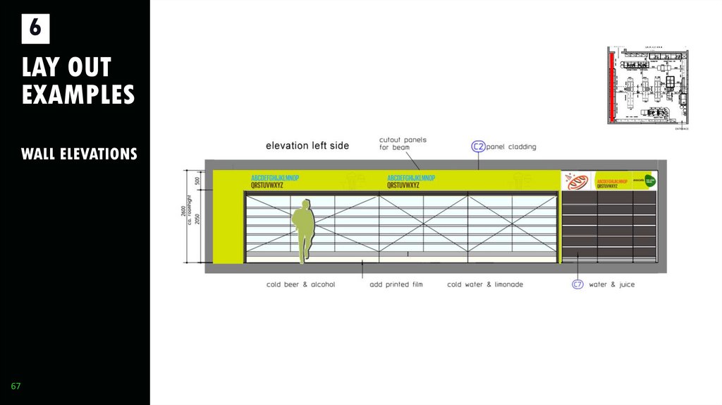
67.
6LAY OUT
EXAMPLES
WALL ELEVATIONS
67
67
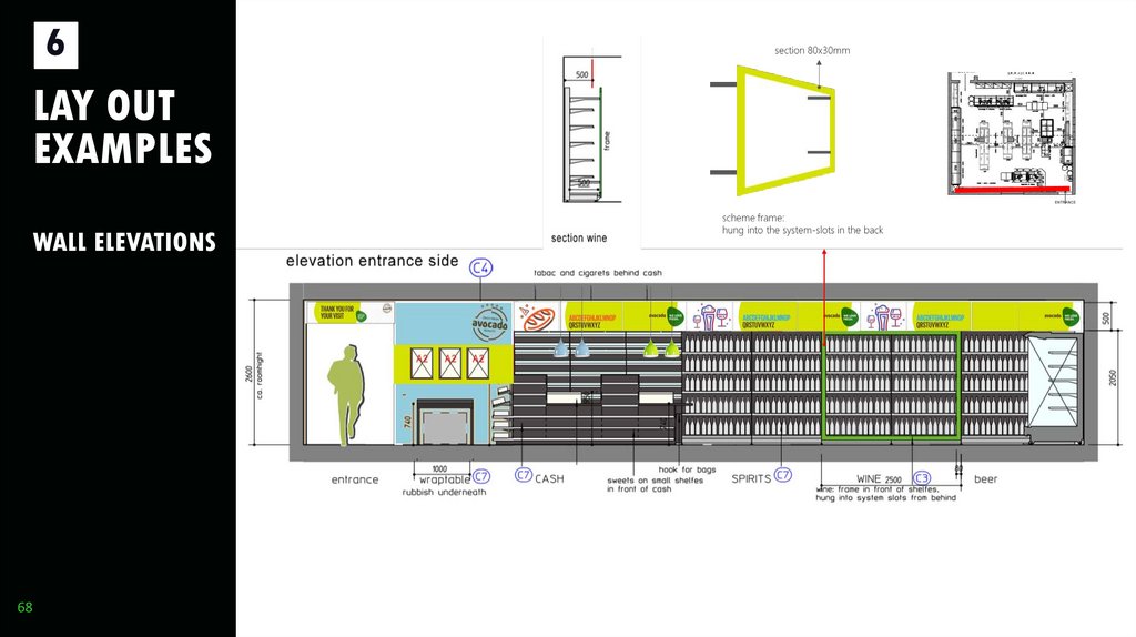
68.
6LAY OUT
EXAMPLES
WALL ELEVATIONS
68
68
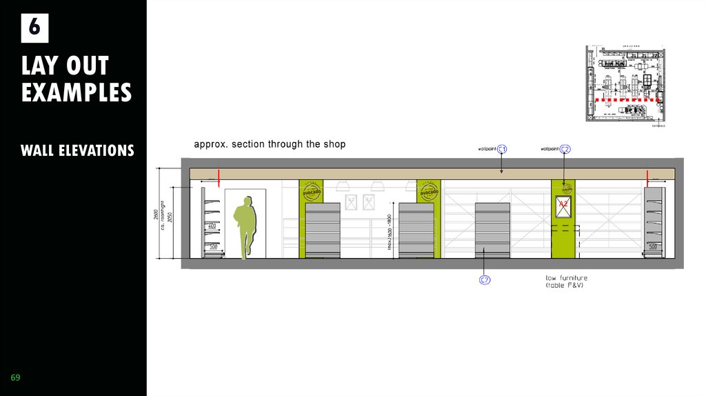
69.
6LAY OUT
EXAMPLES
WALL ELEVATIONS
69
69
70.
6LAY OUT
EXAMPLES
WALL ELEVATIONS
70
70
71.
6LAY OUT
EXAMPLES
WALL ELEVATIONS
71
71
72.
6LAY OUT
EXAMPLES
WALL ELEVATIONS
72
72
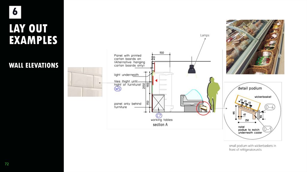
Lamps
73.
7FACADE
73
74.
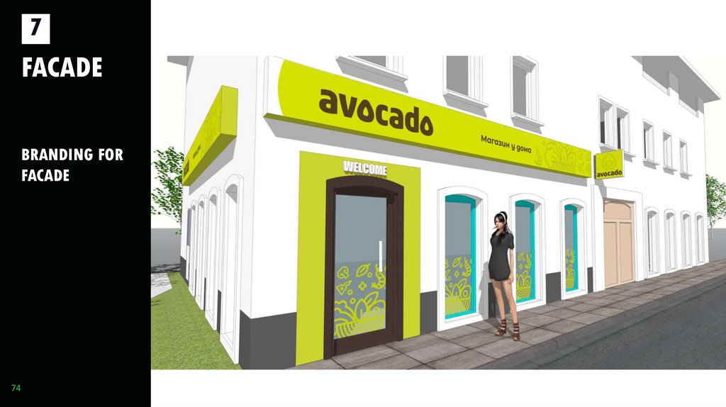
7FACADE
BRANDING FOR
FACADE
74
74
75.
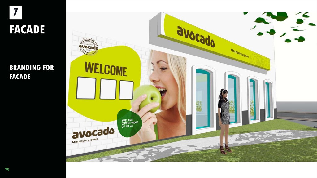
7FACADE
BRANDING FOR
FACADE
75
75
76.
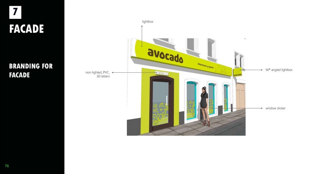
7lightbox
FACADE
BRANDING FOR
FACADE
non-lighted, PVC,
3D letters
90° angled lightbox
window sticker
76
76
77.
7CONTACT
Bart Ooijman
Kateryna Radinger
Project
management
Director of Storebranding
Division
retail branding GmbH
3300 Amstetten / Austria, Preinsbacher Straß
www.retailbranding.at
Tel: (+43) 7472 / 233 77Tel.:
- 22 (+43 ) 7472 / 233 77 – 0
Mobile:: (+43) 664 / 383Mobile:
24 81 (+43) 664 884 75 447
kateryna.radinger@retailbranding.at
bart.ooijman@retailbranding.at
77





 Маркетинг


