


 Искусство
Похожие презентации:


")


Design. Effective presentation design principles for impactful communication
1.
PresentationDesign
Effective presentation design principles for impactful
communication.
2.
Introduction3.
01Design Principles
4.
Minimalist StyleAdopting a minimalist style in presentation design enhances
clarity and focuses the audience's attention on the content.
This approach emphasizes simplicity by reducing clutter on
each slide, allowing viewers to engage with the key messages
without distractions. Visual elements should be restrained, and
the use of space should be optimized to create an
aesthetically pleasing flow.
5.
Font RecommendationsSelecting the right fonts is crucial for readability and
professionalism. Sans-serif fonts are recommended for their
modern appearance and ease of reading on screens.
Consistency in font choice helps maintain a uniform look
throughout the presentation. Important considerations include
using sufficient contrast between text and background colors
to enhance legibility, as well as maintaining uniform sizes for
headings and body text.
6.
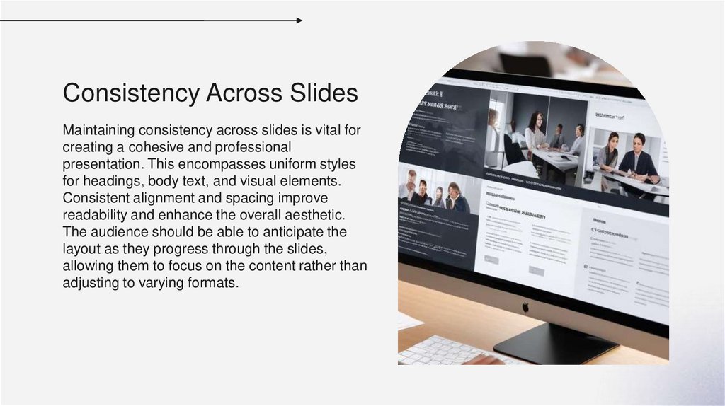
Consistency Across SlidesMaintaining consistency across slides is vital for
creating a cohesive and professional
presentation. This encompasses uniform styles
for headings, body text, and visual elements.
Consistent alignment and spacing improve
readability and enhance the overall aesthetic.
The audience should be able to anticipate the
layout as they progress through the slides,
allowing them to focus on the content rather than
adjusting to varying formats.
7.
02Slide Elements
8.
Background and Text ColorsThe choice of background and text colors significantly impacts the
effectiveness of a presentation. A balanced color palette enhances
visual appeal while ensuring that content is easy to read. For
instance, contrasting colors, such as dark backgrounds with light
text, increase legibility. Using a limited color scheme with
complementary tones maintains professionalism and ensures the
audience remains focused on the message.
9.
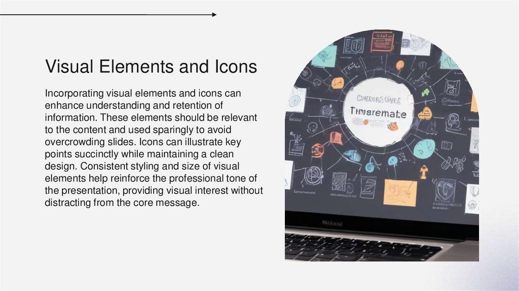
Visual Elements and IconsIncorporating visual elements and icons can
enhance understanding and retention of
information. These elements should be relevant
to the content and used sparingly to avoid
overcrowding slides. Icons can illustrate key
points succinctly while maintaining a clean
design. Consistent styling and size of visual
elements help reinforce the professional tone of
the presentation, providing visual interest without
distracting from the core message.
10.
Use of Graphs and DiagramsGraphs and diagrams are powerful tools for conveying complex
data and relationships clearly. They should be designed to highlight
key insights and trends, using appropriate scales and labels to
ensure clarity. Simplified visuals can improve comprehension and
engagement among the audience. Additionally, ensuring that these
elements complement the narrative enhances the effectiveness of
the overall presentation.
11.
Conclusions• Effective presentation design combines thoughtful
layout, consistent styling, and strategic use of visual
elements. By adhering to these principles, presenters
can ensure their messages are communicated clearly
and effectively, fostering better understanding and
engagement from the audience.
12.
Thank you!Do you have any questions?
CREDITS: This presentation template was created by Slidesgo, and
includes icons by Flaticon, and infographics & images by Freepik