

 Маркетинг
Похожие презентации:


 Shoot Deck")


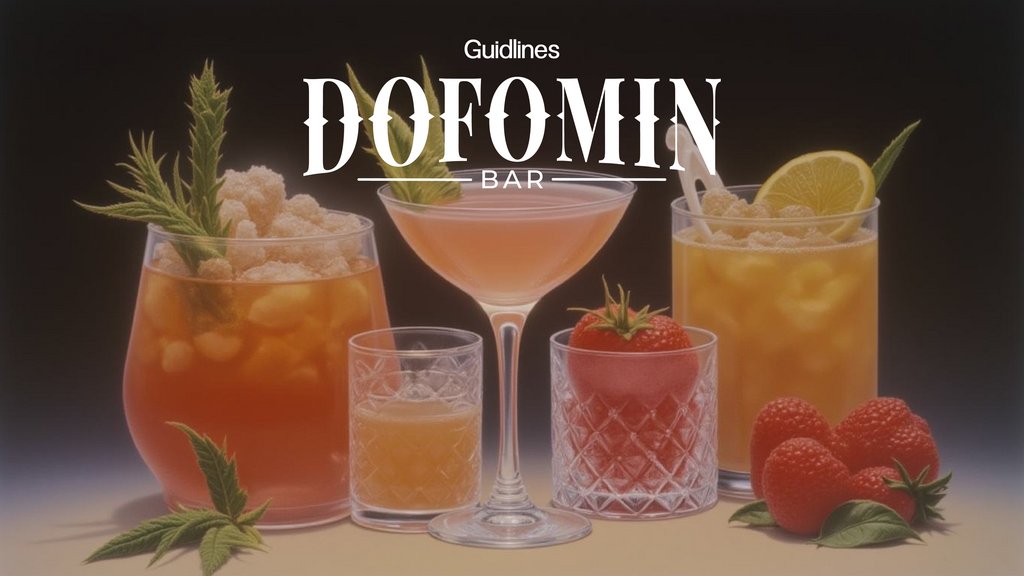
Dofomin бар
1.
GuidlinesBAR
2.
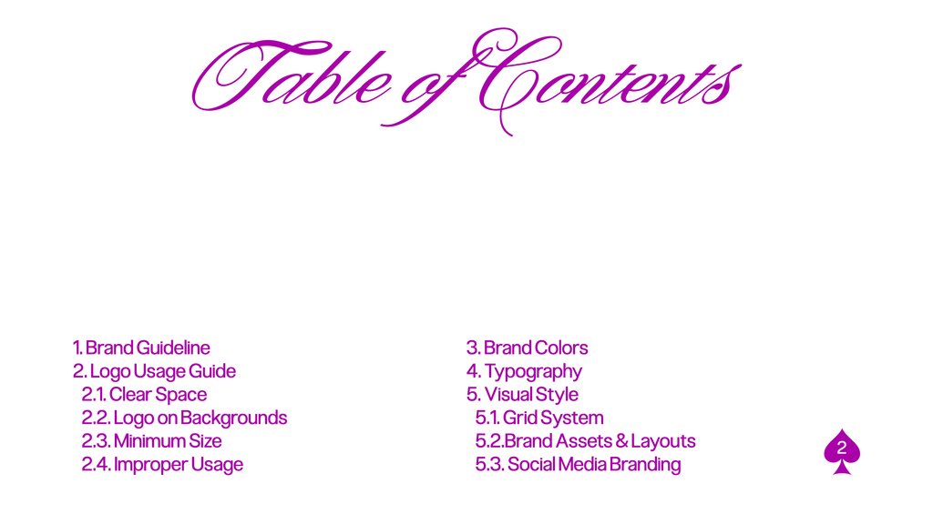
Table of Contents1. Brand Guideline
3. Brand Colors
2. Logo Usage Guide
4. Typography
2.1. Clear Space
5. Visual Style
2.2. Logo on Backgrounds
5.1. Grid System
2.3. Minimum Size
5.2.Brand Assets & Layouts
2.4. Improper Usage
5.3. Social Media Branding
2
3.
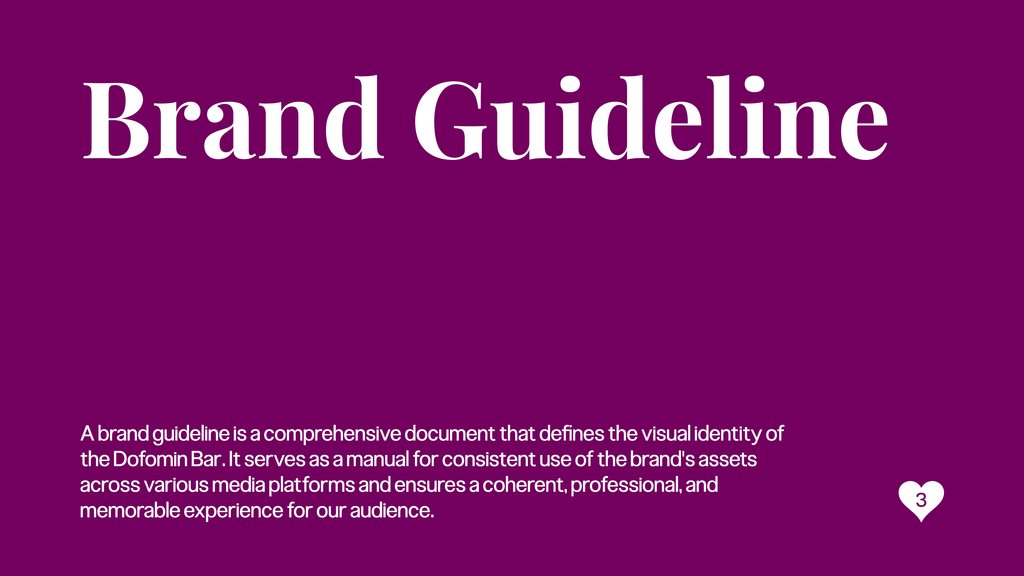
Brand GuidelineA brand guideline is a comprehensive document that defines the visual identity of
the Dofomin Bar. It serves as a manual for consistent use of the brand's assets
across various media platforms and ensures a coherent, professional, and
memorable experience for our audience.
3
4.
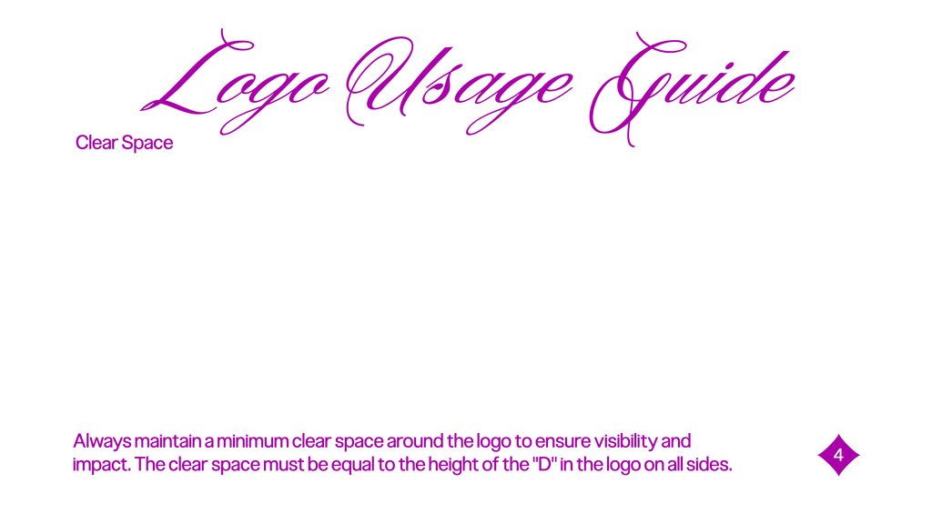
Logo Usage GuideClear Space
Always maintain a minimum clear space around the logo to ensure visibility and
impact. The clear space must be equal to the height of the "D" in the logo on all sides.
4
5.
Logo on BackgroundsUse the primary logo on light or neutral backgrounds. When placed on dark or vibrant
backgrounds, use the white or monochrome version of the logo to maintain contrast and
legibility.
6.
Minimum SizeTo maintain legibility, the logo should never be smaller than:
Printed: 25 mm in width
Digital: 90 px in width
6
7.
Improper UsageTo maintain legibility, the logo should never be smaller than:
Printed: 25 mm in width
Digital: 90 px in width
7
8.
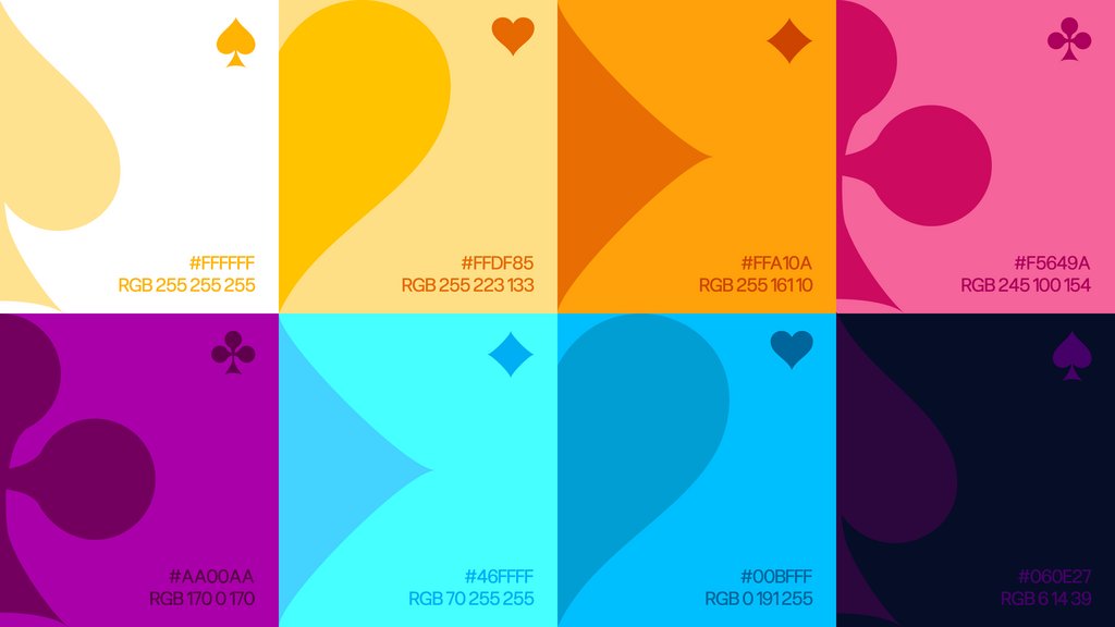
Brand ColorsThe color palette reflects the vibrant and dynamic spirit of Las Vegas nightlife. The
primary colors include electric red, neon yellow, royal blue, and vivid purple. These
are supported by secondary accents such as neon green and deep black.
Use colors consistently to build recognition and mood. Bright hues should
dominate visual layouts, while darker tones provide contrast and balance.
8
9.
#FFFFFFRGB 255 255 255
#FFDF85
RGB 255 223 133
#FFA10A
RGB 255 161 10
#F5649A
RGB 245 100 154
#AA00AA
RGB 170 0 170
#46FFFF
RGB 70 255 255
#00BFFF
RGB 0 191 255
#060E27
RGB 6 14 39
10.
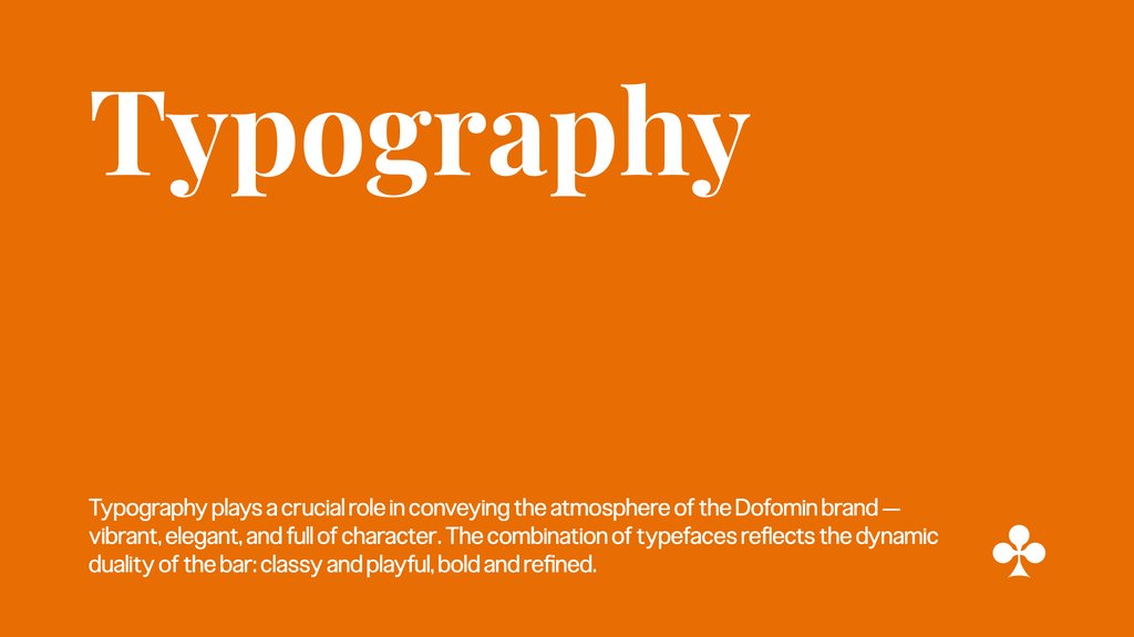
TypographyTypography plays a crucial role in conveying the atmosphere of the Dofomin brand —
vibrant, elegant, and full of character. The combination of typefaces reflects the dynamic
duality of the bar: classy and playful, bold and refined.
11.
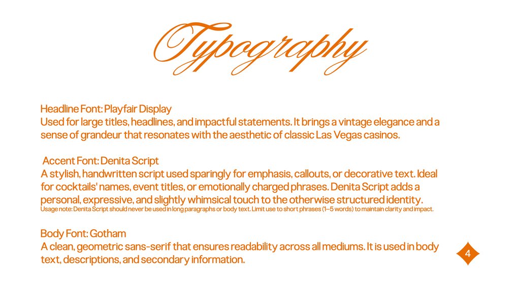
TypographyHeadline Font: Playfair Display
Used for large titles, headlines, and impactful statements. It brings a vintage elegance and a
sense of grandeur that resonates with the aesthetic of classic Las Vegas casinos.
Accent Font: Denita Script
A stylish, handwritten script used sparingly for emphasis, callouts, or decorative text. Ideal
for cocktails' names, event titles, or emotionally charged phrases. Denita Script adds a
personal, expressive, and slightly whimsical touch to the otherwise structured identity.
Usage note: Denita Script should never be used in long paragraphs or body text. Limit use to short phrases (1–5 words) to maintain clarity and impact.
Body Font: Gotham
A clean, geometric sans-serif that ensures readability across all mediums. It is used in body
text, descriptions, and secondary information.
4
12.
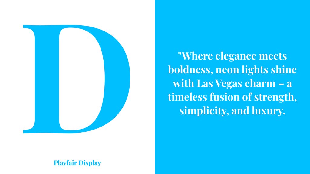
DPlayfair Display
"Where elegance meets
boldness, neon lights shine
with Las Vegas charm – a
timeless fusion of strength,
simplicity, and luxury.
13.
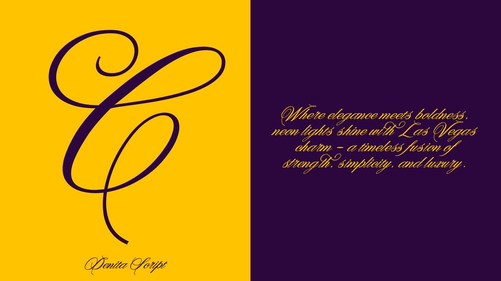
CDenita Script
Where elegance meets boldness,
neon lights shine with Las Vegas
charm – a timeless fusion of
strength, simplicity, and luxury.
14.
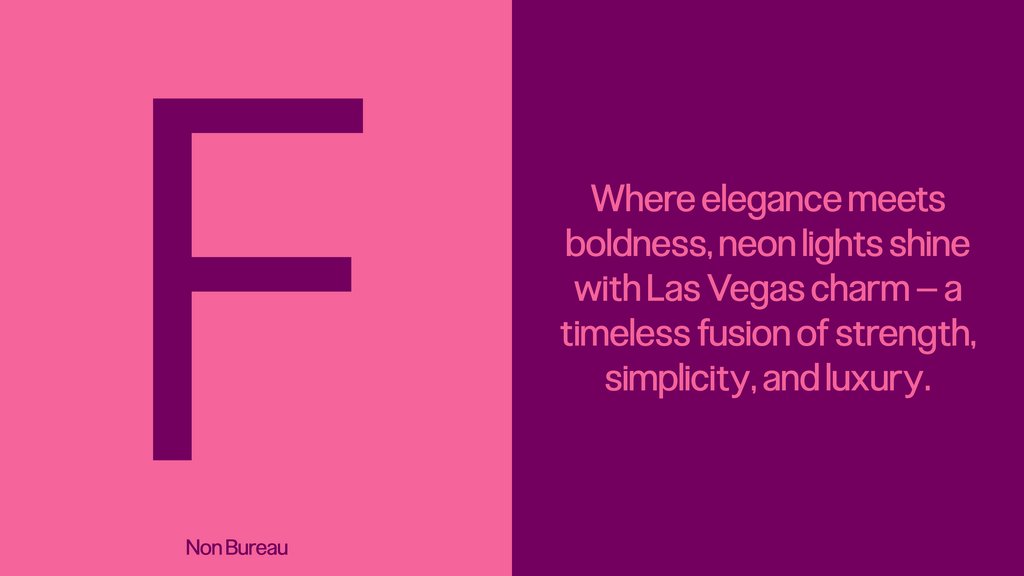
FNon Bureau
Where elegance meets
boldness, neon lights shine
with Las Vegas charm – a
timeless fusion of strength,
simplicity, and luxury.
15.
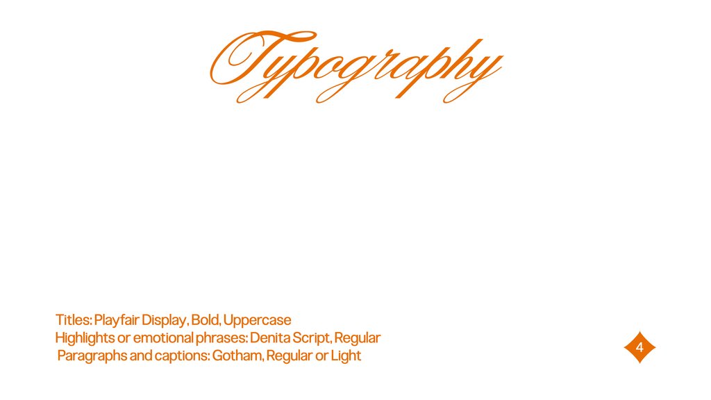
TypographyTitles: Playfair Display, Bold, Uppercase
Highlights or emotional phrases: Denita Script, Regular
Paragraphs and captions: Gotham, Regular or Light
4
16.
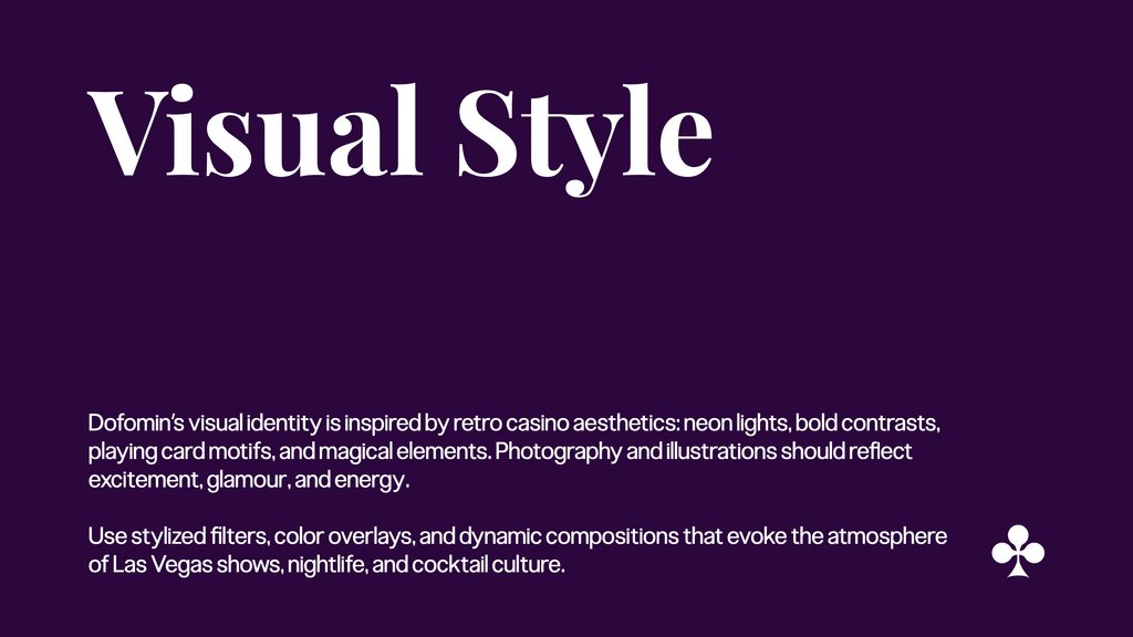
Visual StyleDofomin’s visual identity is inspired by retro casino aesthetics: neon lights, bold contrasts,
playing card motifs, and magical elements. Photography and illustrations should reflect
excitement, glamour, and energy.
Use stylized filters, color overlays, and dynamic compositions that evoke the atmosphere
of Las Vegas shows, nightlife, and cocktail culture.
17.
18.
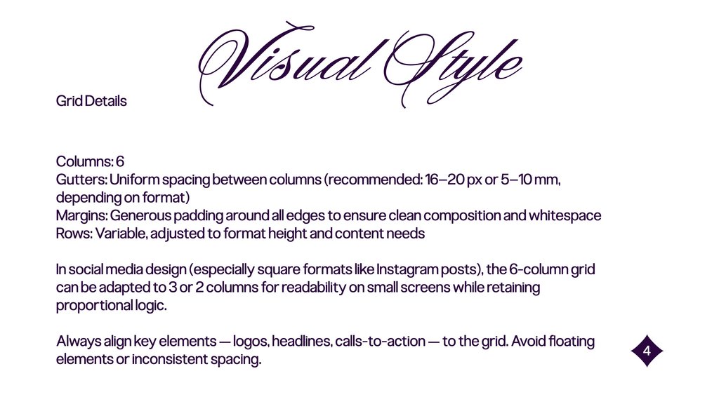
Grid DetailsVisual Style
Columns: 6
Gutters: Uniform spacing between columns (recommended: 16–20 px or 5–10 mm,
depending on format)
Margins: Generous padding around all edges to ensure clean composition and whitespace
Rows: Variable, adjusted to format height and content needs
In social media design (especially square formats like Instagram posts), the 6-column grid
can be adapted to 3 or 2 columns for readability on small screens while retaining
proportional logic.
Always align key elements — logos, headlines, calls-to-action — to the grid. Avoid floating
elements or inconsistent spacing.
4
19.
20.
Brand Assets & LayoutsTemplates include:
Posters
Business cards
Menus
Merchandise
Packaging
Signage
All layouts use consistent spacing, branding elements, and color balance. Logos are placed
prominently. Key messages follow the visual hierarchy set by the grid system and
typography rules.
4
21.
Social Media BrandingAll social media visuals should reflect the core identity: bright neon colors, sharp
typography, and playful, luxurious imagery.
Maintain branding color schemes
Use approved fonts
Avoid visual clutter
Emphasize engagement and entertainment
4