Похожие презентации:


Web redesign 22 Jan 2026
1.
Website designed for desktop.96% of views on mobile devices and site is very poor
Main landing page goes for ~18+ screens which….target ~ 5-6
Product sort also not great / easy to navigate and not sexy.
We need to move from long text paragraphs to Visuals as people not prepared to rea
1: Design a template that can be applied across all pages
Appealing ATF…with strong headline, hero pic CTA, call us and G review summa
BTF needs to be summarized into key sections with cards giving people the opp
get more information. Cards need high quality specific pics.
2: Initial focus will be on the clinic landing and child pages….start with Ikeja
2.
3.
4.
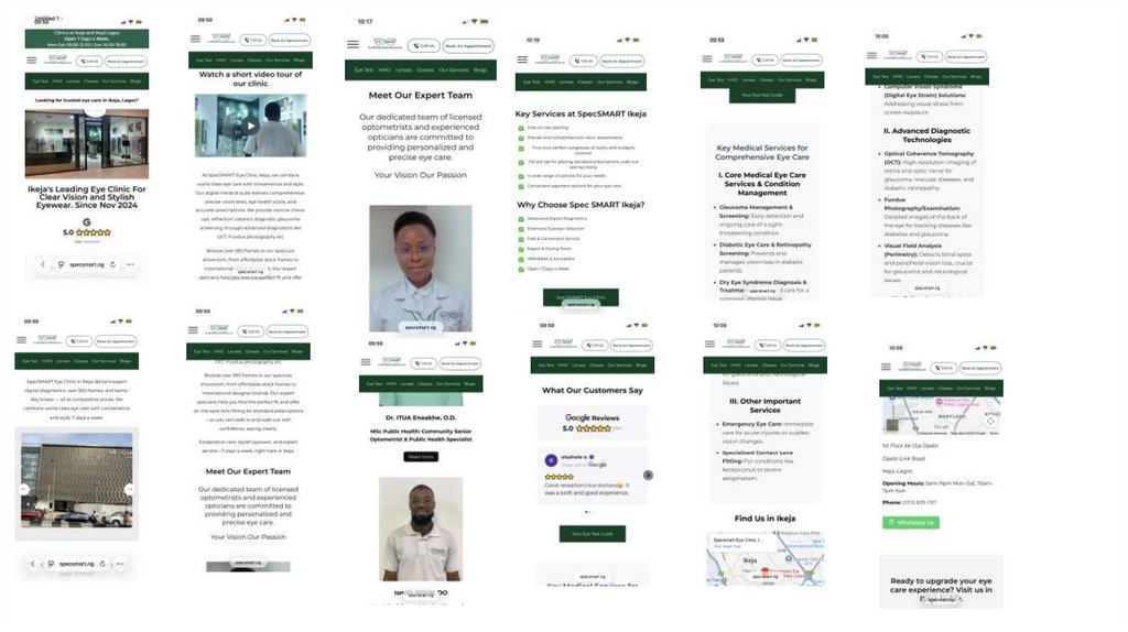
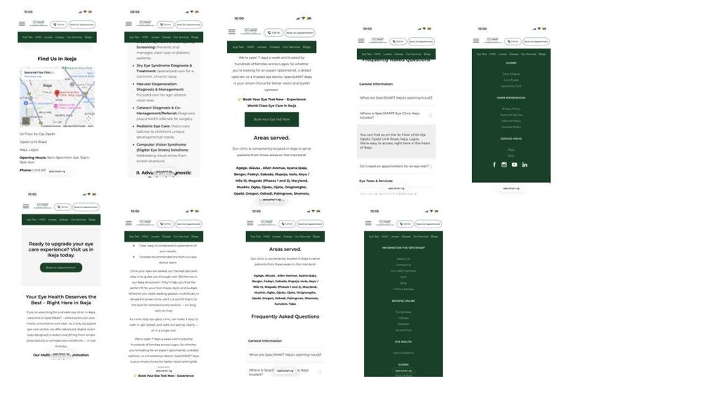
SectionsATF: see design mock-up, content as per current but layout
BTF: Sections (need to think thro order)…Card Headlines each needs a high quality
1: Meet our expert team
2: Service Overview ?
3: Medical services….i Core ii Advanced iii Other
4: Explore our Modern Clinic (VDO and Pic carousel)…take a virtual tour
5: Clinic Details and opening hours (NAP / Get directions G map)
6: Read our 5* Reviews
7: Areas served
8 : FAQ
Signature Colour PMS 3435C dark green
Type face: Monserrat sans serif.
5.
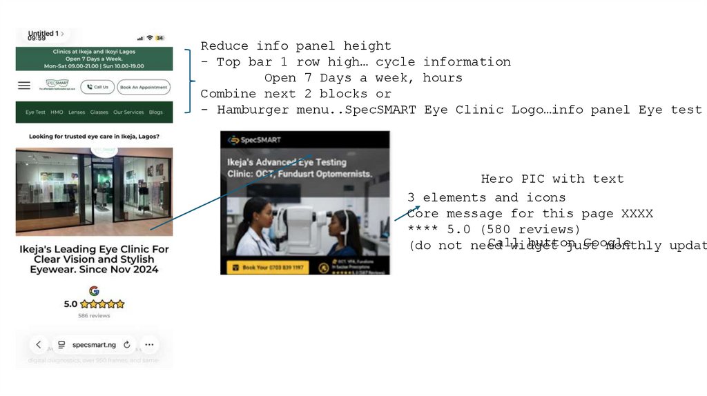
Reduce info panel height- Top bar 1 row high… cycle information
Open 7 Days a week, hours
Combine next 2 blocks or
- Hamburger menu..SpecSMART Eye Clinic Logo…info panel Eye test
Hero PIC with text
3 elements and icons
Core message for this page XXXX
**** 5.0 (580 reviews)
Call
button
(do not need
widget
just
monthly updat
6.
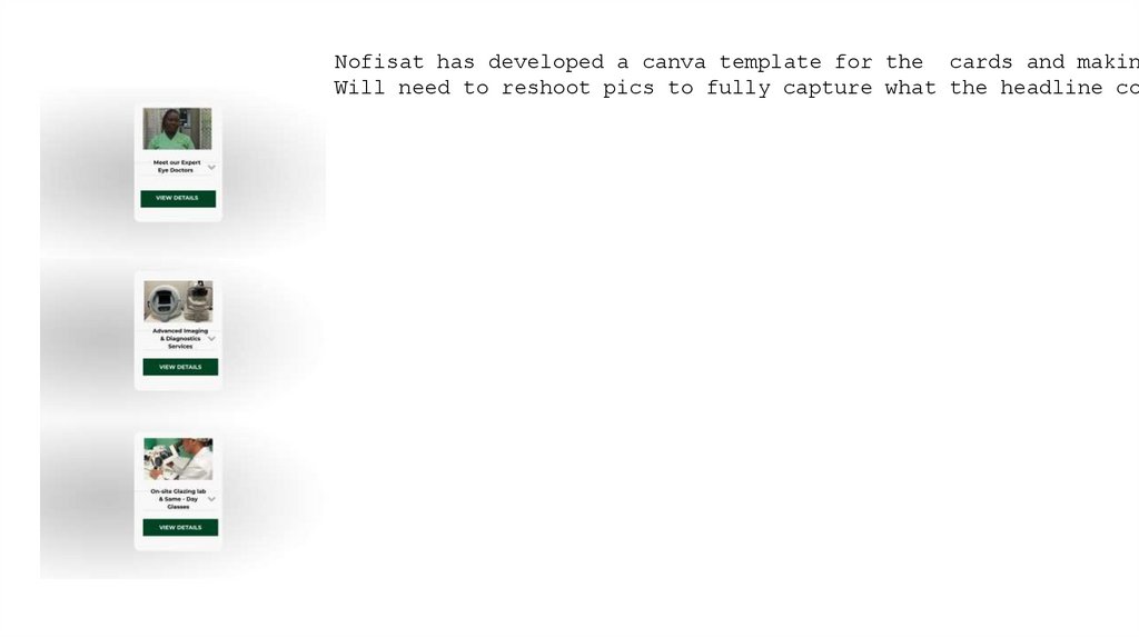
Nofisat has developed a canva template for the cards and makinWill need to reshoot pics to fully capture what the headline co
7.
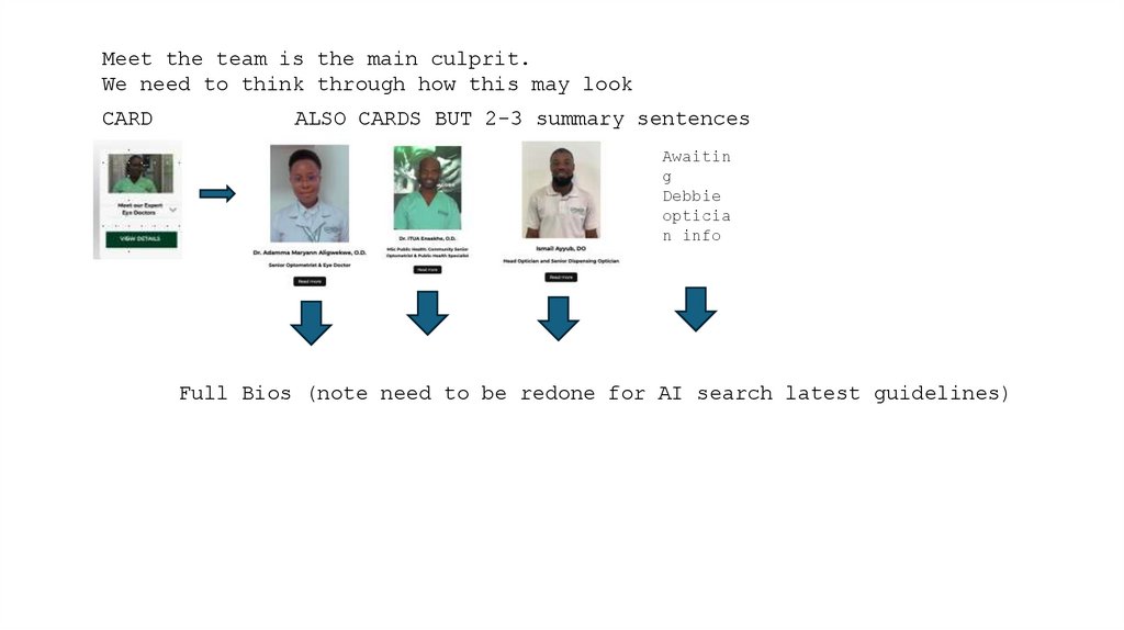
Meet the team is the main culprit.We need to think through how this may look
CARD
ALSO CARDS BUT 2-3 summary sentences
Awaitin
g
Debbie
opticia
n info
Full Bios (note need to be redone for AI search latest guidelines)