


 Искусство
Похожие презентации:


Slide design
1.
Slide Design2.
Background colors-Don’t be too creative
3. Colors
• Good contrast is importantYellow on dark blue
Black on white
White on black
• Be aware that colors may
look different on the screen
4. YELLOW
5. BLACK
6. WHITE
7. Colors may look different on the screen
8. Colors
You can use colors to emphasize a
point, but do it occasionally
Using a color as a decoration is distracting
Using different colors for different points is
not advisable
9. COLORS
Do not use red and green as acombination
Do not use distracting background
Do not use colors that are not good
contrast
10. Specifičnosti intenzivne terapije pacijenata sa HOBP
• Dobro tolerišu loše GAK• U proceni potrebe za mehaničkom ventilacijom
gledati prvenstveno stanje pacijenta(npr da li
može normalno da priča) a ne loše GAK
• Cilj u korekciji GAK je PaO2 veće od 60mmHG a
saturacija O2 veća od 90%
• Kod pacijenata sa hroničnom hiperkapnijom
stimulus za disanje postaje hipoksija te nebi
trebali davati veliku koncentraciju O2 zbog
mogućeg prestanka disanja.
• Za procenu takvih pacijenata pogledati
bikarbonate u GAK(ako su veći od 30mmol/l
onda postoji jedino hipoksičan nadražaj
respiratornog centra
11.
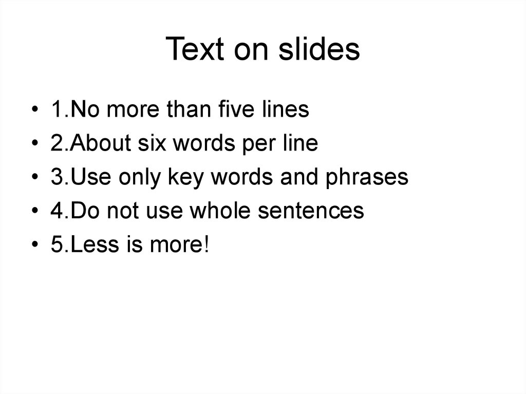
Text on slides1.No more than five lines
2.About six words per line
3.Use only key words and phrases
4.Do not use whole sentences
5.Less is more!
12. Fonts
Be sure that everybody can read it
Try to make 28 the smallest
Use different sizes for main and
secondary points
Again be sure it is not to small
13. Typography for doctors
Sans serif for headingsI I
You can use sans serif font for headings
(Arial), and serif (Times new roman) for body
text
Serif for longer phrases and short sentences
14. Fonts
Not more than two fonts per slideDO NOT USE ALL CAPITALS
Never underline
For emphasize use Italic or bold
15.
Keep your color schemes simple andtraditional, and never use red unless
you have somthing to hide.
16.
What was wrong with that slide?17. Don’t use RED color to emphasize text
18.
PICTURES (Photographs) ON THESLIDE
19. Don’t do this!
20. PREPARATION
PATIENTPREPARATION
21. Animation
22. Animations
Use sparingly, for emphasizing
points
Useful to bring one point at the
time
It can be distraction
Do not do this
Do not do this
Do not do this
Do not do this
23.
PP slides wont make yourboring teaching interesting!