Похожие презентации:
World Map Infographic
1. World Map Infographic
1World Map Infographic
World Map Infographic
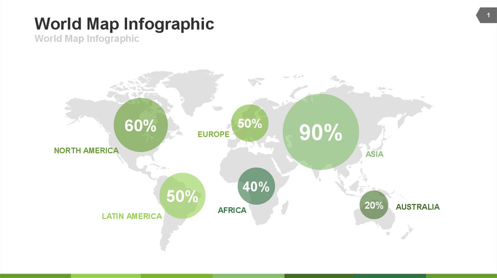
60%
50%
EUROPE
NORTH AMERICA
ASIA
50%
LATIN AMERICA
90%
40%
AFRICA
20%
AUSTRALIA
2. World Map Infographic
2World Map Infographic
World Map Infographic
90% North America
There are many variations
passages but the majority
90% Africa
There are many variations
passages but the majority
90% Latin America
There are many variations
passages but the majority
80% Asia
There are many variations
passages but the majority
100% Europe
There are many variations
passages but the majority
70% Australia
There are many variations
passages but the majority
There are many variations of passages of lorem ipsum available, but the majority have suffered alteration in some form, by injected
humour randomized words which don't look even slightly believable. If you are going to use A passage of lorem ipsum, you need
to be sure there embarrassing hidden in the middle of text. All the lorem ipsum generators on the internet tend to repeat
predefined chunks as of lorem but the majority have suffered alteration in some form necessary.
3. USA Map infographic
3USA Map infographic
Maps Infographic Data Design
Description
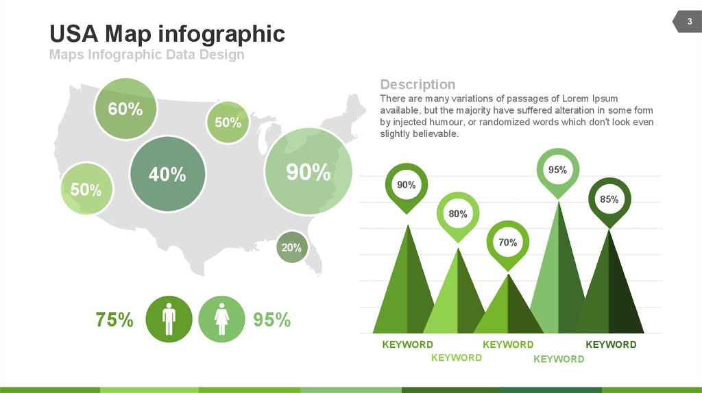
60%
50%
There are many variations of passages of Lorem Ipsum
available, but the majority have suffered alteration in some form
by injected humour, or randomized words which don't look even
slightly believable.
50%
40%
90%
95%
90%
85%
80%
20%
75%
70%
95%
KEYWORD
KEYWORD
KEYWORD
KEYWORD
KEYWORD
4. Maps Comparison infographic
4Maps Comparison infographic
Maps Comparison infographic
ASIA MAP
EUROPE MAP
60%
60%
40%
50%
50%
90%
50%
20%
CONSTRUCTION
ANALYSIS
IMPROVEMENT
RECONSTRUCTION
IMPROVEMENT
IMPROVEMENT


 Английский язык


