


 Бизнес
Похожие презентации:


Business Statistics. Organizing and Visualizing Data
1.
Business Statistics: A First Course6th Edition
Chapter 2
Organizing and Visualizing Data
Chap 2-1
2.
Organizing and VisualizingData
Chap 2-2
3.
Learning ObjectivesIn this chapter you learn:
The sources of data used in business
To construct tables and charts for
numerical data
To construct tables and charts for
categorical data
The principles of properly presenting
graphs
Chap 2-3
4.
GOALS1.Organize qualitative data into a frequency
table.
2.Present a frequency table as a bar chart or a
pie chart.
3.Organize quantitative data into a frequency
distribution.
4.Present a frequency distribution for quantitative
data using histograms, frequency polygons, and
cumulative frequency polygons.
Chap 2-4
5.
A Step by Step Process For Examining &Concluding From Data Is Helpful
In this book we will use DCOVA
Define the variables for which you want to reach
conclusions
Collect the data from appropriate sources
Organize the data collected by developing tables
Visualize the data by developing charts
Analyze the data by examining the appropriate
tables and charts (and in later chapters by using
other statistical methods) to reach conclusions
Copyright ©2013 Pearson Education, Inc. publishing as Prentice Hall
Chap 2-5
6.
Why Collect Data?DCOVA
A marketing research analyst needs to assess the effectiveness of a
new television advertisement.
A pharmaceutical manufacturer needs to determine whether a new
drug is more effective than those currently in use.
An operations manager wants to monitor a manufacturing process
to find out whether the quality of the product being manufactured
is conforming to company standards.
An auditor wants to review the financial transactions of a company
in order to determine whether the company is in compliance with
generally accepted accounting principles.
Chap 2-6
7.
Sources of DataDCOVA
Primary Sources: The data collector is the one using the data
for analysis
Data from a political survey
Data collected from an experiment
Observed data
Secondary Sources: The person performing data analysis is
not the data collector
Analyzing census data
Examining data from print journals or data published on
the internet.
Copyright ©2013 Pearson Education, Inc. publishing as Prentice Hall
Chap 2-7
8.
Sources of data fall into fourcategories
DCOVA
Data distributed by an organization or an
individual
A designed experiment
A survey
An observational study
Copyright ©2013 Pearson Education, Inc. publishing as Prentice Hall
Chap 2-8
9.
Examples Of Data DistributedBy Organizations or Individuals
DCOVA
Financial data on a company provided by
investment services
Industry or market data from market research
firms and trade associations
Stock prices, weather conditions, and sports
statistics in daily newspapers
Copyright ©2013 Pearson Education, Inc. publishing as Prentice Hall
Chap 2-9
10.
Examples of Data FromA Designed Experiment
DCOVA
Consumer testing of different versions of a
product to help determine which product should
be pursued further
Material testing to determine which supplier’s
material should be used in a product
Market testing on alternative product
promotions to determine which promotion to
use more broadly
Copyright ©2013 Pearson Education, Inc. publishing as Prentice Hall
Chap 2-10
11.
Examples of Survey DataDCOVA
Political polls of registered voters during political
campaigns
People being surveyed to determine their
satisfaction with a recent product or service
experience
Copyright ©2013 Pearson Education, Inc. publishing as Prentice Hall
Chap 2-11
12.
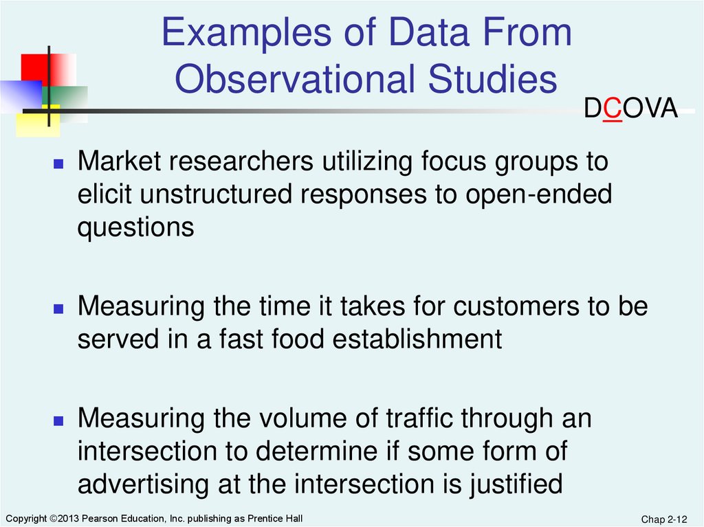
Examples of Data FromObservational Studies
DCOVA
Market researchers utilizing focus groups to
elicit unstructured responses to open-ended
questions
Measuring the time it takes for customers to be
served in a fast food establishment
Measuring the volume of traffic through an
intersection to determine if some form of
advertising at the intersection is justified
Copyright ©2013 Pearson Education, Inc. publishing as Prentice Hall
Chap 2-12
13.
Categorical Data Are Organized ByUtilizing Tables
DCOVA
Categorical
Data
Tallying Data
One
Categorical
Variable
Two
Categorical
Variables
Summary
Table
Contingency
Table
Copyright ©2013 Pearson Education, Inc. publishing as Prentice Hall
Chap 2-13
14.
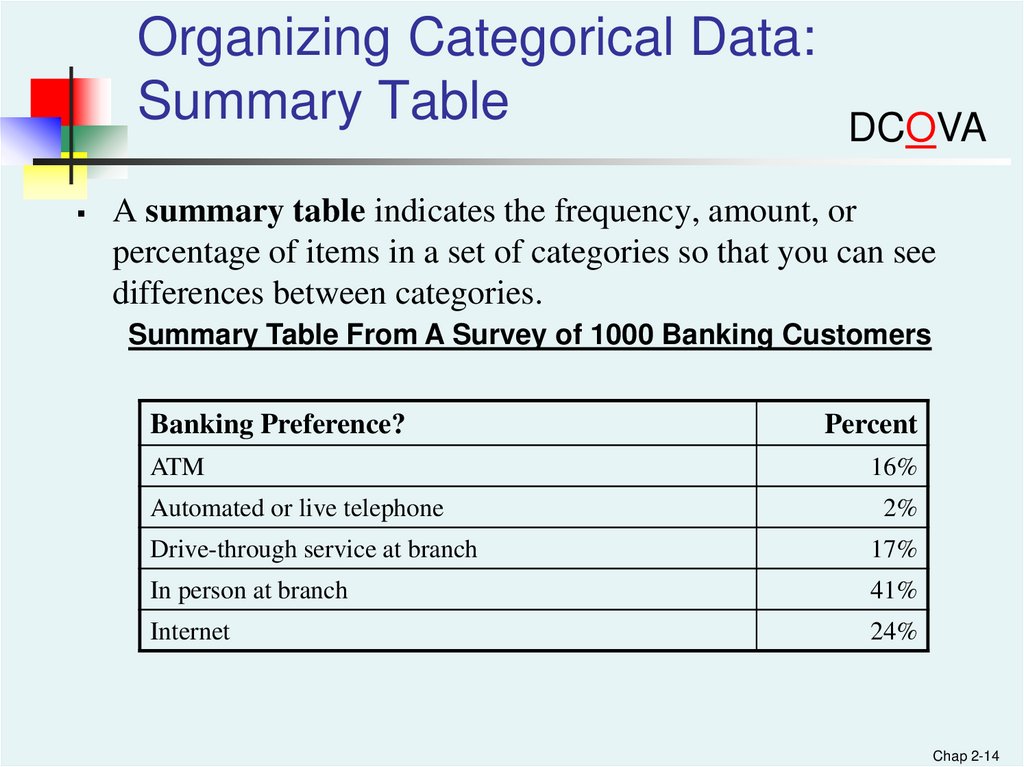
Organizing Categorical Data:Summary Table
DCOVA
A summary table indicates the frequency, amount, or
percentage of items in a set of categories so that you can see
differences between categories.
Summary Table From A Survey of 1000 Banking Customers
Banking Preference?
ATM
Automated or live telephone
Percent
16%
2%
Drive-through service at branch
17%
In person at branch
41%
Internet
24%
Chap 2-14
15.
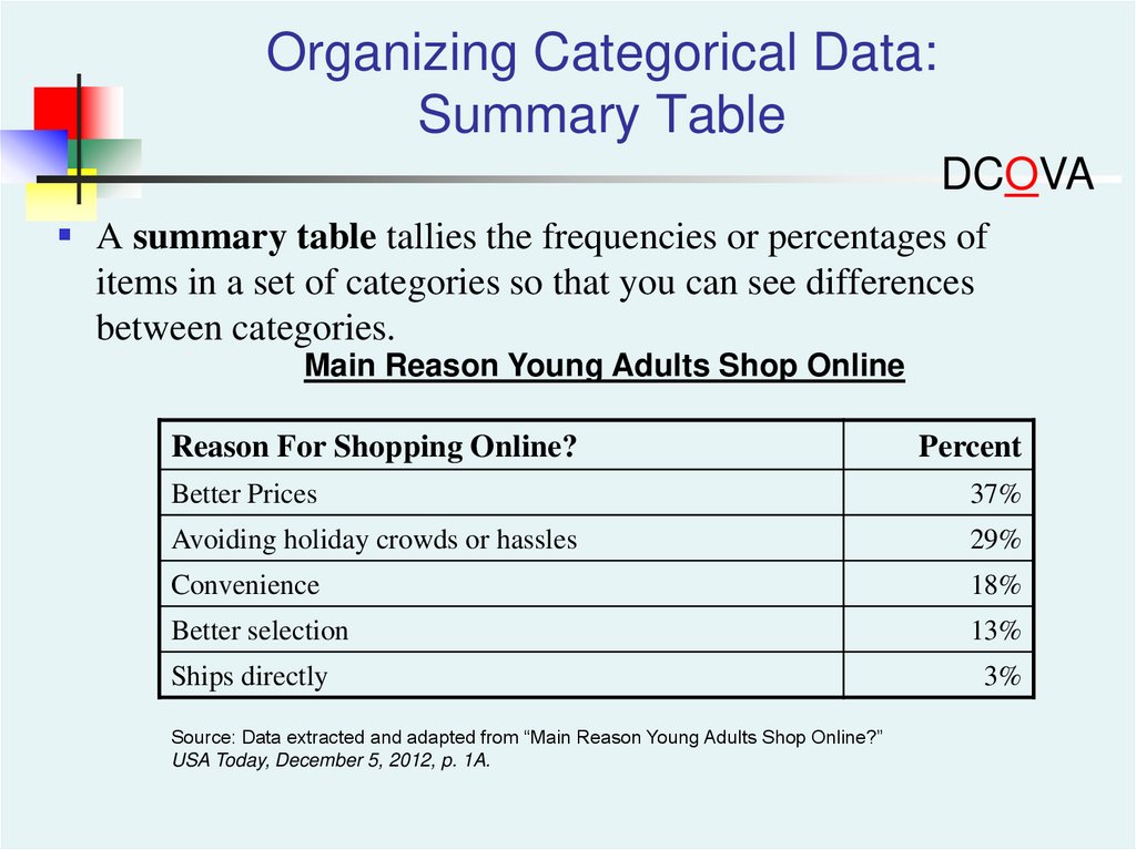
Organizing Categorical Data:Summary Table
DCOVA
A summary table tallies the frequencies or percentages of
items in a set of categories so that you can see differences
between categories.
Main Reason Young Adults Shop Online
Reason For Shopping Online?
Percent
Better Prices
37%
Avoiding holiday crowds or hassles
29%
Convenience
18%
Better selection
13%
Ships directly
Source: Data extracted and adapted from “Main Reason Young Adults Shop Online?”
USA Today, December 5, 2012, p. 1A.
3%
16.
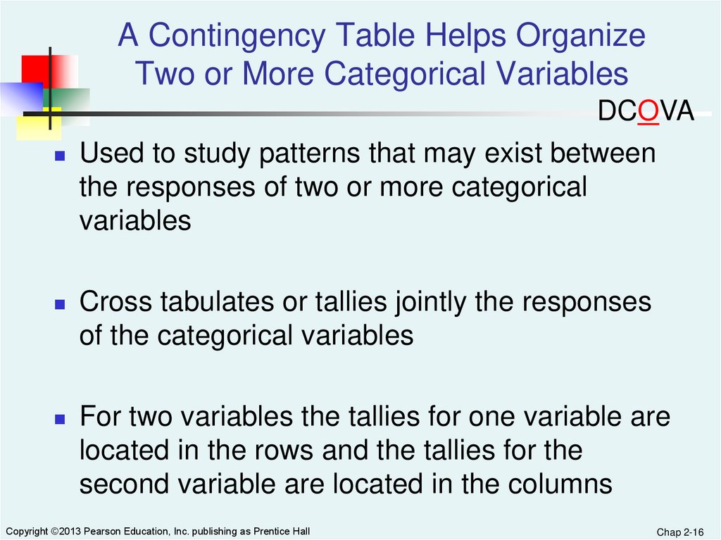
A Contingency Table Helps OrganizeTwo or More Categorical Variables
DCOVA
Used to study patterns that may exist between
the responses of two or more categorical
variables
Cross tabulates or tallies jointly the responses
of the categorical variables
For two variables the tallies for one variable are
located in the rows and the tallies for the
second variable are located in the columns
Copyright ©2013 Pearson Education, Inc. publishing as Prentice Hall
Chap 2-16
17.
Contingency Table - ExampleDCOVA
A random sample of 400
Contingency Table Showing
invoices is drawn.
Frequency of Invoices Categorized
Each invoice is categorized By Size and The Presence Of Errors
as a small, medium, or large
No
Errors
Errors
Total
amount.
Small
170
20
190
Each invoice is also
Amount
examined to identify if there
Medium
100
40
140
are any errors.
Amount
These data are then
Large
65
5
70
Amount
organized in the contingency
table to the right.
335
65
400
Total
Copyright ©2013 Pearson Education, Inc. publishing as Prentice Hall
Chap 2-17
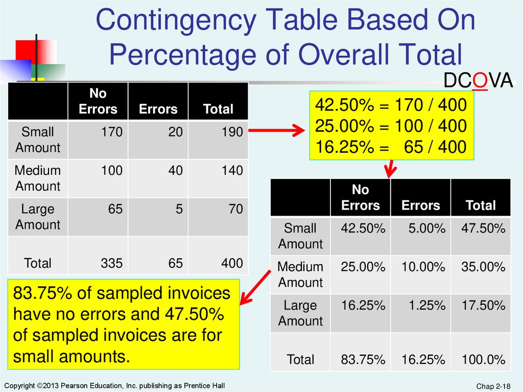
18.
Contingency Table Based OnPercentage of Overall Total
No
Errors
DCOVA
Errors
Small
Amount
170
20
190
Medium
Amount
100
40
140
Large
Amount
65
Total
335
5
65
42.50% = 170 / 400
25.00% = 100 / 400
16.25% = 65 / 400
Total
No
Errors
70
400
83.75% of sampled invoices
have no errors and 47.50%
of sampled invoices are for
small amounts.
Copyright ©2013 Pearson Education, Inc. publishing as Prentice Hall
Errors
Total
Small
Amount
42.50%
5.00%
47.50%
Medium
Amount
25.00%
10.00%
35.00%
Large
Amount
16.25%
1.25%
17.50%
Total
83.75%
16.25%
100.0%
Chap 2-18
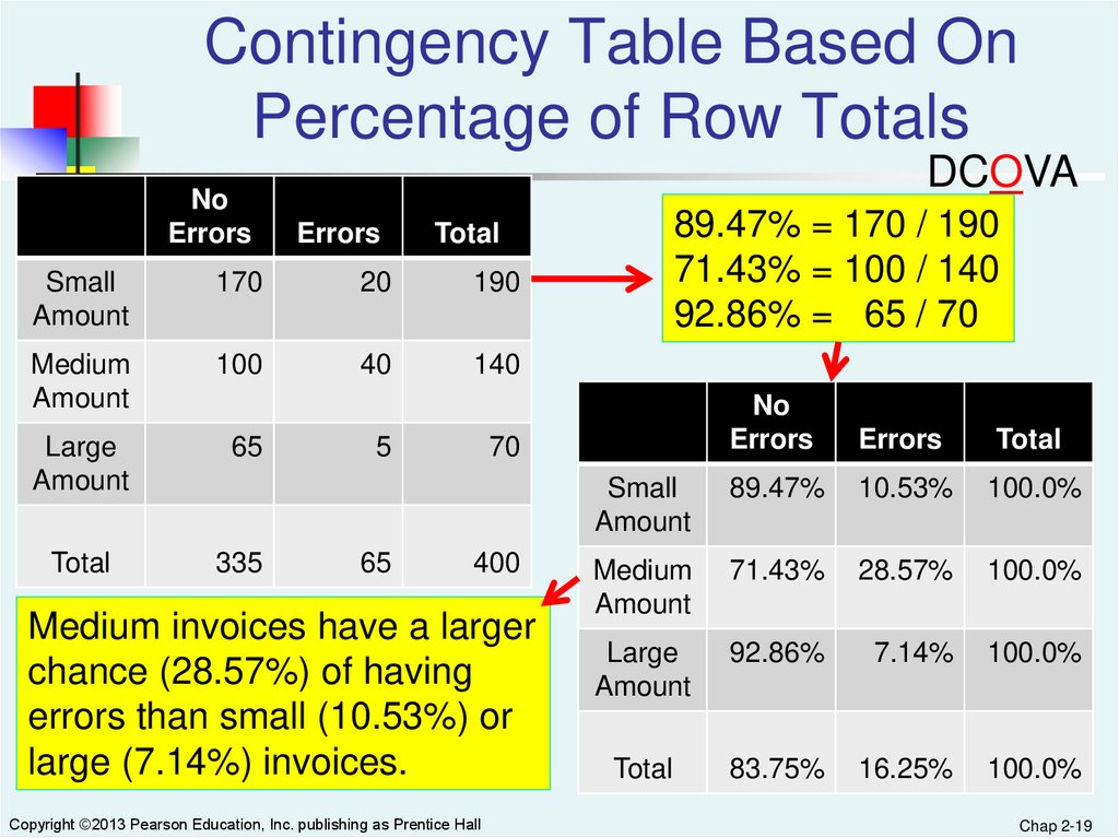
19.
Contingency Table Based OnPercentage of Row Totals
No
Errors
DCOVA
Errors
Small
Amount
170
20
190
Medium
Amount
100
40
140
Large
Amount
65
Total
335
5
65
89.47% = 170 / 190
71.43% = 100 / 140
92.86% = 65 / 70
Total
No
Errors
Errors
Total
Small
Amount
89.47%
10.53%
100.0%
Medium
Amount
71.43%
28.57%
100.0%
Large
Amount
92.86%
7.14%
100.0%
Total
83.75%
16.25%
100.0%
70
400
Medium invoices have a larger
chance (28.57%) of having
errors than small (10.53%) or
large (7.14%) invoices.
Copyright ©2013 Pearson Education, Inc. publishing as Prentice Hall
Chap 2-19
20.
Contingency Table Based OnPercentage Of Column Total
No
Errors
DCOVA
Errors
Small
Amount
170
20
190
Medium
Amount
100
40
140
Large
Amount
65
Total
335
5
65
50.75% = 170 / 335
30.77% = 20 / 65
Total
No
Errors
Errors
Total
Small
Amount
50.75%
30.77%
47.50%
Medium
Amount
29.85%
61.54%
35.00%
Large
Amount
19.40%
7.69%
17.50%
Total
100.0%
100.0%
100.0%
70
400
There is a 61.54% chance
that invoices with errors are
of medium size.
Copyright ©2013 Pearson Education, Inc. publishing as Prentice Hall
Chap 2-20
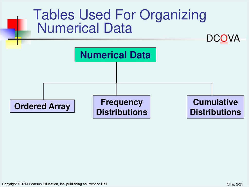
21.
Tables Used For OrganizingNumerical Data
DCOVA
Numerical Data
Ordered Array
Frequency
Distributions
Copyright ©2013 Pearson Education, Inc. publishing as Prentice Hall
Cumulative
Distributions
Chap 2-21
22.
Organizing Numerical Data:Ordered Array
DCOVA
An ordered array is a sequence of data, in rank order, from the
smallest value to the largest value.
Shows range (minimum value to maximum value)
May help identify outliers (unusual observations)
Age of
Surveyed
College
Students
Day Students
16
17
17
18
18
18
19
22
19
25
20
27
20
32
21
38
22
42
Night Students
18
18
19
19
20
21
23
28
32
33
41
45
Copyright ©2013 Pearson Education, Inc. publishing as Prentice Hall
Chap 2-22
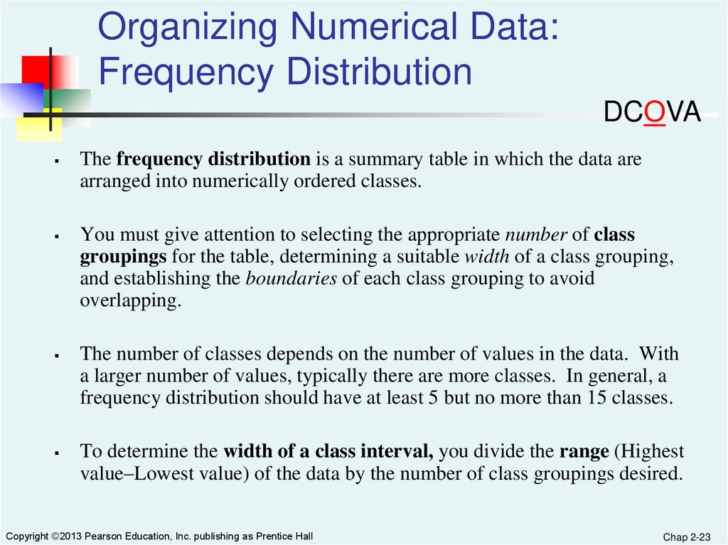
23.
Organizing Numerical Data:Frequency Distribution
DCOVA
The frequency distribution is a summary table in which the data are
arranged into numerically ordered classes.
You must give attention to selecting the appropriate number of class
groupings for the table, determining a suitable width of a class grouping,
and establishing the boundaries of each class grouping to avoid
overlapping.
The number of classes depends on the number of values in the data. With
a larger number of values, typically there are more classes. In general, a
frequency distribution should have at least 5 but no more than 15 classes.
To determine the width of a class interval, you divide the range (Highest
value–Lowest value) of the data by the number of class groupings desired.
Copyright ©2013 Pearson Education, Inc. publishing as Prentice Hall
Chap 2-23
24.
Organizing Numerical Data:Frequency Distribution Example
DCOVA
Example: A manufacturer of insulation randomly selects 20
winter days and records the daily high temperature in
degrees F.
24, 35, 17, 21, 24, 37, 26, 46, 58, 30, 32, 13, 12, 38, 41, 43, 44, 27, 53, 27
Copyright ©2013 Pearson Education, Inc. publishing as Prentice Hall
Chap 2-24
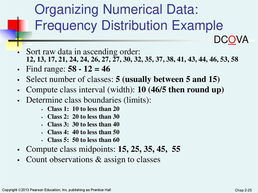
25.
Organizing Numerical Data:Frequency Distribution Example
DCOVA
Sort raw data in ascending order:
12, 13, 17, 21, 24, 24, 26, 27, 27, 30, 32, 35, 37, 38, 41, 43, 44, 46, 53, 58
Find range: 58 - 12 = 46
Select number of classes: 5 (usually between 5 and 15)
Compute class interval (width): 10 (46/5 then round up)
Determine class boundaries (limits):
Class 1:
Class 2:
Class 3:
Class 4:
Class 5:
10 to less than 20
20 to less than 30
30 to less than 40
40 to less than 50
50 to less than 60
Compute class midpoints: 15, 25, 35, 45, 55
Count observations & assign to classes
Copyright ©2013 Pearson Education, Inc. publishing as Prentice Hall
Chap 2-25
26.
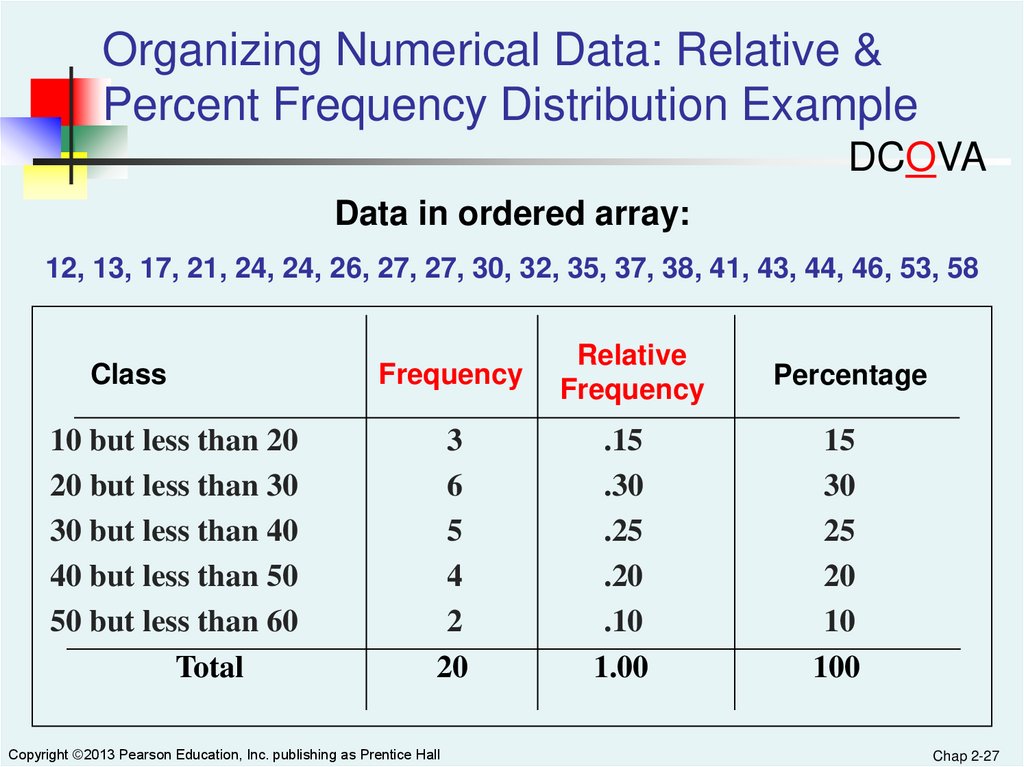
Organizing Numerical Data: FrequencyDistribution Example
DCOVA
Data in ordered array:
12, 13, 17, 21, 24, 24, 26, 27, 27, 30, 32, 35, 37, 38, 41, 43, 44, 46, 53, 58
Class
Midpoints
10 but less than 20
20 but less than 30
30 but less than 40
40 but less than 50
50 but less than 60
Total
Copyright ©2013 Pearson Education, Inc. publishing as Prentice Hall
15
25
35
45
55
Frequency
3
6
5
4
2
20
Chap 2-26
27.
Organizing Numerical Data: Relative &Percent Frequency Distribution Example
DCOVA
Data in ordered array:
12, 13, 17, 21, 24, 24, 26, 27, 27, 30, 32, 35, 37, 38, 41, 43, 44, 46, 53, 58
Class
10 but less than 20
20 but less than 30
30 but less than 40
40 but less than 50
50 but less than 60
Total
Frequency
3
6
5
4
2
20
Copyright ©2013 Pearson Education, Inc. publishing as Prentice Hall
Relative
Frequency
.15
.30
.25
.20
.10
1.00
Percentage
15
30
25
20
10
100
Chap 2-27
28.
Organizing Numerical Data: CumulativeFrequency Distribution Example
DCOVA
Data in ordered array:
12, 13, 17, 21, 24, 24, 26, 27, 27, 30, 32, 35, 37, 38, 41, 43, 44, 46, 53, 58
Class
Frequency Percentage
Cumulative Cumulative
Frequency Percentage
10 but less than 20
3
15%
3
15%
20 but less than 30
6
30%
9
45%
30 but less than 40
5
25%
14
70%
40 but less than 50
4
20%
18
90%
50 but less than 60
2
10%
20
100%
20
100
20
Total
Copyright ©2013 Pearson Education, Inc. publishing as Prentice Hall
100%
Chap 2-28
29.
Why Use a Frequency Distribution?DCOVA
It condenses the raw data into a more
useful form
It allows for a quick visual interpretation of
the data
It enables the determination of the major
characteristics of the data set including
where the data are concentrated /
clustered
Copyright ©2013 Pearson Education, Inc. publishing as Prentice Hall
Chap 2-29
30.
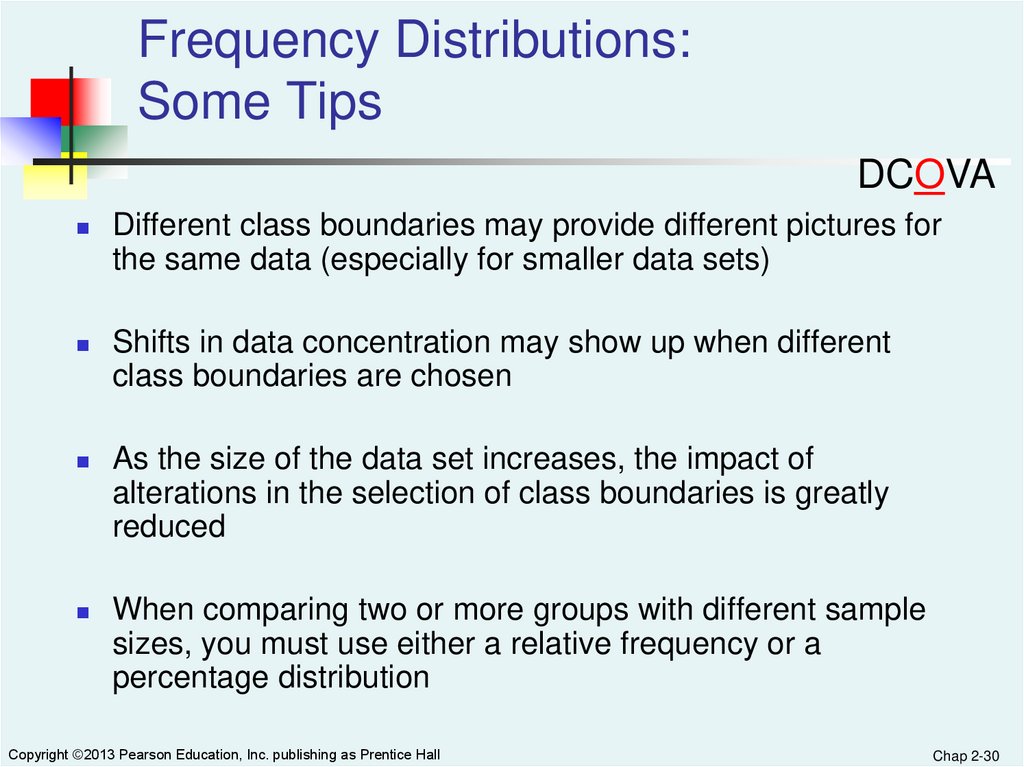
Frequency Distributions:Some Tips
DCOVA
Different class boundaries may provide different pictures for
the same data (especially for smaller data sets)
Shifts in data concentration may show up when different
class boundaries are chosen
As the size of the data set increases, the impact of
alterations in the selection of class boundaries is greatly
reduced
When comparing two or more groups with different sample
sizes, you must use either a relative frequency or a
percentage distribution
Copyright ©2013 Pearson Education, Inc. publishing as Prentice Hall
Chap 2-30
31.
Visualizing Categorical DataThrough Graphical Displays
DCOVA
Categorical
Data
Visualizing Data
Contingency
Table For Two
Variables
Summary
Table For One
Variable
Bar
Chart
Pareto
Chart
Side-By-Side
Bar Chart
Pie Chart
Copyright ©2013 Pearson Education, Inc. publishing as Prentice Hall
Chap 2-31
32.
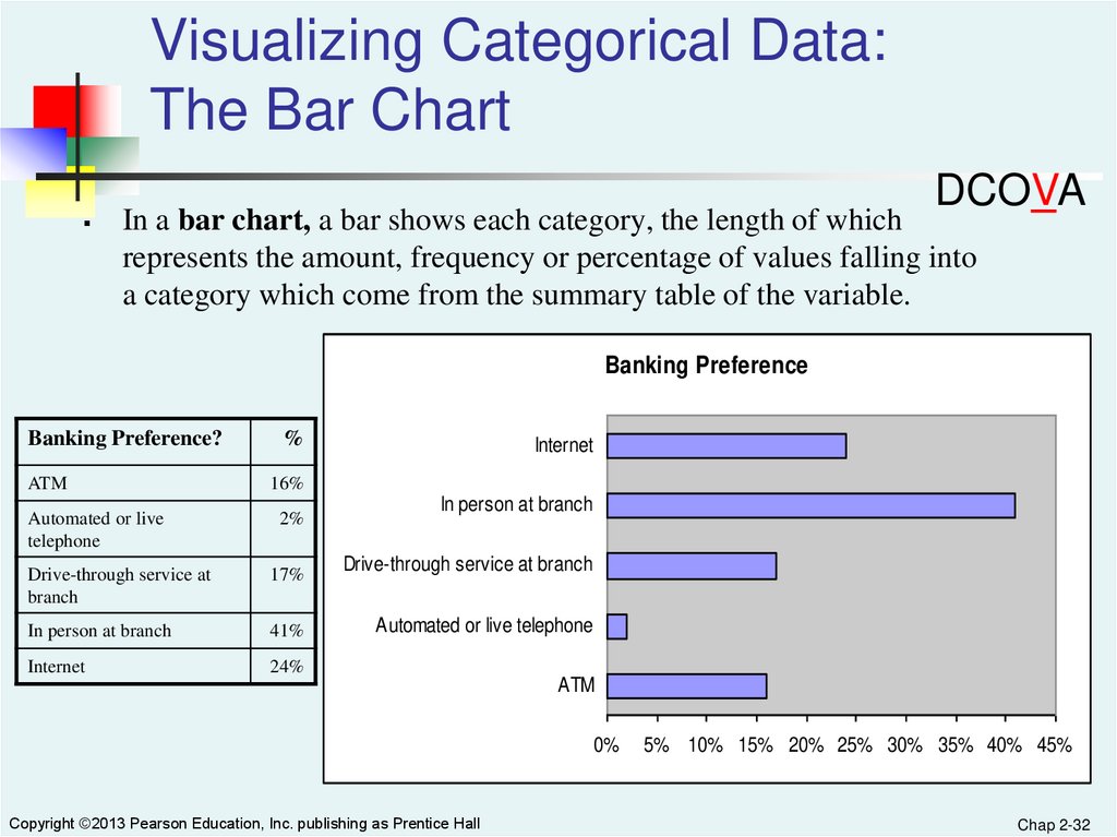
Visualizing Categorical Data:The Bar Chart
DCOVA
In a bar chart, a bar shows each category, the length of which
represents the amount, frequency or percentage of values falling into
a category which come from the summary table of the variable.
Banking Preference
Banking Preference?
ATM
Automated or live
telephone
%
Internet
16%
2%
Drive-through service at
branch
17%
In person at branch
41%
Internet
24%
In person at branch
Drive-through service at branch
Automated or live telephone
ATM
0%
Copyright ©2013 Pearson Education, Inc. publishing as Prentice Hall
5% 10% 15% 20% 25% 30% 35% 40% 45%
Chap 2-32
33.
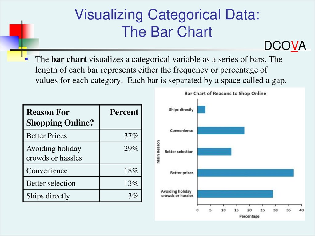
Visualizing Categorical Data:The Bar Chart
DCOVA
The bar chart visualizes a categorical variable as a series of bars. The
length of each bar represents either the frequency or percentage of
values for each category. Each bar is separated by a space called a gap.
Reason For
Shopping Online?
Percent
Better Prices
37%
Avoiding holiday
crowds or hassles
29%
Convenience
18%
Better selection
13%
Ships directly
3%
34.
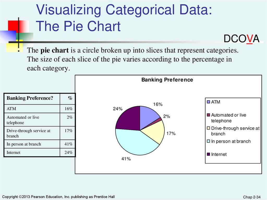
Visualizing Categorical Data:The Pie Chart
DCOVA
The pie chart is a circle broken up into slices that represent categories.
The size of each slice of the pie varies according to the percentage in
each category.
Banking Preference
Banking Preference?
%
ATM
16%
ATM
Automated or live
telephone
16%
24%
2%
2%
Drive-through service at
branch
17%
In person at branch
41%
Internet
24%
17%
Automated or live
telephone
Drive-through service at
branch
In person at branch
Internet
41%
Copyright ©2013 Pearson Education, Inc. publishing as Prentice Hall
Chap 2-34
35.
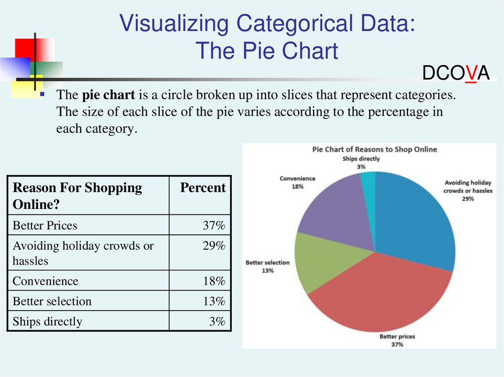
Visualizing Categorical Data:The Pie Chart
DCOVA
The pie chart is a circle broken up into slices that represent categories.
The size of each slice of the pie varies according to the percentage in
each category.
Reason For Shopping
Online?
Percent
Better Prices
37%
Avoiding holiday crowds or
hassles
29%
Convenience
18%
Better selection
13%
Ships directly
3%
36.
Visualizing Categorical Data:The Pareto Chart
DCOVA
Used to portray categorical data
A vertical bar chart, where categories are
shown in descending order of frequency
A cumulative polygon is shown in the same
graph
Used to separate the “vital few” from the “trivial
many”
Copyright ©2013 Pearson Education, Inc. publishing as Prentice Hall
Chap 2-36
37.
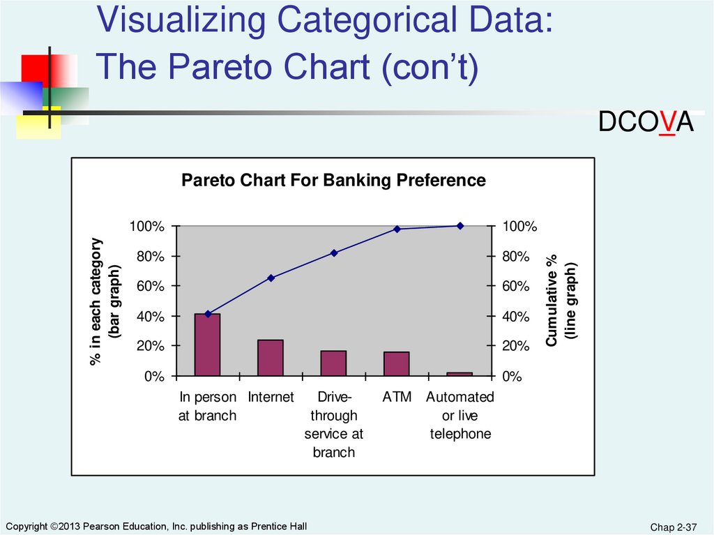
Visualizing Categorical Data:The Pareto Chart (con’t)
DCOVA
100%
100%
80%
80%
60%
60%
40%
40%
20%
20%
0%
0%
In person Internet
at branch
Drivethrough
service at
branch
Copyright ©2013 Pearson Education, Inc. publishing as Prentice Hall
ATM
Cumulative %
(line graph)
% in each category
(bar graph)
Pareto Chart For Banking Preference
Automated
or live
telephone
Chap 2-37
38.
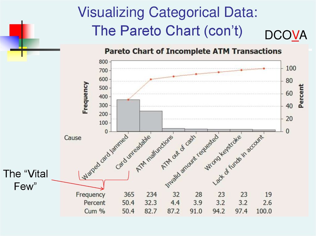
Visualizing Categorical Data:The Pareto Chart (con’t)
DCOVA
The “Vital
Few”
39.
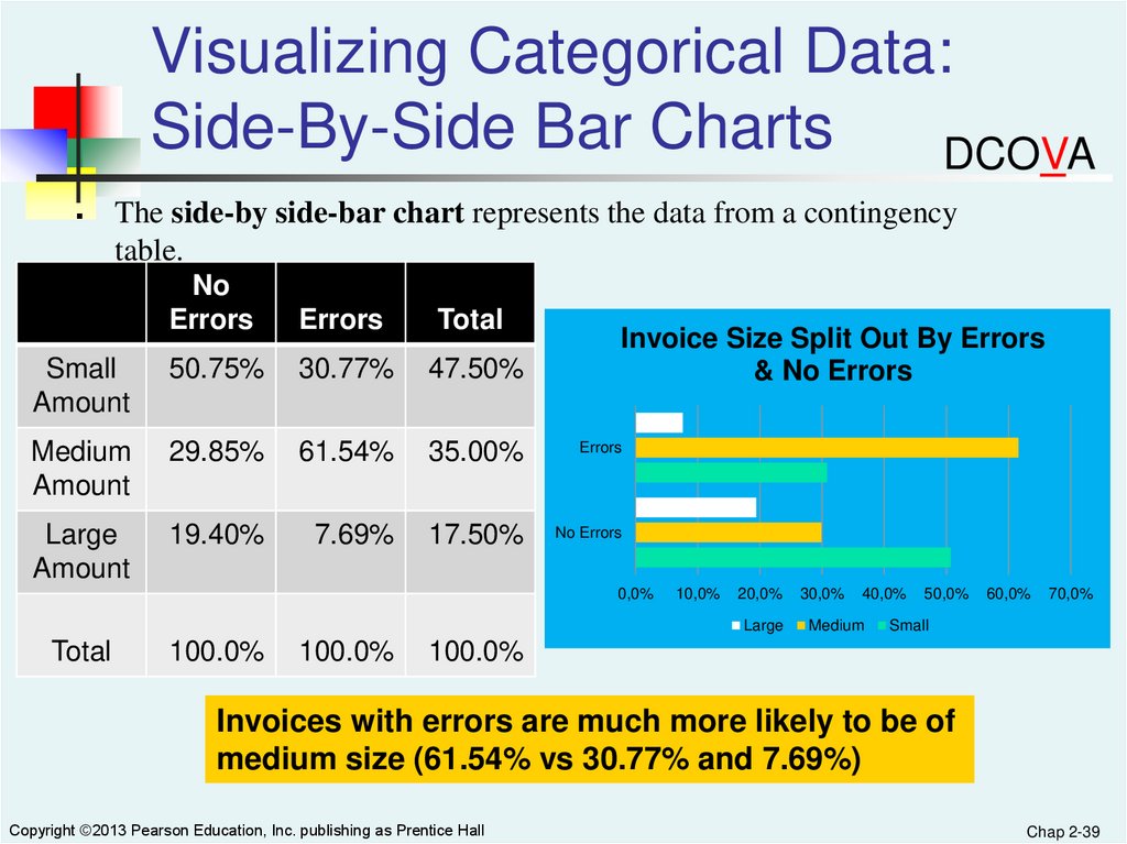
Visualizing Categorical Data:Side-By-Side Bar Charts
DCOVA
The side-by side-bar chart represents the data from a contingency
table.
No
Errors
Errors
Total
Small
Amount
50.75%
30.77%
47.50%
Medium
Amount
29.85%
61.54%
35.00%
Errors
Large
Amount
19.40%
7.69%
17.50%
No Errors
Invoice Size Split Out By Errors
& No Errors
0,0%
10,0%
20,0%
Large
Total
100.0%
100.0%
30,0%
40,0%
Medium
50,0%
60,0%
70,0%
Small
100.0%
Invoices with errors are much more likely to be of
medium size (61.54% vs 30.77% and 7.69%)
Copyright ©2013 Pearson Education, Inc. publishing as Prentice Hall
Chap 2-39
40.
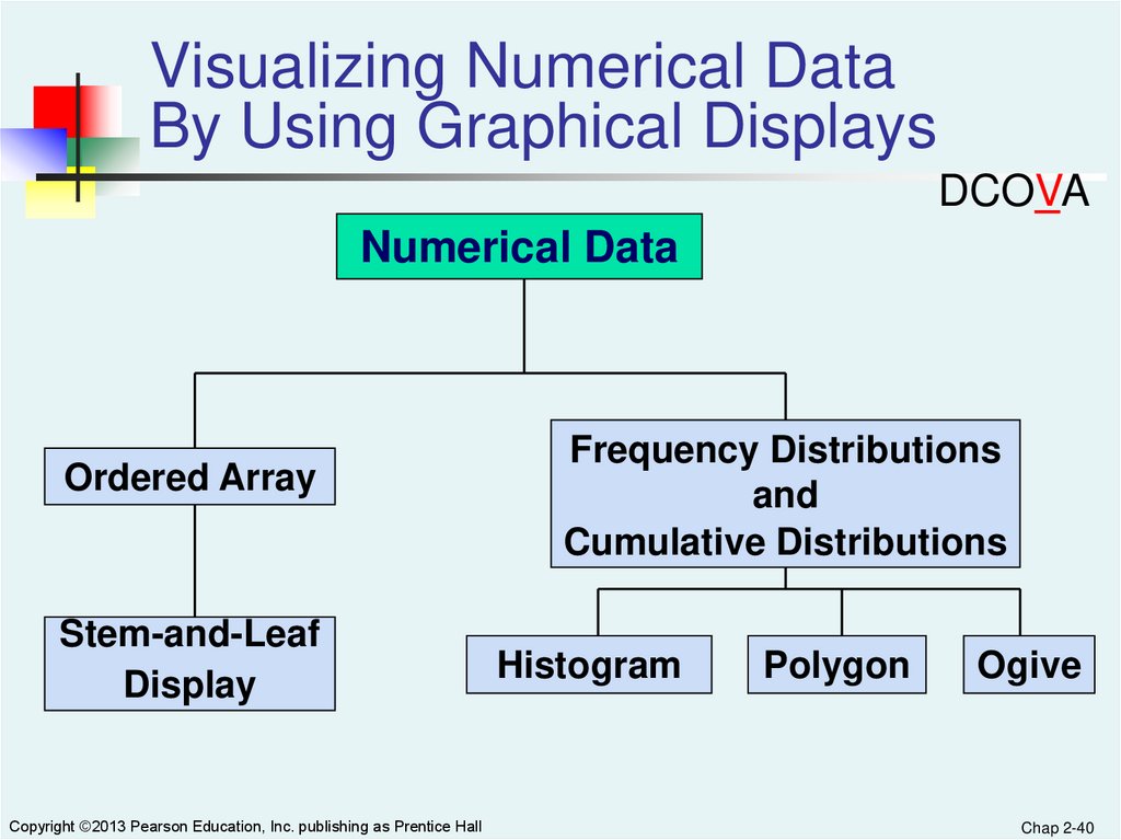
Visualizing Numerical DataBy Using Graphical Displays
DCOVA
Numerical Data
Ordered Array
Stem-and-Leaf
Display
Copyright ©2013 Pearson Education, Inc. publishing as Prentice Hall
Frequency Distributions
and
Cumulative Distributions
Histogram
Polygon
Ogive
Chap 2-40
41.
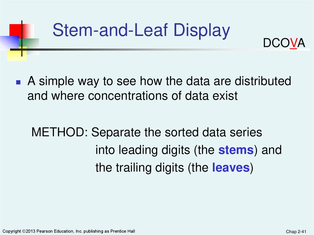
Stem-and-Leaf DisplayDCOVA
A simple way to see how the data are distributed
and where concentrations of data exist
METHOD: Separate the sorted data series
into leading digits (the stems) and
the trailing digits (the leaves)
Copyright ©2013 Pearson Education, Inc. publishing as Prentice Hall
Chap 2-41
42.
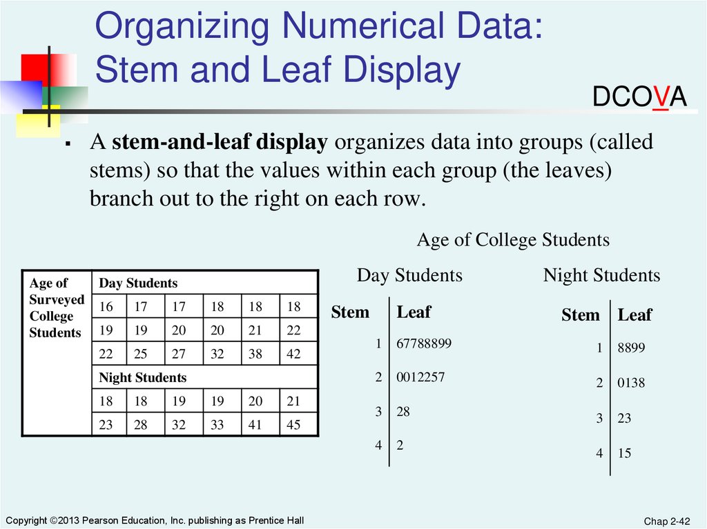
Organizing Numerical Data:Stem and Leaf Display
DCOVA
A stem-and-leaf display organizes data into groups (called
stems) so that the values within each group (the leaves)
branch out to the right on each row.
Age of College Students
Age of
Surveyed
College
Students
Day Students
Day Students
16
17
17
18
18
18
19
19
20
20
21
22
22
25
27
32
38
42
Night Students
18
18
19
19
20
21
23
28
32
33
41
45
Copyright ©2013 Pearson Education, Inc. publishing as Prentice Hall
Stem
Leaf
Night Students
Stem Leaf
1
67788899
1
8899
2
0012257
2
0138
3
28
3
23
4
2
4
15
Chap 2-42
43.
Visualizing Numerical Data:The Histogram
DCOVA
A vertical bar chart of the data in a frequency distribution is
called a histogram.
In a histogram there are no gaps between adjacent bars.
The class boundaries (or class midpoints) are shown on the
horizontal axis.
The vertical axis is either frequency, relative frequency, or
percentage.
The height of the bars represent the frequency, relative
frequency, or percentage.
Copyright ©2013 Pearson Education, Inc. publishing as Prentice Hall
Chap 2-43
44.
Visualizing Numerical Data:The Histogram
10 but less than 20
20 but less than 30
30 but less than 40
40 but less than 50
50 but less than 60
Total
Frequency
3
6
5
4
2
20
Relative
Frequency
.15
.30
.25
.20
.10
1.00
Percentage
15
30
25
20
10
100
(In a percentage
histogram the vertical
axis would be defined to
show the percentage of
observations per class)
8
Histogram: Age Of Students
Frequency
Class
DCOVA
6
4
2
0
5
Copyright ©2013 Pearson Education, Inc. publishing as Prentice Hall
15 25 35 45 55 More
Chap 2-44
45.
Visualizing Numerical Data:The Polygon
DCOVA
A percentage polygon is formed by having the midpoint of
each class represent the data in that class and then connecting
the sequence of midpoints at their respective class
percentages.
The cumulative percentage polygon, or ogive, displays the
variable of interest along the X axis, and the cumulative
percentages along the Y axis.
Useful when there are two or more groups to compare.
Copyright ©2013 Pearson Education, Inc. publishing as Prentice Hall
Chap 2-45
46.
Visualizing Numerical Data:The Percentage Polygon DCOVA
Useful When Comparing Two or More Groups
47.
Visualizing Numerical Data:The Percentage Polygon
DCOVA
48.
Visualizing Numerical Data:The Frequency Polygon
DCOVA
Class
Midpoint Frequency
Class
15
25
35
45
55
3
6
5
4
2
Frequency Polygon: Age Of Students
Frequency
10 but less than 20
20 but less than 30
30 but less than 40
40 but less than 50
50 but less than 60
(In a percentage
polygon the vertical axis
would be defined to
show the percentage of
observations per class)
7
6
5
4
3
2
1
0
Copyright ©2013 Pearson Education, Inc. publishing as Prentice Hall
5
15
25
35
45
Class Midpoints
55
65
Chap 2-48
49.
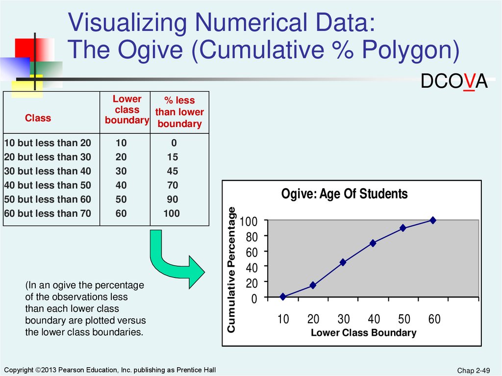
Visualizing Numerical Data:The Ogive (Cumulative % Polygon)
DCOVA
10 but less than 20
20 but less than 30
30 but less than 40
40 but less than 50
50 but less than 60
60 but less than 70
10
20
30
40
50
60
0
15
45
70
90
100
(In an ogive the percentage
of the observations less
than each lower class
boundary are plotted versus
the lower class boundaries.
Copyright ©2013 Pearson Education, Inc. publishing as Prentice Hall
Ogive: Age Of Students
Cumulative Percentage
Class
Lower
% less
class
than lower
boundary boundary
100
80
60
40
20
0
10
20
30
40
50
60
Lower Class Boundary
Chap 2-49
50.
Visualizing Two Numerical Variables ByUsing Graphical Displays
DCOVA
Two Numerical
Variables
Scatter
Plot
TimeSeries
Plot
51.
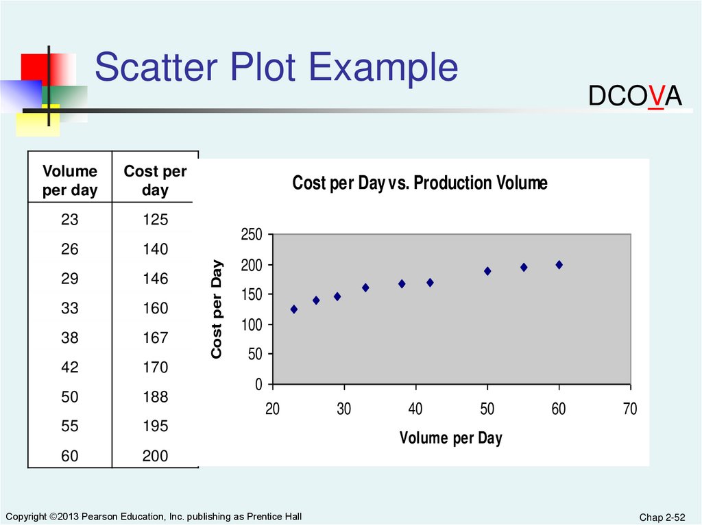
Visualizing Two NumericalVariables: The Scatter Plot
DCOVA
Scatter plots are used for numerical data consisting
of paired observations taken from two numerical
variables
One variable is measured on the vertical axis and the
other variable is measured on the horizontal axis
Scatter plots are used to examine possible
relationships between two numerical variables
Copyright ©2013 Pearson Education, Inc. publishing as Prentice Hall
Chap 2-51
52.
Scatter Plot ExampleCost per
day
23
125
26
140
29
146
33
160
38
167
42
170
50
188
55
195
60
200
Cost per Day vs. Production Volume
250
Cost per Day
Volume
per day
DCOVA
200
150
100
50
0
20
Copyright ©2013 Pearson Education, Inc. publishing as Prentice Hall
30
40
50
60
70
Volume per Day
Chap 2-52
53.
Visualizing Two NumericalVariables: The Time-Series Plot
DCOVA
Time-series plots are used to study patterns in the
values of a numeric variable over time.
The numeric variable is measured on the vertical
axis and the time period is measured on the
horizontal axis.
Copyright ©2013 Pearson Education, Inc. publishing as Prentice Hall
Chap 2-53
54.
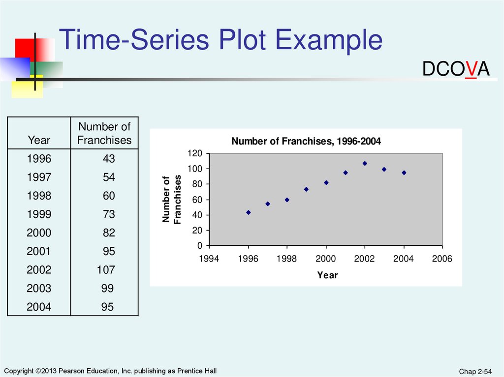
Time-Series Plot ExampleDCOVA
1996
43
1997
54
1998
60
1999
73
2000
82
2001
95
2002
107
2003
99
2004
95
Number of Franchises, 1996-2004
120
100
Number of
Franchises
Year
Number of
Franchises
80
60
40
20
0
1994
Copyright ©2013 Pearson Education, Inc. publishing as Prentice Hall
1996
1998
2000
2002
2004
2006
Year
Chap 2-54
55.
Exploring Multidimensional DataDCOVA
Can be used to discover possible patterns and
relationships.
Simple applications used to create summary or
contingency tables
Can also be used to change and / or add variables to a
table
All of the examples that follow can be created using
Sections EG2.3 and EG2.7 or MG2.3 and MG2.7
Copyright ©2013 Pearson Education, Inc. publishing as Prentice Hall
Chap 2-55
56.
Pivot Table Version ofContingency Table For Bond Data
DCOVA
First Six Data Points In The Bond Data Set
Fund
Number
Type
Assets Fees
Expense
Ratio
Return
2009
3-Year
Return
5-Year
Return
Risk
FN-1
Intermediate Government
7268.1 No
0.45
6.9
6.9
5.5Below average
FN-2
Intermediate Government
475.1 No
0.50
9.8
7.5
6.1Below average
FN-3
Intermediate Government
193.0 No
0.71
6.3
7.0
5.6Average
FN-4
Intermediate Government
18603.5 No
0.13
5.4
6.6
5.5Average
FN-5
Intermediate Government
142.6 No
0.60
5.9
6.7
5.4Average
FN-6
Intermediate Government
1401.6 No
0.54
5.7
6.4
6.2Average
Copyright ©2013 Pearson Education, Inc. publishing as Prentice Hall
Chap 2-56
57.
Can Easily Convert To AnOverall Percentages Table
DCOVA
Intermediate government funds are much more
likely to charge a fee.
Copyright ©2013 Pearson Education, Inc. publishing as Prentice Hall
Chap 2-57
58.
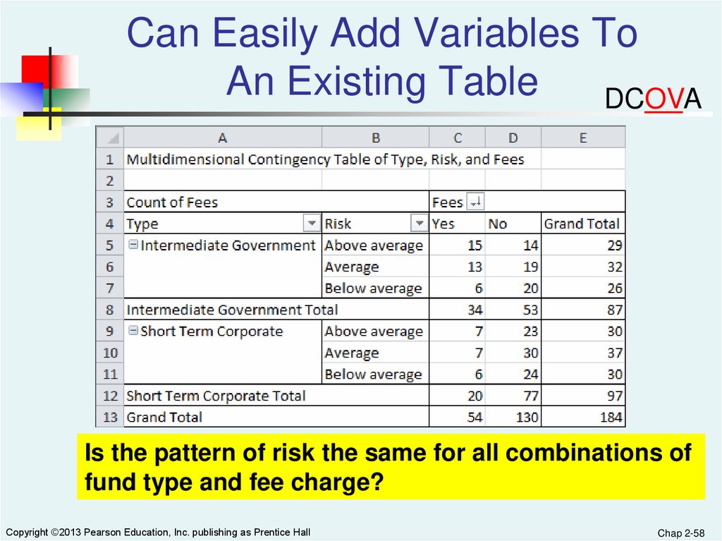
Can Easily Add Variables ToAn Existing Table
DCOVA
Is the pattern of risk the same for all combinations of
fund type and fee charge?
Copyright ©2013 Pearson Education, Inc. publishing as Prentice Hall
Chap 2-58
59.
Can Easily Change TheStatistic Displayed
DCOVA
This table computes the sum of a numerical variable (Assets)
for each of the four groupings and shows a total for each row
and column.
Copyright ©2013 Pearson Education, Inc. publishing as Prentice Hall
Chap 2-59
60.
Tables Can Compute & DisplayOther Descriptive Statistics
DCOVA
This table computes and displays averages of 3-year return
for each of the twelve groupings.
Copyright ©2013 Pearson Education, Inc. publishing as Prentice Hall
Chap 2-60
61.
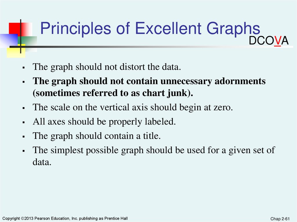
Principles of Excellent GraphsDCOVA
The graph should not distort the data.
The graph should not contain unnecessary adornments
(sometimes referred to as chart junk).
The scale on the vertical axis should begin at zero.
All axes should be properly labeled.
The graph should contain a title.
The simplest possible graph should be used for a given set of
data.
Copyright ©2013 Pearson Education, Inc. publishing as Prentice Hall
Chap 2-61
62.
Graphical Errors: Chart JunkDCOVA
Bad Presentation
Good Presentation
Minimum Wage
1960: $1.00
$
Minimum Wage
4
1970: $1.60
2
1980: $3.10
0
1990: $3.80
Copyright ©2013 Pearson Education, Inc. publishing as Prentice Hall
1960
1970
1980
1990
Chap 2-62
63.
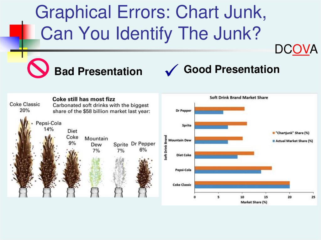
Graphical Errors: Chart Junk,Can You Identify The Junk?
DCOVA
Bad Presentation
Good Presentation
64.
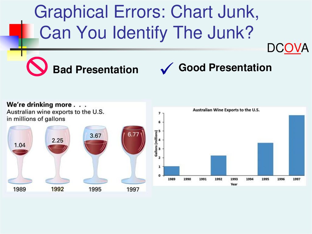
Graphical Errors: Chart Junk,Can You Identify The Junk?
DCOVA
Bad Presentation
Good Presentation
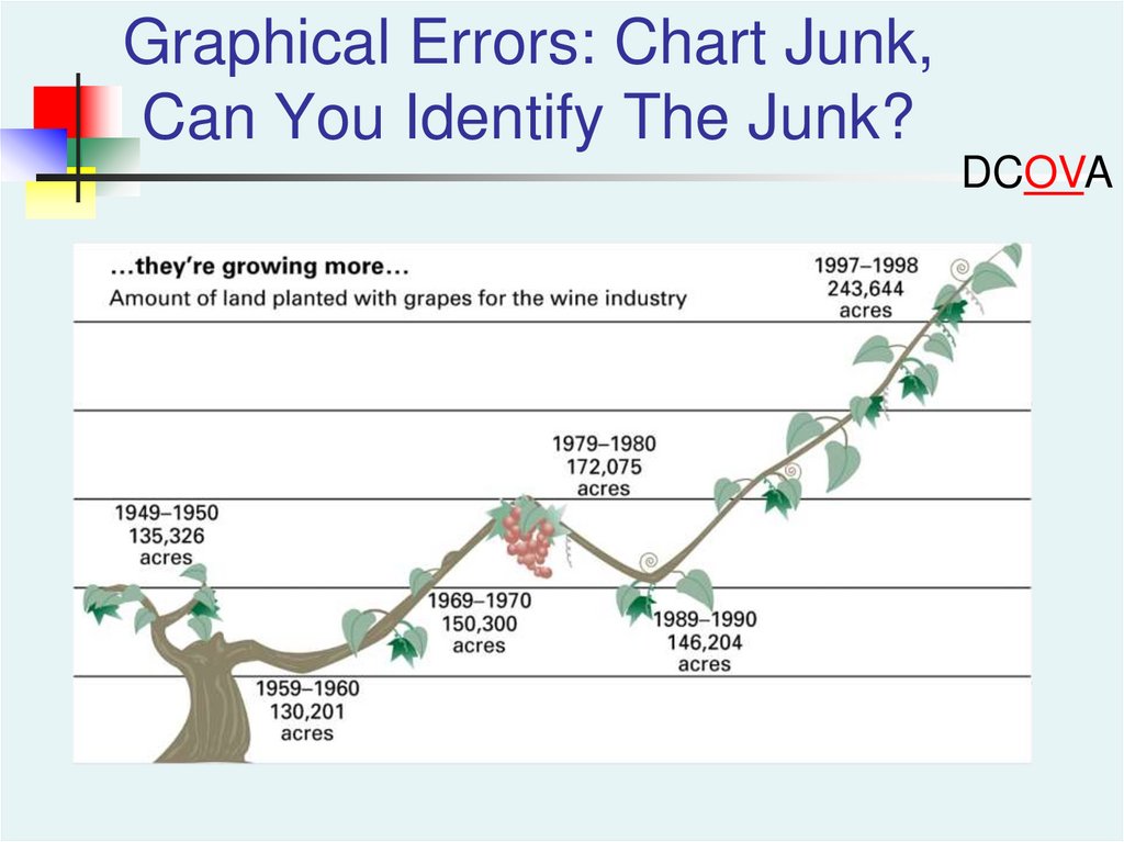
65.
Graphical Errors: Chart Junk,Can You Identify The Junk?
DCOVA
66.
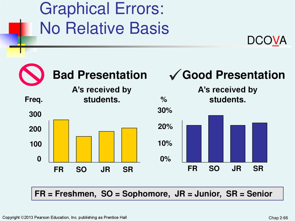
Graphical Errors:No Relative Basis
Bad Presentation
A’s received by
students.
Freq.
300
Good Presentation
20%
100
10%
0
0%
SO
JR
SR
A’s received by
students.
%
30%
200
FR
DCOVA
FR
SO
JR
SR
FR = Freshmen, SO = Sophomore, JR = Junior, SR = Senior
Copyright ©2013 Pearson Education, Inc. publishing as Prentice Hall
Chap 2-66
67.
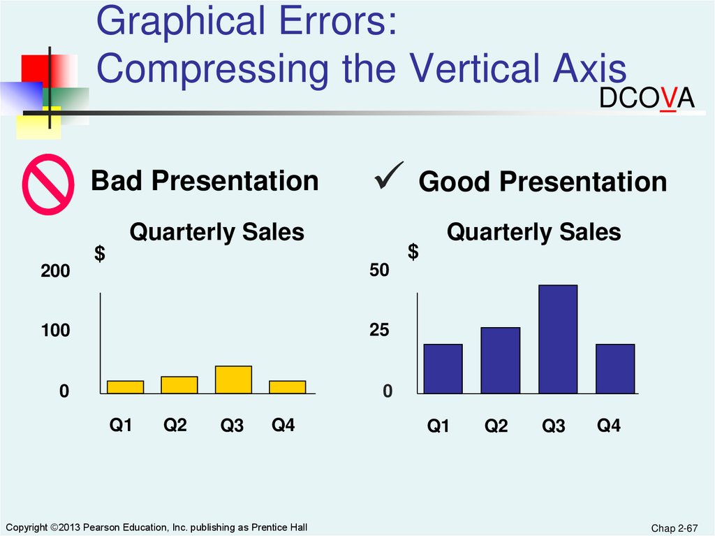
Graphical Errors:Compressing the Vertical Axis
DCOVA
Bad Presentation
Good Presentation
Quarterly Sales
200
$
$
Quarterly Sales
50
100
25
0
0
Q1
Q2
Q3
Q4
Copyright ©2013 Pearson Education, Inc. publishing as Prentice Hall
Q1
Q2
Q3
Q4
Chap 2-67
68.
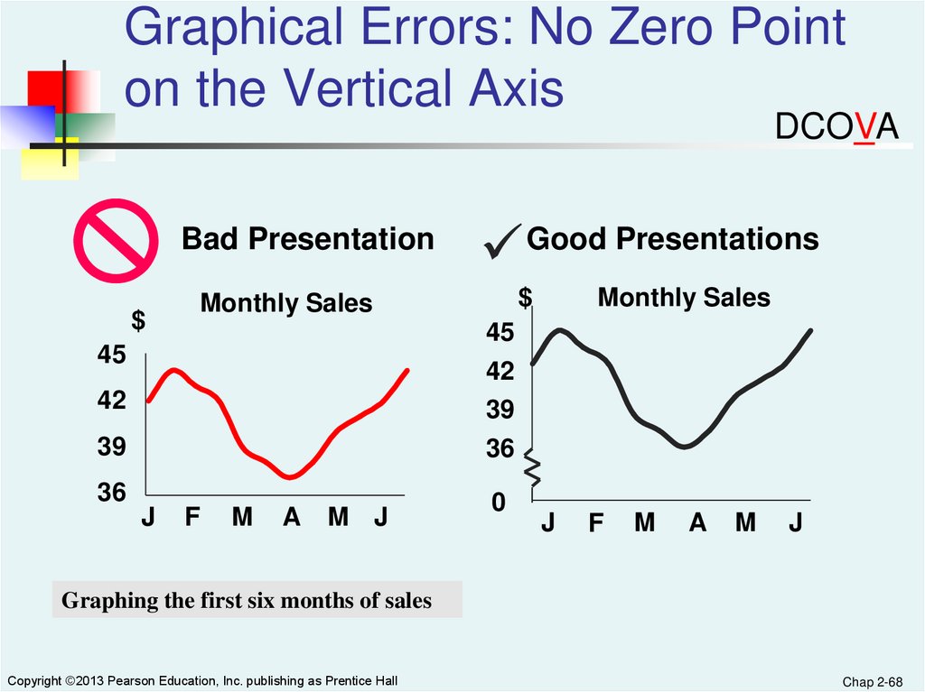
Graphical Errors: No Zero Pointon the Vertical Axis
DCOVA
Bad Presentation
$
$
Monthly Sales
Monthly Sales
45
42
39
36
45
42
39
36
J
Good Presentations
F
M
A
M J
0
J
F
M
A
M
J
Graphing the first six months of sales
Copyright ©2013 Pearson Education, Inc. publishing as Prentice Hall
Chap 2-68
69.
In Excel It Is Easy ToInadvertently Create Distortions
Excel often will create a graph where the
vertical axis does not start at 0
Excel offers the opportunity to turn simple
charts into 3-D charts and in the process can
create distorted images
Unusual charts offered as choices by Excel will
most often create distorted images
70.
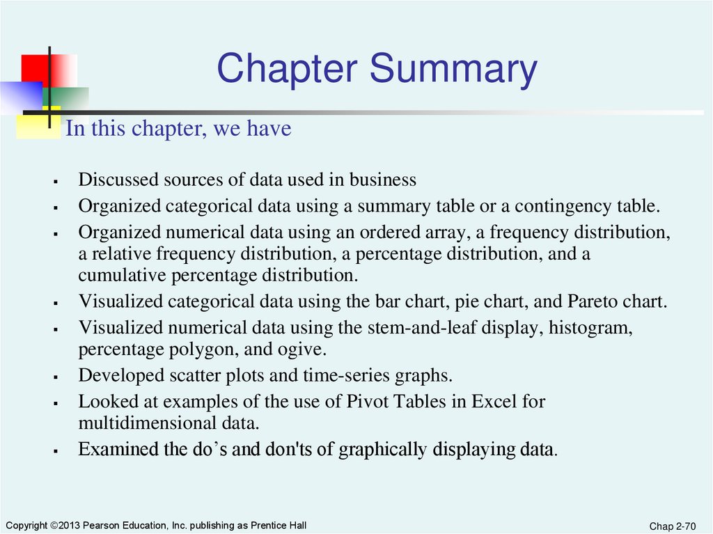
Chapter SummaryIn this chapter, we have
Discussed sources of data used in business
Organized categorical data using a summary table or a contingency table.
Organized numerical data using an ordered array, a frequency distribution,
a relative frequency distribution, a percentage distribution, and a
cumulative percentage distribution.
Visualized categorical data using the bar chart, pie chart, and Pareto chart.
Visualized numerical data using the stem-and-leaf display, histogram,
percentage polygon, and ogive.
Developed scatter plots and time-series graphs.
Looked at examples of the use of Pivot Tables in Excel for
multidimensional data.
Examined the do’s and don'ts of graphically displaying data.
Copyright ©2013 Pearson Education, Inc. publishing as Prentice Hall
Chap 2-70
71.
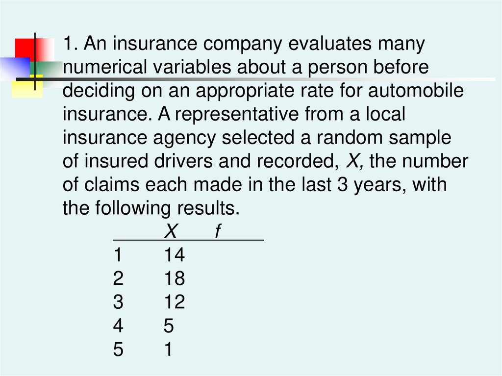
1. An insurance company evaluates manynumerical variables about a person before
deciding on an appropriate rate for automobile
insurance. A representative from a local
insurance agency selected a random sample
of insured drivers and recorded, X, the number
of claims each made in the last 3 years, with
the following results.
X
f
1
14
2
18
3
12
4
5
5
1
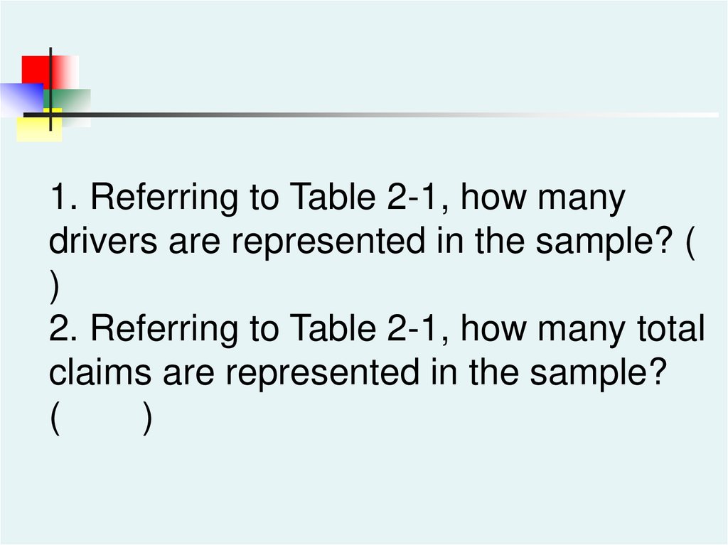
72.
1. Referring to Table 2-1, how manydrivers are represented in the sample? (
)
2. Referring to Table 2-1, how many total
claims are represented in the sample?
(
)
73.
3. A type of vertical bar chart in which thecategories are plotted in the descending rank
order of the magnitude of their frequencies is
called a (
)
74.
4. The width of each bar in a histogramcorresponds to the(
)
a) differences between the boundaries of
the class.
b) number of observations in each class.
c) midpoint of each class.
d) percentage of observations in each
class.
75.
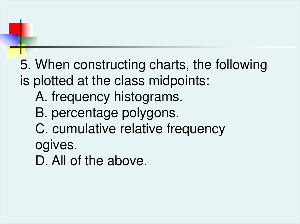
5. When constructing charts, the followingis plotted at the class midpoints:
A. frequency histograms.
B. percentage polygons.
C. cumulative relative frequency
ogives.
D. All of the above.
76.
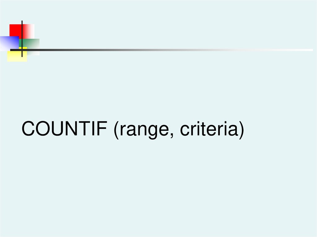
COUNTIF (range, criteria)77.
Active Learning Lecture SlidesFor use with Classroom Response Systems
Business Statistics:
Course
Copyright © 2011 Pearson Education, Inc.
A First
Slide 3- 77
78.
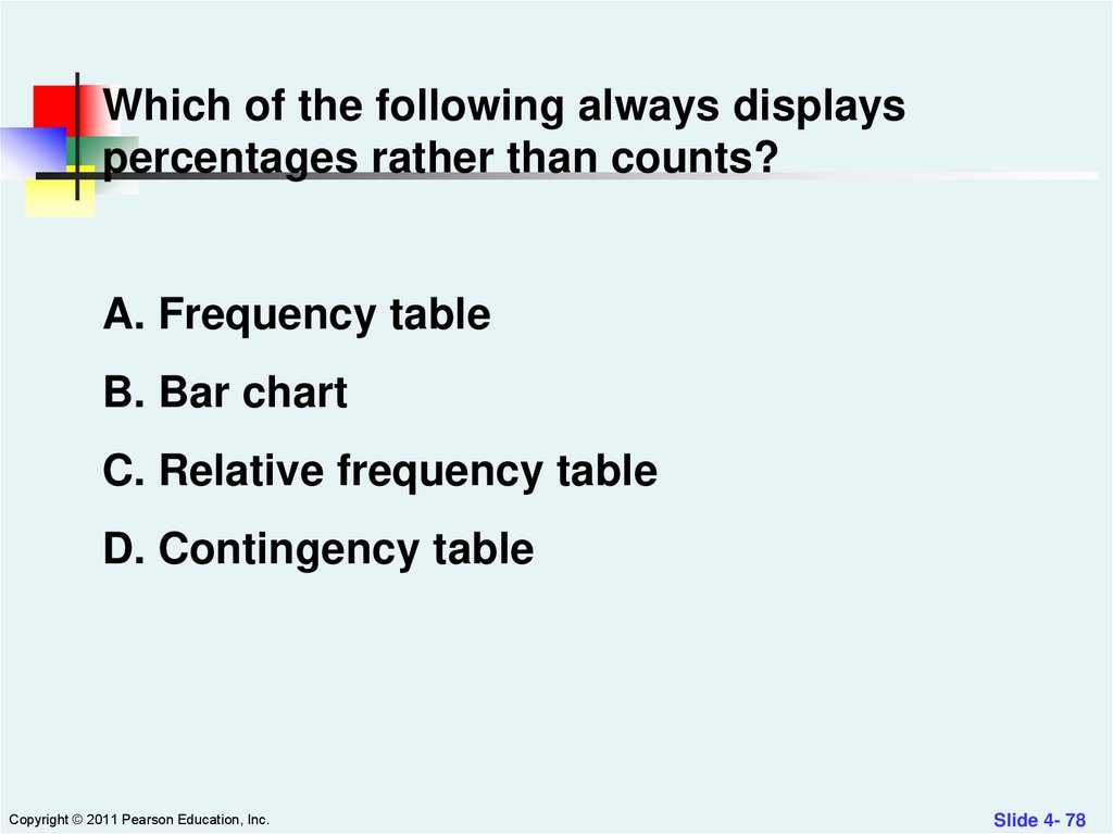
Which of the following always displayspercentages rather than counts?
A. Frequency table
B. Bar chart
C. Relative frequency table
D. Contingency table
Copyright © 2011 Pearson Education, Inc.
Slide 4- 78
79.
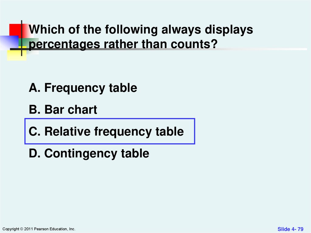
Which of the following always displayspercentages rather than counts?
A. Frequency table
B. Bar chart
C. Relative frequency table
D. Contingency table
Copyright © 2011 Pearson Education, Inc.
Slide 4- 79
80.
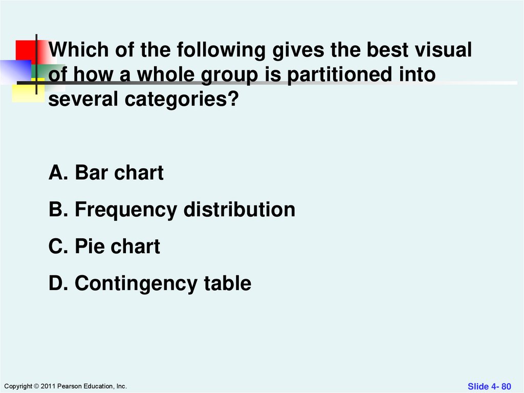
Which of the following gives the best visualof how a whole group is partitioned into
several categories?
A. Bar chart
B. Frequency distribution
C. Pie chart
D. Contingency table
Copyright © 2011 Pearson Education, Inc.
Slide 4- 80
81.
Which of the following gives the best visualof how a whole group is partitioned into
several categories?
A. Bar chart
B. Frequency distribution
C. Pie chart
D. Contingency table
Copyright © 2011 Pearson Education, Inc.
Slide 4- 81
82.
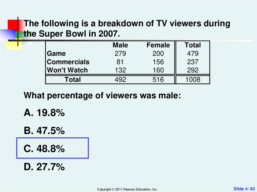
The following is a breakdown of TV viewers duringthe Super Bowl in 2007.
Game
Commercials
Won't Watch
Total
Male
279
81
132
492
Female
200
156
160
516
Total
479
237
292
1008
What percentage of viewers was male:
A. 19.8%
B. 47.5%
C. 48.8%
D. 27.7%
Copyright © 2011 Pearson Education, Inc.
Slide 4- 82
83.
The following is a breakdown of TV viewers duringthe Super Bowl in 2007.
Game
Commercials
Won't Watch
Total
Male
279
81
132
492
Female
200
156
160
516
Total
479
237
292
1008
What percentage of viewers was male:
A. 19.8%
B. 47.5%
C. 48.8%
D. 27.7%
Copyright © 2011 Pearson Education, Inc.
Slide 4- 83
84.
The following is a breakdown of TV viewers duringthe Super Bowl in 2007.
Game
Commercials
Won't Watch
Total
Male
279
81
132
492
Female
200
156
160
516
Total
479
237
292
1008
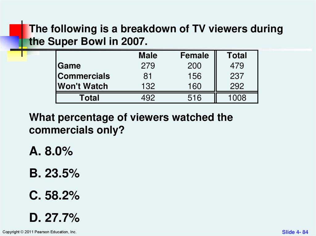
What percentage of viewers watched the
commercials only?
A. 8.0%
B. 23.5%
C. 58.2%
D. 27.7%
Copyright © 2011 Pearson Education, Inc.
Slide 4- 84
85.
The following is a breakdown of TV viewers duringthe Super Bowl in 2007.
Game
Commercials
Won't Watch
Total
Male
279
81
132
492
Female
200
156
160
516
Total
479
237
292
1008
What percentage of viewers watched the
commercials only?
A. 8.0%
B. 23.5%
C. 58.2%
D. 27.7%
Copyright © 2011 Pearson Education, Inc.
Slide 4- 85
86.
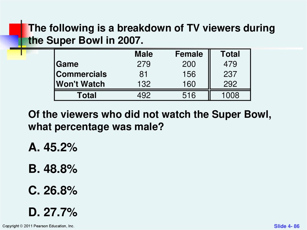
The following is a breakdown of TV viewers duringthe Super Bowl in 2007.
Game
Commercials
Won't Watch
Total
Male
279
81
132
492
Female
200
156
160
516
Total
479
237
292
1008
Of the viewers who did not watch the Super Bowl,
what percentage was male?
A. 45.2%
B. 48.8%
C. 26.8%
D. 27.7%
Copyright © 2011 Pearson Education, Inc.
Slide 4- 86
87.
The following is a breakdown of TV viewers duringthe Super Bowl in 2007.
Game
Commercials
Won't Watch
Total
Male
279
81
132
492
Female
200
156
160
516
Total
479
237
292
1008
Of the viewers who did not watch the Super Bowl,
what percentage was male?
A. 45.2%
B. 48.8%
C. 26.8%
D. 27.7%
Copyright © 2011 Pearson Education, Inc.
Slide 4- 87
88.
In a contingency table, when thedistribution of one variable is the same for
all categories of another, we say the
variables are
A. separate.
B. independent.
C. distinct.
D. dependent.
Copyright © 2011 Pearson Education, Inc.
Slide 4- 88
89.
In a contingency table, when thedistribution of one variable is the same for
all categories of another, we say the
variables are
A. separate.
B. independent.
C. distinct.
D. dependent.
Copyright © 2011 Pearson Education, Inc.
Slide 4- 89
90.
You should use a histogram to displaycategorical data.
A. True
B. False
Copyright © 2011 Pearson Education, Inc.
Slide 5- 90
91.
You should use a histogram to displaycategorical data.
A. True
B. False
Copyright © 2011 Pearson Education, Inc.
Slide 5- 91