Похожие презентации:
Creating simple reports using basic visuals
1.
CREATING SIMPLEREPORTS USING
BASIC VISUALS
2.
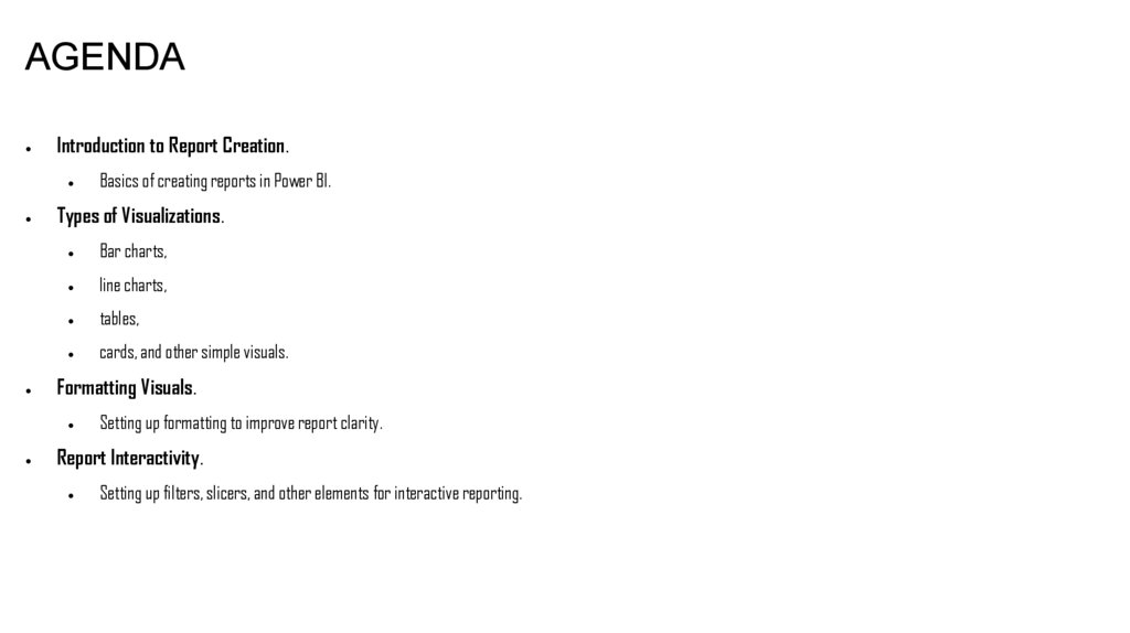
AGENDAIntroduction to Report Creation.
Types of Visualizations.
Bar charts,
line charts,
tables,
cards, and other simple visuals.
Formatting Visuals.
Basics of creating reports in Power BI.
Setting up formatting to improve report clarity.
Report Interactivity.
Setting up filters, slicers, and other elements for interactive reporting.
3.
INTRODUCTION TO VISUALIZATIONS IN POWER BIWhat is a visualization?
Visualizations turn data into graphical elements, such as charts, graphs, and tables, making
information clear and easy to understand.
They allow users to quickly analyze large volumes of data in an intuitive format.
4.
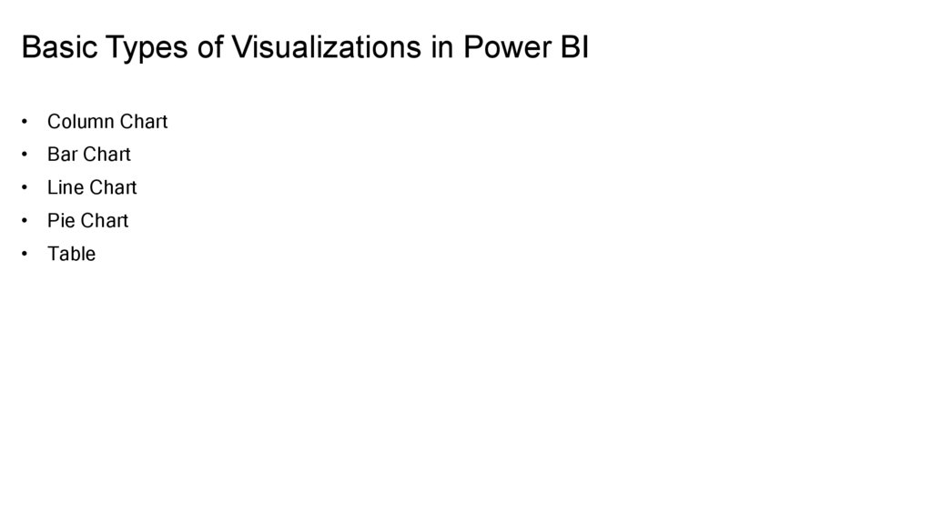
Basic Types of Visualizations in Power BI• Column Chart
• Bar Chart
• Line Chart
• Pie Chart
• Table
5.
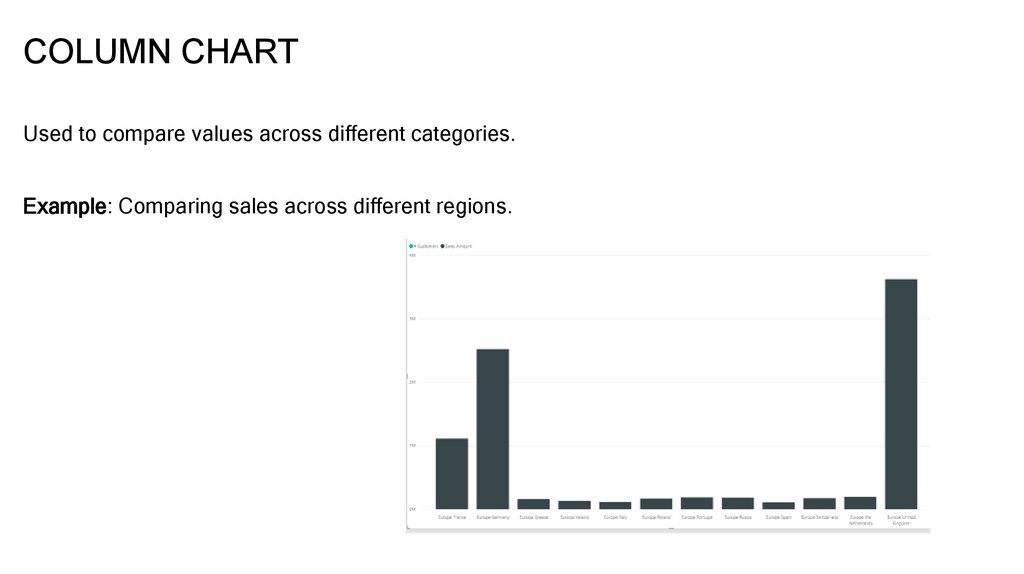
COLUMN CHARTUsed to compare values across different categories.
Example: Comparing sales across different regions.
6.
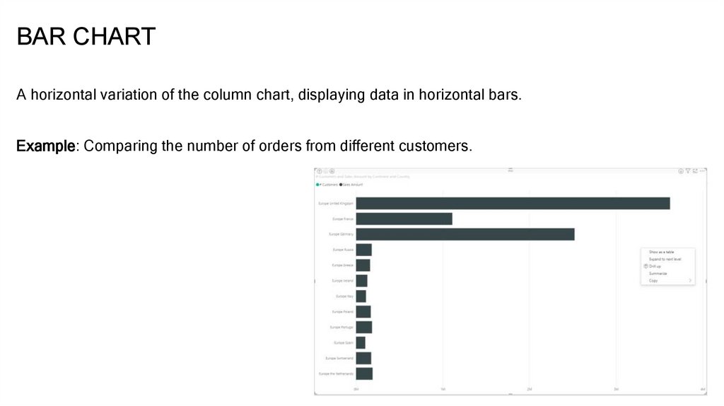
BAR CHARTA horizontal variation of the column chart, displaying data in horizontal bars.
Example: Comparing the number of orders from different customers.
7.
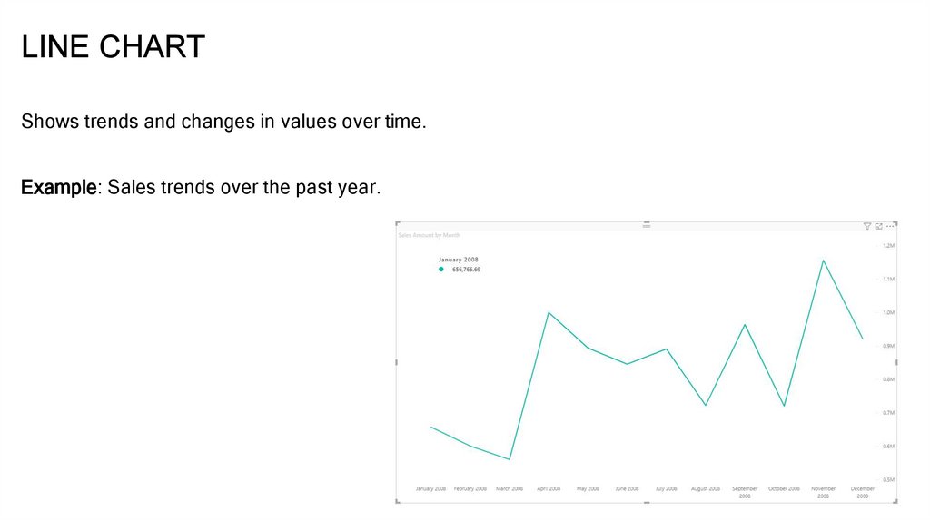
LINE CHARTShows trends and changes in values over time.
Example: Sales trends over the past year.
8.
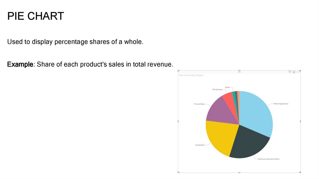
PIE CHARTUsed to display percentage shares of a whole.
Example: Share of each product's sales in total revenue.
9.
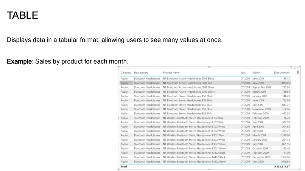
TABLEDisplays data in a tabular format, allowing users to see many values at once.
Example: Sales by product for each month.
10.
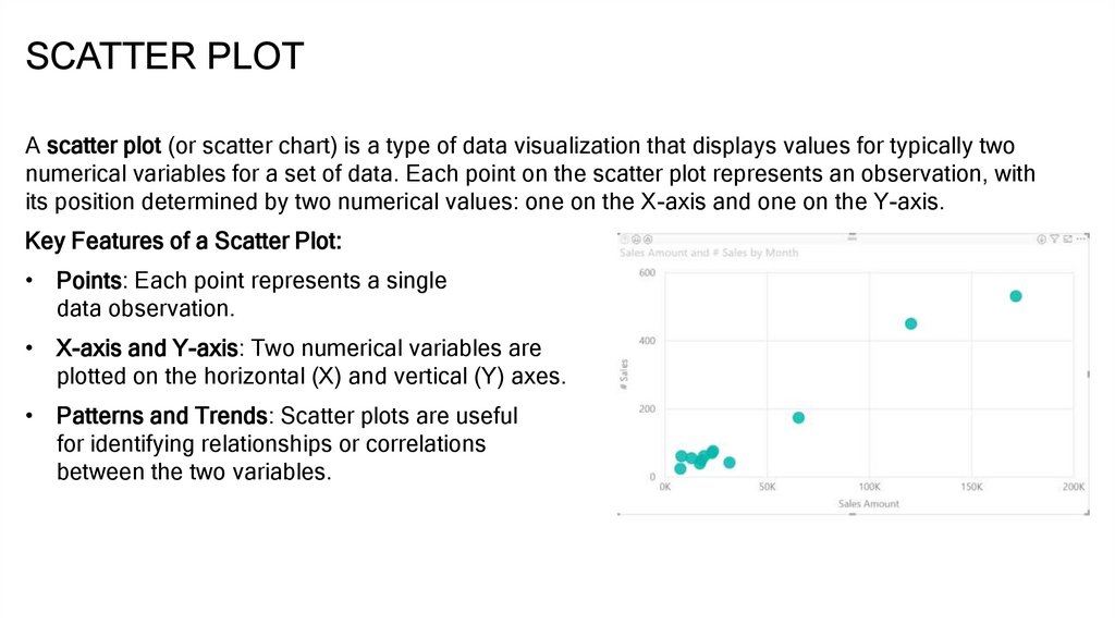
SCATTER PLOTA scatter plot (or scatter chart) is a type of data visualization that displays values for typically two
numerical variables for a set of data. Each point on the scatter plot represents an observation, with
its position determined by two numerical values: one on the X-axis and one on the Y-axis.
Key Features of a Scatter Plot:
• Points: Each point represents a single
data observation.
• X-axis and Y-axis: Two numerical variables are
plotted on the horizontal (X) and vertical (Y) axes.
• Patterns and Trends: Scatter plots are useful
for identifying relationships or correlations
between the two variables.
11.
CREATING VISUALIZATIONS IN POWER BI• How to Add a Visualization:
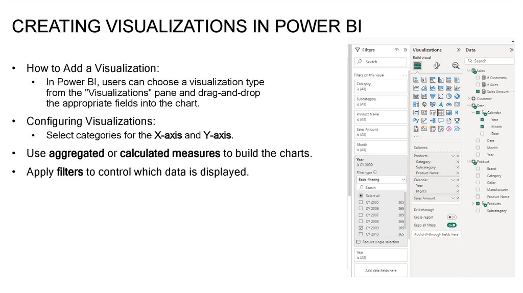
In Power BI, users can choose a visualization type
from the "Visualizations" pane and drag-and-drop
the appropriate fields into the chart.
• Configuring Visualizations:
Select categories for the X-axis and Y-axis.
• Use aggregated or calculated measures to build the charts.
• Apply filters to control which data is displayed.
12.
FORMATTING VISUALIZATIONS• Changing Colors and Styles:
Power BI allows you to adjust colors, column styles, line thickness, and text formatting for axes and titles
to enhance the report's look.
• Adding Data Labels:
You can enable data labels to display values directly on the charts.
• Using Legends and Tooltips:
Add legends to explain the categories and tooltips to provide more details when hovering over a data
point.
13.
FILTERING AND INTERACTION BETWEENVISUALIZATIONS
• Interaction Between Visualizations:
In Power BI, visualizations are interconnected, and filtering or selecting values in one visualization will
affect the others.
Example: Selecting a specific region on a chart will filter the data in other visualizations to show sales for
only that region.
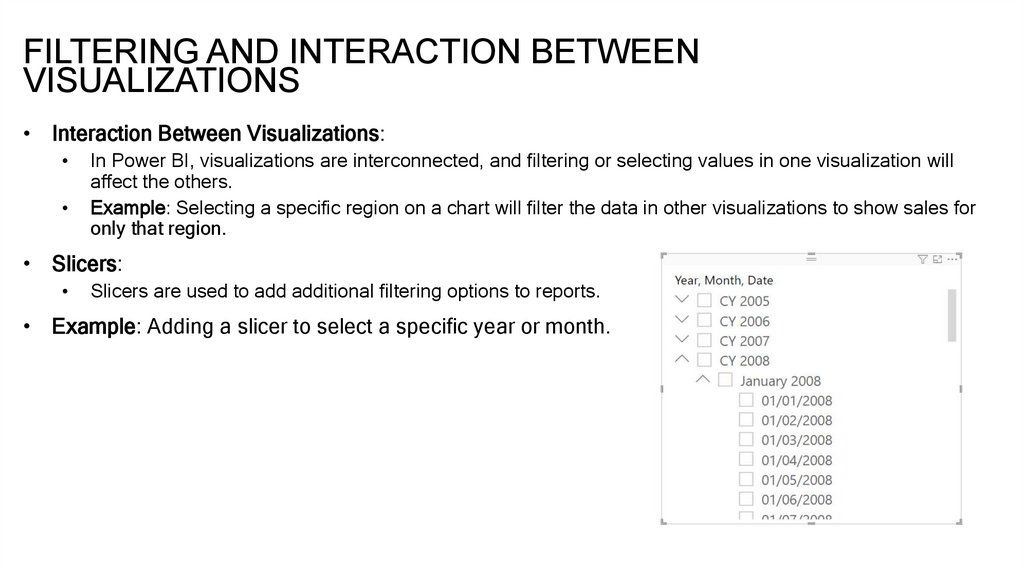
• Slicers:
Slicers are used to add additional filtering options to reports.
• Example: Adding a slicer to select a specific year or month.
14.
CREATING SIMPLE INTERACTIVE REPORTS• Adding Multiple Visualizations to a Single Dashboard:
Combine different types of visualizations (line charts, column charts, tables) to create a comprehensive
interactive report.
• Page and Report-Level Filters:
Set up filters that apply to the entire page or the entire report, allowing users to control which data they
want to analyze.
15.
DEMO16.
USEFUL LINKShttps://learn.microsoft.com/en-us/training/paths/build-power-bi-visuals-reports/
17.
THANKYOU




 Программное обеспечение


