


 Программное обеспечение
Похожие презентации:


")


Data Representation: Influence Diagrams
1.
Data Representation:Influence Diagrams
Nazar Mansurov
22205058
Instructor: Erkan Emirzade,
PMP
2.
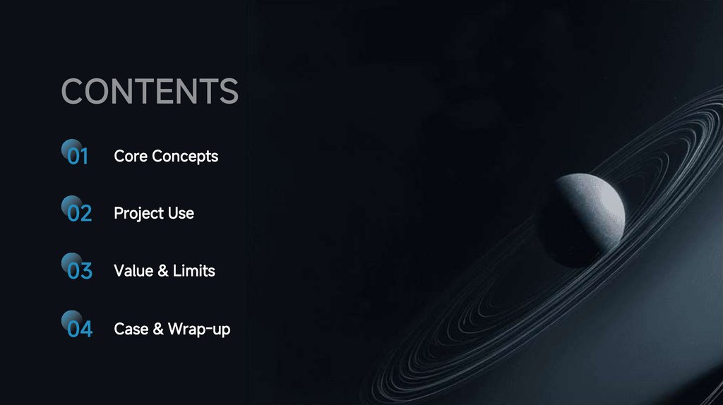
01Core Concepts
02
Project Use
03
Value & Limits
04
Case & Wrap-up
3.
01Core Concepts
4.
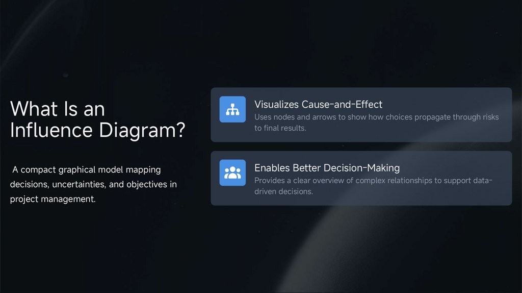
What Is anInfluence Diagram?
Visualizes Cause-and-Effect
A compact graphical model mapping
Enables Better Decision-Making
decisions, uncertainties, and objectives in
Provides a clear overview of complex relationships to support datadriven decisions.
project management.
Uses nodes and arrows to show how choices propagate through risks
to final results.
5.
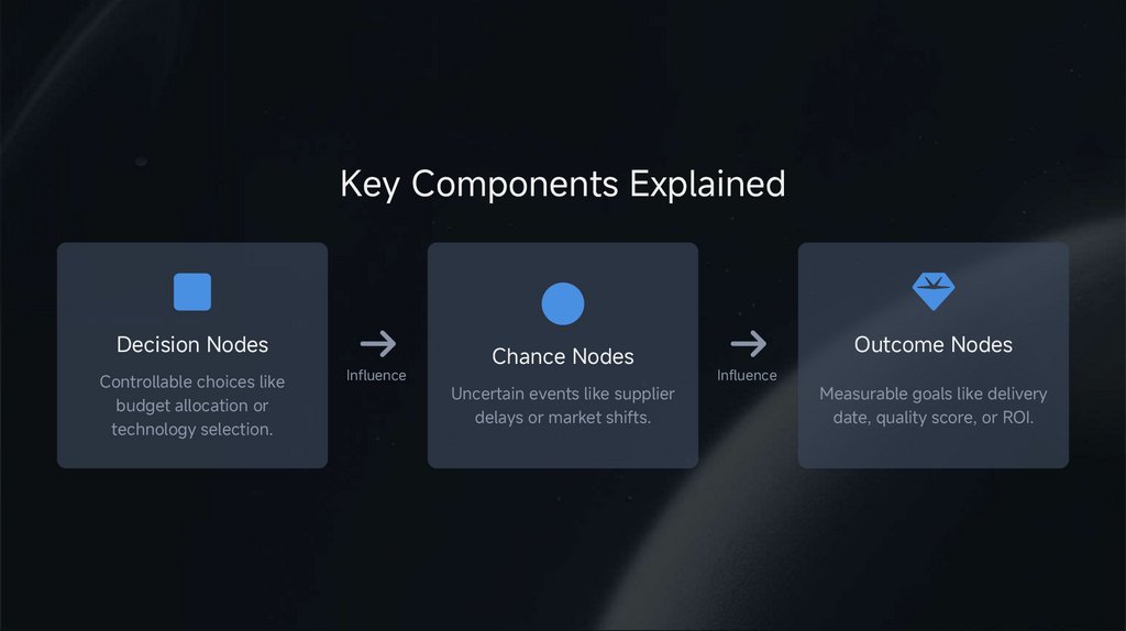
Key Components ExplainedDecision Nodes
Controllable choices like
budget allocation or
technology selection.
Influence
Chance Nodes
Uncertain events like supplier
delays or market shifts.
Outcome Nodes
Influence
Measurable goals like delivery
date, quality score, or ROI.
6.
02Project Use
7.
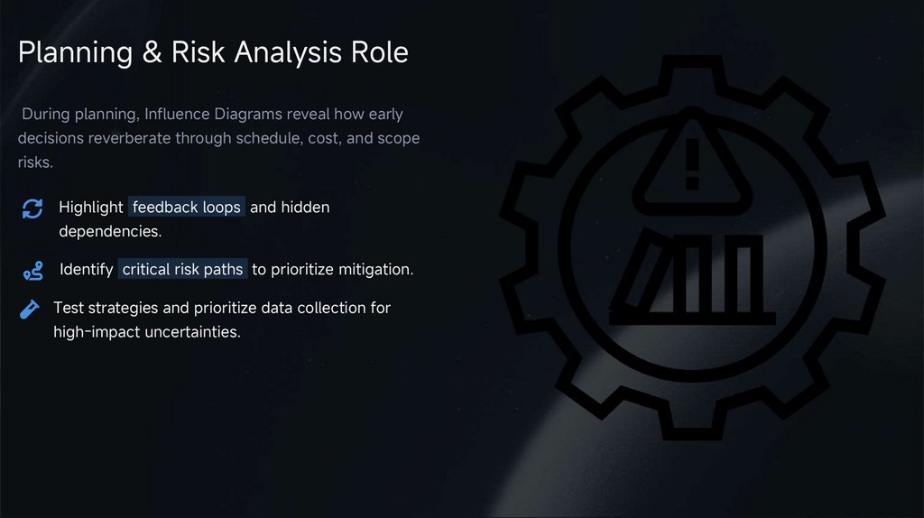
Planning & Risk Analysis RoleDuring planning, Influence Diagrams reveal how early
decisions reverberate through schedule, cost, and scope
risks.
Highlight feedback loops and hidden
dependencies.
Identify critical risk paths to prioritize mitigation.
Test strategies and prioritize data collection for
high-impact uncertainties.
8.
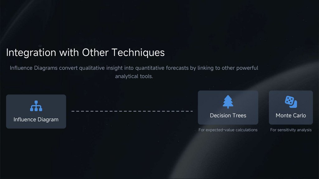
Integration with Other TechniquesInfluence Diagrams convert qualitative insight into quantitative forecasts by linking to other powerful
analytical tools.
Influence Diagram
Decision Trees
Monte Carlo
For expected-value calculations
For sensitivity analysis
9.
03Value & Limits
10.
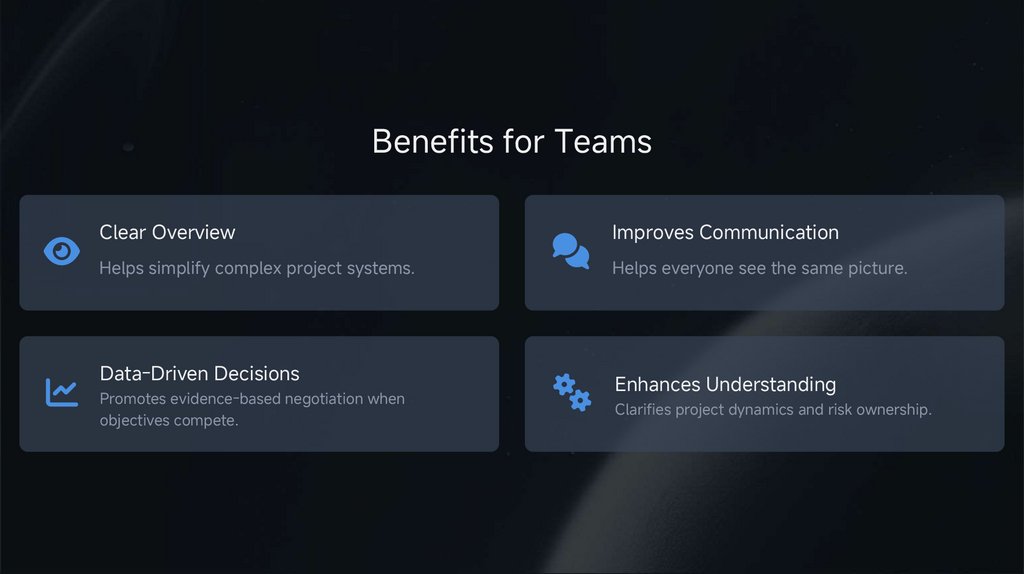
Benefits for TeamsClear Overview
Improves Communication
Helps simplify complex project systems.
Helps everyone see the same picture.
Data-Driven Decisions
Promotes evidence-based negotiation when
objectives compete.
Enhances Understanding
Clarifies project dynamics and risk ownership.
11.
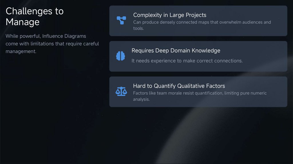
Challenges toManage
Complexity in Large Projects
Can produce densely connected maps that overwhelm audiences and
tools.
While powerful, Influence Diagrams
come with limitations that require careful
management.
Requires Deep Domain Knowledge
It needs experience to make correct connections.
Hard to Quantify Qualitative Factors
Factors like team morale resist quantification, limiting pure numeric
analysis.
12.
04Case & Wrap-up
13.
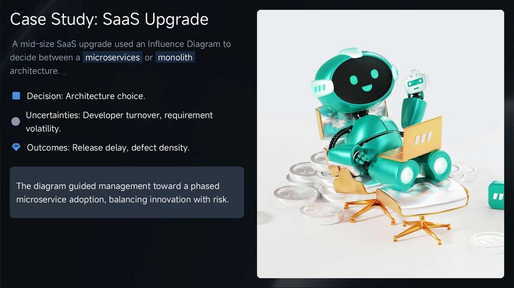
Case Study: SaaS UpgradeA mid-size SaaS upgrade used an Influence Diagram to
decide between a microservices or monolith
architecture.
Decision: Architecture choice.
Uncertainties: Developer turnover, requirement
volatility.
Outcomes: Release delay, defect density.
The diagram guided management toward a phased
microservice adoption, balancing innovation with risk.
14.
Key TakeawaysSharpen Risk Conversations
Integrate Seamlessly
Drive Better Decisions
Translate project narratives into
transparent networks of decisions,
risks, and payoffs.
Link qualitative insight to quantitative
tools like Monte Carlo simulations for
deeper analysis.
Consistent use leads to faster, betterdocumented, and defensible project
choices.
15.
Adopting Influence Diagrams1
Start with one pivotal decision in your next charter
or risk workshop.
2
Map immediate uncertainties and validate arrows
with subject-matter experts.
3
Iterate as new data arrives and archive versions to
track evolving understanding.
Q&A
Thank you for listening!
16.
THANKYOU