


")


")
")

 light (CMYK)")


; saturation still zero, brightness up")


")
")


")
")


 Интернет
Похожие презентации:


")
")
User-Centered Website Development: A Human-Computer Interaction Approach
1. User-Centered Website Development: A Human-Computer Interaction Approach
User-Centered WebsiteDevelopment: A HumanComputer Interaction Approach
Chapter 9: Color
Copyright © 2004 by Prentice Hall
2. The Physics of Color
Light with a wavelength between 400-700nanometers is perceived by the human eye as a
color
Chapter 9: Color
Copyright © 2004 by Prentice Hall
3. The electromagnetic spectrum, of which visible light is a very thin band
Chapter 9: ColorCopyright © 2004 by Prentice Hall
4. The spectrum of visible light
Chapter 9: ColorCopyright © 2004 by Prentice Hall
5. Human Response to Color (Weakness in seeing differences in blue)
Chapter 9: ColorCopyright © 2004 by Prentice Hall
6. 9.3 Color Models
An artist’s color wheel: red, yellow, and blue(RYB)
Additive color: red, green, blue (RGB)
Subtractive color: cyan, magenta, yellow, and
black (CMYK)
Hue, saturation, and brightness (HSB)
Chapter 9: Color
Copyright © 2004 by Prentice Hall
7. The artist’s model: red, yellow, and blue
Chapter 9: ColorCopyright © 2004 by Prentice Hall
8. An artist’s color wheel
Chapter 9: ColorCopyright © 2004 by Prentice Hall
9. The secondary colors
Chapter 9: ColorCopyright © 2004 by Prentice Hall
10. The tertiary colors
Chapter 9: ColorCopyright © 2004 by Prentice Hall
11. In additive color (RGB)
Red + Green = YellowRed + Blue = Magenta
Green + Blue = Cyan
Chapter 9: Color
Copyright © 2004 by Prentice Hall
12. Additive color: things that emit light, especially monitors (RGB)
Chapter 9: ColorCopyright © 2004 by Prentice Hall
13. In subtractive color . . .
Cyan subtracts Red (Green+Blue-Red)Magenta subtracts Green (Red+Blue-Green)
Yellow subtracts Blue (Red+Green-Blue)
In photography, that’s it: all three together
subtract all light, giving black
In print, the dyes aren’t that good, and we need
black ink too
Hence, four-color printing: CMYK
K from blacK; B already means Blue
Chapter 9: Color
Copyright © 2004 by Prentice Hall
14. Subtractive color: things that reflect (and selectively absorb) light (CMYK)
Chapter 9: ColorCopyright © 2004 by Prentice Hall
15. HSB: Hue, Saturation, and Brightness
Hue: where a color lies around a color wheel:red, green, yellow, blue-green, etc.
Saturation: the “purity” of a color; a fullysaturated color has no white mixed with it, in
paint terms
Brightness: light, dark, or in between?
In everyday use, most people probably are
thinking of hue when they speak of color
Chapter 9: Color
Copyright © 2004 by Prentice Hall
16. The color cone: hue, saturation, and brightness in relation to each other
Chapter 9: ColorCopyright © 2004 by Prentice Hall
17. HSB: Hue, Saturation, and Brightness
Chapter 9: ColorCOLOR
Hue
Saturation
Brightness
Red
0o
100%
100%
Yellow
60o
100%
100%
Green
120o
100%
100%
Cyan
180o
100%
100%
Blue
240o
100%
100%
Magenta
300o
100%
100%
White
0o
0%
100%
Black
0o
0%
0%
Copyright © 2004 by Prentice Hall
18. Varying saturation, with brightness held constant
Chapter 9: ColorCopyright © 2004 by Prentice Hall
19. Varying brightness, with saturation held constant
Chapter 9: ColorCopyright © 2004 by Prentice Hall
20. 9.4 Four Color-Harmony Schemes
Monochromatic: colors of same or similar hue,differing in brightness and/or saturation
Complementary: colors approximately opposite
each other on a color wheel
Analogous: colors adjacent to each other, from
any segment of a color wheel
Triadic: three colors approximately equally
spaced around a color wheel
Chapter 9: Color
Copyright © 2004 by Prentice Hall
21. Analogous Colors
Chapter 9: ColorCopyright © 2004 by Prentice Hall
22. Complementary Colors
Chapter 9: ColorCopyright © 2004 by Prentice Hall
23. Triadic Colors
Chapter 9: ColorCopyright © 2004 by Prentice Hall
24. Monochromatic color harmony: colors of same hue, differing in brightness and/or saturation
All blueChapter 9: Color
All orange
Copyright © 2004 by Prentice Hall
25. Monochromatic example: orange, with variation in brightness and saturation
Chapter 9: ColorCopyright © 2004 by Prentice Hall
26. Complementary: red and green
Chapter 9: ColorCopyright © 2004 by Prentice Hall
27. Complementary: various blues, with red-orange highlights
Complementary: various blues, with redorange highlightsChapter 9: Color
Copyright © 2004 by Prentice Hall
28. Analogous: bright orange, darker yellow-orange, light yellow
Analogous: bright orange, darker yelloworange, light yellowChapter 9: Color
Copyright © 2004 by Prentice Hall
29. Analogous: red-orange through yellow-green
Analogous: red-orange through yellowgreenChapter 9: Color
Copyright © 2004 by Prentice Hall
30. Triadic: red, yellow, blue
Chapter 9: ColorCopyright © 2004 by Prentice Hall
31. Triadic: red, yellow, blue
Chapter 9: ColorCopyright © 2004 by Prentice Hall
32. The color software at the companion Web site is a great way to learn
Permits simple experimentation with theconcepts, e.g.:
What is pink? (Desaturated red)
Can a dark color be saturated? (Yes)
Does adding red and green really give yellow? (Yes)
Is gray ever saturated? (No)
What does saturation mean at low brightness levels?
(Not much)
In RGB, how do you “add white” to red? (Increase the
amounts of green and blue)
http://www.prenhall.com/mccracken/
Chapter 9: Color
Copyright © 2004 by Prentice Hall
33. Here is pure red; what would we have to do to make pink?
Chapter 9: ColorCopyright © 2004 by Prentice Hall
34. Answer: add green and blue
Chapter 9: ColorCopyright © 2004 by Prentice Hall
35. Lower all three, to get “dusty red,” maybe, although we don’t often use the language of fashion or interior decoration
Chapter 9: ColorCopyright © 2004 by Prentice Hall
36. This is a cool gray: less red than green and blue
Chapter 9: ColorCopyright © 2004 by Prentice Hall
37. This is a warm gray: less blue than red and green
Chapter 9: ColorCopyright © 2004 by Prentice Hall
38. Is gray ever saturated? Let’s try: this is so dark as to be almost black, depending on room lighting; zero saturation
Chapter 9: ColorCopyright © 2004 by Prentice Hall
39. Another gray (same amount of R, G, and B); saturation still zero, brightness up
Chapter 9: ColorCopyright © 2004 by Prentice Hall
40. A lighter gray
Chapter 9: ColorCopyright © 2004 by Prentice Hall
41. Gray getting toward white; still zero saturation
Chapter 9: ColorCopyright © 2004 by Prentice Hall
42. Black is completely unsaturated, right? Right.
Chapter 9: ColorCopyright © 2004 by Prentice Hall
43. Change the amount of blue from zero to one: now 100% saturated (same result in Adobe and Microsoft software)
Chapter 9: ColorCopyright © 2004 by Prentice Hall
44. Now B = 40; can you distinguish from black? (Still 100% saturated)
Chapter 9: ColorCopyright © 2004 by Prentice Hall
45. Now B = 100, and we have something like midnight blue; still 100% saturated—but now that begins to make sense
Now B = 100, and we have somethinglike midnight blue; still 100% saturated—
but now that begins to make sense
Chapter 9: Color
Copyright © 2004 by Prentice Hall
46. Pure blue; fully saturated by any definition
Chapter 9: ColorCopyright © 2004 by Prentice Hall
47. A little more on color harmony
In the text we were limited in the number ofcolor pages we could use, so the examples of
color harmony were necessarily restricted. With
the luxury of more space here, we can add some
additional material.
In printing color in the book there is also the
problem of gamut: many colors we can produce
on the screen cannot be printed on a CMYK
printer. Examples: red, green, and blue.
Chapter 9: Color
Copyright © 2004 by Prentice Hall
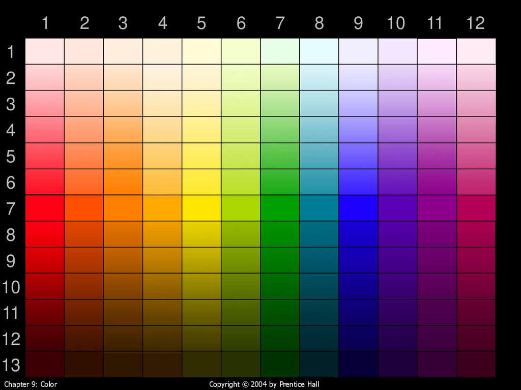
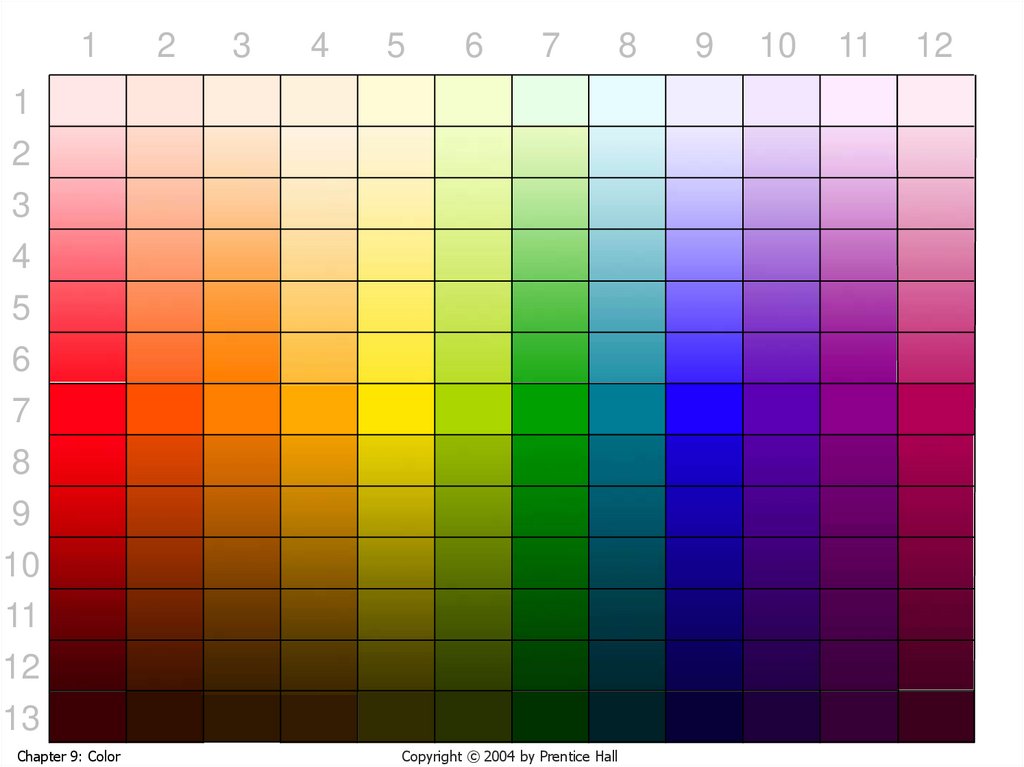
48. The colors, laid out linearly instead of around a circle
On the next two slides we have the 12 colors ofSlide 12, but shown in vertical bands
In each band the colors range from quite light to
quite dark
Light colors may appear almost white—but that
perception depends in part on background
Dark colors may appear almost black—same
comment
So we show with a black background and then
with a white background
Chapter 9: Color
Copyright © 2004 by Prentice Hall
49.
12
3
4
5
6
7
8
1
2
3
4
5
6
7
8
9
10
11
12
13
Chapter 9: Color
Copyright © 2004 by Prentice Hall
9
10
11
12
50.
12
3
4
5
6
7
8
1
2
3
4
5
6
7
8
9
10
11
12
13
Chapter 9: Color
Copyright © 2004 by Prentice Hall
9
10
11
12
51. The four color-harmony schemes
Monochromatic: colors from one columnComplementary: any two colors whose column
numbers differ by 6
Analogous: several colors from adjacent
columns, with 12 considered next to 1
Triadic: colors from columns:
1,
2,
3,
4,
Chapter 9: Color
5, and
6, and
7, and
8, and
9, or
10, or
11, or
12
Copyright © 2004 by Prentice Hall
52. Three columns for picking monochromatic schemes; these three make a triadic
3Chapter 9: Color
7
Copyright © 2004 by Prentice Hall
11
53. Monochromatic: Column 8, rows 2, 7, 12
Chapter 9: ColorCopyright © 2004 by Prentice Hall
54. Monochromatic: Column 1, rows 1, 4, 10
Chapter 9: ColorCopyright © 2004 by Prentice Hall
55. Three pairs of complementary colors (complements don’t have to scream)
Chapter 9: ColorCopyright © 2004 by Prentice Hall
56. But they can scream, if you wish (It’s called a clash—gets people’s attention)
But don’t do this casually—the clash can be almostpainful; you need to have a reason to do it
Chapter 9: Color
Copyright © 2004 by Prentice Hall
57. A triadic can shout . . .
Chapter 9: ColorCopyright © 2004 by Prentice Hall
58. . . . or whisper . . .
Chapter 9: ColorCopyright © 2004 by Prentice Hall
59. . . . or speak conversationally . . .
Chapter 9: ColorCopyright © 2004 by Prentice Hall
60. . . . or let others talk . . .
Big Important WordsNice words, but not headline-type words.
Text. The story, now that I have your
attention.
Chapter 9: Color
Copyright © 2004 by Prentice Hall
61. End interlude
End of InterludeAnd that is what we have time for, in
exploring another way of looking at
color harmony. Try it! Think about the
color combinations that work, and
experiment with variations of them.
Chapter 9: Color
Copyright © 2004 by Prentice Hall
62. Text and background colors for legibility
Use combinations of dark text and light (highbrightness, low saturation) background
Avoid text and background colors that differ only in
blue (Recall the “Human Response to Color” graph)
R G
B Color
Chapter 9: Color
Text
255 255 0 Yellow
Background 255 255 255 White
Difference
No No Yes
BAD CHOICE
Text
255 255 0 Yellow
Background 0
0
80 Navy
Difference
Yes Yes Yes
GOOD CHOICE
Copyright © 2004 by Prentice Hall
63. Text and background colors for legibility
Avoid combinations that use bright, saturatedcolors.
Avoid combinations of red and blue, red and
green and magenta and green because these
can create a perception of vibration and can
cause eye fatigue.
Chapter 9: Color
Copyright © 2004 by Prentice Hall
64. Text in a dark color on its complement in a light color works nicely
Color is one of the pleasurable aspects of eyesightand is an integral part of Web pages. Properly used,
color makes a page both attractive and usable. It
can provide cues that indicate a button’s function or
state. It can distinguish between navigational aids
and content, unobtrusively guiding the user through
a page. This chapter presents some color basics
and design tips to enhance both the effectiveness
and appeal of a Web site.
Chapter 9: Color
Copyright © 2004 by Prentice Hall
65. A great many combinations are possible
In this chapter you will do the following:understand physical and perceptual aspects of color
become aware of several color models and learn the
advantages of each
learn to apply four different color harmony schemes
explore how color can make Web pages pleasing
and easy to read
Chapter 9: Color
Copyright © 2004 by Prentice Hall
66. Even a little color in the background makes text easier to read
It is rare that the color choices for Web pages are leftentirely in the hands of a developer or designer. In most
cases, the client will already have some colors in mind,
based on a corporate logo, a school insignia or personal
preference. Color harmonies provide options for
choosing colors that are compatible with the client’s
wishes. Applying guidelines for text and background
color will foster readability. Finally, using color to
organize text and focus attention will result in easier
navigation.
Chapter 9: Color
Copyright © 2004 by Prentice Hall
67. Now, for comparison, here is what black on white looks like
There is quite a bit of overlap in the response curves.The peak sensitivities for the first and second types
are actually in the yellow range. There is a big disparity
in the height of the three curves. This is due to the fact
that human eyes are most sensitive in the green range
of the spectrum and are dramatically less sensitive in
the blue range.
Black on white may not look too bad here. But
suppose you sat at a monitor six hours a day. Wouldn’t
you prefer a pastel background? And text that is dark
but not black?
Chapter 9: Color
Copyright © 2004 by Prentice Hall
68. But do provide adequate contrast
Offer expires 07/31/03. Offer available to new High SpeedInternet subscribers only. May not be used in conjunction
with any other offer. Service is not available in all areas.
Certain taxes and fees may apply. DSL: Offer requires a 12
month subscription. First six months will be billed at $29.95
per month, 49.95 thereafter. Early termination fees apply.
Includes Standard DSL Installation Kit. Does not include
shipping and handling charges. Additional equipment may be
required.
Chapter 9: Color
Copyright © 2004 by Prentice Hall
69. Always remember how we perceive blue vs. red and green
Below is the same text as on the previous slide, except pureblue instead of pure yellow. According to Adobe they both
have 100% brightness, and according to Microsoft they both
have luminance of 128. But that it not how we perceive them.
Offer expires 07/31/03. Offer available to new High Speed
Internet subscribers only. May not be used in conjunction
with any other offer. Service is not available in all areas.
Certain taxes and fees may apply. DSL: Offer requires a 12
month subscription. First six months will be billed at $29.95
per month, 49.95 thereafter. Early termination fees apply.
Includes Standard DSL Installation Kit. Does not include
shipping and handling charges. Additional equipment may be
required.
Chapter 9: Color
Copyright © 2004 by Prentice Hall
70. Don’t use red on blue or vice-versa
Blue has the shortest wavelength of visible light and redthe longest. Blue is refracted more strongly than red in our
lenses. (Compare with what a prism does to white light.)
Result: our eyes can’t focus on red and blue at the same
time, and the boundary seems to vibrate. It gets painful.
Camera lenses deal with this by using lens components
with different indexes of refraction, to produce an
achromatic lens, so that red and blue both focus at the
focal plane. Our eyes don’t work that way. This hurts.
Chapter 9: Color
Copyright © 2004 by Prentice Hall
71. Never use bright red on bright green or vice-versa
Red on green also hurts the eyes. I refuse toshow any more of it!
Chapter 9: Color
Copyright © 2004 by Prentice Hall
72. But change brightness and/or saturation . . .
But: same hues, except a very light green background anda very dark red text—different story. In fact, this is rather
nice, so I’ll show some more of it.
One reason this works is that there is adequate contrast
between the text and the background. As noted, our low
sensitivity to blue makes it hard to give rules on what the
difference in brightness should be. Use judgment and
common sense. And maybe do some user testing.
Chapter 9: Color
Copyright © 2004 by Prentice Hall
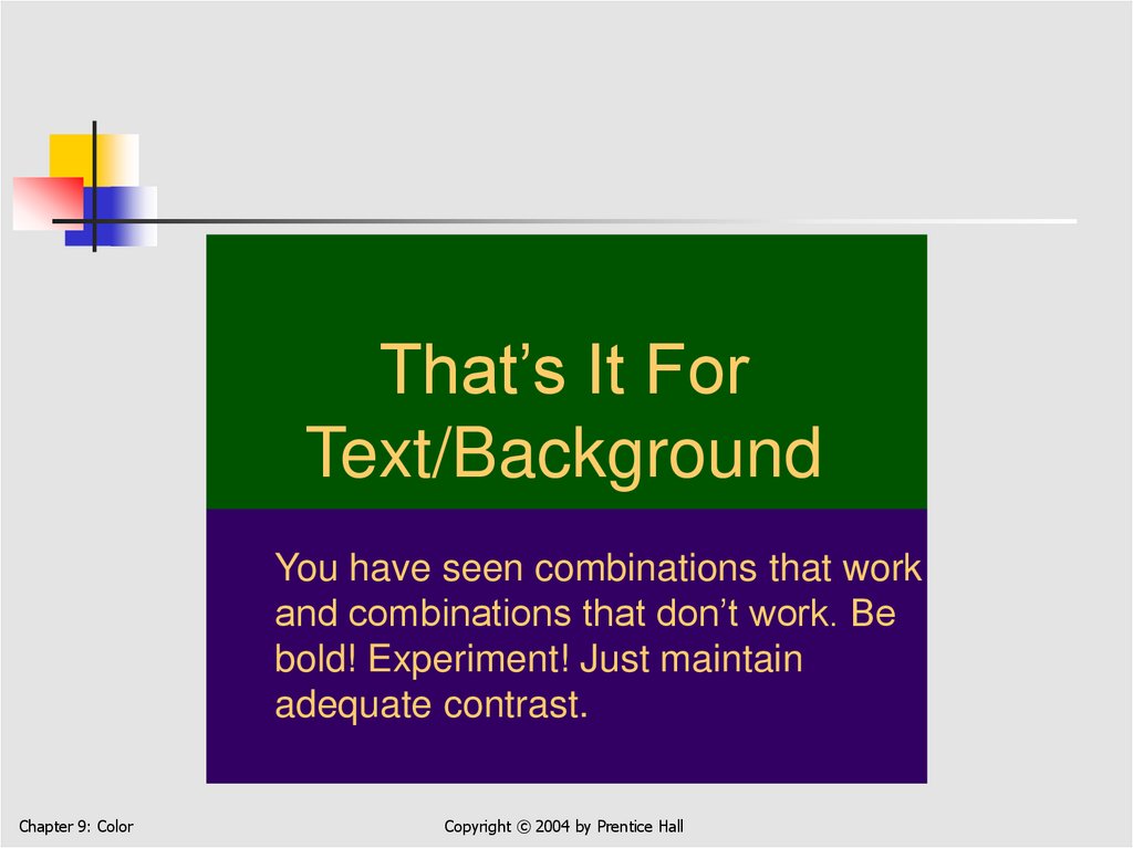
73.
That’s It ForText/Background
You have seen combinations that work
and combinations that don’t work. Be
bold! Experiment! Just maintain
adequate contrast.
Chapter 9: Color
Copyright © 2004 by Prentice Hall
74. Types of Color Blindness
Protanopia – L-cone (“red weak”)Deuteranopia – M-cone (“green weak”)
Tritanopia – S-cone (yellow/blue)
Chapter 9: Color
75. What Color Blindness Looks Like
NormalChapter 9: Color
Deuteranopia
Tritanopia
76. What Color Blindness Looks Like
NormalProtanopia
Chapter 9: Color
Deuteranopia
Tritanopia
77. Designing for Color Blindness
Avoid red-on-green or green-on-red at all costs!Consider using magenta instead of red
Avoid using magenta with blue
Use redundant coding of information
Use color and shape/location
Avoid thin lines / small symbols
For color-coded text, use bold fonts
Chapter 9: Color
78. Summary
In this chapter you learned about:The color spectrum; our eyes’ sensitivity to red, green,
and blue
Additive (RGB) and subtractive (CMYK) color models
The hue, saturation, and brightness (HSB) color model
Four color-harmony schemes: monochromatic,
complementary, analogous, and triadic
Text and background color combinations that are
legible and easy on the eyes
Chapter 9: Color
Copyright © 2004 by Prentice Hall