Похожие презентации:
Understanding CSS. Essentials: layouts, managing text flow, managing the graphical interface
1. Understanding CSS Essentials: Layouts, Managing Text Flow, Managing the Graphical Interface
• Vyacheslav KoldovskyyLast update: 01/07/2015
2. Agenda
UI design
Traditional CSS Box model
Block-level and inline element
Parent/child relationships
Vendor prefixes
CSS Flexbox Box model
CSS Grid Layout model
3. Vendor Prefixes
• CSS3 specification is still in draft formatand undergoing modifications
• Need to use vendor prefixes with several
CSS3 constructs
Internet Explorer uses the -ms- prefix.
Firefox supports the -moz- prefix.
Chrome and Safari support the -webkitprefix.
Opera supports the -o- prefix.
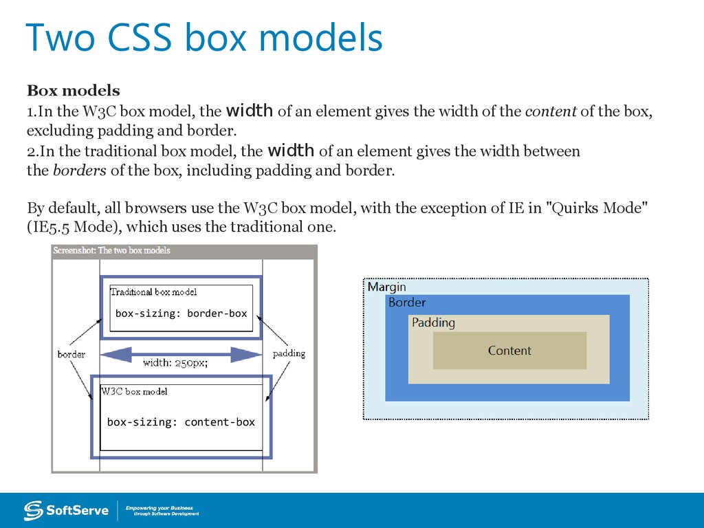
4. Two CSS box models
Box models1.In the W3C box model, the width of an element gives the width of the content of the box,
excluding padding and border.
2.In the traditional box model, the width of an element gives the width between
the borders of the box, including padding and border.
By default, all browsers use the W3C box model, with the exception of IE in "Quirks Mode"
(IE5.5 Mode), which uses the traditional one.
box-sizing: border-box
box-sizing: content-box
5. Box model sample
http://jsfiddle.net/koldovsky/e1984en9/1/6. Inherited Properties
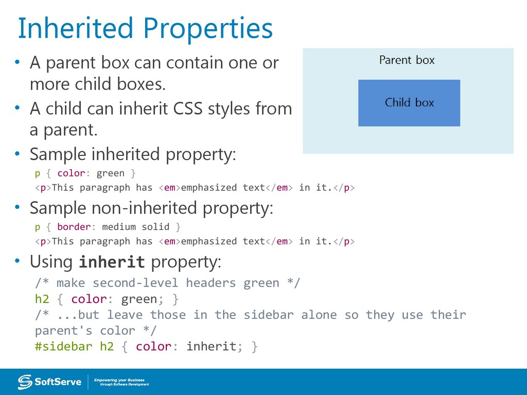
• A parent box can contain one ormore child boxes.
• A child can inherit CSS styles from
a parent.
• Sample inherited property:
p { color: green }
<p>This paragraph has <em>emphasized text</em> in it.</p>
• Sample non-inherited property:
p { border: medium solid }
<p>This paragraph has <em>emphasized text</em> in it.</p>
• Using inherit property:
/* make second-level headers green */
h2 { color: green; }
/* ...but leave those in the sidebar alone so they use their
parent's color */
#sidebar h2 { color: inherit; }
7. Browser Default Styles
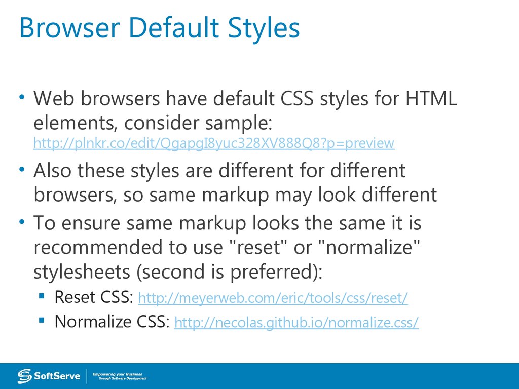
• Web browsers have default CSS styles for HTMLelements, consider sample:
http://plnkr.co/edit/QgapgI8yuc328XV888Q8?p=preview
• Also these styles are different for different
browsers, so same markup may look different
• To ensure same markup looks the same it is
recommended to use "reset" or "normalize"
stylesheets (second is preferred):
Reset CSS: http://meyerweb.com/eric/tools/css/reset/
Normalize CSS: http://necolas.github.io/normalize.css/
8. Media Queries
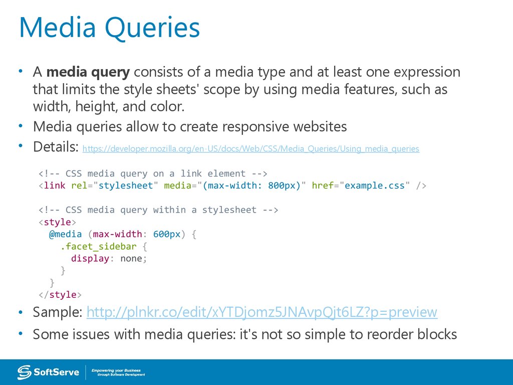
• A media query consists of a media type and at least one expressionthat limits the style sheets' scope by using media features, such as
width, height, and color.
• Media queries allow to create responsive websites
• Details: https://developer.mozilla.org/en-US/docs/Web/CSS/Media_Queries/Using_media_queries
<!-- CSS media query on a link element -->
<link rel="stylesheet" media="(max-width: 800px)" href="example.css" />
<!-- CSS media query within a stylesheet -->
<style>
@media (max-width: 600px) {
.facet_sidebar {
display: none;
}
}
</style>
• Sample: http://plnkr.co/edit/xYTDjomz5JNAvpQjt6LZ?p=preview
• Some issues with media queries: it's not so simple to reorder blocks
9. UI Challenges
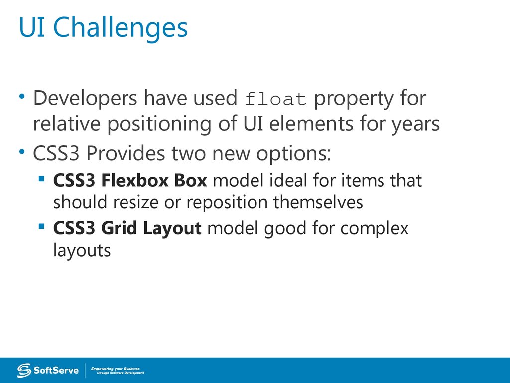
• Developers have used float property forrelative positioning of UI elements for years
• CSS3 Provides two new options:
CSS3 Flexbox Box model ideal for items that
should resize or reposition themselves
CSS3 Grid Layout model good for complex
layouts
10. CSS Flexbox Box Model
• Good for controls, toolbars, menus, and formsthat resize and reposition automatically when
the user changes the size of the browser
window
• Browser takes the available space into account
and calculates the dimensions for the user
• Enables relative sizes and positioning
• Good tutorial:
https://css-tricks.com/snippets/css/a-guide-to-flexbox/
11. CSS Flexbox Model Reordering Sample
• http://jsfiddle.net/koldovsky/jb5h57jw/12. CSS3 Grid Layout Model
• Gives developers greatercontrol over complex layouts
than the flexbox model
• Lets you control the design of
sections or entire HTML-based
documents using CSS3
• Grid layouts use columns, rows, and cells, but
you can move blocks of content from one
part of page or application to another by
moving code lines in CSS
13. Multi-column Layout
• Create columns by dividing text acrossmultiple columns
• Specify the amount of space that appears
between columns (the gap)
• Make vertical lines (rules) appear between
columns
• Define where columns break
14. Multi-column Layout
• Main CSS properties for creating multiple columnsin an HTML document:
column-count: Sets the number of columns
Alternative: Use columns property with column-count
and column-width properties
column-gap: Specifies the gap between the columns,
known as the gutter or alley
column-rule: Creates a vertical line in the gap
between columns and sets the width, style (single or
double line, solid, dashed, 3D, etc.) and color of the
rule
15. Multi-column Layout Example
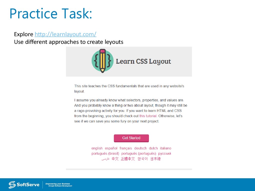
https://jsfiddle.net/koldovsky/4k1h7bg0/1/16. Practice Task:
Explore http://learnlayout.com/Use different approaches to create leyouts
17. Hyphenation
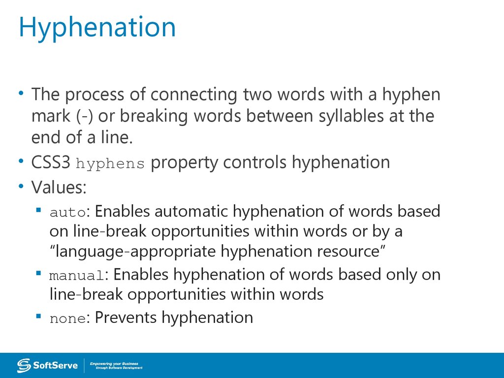
• The process of connecting two words with a hyphenmark (-) or breaking words between syllables at the
end of a line.
• CSS3 hyphens property controls hyphenation
• Values:
auto: Enables automatic hyphenation of words based
on line-break opportunities within words or by a
“language-appropriate hyphenation resource”
manual: Enables hyphenation of words based only on
line-break opportunities within words
none: Prevents hyphenation
18. Language Declaration
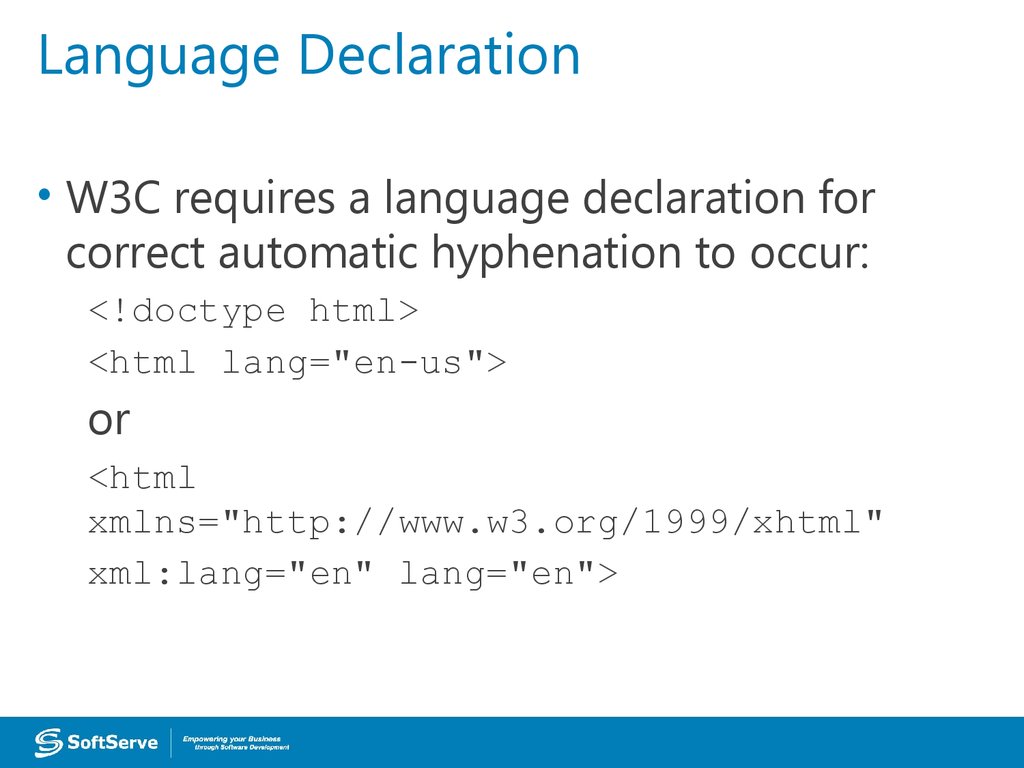
• W3C requires a language declaration forcorrect automatic hyphenation to occur:
<!doctype html>
<html lang="en-us">
or
<html
xmlns="http://www.w3.org/1999/xhtml"
xml:lang="en" lang="en">
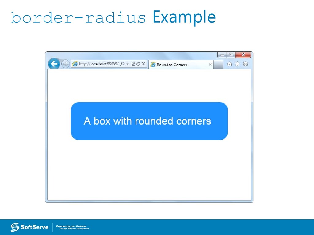
19. border-radius Property
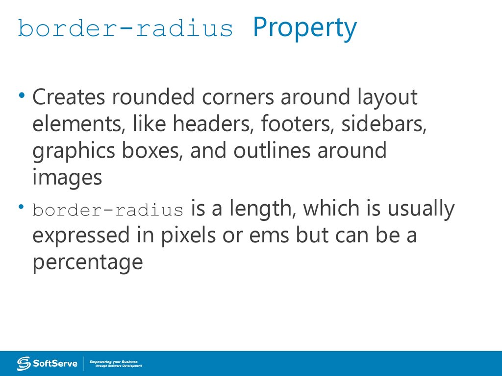
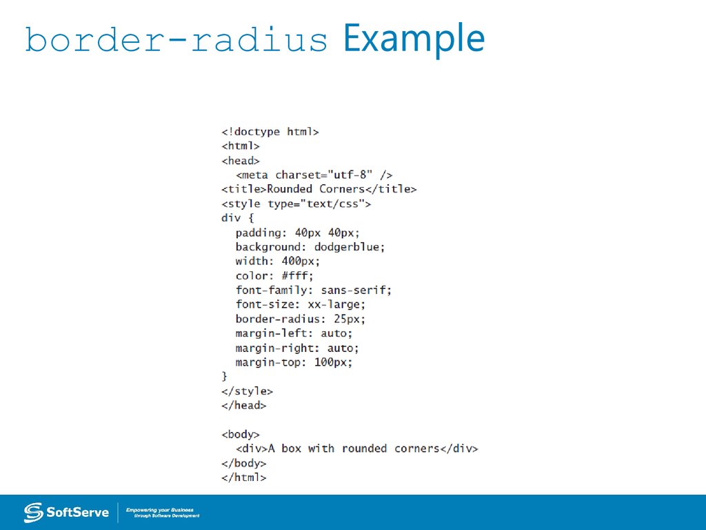
• Creates rounded corners around layoutelements, like headers, footers, sidebars,
graphics boxes, and outlines around
images
• border-radius is a length, which is usually
expressed in pixels or ems but can be a
percentage
20. border-radius Example
21. border-radius Example
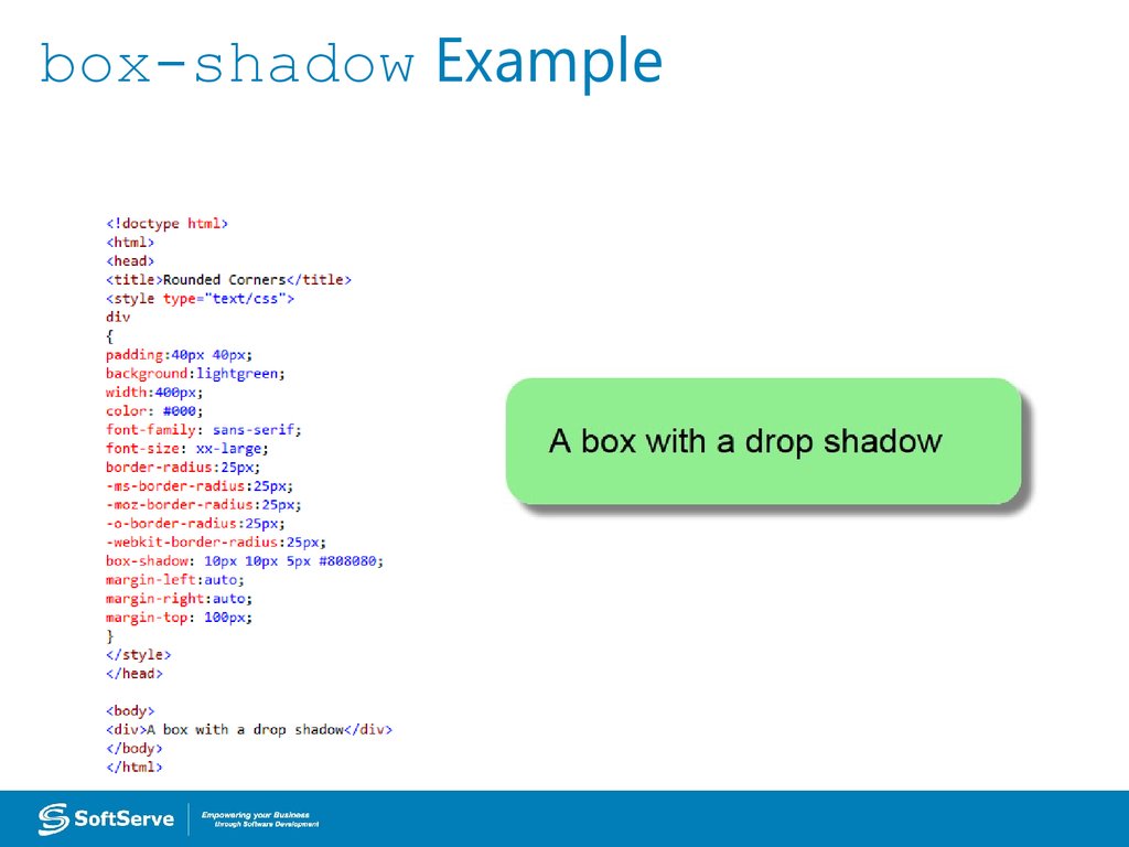
22. box-shadow Property
• Creates drop shadows around layoutelements
• CSS syntax for creating a shadow:
box-shadow: h-shadow v-shadow blur
spread color inset;
• Required: h-shadow and v-shadow attributes
set the horizontal and vertical position of
the shadow in relation to the box
• Optional: blur, spread, color, and inset
23. box-shadow Example
24. Opacity and Transparency
• An opaque item does not let light passthrough, whereas you can see through a
transparent item.
• Syntax for applying a transparency to an
image or other element:
opacity: value
• Value is a floating-point value between 0.0
(100% transparent) and 1.0 (100% opaque)
25. Transparency Example
OriginalPhoto: © AVTG/iStockphoto
With transparency
26. CSS Gradients
• Gradient is a smooth change of colors,within the same hue or starting with one
color and ending with a different color
• Used for subtle shading within
backgrounds, button embellishments, and
more
• Created as methods to the CSS
background property
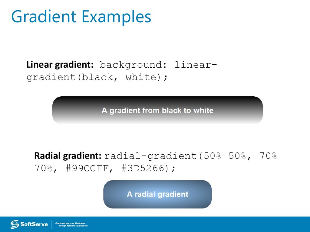
27. Gradient Examples
Linear gradient: background: lineargradient(black, white);Radial gradient: radial-gradient(50% 50%, 70%
70%, #99CCFF, #3D5266);
28. 2D and 3D Transformations
• A transform is an effect that lets you changethe size, shape, and position of an element.
• Transformations use the transform property.
Methods: matrix, perspective, rotate,
scale, skew, translate
• To see the “action” of a transformation requires
JavaScript; using only CSS shows the before and
after effects of properties and their values.
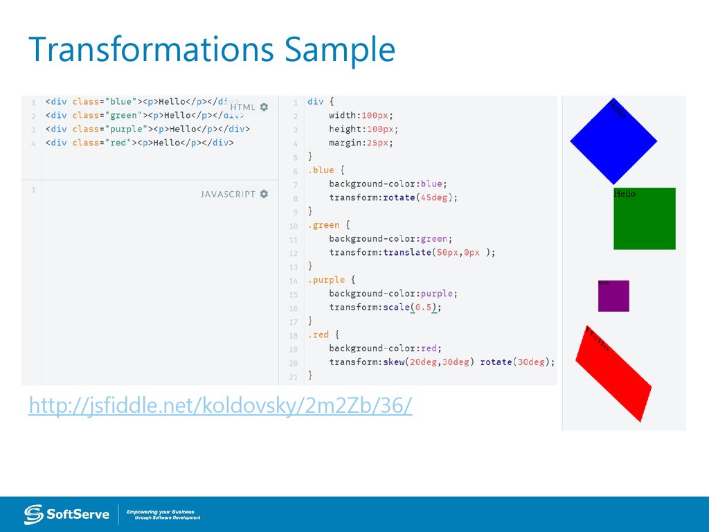
29. Transformations Sample
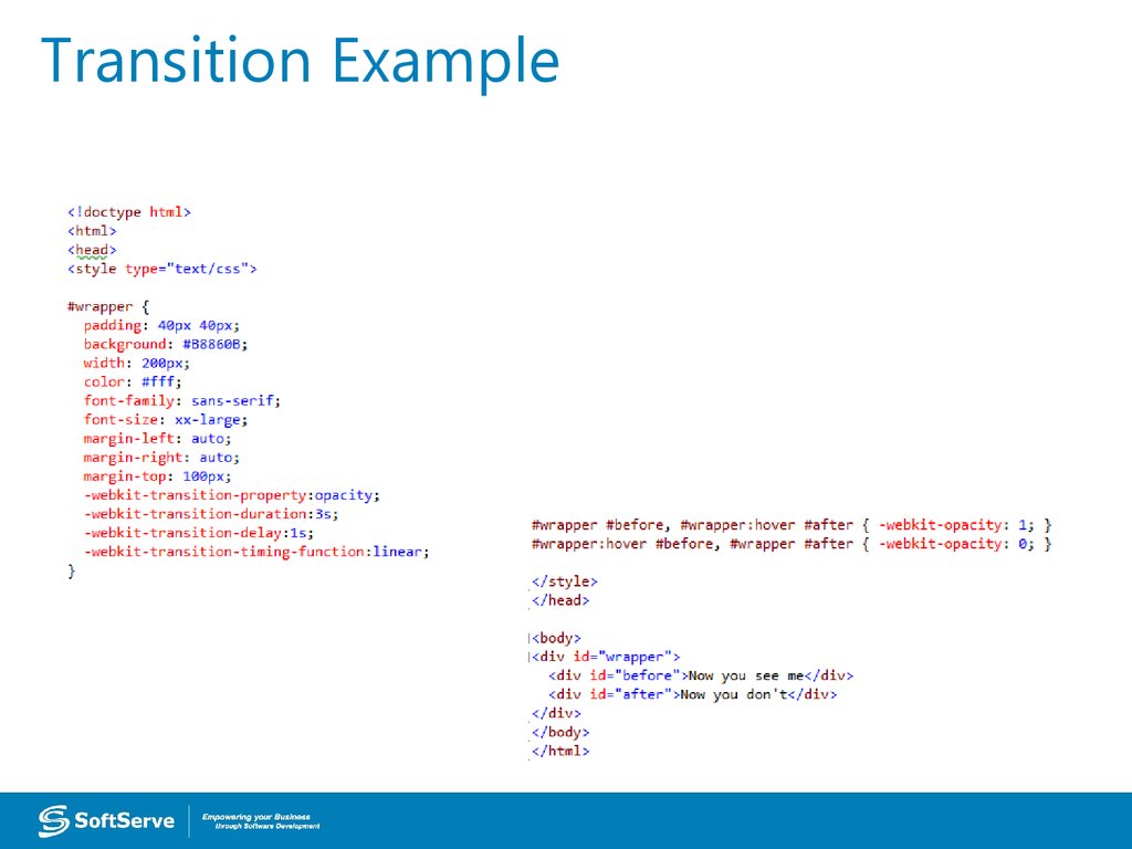
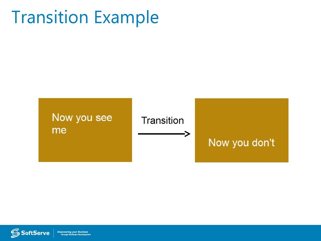
http://jsfiddle.net/koldovsky/2m2Zb/36/30. CSS Transition
• A transition is a change from one thing toanother; in CSS, a transition is the change
in an element from one style to another.
• In CSS3, the action of a transition renders
onscreen—no JavaScript is needed!
• The transition property requires the CSS
property to be acted upon during the
transition.
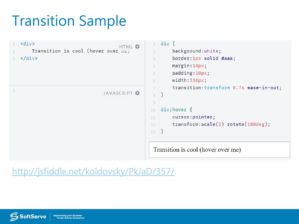
31. Transition Sample
http://jsfiddle.net/koldovsky/PkJaD/357/32. CSS Animation
CSS animations animates transitions between CSS styles to another.Consist of two components: a style describing the CSS animation and a set of keyframes that
indicate the start and end states of the animation's style, as well as possible waypoints.
There are three key advantages to CSS animations over traditional script-driven animation:
Easy to use for simple animations.
The animations run well, even under moderate system load. The rendering engine can use
frame-skipping and other techniques to keep the performance as smooth as possible.
Letting the browser control the animation sequence lets the browser optimize
performance and efficiency by, for example, reducing the update frequency of animations
running in tabs that aren't currently visible.
Some cool samples:
http://webdesign.tutsplus.com/articles/15-inspiring-examples-of-css-animation-on-codepen-cms-23937
Details: https://css-tricks.com/almanac/properties/a/animation/
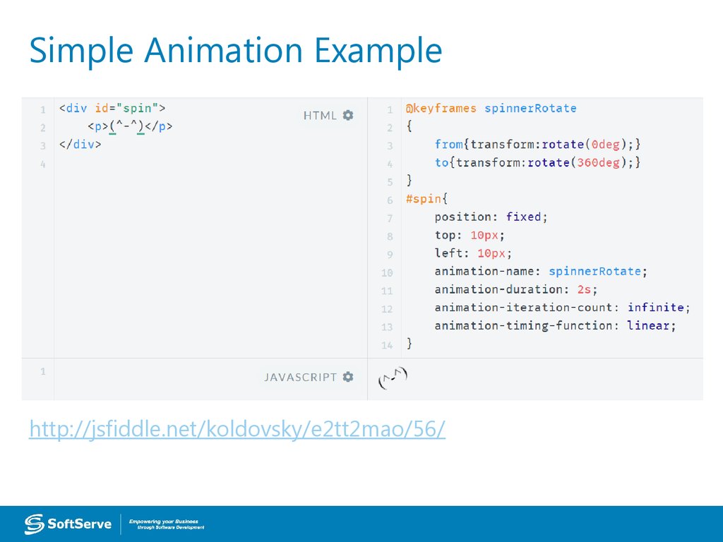
33. Simple Animation Example
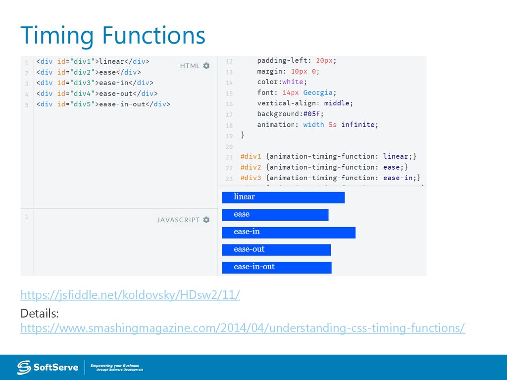
http://jsfiddle.net/koldovsky/e2tt2mao/56/34. Timing Functions
https://jsfiddle.net/koldovsky/HDsw2/11/Details:
https://www.smashingmagazine.com/2014/04/understanding-css-timing-functions/
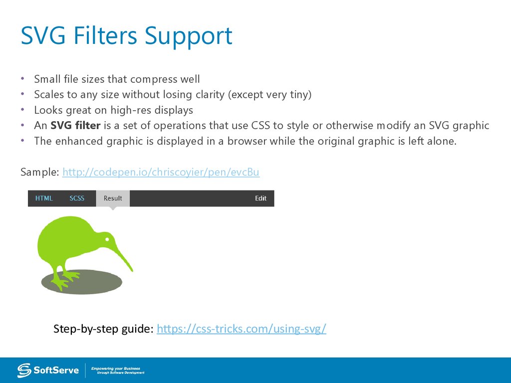
35. SVG Filters Support
Small file sizes that compress well
Scales to any size without losing clarity (except very tiny)
Looks great on high-res displays
An SVG filter is a set of operations that use CSS to style or otherwise modify an SVG graphic
The enhanced graphic is displayed in a browser while the original graphic is left alone.
Sample: http://codepen.io/chriscoyier/pen/evcBu
Step-by-step guide: https://css-tricks.com/using-svg/
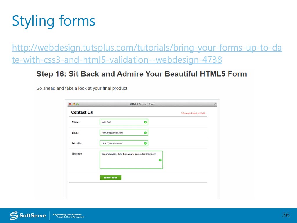
36. Styling forms
http://webdesign.tutsplus.com/tutorials/bring-your-forms-up-to-date-with-css3-and-html5-validation--webdesign-4738
36
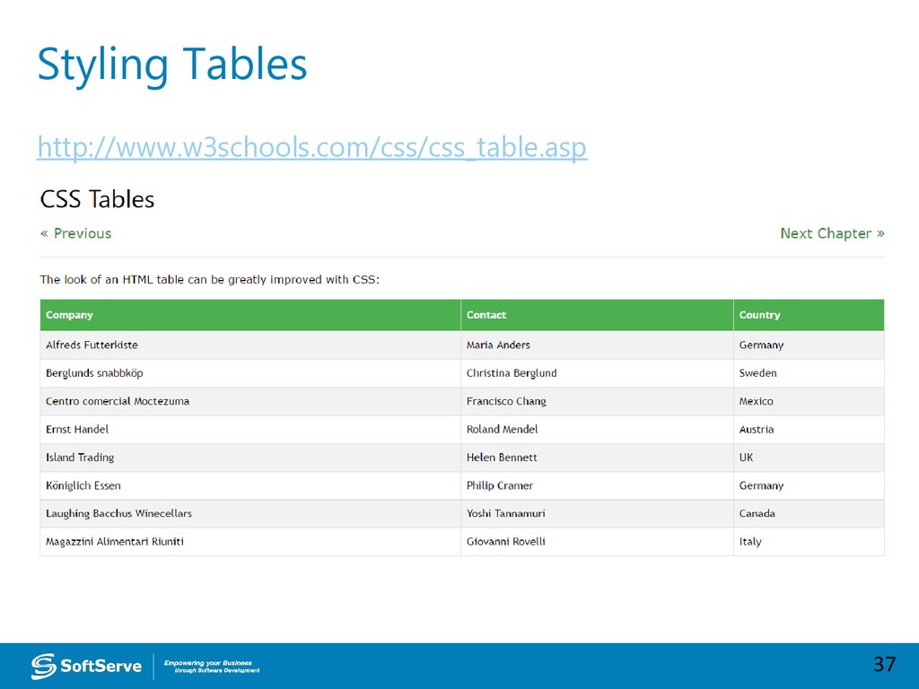
37. Styling Tables
http://www.w3schools.com/css/css_table.asp37
38. Practice Task
39. Advanced Topics
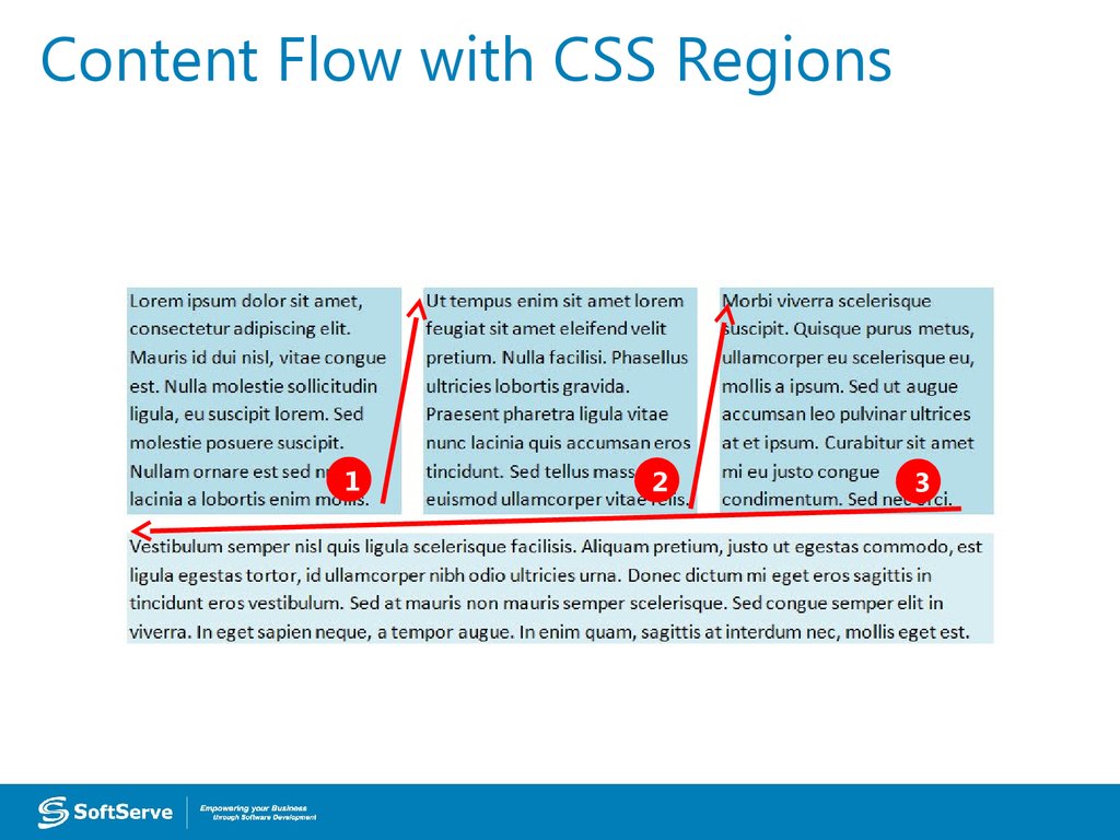
40. CSS Regions
• Feature allows developers to dynamicallyflow content across multiple boxes, or
containers, in HTML documents with fluid
layouts
• Content adjusts and displays properly
whether viewed on large or small
41. Content Flow with CSS Regions
12
3
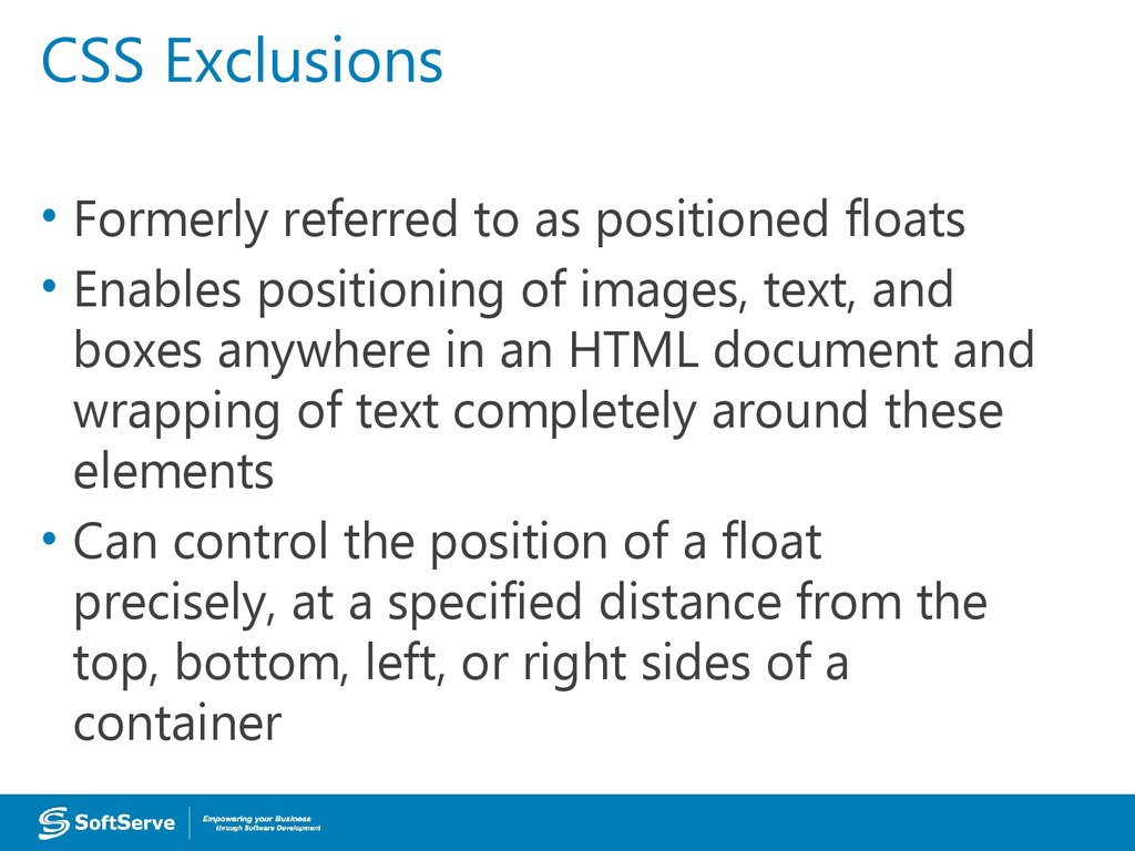
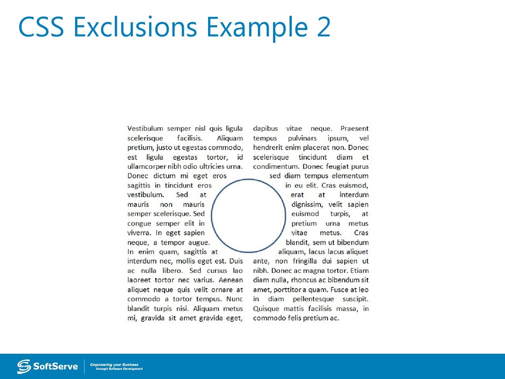
42. CSS Exclusions
• Formerly referred to as positioned floats• Enables positioning of images, text, and
boxes anywhere in an HTML document and
wrapping of text completely around these
elements
• Can control the position of a float
precisely, at a specified distance from the
top, bottom, left, or right sides of a
container
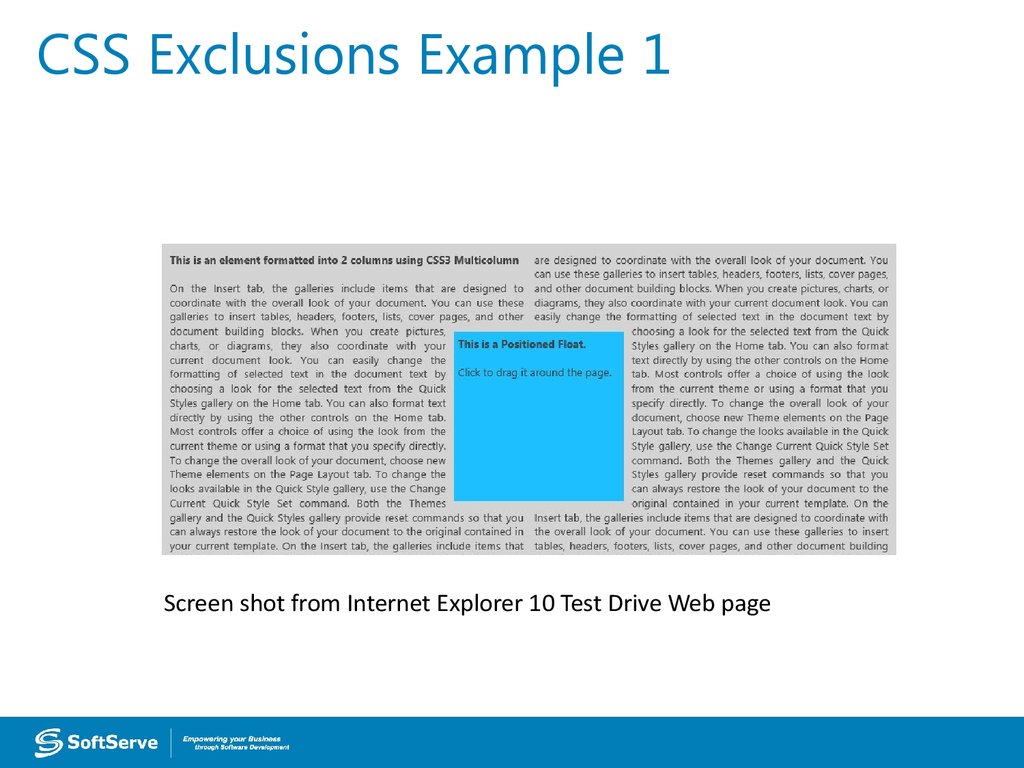
43. CSS Exclusions Example 1
Screen shot from Internet Explorer 10 Test Drive Web page44. CSS Exclusions Properties
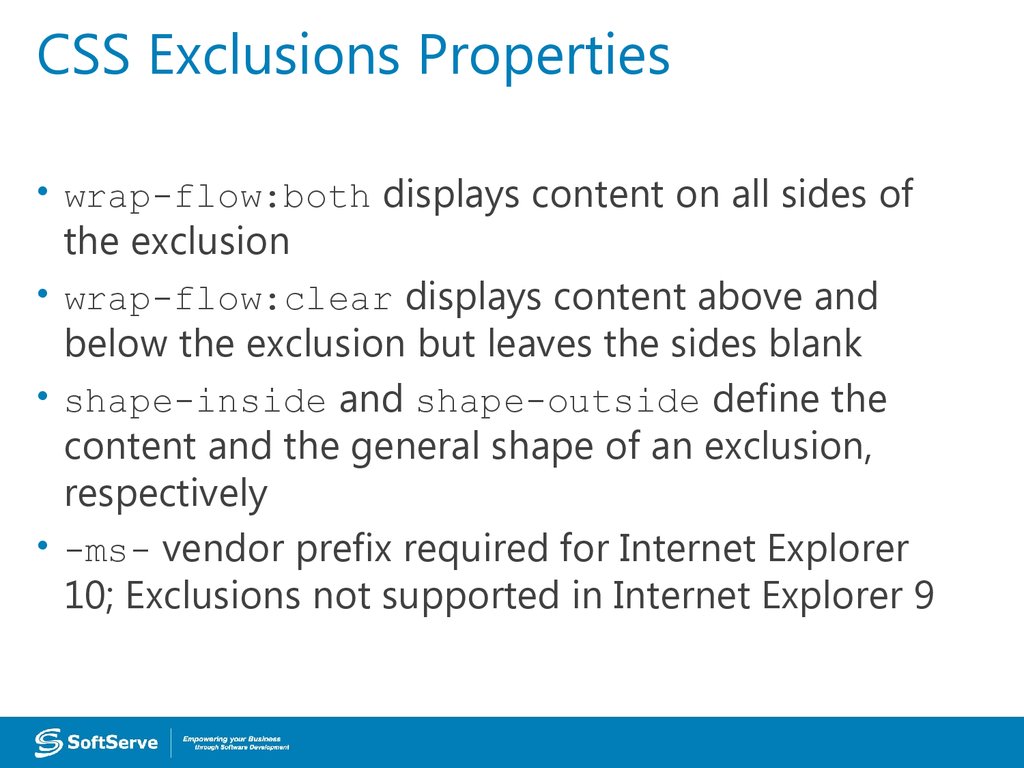
• wrap-flow:both displays content on all sides ofthe exclusion
• wrap-flow:clear displays content above and
below the exclusion but leaves the sides blank
• shape-inside and shape-outside define the
content and the general shape of an exclusion,
respectively
• -ms- vendor prefix required for Internet Explorer
10; Exclusions not supported in Internet Explorer 9
45. CSS Exclusions Example 2
46. CSS Exclusions Step-by-step
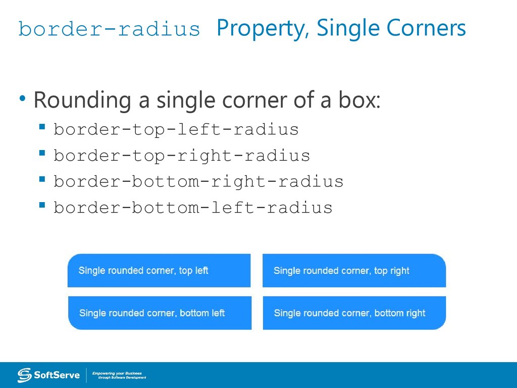
47. border-radius Property, Single Corners
• Rounding a single corner of a box:border-top-left-radius
border-top-right-radius
border-bottom-right-radius
border-bottom-left-radius
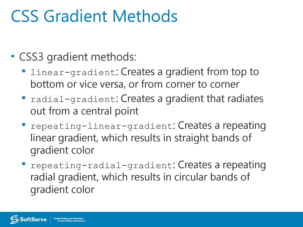
48. CSS Gradient Methods
• CSS3 gradient methods:linear-gradient: Creates a gradient from top to
bottom or vice versa, or from corner to corner
radial-gradient: Creates a gradient that radiates
out from a central point
repeating-linear-gradient: Creates a repeating
linear gradient, which results in straight bands of
gradient color
repeating-radial-gradient: Creates a repeating
radial gradient, which results in circular bands of
gradient color
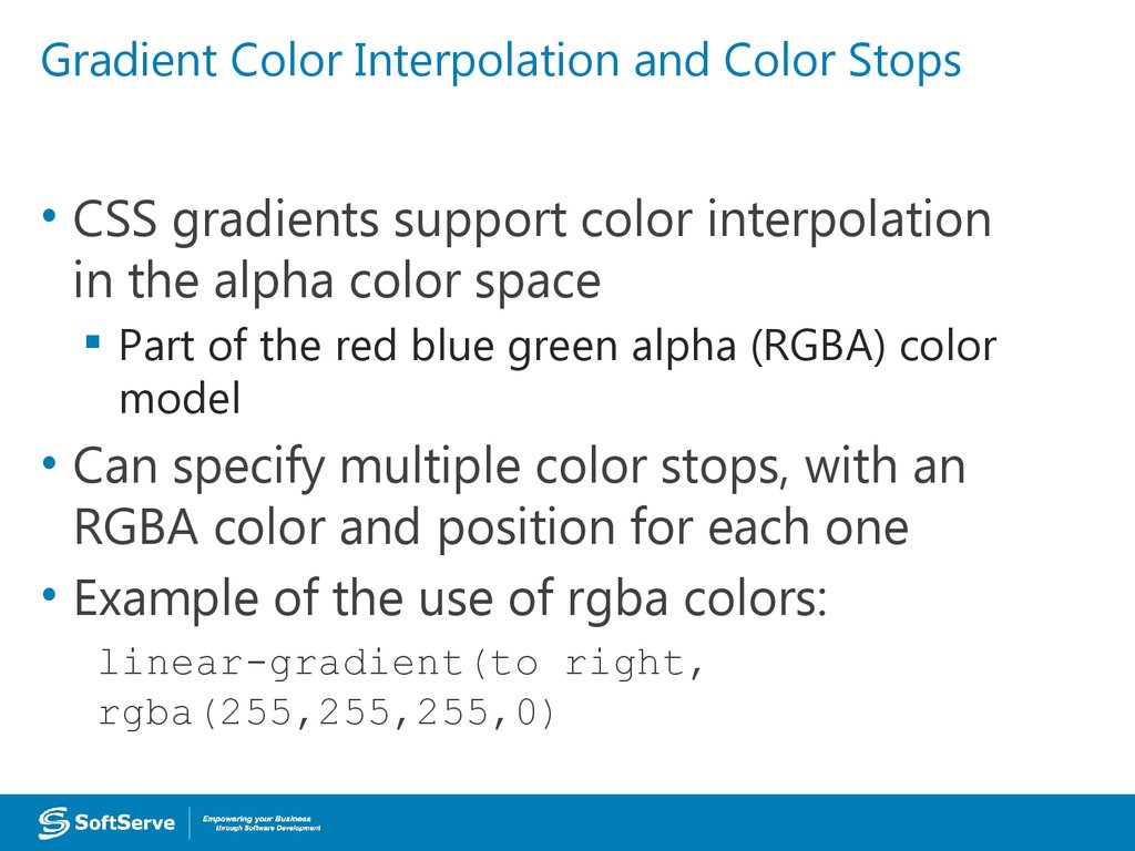
49. Gradient Color Interpolation and Color Stops
• CSS gradients support color interpolationin the alpha color space
Part of the red blue green alpha (RGBA) color
model
• Can specify multiple color stops, with an
RGBA color and position for each one
• Example of the use of rgba colors:
linear-gradient(to right,
rgba(255,255,255,0)
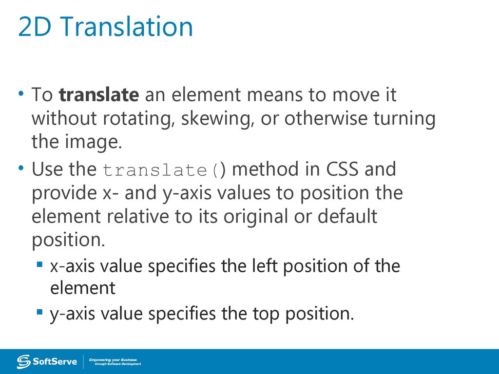
50. 2D Translation
• To translate an element means to move itwithout rotating, skewing, or otherwise turning
the image.
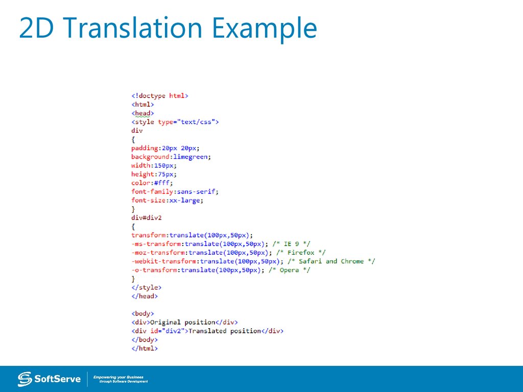
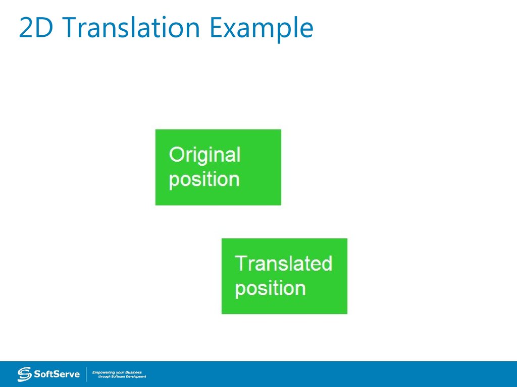
• Use the translate() method in CSS and
provide x- and y-axis values to position the
element relative to its original or default
position.
x-axis value specifies the left position of the
element
y-axis value specifies the top position.
51. 2D Translation Example
52. 2D Translation Example
53. 2D Scaling
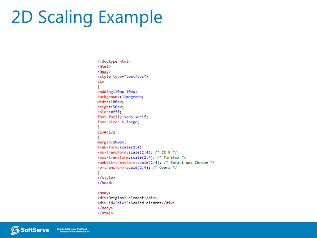
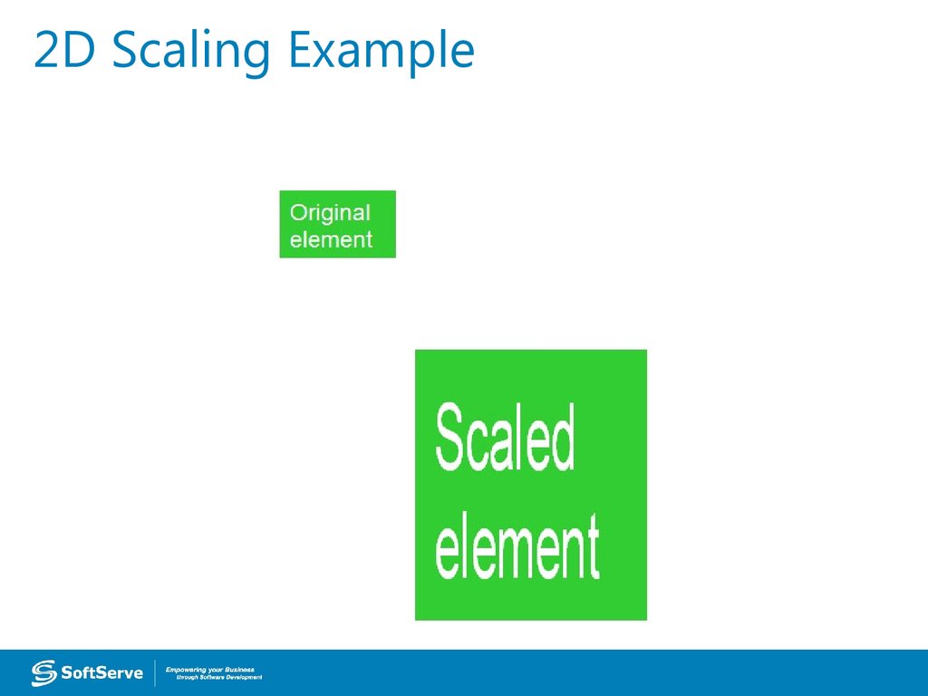
• To scale an element is to increase ordecrease its size.
• Use the scale() method in CSS and provide
x-axis (width) and y-axis (height) values.
• The example on the following two slides
increases the width of the element two times
its original size, and increases the height four
times its original size:
transform: scale(2,4);
54. 2D Scaling Example
55. 2D Scaling Example
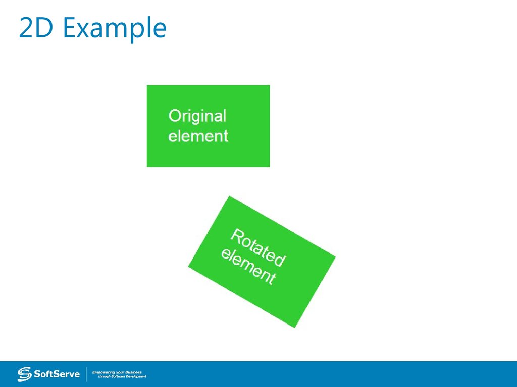
56. 2D Rotation
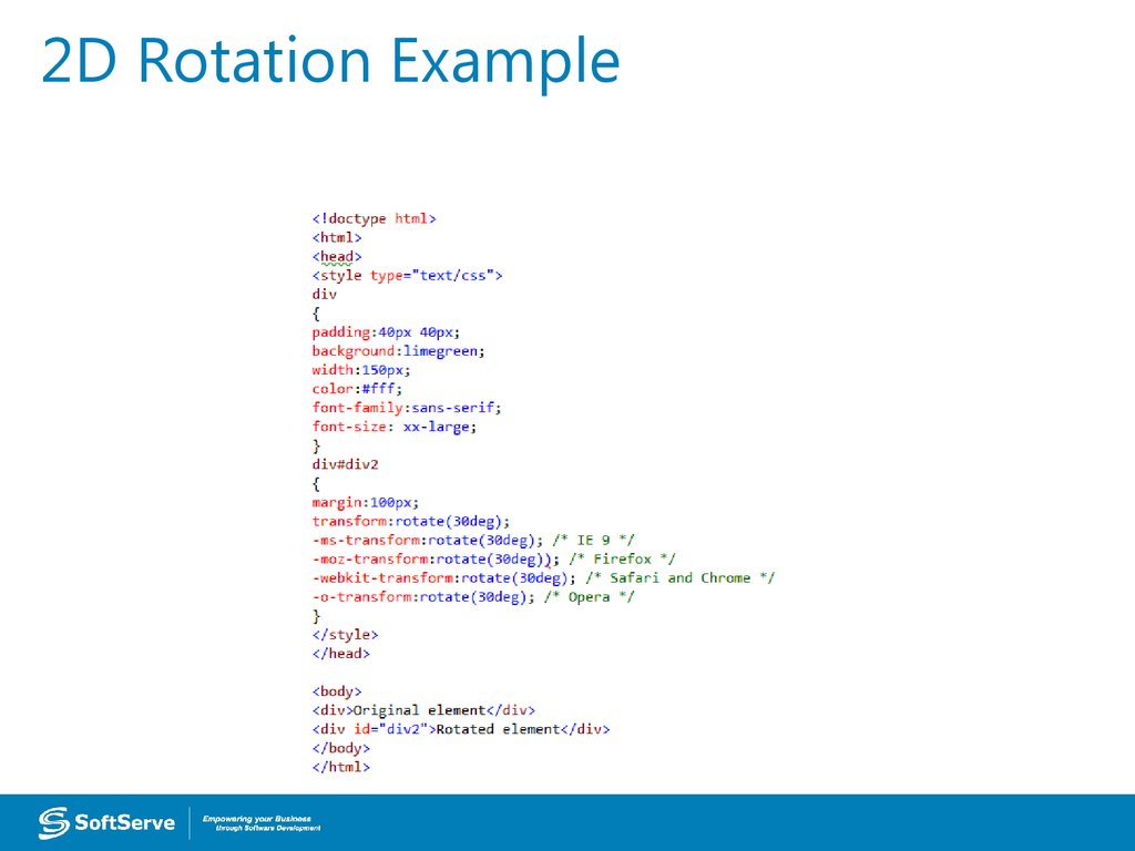
• To rotate an element turns it clockwise bya specified number of degrees.
• Use the rotate() method in CSS and
specify the degrees of rotation.
• The example on the following two slides
rotates an element by 30 degrees in the 2D
plane:
transform: rotate(30deg);
57. 2D Rotation Example
58. 2D Example
59. 3D Rotation
• 3D rotation uses the rotateX() androtateY() methods.
rotateX(): Element rotates around its x-axis
rotateY(): Element rotates around its y- axis
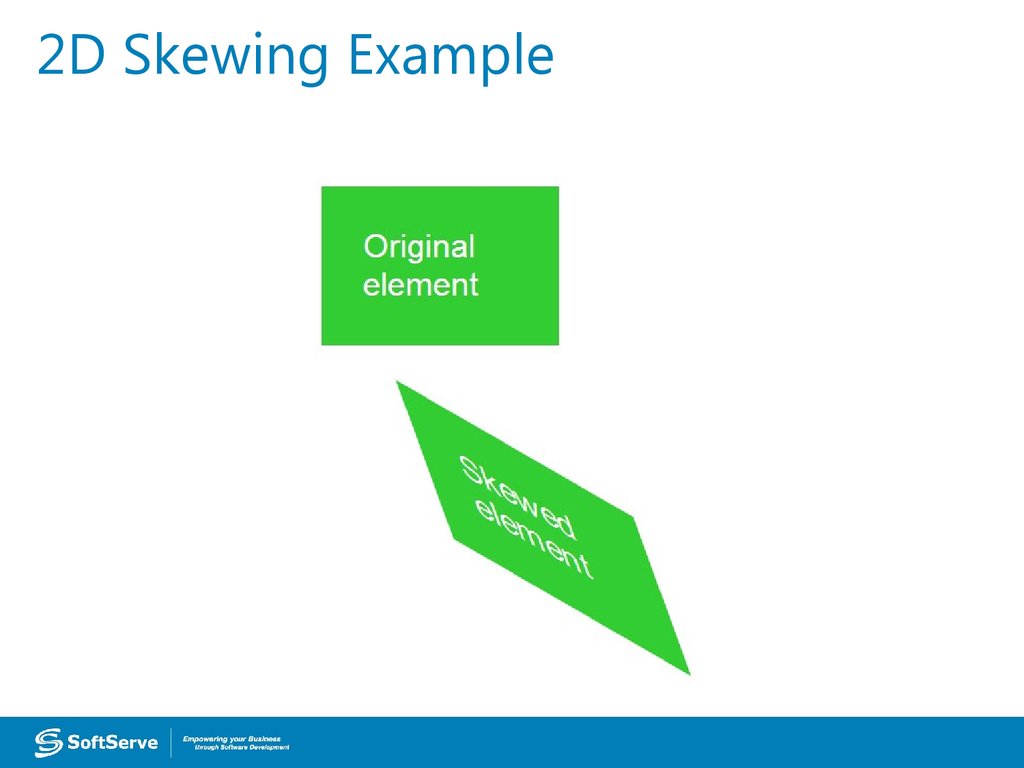
60. 2D Skewing
• To skew an element is to stretch it in one ormore directions.
• Use the skew() method and provide x-axis
and y-axis values, in degrees, to create an
angular shape.
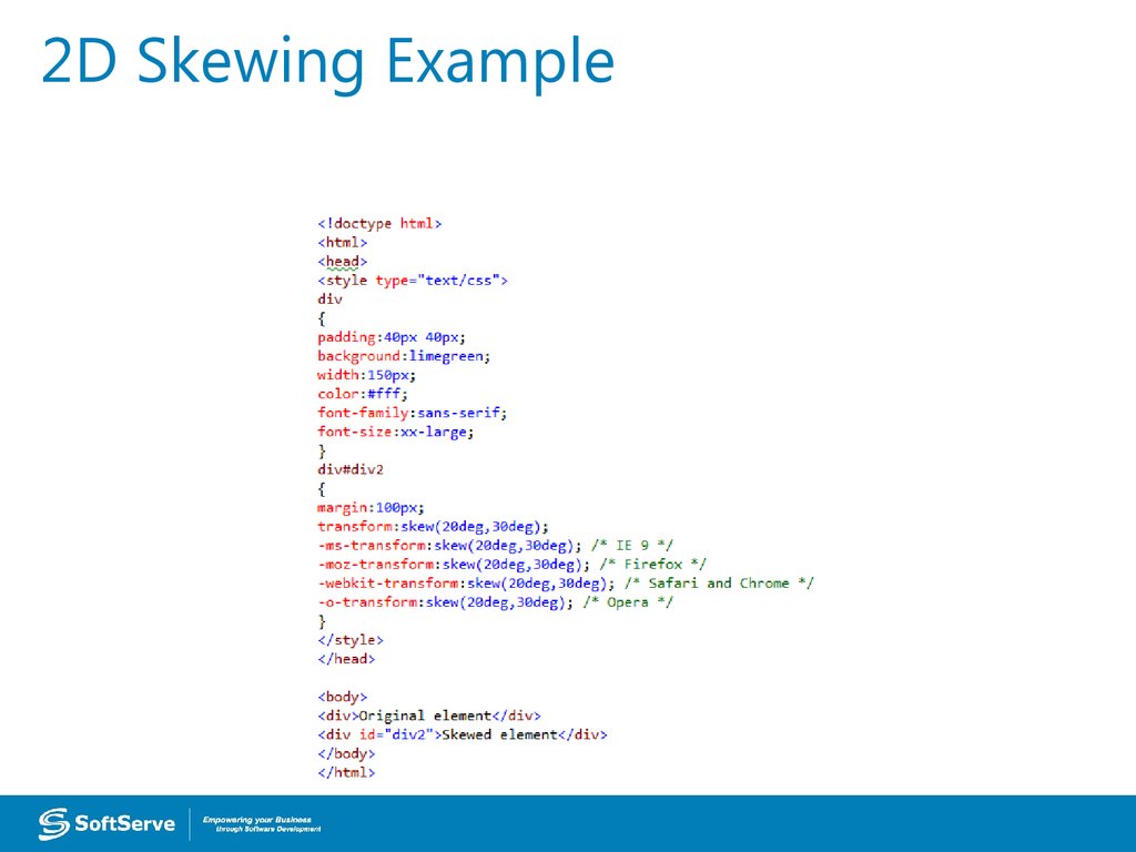
• The example on the following two slides
turns an element 20 degrees around the xaxis and 30 degrees around the y-axis:
transform: skew(20deg,30deg);
61. 2D Skewing Example
62. 2D Skewing Example
63. 3D Skewing
• 3D skewing uses the skewX() and skewY()methods to skew an element around its xaxis and y-axis, respectively.
• As an example, the following code skews
an element 45 degrees:
transform: skewX(45deg);
64. 3D Perspective
• The CSS3 3D perspective propertydefines how a browser renders the depth
of a 3D transformed element.
• The property takes on a number value:
lower values (in the range of 1 to 1000)
create a more pronounced effect than
higher values.
65. Transition Example
66. Transition Example
Transition67. Animation (Continued)
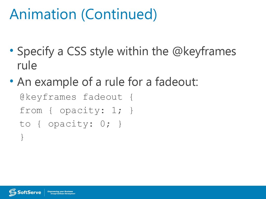
• Specify a CSS style within the @keyframesrule
• An example of a rule for a fadeout:
@keyframes fadeout {
from { opacity: 1; }
to { opacity: 0; }
}
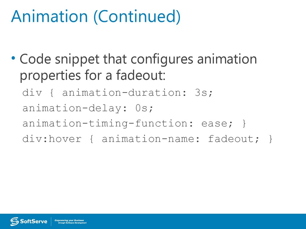
68. Animation (Continued)
• Code snippet that configures animationproperties for a fadeout:
div { animation-duration: 3s;
animation-delay: 0s;
animation-timing-function: ease; }
div:hover { animation-name: fadeout; }
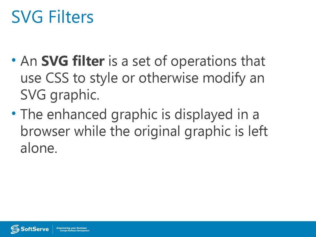
69. SVG Filters
• An SVG filter is a set of operations thatuse CSS to style or otherwise modify an
SVG graphic.
• The enhanced graphic is displayed in a
browser while the original graphic is left
alone.
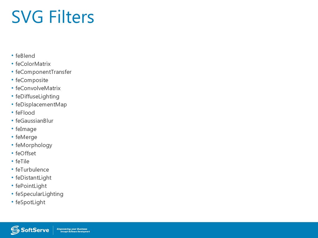
70. SVG Filters
feBlend
feColorMatrix
feComponentTransfer
feComposite
feConvolveMatrix
feDiffuseLighting
feDisplacementMap
feFlood
feGaussianBlur
feImage
feMerge
feMorphology
feOffset
feTile
feTurbulence
feDistantLight
fePointLight
feSpecularLighting
feSpotLight
71. SVG Filters Gaussian Blur Example
72. SVG Filters Offset Example
73. Canvas
• Use canvas to draw pixel-based shapes.• The canvas element accepts only two
attributes—height and width.
• You can use most CSS properties to style
the canvas element, adding color,
gradients, pattern fills, transformation,
animation, and much more.
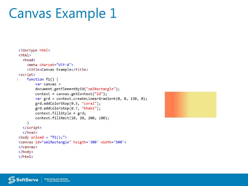
74. Canvas Example 1
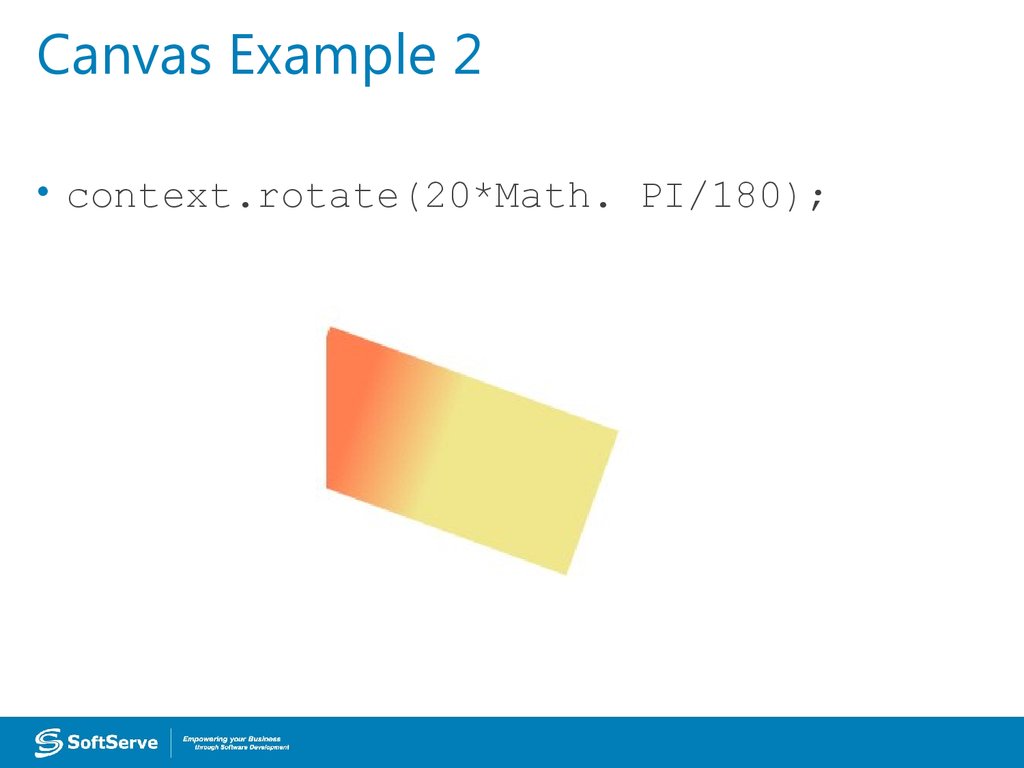
75. Canvas Example 2
• context.rotate(20*Math. PI/180);76. Canvas Example 3
77. Contacts
Europe HeadquartersUS Headquarters
52 V. Velykoho Str.
Lviv 79053, Ukraine
12800 University Drive, Suite 250
Fort Myers, FL 33907, USA
Tel: +380-32-240-9090
Fax: +380-32-240-9080
Tel: 239-690-3111
Fax: 239-690-3116
E-mail: info@softserveinc.com
Website: www.softserveinc.com
Thank You!
Copyright © 2010 SoftServe, Inc.













 Интернет
 Программирование


