Похожие презентации:
Presentation and protection of the main results of design activity in the specialty
1.
SC «Medical university Astana»Department of biostatistics, bioinformatics and information
technologies
IWS
Theme:Presentation and protection of the main
results of design activity in the specialty.
Prepared by:Balnur
Zhaksybek.
Group: 148
Speciality:GM
2. Содержание
1….3The 4 Basic Principles of Presentation Design4….. How to make a presentation?
5….. Project presentation plan
6….. Presentation design
7…. Presentation Background Color
8…. Making the title (first) slide
3.
The 4 Basic Principles of PresentationDesign
4.
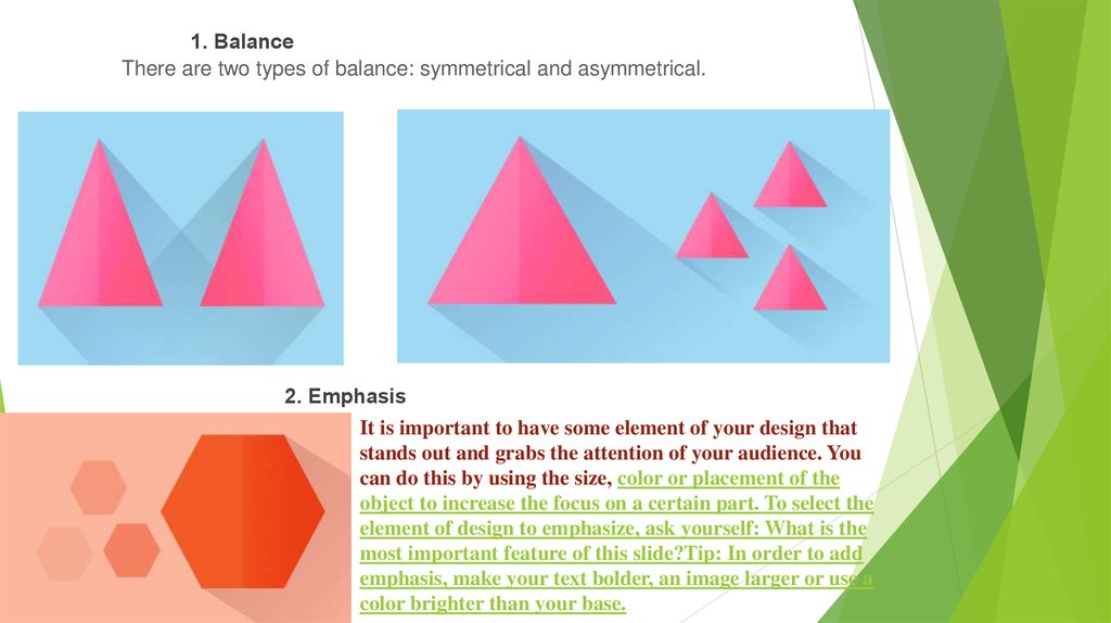
1. BalanceThere are two types of balance: symmetrical and asymmetrical.
2. Emphasis
It is important to have some element of your design that
stands out and grabs the attention of your audience. You
can do this by using the size, color or placement of the
object to increase the focus on a certain part. To select the
element of design to emphasize, ask yourself: What is the
most important feature of this slide?Tip: In order to add
emphasis, make your text bolder, an image larger or use a
color brighter than your base.
5.
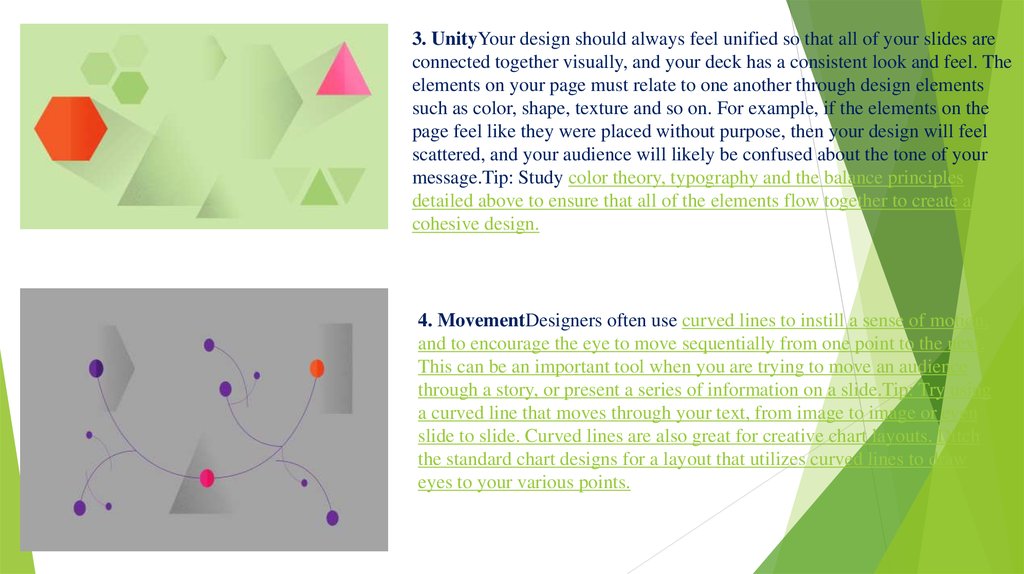
3. UnityYour design should always feel unified so that all of your slides areconnected together visually, and your deck has a consistent look and feel. The
elements on your page must relate to one another through design elements
such as color, shape, texture and so on. For example, if the elements on the
page feel like they were placed without purpose, then your design will feel
scattered, and your audience will likely be confused about the tone of your
message.Tip: Study color theory, typography and the balance principles
detailed above to ensure that all of the elements flow together to create a
cohesive design.
4. MovementDesigners often use curved lines to instill a sense of motion,
and to encourage the eye to move sequentially from one point to the next.
This can be an important tool when you are trying to move an audience
through a story, or present a series of information on a slide.Tip: Try using
a curved line that moves through your text, from image to image or even
slide to slide. Curved lines are also great for creative chart layouts. Ditch
the standard chart designs for a layout that utilizes curved lines to draw
eyes to your various points.
6.
How to make apresentation?
No matter what the purpose of your
presentation is, it can be:
Protection of abstract, term paper or thesis;
Report on events or achievements;
Product OverviewAdvertising company.For
any task, the basic principles of proper
presentation design are always the same!
7.
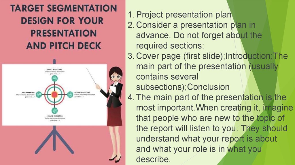
1. Project presentation plan2. Consider a presentation plan in
advance. Do not forget about the
required sections:
3. Cover page (first slide);Introduction;The
main part of the presentation (usually
contains several
subsections);Conclusion
4. The main part of the presentation is the
most important.When creating it, imagine
that people who are new to the topic of
the report will listen to you. They should
understand what your report is about
and what your role is in what you
describe.
8.
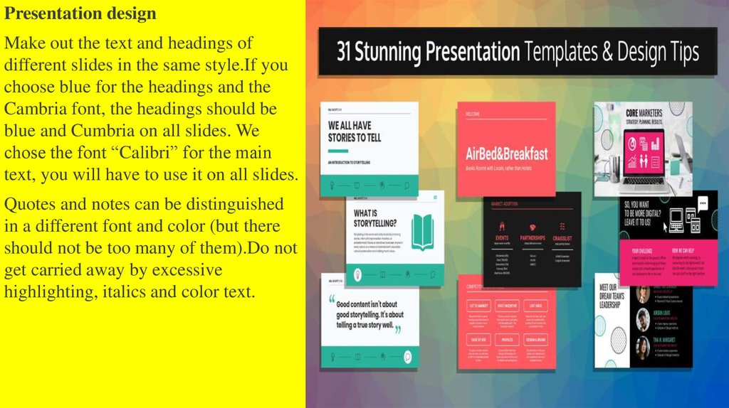
Presentation designMake out the text and headings of
different slides in the same style.If you
choose blue for the headings and the
Cambria font, the headings should be
blue and Cumbria on all slides. We
chose the font “Calibri” for the main
text, you will have to use it on all slides.
Quotes and notes can be distinguished
in a different font and color (but there
should not be too many of them).Do not
get carried away by excessive
highlighting, italics and color text.
9.
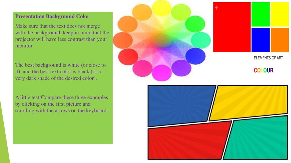
Presentation Background ColorMake sure that the text does not merge
with the background, keep in mind that the
projector will have less contrast than your
monitor.
The best background is white (or close to
it), and the best text color is black (or a
very dark shade of the desired color).
A little test!Compare these three examples
by clicking on the first picture and
scrolling with the arrows on the keyboard:
10.
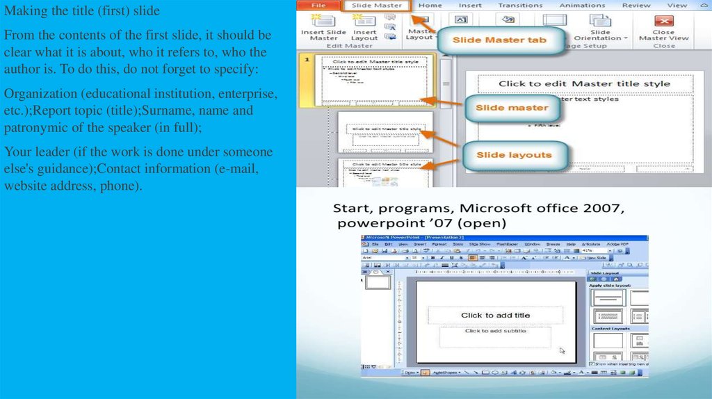
Making the title (first) slideFrom the contents of the first slide, it should be
clear what it is about, who it refers to, who the
author is. To do this, do not forget to specify:
Organization (educational institution, enterprise,
etc.);Report topic (title);Surname, name and
patronymic of the speaker (in full);
Your leader (if the work is done under someone
else's guidance);Contact information (e-mail,
website address, phone).



 Информатика
 Английский язык


