


")
")
")
")

")
")
")


")


 Программирование
Похожие презентации:


")


CSS-recipies
1. CSS-recipes
presented by AlexPolybinsky & Sergey Zdobnov
february, 2017
CSS-recipes
key strategic tips
2. Basic notions
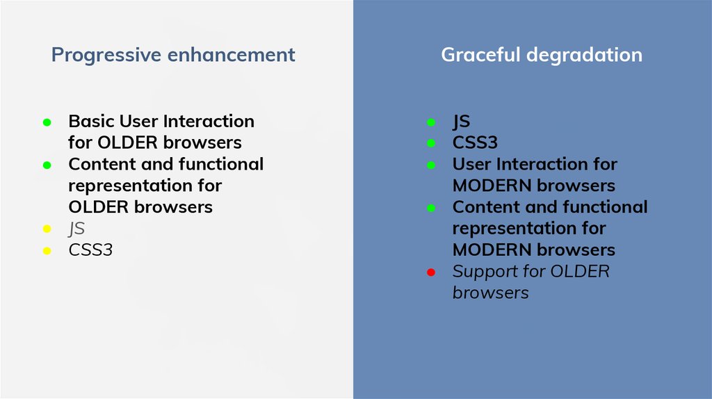
main approaches of web-development3.
Progressive enhancement● Basic User Interaction
for OLDER browsers
● Content and functional
representation for
OLDER browsers
● JS
● CSS3
Graceful degradation
● JS
● CSS3
● User Interaction for
MODERN browsers
● Content and functional
representation for
MODERN browsers
● Support for OLDER
browsers
4.
Mobile First● UI focusing on the most
important aspects
● Simplicity and clarity of
interface
● JS
● Support for OLDER
browsers
Desktop First
● Applicable for big portals
with hundreds of items
● Support for OLDER
browsers
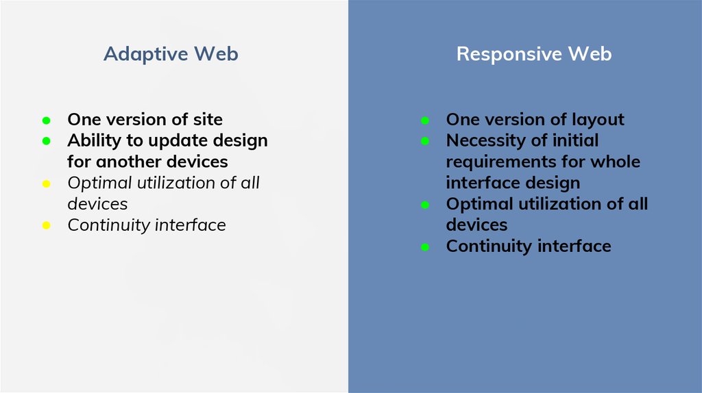
5.
Adaptive Web● One version of site
● Ability to update design
for another devices
● Optimal utilization of all
devices
● Continuity interface
Responsive Web
● One version of layout
● Necessity of initial
requirements for whole
interface design
● Optimal utilization of all
devices
● Continuity interface
6. Alignment
vertical and horizontal positioning7. Vertical Alignment
vertical-align and display: inline-blockNew innovative processes
created over industry best
practices.
alignment on baseline
Global solutions for the new
interconnected world.
8. Vertical Alignment
baseline and x-height9. Vertical Alignment
vertical-align and display: table-cellNew innovative processes
created over industry best
practices.
alignment on container
Global solutions for the new
interconnected world.
10. Useful links
★ https://developer.mozilla.org/en/docs/Web/CSS/vertical-align★ http://css-tricks.com/what-is-vertical-align/
★ http://stackoverflow.com/questions/19366401/my-inline-blockelements-are-not-lining-up-properly
★ https://web-standards.ru/articles/vertical-align/
11. Horizontal Alignment
text-align:center for inline or inline-blockGlobal solutions for the new
interconnected world.
alignment on container
12. Horizontal Alignment
margin: 0 auto; and display: block;13. Middle of Screen (1st way)
strict size, element’s position (absolute)left (50%), top (50%), margin (size/2)
14. Middle of Screen (2nd way)
strict size, parent’s position (relative), element’s position (absolute)left (0), top (0), bottom (0), right (0), margin (auto)
15. Middle of Screen (3rd way)
non-strict size, parent’s position (relative), element’s display (inline-block)::before contains width (1%), height (100%), vertical-align (middle)
::before
16. Middle of Screen (4th way)
non-strict size, parent’s position (relative), element’s position (absolute)left (50%), top (50%), transform: translate(-50%, -50%);
17. Useful links
★ https://www.w3.org/Style/Examples/007/center.en.html★ https://css-tricks.com/centering-css-complete-guide/
★ https://www.smashingmagazine.com/2013/08/absolute-horizontalvertical-centering-css/
18. Footer to bottom (1st way)
html { height: 100%; }body
body { min-height: 100%; position: relative; }
container { padding-bottom:70px; }
footer { position: absolute; height: 70px; left:0;
bottom:0;}
container
footer
19. Footer to bottom (2nd way)
html { height: 100%; } body { height: 100%; }wrapper
wrapper { height: 100%; }
container { min-height: 100%; boxsizing: border-box; padding-bottom:
70px; }
footer { box-sizing: border-box; height: 70px;
margin-top: -70px; }
container
footer
20. Footer to bottom (3rd way)
container { calc(100vh - 70px); boxsizing: border-box; }footer { box-sizing: border-box; height: 70px; }
container
footer
21. Useful links
★ 1st way example★ 2st way example
★ 3st way example
22. Popular recipes
necessary practical approaches23. Text Overflow
overflow (hidden), text-overflow (ellipsis), white-space (nowrap)block
Lorem ipsum dolor sit amet, consectetur adipiscing elit. Sed vitae massa sed arcu...
+ table-layout (fixed) for <table>
td
Lorem ipsum dolor sit amet, consectetur adipiscing elit. Sed vitae massa sed arcu...
24. Useful links
★ https://css-tricks.com/snippets/css/truncate-string-with-ellipsis/★ https://software.intel.com/en-us/html5/hub/blogs/ellipse-my-text/
★ http://dev.mobify.com/blog/multiline-ellipsis-in-pure-css/
25. Operations with ::before, ::after
26. Operations with ::before, ::after
<div class="example">Button with Up Arrow</div>.example::before {
content: "";
display: block;
width: 0px;
height: 0px;
border-style: solid;
border-width: 0 100px 100px 100px;
border-color: transparent transparent red transparent;
}
27. Operations with ::before, ::after
<a class="tooltip" title=”This is some information for our tooltip.”><span>CSS3 Tooltip</span>
</a>
.tooltip:hover::before {
triangle styles
}
.tooltip:hover::after {
tooltip’s box styles (background and font)
}
28. Operations with ::before, ::after
.icon::before {circle styles
.icon::after {
line styles
content: "";
position: absolute;
top: 3px;
left: 3px;
width: 6px;
height: 6px;
border: 2px solid #ccc;
border-radius: 14px;
content: "";
position: absolute;
top: 9px;
left: 11px;
width: 3px;
height: 7px;
margin-top: 0;
background: #ccc;
transform: rotate(-45deg);
border-radius: 2px;
}
}
29. Operations with ::before, ::after
.icon::before {line styles
.icon::after {
triangle styles
content: "";
display: block;
height: 10px;
width: 0;
border-left: solid 2px #ccc;
position: absolute;
top: 4px;
left: 4px;
}
content: "";
height: 0;
width: 0;
border-style: solid;
border-width: 5px 9px 5px 0;
border-color: transparent #ccc transparent transparent;
position: absolute;
top: 4px;
left: 8px;
}
30. Useful links
★ https://developer.mozilla.org/en-US/docs/Web/CSS/Pseudo-elements★ https://css-tricks.com/almanac/selectors/a/after-and-before/
★ https://css-tricks.com/pseudo-element-roundup/
★ https://www.amazeelabs.com/en/blog/three-things-you-can-do-withcss-pseudo-elements
★ https://www.smashingmagazine.com/2011/03/styling-elements-withglyphs-sprites-and-pseudo-elements/
★ TOOLTIP
★ ICONS
31. Customization (input + label)
<input id=”inputId” /><label for=”inputId”>Custom style</label>
input {
display: none;
}
input + label {
custom input styles (inactive)
}
input:checked + label {
custom input styles (active)
}
32. Useful links
★ https://css-tricks.com/float-labels-css/★ http://htmlbook.ru/blog/kartinka-vmesto-chekboksa
33. Tables
options of table layout34. Table Layout
table-layout: auto (default)Column 1
This is your text.
Column 2
Column 3
This is yoooooooooooooooooooooooooooour text.
This is your text.
table-layout: auto + width: 100%
Column 1
This is your text.
Column 2
This is yoooooooooooooooooooooooooooour text.
Column 3
This is your text.
35. Table Layout
table-layout: fixedColumn 1
This is your text.
Column 2
Column 3
This is yoooooooooooooooooooooooooooour text.
This is your text.
table-layout: fixed + width: 100%
Column 1
This is your text.
Column 2
This is yooooooooooooooooooooooour text.
Column 3
This is your text.
36. Useful links
★ Scrolling in table★ https://www.w3.org/wiki/CSS/Properties/table-layout
★ https://css-tricks.com/almanac/properties/t/text-overflow/
37. Emails*
Table structure of frame and content items(<table> inside <table>)
Fixed size of main container
Use and support of obsolete properties and
attributes (align, bg-color, width)
Possibility of adaptive layout
38. Useful links
★ Example #1★ Adaptive email-letters
★ https://litmus.com/community/templates