Похожие презентации:
Introduction to Flexbox
1.
Introduction to FlexboxMirzoulugbek Yusupov
2.
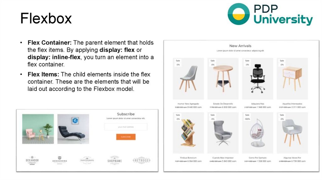
Flexbox• Flex Container: The parent element that holds
the flex items. By applying display: flex or
display: inline-flex, you turn an element into a
flex container.
• Flex Items: The child elements inside the flex
container. These are the elements that will be
laid out according to the Flexbox model.
3.
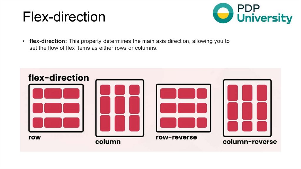
Flex-direction• flex-direction: This property determines the main axis direction, allowing you to
set the flow of flex items as either rows or columns.
4.
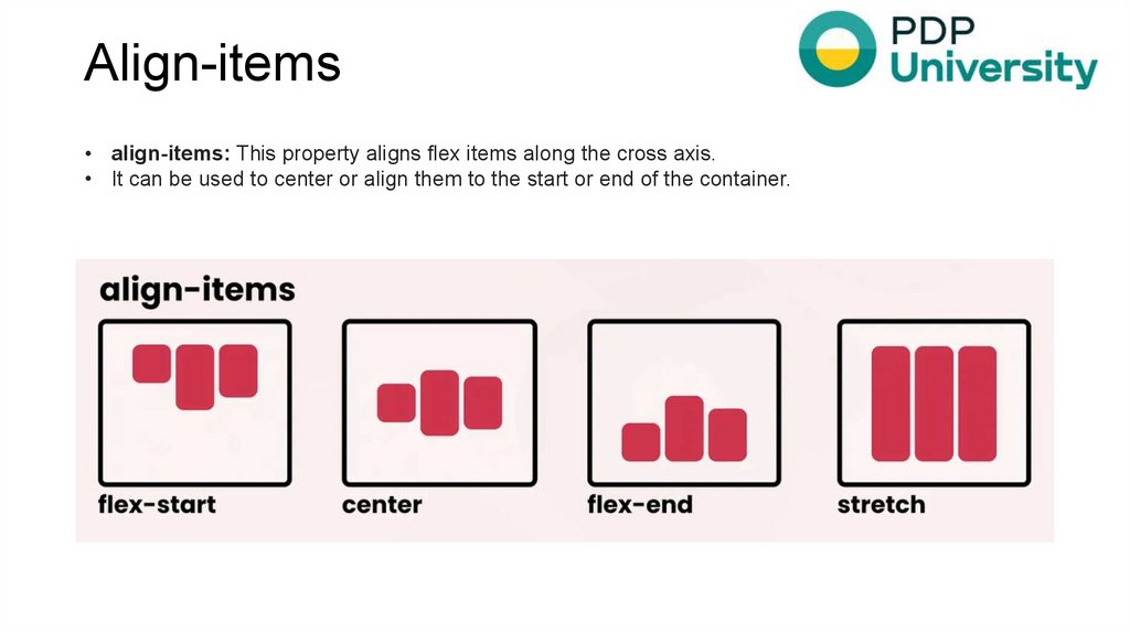
Align-items• align-items: This property aligns flex items along the cross axis.
• It can be used to center or align them to the start or end of the container.
5.
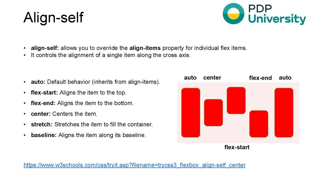
Align-self• align-self: allows you to override the align-items property for individual flex items.
• It controls the alignment of a single item along the cross axis.
• auto: Default behavior (inherits from align-items).
auto
center
flex-end
• flex-start: Aligns the item to the top.
• flex-end: Aligns the item to the bottom.
• center: Centers the item.
• stretch: Stretches the item to fill the container.
• baseline: Aligns the item along its baseline.
flex-start
https://www.w3schools.com/css/tryit.asp?filename=trycss3_flexbox_align-self_center
auto
6.
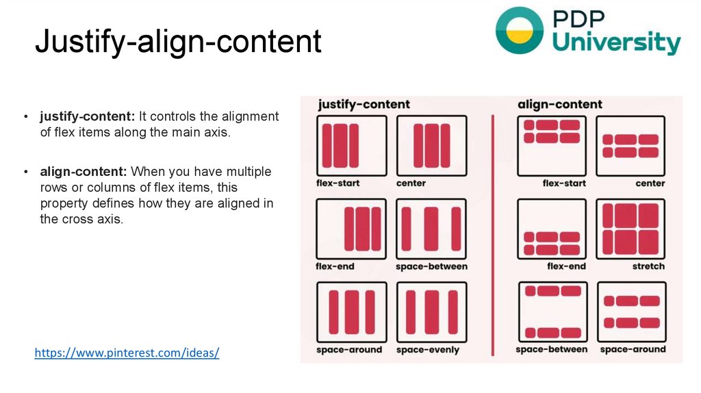
Justify-align-content• justify-content: It controls the alignment
of flex items along the main axis.
• align-content: When you have multiple
rows or columns of flex items, this
property defines how they are aligned in
the cross axis.
https://www.pinterest.com/ideas/
7.
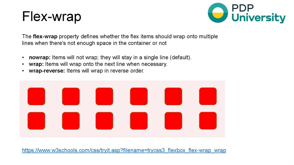
Flex-wrapThe flex-wrap property defines whether the flex items should wrap onto multiple
lines when there's not enough space in the container or not
• nowrap: Items will not wrap; they will stay in a single line (default).
• wrap: Items will wrap onto the next line when necessary.
• wrap-reverse: Items will wrap in reverse order.
https://www.w3schools.com/css/tryit.asp?filename=trycss3_flexbox_flex-wrap_wrap
8.
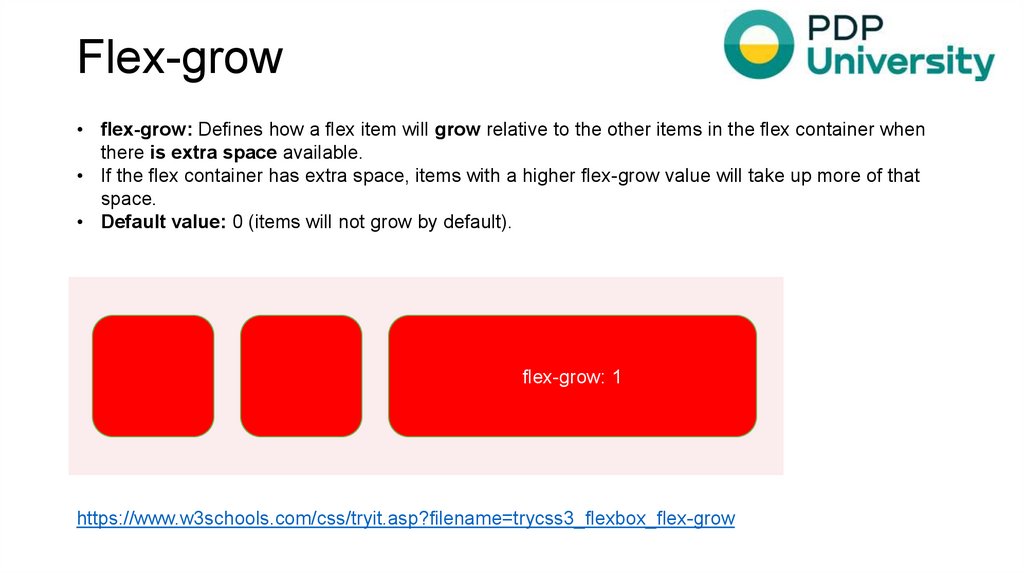
Flex-grow• flex-grow: Defines how a flex item will grow relative to the other items in the flex container when
there is extra space available.
• If the flex container has extra space, items with a higher flex-grow value will take up more of that
space.
• Default value: 0 (items will not grow by default).
flex-grow: 1
https://www.w3schools.com/css/tryit.asp?filename=trycss3_flexbox_flex-grow
9.
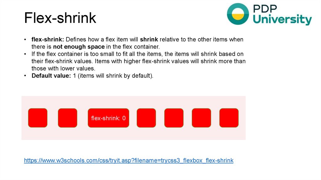
Flex-shrink• flex-shrink: Defines how a flex item will shrink relative to the other items when
there is not enough space in the flex container.
• If the flex container is too small to fit all the items, the items will shrink based on
their flex-shrink values. Items with higher flex-shrink values will shrink more than
those with lower values.
• Default value: 1 (items will shrink by default).
flex-shrink: 0
https://www.w3schools.com/css/tryit.asp?filename=trycss3_flexbox_flex-shrink
10.
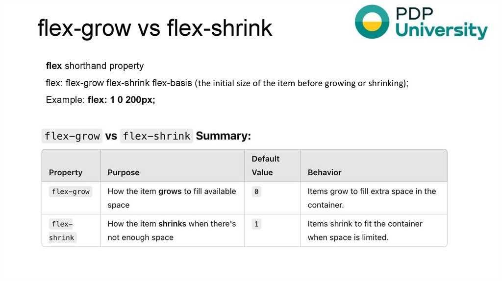
flex-grow vs flex-shrinkflex shorthand property
flex: flex-grow flex-shrink flex-basis (the initial size of the item before growing or shrinking);
Example: flex: 1 0 200px;


 Маркетинг


