


 Интернет
Похожие презентации:
")
")
")
")


")


Introduction to HTML/CSS (part 5)
1.
Introduction to HTML / CSS2.
HTMLHyperText
Markup
Language
3.
ResponsiveWeb Design
4.
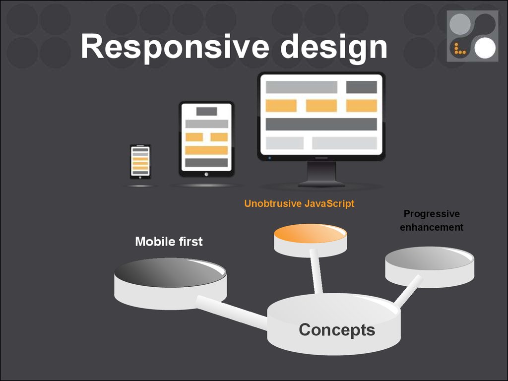
Responsive design5.
Responsive design6.
Responsive designUnobtrusive JavaScript
Progressive
enhancement
Mobile first
Concepts
7.
Media Queries<!-- CSS media query on a link element -->
<link rel="stylesheet" media="screen" href="example.css" />
<!-- The only keyword prevents older browsers that do not support media
queries with media features from applying the given styles -->
<link rel="stylesheet" media="only screen and (color)" href="example.css" />
8.
Media Queries<!-- CSS media query on a link element -->
<link rel="stylesheet" media="screen" href="example.css" />
<!-- The only keyword prevents older browsers that do not support media
queries with media features from applying the given styles -->
<link rel="stylesheet" media="only screen and (color)" href="example.css" />
/* CSS
@media
@media
@media
media query within a stylesheet */
all and (min-width:500px) { … }
(orientation: portrait) { … }
not (all and (monochrome)) { ... }
9.
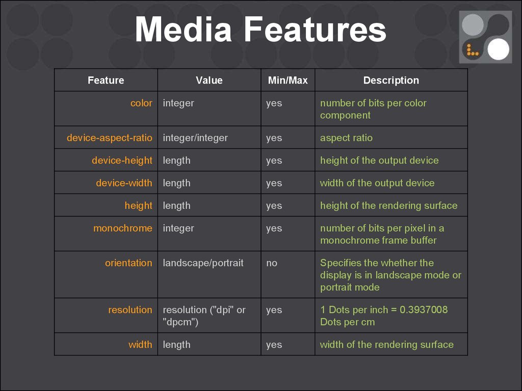
Media FeaturesFeature
Value
color
Min/Max
Description
integer
yes
number of bits per color
component
integer/integer
yes
aspect ratio
device-height
length
yes
height of the output device
device-width
length
yes
width of the output device
height
length
yes
height of the rendering surface
integer
yes
number of bits per pixel in a
monochrome frame buffer
orientation
landscape/portrait
no
Specifies the whether the
display is in landscape mode or
portrait mode
resolution
resolution ("dpi" or
"dpcm")
yes
1 Dots per inch = 0.3937008
Dots per cm
length
yes
width of the rendering surface
device-aspect-ratio
monochrome
width
10.
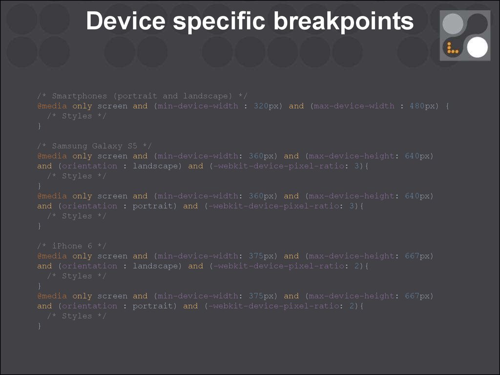
Device specific breakpoints/* Smartphones (portrait and landscape) */
@media only screen and (min-device-width : 320px) and (max-device-width : 480px) {
/* Styles */
}
/* Samsung Galaxy S5 */
@media only screen and (min-device-width: 360px) and (max-device-height: 640px)
and (orientation : landscape) and (-webkit-device-pixel-ratio: 3){
/* Styles */
}
@media only screen and (min-device-width: 360px) and (max-device-height: 640px)
and (orientation : portrait) and (-webkit-device-pixel-ratio: 3){
/* Styles */
}
/* iPhone 6 */
@media only screen
and (orientation :
/* Styles */
}
@media only screen
and (orientation :
/* Styles */
}
and (min-device-width: 375px) and (max-device-height: 667px)
landscape) and (-webkit-device-pixel-ratio: 2){
and (min-device-width: 375px) and (max-device-height: 667px)
portrait) and (-webkit-device-pixel-ratio: 2){
11.
Device specific breakpoints/* iPads (portrait and landscape) */
@media only screen and (min-device-width : 768px) and (max-device-width : 1024px)
{
/* Styles */
}
/* iPads (landscape) */
@media only screen and (min-device-width : 768px) and (max-device-width : 1024px)
and (orientation : landscape) {
/* Styles */
}
/* iPads (portrait) */
@media only screen and (min-device-width : 768px) and (max-device-width : 1024px)
and (orientation : portrait) {
/* Styles */
}
/* Desktops and laptops */
@media only screen and (min-width : 1024px) {
/* Styles */
}
/* Large screens */
@media only screen and (min-width : 1824px) {
/* Styles */
}