

 Программное обеспечение
Похожие презентации:


")

")
UWP app templates for phones
1.
Welcome to the PowerPoint UIToolkit
This toolkit is intended for non-designers. Use it to create
wireframes built with standard controls and patterns.
Toolkits in Adobe Photoshop and Adobe Illustrator are
also available.
For questions or feedback on this toolkit, contact
uwpappdesignfeedback@microsoft.com
CONTENTS
Slide 1: Intro
Slide 2-3: How-to
Slide 4: Resources
Slide 5: Type
Common type styles.
Slide 6-7: Colors
Common colors. This toolkit was created for light theme.
Slide 8: Device Frame
The device frames represent the three snap points that
the design team is targeting (phone, tablet, desktop).
Within each frame, the dotted lines indicate the standard
page margins.
2.
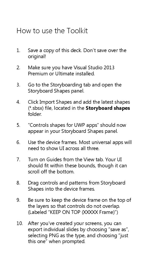
How to use the Toolkit1.
Save a copy of this deck. Don’t save over the
original!
2.
Make sure you have Visual Studio 2013
Premium or Ultimate installed.
3.
Go to the Storyboarding tab and open the
Storyboard Shapes panel.
4.
Click Import Shapes and add the latest shapes
(*.sbsx) file, located in the Storyboard shapes
folder.
5.
“Controls shapes for UWP apps” should now
appear in your Storyboard Shapes panel.
6.
Use the device frames. Most universal apps will
need to show UI across all three.
7.
Turn on Guides from the View tab. Your UI
should fit within these bounds, though it can
scroll off the bottom.
8.
Drag controls and patterns from Storyboard
Shapes into the device frames.
9.
Be sure to keep the device frame on the top of
the layers so that controls do not overlap.
(Labeled “KEEP ON TOP (XXXXX Frame)”)
10. After you’ve created your screens, you can
export individual slides by choosing “save as”,
selecting PNG as the type, and choosing “just
this one” when prompted.
3.
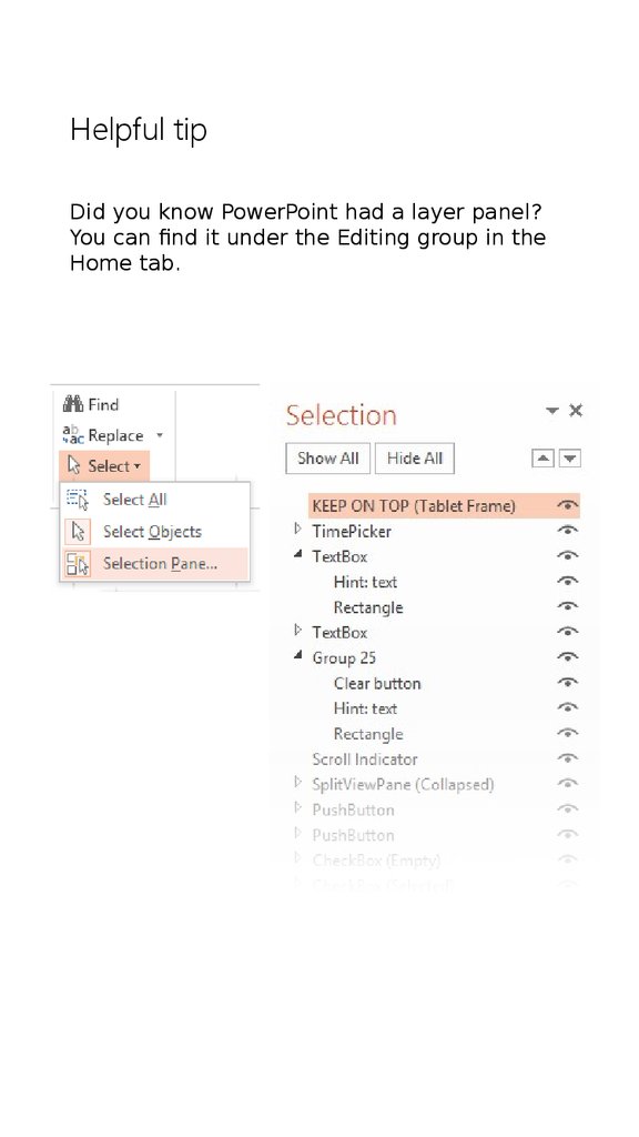
Helpful tipDid you know PowerPoint had a layer panel?
You can find it under the Editing group in the
Home tab.
4.
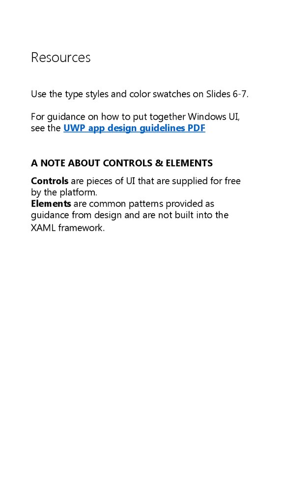
ResourcesUse the type styles and color swatches on Slides 6-7.
For guidance on how to put together Windows UI,
see the UWP app design guidelines PDF
A NOTE ABOUT CONTROLS & ELEMENTS
Controls are pieces of UI that are supplied for free
by the platform.
Elements are common patterns provided as
guidance from design and are not built into the
XAML framework.
5.
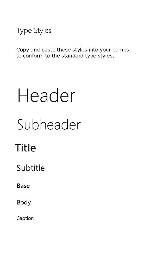
Type StylesCopy and paste these styles into your comps
to conform to the standard type styles.
Header
Subheader
Title
Subtitle
Base
Body
Caption
6.
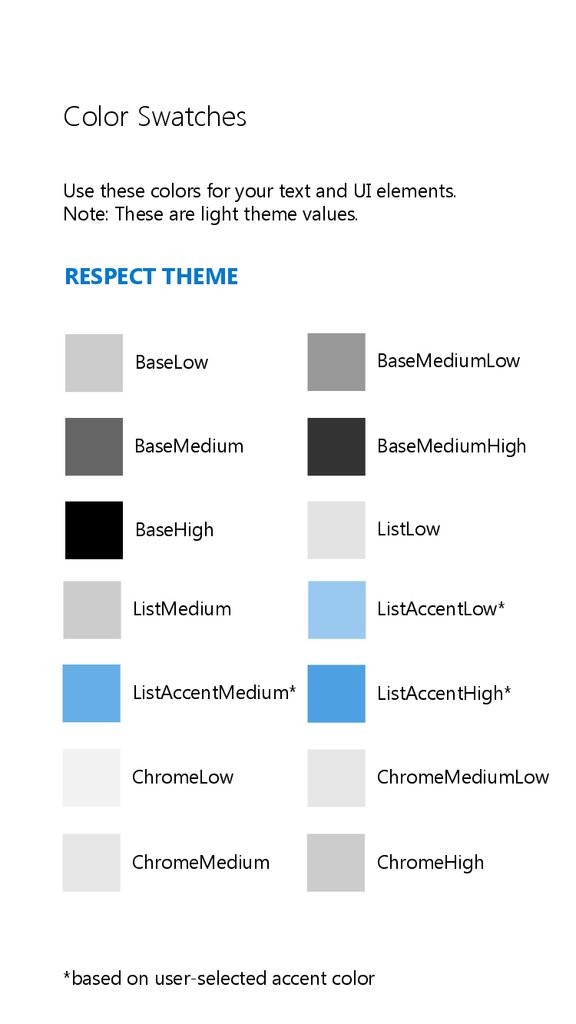
Color SwatchesUse these colors for your text and UI elements.
Note: These are light theme values.
RESPECT THEME
BaseLow
BaseMediumLow
BaseMedium
BaseMediumHigh
BaseHigh
ListLow
ListMedium
ListAccentLow*
ListAccentMedium*
ListAccentHigh*
ChromeLow
ChromeMediumLow
ChromeMedium
ChromeHigh
*based on user-selected accent color
7.
Color Swatches (continued)Use these colors for your text and UI elements.
Note: These are light theme values.
DO NOT RESPECT THEME
ChromeWhite
Accent*
*based on user-selected accent color
ChromeBlackHigh